
Search results for "Bot like behavior" in Home Design Ideas
 Keechi Creek Builders
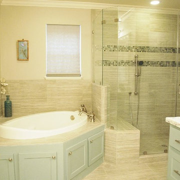
Inspiration for a mid-sized transitional master gray tile and ceramic tile ceramic tile bathroom remodel in Houston with an undermount sink, shaker cabinets, blue cabinets, granite countertops, a two-piece toilet and gray walls
 Living Stone Design + Build
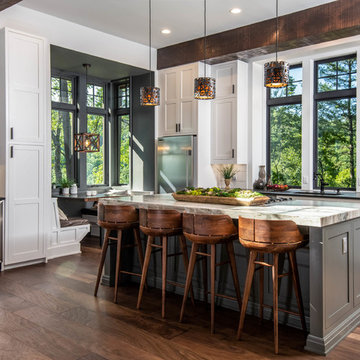
A rustic modern kitchen featuring custom wood cabinetry, stone accents, and sleek energy-efficient appliances, blending functionality with organic elegance in this sustainable mountain home.
 J.P. Hoffman Design Build
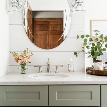
Back to back bathroom vanities make quite a unique statement in this main bathroom. Add a luxury soaker tub, walk-in shower and white shiplap walls, and you have a retreat spa like no where else in the house!
Find the right local pro for your project
 Cascade West Development
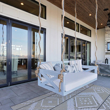
Inspired by the majesty of the Northern Lights and this family's everlasting love for Disney, this home plays host to enlighteningly open vistas and playful activity. Like its namesake, the beloved Sleeping Beauty, this home embodies family, fantasy and adventure in their truest form. Visions are seldom what they seem, but this home did begin 'Once Upon a Dream'. Welcome, to The Aurora.
 KK Design Concepts
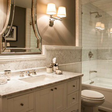
This hall bath, prior to the remodel, was a 2 part bath with tub and toilet in one, and the vanity in the other part separated by a wall with a door. We turned it into one sinlge space. and with the use of handmade (irregular) subway tile and Carrara marble turned it into a monochromatic yet fresh and elegant hall bath with a soothing Spa-like ambience. Here you see how the herringbone band is carried across into and around the tub area.
Photo: Sabine Klingler Kane, KK Design Koncepts, Laguna Niguel, CA
 Flavin Architects
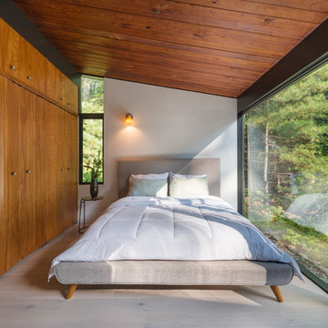
Flavin Architects was chosen for the renovation due to their expertise with Mid-Century-Modern and specifically Henry Hoover renovations. Respect for the integrity of the original home while accommodating a modern family’s needs is key. Practical updates like roof insulation, new roofing, and radiant floor heat were combined with sleek finishes and modern conveniences. Photo by: Nat Rea Photography
 Bria Hammel Interiors
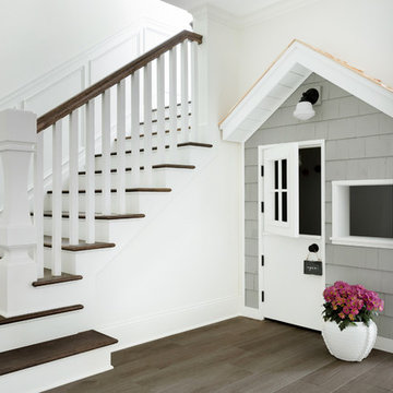
We built this adorable playhouse under the staircase to help store toys and create a play area for the kids. It was important to our clients to have the basement not feel like a basement. We accomplished this by keeping the trim white, adding custom bookcases and installing a wood plank tile throughout.
PC: Spacecrafting Photography
Sponsored
Columbus, OH

Snider & Metcalf Interior Design, LTD
Leading Interior Designers in Columbus, Ohio & Ponte Vedra, Florida
 Advance Design Studio, Ltd.
After six years of living in their Huntley IL home, Chris and Meghan were tired of their dark, dingy, outdated kitchen and it was finally time for a long-anticipated change. “The kitchen is the place where we live, it’s where we do everything,” Meghan said. “It was important that it be a space where we wanted to be.” Meghan loves cooking and enjoys including their girls in healthy meal prepping, this led them to want a brighter, more enjoyable kitchen with increased functionality and improved storage.
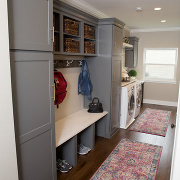
For Chris especially, the laundry room was an entirely dysfunctional eyesore. “We had a washer and a dryer, but it was all kind-of cobbled together!” Chris said. “There were always laundry piles everywhere, we weren’t really sure what we wanted to do in there, but it was time for us to make a change.” The mess of the space was stressful every time they walked in the door from the garage each day. Kids’ backpacks and shoes piled up haphazardly in the makeshift boot-bench closet left the family feeling disorganized and stressed. They needed space for folding clothes and locker cubbies to help keep the family organized.
Having known Christine and Todd in the Huntley community for years, Chris and Meghan were familiar with their work. “We already trusted them personally and having seen their projects for years we knew they did top notch work. After we reviewed the initial round of designs, we knew that hiring them was definitely the right choice,” Meghan and Chris said. Although Chris had done a lot of work in their home himself, the kitchen and laundry room renovation was such a large undertaking that he didn’t want to steal time away from his family to spend what would surely be many long weekends doing the job himself. “That would not have been a wise choice for us,” Chris laughed.
“Our designer, Michelle was very, very, easy to work with; anything we wanted to see or weren’t sure about, she went above and beyond to make this easy for us. She was easy to get hold of and always quick to respond,” the couple said. Michelle pulled ideas that mirrored the couple’s taste and style and was adept at directing the couple to limited choices that didn’t overwhelm them and kept the process moving. “I have a hard time making decisions. Michelle made the decision-making process so easy. I loved how she listened to what I liked and then presented three great options for me to choose from,” Meghan said.
The main objectives for the kitchen were better storage solutions, they wanted the space to reflect their lifestyle and taste, and they wanted it to last for years with low maintenance. One of the first steps in creating a more functional kitchen was relocating the refrigerator, creating an improved workflow for the busy family.
“We didn’t know that we could even move the refrigerator to a new location where it is now, that was something that we never would have thought of,” Chris said. “The new refrigerator location makes the kitchen feel so much bigger. We didn’t add any space, but our whole kitchen with the new design just seems like it’s so much larger than before!” Meghan said.
The perimeter mist colored cabinets helped warm and brighten the entire room, while the graphite colored cabinets on the island added contrast. Using this fresh, clean color palette satisfied the couple’s desire for a bright space that was the exact opposite of what they had before. Organization accessories were also added to the cabinets such as a spice drawer tray and roll outs to create hidden convenience.
“I absolutely love the hidden spices – it makes cooking so much more enjoyable!” Chris said. “And all the pull outs, and the double trash bin, who would think you could get so excited about organization!” the couple said in unison.
One thing they hated in their original kitchen was how dark the space felt. Added lighting on the ceiling with the new light fixtures combined with the lighter cabinetry colors throughout solved this problem. “Our new kitchen has this warm, almost cozy feeling that our old kitchen never had, it’s just a space that I love spending my time in now,” Meghan said. The light airy feeling was accentuated with the use of floating white shelves on either side of the decorative range hood. “We have so much cabinetry space, the new design is amazing we actually have more storage space than we will ever need,” Meghan said.
The island was extended to create more work surface and added space for stool seating. “The new island changes how we live. Now the kids can be in the kitchen with us, doing homework, eating breakfast, and the three of us have special dinners there when Chris is working late,” Meghan said.
The Carrara Marmi Quartz countertops were chosen because they are, not only beautiful, but are made from hard-working material that doesn’t require maintenance. The white subway tile backsplash that wraps to the ceiling behind the focal point cooktop range/hood compliments the crisp white countertops perfectly, while brushed brass hardware and light fixtures keep the design fresh and new.
The couple had a few fears at the beginning of the project, as most homeowners do. Their biggest fear was being out of their kitchen and laundry room for an extended time. The crew made it very easy for the family to work in a limited space keeping the washer and dryer hooked up the majority of the time, and also getting appliances working with minimal downtime.
“They above and beyond accommodated us to get us through the process,” Meghan said. “They did a great job making sure we were as comfortable as possible throughout the process,” Chris added.
“Our project manager DJ did a great job. He was very good at updating us on schedule changes, getting guys in as quickly as possible. Everyone that stepped in the house was nice and did great work,” said Chris. They thought Advance’s carpenter was phenomenal and were impressed when he took a conceptual idea from a photograph and worked with designer Michelle to create a one of a kind range/hood that has become the topic of conversation with friends and family who visit the new kitchen. “He was in our house literally every day for several weeks. He was easy to work with and good at what he did,” Meghan and Chris said.
The focal point of the kitchen; a hand-crafted, custom-built ventilation hood was clad with handpicked reclaimed barnwood. Advance Design’s carpenter built the framework and the cladding to create a one-of-a-kind design element that the couple loves.
“I think it was especially fun for him to create something unique from scratch, showcasing his talent in this area,” Meghan said. “I love that my kitchen is not like everyone else’s. I got to pick out the wood on my hood and watch it being built and was able to choose what pieces of wood went where on it. It’s totally unique.”
Red Oak flooring was toothed-in throughout the kitchen and the rest of the first floor anywhere changes were made. Then the whole floor was refinished to tone down the orange undertones in the existing floor stain, ultimately changing the color complexion of the entire first floor. The result is a completely new feeling to the entire home.
Renovating the laundry room was extremely important to Meghan and Chris, but they had trouble visualizing what the possibilities were for the seemingly small space. Michelle produced beautiful 3D illustrations that helped them envision the space in a whole new way.
“I must have told Michelle 100 times that I am a visual person, seeing the designs in 3D made it so easy to make decisions and see what we could really do with our space,” Meghan said.
A dividing wall and doorway were removed between the existing laundry room and hallway formerly containing a coat closet, providing space to design specialized graphite colored cabinetry matching the kitchen island to house custom storage cubbies for each family member. Adding the tall utility cabinetry in the new laundry area helped solve the storage issue, tucking away cleaning supplies, household items, and even the cat got its own cubby.
“I love how everything is now hidden in its own space. I can’t tell you how much I hated coming home and seeing everything sitting around on counters,” Chris said.
Electrical outlets were planned for the inside of utility cabinets, so devices could charge in hidden locations. Stacking the washer and dryer allowed for wider countertop space to provide a folding area and a special space for clothes to hang. “The way I do laundry has been completely transformed! I can actually fold clothes and hang them now right out of the washer and dryer,” Meghan said.
“The end result in the kitchen and the laundry/mud room was an updated light and bright space, with a smarter work flow that better meets the needs of this family,” Michelle said.
“I would totally recommend Advance Design,” Meghan said. “Sometimes I sit and just look at my kitchen and laundry room and think ‘Wow, I can’t believe I get to live here!’ It’s an understatement to say we love our new space.”
 Edgewater Design Group
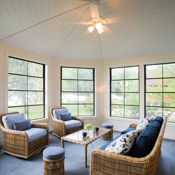
This home started out as a remodel of a family’s beloved summer cottage. A fire started on the work site which caused irreparable damage. Needless to say, a remodel turned into a brand-new home. We were brought on board to help our clients re-imagine their summer haven. Windows were important to maximize the gorgeous lake view. Access to the lake was also very important, so an outdoor shower off the mudroom/laundry area with its own side entrance provided a nice beach entry for the kids. A large kitchen island open to dining and living was imperative for the family and the time they like to spend together. The master suite is on the main floor and three bedrooms upstairs, one of which has built-in bunks allows the kids to have their own area. While the original family cottage is no more, we were able to successfully help our clients begin again so they can start new memories.
- Jacqueline Southby Photography
 DHD Architecture and Interior Design
Union Square Loft II
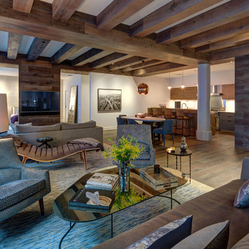
DHD Interiors worked with this couple to furnish their new recently renovated Flatiron loft. Navigating the dark wood paneling and flooring, DHD selected furniture and finishes that felt rich in color and texture while still cool and casual. Layers of grass cloth wallpapers were added to the main bedrooms to reduce the contrast of the dark wood and walls, adding brightness to the loft’s overall feel. Greys and mink-toned browns served as the foundation for a base palette, with deep burgundies and blues working as accents. This loft feels like a true downtown loft with its original brick and an industrial dining table, but stays balanced with softly upholstered furniture. Each piece, from the Dunbar chaise lounge to the organically shaped coffee table, displays a sculptural quality that contributes to a visually dynamic space.
2 Bedrooms / 2,000 Square Feet
Architecture and Photography:
Danny Forster Design Studio
 SV Design
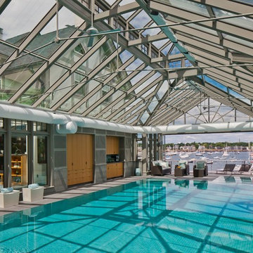
A desire for a more modern and zen-like environment in a historical, turn of the century stone and stucco house was the drive and challenge for this sophisticated Siemasko + Verbridge Interiors project. Along with a fresh color palette, new furniture is woven with antiques, books, and artwork to enliven the space. Carefully selected finishes enhance the openness of the glass pool structure, without competing with the grand ocean views. Thoughtfully designed cabinetry and family friendly furnishings, including a kitchenette, billiard area, and home theater, were designed for both kids and adults.
 Innovative Design Build
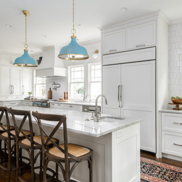
Our clients wanted to stay true to the style of this 1930's home with their kitchen renovation. Changing the footprint of the kitchen to include smaller rooms, we were able to provide this family their dream kitchen with all of the modern conveniences like a walk in pantry, a large seating island, custom cabinetry and appliances. It is now a sunny, open family kitchen.
 Kathleen Jennison
An Arts & Crafts Bungalow is one of my favorite styles of homes. We have quite a few of them in our Stockton Mid-Town area. And when C&L called us to help them remodel their 1923 American Bungalow, I was beyond thrilled.
As per usual, when we get a new inquiry, we quickly Google the project location while we are talking to you on the phone. My excitement escalated when I saw the Google Earth Image of the sweet Sage Green bungalow in Mid-Town Stockton. "Yes, we would be interested in working with you," I said trying to keep my cool.
But what made it even better was meeting C&L and touring their home, because they are the nicest young couple, eager to make their home period perfect. Unfortunately, it had been slightly molested by some bad house-flippers, and we needed to bring the bathroom back to it "roots."
We knew we had to banish the hideous brown tile and cheap vanity quickly. But C&L complained about the condensation problems and the constant fight with mold. This immediately told me that improper remodeling had occurred and we needed to remedy that right away.
The Before: Frustrations with a Botched Remodel
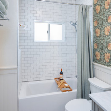
The bathroom needed to be brought back to period appropriate design with all the functionality of a modern bathroom. We thought of things like marble countertop, white mosaic floor tiles, white subway tile, board and batten molding, and of course a fabulous wallpaper.
This small (and only) bathroom on a tight budget required a little bit of design sleuthing to figure out how we could get the proper look and feel. Our goal was to determine where to splurge and where to economize and how to complete the remodel as quickly as possible because C&L would have to move out while construction was going on.
The Process: Hard Work to Remedy Design and Function
During our initial design study, (which included 2 hours in the owners’ home), we noticed framed images of William Morris Arts and Crafts textile patterns and knew this would be our design inspiration. We presented C&L with three options and they quickly selected the Pimpernel Design Concept.
We had originally selected the Black and Olive colors with a black vanity, mirror, and black and white floor tile. C&L liked it but weren’t quite sure about the black, We went back to the drawing board and decided the William & Co Pimpernel Wallpaper in Bayleaf and Manilla color with a softer gray painted vanity and mirror and white floor tile was more to their liking.
After the Design Concept was approved, we went to work securing the building permit, procuring all the elements, and scheduling our trusted tradesmen to perform the work.
We did uncover some shoddy work by the flippers such as live electrical wires hidden behind the wall, plumbing venting cut-off and buried in the walls (hence the constant dampness), the tub barely balancing on two fence boards across the floor joist, and no insulation on the exterior wall.
All of the previous blunders were fixed and the bathroom put back to its previous glory. We could feel the house thanking us for making it pretty again.
The After Reveal: Cohesive Design Decisions
We selected a simple white subway tile for the tub/shower. This is always classic and in keeping with the style of the house.
We selected a pre-fab vanity and mirror, but they look rich with the quartz countertop. There is much more storage in this small vanity than you would think.
The Transformation: A Period Perfect Refresh
We began the remodel just as the pandemic reared and stay-in-place orders went into effect. As C&L were already moved out and living with relatives, we got the go-ahead from city officials to get the work done (after all, how can you shelter in place without a bathroom?).
All our tradesmen were scheduled to work so that only one crew was on the job site at a time. We stayed on the original schedule with only a one week delay.
The end result is the sweetest little bathroom I've ever seen (and I can't wait to start work on C&L's kitchen next).
Thank you for joining me in this project transformation. I hope this inspired you to think about being creative with your design projects, determining what works best in keeping with the architecture of your space, and carefully assessing how you can have the best life in your home.


 Simply Home Decorating
This beautiful North Vancouver home belongs to a nature-loving and health-conscious couple, Emma and Vince (names changed), their two young children, and their dog, Jasper. When they contacted us about renovating and furnishing their kitchen and family room, we walked in and saw a world of potential waiting to be uncovered.
Before: Larkhall Crescent Home:
Like many original North Vancouver homes, the interior was definitely dated. We encountered late ‘80s finishes in powder pink and teal green, old carpet, and a kitchen that wasn’t maximized to suit this family’s modern-day lifestyle. However, the size of the rooms offered us a ton of space with which to get creative.
Knowing our clients’ love of cooking, need for work spaces (Emma and Vince both work remotely), and growing family, we developed a design concept that would increase usable space, optimize storage, and create intimacy in this large area. As for the style, we were inspired by their European roots, inventing a new and modern take on “Belgian Farmhouse” style. Now, the home is truly one-of-a-kind.
After: Warm & Cozy Family Room:
Fresh, bright, and comfortable, this living area has been transformed! We started with the fireplace as a focal point, selecting aged brick tiles for added texture and a crisp wood mantle. The taupe-coloured sectional infuses the room with visual warmth and serves the added purpose of separating the family room from the kitchen.
Emma and Vince were also keen on using non-toxic materials in their home, and we were happy to oblige. To meet their needs, we sourced natural wood elements and sought out Canadian-made products - that adhere to high health standards - whenever possible.
Look closer at the elements of this space, and you will find this stunning, honeycomb-patterned rug in earthy gold, beige, and charcoal tones. It’s plush to the touch and full of visual texture that brings this room’s colour palette together. We sourced these two-tone chairs with caning, petrified wood side table, black sconces, and botanical prints in greyscale from local artist, Heather Johnston.
We topped off the space with this dark wood and rattan console that offers storage facing the kitchen and presents an opportunity to display cherished items. The result is a cozy lounging space brimming with comfort and functionality. It’s perfect for enjoying quality family time, or Emma can simply slide the coffee table away to make room for her morning yoga practice.
Now, let’s turn around and give some attention to the kitchen. Do you remember what the original kitchen looked like? If not, scroll back up, because the transformation is shocking…
Moody & Welcoming Kitchen for Healthy Living:
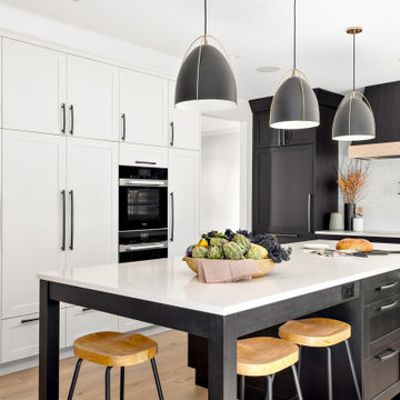
This kitchen looks very different from how it started, right? Though we didn’t touch any walls, the kitchen has almost doubled in usable space! We created a long, extended island with storage, an outlet for small appliances, and seating for comfortable prep, after-school snacking, or mingling among friends.
On the other side of the island, the family has even more storage and an integrated dishwasher within easy reach of the sink, perfect for quick clean-up. From this angle, you can also see the expansive custom Shaker cabinetry in white and the integrated double ovens. These facilitate their cooking experience and gave us the opportunity to add an additional surprise…
A coffee garage station and more hidden storage! Keeping these items located along the perimeter allows them to be accessed by the family or their guests without someone getting under the cook’s feet. These are the little details that make everyday life easier and more enjoyable.
Moving deeper into the kitchen, the seamless induction cooktop topped with a freestanding concealed hood fan commands attention in a soft yet prominent way. The natural wood accent mirrors the fireplace mantle, and the choice of off-black wood-grain cabinets not only continues our black-and-white colour palette but adds a sense of depth and contrast. The corner sink is located to the right and perfectly positioned with a view of their thriving backyard.
To invite more of this family’s character into the space, we mixed metals for interest — matte black, dark pewter, and warm brass — and created open shelves in white oak for their plants and decor. You can also glimpse the tumbled edge of the backsplash tile, which echoes the rustic brick of the fireplace. It adds that farmhouse charm while still feeling timeless and sophisticated.
Last but not least, we designed this dining banquette in the bay window (with integrated bench storage, of course), where the family can share a meal together, the kids can do homework, or Emma and Vince can work and enjoy a change of scenery from their offices. Like the other spaces in the home, it was designed to be beautiful, multi-functional, and long-lasting.
Praise from Our Clients:
It is clear that we love this home, but what did our clients have to say?
“Lori is a visionary and masters execution to the finest detail all at the same time. When she first met us to know more about who we are and how we live, she could right away envision how we could use the space in our kitchen and living room…The results exceeded our expectations.
Lori and her team were also a delight to work with — coordination with all the trades, fast problem-solving, regular updates, professional and friendly attitude of her entire team — made it the dream team. Thank you SHD for making our space so beautiful!”
In turn, we are so grateful for this family’s trust, their open communication, and for being wonderful people with whom to work. (So, thank you!)
 Cinergy Construction
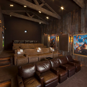
This was a detached building from the main house just for the theater. The interior of the room was designed to look like an old lodge with reclaimed barn wood on the interior walls and old rustic beams in the ceiling. In the process of remodeling the room we had to find old barn wood that matched the existing barn wood and weave in the old with the new so you could not see the difference when complete. We also had to hide speakers in the walls by Faux painting the fabric speaker grills to match the grain of the barn wood on all sides of it so the speakers were completely hidden.
We also had a very short timeline to complete the project so the client could screen a movie premiere in the theater. To complete the project in a very short time frame we worked 10-15 hour days with multiple crew shifts to get the project done on time.
The ceiling of the theater was over 30’ high and all of the new fabric, barn wood, speakers, and lighting required high scaffolding work.
 Housetrends Magazine
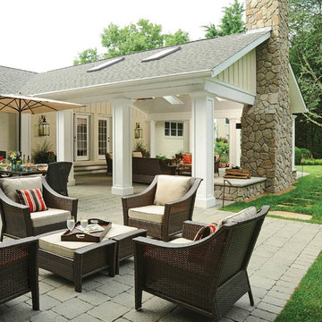
When you open the back doors of the home of Nancy and Jeremy Campbell in Granville, you don’t just step out onto a patio. You enter an extension of a modern living space that just happens to be outdoors. Their patio’s unique design and setting provides the comfort and style of indoors while enjoying the natural beauty and fresh air of outdoors.
It all started with a rather desolate back yard. “It was completely blank, there was nothing back there,” Nancy remembers of the patio space of this 1972 split-level house they bought five years ago. With a blank slate to work with, the Campbells knew the key elements of what they wanted for their new outdoor space when they sat down with Travis Ketron of Ketron Custom Builders to design it. “We knew we wanted something covered so we could use it in the rain, and in the winter, and we knew we wanted a stone fireplace,” Nancy recalls.
Travis translated the Campbells’ vision into a design to satisfy outdoor entertaining and relaxing desires in all seasons. The new outdoor space is reminiscent of a vast, rustic great room complete with a stone fireplace, a vaulted ceiling, skylights, and ceiling fans, yet no walls. The space is completely open to the elements without any glass or doors on any of the sides, except from the house. Furnished like a great room, with a built-in music system as well, it’s truly an extension of indoor living and entertaining space, and one that is unaffected by rain. Jeremy comments, “We haven’t had to cover the furniture yet. It would have to be a pretty strong wind to get wet.” Just outside the covered patio is a quartet of outdoor chairs adorned with plush cushions and colorful pillows, positioned perfectly for users to bask in the sun.
In the design process, the fireplace emerged as the anchor of the space and set the stage for the outdoor space both aesthetically and functionally. “We didn’t want it to block the view. Then designing the space with Travis, the fireplace became the center,” remembers Jeremy. Placed directly across from the two sets of French doors leading out from the house, a Rumford fireplace and extended hearth of stone in neutral earth tones is the focal point of this outdoor living room. Seating for entertaining and lounging falls easily into place around it providing optimal viewing of the private, wooded back yard. When temperatures cool off, the fireplace provides ample warmth and a cozy setting to experience the change of seasons. “It’s a great fireplace for the space,” Jeremy says of the unique design of a Rumford style fireplace. “The way you stack the wood in the fireplace is different so as to get more heat. It has a shallower box, burns hotter and puts off more heat. Wood is placed in it vertically, not stacked.” Just in case the fireplace doesn’t provide enough light for late-night soirees, there is additional outdoor lighting mounted from the ceiling to make sure the party always goes on.
Travis brought the idea of the Rumford outdoor fireplace to the Campbells. “I learned about it a few years back from some masons, and I was intrigued by the idea then,” he says. “We like to do stuff that’s out of the norm, and this fireplace fits the space and function very well.” Travis adds, “People want unique things that are designed for them. That’s our style to do that for them.”
The patio also extends out to an uncovered area set up with patio tables for grilling and dining. Gray pavers flow throughout from the covered space to the open-air area. Their continuous flow mimics the feel of flooring that extends from a living room into a dining room inside a home. Also, the earth tone colors throughout the space on the pavers, fireplace and furnishings help the entire space mesh nicely with its natural surroundings.
A little ways off from both the covered and uncovered patio area is a stone fire pit ring. Removed by just the right distance, it provides a separate place for young adults to gather and enjoy the night.
Adirondack chairs and matching tables surround the outdoor fire pit, offering seating for anyone who doesn’t wish to stand and a place to set down ingredients for yummy fireside treats like s’mores.
Padded chairs outside the reach of the pavilion and the nearby umbrella the perfect place to kick back and relax in the sun. The colorful throw pillows and outdoor furniture cushions add some needed color and a touch of personality.
Enjoying the comforts of indoors while being outdoors is exactly what the Campbells are doing now, particularly when lounging on the comfortable wicker furniture that dominate most of the area. “My favorite part of the whole thing is the fireplace,” Nancy says.
Jeremy concludes, “There is no television, it would destroy the ambiance out there. We just enjoy listening to music and watching the fire.”
 Suzanne Nichols Design Group, Inc.
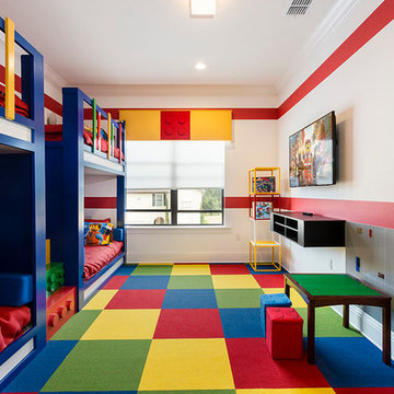
Childrens Lego room is a fun space for children to play and create in. The custom bunk beds are like no other giving this space a unique flare and an unforgettable impression. The pops of color brighten the room as well as grab the attention of any passer-byer.


 Soda Pop Design Inc.
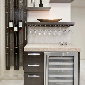
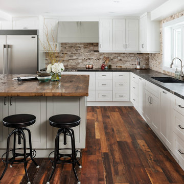
Custom design by Cynthia Soda of Soda Pop Design Inc. in Toronto, Canada. Photography by Stephani Buchman Photography.
Open concept kitchen - large transitional l-shaped dark wood floor open concept kitchen idea in Toronto with white cabinets, an island, recessed-panel cabinets, beige backsplash, stone tile backsplash and stainless steel appliances
Open concept kitchen - large transitional l-shaped dark wood floor open concept kitchen idea in Toronto with white cabinets, an island, recessed-panel cabinets, beige backsplash, stone tile backsplash and stainless steel appliances
 TKS Design Group
Download our free ebook, Creating the Ideal Kitchen. DOWNLOAD NOW
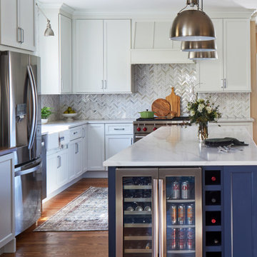
Like many families with older children, this local Glen Ellyn couple wanted to expand the size of their kitchen while also creating a more open, airy feel for their main level. The home had plenty of space that included a formal living room, formal dining room, family room with eat-in area and kitchen with butler’s pantry. What it didn’t have, was an effortless flow between the areas used daily for cooking, eating and gathering.
Additionally, the kitchen had become outdated, feeling dark and dismal, despite the abundance of natural light. Our clients wanted a bright, cheerful interior that would inspire the family to congregate in this part of the house. No easy feat with teenagers.
An open floor plan design solved the issues with functionality and circulation, removing the walls that restricted flow and opening up the entry to the dining room. We also eliminated the rarely used butler’s pantry allowing us to expand the kitchen and add a large island for food prep and gathering. To create a sense of symmetry and consistency in the space, a clerestory window was added below the header and framed to match the existing adjacent entry from the living room.
Inspired by the owner’s Scottish ancestry, the island cabinetry boasts a beautiful blue hue, paired with stools upholstered in a sprightly plaid. The built-in buffet area provides additional storage, topped with a beautiful wooden top stained to coordinate with the stunning tones of the flooring.
The owner’s opted for stainless steel appliances, inspiring the selection of brushed silver light fixtures and polished chrome hardware. Marble-look quartz offered a durable, lightly colored surface to reflect sunlight and enhance the cheer factor. According to this happy family, this uplifting space is now everyone’s favorite place to gather.
Designed by: Susan Klimala, CKBD
Photography by: Michael Kaskel
For more design inspiration go to: www.kitchenstudio-ge.com
40