
Search results for "Brought" in Home Design Ideas

 Connie Anderson Photography
Builder: Frankel Building Group
Example of a patio design in Houston with a fire pit and a roof extension
Example of a patio design in Houston with a fire pit and a roof extension


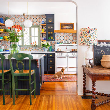
 Julia Chasman Design
We removed half the full wall between the Living Room and Kitchen, and built an arched opening to make the space seem like it had always been there. The opening brought in light, and allowed us to add an island, which greatly increased our storage space and functionality in the kitchen.
Find the right local pro for your project

 Prime 1 Builders
Inspiration for a transitional u-shaped light wood floor and beige floor kitchen remodel with an undermount sink, shaker cabinets, gray backsplash, stainless steel appliances, a peninsula, white countertops, turquoise cabinets and window backsplash

 Jan Gleysteen Architects, Inc
Photography by Richard Mandelkorn
Kitchen - transitional kitchen idea in Boston with recessed-panel cabinets, white cabinets, white backsplash and stainless steel appliances
Kitchen - transitional kitchen idea in Boston with recessed-panel cabinets, white cabinets, white backsplash and stainless steel appliances

 G.W. Smith Lumber Co.
This bright and beautiful modern farmhouse kitchen incorporates a beautiful custom made wood hood with white upper cabinets and a dramatic black base cabinet from Kraftmaid.

 Keystone Millworks Inc
Nikola Vick
Elegant master corner shower photo in Atlanta with an undermount sink, recessed-panel cabinets, white cabinets and gray walls
Elegant master corner shower photo in Atlanta with an undermount sink, recessed-panel cabinets, white cabinets and gray walls

 Décor Aid
Having an eye for great interior design yet no clue on where to start or how to narrow down their aesthetic vision, a young family turned to Décor Aid to bring their drab pre-war Upper West Side apartment to life. With two young daughters in tow, our clients were looking for high style décor grounded in practicality and function – namely for their foyer, living room, dining room, and den.
Armed with a variety of inspiration from traditional to ultra-modern, they knew that they wanted their apartment’s interior design to look put together and thought through, but were short on a concise design direction.
In comes Décor Aid interior designer Gabrielle G. to revive their stark home with inspired design. After their initial in-home consultation, Gabrielle honed in on key decorative touchstones the couple had interest in and compiled a list of must-haves as an aesthetic foundation for the home.
Starting with fresh coats of pure white paint to liven up and brighten each room, Gabrielle took advantage of the apartments closed floor plan and gave each room it’s own design signature rather than having to ensure that everything flowed together – in turn, giving her more freedom.
Save for a china cabinet and formal dining table, Gabrielle was tasked with sourcing furnishings and accessories and went for clean simplicity as the couple also expressed that they’d like to have pieces that can move with them as their family grows while also being conducive for family life.
As you can see, the space is grounded with soothing neutrals so Gabrielle brought in pops of color and texture through accessories and abstract art for a sophisticated yet casual vibe.
The end result boasts concise design and pulled together everyday glamor for this modern family home that our clients adore, and so do we.

 KS Designs LLC
This guest bath has a light and airy feel with an organic element and pop of color. The custom vanity is in a midtown jade aqua-green PPG paint Holy Glen. It provides ample storage while giving contrast to the white and brass elements. A playful use of mixed metal finishes gives the bathroom an up-dated look. The 3 light sconce is gold and black with glass globes that tie the gold cross handle plumbing fixtures and matte black hardware and bathroom accessories together. The quartz countertop has gold veining that adds additional warmth to the space. The acacia wood framed mirror with a natural interior edge gives the bathroom an organic warm feel that carries into the curb-less shower through the use of warn toned river rock. White subway tile in an offset pattern is used on all three walls in the shower and carried over to the vanity backsplash. The shower has a tall niche with quartz shelves providing lots of space for storing shower necessities. The river rock from the shower floor is carried to the back of the niche to add visual interest to the white subway shower wall as well as a black Schluter edge detail. The shower has a frameless glass rolling shower door with matte black hardware to give the this smaller bathroom an open feel and allow the natural light in. There is a gold handheld shower fixture with a cross handle detail that looks amazing against the white subway tile wall. The white Sherwin Williams Snowbound walls are the perfect backdrop to showcase the design elements of the bathroom.
Photography by LifeCreated.
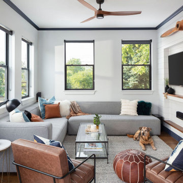
 TVL Creative Ltd.
This 1910 West Highlands home was so compartmentalized that you couldn't help to notice you were constantly entering a new room every 8-10 feet. There was also a 500 SF addition put on the back of the home to accommodate a living room, 3/4 bath, laundry room and back foyer - 350 SF of that was for the living room. Needless to say, the house needed to be gutted and replanned.
Kitchen+Dining+Laundry-Like most of these early 1900's homes, the kitchen was not the heartbeat of the home like they are today. This kitchen was tucked away in the back and smaller than any other social rooms in the house. We knocked out the walls of the dining room to expand and created an open floor plan suitable for any type of gathering. As a nod to the history of the home, we used butcherblock for all the countertops and shelving which was accented by tones of brass, dusty blues and light-warm greys. This room had no storage before so creating ample storage and a variety of storage types was a critical ask for the client. One of my favorite details is the blue crown that draws from one end of the space to the other, accenting a ceiling that was otherwise forgotten.
Primary Bath-This did not exist prior to the remodel and the client wanted a more neutral space with strong visual details. We split the walls in half with a datum line that transitions from penny gap molding to the tile in the shower. To provide some more visual drama, we did a chevron tile arrangement on the floor, gridded the shower enclosure for some deep contrast an array of brass and quartz to elevate the finishes.
Powder Bath-This is always a fun place to let your vision get out of the box a bit. All the elements were familiar to the space but modernized and more playful. The floor has a wood look tile in a herringbone arrangement, a navy vanity, gold fixtures that are all servants to the star of the room - the blue and white deco wall tile behind the vanity.
Full Bath-This was a quirky little bathroom that you'd always keep the door closed when guests are over. Now we have brought the blue tones into the space and accented it with bronze fixtures and a playful southwestern floor tile.
Living Room & Office-This room was too big for its own good and now serves multiple purposes. We condensed the space to provide a living area for the whole family plus other guests and left enough room to explain the space with floor cushions. The office was a bonus to the project as it provided privacy to a room that otherwise had none before.

 Locati Architects
Cassiopeia Way Residence
Architect: Locati Architects
General Contractor: SBC
Interior Designer: Jane Legasa
Photography: Zakara Photography
Example of a mountain style open concept medium tone wood floor and brown floor living room design with gray walls and a standard fireplace
Example of a mountain style open concept medium tone wood floor and brown floor living room design with gray walls and a standard fireplace

 Corynne Pless
Photo: Corynne Pless © 2013 Houzz
Danish living room photo in New York with gray walls and a brick fireplace
Danish living room photo in New York with gray walls and a brick fireplace

 MasterBrand Cabinets
This drawer stack and wall #cabinet combination by Aristokraft #Cabinetry provides loads of #storage opportunities.
Example of a small transitional single-wall utility room design with white cabinets and white walls
Example of a small transitional single-wall utility room design with white cabinets and white walls

 Interiors by Maite Granda
Project Feature in: Luxe Magazine & Luxury Living Brickell
From skiing in the Swiss Alps to water sports in Key Biscayne, a relocation for a Chilean couple with three small children was a sea change. “They’re probably the most opposite places in the world,” says the husband about moving
from Switzerland to Miami. The couple fell in love with a tropical modern house in Key Biscayne with architecture by Marta Zubillaga and Juan Jose Zubillaga of Zubillaga Design. The white-stucco home with horizontal planks of red cedar had them at hello due to the open interiors kept bright and airy with limestone and marble plus an abundance of windows. “The light,” the husband says, “is something we loved.”
While in Miami on an overseas trip, the wife met with designer Maite Granda, whose style she had seen and liked online. For their interview, the homeowner brought along a photo book she created that essentially offered a roadmap to their family with profiles, likes, sports, and hobbies to navigate through the design. They immediately clicked, and Granda’s passion for designing children’s rooms was a value-added perk that the mother of three appreciated. “She painted a picture for me of each of the kids,” recalls Granda. “She said, ‘My boy is very creative—always building; he loves Legos. My oldest girl is very artistic— always dressing up in costumes, and she likes to sing. And the little one—we’re still discovering her personality.’”
To read more visit:
https://maitegranda.com/wp-content/uploads/2017/01/LX_MIA11_HOM_Maite_12.compressed.pdf
Rolando Diaz
 TVL Creative Ltd.
Our clients had just recently closed on their new house in Stapleton and were excited to transform it into their perfect forever home. They wanted to remodel the entire first floor to create a more open floor plan and develop a smoother flow through the house that better fit the needs of their family. The original layout consisted of several small rooms that just weren’t very functional, so we decided to remove the walls that were breaking up the space and restructure the first floor to create a wonderfully open feel.
After removing the existing walls, we rearranged their spaces to give them an office at the front of the house, a large living room, and a large dining room that connects seamlessly with the kitchen. We also wanted to center the foyer in the home and allow more light to travel through the first floor, so we replaced their existing doors with beautiful custom sliding doors to the back yard and a gorgeous walnut door with side lights to greet guests at the front of their home.
Living Room
Our clients wanted a living room that could accommodate an inviting sectional, a baby grand piano, and plenty of space for family game nights. So, we transformed what had been a small office and sitting room into a large open living room with custom wood columns. We wanted to avoid making the home feel too vast and monumental, so we designed custom beams and columns to define spaces and to make the house feel like a home. Aesthetically we wanted their home to be soft and inviting, so we utilized a neutral color palette with occasional accents of muted blues and greens.
Dining Room
Our clients were also looking for a large dining room that was open to the rest of the home and perfect for big family gatherings. So, we removed what had been a small family room and eat-in dining area to create a spacious dining room with a fireplace and bar. We added custom cabinetry to the bar area with open shelving for displaying and designed a custom surround for their fireplace that ties in with the wood work we designed for their living room. We brought in the tones and materiality from the kitchen to unite the spaces and added a mixed metal light fixture to bring the space together
Kitchen
We wanted the kitchen to be a real show stopper and carry through the calm muted tones we were utilizing throughout their home. We reoriented the kitchen to allow for a big beautiful custom island and to give us the opportunity for a focal wall with cooktop and range hood. Their custom island was perfectly complimented with a dramatic quartz counter top and oversized pendants making it the real center of their home. Since they enter the kitchen first when coming from their detached garage, we included a small mud-room area right by the back door to catch everyone’s coats and shoes as they come in. We also created a new walk-in pantry with plenty of open storage and a fun chalkboard door for writing notes, recipes, and grocery lists.
Office
We transformed the original dining room into a handsome office at the front of the house. We designed custom walnut built-ins to house all of their books, and added glass french doors to give them a bit of privacy without making the space too closed off. We painted the room a deep muted blue to create a glimpse of rich color through the french doors
Powder Room
The powder room is a wonderful play on textures. We used a neutral palette with contrasting tones to create dramatic moments in this little space with accents of brushed gold.
Master Bathroom
The existing master bathroom had an awkward layout and outdated finishes, so we redesigned the space to create a clean layout with a dream worthy shower. We continued to use neutral tones that tie in with the rest of the home, but had fun playing with tile textures and patterns to create an eye-catching vanity. The wood-look tile planks along the floor provide a soft backdrop for their new free-standing bathtub and contrast beautifully with the deep ash finish on the cabinetry.

 Kimberlee Marie Interiors
When my clients purchased this charming 1940's home in the Seattle neighborhood of Wedgwood, they were amazed by how intact the original kitchen was. It was like a perfect time capsule. The color palette was avocado green and buttercream yellow. The highlights were an original retro built-in banquette and vintage oven! The challenge we faced (besides the awesome but dated finishes) was the closed floor plan typical in this era of homes and the lack of storage. So, we opened the kitchen to the adjacent dining and living room, bringing it up to speed with modern-day living. In opening it up, we also walled off a doorway that went from the kitchen to the hallway, but it was completely unnecessary and allowed us to gain an entire wall of cabinets that didn't exist previously.
For the finishes, we kept it classic with mostly gray and white but brought in a little flare and interest with the herringbone backsplash and brushed brass finishes because who doesn't love a little gold? Also, we added color with the finishing details like the rug and countertop decor because those things are a great way to add interest and warmth to a space and can be easily changed when it's time for a fresh new look.

 Collaborative Designworks
The Binary House was conceived as part of Hometta's premier collection. It explores several dualities of modern living.
Photo Credit: Ben Hill
Example of a minimalist galley eat-in kitchen design in Houston with an undermount sink, flat-panel cabinets and stainless steel appliances
Example of a minimalist galley eat-in kitchen design in Houston with an undermount sink, flat-panel cabinets and stainless steel appliances

 Margot Hartford Photography
Photo: Margot Hartford © 2014 Houzz
Inspiration for an eclectic powder room remodel in San Francisco
Inspiration for an eclectic powder room remodel in San Francisco


 TVL Creative Ltd.
[Our Clients]
We were so excited to help these new homeowners re-envision their split-level diamond in the rough. There was so much potential in those walls, and we couldn’t wait to delve in and start transforming spaces. Our primary goal was to re-imagine the main level of the home and create an open flow between the space. So, we started by converting the existing single car garage into their living room (complete with a new fireplace) and opening up the kitchen to the rest of the level.
[Kitchen]
The original kitchen had been on the small side and cut-off from the rest of the home, but after we removed the coat closet, this kitchen opened up beautifully. Our plan was to create an open and light filled kitchen with a design that translated well to the other spaces in this home, and a layout that offered plenty of space for multiple cooks. We utilized clean white cabinets around the perimeter of the kitchen and popped the island with a spunky shade of blue. To add a real element of fun, we jazzed it up with the colorful escher tile at the backsplash and brought in accents of brass in the hardware and light fixtures to tie it all together. Through out this home we brought in warm wood accents and the kitchen was no exception, with its custom floating shelves and graceful waterfall butcher block counter at the island.
[Dining Room]
The dining room had once been the home’s living room, but we had other plans in mind. With its dramatic vaulted ceiling and new custom steel railing, this room was just screaming for a dramatic light fixture and a large table to welcome one-and-all.
[Living Room]
We converted the original garage into a lovely little living room with a cozy fireplace. There is plenty of new storage in this space (that ties in with the kitchen finishes), but the real gem is the reading nook with two of the most comfortable armchairs you’ve ever sat in.
[Master Suite]
This home didn’t originally have a master suite, so we decided to convert one of the bedrooms and create a charming suite that you’d never want to leave. The master bathroom aesthetic quickly became all about the textures. With a sultry black hex on the floor and a dimensional geometric tile on the walls we set the stage for a calm space. The warm walnut vanity and touches of brass cozy up the space and relate with the feel of the rest of the home. We continued the warm wood touches into the master bedroom, but went for a rich accent wall that elevated the sophistication level and sets this space apart.
[Hall Bathroom]
The floor tile in this bathroom still makes our hearts skip a beat. We designed the rest of the space to be a clean and bright white, and really let the lovely blue of the floor tile pop. The walnut vanity cabinet (complete with hairpin legs) adds a lovely level of warmth to this bathroom, and the black and brass accents add the sophisticated touch we were looking for.
[Office]
We loved the original built-ins in this space, and knew they needed to always be a part of this house, but these 60-year-old beauties definitely needed a little help. We cleaned up the cabinets and brass hardware, switched out the formica counter for a new quartz top, and painted wall a cheery accent color to liven it up a bit. And voila! We have an office that is the envy of the neighborhood.
5