
Search results for "Challenging task" in Home Design Ideas

 David R. Lamb, Landscape Architect
This propery is situated on the south side of Centre Island at the edge of an oak and ash woodlands. orignally, it was three properties having one house and various out buildings. topographically, it more or less continually sloped to the water. Our task was to creat a series of terraces that were to house various functions such as the main house and forecourt, cottage, boat house and utility barns.
The immediate landscape around the main house was largely masonry terraces and flower gardens. The outer landscape was comprised of heavily planted trails and intimate open spaces for the client to preamble through. As the site was largely an oak and ash woods infested with Norway maple and japanese honey suckle we essentially started with tall trees and open ground. Our planting intent was to introduce a variety of understory tree and a heavy shrub and herbaceous layer with an emphisis on planting native material. As a result the feel of the property is one of graciousness with a challenge to explore.

 Interiors by Natasha
I was hired by the parents of a soon-to-be teenage girl turning 13 years-old. They wanted to remodel her bedroom from a young girls room to a teenage room. This project was a joy and a dream to work on! I got the opportunity to channel my inner child. I wanted to design a space that she would love to sleep in, entertain, hangout, do homework, and lounge in.
The first step was to interview her so that she would feel like she was a part of the process and the decision making. I asked her what was her favorite color, what was her favorite print, her favorite hobbies, if there was anything in her room she wanted to keep, and her style.
The second step was to go shopping with her and once that process started she was thrilled. One of the challenges for me was making sure I was able to give her everything she wanted. The other challenge was incorporating her favorite pattern-- zebra print. I decided to bring it into the room in small accent pieces where it was previously the dominant pattern throughout her room. The color palette went from light pink to her favorite color teal with pops of fuchsia. I wanted to make the ceiling a part of the design so I painted it a deep teal and added a beautiful teal glass and crystal chandelier to highlight it. Her room became a private oasis away from her parents where she could escape to. In the end we gave her everything she wanted.
Photography by Haigwood Studios

 Nar Design Group
This home remodel is a celebration of curves and light. Starting from humble beginnings as a basic builder ranch style house, the design challenge was maximizing natural light throughout and providing the unique contemporary style the client’s craved.
The Entry offers a spectacular first impression and sets the tone with a large skylight and an illuminated curved wall covered in a wavy pattern Porcelanosa tile.
The chic entertaining kitchen was designed to celebrate a public lifestyle and plenty of entertaining. Celebrating height with a robust amount of interior architectural details, this dynamic kitchen still gives one that cozy feeling of home sweet home. The large “L” shaped island accommodates 7 for seating. Large pendants over the kitchen table and sink provide additional task lighting and whimsy. The Dekton “puzzle” countertop connection was designed to aid the transition between the two color countertops and is one of the homeowner’s favorite details. The built-in bistro table provides additional seating and flows easily into the Living Room.
A curved wall in the Living Room showcases a contemporary linear fireplace and tv which is tucked away in a niche. Placing the fireplace and furniture arrangement at an angle allowed for more natural walkway areas that communicated with the exterior doors and the kitchen working areas.
The dining room’s open plan is perfect for small groups and expands easily for larger events. Raising the ceiling created visual interest and bringing the pop of teal from the Kitchen cabinets ties the space together. A built-in buffet provides ample storage and display.
The Sitting Room (also called the Piano room for its previous life as such) is adjacent to the Kitchen and allows for easy conversation between chef and guests. It captures the homeowner’s chic sense of style and joie de vivre.
Find the right local pro for your project
 Nar Design Group
This home remodel is a celebration of curves and light. Starting from humble beginnings as a basic builder ranch style house, the design challenge was maximizing natural light throughout and providing the unique contemporary style the client’s craved.
The Entry offers a spectacular first impression and sets the tone with a large skylight and an illuminated curved wall covered in a wavy pattern Porcelanosa tile.
The chic entertaining kitchen was designed to celebrate a public lifestyle and plenty of entertaining. Celebrating height with a robust amount of interior architectural details, this dynamic kitchen still gives one that cozy feeling of home sweet home. The large “L” shaped island accommodates 7 for seating. Large pendants over the kitchen table and sink provide additional task lighting and whimsy. The Dekton “puzzle” countertop connection was designed to aid the transition between the two color countertops and is one of the homeowner’s favorite details. The built-in bistro table provides additional seating and flows easily into the Living Room.
A curved wall in the Living Room showcases a contemporary linear fireplace and tv which is tucked away in a niche. Placing the fireplace and furniture arrangement at an angle allowed for more natural walkway areas that communicated with the exterior doors and the kitchen working areas.
The dining room’s open plan is perfect for small groups and expands easily for larger events. Raising the ceiling created visual interest and bringing the pop of teal from the Kitchen cabinets ties the space together. A built-in buffet provides ample storage and display.
The Sitting Room (also called the Piano room for its previous life as such) is adjacent to the Kitchen and allows for easy conversation between chef and guests. It captures the homeowner’s chic sense of style and joie de vivre.

 Cummings Architecture + Interiors
Designing additions for Victorian homes is a challenging task. The architects and builders who designed and built these homes were masters in their craft. No detail of design or proportion went unattended. Cummings Architects is often approached to work on these types of projects because of their unwavering dedication to ensure structural and aesthetic continuity both inside and out.
Upon meeting the owner of this stately home in Winchester, Massachusetts, Mathew immediately began sketching a beautifully detail drawing of a design for a family room with an upstairs master suite. Though the initial ideas were just rough concepts, the client could already see that Mathew’s vision for the house would blend the new space seamlessly into the fabric of the turn of the century home.
In the finished design, expanses of glass stretch along the lines of the living room, letting in an expansive amount of light and creating a sense of openness. The exterior walls and interior trims were designed to create an environment that merged the indoors and outdoors into a single comfortable space. The family enjoys this new room so much, that is has become their primary living space, making the original sitting rooms in the home a bit jealous.
Photo Credit: Cydney Ambrose

 Orren Pickell Building Group
A home office off the kitchen can be concealed with a pocket door. Gray-painted maple Wood-Mode cabinetry complements the kitchen finishes but makes the space unique.
**Project Overview**
A small, quiet, efficient office space for one that is perfect for sorting mail and paying bills. Though small it has a great deal of natural light and views out the front of the house of the lush landscaping and wildlife. A pocket door makes the office disappear when it's time to entertain.
**What Makes This Project Unique?**
Small yet incredibly functional, this desk space is a comfortable, quiet place to catch up on home management tasks. Filled with natural light and offering a view of lush landscaping, the compact space is light and airy. To keep it from feeling cramped or crowded, we complemented warm gray-painted maple cabinetry with light countertops and tile. Taller ceilings allow ample storage, including full-height open storage, to manage all of the papers, files and extras that find their way into the home.
**Design Challenges**
While the office was intentionally designed into a tiny nook off the kitchen and pantry, we didn't want it to feel small for the people using it. By keeping the color palette light, taking cabinetry to the ceiling, incorporating open storage and maximizing natural light, the space feels cozy, and larger than it actually is.
Photo by MIke Kaskel.
 Nar Design Group
This home remodel is a celebration of curves and light. Starting from humble beginnings as a basic builder ranch style house, the design challenge was maximizing natural light throughout and providing the unique contemporary style the client’s craved.
The Entry offers a spectacular first impression and sets the tone with a large skylight and an illuminated curved wall covered in a wavy pattern Porcelanosa tile.
The chic entertaining kitchen was designed to celebrate a public lifestyle and plenty of entertaining. Celebrating height with a robust amount of interior architectural details, this dynamic kitchen still gives one that cozy feeling of home sweet home. The large “L” shaped island accommodates 7 for seating. Large pendants over the kitchen table and sink provide additional task lighting and whimsy. The Dekton “puzzle” countertop connection was designed to aid the transition between the two color countertops and is one of the homeowner’s favorite details. The built-in bistro table provides additional seating and flows easily into the Living Room.
A curved wall in the Living Room showcases a contemporary linear fireplace and tv which is tucked away in a niche. Placing the fireplace and furniture arrangement at an angle allowed for more natural walkway areas that communicated with the exterior doors and the kitchen working areas.
The dining room’s open plan is perfect for small groups and expands easily for larger events. Raising the ceiling created visual interest and bringing the pop of teal from the Kitchen cabinets ties the space together. A built-in buffet provides ample storage and display.
The Sitting Room (also called the Piano room for its previous life as such) is adjacent to the Kitchen and allows for easy conversation between chef and guests. It captures the homeowner’s chic sense of style and joie de vivre.



 A. Perry Homes
Large transitional u-shaped porcelain tile and gray floor dedicated laundry room photo in Chicago with a farmhouse sink, blue cabinets, wood countertops, a side-by-side washer/dryer, shaker cabinets, multicolored walls and beige countertops
 David R. Lamb, Landscape Architect
This propery is situated on the south side of Centre Island at the edge of an oak and ash woodlands. orignally, it was three properties having one house and various out buildings. topographically, it more or less continually sloped to the water. Our task was to creat a series of terraces that were to house various functions such as the main house and forecourt, cottage, boat house and utility barns.
The immediate landscape around the main house was largely masonry terraces and flower gardens. The outer landscape was comprised of heavily planted trails and intimate open spaces for the client to preamble through. As the site was largely an oak and ash woods infested with Norway maple and japanese honey suckle we essentially started with tall trees and open ground. Our planting intent was to introduce a variety of understory tree and a heavy shrub and herbaceous layer with an emphisis on planting native material. As a result the feel of the property is one of graciousness with a challenge to explore.

 Elza B. Design, Inc.
Upon moving to a new home, this couple chose to convert two small guest baths into one large luxurious space including a Japanese soaking tub and custom glass shower with rainfall spout. Two floating vanities in a walnut finish topped with composite countertops and integrated sinks flank each wall. Due to the pitched walls, Barbara worked with both an industrial designer and mirror manufacturer to design special clips to mount the vanity mirrors, creating a unique and modern solution in a challenging space.
The mix of travertine floor tiles with glossy cream wainscotting tiles creates a warm and inviting feel in this bathroom. Glass fronted shelving built into the eaves offers extra storage for towels and accessories. A oil-rubbed bronze finish lantern hangs from the dramatic ceiling while matching finish sconces add task lighting to the vanity areas.
This project was featured in Boston Magazine Home Design section entitiled "Spaces: Bathing Beauty" in the March 2018 issue. Click here for a link to the article:
https://www.bostonmagazine.com/property/2018/03/27/elza-b-design-bathroom-transformation/
Photography: Jared Kuzia

 Décor Aid
When a family living in Singapore decided to purchase a New York City pied-à-terre, they settled on the historic Langham Place, a 60-floor building along 5th Ave which features a mixture of permanent residencies and 5-star hotel suites. Immediately after purchasing the condo, they reached out to Decor Aid, and tasked us with designing a home that would reflect their jet-setting lifestyle and chic sensibility.
Book Your Free In-Home Consultation
Connecting to the historic Tiffany Building at 404 5th Ave, the exterior of Langham Place is a combination of highly contemporary architecture and 1920’s art deco design. And with this highly unique architecture, came highly angular, outward leaning floor-to-ceiling windows, which would prove to be our biggest design challenge.
One of the apartment’s quirks was negotiating an uneven balance of natural light throughout the space. Parts of the apartment, such one of the kids’ bedrooms, feature floor-to-ceiling windows and an abundance of natural light, while other areas, such as one corner of the living room, receive little natural light.
By sourcing a combination of contemporary, low-profile furniture pieces and metallic accents, we were able to compensate for apartment’s pockets of darkness. A low-profile beige sectional from Room & Board was an obvious choice, which we complemented with a lucite console and a bronze Riverstone coffee table from Mitchell Gold+Bob Williams.
Circular tables were placed throughout the apartment in order to establish a design scheme that would be easy to walk through. A marble tulip table from Sit Down New York provides an opulent dining room space, without crowding the floor plan. The finishing touches include a sumptuous swivel chair from Safavieh, to create a sleek, welcoming vacation home for this international client.

 Mittendorf Quality Construction
Inspiration for a rustic brown one-story wood gable roof remodel in Seattle

 TKS Design Group
Download our free ebook, Creating the Ideal Kitchen. DOWNLOAD NOW
For many, extra time at home during COVID left them wanting more from their homes. Whether you realized the shortcomings of your space or simply wanted to combat boredom, a well-designed and functional home was no longer a want, it became a need. Tina found herself wanting more from her Old Irving Park home and reached out to The Kitchen Studio about adding function to her kitchen to make the most of the available real estate.
At the end of the day, there is nothing better than returning home to a bright and happy space you love. And this kitchen wasn’t that for Tina. Dark and dated, with a palette from the past and features that didn’t make the most of the available square footage, this remodel required vision and a fresh approach to the space. Lead designer, Stephanie Cole’s main design goal was better flow, while adding greater functionality with organized storage, accessible open shelving, and an overall sense of cohesion with the adjoining family room.
The original kitchen featured a large pizza oven, which was rarely used, yet its footprint limited storage space. The nearby pantry had become a catch-all, lacking the organization needed in the home. The initial plan was to keep the pizza oven, but eventually Tina realized she preferred the design possibilities that came from removing this cumbersome feature, with the goal of adding function throughout the upgraded and elevated space. Eliminating the pantry added square footage and length to the kitchen for greater function and more storage. This redesigned space reflects how she lives and uses her home, as well as her love for entertaining.
The kitchen features a classic, clean, and timeless palette. White cabinetry, with brass and bronze finishes, contrasts with rich wood flooring, and lets the large, deep blue island in Woodland’s custom color Harbor – a neutral, yet statement color – draw your eye.
The kitchen was the main priority. In addition to updating and elevating this space, Tina wanted to maximize what her home had to offer. From moving the location of the patio door and eliminating a window to removing an existing closet in the mudroom and the cluttered pantry, the kitchen footprint grew. Once the floorplan was set, it was time to bring cohesion to her home, creating connection between the kitchen and surrounding spaces.
The color palette carries into the mudroom, where we added beautiful new cabinetry, practical bench seating, and accessible hooks, perfect for guests and everyday living. The nearby bar continues the aesthetic, with stunning Carrara marble subway tile, hints of brass and bronze, and a design that further captures the vibe of the kitchen.
Every home has its unique design challenges. But with a fresh perspective and a bit of creativity, there is always a way to give the client exactly what they want [and need]. In this particular kitchen, the existing soffits and high slanted ceilings added a layer of complexity to the lighting layout and upper perimeter cabinets.
While a space needs to look good, it also needs to function well. This meant making the most of the height of the room and accounting for the varied ceiling features, while also giving Tina everything she wanted and more. Pendants and task lighting paired with an abundance of natural light amplify the bright aesthetic. The cabinetry layout and design compliments the soffits with subtle profile details that bring everything together. The tile selections add visual interest, drawing the eye to the focal area above the range. Glass-doored cabinets further customize the space and give the illusion of even more height within the room.
While her family may be grown and out of the house, Tina was focused on adding function without sacrificing a stunning aesthetic and dreamy finishes that make the kitchen the gathering place of any home. It was time to love her kitchen again, and if you’re wondering what she loves most, it’s the niche with glass door cabinetry and open shelving for display paired with the marble mosaic backsplash over the range and complimenting hood. Each of these features is a stunning point of interest within the kitchen – both brag-worthy additions to a perimeter layout that previously felt limited and lacking.
Whether your remodel is the result of special needs in your home or simply the excitement of focusing your energy on creating a fun new aesthetic, we are here for it. We love a good challenge because there is always a way to make a space better – adding function and beauty simultaneously.
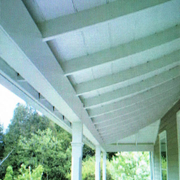
 Tradition Home Designs
A challenging task to reproduce a period bell-cast porch but our cabinetmaker was up to the task.

 Dado Interior Design
Location: Denver, CO, USA
THE CHALLENGE: Transform an outdated, uninspired condo into a unique, forward thinking home, while dealing with a limited capacity to remodel due to the buildings’ high-rise architectural restrictions.
THE SOLUTION: Warm wood clad walls were added throughout the home, creating architectural interest, as well as a sense of unity. Soft, textured furnishing was selected to elevate the home’s sophistication, while attention to layout and detail ensures its functionality.
Dado Interior Design
DAVID LAUER PHOTOGRAPHY

 TVL Creative Ltd.
This project was such an incredible design opportunity, and instilled inspiration and excitement at every turn! Our amazing clients came to us with the challenge of converting their beloved family home into a welcoming haven for all members of the family. At the time that we met our clients, they were struggling with the difficult personal decision of the fate of the home. Their father/father-in-law had passed away and their mother/mother-in-law had recently been admitted into a nursing facility and was fighting Alzheimer’s. Resistant to loss of the home now that both parents were out of it, our clients purchased the home to keep in in the family. Despite their permanent home currently being in New Jersey, these clients dedicated themselves to keeping and revitalizing the house. We were moved by the story and became immediately passionate about bringing this dream to life.
The home was built by the parents of our clients and was only ever owned by them, making this a truly special space to the family. Our goal was to revitalize the home and to bring new energy into every room without losing the special characteristics that were original to the home when it was built. In this way, we were able to develop a house that maintains its own unique personality while offering a space of welcoming neutrality for all members of the family to enjoy over time.
The renovation touched every part of the home: the exterior, foyer, kitchen, living room, sun room, garage, six bedrooms, three bathrooms, the laundry room, and everything in between. The focus was to develop a style that carried consistently from space to space, but allowed for unique expression in the small details in every room.
Starting at the entry, we renovated the front door and entry point to offer more presence and to bring more of the mid-century vibe to the home’s exterior. We integrated a new modern front door, cedar shingle accents, new exterior paint, and gorgeous contemporary house numbers that really allow the home to stand out. Just inside the entry, we renovated the foyer to create a playful entry point worthy of attention. Cement look tile adorns the foyer floor, and we’ve added new lighting and upgraded the entry coat storage.
Upon entering the home, one will immediately be captivated by the stunning kitchen just off the entry. We transformed this space in just about every way. While the footprint of the home ultimately remained almost identical, the aesthetics were completely turned on their head. We re-worked the kitchen to maximize storage and to create an informal dining area that is great for casual hosting or morning coffee.
We removed the entry to the garage that was once in the informal dining, and created a peninsula in its place that offers a unique division between the kitchen/informal dining and the formal dining and living areas. The simple light warm light gray cabinetry offers a bit of traditional elegance, along with the marble backsplash and quartz countertops. We extended the original wood flooring into the kitchen and stained all floors to match for a warmth that truly resonates through all spaces. We upgraded appliances, added lighting everywhere, and finished the space with some gorgeous mid century furniture pieces.
In the formal dining and living room, we really focused on maintaining the original marble fireplace as a focal point. We cleaned the marble, repaired the mortar, and refinished the original fireplace screen to give a new sleek look in black. We then integrated a new gas insert for modern heating and painted the upper portion in a rich navy blue; an accent that is carried through the home consistently as a nod to our client’s love of the color.
The former entry into the old covered porch is now an elegant glass door leading to a stunning finished sunroom. This room was completely upgraded as well. We wrapped the entire space in cozy white shiplap to keep a casual feel with brightness. We tiled the floor with large format concrete look tile, and painted the old brick fireplace a bright white. We installed a new gas burning unit, and integrated transitional style lighting to bring warmth and elegance into the space. The new black-frame windows are adorned with decorative shades that feature hand-sketched bird prints, and we’ve created a dedicated garden-ware “nook” for our client who loves to work in the yard. The far end of this space is completed with two oversized chaise loungers and overhead lights…the most perfect little reading nook!
Just off the dining room, we created an entirely new space to the home: a mudroom. The clients lacked this space and desperately needed a landing spot upon entering the home from the garage. We uniquely planned existing space in the garage to utilize for this purpose, and were able to create a small but functional entry point without losing the ability to park cars in the garage. This new space features cement-look tile, gorgeous deep brown cabinetry, and plenty of storage for all the small items one might need to store while moving in and out of the home.
The remainder of the upstairs level includes massive renovations to the guest hall bathroom and guest bedroom, upstairs master bed/bath suite, and a third bedroom that we converted into a home office for the client.
Some of the largest transformations were made in the basement, where unfinished space and lack of light were converted into gloriously lit, cozy, finished spaces. Our first task was to convert the massive basement living room into the new master bedroom for our clients. We removed existing built-ins, created an entirely new walk-in closet, painted the old brick fireplace, installed a new gas unit, added carpet, introduced new lighting, replaced windows, and upgraded every part of the aesthetic appearance. One of the most incredible features of this space is the custom double sliding barn door made by a Denver artisan. This space is truly a retreat for our clients!
We also completely transformed the laundry room, back storage room, basement master bathroom, and two bedrooms.
This home’s massive scope and ever-evolving challenges were thrilling and exciting to work with, and the result is absolutely amazing. At the end of the day, this home offers a look and feel that the clients love. Above all, though, the clients feel the spirit of their family home and have a welcoming environment for all members of the family to enjoy for years to come.
 TKS Design Group
Download our free ebook, Creating the Ideal Kitchen. DOWNLOAD NOW
For many, extra time at home during COVID left them wanting more from their homes. Whether you realized the shortcomings of your space or simply wanted to combat boredom, a well-designed and functional home was no longer a want, it became a need. Tina found herself wanting more from her Old Irving Park home and reached out to The Kitchen Studio about adding function to her kitchen to make the most of the available real estate.
At the end of the day, there is nothing better than returning home to a bright and happy space you love. And this kitchen wasn’t that for Tina. Dark and dated, with a palette from the past and features that didn’t make the most of the available square footage, this remodel required vision and a fresh approach to the space. Lead designer, Stephanie Cole’s main design goal was better flow, while adding greater functionality with organized storage, accessible open shelving, and an overall sense of cohesion with the adjoining family room.
The original kitchen featured a large pizza oven, which was rarely used, yet its footprint limited storage space. The nearby pantry had become a catch-all, lacking the organization needed in the home. The initial plan was to keep the pizza oven, but eventually Tina realized she preferred the design possibilities that came from removing this cumbersome feature, with the goal of adding function throughout the upgraded and elevated space. Eliminating the pantry added square footage and length to the kitchen for greater function and more storage. This redesigned space reflects how she lives and uses her home, as well as her love for entertaining.
The kitchen features a classic, clean, and timeless palette. White cabinetry, with brass and bronze finishes, contrasts with rich wood flooring, and lets the large, deep blue island in Woodland’s custom color Harbor – a neutral, yet statement color – draw your eye.
The kitchen was the main priority. In addition to updating and elevating this space, Tina wanted to maximize what her home had to offer. From moving the location of the patio door and eliminating a window to removing an existing closet in the mudroom and the cluttered pantry, the kitchen footprint grew. Once the floorplan was set, it was time to bring cohesion to her home, creating connection between the kitchen and surrounding spaces.
The color palette carries into the mudroom, where we added beautiful new cabinetry, practical bench seating, and accessible hooks, perfect for guests and everyday living. The nearby bar continues the aesthetic, with stunning Carrara marble subway tile, hints of brass and bronze, and a design that further captures the vibe of the kitchen.
Every home has its unique design challenges. But with a fresh perspective and a bit of creativity, there is always a way to give the client exactly what they want [and need]. In this particular kitchen, the existing soffits and high slanted ceilings added a layer of complexity to the lighting layout and upper perimeter cabinets.
While a space needs to look good, it also needs to function well. This meant making the most of the height of the room and accounting for the varied ceiling features, while also giving Tina everything she wanted and more. Pendants and task lighting paired with an abundance of natural light amplify the bright aesthetic. The cabinetry layout and design compliments the soffits with subtle profile details that bring everything together. The tile selections add visual interest, drawing the eye to the focal area above the range. Glass-doored cabinets further customize the space and give the illusion of even more height within the room.
While her family may be grown and out of the house, Tina was focused on adding function without sacrificing a stunning aesthetic and dreamy finishes that make the kitchen the gathering place of any home. It was time to love her kitchen again, and if you’re wondering what she loves most, it’s the niche with glass door cabinetry and open shelving for display paired with the marble mosaic backsplash over the range and complimenting hood. Each of these features is a stunning point of interest within the kitchen – both brag-worthy additions to a perimeter layout that previously felt limited and lacking.
Whether your remodel is the result of special needs in your home or simply the excitement of focusing your energy on creating a fun new aesthetic, we are here for it. We love a good challenge because there is always a way to make a space better – adding function and beauty simultaneously.
 Nar Design Group
This home remodel is a celebration of curves and light. Starting from humble beginnings as a basic builder ranch style house, the design challenge was maximizing natural light throughout and providing the unique contemporary style the client’s craved.
The Entry offers a spectacular first impression and sets the tone with a large skylight and an illuminated curved wall covered in a wavy pattern Porcelanosa tile.
The chic entertaining kitchen was designed to celebrate a public lifestyle and plenty of entertaining. Celebrating height with a robust amount of interior architectural details, this dynamic kitchen still gives one that cozy feeling of home sweet home. The large “L” shaped island accommodates 7 for seating. Large pendants over the kitchen table and sink provide additional task lighting and whimsy. The Dekton “puzzle” countertop connection was designed to aid the transition between the two color countertops and is one of the homeowner’s favorite details. The built-in bistro table provides additional seating and flows easily into the Living Room.
A curved wall in the Living Room showcases a contemporary linear fireplace and tv which is tucked away in a niche. Placing the fireplace and furniture arrangement at an angle allowed for more natural walkway areas that communicated with the exterior doors and the kitchen working areas.
The dining room’s open plan is perfect for small groups and expands easily for larger events. Raising the ceiling created visual interest and bringing the pop of teal from the Kitchen cabinets ties the space together. A built-in buffet provides ample storage and display.
The Sitting Room (also called the Piano room for its previous life as such) is adjacent to the Kitchen and allows for easy conversation between chef and guests. It captures the homeowner’s chic sense of style and joie de vivre.


 Leclair Decor
When we found out we were expecting in June, we had already put a plan in motion to merge our home offices to eventually make way for a nursery. After the excitement of the big news we kicked it into high gear!
First off we painted the room a crisp white to contrast from the past 2 tone dark office colours. Our amazing painter Carolyn from Roll Her Sleeves then traced out and painted our vision for the mural. At first we wanted to go very minimal but after looking at it for a few weeks, we asked her to come back and add a forefront layer of grey mountains, details in the peaks and the yellow sun.
During that time the search for the perfect modern crib was on. We found the Hudson model from Babyletto which we loved from one of our suppliers in the states but after duties and shipping it ended up being more practical to buy it here in town.
At the Artemano opening we hosted in November, we connected with Jonathan from Obasan mattresses. He graciously offered to supply us with one of their locally made high quality mattresses. We can’t wait for our baby boy to sleep on it!
Our rocking chair has quite the story behind it. We originally found it for $8 ( yes eight ) dollars last spring. We weren’t sure at the time where and how we were going to use it so we had stored it in one of the garages where we were keeping furniture for an ongoing model home project. One morning we arrived and noticed the chair was missing. We made a call to our construction contact and he relayed the message. Next thing we know a worker was jumping in the garbage bins across the street. They had believed the chair was to be thrown away. Although a bit dusty it was recovered in decent shape. A few months passed and we started entertaining the idea of using it as our rocker. We asked Melissa’s dad if he would be interested in converting it to a rocker for us, and always up for a challenge he accepted and came through big time! At least was the task of reupholstering. We kind of liked the fun bright orange it was but decided to keep it safe with a nice grey material.
After trying numerous curtains ( we lost count ) we finally settled on a old fav, the west elm chevrons. As well, 3 or 4 rugs were attempted until we tried the yellow rug from Urban Barn and instantly knew that was the one.
We slid a couple small Ikea hacks in there. We wrapped an inexpensive floor lamp with rope to give it a different look ( and hide the silver since everything is brass ) and spray painted the shelf hinges to match the rest of the finishes.
Photo: Sacha Leclair
1