
Search results for "Colored window frame" in Home Design Ideas
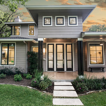

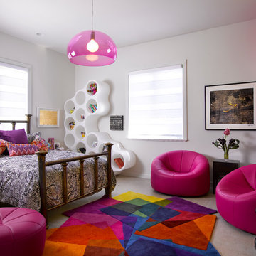
 Hollub Homes
Hollub Homes | Interior design by Helene Hollub | Ken Hayden Photography
Example of a trendy girl carpeted kids' room design in Miami with white walls
Example of a trendy girl carpeted kids' room design in Miami with white walls
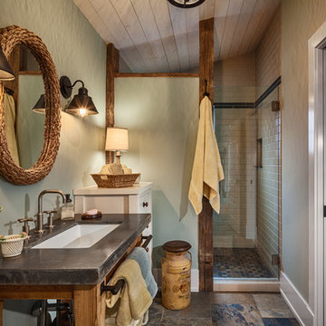
 DeLeers Construction, Inc.
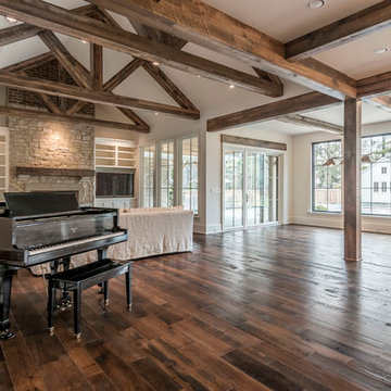
This 3200 square foot home features a maintenance free exterior of LP Smartside, corrugated aluminum roofing, and native prairie landscaping. The design of the structure is intended to mimic the architectural lines of classic farm buildings. The outdoor living areas are as important to this home as the interior spaces; covered and exposed porches, field stone patios and an enclosed screen porch all offer expansive views of the surrounding meadow and tree line.
The home’s interior combines rustic timbers and soaring spaces which would have traditionally been reserved for the barn and outbuildings, with classic finishes customarily found in the family homestead. Walls of windows and cathedral ceilings invite the outdoors in. Locally sourced reclaimed posts and beams, wide plank white oak flooring and a Door County fieldstone fireplace juxtapose with classic white cabinetry and millwork, tongue and groove wainscoting and a color palate of softened paint hues, tiles and fabrics to create a completely unique Door County homestead.
Mitch Wise Design, Inc.
Richard Steinberger Photography
Find the right local pro for your project
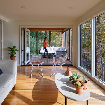
 place architecture:design
Photo Credit: ©Tom Holdsworth,
A screen porch was added to the side of the interior sitting room, enabling the two spaces to become one. A unique three-panel bi-fold door, separates the indoor-outdoor space; on nice days, plenty of natural ventilation flows through the house. Opening the sunroom, living room and kitchen spaces enables a free dialog between rooms. The kitchen level sits above the sunroom and living room giving it a perch as the heart of the home. Dressed in maple and white, the cabinet color palette is in sync with the subtle value and warmth of nature. The cooktop wall was designed as a piece of furniture; the maple cabinets frame the inserted white cabinet wall. The subtle mosaic backsplash with a hint of green, represents a delicate leaf.
 Ruth Richards, Allied ASID
Paint color is Winter Solstice
Photography by Robert Granoff
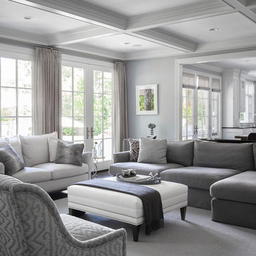
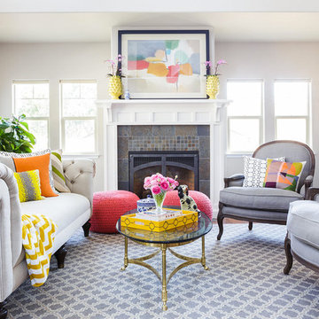
Example of a transitional carpeted family room design in New York with gray walls
Example of a transitional carpeted family room design in New York with gray walls
 Safferstone Interiors
Dennis and Joe have a large, light-filled house. New construction meant lofted space and open floor plans with traditional styling. Running a busy dental practice by day and engaged in a rich social life by night, this couple needed a professional to take the lead on making their house a home.
That’s my cue!
They wanted to take risks, and stay away from “matchy-matchy”. We gussied up a plain ol’ TV room and gave it a healthy dose of luxury.
Our plan was initially inspired by an abstract painting hanging over their stone fireplace. We brought in their love of the outdoors to make things cozy and used family furniture whenever possible for nostalgia and comfort.
I took their love for one-of-a-kind objects and started making a design plan, aiming to solve their biggest frustration: the family room. They had a tortured relationship with a “forgotten family room,” a great space that was spacious and bright, but not at all cozy or joyful, and certainly not “them.”
I wanted to create a cozy space functional for everyday curling up with puppies and watching TV after dinner, yet chic enough for hosting the pre-dinner kitchen overflow and cocktails during parties.
I went looking for contrasting textures and materials. I wanted to balance patterns and scale, and use non-traditional colors as neutrals to create an overall sense of “BAM!”
Dennis and Joe loved the nod to the classics juxtaposed with new and different globally-inspired pieces. For this project our design aesthetic can be described as Middle Eastern/tribal meets mid-century modern. We played to their sensible side with proportion and balance, and stayed as far away from boring/bleh as we could.
You could say this room was pretty successful...It was featured in DC Modern Luxury. (#nobigdeal, right?)
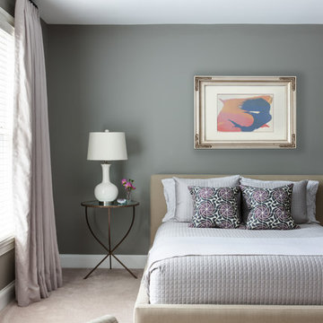
From there we moved on to other spaces.. We added colorful pillows and sheer drapery to finish off their formal living room. We kept an inherited bedroom set from Dennis’ Mom and added color, draperies, and pillows to overhaul the guest bedroom.
Their project was not a rip-and-replace, we weren’t starting from scratch with a blank piece of paper.
Rather, our goal was to take what was already there and make it better, more like them. Using functionality first, we focused on giving the house a soothing, joyful aesthetic. We upped the chic factor by a gajillion and helped them find their ‘happy’ at home. See more Safferstone stuff at www.safferstone.com. Connect with us on Facebook, get inspired on Pinterest, and share modern musings on life & design on Instagram. Or, send us a love note at hello@safferstone.com.
Photo: Angie Seckinger
 Milgard Windows & Doors
The Kiguchi family moved into their Austin, Texas home in 1994. Built in the 1980’s as part of a neighborhood development, they happily raised their family here but longed for something more contemporary. Once they became empty nesters, they decided it was time for a major remodel. After spending many years visiting Austin AIA Home Tours that highlight contemporary residential architecture, they had a lot of ideas and in 2013 were ready to interview architects and get their renovation underway.
The project turned into a major remodel due to an unstable foundation. Architects Ben Arbib and Ed Hughey, of Arbib Hughey Design were hired to solve the structural issue and look for inspiration in the bones of the house, which sat on top of a hillside and was surrounded by great views.
Unfortunately, with the old floor plan, the beautiful views were hidden by small windows that were poorly placed. In order to bring more natural light into the house the window sizes and configurations had to be addressed, all while keeping in mind the homeowners desire for a modern look and feel.
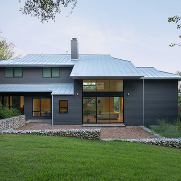
To achieve a more contemporary and sophisticated front of house, a new entry was designed that included removing a two-story bay window and porch. The entrance of the home also became more integrated with the landscape creating a template for new foliage to be planted. Older exterior materials were updated to incorporate a more muted palette of colors with a metal roof, dark grey siding in the back and white stucco in the front. Deep eaves were added over many of the new large windows for clean lines and sun protection.
“Inside it was about opening up the floor plan, expanding the views throughout the house, and updating the material palette to get a modern look that was also warm and inviting,” said Ben from Arbib Hughey Design. “Prior to the remodel, the house had the typical separation of rooms. We removed the walls between them and changed all of the windows to Milgard Thermally Improved Aluminum to connect the inside with the outside. No matter where you are you get nice views and natural light.”
The architects wanted to create some drama, which they accomplished with the window placement and opening up the interior floor plan to an open concept approach. Cabinetry was used to help delineate intimate spaces. To add warmth to an all-white living room, white-washed oak wood floors were installed and pine planks were used around the fireplace. The large windows served as artwork bringing the color of nature into the space.
An octagon shaped, elevated dining room, (named “the turret”), had a big impact on the design of the house. They architects rounded the corners and added larger window openings overlooking a new sunken garden. The great room was also softened by rounding out the corners and that circular theme continued throughout the house, being picked up in skylight wells and kitchen cabinetry. A staircase leading to a catwalk was added and the result was a two-story window wall that flooded the home with natural light.
When asked why Milgard® Thermally Improved Aluminum windows were selected, the architectural team listed many reasons:
1) Aesthetics: “We liked the slim profiles and narrow sightlines. The window frames never get in the way of the view and that was important to us. They also have a very contemporary look that went well with our design.”
2) Options: “We liked that we could get large sliding doors that matched the windows, giving us a very cohesive look and feel throughout the project.”
3) Cost Effective: “Milgard windows are affordable. You get a good product at a good price.”
4) Custom Sizes: “Milgard windows are customizable, which allowed us to get the right window for each location.”
Ready to take on your own traditional to modern home remodeling project? Arbib Hughey Design advises, “Work with a good architect. That means picking a team that is creative, communicative, listens well and is responsive. We think it’s important for an architect to listen to their clients and give them something they want, not something the architect thinks they should have. At the same time you want an architect who is willing and able to think outside the box and offer up design options that you may not have considered. Design is about a lot of back and forth, trying out ideas, getting feedback and trying again.”
The home was completely transformed into a unique, contemporary house perfectly integrated with its site. Internally the home has a natural flow for the occupants and externally it is integrated with the surroundings taking advantage of great natural light. As a side note, it was highly praised as part of the Austin AIA homes tour.
Sponsored
Sunbury, OH

J.Holderby - Renovations
Franklin County's Leading General Contractors - 2X Best of Houzz!
 Flavin Architects
Mid-Century Remodel on Tabor Hill
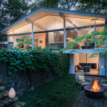
This sensitively sited house was designed by Robert Coolidge, a renowned architect and grandson of President Calvin Coolidge. The house features a symmetrical gable roof and beautiful floor to ceiling glass facing due south, smartly oriented for passive solar heating. Situated on a steep lot, the house is primarily a single story that steps down to a family room. This lower level opens to a New England exterior. Our goals for this project were to maintain the integrity of the original design while creating more modern spaces. Our design team worked to envision what Coolidge himself might have designed if he'd had access to modern materials and fixtures.
With the aim of creating a signature space that ties together the living, dining, and kitchen areas, we designed a variation on the 1950's "floating kitchen." In this inviting assembly, the kitchen is located away from exterior walls, which allows views from the floor-to-ceiling glass to remain uninterrupted by cabinetry.
We updated rooms throughout the house; installing modern features that pay homage to the fine, sleek lines of the original design. Finally, we opened the family room to a terrace featuring a fire pit. Since a hallmark of our design is the diminishment of the hard line between interior and exterior, we were especially pleased for the opportunity to update this classic work.
 Kitchen Design Concepts
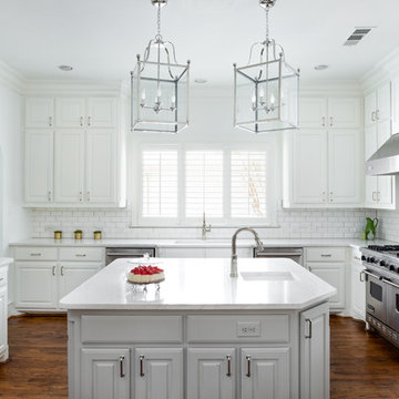
With a little bit of love, you can transform your kitchen into a space you love to spend time in! Many people are so used to their surroundings that we don’t realize what a little bit of paint and new finishes can do to change a room. That’s exactly the case of this kitchen. Actually, the cabinetry was already refinished prior to us coming into the picture, our clients couldn’t wait! So, we had the opportunity to incorporate those finishing touches to really seal the deal of this space. Today, this kitchen is up-to-date and classic. It really will stand the test of time! To learn more about this space, continue reading below:
Cabinets
The cabinetry was already refinished prior to us doing our magic. But we love how the crisp and clean finishes of the cabinetry pairs so well with the new finishes and materials we incorporated. To elevate the cabinetry, we embellished the doors and drawers with 5 inch “Emerald” hardware from Top Knobs (TK288BSN).
Countertops
At first glance, you may have noticed we incorporated beautiful marble countertops to this space. So, what if we told you those countertops are not made of marble? Actually, not even close! These countertops are a beautiful 3cm Cambria quartz in the finish “Ironsbridge”. The specs of grey and veining in the countertops might have fooled you! We love the way it looks in this space.
Backsplash
Subway tiles have been around a long time. Still, we love the classic look of subway tile and our clients are always requesting it! A simple way to add interested to subway tile is to utilize tile with beveling, create a contrasting pattern, and add contrasting grout color, as we have done here. Here we have utilized a 3×6 Daltile Rittenhouse Square with beveled edges as the main tile. Then, over the range, we have framed the tile and changed the pattern to herringbone to add some pop!
Fixtures
The fixtures of this space are classically styled as well. From Blanco, we have the main sink in a Precis Super Single Bowl in White paired with an Atura kitchen faucet with pull-down spray in stainless steel. Then on the island, we have a Precis Medium Bowl in White and an Atura Pulldown bar faucet in stainless steel, also from Blanco.
 Pella Windows and Doors
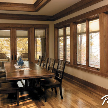
Pella Designer Series snap-in, between-the-glass window fashions coordinate with virtually any dining room décor. You’ll enjoy a cleaner, healthier and safer home and the removable between-the-glass grilles, shades or blinds can be changed in a snap.

 Mary Anne Smiley Interiors
Danny Piassick
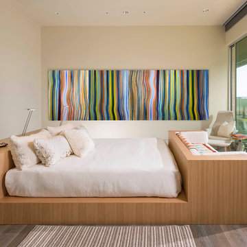
Example of a mid-sized 1950s guest porcelain tile bedroom design in Austin with beige walls
Example of a mid-sized 1950s guest porcelain tile bedroom design in Austin with beige walls


 MANDARINA STUDIO interior design
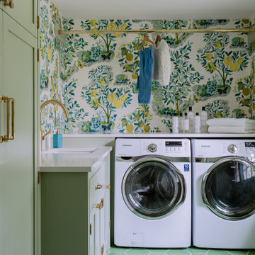
Summary of Scope: gut renovation/reconfiguration of kitchen, coffee bar, mudroom, powder room, 2 kids baths, guest bath, master bath and dressing room, kids study and playroom, study/office, laundry room, restoration of windows, adding wallpapers and window treatments
Background/description: The house was built in 1908, my clients are only the 3rd owners of the house. The prior owner lived there from 1940s until she died at age of 98! The old home had loads of character and charm but was in pretty bad condition and desperately needed updates. The clients purchased the home a few years ago and did some work before they moved in (roof, HVAC, electrical) but decided to live in the house for a 6 months or so before embarking on the next renovation phase. I had worked with the clients previously on the wife's office space and a few projects in a previous home including the nursery design for their first child so they reached out when they were ready to start thinking about the interior renovations. The goal was to respect and enhance the historic architecture of the home but make the spaces more functional for this couple with two small kids. Clients were open to color and some more bold/unexpected design choices. The design style is updated traditional with some eclectic elements. An early design decision was to incorporate a dark colored french range which would be the focal point of the kitchen and to do dark high gloss lacquered cabinets in the adjacent coffee bar, and we ultimately went with dark green.
 Amy Pearson Design
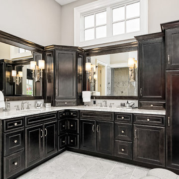
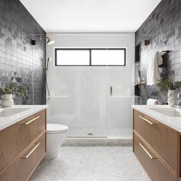
The primary bedroom and bathroom are the showstoppers of this phase! Unused and awkwardly located closets in both the bedroom and bathroom were removed to make way for additional square-footage in the bath and replaced with a sizable and functional reach-in closet in the bedroom. A dated and cramped shower stall was removed in favor for an expansive step in shower spanning the width of the bathroom and a new transom window washes the room in natural light. While the previous bathroom was only able to accommodate a single vanity, the new layout allowed us to create double matching vanities mirrored across from each other - a much appreciated addition for a primary bath. Floating walnut vanities boast impressive storage and are capped with tower cabinets with hidden outlets for charging and storing electronic bathroom tools. While the color palette is restrained - black, white, gray, and brown - the result is a timelessly modern and masculine space that is at once striking and warm. Modern geometric patterns play with each other throughout the material selections.
 Bauer Clifton Interiors
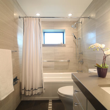
Winner of Interior Design Society's 2013 Designer of the Year Awards: Bathrooms 30K & Under - 2nd Place
Inspiration for a transitional beige tile bathroom remodel in Other with an undermount sink, flat-panel cabinets and beige cabinets
Inspiration for a transitional beige tile bathroom remodel in Other with an undermount sink, flat-panel cabinets and beige cabinets
 Excel Remodeling
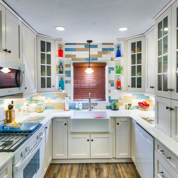
This floor-to-ceiling kitchen remodel really pops with color and personality! The apron sink is centered directly in front of the window, with plenty of task lighting throughout the space and colorful tile and display shelves incorporated into the design, to add visual interest and depth to the room.
Sponsored
Plain City, OH

Kuhns Contracting, Inc.
Central Ohio's Trusted Home Remodeler Specializing in Kitchens & Baths
 Morr Interiors
Nat Rea Photography
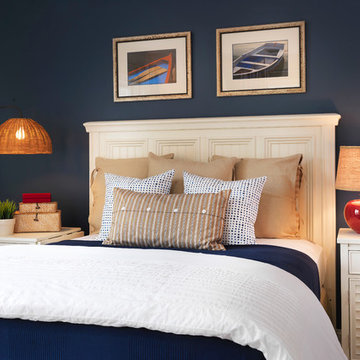
Inspiration for a mid-sized coastal bedroom remodel in Boston with blue walls
Inspiration for a mid-sized coastal bedroom remodel in Boston with blue walls
 JJ Interiors
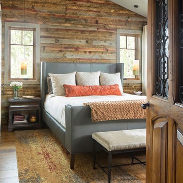
An antique wood and iron door welcome you into this private retreat. Colorful barn wood anchor the bed wall with windows letting in natural light and warm the earthy tones.
 Total Solutions Group
Uneek Image
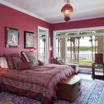
Large elegant master dark wood floor bedroom photo in Orlando with no fireplace and purple walls
Large elegant master dark wood floor bedroom photo in Orlando with no fireplace and purple walls
26