
Search results for "Conflicts" in Home Design Ideas
 Knickerbocker Group
knickerbockergroup.com
Photo copyright 2017 Darren Setlow / @darrensetlow / darrensetlow.com
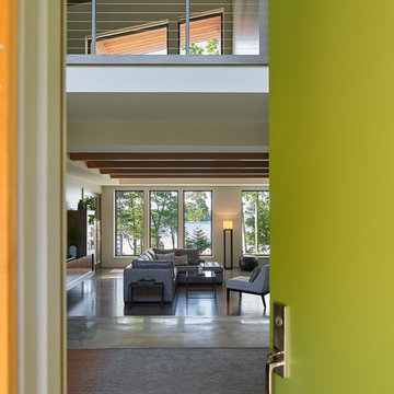
The story of Tide’s Ledge began much differently than it ended. It was originally conceived as a transitional home, but one that was distinctly more on the traditional side, so as not to “stick out too much” in its classic coastal Maine environment. As the design team continued to meet with the clients about their desires and the direction of the project, it became apparent that there was a disconnect between the objective and the inspiration imagery they were drawn to. The design was well underway, the foundation going in the ground, when the lead Architect stopped the process short to address the conflicting visions. He pointed out that the clients did in fact have a keen eye for contemporary design and were clearly attracted to something with more of an edge. After mulling it over for a few days, the clients decided to take a leap of faith and truly build the house of their dreams. They then gave Knickerbocker permission to develop a fresh concept, and soon a new home emerged.
 Michelle Miller Design, Inc.
David Hall (Photo Inc.)
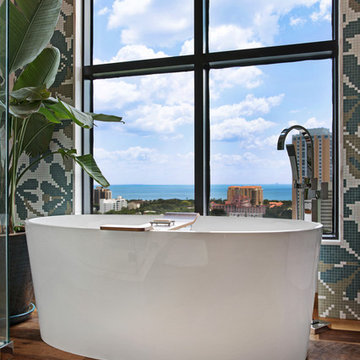
Example of a small transitional master multicolored tile and mosaic tile medium tone wood floor freestanding bathtub design in Tampa with furniture-like cabinets, distressed cabinets, a one-piece toilet, multicolored walls, a vessel sink and wood countertops
Example of a small transitional master multicolored tile and mosaic tile medium tone wood floor freestanding bathtub design in Tampa with furniture-like cabinets, distressed cabinets, a one-piece toilet, multicolored walls, a vessel sink and wood countertops

Find the right local pro for your project
 HMWhite
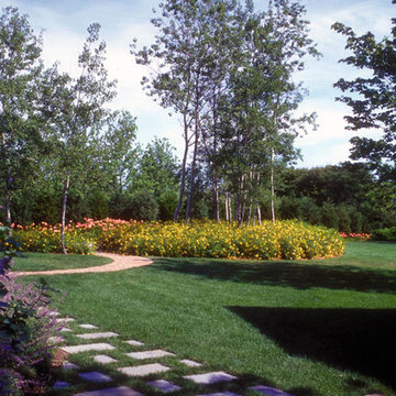
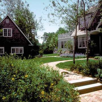
On the quick view, the landscape for this speculative summer home development could not be more ordinary. Its story all too common. As a product of a farm’s subdivision, it had all the trappings of American residential sprawl – large front lawn exposed to street, few mature trees, clumsy entry sequence with service and front door in direct conflict, and lack of privacy. To fulfill its function as a summer and vacation house destination, the new owner understood the landscape required a transformation.
A delightful and magical surprise was the property’s mature Poplar forest, abutting the new house. By removing and transplanting the Poplars, a sculpted void and solid composition established a garden structure. Introducing scale and a landscape continuum, the relocated tall Poplars erased the house front’s youthful origins. A distinctive landscape personality grew out of the skeletal structure of the Poplar groves. A bold landscape graphic emerged with simplified underplanting strengthens the Poplar’s mono-culture presentation, calming the eye and inviting further sensory observation and reflection.
 Alpine Lumber
Builder | Bighorn Building Services
Photography | Jon Kohlwey
Designer | Tara Bender
Starmark Cabinetry by Alpine Lumber Granby
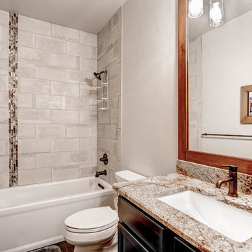
Tub/shower combo - small rustic 3/4 gray tile and porcelain tile dark wood floor and brown floor tub/shower combo idea in Denver with a one-piece toilet, white walls, an undermount sink, granite countertops, recessed-panel cabinets, dark wood cabinets and a hinged shower door
Tub/shower combo - small rustic 3/4 gray tile and porcelain tile dark wood floor and brown floor tub/shower combo idea in Denver with a one-piece toilet, white walls, an undermount sink, granite countertops, recessed-panel cabinets, dark wood cabinets and a hinged shower door
 HMWhite
On the quick view, the landscape for this speculative summer home development could not be more ordinary. Its story all too common. As a product of a farm’s subdivision, it had all the trappings of American residential sprawl – large front lawn exposed to street, few mature trees, clumsy entry sequence with service and front door in direct conflict, and lack of privacy. To fulfill its function as a summer and vacation house destination, the new owner understood the landscape required a transformation.
A delightful and magical surprise was the property’s mature Poplar forest, abutting the new house. By removing and transplanting the Poplars, a sculpted void and solid composition established a garden structure. Introducing scale and a landscape continuum, the relocated tall Poplars erased the house front’s youthful origins. A distinctive landscape personality grew out of the skeletal structure of the Poplar groves. A bold landscape graphic emerged with simplified underplanting strengthens the Poplar’s mono-culture presentation, calming the eye and inviting further sensory observation and reflection.

 Glam Vintage & Moderne
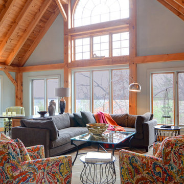
Beautiful cottage updated to a sophisticated retreat with custom upholstery, kitchen make over, painting and elegant lighting. Photos by Warren Denome
 Donald Lococo Architects
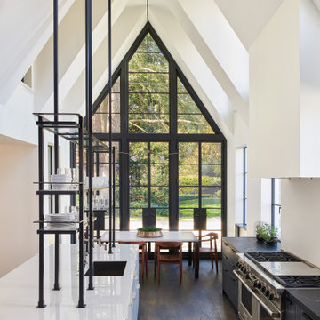
Subsequent additions are covered with living green walls to deemphasize stylistic conflicts imposed on a 1940’s Tudor and become backdrop surrounding a kitchen addition. On the interior, further added architectural inconsistencies are edited away, and the language of the Tudor’s original reclaimed integrity is referenced for the addition. Sympathetic to the home, windows and doors remain untrimmed and stark plaster walls contrast the original black metal windows. Sharp black elements contrast fields of white. With a ceiling pitch matching the existing and chiseled dormers, a stark ceiling hovers over the kitchen space referencing the existing homes plaster walls. Grid members in windows and on saw scored paneled walls and cabinetry mirror the machine age windows as do exposed steel beams. The exaggerated white field is pierced by an equally exaggerated 13 foot black steel tower that references the existing homes steel door and window members. Glass shelves in the tower further the window parallel. Even though it held enough dinner and glassware for eight, its thin members and transparent shelves defy its massive nature, allow light to flow through it and afford the kitchen open views and the feeling of continuous space. The full glass at the end of the kitchen reveres a grouping of 50 year old Hemlocks. At the opposite end, a window close to the peak looks up to a green roof.
 Craftsman Design and Renovation
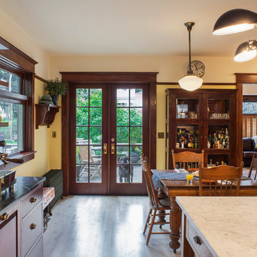
The original kitchen was disjointed and lacked connection to the home and its history. The remodel opened the room to other areas of the home by incorporating an unused breakfast nook and enclosed porch to create a spacious new kitchen. It features stunning soapstone counters and range splash, era appropriate subway tiles, and hand crafted floating shelves. Ceasarstone on the island creates a durable, hardworking surface for prep work. A black Blue Star range anchors the space while custom inset fir cabinets wrap the walls and provide ample storage. Great care was given in restoring and recreating historic details for this charming Foursquare kitchen.
 Douglas Knight Construction
Springgate Photography
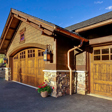
Example of a large arts and crafts attached garage design in Salt Lake City
Example of a large arts and crafts attached garage design in Salt Lake City
 Décor Aid
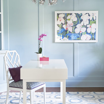
Our client’s well-defined sense of style is bright, fresh, preppy, and modern, which conflicted with the sensibility of her former home office. The entire space needed to be redesigned, starting with the dark, wooded walls. We re-lacquered the walls with a sky blue color, for a brighter, airier feel.
Once the walls were finished, bold furniture pieces were added, to complement our client’s distinctive style. The pattern used for the custom window treatments matches the two chair pillows, both of which contrast against the solid colors elsewhere in the room. A tall mirror, with a chrome frame, gives the space a larger feel. We reupholstered the chairs with a contrast piping, and the side table was given a custom pink finish.
But it was the fine details and final additions that transformed this home office into a truly individualized space. The Lulu DK Print on the wall, and a few pieces on the bookshelf, gave the space a more personalized feel. The final touch was the Jonathan Adler light fixture, which complimented the modern vibe in this home office, while incorporating our client’s distinctive style.
 Murphy Bros. Design | Build | Remodel
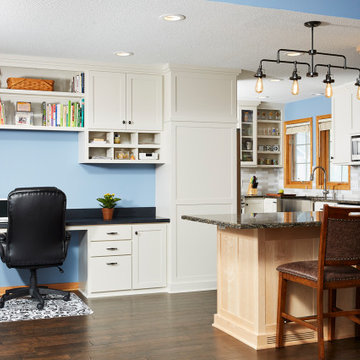
This client had just retired from an international banking post that required extensive travel and time away from home for more than a decade. Now with time on her hands, she could finally address her dysfunctional, oddly L-shaped kitchen. She needed more storage and work surfaces, better traffic flow, including the elimination of an annoying door-swing conflict between the laundry and garage access. She also desired a much brighter color palette to complement all new upscale surfaces and fixtures. It's a complete make over, full of vibrant color, innovation and a unique use of materials. In order to meet budget and aesthetic goals for this project Corian was selected to be used along the office wall, so that Cambria could be used on the main island.
Colors – Cabinets Clear Coat on Maple & Paint SW 7632 Modern Gray; Wall Color – H/F 0625 North Sea; Ceilings are Ceiling White
Design/Build Consultant — Jonah Smith
Photography — Alyssa Lee
 Donald Lococo Architects
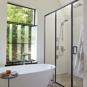
Subsequent additions are covered with living green walls to deemphasize stylistic conflicts imposed on a 1940’s Tudor and become backdrop surrounding a kitchen addition. On the interior, further added architectural inconsistencies are edited away, and the language of the Tudor’s original reclaimed integrity is referenced for the addition. Sympathetic to the home, windows and doors remain untrimmed and stark plaster walls contrast the original black metal windows. Sharp black elements contrast fields of white. With a ceiling pitch matching the existing and chiseled dormers, a stark ceiling hovers over the kitchen space referencing the existing homes plaster walls. Grid members in windows and on saw scored paneled walls and cabinetry mirror the machine age windows as do exposed steel beams. The exaggerated white field is pierced by an equally exaggerated 13 foot black steel tower that references the existing homes steel door and window members. Glass shelves in the tower further the window parallel. Even though it held enough dinner and glassware for eight, its thin members and transparent shelves defy its massive nature, allow light to flow through it and afford the kitchen open views and the feeling of continuous space. The full glass at the end of the kitchen reveres a grouping of 50 year old Hemlocks. At the opposite end, a window close to the peak looks up to a green roof.
 Kitchen & Bath ReStylers
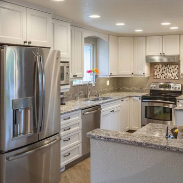
Keith & Shari wanted to open things up, while preserving the recently installed laminate floor outside the kitchen. The kitchen was mostly original with the exception of the range and hood, which were recent upgrades. The layout worked fine for them, but capturing more storage and modernizing were priorities.
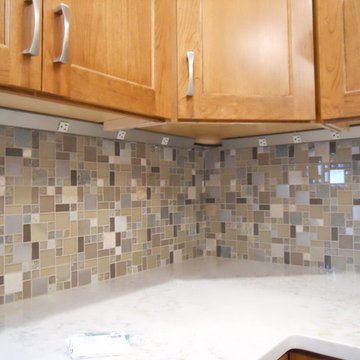
The first thing we did was to remove the top 1/2 of two of the walls to gain visual space. Next, we expanded the cabinetry to fill the unused table space in the kitchen. Since the space is now open, both the living and dining rooms are close enough for comfortable conversation. White painted cabinetry helped to further expand the visual size of the new space. The herringbone layout of the tile floor avoided conflict with the laminate floor in the living room. Quartz countertops, a full height tile splash, LED under-cabinet lighting, and concealed angled plug strips add clean, bright, bullet-proof, and stylish elements to complete the space in a soft, elegant, & timeless manner.
Photo by: Warren Smith, CMKBD, CAPS
 Drewett Works
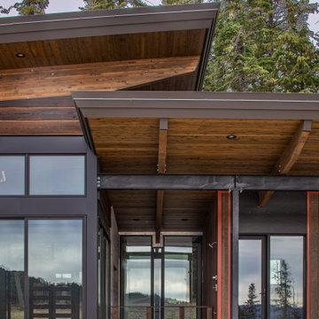
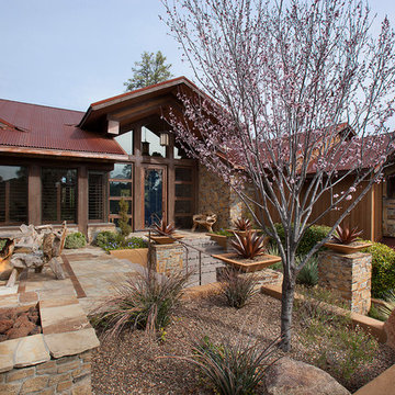
This homage to prairie style architecture located at The Rim Golf Club in Payson, Arizona was designed for owner/builder/landscaper Tom Beck.
This home appears literally fastened to the site by way of both careful design as well as a lichen-loving organic material palatte. Forged from a weathering steel roof (aka Cor-Ten), hand-formed cedar beams, laser cut steel fasteners, and a rugged stacked stone veneer base, this home is the ideal northern Arizona getaway.
Expansive covered terraces offer views of the Tom Weiskopf and Jay Morrish designed golf course, the largest stand of Ponderosa Pines in the US, as well as the majestic Mogollon Rim and Stewart Mountains, making this an ideal place to beat the heat of the Valley of the Sun.
Designing a personal dwelling for a builder is always an honor for us. Thanks, Tom, for the opportunity to share your vision.
Project Details | Northern Exposure, The Rim – Payson, AZ
Architect: C.P. Drewett, AIA, NCARB, Drewett Works, Scottsdale, AZ
Builder: Thomas Beck, LTD, Scottsdale, AZ
Photographer: Dino Tonn, Scottsdale, AZ
 Sullivan Building & Design Group
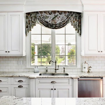
The sink is accentuated by fluted pilasters and profiled counter top. The upper cabinets frame the window which lends to a grand view of the backyard.
 JS Design
At first glance the kitchen looked fine, but refrigerator placement had the door hitting the countertop, the microwave occupied the entire corner countertop and the dishwasher and oven interfered with each other frustrating the homeowners.
Removing the wall between kitchen and dining room allows daylight from adjoining sunporch to brighten the entire space, expand sightlines and room for the table to expand at the holidays.
The kitchen layout was re-worked. Removing soffits lets new cherry cabinetry rise to the ceiling for the illusion of a taller space.
Refrigerator now positioned to separate work areas, each with bi-fold appliance garages. On left is beverage center for gourmet coffee making, and under the countertop an ice maker for homeowner’s desired continuous supply of ice. The microwave moved to new home in wall cabinet next to refrigerator, freeing up the corner countertop. Dishwasher moved to the other side of the sink, resolving its conflict with the oven. Now space is available for a cabinet with pull-out waste.
The peninsula angled out to open up the room. Topped with a trio of lights it includes for stools for visitors. The peninsula angle is repeated with the floor tile. The homeowners found a backsplash they loved. To avoid interrupting the tile with outlets, angled outlet strips are placed under the wall cabinets to complete the updated make-over.
 Masterworks Window Fashions & Design, LLC
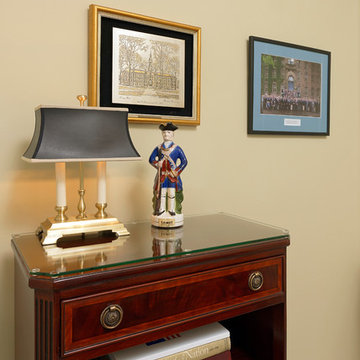
The Princeton Room had room for a small bookcase, and one had to be found narrow enough to fit between the open wardrobe door and open bedroom door. Glass tops were made for each of the pieces of furniture, because these bedrooms are used both by geographical bachelors, and by families staying in the Massachusetts Suite, with their children staying in the adjacent New Jersey Suite. Assorted additional books about the Revolutionary War, and specifically about the conflict in New Jersey, were added to the new bookcase. An applejack decanter in the form of a New Jersey Blues soldier was found for this room. Above the bookcase is an etching of Nassau Hall, at Princeton, the original Princeton building, and to the right, a photo of descendants of New Jersey Revolutionary War officers (the Society of the Cincinnati in the State of New Jersey) taken in front of Nassau Hall. Bob Narod, Photographer. Design by Linda H. Bassert, Masterworks Window Fashions & Design, LLC
 Donald Lococo Architects
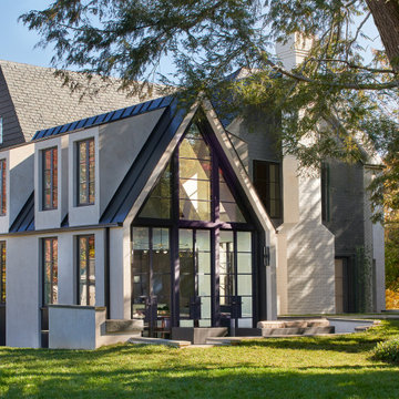
Subsequent additions are covered with living green walls to deemphasize stylistic conflicts imposed on a 1940’s Tudor and become backdrop surrounding a kitchen addition. On the interior, further added architectural inconsistencies are edited away, and the language of the Tudor’s original reclaimed integrity is referenced for the addition. Sympathetic to the home, windows and doors remain untrimmed and stark plaster walls contrast the original black metal windows. Sharp black elements contrast fields of white. With a ceiling pitch matching the existing and chiseled dormers, a stark ceiling hovers over the kitchen space referencing the existing homes plaster walls. Grid members in windows and on saw scored paneled walls and cabinetry mirror the machine age windows as do exposed steel beams. The exaggerated white field is pierced by an equally exaggerated 13 foot black steel tower that references the existing homes steel door and window members. Glass shelves in the tower further the window parallel. Even though it held enough dinner and glassware for eight, its thin members and transparent shelves defy its massive nature, allow light to flow through it and afford the kitchen open views and the feeling of continuous space. The full glass at the end of the kitchen reveres a grouping of 50 year old Hemlocks. At the opposite end, a window close to the peak looks up to a green roof.
20