
Search results for "Congestion" in Home Design Ideas
 Ferrarini & Co. Kitchens & Interiors
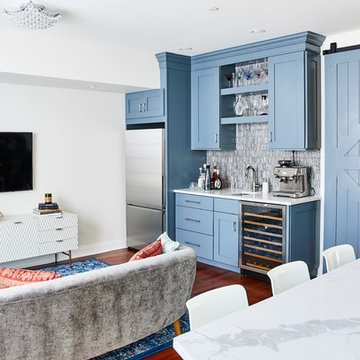
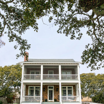
Example of a beach style family room design in Philadelphia with white walls
 Nandco Construction
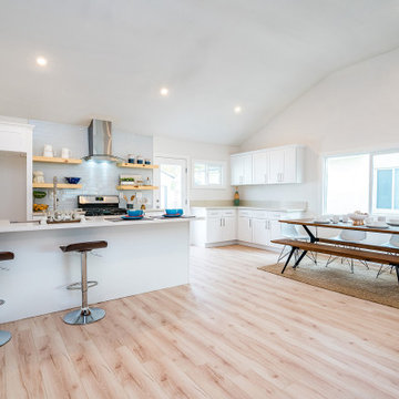
The home was its normal, walled up and congested floor plan. The client wanted to vault the ceiling and open up the entire space.
Inspiration for a mid-sized modern single-wall eat-in kitchen remodel in Los Angeles with shaker cabinets, white cabinets, quartz countertops, an island and white countertops
Inspiration for a mid-sized modern single-wall eat-in kitchen remodel in Los Angeles with shaker cabinets, white cabinets, quartz countertops, an island and white countertops
 kellydesigns
Diane Wagner
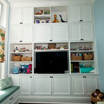
The living room has soaring cathedral ceilings with lots of natural light.The kitchen was redone to allow a better flow with custom cabinets and ope floor plan with family room. The addition of a wall of cabinets in the playroom afforded these clients the much needed storage space their home was lacking, and helps to keep the playroom tidy!
Find the right local pro for your project
 Irons Brothers Construction Inc
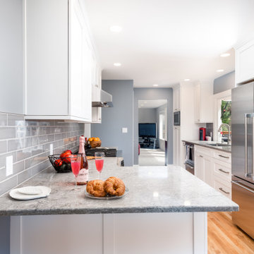
This rambler’s small kitchen was dysfunctional and out of touch with our client’s needs. She desired a larger footprint without an addition or expanding the footprint to stay within a realistic budget for her homes size and neighborhood.
The existing kitchen was “boxed-in” at the back of the house. The entrance from
the hallway was very narrow causing congestion and cramping the cook. In the living room the existing fireplace was a room hog, taking up the middle of the house. The kitchen was isolated from the other room’s downstairs.
The design team and homeowner decided to open the kitchen, connecting it to the dining room by removing the fireplace. This expanded the interior floor space. To create further integration amongst the spaces, the wall opening between the dining and living room was also widened. An archway was built to replicate the existing arch at the hallway & living room, giving a more spacious feel.
The new galley kitchen includes generous workspaces and enhanced storage. All designed for this homeowners’ specific needs in her kitchen. We also created a kitchen peninsula where guests can sit and enjoy conversations with the cook. (After 5,6) The red Viking range gives a fun pop of color to offset the monochromatic floor, cabinets and counters. It also plays to her Stanford alumni colors.
One of our favorite and most notable features of this kitchen is the “flip-out” window at the sink. This creative solution allows for an enhanced outdoor living experience, without an expansive remodel or addition. When the window is open the party can happen inside and outside with an interactive experience between spaces. The countertop was installed flush to the window, specifically designed as a cocktail/counter rail surface.
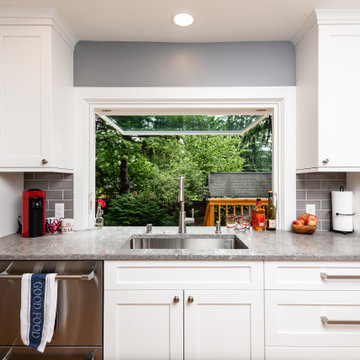 Irons Brothers Construction Inc
This rambler’s small kitchen was dysfunctional and out of touch with our client’s needs. She desired a larger footprint without an addition or expanding the footprint to stay within a realistic budget for her homes size and neighborhood.
The existing kitchen was “boxed-in” at the back of the house. The entrance from
the hallway was very narrow causing congestion and cramping the cook. In the living room the existing fireplace was a room hog, taking up the middle of the house. The kitchen was isolated from the other room’s downstairs.
The design team and homeowner decided to open the kitchen, connecting it to the dining room by removing the fireplace. This expanded the interior floor space. To create further integration amongst the spaces, the wall opening between the dining and living room was also widened. An archway was built to replicate the existing arch at the hallway & living room, giving a more spacious feel.
The new galley kitchen includes generous workspaces and enhanced storage. All designed for this homeowners’ specific needs in her kitchen. We also created a kitchen peninsula where guests can sit and enjoy conversations with the cook. (After 5,6) The red Viking range gives a fun pop of color to offset the monochromatic floor, cabinets and counters. It also plays to her Stanford alumni colors.
One of our favorite and most notable features of this kitchen is the “flip-out” window at the sink. This creative solution allows for an enhanced outdoor living experience, without an expansive remodel or addition. When the window is open the party can happen inside and outside with an interactive experience between spaces. The countertop was installed flush to the window, specifically designed as a cocktail/counter rail surface.
 Fast Equipment
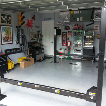
Whether a commercial parking lot, a congested automotive dealership, or a private residential garage, we find better parking and storage solutions - even with limited space available. CALL US TODAY at 800-225-7234 and let us help you discover the best, most cost-effective options for your parking and vehicle storage needs! www.fastequipment.net
 Horizon Interior Design
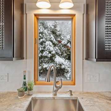
As a busy family of four with two boys and three cats, this client was ready for a kitchen remodel that made family life easier. With dated finishes, appliances, cabinetry, counters, and an oversized laundry room that could be better used as kitchen space, there were many aspects they wanted to change.
They had five different flooring surfaces within the line of sight, kept bumping into each other in the congested hallway, wanted to move their cooktop to the perimeter of their island rather than in the middle, hated their refrigerator location, and didn’t like having an island with two heights. Good thing they came to Horizon Interior Design, where we developed solutions for every problem!
We ran hardwood flooring throughout the main level to make it feel uniform and cohesive, opened up the hallway, and decreased the size of the laundry room to significantly extend their kitchen space and remove congestion in their hallway. We added more functional pull-out shelves to their pantry to replace the original rickety, narrow shelving and placed their refrigerator and cooktop on the perimeter wall, allowing for a large island with a solid surface and a decorative range hood.
We reduced the size of their kitchen windows to allow for more upper cabinetry space and added a granite waterfall feature on the island for a wow factor while placing the counter stools in such a way that they didn't block up main walkways. Dark cabinetry tied in nicely with the knots in the pine ceiling, and white tile backsplash brightened up the space beautifully. Our new kitchen layout meant the family had a nicer view while walking down the stairs, rather than staring at the top of kitchen cabinets.
Gugel Photography
 Horizon Interior Design
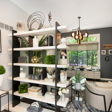
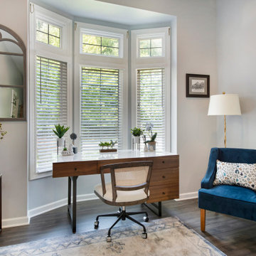
Lindsey and Patrick have young daughters and live in a beautiful colonial home. They spent most of their time in the family room and kitchen, and hardly used the formal living room or formal dining room. They wanted ideas on different uses for these rooms so that the family and their friends would want to spend time there. Also, their daughters are heavily into arts and crafts. All of their supplies were located in a hall closet, which was congested with materials and difficult to organize. They love the look of mid-century modern design and wanted to sprinkle elements of this aesthetic into the space.
The front formal living room was transformed into a dual-purpose space: office area for her and a craft area for the girls. Lindsey loves that she can now sit at a desk with a view of the front yard to be on her computer, while her girls create artwork just a few feet away. An art cabinet was placed in the room which has two large doors that swing out and contains a flip-down desk, with multiple bins to store and organize all the art supplies. A modern etagere divides this space from the Lounge area, carefully decorated with contemporary and modern decor. The lounge area was created as an inviting space for the adults to relax in and share drinks with their friends. They say they now use these rooms every day, and hang out there more often than in the family room!
 Bianchi Design
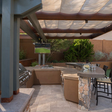
Previously, this yard was burdened by a typical boulder pile pool, that was heaped higher than typical, trying to hide the towering wall behind. At first, the clients sought merely to reconfigure the BBQ that was congesting the patio, but upon further analysis, they decided it was time to strip the entire yard, leaving only the pool shell. Bianchi’s solution introduced an array of four arbors to distract the eye from the wall behind, solving what the boulder waterfall could never do.
Additionally, the wall was painted a dark earth tone to add contrast and depth. This strategy enabled the wall to recede into the distance, while the agave blue grey arbors floated forward visually from the background. Previously, the patios were a hodgepodge of deck islands that were impossible to navigate, and were of insufficient size to arrange furniture on. A well organized patio streamlined the traffic flow and the living space, featuring a cast in place concrete fire pit and banco couch, as well as a new outdoor bistro, glowing with filtered light from the canvas shade sails overhead.
A turquoise glass overflow spa became the yards focal point, sharing the space between the pool and outdoor living. The striking symmetry of the spa and pot pedestal with regal cacti arrangement behind, flanked by the arbors on either side, created a stately first impression from the front door. This teaser was just a glimpse of what could not yet be seen serving as an invitation to explore and enjoy as the yard unfolds.
See more about this project & hear from the homeowner here: https://www.youtube.com/watch?v=7eT3RkLkg5w&feature=youtu.be
 Horizon Interior Design
Lindsey and Patrick have young daughters and live in a beautiful colonial home. They spent most of their time in the family room and kitchen, and hardly used the formal living room or formal dining room. They wanted ideas on different uses for these rooms so that the family and their friends would want to spend time there. Also, their daughters are heavily into arts and crafts. All of their supplies were located in a hall closet, which was congested with materials and difficult to organize. They love the look of mid-century modern design and wanted to sprinkle elements of this aesthetic into the space.
The front formal living room was transformed into a dual-purpose space: office area for her and a craft area for the girls. Lindsey loves that she can now sit at a desk with a view of the front yard to be on her computer, while her girls create artwork just a few feet away. An art cabinet was placed in the room which has two large doors that swing out and contains a flip-down desk, with multiple bins to store and organize all the art supplies. A modern etagere divides this space from the Lounge area, carefully decorated with contemporary and modern decor. The lounge area was created as an inviting space for the adults to relax in and share drinks with their friends. They say they now use these rooms every day, and hang out there more often than in the family room!

 Tammara Stroud Design
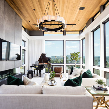
Example of a large minimalist open concept medium tone wood floor and brown floor living room design in Seattle with white walls, a ribbon fireplace, a concrete fireplace and a wall-mounted tv
 Horizon Interior Design
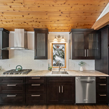
As a busy family of four with two boys and three cats, this client was ready for a kitchen remodel that made family life easier. With dated finishes, appliances, cabinetry, counters, and an oversized laundry room that could be better used as kitchen space, there were many aspects they wanted to change.
They had five different flooring surfaces within the line of sight, kept bumping into each other in the congested hallway, wanted to move their cooktop to the perimeter of their island rather than in the middle, hated their refrigerator location, and didn’t like having an island with two heights. Good thing they came to Horizon Interior Design, where we developed solutions for every problem!
We ran hardwood flooring throughout the main level to make it feel uniform and cohesive, opened up the hallway, and decreased the size of the laundry room to significantly extend their kitchen space and remove congestion in their hallway. We added more functional pull-out shelves to their pantry to replace the original rickety, narrow shelving and placed their refrigerator and cooktop on the perimeter wall, allowing for a large island with a solid surface and a decorative range hood.
We reduced the size of their kitchen windows to allow for more upper cabinetry space and added a granite waterfall feature on the island for a wow factor while placing the counter stools in such a way that they didn't block up main walkways. Dark cabinetry tied in nicely with the knots in the pine ceiling, and white tile backsplash brightened up the space beautifully. Our new kitchen layout meant the family had a nicer view while walking down the stairs, rather than staring at the top of kitchen cabinets.
Gugel Photography
 Horizon Interior Design
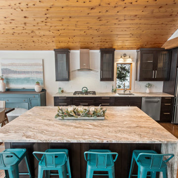
As a busy family of four with two boys and three cats, this client was ready for a kitchen remodel that made family life easier. With dated finishes, appliances, cabinetry, counters, and an oversized laundry room that could be better used as kitchen space, there were many aspects they wanted to change.
They had five different flooring surfaces within the line of sight, kept bumping into each other in the congested hallway, wanted to move their cooktop to the perimeter of their island rather than in the middle, hated their refrigerator location, and didn’t like having an island with two heights. Good thing they came to Horizon Interior Design, where we developed solutions for every problem!
We ran hardwood flooring throughout the main level to make it feel uniform and cohesive, opened up the hallway, and decreased the size of the laundry room to significantly extend their kitchen space and remove congestion in their hallway. We added more functional pull-out shelves to their pantry to replace the original rickety, narrow shelving and placed their refrigerator and cooktop on the perimeter wall, allowing for a large island with a solid surface and a decorative range hood.
We reduced the size of their kitchen windows to allow for more upper cabinetry space and added a granite waterfall feature on the island for a wow factor while placing the counter stools in such a way that they didn't block up main walkways. Dark cabinetry tied in nicely with the knots in the pine ceiling, and white tile backsplash brightened up the space beautifully. Our new kitchen layout meant the family had a nicer view while walking down the stairs, rather than staring at the top of kitchen cabinets.
Gugel Photography
 Bianchi Design
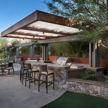
Previously, this yard was burdened by a typical boulder pile pool, that was heaped higher than typical, trying to hide the towering wall behind. At first, the clients sought merely to reconfigure the BBQ that was congesting the patio, but upon further analysis, they decided it was time to strip the entire yard, leaving only the pool shell. Bianchi’s solution introduced an array of four arbors to distract the eye from the wall behind, solving what the boulder waterfall could never do.
Additionally, the wall was painted a dark earth tone to add contrast and depth. This strategy enabled the wall to recede into the distance, while the agave blue grey arbors floated forward visually from the background. Previously, the patios were a hodgepodge of deck islands that were impossible to navigate, and were of insufficient size to arrange furniture on. A well organized patio streamlined the traffic flow and the living space, featuring a cast in place concrete fire pit and banco couch, as well as a new outdoor bistro, glowing with filtered light from the canvas shade sails overhead.
A turquoise glass overflow spa became the yards focal point, sharing the space between the pool and outdoor living. The striking symmetry of the spa and pot pedestal with regal cacti arrangement behind, flanked by the arbors on either side, created a stately first impression from the front door. This teaser was just a glimpse of what could not yet be seen serving as an invitation to explore and enjoy as the yard unfolds.
See more about this project & hear from the homeowner here: https://www.youtube.com/watch?v=7eT3RkLkg5w&feature=youtu.be
 Westwood Interior Designs, Inc.
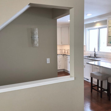
The flow of this Kitchen/Dining/Family Room area was dramatically changed by the redesign of three problematic areas. Originally the Kitchen had a oversized, angled peninsula that made traffic flow to the adjacent Dining And Family Rooms congested. The Dining Room was a dark, enclosed space with angled walls. And the Stairway to the Lower Level had a awkward door at the top of the stairs plus poor lighting making the stairway feel like a cramped tunnel.
To solve the problems, the Kitchen peninsula was redesigned with a new layout that didn't sacrifice seating. The Dining Room was opened up to the Kitchen and Family Room by removing a small angled wall and also the wall that divided the Dining and the Family Rooms - now the Family's Room fireplace is visible for enjoying upon entering the house and your view can even extend out the Family Room windows to the landscape of the backyard beyond. And finally, the staircase was updated by eliminating the door and opening up one of its side walls so that sightlines now flow through to the Kitchen and natural and accent lights flood the space. By reworking these spaces they now have an updated, open, expansive feeling with easy traffic flow and lots of light. Problems solved!
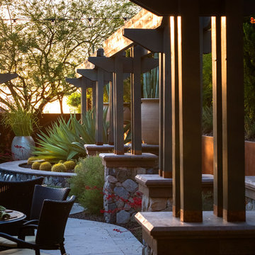 Bianchi Design
Previously, this yard was burdened by a typical boulder pile pool, that was heaped higher than typical, trying to hide the towering wall behind. At first, the clients sought merely to reconfigure the BBQ that was congesting the patio, but upon further analysis, they decided it was time to strip the entire yard, leaving only the pool shell. Bianchi’s solution introduced an array of four arbors to distract the eye from the wall behind, solving what the boulder waterfall could never do.
Additionally, the wall was painted a dark earth tone to add contrast and depth. This strategy enabled the wall to recede into the distance, while the agave blue grey arbors floated forward visually from the background. Previously, the patios were a hodgepodge of deck islands that were impossible to navigate, and were of insufficient size to arrange furniture on. A well organized patio streamlined the traffic flow and the living space, featuring a cast in place concrete fire pit and banco couch, as well as a new outdoor bistro, glowing with filtered light from the canvas shade sails overhead.
A turquoise glass overflow spa became the yards focal point, sharing the space between the pool and outdoor living. The striking symmetry of the spa and pot pedestal with regal cacti arrangement behind, flanked by the arbors on either side, created a stately first impression from the front door. This teaser was just a glimpse of what could not yet be seen serving as an invitation to explore and enjoy as the yard unfolds.
See more about this project & hear from the homeowner here: https://www.youtube.com/watch?v=7eT3RkLkg5w&feature=youtu.be

 Southern Living Plant Collection
Featuring extra large dual colored white and violet blue flower heads and clumping strap-like foliage. Ideal for beds, borders, pots, and boxes.
FEATURES
Bloom/Feature White blooms in late spring/early summer
Plant Type Perennials
Evergreen or Deciduous Deciduous
USDA Zones 8,9,10,11
Zone Detail Hardy to 10°F
Key Features Deer resistant
Use Accent, container, border, edging
Exposure Full sun to part shade
Bloom Season Spring, summer
Dimension 1-1.5' H x 1-1.5' W
Growth Rate Moderate to fast growth
CARE
Water Regular to moderate water
Soil Type Well-drained garden soil
Fertilizer Moderate feeder
Pruning None
PLANTING INSTRUCTIONS
water before planting
plant in full sun to part shade
dig hole 3X the width of pot,
backfill and plant 1”-2” above soil level
water and add more soil if needed
mulch plants; fertilize in early spring
 El Dot Designs
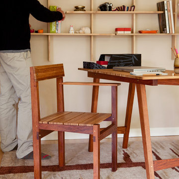
Designed for our office in Kathmandu, The Simple Office Collection is where we do our work to this day. Compact, light & efficient, it is great for a home office, allowing you to get your work done without too much clutter or congestion. The collection is handmade in Nepal by our trained artisans using Bamboo plywood and sustainably harvested Rosewood. It packs flat and is assembled with brass nuts and bolts for easy assembly and disassembly.
 Bianchi Design
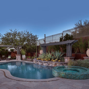
Previously, this yard was burdened by a typical boulder pile pool, that was heaped higher than typical, trying to hide the towering wall behind. At first, the clients sought merely to reconfigure the BBQ that was congesting the patio, but upon further analysis, they decided it was time to strip the entire yard, leaving only the pool shell. Bianchi’s solution introduced an array of four arbors to distract the eye from the wall behind, solving what the boulder waterfall could never do.
Additionally, the wall was painted a dark earth tone to add contrast and depth. This strategy enabled the wall to recede into the distance, while the agave blue grey arbors floated forward visually from the background. Previously, the patios were a hodgepodge of deck islands that were impossible to navigate, and were of insufficient size to arrange furniture on. A well organized patio streamlined the traffic flow and the living space, featuring a cast in place concrete fire pit and banco couch, as well as a new outdoor bistro, glowing with filtered light from the canvas shade sails overhead.
A turquoise glass overflow spa became the yards focal point, sharing the space between the pool and outdoor living. The striking symmetry of the spa and pot pedestal with regal cacti arrangement behind, flanked by the arbors on either side, created a stately first impression from the front door. This teaser was just a glimpse of what could not yet be seen serving as an invitation to explore and enjoy as the yard unfolds.
See more about this project & hear from the homeowner here: https://www.youtube.com/watch?v=7eT3RkLkg5w&feature=youtu.be
3