
Search results for "Consistent material" in Home Design Ideas
 Nukitchens
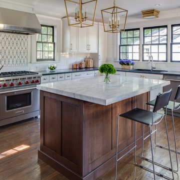
Nukitchens design for 1856 Victorian Rectory in Fairfield CT. Cabinetry in Slate White, Quarter Sawn Oak Island in custom stain with Calcatta Gold Honed Countertop.
Photo by Marco Ricca
 SLR Architecture Inc.
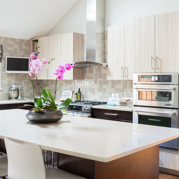
This tired ranch was in dire need of an update. Formerly the kitchen was separate from the living room and the dining area was severely undersized.
SLR Architecture opened up the kitchen to the great room and defined the living and dining areas so that each space stands on it's own. With help from interior designer Justine Sterling the finishes, furniture, ad accessories were carefully considered so that the whole room works as an overall composition.
A compact mud room was carved out of the back hall from a formally over sized laundry room so the family had a convenient drop zone, also the front entry was upgraded and a new rear deck was added for easier exterior access. Lighting was carefully considered so that different zones were well lit.
photo: Jessica Delaney
 TKS Design Group
Download our free ebook, Creating the Ideal Kitchen. DOWNLOAD NOW
Lakefront property in the northwest suburbs of Chicago is hard to come by, so when we were hired by this young family with exactly that, we were immediately inspired by not just the unusually large footprint of this 1950’s colonial revival but also the lovely views of the manmade lake it was sited on. The large 5-bedroom home was solidly stuck in the 1980’s, but we saw tons of potential. We started out by updating the existing staircase with a fresh coat of paint and adding new herringbone slate to the entry hall.
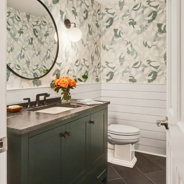
The powder room off the entryway also got a refresh - new flooring, new cabinets and fixtures. We ran the new slate right through into this space for some consistency. A fun wallpaper and shiplap trim add a welcoming feel and set the tone for the home.
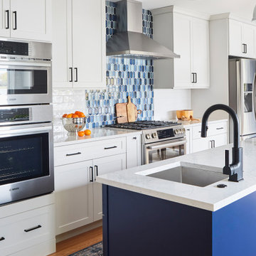
Next, we tackled the kitchen. Located away from the rest of the first floor, the kitchen felt a little isolated, so we immediately began planning for how to better connect it to the rest of the first floor. We landed on removing the wall between the kitchen and dining room and designed a modified galley style space with separate cooking and clean up zones. The cooking zone consists of the refrigerator, prep sink and cooktop, along with a nice long run of prep space at the island. The cleanup side of the kitchen consists of the main sink and dishwasher. Both areas are situated so that the user can view the lake during prep work and cleanup!
One of the home’s main puzzles was how to incorporate the mudroom and area in front of the patio doors at the back of the house. We already had a breakfast table area, so the space by the patio doors was a bit of a no man’s land. We decided to separate the kitchen proper from what became the new mudroom with a large set of barn doors. That way you can quickly hide any mudroom messes but have easy access to the light coming in through the patio doors as well as the outdoor grilling station. We also love the impact the barn doors add to the overall space.
The homeowners’ first words to us were “it’s time to ditch the brown,” so we did! We chose a lovely blue pallet that reflects the home’s location on the lake which is also vibrant yet easy on the eye. Countertops are white quartz, and the natural oak floor works well with the other honey accents. The breakfast table was given a refresh with new chairs, chandelier and window treatments that frame the gorgeous views of the lake out the back.
We coordinated the slate mudroom flooring with that used in the home’s main entrance for a consistent feel. The storage area consists of open and closed storage to allow for some clutter control as needed.
Next on our “to do” list was revamping the dated brown bar area in the neighboring dining room. We eliminated the clutter by adding some closed cabinets and did some easy updates to help the space feel more current. One snag we ran into here was the discovery of a beam above the existing open shelving that had to be modified with a smaller structural beam to allow for our new design to work. This was an unexpected surprise, but in the end we think it was well worth it!
We kept the colors here a bit more muted to blend with the homeowner’s existing furnishings. Open shelving and polished nickel hardware add some simple detail to the new entertainment zone which also looks out onto the lake!
Next we tackled the upstairs starting with the homeowner’s son’s bath. The bath originally had both a tub shower and a separate shower, so we decided to swap out the shower for a new laundry area. This freed up some space downstairs in what used to be the mudroom/laundry room and is much more convenient for daily laundry needs.
We continued the blue palette here with navy cabinetry and the navy tile in the shower. Porcelain floor tile and chrome fixtures keep maintenance to a minimum while matte black mirrors and lighting add some depth the design. A low maintenance runner adds some warmth underfoot and ties the whole space together.
We added a pocket door to the bathroom to minimize interference with the door swings. The left door of the laundry closet is on a 180 degree hinge to allow for easy full access to the machines. Next we tackled the master bath which is an en suite arrangement. The original was typical of the 1980’s with the vanity outside of the bathroom, situated near the master closet. And the brown theme continued here with multiple shades of brown.
Our first move was to segment off the bath and the closet from the master bedroom. We created a short hall from the bedroom to the bathroom with his and hers walk-in closets on the left and right as well as a separate toilet closet outside of the main bathroom for privacy and flexibility.
The original bathroom had a giant soaking tub with steps (dangerous!) as well as a small shower that did not work well for our homeowner who is 6’3”. With other bathtubs in the home, they decided to eliminate the tub and create an oversized shower which takes up the space where the old tub was located. The double vanity is on the opposite wall and a bench is located under the window for morning conversations and a place to set a couple of towels.
The pallet in here is light and airy with a mix of blond wood, creamy porcelain and marble tile, and brass accents. A simple roman shade adds some texture and it’s top-down mechanism allows for light and privacy.
This large whole house remodel gave our homeowners not only the ability to maximize the potential of their home but also created a lovely new frame from which to view their fabulous lake views.
Designed by: Susan Klimala, CKD, CBD
Photography by: Michael Kaskel
For more information on kitchen and bath design ideas go to: www.kitchenstudio-ge.com
Find the right local pro for your project
 Chr DAUER Architects
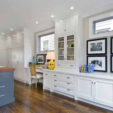
A typical post-1906 Noe Valley house is simultaneously restored, expanded and redesigned to keep what works and rethink what doesn’t. The front façade, is scraped and painted a crisp monochrome white—it worked. The new asymmetrical gabled rear addition takes the place of a windowless dead end box that didn’t. A “Great kitchen”, open yet formally defined living and dining rooms, a generous master suite, and kid’s rooms with nooks and crannies, all make for a newly designed house that straddles old and new.
Structural Engineer: Gregory Paul Wallace SE
General Contractor: Cardea Building Co.
Photographer: Open Homes Photography
 Baluco
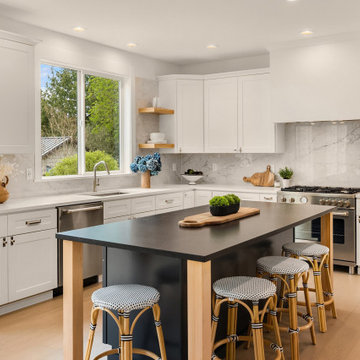
Inspiration for a mid-sized transitional u-shaped light wood floor and beige floor open concept kitchen remodel in Seattle with an undermount sink, shaker cabinets, dark wood cabinets, quartz countertops, white backsplash, porcelain backsplash, stainless steel appliances, an island and white countertops
 Artisan Kitchens and Baths
Photographer: Steven Paul Whitsitt
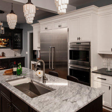
ALLENTOWN CHARMER - Designed by George Siwy of Artisan Kitchens and Baths
This unique home located in the historical Allentown area of Buffalo, was purchased by two busy professionals who had a dream to bring back this historical mansion to its original glory and add a modernized kitchen to its design. The owners with their passion for Architecture and their love of cooking and entertaining hired George Siwy of Artisan Kitchens & Baths at Appliance Associates to make this dream a reality.
The project started with the removal of a load bearing wall that structurally supported two stories above. The project called for a structural engineer to design the right size beam that can be supported by two columns that were built flush into the walls to give the space a more open feel.
George Suggested in bringing in the homes architectural elements by choosing materials and details that were historic to the era of the home. Such details consist of the inset cabinet doors and its recessed panel and molding details, which relate to the quarter sawn oak stair case existing and wainscoting panel details found throughout the first floor of the home. The perimeter cabinetry in the kitchen consist of a maple wood species with a reversed raised panel door style painted white. The island and bar cabinetry consist of a wood species quarter sawn oak stained in an onyx color to relate to a historic cast iron stove inserted into a fireplace which is all original to the home. The imperfect glass seen on either side of the mullion glass windows, which are original to the home, is repeated within the design of the hutch and bar areas with a “seeded glass” material.
The natural countertop materials chosen for this project were seen in the early 20th century era homes, such as Carrera marble which was used in the island and bar areas as well as the Soapstone material used for the perimeter cabinetry.
The well thought out design has made the homeowners dreams a reality, with a kitchen that relates well to its existing architectural elements and brought up to date with modern conveniences of today.
Designer: George Siwy
Special Features: Glass hutch cabinetry with wainscoting, large bar area with beverage center and prep sink, expanded island with seating for four.
Cabinetry: Medallion Gold / Door Style: Bayside
Countertop: Soapstone and Carrera Marble
Kohler: Stages Sink
Elkay: Avado Bar Sink
Wolf: Range top, Wall Oven, and Microwave Drawers
Thermador: Refrigerator / Freezer
 USI Design & Remodeling
This master bathroom renovation in Frisco was completed for a repeat USI Design & Remodeling client as part of a larger first-floor transformation of the home. The original bathroom reflected a very typical North Texas layout of its era — dark stained cabinetry, granite countertops, compartmentalized vanities, a built-in tub adjoining a framed shower, and separated spaces that no longer aligned with how the homeowners wanted to live. As their aesthetic evolved toward a more transitional and contemporary direction, the goal became less about replacing finishes and more about redefining the experience of the room itself. The project needed to feel calmer, more architectural, and far more intentional in how the space functioned visually and emotionally.
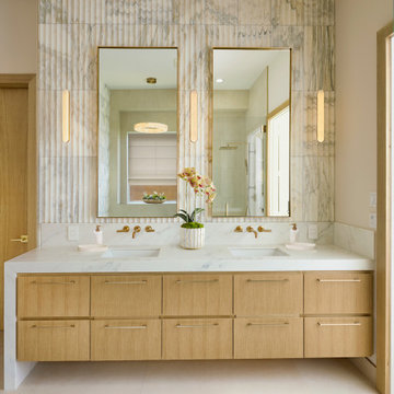
One of the most important changes was removing the original shower curb and pony wall in favor of a fully open curbless shower with ultra-clear ½-inch heavy glass. Achieving that look required recessing the slab, re-floating the shower floor toward a linear drain, and engineering the space so the room would read as visually uninterrupted from end to end. Throughout the project, many of the design decisions were rooted in restraint rather than excess. The oversized 24x48 Porcelanosa flooring carries very little shade variation, creating a quieter visual field, while the cabinetry was executed in rift-sawn white oak specifically because it produces a far more controlled and consistent finish outcome than more common cuts of wood. In luxury projects, consistency itself becomes part of the refinement.
The floating vanity was designed more like custom furniture than traditional cabinetry, utilizing waterfall mitered edges and fully reworked plumbing locations so both homeowners could share in having generous functional countertop space. The original makeup station was repurposed into integrated storage with powered drawers and concealed organization for everyday items such as blow dryers and flat irons. Along the vanity wall, wall-mounted plumbing fixtures were paired with ribbed natural marble surfaces — a detail that required intentional planning long before construction began. Rather than allowing the ribbed material to terminate awkwardly behind the fixtures, the backsplash and stone transitions were specifically designed to resolve those conditions cleanly. Those are the types of details that distinguish highly coordinated design-build work from projects that simply assemble materials together.
While the room contains a significant amount of luxury detailing — from the freestanding tub and geoprism marble focal wall to the custom rift-sawn white oak closet doors and elongated mirrors that leverage the 11-foot ceiling heights — the project was always guided by quiet luxury rather than visual competition. Even the water closet enclosure was handled with restraint through the use of a satin-etched glass door rather than another heavy solid opening. The intent throughout was to create a bathroom that feels restorative and serene rather than overdesigned. In our view, the best luxury spaces are the ones that feel composed long after the initial impression wears off.
Sponsored
Fredericksburg, OH

High Point Cabinets
Columbus' Experienced Custom Cabinet Builder | 4x Best of Houzz Winner
 TKS Design Group
Download our free ebook, Creating the Ideal Kitchen. DOWNLOAD NOW
Lakefront property in the northwest suburbs of Chicago is hard to come by, so when we were hired by this young family with exactly that, we were immediately inspired by not just the unusually large footprint of this 1950’s colonial revival but also the lovely views of the manmade lake it was sited on. The large 5-bedroom home was solidly stuck in the 1980’s, but we saw tons of potential. We started out by updating the existing staircase with a fresh coat of paint and adding new herringbone slate to the entry hall.
The powder room off the entryway also got a refresh - new flooring, new cabinets and fixtures. We ran the new slate right through into this space for some consistency. A fun wallpaper and shiplap trim add a welcoming feel and set the tone for the home.
Next, we tackled the kitchen. Located away from the rest of the first floor, the kitchen felt a little isolated, so we immediately began planning for how to better connect it to the rest of the first floor. We landed on removing the wall between the kitchen and dining room and designed a modified galley style space with separate cooking and clean up zones. The cooking zone consists of the refrigerator, prep sink and cooktop, along with a nice long run of prep space at the island. The cleanup side of the kitchen consists of the main sink and dishwasher. Both areas are situated so that the user can view the lake during prep work and cleanup!
One of the home’s main puzzles was how to incorporate the mudroom and area in front of the patio doors at the back of the house. We already had a breakfast table area, so the space by the patio doors was a bit of a no man’s land. We decided to separate the kitchen proper from what became the new mudroom with a large set of barn doors. That way you can quickly hide any mudroom messes but have easy access to the light coming in through the patio doors as well as the outdoor grilling station. We also love the impact the barn doors add to the overall space.
The homeowners’ first words to us were “it’s time to ditch the brown,” so we did! We chose a lovely blue pallet that reflects the home’s location on the lake which is also vibrant yet easy on the eye. Countertops are white quartz, and the natural oak floor works well with the other honey accents. The breakfast table was given a refresh with new chairs, chandelier and window treatments that frame the gorgeous views of the lake out the back.
We coordinated the slate mudroom flooring with that used in the home’s main entrance for a consistent feel. The storage area consists of open and closed storage to allow for some clutter control as needed.
Next on our “to do” list was revamping the dated brown bar area in the neighboring dining room. We eliminated the clutter by adding some closed cabinets and did some easy updates to help the space feel more current. One snag we ran into here was the discovery of a beam above the existing open shelving that had to be modified with a smaller structural beam to allow for our new design to work. This was an unexpected surprise, but in the end we think it was well worth it!
We kept the colors here a bit more muted to blend with the homeowner’s existing furnishings. Open shelving and polished nickel hardware add some simple detail to the new entertainment zone which also looks out onto the lake!
Next we tackled the upstairs starting with the homeowner’s son’s bath. The bath originally had both a tub shower and a separate shower, so we decided to swap out the shower for a new laundry area. This freed up some space downstairs in what used to be the mudroom/laundry room and is much more convenient for daily laundry needs.
We continued the blue palette here with navy cabinetry and the navy tile in the shower. Porcelain floor tile and chrome fixtures keep maintenance to a minimum while matte black mirrors and lighting add some depth the design. A low maintenance runner adds some warmth underfoot and ties the whole space together.
We added a pocket door to the bathroom to minimize interference with the door swings. The left door of the laundry closet is on a 180 degree hinge to allow for easy full access to the machines. Next we tackled the master bath which is an en suite arrangement. The original was typical of the 1980’s with the vanity outside of the bathroom, situated near the master closet. And the brown theme continued here with multiple shades of brown.
Our first move was to segment off the bath and the closet from the master bedroom. We created a short hall from the bedroom to the bathroom with his and hers walk-in closets on the left and right as well as a separate toilet closet outside of the main bathroom for privacy and flexibility.
The original bathroom had a giant soaking tub with steps (dangerous!) as well as a small shower that did not work well for our homeowner who is 6’3”. With other bathtubs in the home, they decided to eliminate the tub and create an oversized shower which takes up the space where the old tub was located. The double vanity is on the opposite wall and a bench is located under the window for morning conversations and a place to set a couple of towels.
The pallet in here is light and airy with a mix of blond wood, creamy porcelain and marble tile, and brass accents. A simple roman shade adds some texture and it’s top-down mechanism allows for light and privacy.
This large whole house remodel gave our homeowners not only the ability to maximize the potential of their home but also created a lovely new frame from which to view their fabulous lake views.
Designed by: Susan Klimala, CKD, CBD
Photography by: Michael Kaskel
For more information on kitchen and bath design ideas go to: www.kitchenstudio-ge.com
 Kitchen Associates
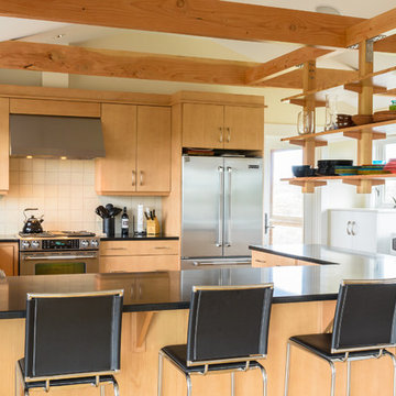
Loads of natural light flood this contemporary kitchen on Martha's Vineyard, a small island off the coast of Cape Cod, MA. Natural maple cabinetry by Wood-Mode and custom open shelving add to the open, airy feel of this modern beach house. Design and installation by Kitchen Associates. Photo by Jeff Baumgart.
 User
UserChiChi Ubiña
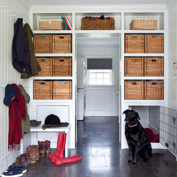
Entryway - mid-sized transitional limestone floor entryway idea in New York with white walls
Entryway - mid-sized transitional limestone floor entryway idea in New York with white walls
 Howell Custom Building Group
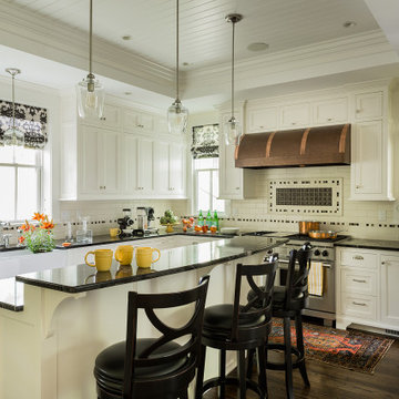
The Hannah Fay House is a fine example of Italianate architecture. Built in 1860, it is located next to historic Phillips Academy in Andover MA and in the past it served as a home to the academy’s administrators. When the homeowners purchased the house, their goal was to restore its original formality and enhance the finish work throughout the first floor. The project included a kitchen remodel The end result is an exquisite blending of historical details with modern amenities. The Kitchen was remodeled into an elegant, airy space: Two windows were added on either side of cooking area to bring in light and views of backyard. Hand painted custom cabinetry from Jewett Farms features decorative furniture feet. Wood paneled raised ceiling with drop soffit gives new depth and warmth to the room. Cosmic Black granite replaced the outdated Formica countertops. Custom designed Backsplash tile consists of a traditional 3 x 6 subway tile with custom selected square mosaics which tie the dark counters in with the white cabinets. Coppery accents within the mosaics reflect the copper range hood and beautiful wood floors. Hand-hammered copper range hood. Commercial grade appliances. Glass display cabinets with interior lighting. The flooring throughout the first floor is antique reclaimed oak.
 User
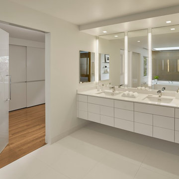
UserASID Design Excellence First Place Residential – Kitchen and Bathroom: Michael Merrill Design Studio was approached three years ago by the homeowner to redesign her kitchen. Although she was dissatisfied with some aspects of her home, she still loved it dearly. As we discovered her passion for design, we began to rework her entire home for consistency including this bathroom.
 Calla Studio
Jeff McNamara Photography
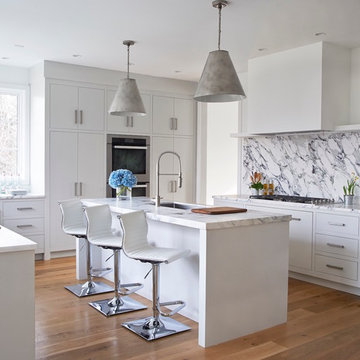
Example of a large transitional l-shaped medium tone wood floor kitchen design in New York with an undermount sink, flat-panel cabinets, white cabinets, white backsplash, stone slab backsplash, stainless steel appliances and an island
Example of a large transitional l-shaped medium tone wood floor kitchen design in New York with an undermount sink, flat-panel cabinets, white cabinets, white backsplash, stone slab backsplash, stainless steel appliances and an island

Sponsored
Westerville, OH

Custom Home Works
Franklin County's Award-Winning Design, Build and Remodeling Expert
 Jess Pedersen Architecture
PHOTOS: Mountain Home Photo
CONTRACTOR: 3C Construction
Main level living: 1455 sq ft
Upper level Living: 1015 sq ft
Guest Wing / Office: 520 sq ft
Total Living: 2990 sq ft
Studio Space: 1520 sq ft
2 Car Garage : 575 sq ft
General Contractor: 3C Construction: Steve Lee
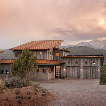
The client, a sculpture artist, and his wife came to J.P.A. only wanting a studio next to their home. During the design process it grew to having a living space above the studio, which grew to having a small house attached to the studio forming a compound. At this point it became clear to the client; the project was outgrowing the neighborhood. After re-evaluating the project, the live / work compound is currently sited in a natural protected nest with post card views of Mount Sopris & the Roaring Fork Valley. The courtyard compound consist of the central south facing piece being the studio flanked by a simple 2500 sq ft 2 bedroom, 2 story house one the west side, and a multi purpose guest wing /studio on the east side. The evolution of this compound came to include the desire to have the building blend into the surrounding landscape, and at the same time become the backdrop to create and display his sculpture.
“Jess has been our architect on several projects over the past ten years. He is easy to work with, and his designs are interesting and thoughtful. He always carefully listens to our ideas and is able to create a plan that meets our needs both as individuals and as a family. We highly recommend Jess Pedersen Architecture”.
- Client
“As a general contractor, I can highly recommend Jess. His designs are very pleasing with a lot of thought put in to how they are lived in. He is a real team player, adding greatly to collaborative efforts and making the process smoother for all involved. Further, he gets information out on or ahead of schedule. Really been a pleasure working with Jess and hope to do more together in the future!”
Steve Lee - 3C Construction
 fuse57 llc architecture
This new Lake Minnetonka custom home was designed for a young growing family that decided to trade uptown Minneapolis condo life for lake living. Located on a narrow 40-foot-wide lot, this 2,850sf modern home provides a strong connection to the lake while also balancing privacy from the neighbors. The main level comprises a three-car tandem garage and public living spaces, the upper level consists of private spaces while the finished basement serves as a flexible space.
High performance triple pane European windows were strategically placed to frame views of the lake while interior facing windows were placed to frame tree and sky views. A stone clad fireplace acts as a spatial anchor that helps define the interior spaces as well as encourages the transition from interior to exterior spaces. Future solar panel conduits to the roof were installed as were EV charging stations in the garage and at the dock for future EV boat charging. Site water runoff is managed through an underground retention system.
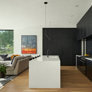
The exterior cement board siding is painted black to recede into the landscape while accents of thermally modified wood, custom steel slats and stone add visual interest at the street and lake facing sides. The interior material palette is purposefully simple and consists of stained white oak flooring, ebony stained white oak cabinetry and millwork, white quartz counters, powder coated steel railings and stone veneer. The final result is a vibrant home for this young family that infuses warmth with a modern aesthetic.
 Betsy Bassett Interiors
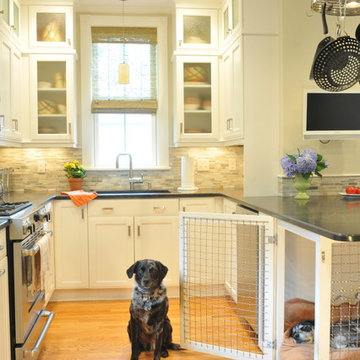
This new kitchen design was created to eliminate dog pens. An L-shaped design allowed for a dog den base cabinet to be incorporated into the kitchen layout.
Photo Credit: Betsy Bassett
 Coco Maison Design
We planned a thoughtful redesign of this beautiful home while retaining many of the existing features. We wanted this house to feel the immediacy of its environment. So we carried the exterior front entry style into the interiors, too, as a way to bring the beautiful outdoors in. In addition, we added patios to all the bedrooms to make them feel much bigger. Luckily for us, our temperate California climate makes it possible for the patios to be used consistently throughout the year.
The original kitchen design did not have exposed beams, but we decided to replicate the motif of the 30" living room beams in the kitchen as well, making it one of our favorite details of the house. To make the kitchen more functional, we added a second island allowing us to separate kitchen tasks. The sink island works as a food prep area, and the bar island is for mail, crafts, and quick snacks.
We designed the primary bedroom as a relaxation sanctuary – something we highly recommend to all parents. It features some of our favorite things: a cognac leather reading chair next to a fireplace, Scottish plaid fabrics, a vegetable dye rug, art from our favorite cities, and goofy portraits of the kids.
---
Project designed by Courtney Thomas Design in La Cañada. Serving Pasadena, Glendale, Monrovia, San Marino, Sierra Madre, South Pasadena, and Altadena.
For more about Courtney Thomas Design, see here: https://www.courtneythomasdesign.com/
To learn more about this project, see here:
https://www.courtneythomasdesign.com/portfolio/functional-ranch-house-design/
Sponsored
Plain City, OH

Kuhns Contracting, Inc.
Central Ohio's Trusted Home Remodeler Specializing in Kitchens & Baths
 Jess Pedersen Architecture
PHOTOS: Mountain Home Photo
CONTRACTOR: 3C Construction
Main level living: 1455 sq ft
Upper level Living: 1015 sq ft
Guest Wing / Office: 520 sq ft
Total Living: 2990 sq ft
Studio Space: 1520 sq ft
2 Car Garage : 575 sq ft
General Contractor: 3C Construction: Steve Lee
The client, a sculpture artist, and his wife came to J.P.A. only wanting a studio next to their home. During the design process it grew to having a living space above the studio, which grew to having a small house attached to the studio forming a compound. At this point it became clear to the client; the project was outgrowing the neighborhood. After re-evaluating the project, the live / work compound is currently sited in a natural protected nest with post card views of Mount Sopris & the Roaring Fork Valley. The courtyard compound consist of the central south facing piece being the studio flanked by a simple 2500 sq ft 2 bedroom, 2 story house one the west side, and a multi purpose guest wing /studio on the east side. The evolution of this compound came to include the desire to have the building blend into the surrounding landscape, and at the same time become the backdrop to create and display his sculpture.
“Jess has been our architect on several projects over the past ten years. He is easy to work with, and his designs are interesting and thoughtful. He always carefully listens to our ideas and is able to create a plan that meets our needs both as individuals and as a family. We highly recommend Jess Pedersen Architecture”.
- Client
“As a general contractor, I can highly recommend Jess. His designs are very pleasing with a lot of thought put in to how they are lived in. He is a real team player, adding greatly to collaborative efforts and making the process smoother for all involved. Further, he gets information out on or ahead of schedule. Really been a pleasure working with Jess and hope to do more together in the future!”
Steve Lee - 3C Construction
 LMT Architecture LLC
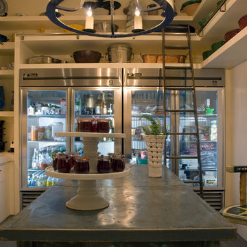
Inspiration for a timeless kitchen remodel in Portland with open cabinets, white cabinets and stainless steel appliances
 Ashton Renovations
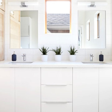
The original bathroom in this Toronto home consisted of both a small shower and a large corner bath. And although the number of windows with southern and western exposure added considerable light to the space, it contributed to limitations with placement of the double vanity. Dave and Jenni decided to add a larger double vanity with an adjacent infrared built in sauna, along with a stand up shower. The style of the bathroom was to be kept clean and simple and tile on the majority of wall surfaces achieved this requirement. The most notable feature of the bathroom is the built-in shelving above the sauna, which was created to avoid a large obtrusive flat surface above it, and instead add space for ornamentation and towels.
Aristea Rizakos
10