
Search results for "Continue reading" in Home Design Ideas
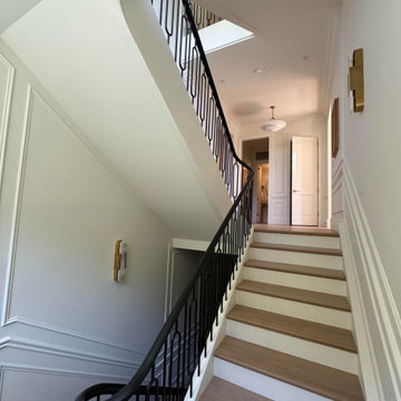
 Century Stair Company
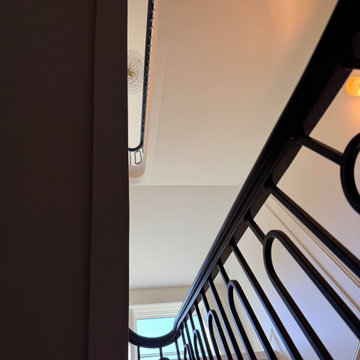
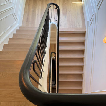
On first glance, this staircase reads as restrained. White oak treads rise with natural warmth, metal balusters hold their disciplined rhythm, and the painted black railing traces a clean, straight path upward. Then you notice the elliptical stringer wrap, and the whole composition shifts. Unlike a circular curve drawn with a compass, an ellipse requires mathematical calculation and a craftsman who knows how to make that complexity disappear. Here, it does exactly that.
Natural light finishes the story. Moving through the space across the day, it deepens the oak grain, catches the metal, and lets the black railing guide the eye along the handrail's elliptical path from start to finish. Restraint brought the design this far. One well-executed curve made it memorable.
1976-2026 © Century Stair Company
 Adam Gibson Design
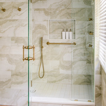
These bathrooms are composed with clean architectural clarity, balancing crisp geometry and warm materiality. Large-format stone tile wraps the walls and sloped ceilings to create a continuous, monolithic envelope, while custom millwork and floating vanities reinforce strong horizontal lines and visual order. The freestanding tub reads as a sculptural element within the space, and warm wood flooring softens the palette and grounds the composition. Brushed brass fixtures provide subtle contrast and refinement, resulting in a calm, well-proportioned interior where detailing and material transitions are deliberately restrained.
 Lola Cwikowski Studio
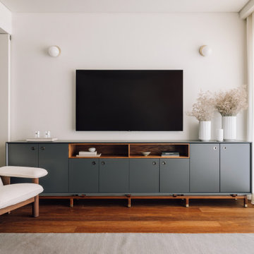
A couple relocating to Lisbon found a property in a recently upgraded building with open layouts and modernized features. Our studio was entrusted to bring elegant comfort to the interior with carefully curated, custom-designed furniture and decor. From a blank canvas, the home was enlivened with walnut furnishings by Portuguese producers, warm-hued textiles in botanical motifs, and accents of delicate brass lighting.
The entryway leads toward a spacious living room, where hand-woven rugs delineate areas for different activities. The first features a dining collection with upholstered shell chairs that comfortably envelop end-of-evening conversation. Midway, a daybed and display shelving system nestled under the lowered ceiling offer an intimate, yet versatile space. Stepping into the lounge, theatrical curtains reveal the pastel medley of Lisbon’s built landscape, the river, and hills in the distance. The dialogue of the room continues around a multi-tiered center table and featherweight pendant: a Brazilian modernist armchair faces a bespoke tufted-leather sofa, its throw cushions tailored to the palette of the media cabinet.
Outside, the balcony’s slate lacquered dining set caters to convivial meals. Private appreciation is found in a pair of leisurely chairs adjacent to the bedroom, with a side table quoting the terracotta background.
The main suite is endued with a crafted spindle bed dressed in deep blue linens and a lively made-to-measure embroidered bedspread. White Estremoz marble nightstands were designed to organize reading material and provide cable management. Circular ceramic lamps and bedside tables complement an ample upholstered bed to accommodate guests, and a floating console offers a discreet solution for remote meetings.
Find the right local pro for your project
 User
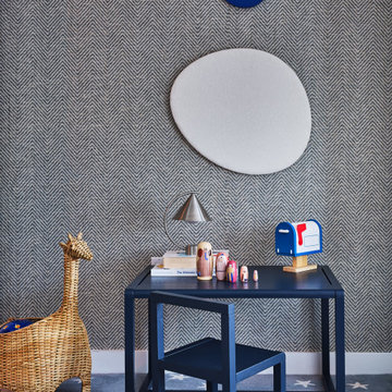
UserLoved creating this little reading/study area for this boy's bedroom. We continued with the love of nautical with the navy blue aesthetic and used the gorgeous Phillip Jeffries' wallpaper in chevron chic to add depth and richness to the room. The irregular puddle shaped pinboard and wall clock adds a touch of playful!
 Century Stair Company
On first glance, this staircase reads as restrained. White oak treads rise with natural warmth, metal balusters hold their disciplined rhythm, and the painted black railing traces a clean, straight path upward. Then you notice the elliptical stringer wrap, and the whole composition shifts. Unlike a circular curve drawn with a compass, an ellipse requires mathematical calculation and a craftsman who knows how to make that complexity disappear. Here, it does exactly that.
Natural light finishes the story. Moving through the space across the day, it deepens the oak grain, catches the metal, and lets the black railing guide the eye along the handrail's elliptical path from start to finish. Restraint brought the design this far. One well-executed curve made it memorable.
1976-2026 © Century Stair Company
 Talianko Design Group, LLC
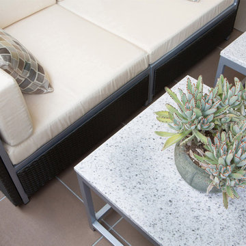
The patios are open from the living room, guest bedroom and master bedroom and overlook a gorgeous pool below. Contemporary metal furniture continues the contemporary style from inside and complements the architecture of the building. Two loveseats with granite top tables are the perfect place for lounging in the afternoon. Pillows and an outdoor rug bring interesting textures to the patio. Behind the loveseats is a pub table for dining and entertaining. Off of the Guest Bedroom and Master Bedroom are more private seating areas for a quite morning cup of coffee or a reading in the afternoons. Plants were added to the space for extra privacy and color. Photography by Erika Bierman
 Cutuli Homes
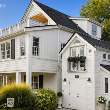
Built in 2024 by Cutuli Homes, this custom detached accessory dwelling unit was designed as a true mother-in-law home—a private, beautifully finished residence that allows three generations of one family to live close together while maintaining their own individual spaces.
The DADU was built as a companion to the homeowners' main residence, which Cutuli Homes had extensively remodeled and expanded two years earlier. Rather than treating the new structure as an afterthought, the goal was to create a home that felt architecturally connected to the existing property. Its traditional exterior, white siding, steeply pitched roof, generous windows and carefully proportioned trim give the small residence the character of an established home.
The project was created for the homeowners' mother, who downsized from her large lakefront home in the Midwest to move closer to her family and young grandchild. The result captures one of the greatest advantages of multigenerational living: family and shared community just steps away, balanced with the independence, privacy and comfort of a home of her own.
Inside, every inch was carefully considered. The compact footprint feels remarkably open thanks to a vaulted, white-paneled ceiling, abundant natural light, tall windows and an open vertical design that draws the eye upward. A loft level expands the usable living space without sacrificing the airy feeling of the main floor.
Traditional white Shaker-style cabinetry provides extensive built-in storage throughout the home and gives the interior a clean, timeless architectural character. In the kitchen, cabinetry extends upward to take advantage of the available height, while warm neutral countertops and a textured herringbone-pattern backsplash introduce subtle depth and contrast. Stainless-steel appliances are thoughtfully incorporated into the compact layout, creating a highly functional kitchen without overwhelming the living space.
One of the home's most charming features is the intimate living area tucked beneath custom built-in cabinetry. A built-in upholstered window-seat-style sofa with drawers below transforms what could have been unused space into a comfortable place to read, relax or visit. Across from it, a contemporary fireplace is integrated into a compact feature wall, with a wood display ledge above providing space for artwork, plants and personal collections.
Warm wood accents soften the predominantly white interior. Natural wood ledges, shelving, flooring and the loft ladder bring warmth and texture to the rooms, while greenery and personal furnishings give the home the comfortable character of a full-size residence rather than a conventional accessory dwelling unit.
The private sleeping area demonstrates the same emphasis on intelligent space planning. Built-in cabinetry surrounds the bed and continues overhead, providing substantial storage without requiring bulky freestanding furniture. A softly textured wall treatment, warm wood shelving and abundant natural light make the compact bedroom feel inviting and finished.
Above, the loft takes advantage of the dramatic roofline with a white tongue-and-groove style paneled ceiling extending from wall to wall. Built-in storage is incorporated beneath the sloped portions of the ceiling, turning otherwise difficult spaces into useful cabinetry while preserving an open central area for a desk, music, hobbies or additional flexible living space.
Even the exterior reflects the home's attention to detail. Large windows bring daylight deep into the interior, while the private patio extends the living space outdoors. Traditional siding and trim allow the DADU to complement the architecture of the main residence while still having an identity of its own.
At every turn, this project demonstrates that downsizing does not have to mean compromising on craftsmanship, beauty, storage or individuality. Through custom cabinetry, creative built-ins, vertical space planning and carefully considered architectural details, Cutuli Homes transformed a modest footprint into an elegant and highly personalized residence.
More than simply a DADU, this is a thoughtfully designed multigenerational home—close enough for grandparents, parents and grandchildren to share everyday life, while giving everyone the privacy and independence of having a place of their own.


 McCabe Design & Interiors
Phillip Crocker Photography
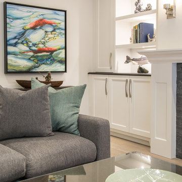
This cozy family room is adjacent to the kitchen and also separated from the kitchen by a 9' wide set of three stairs.
Custom millwork designed by McCabe Design & Interiors sets the stage for an inviting and relaxing space. The sectional was sourced from Lee Industries with sunbrella fabric for a lifetime of use. The cozy round chair provides a perfect reading spot. The same leathered black granite was used for the built-ins as was sourced for the kitchen providing continuity and cohesiveness. The mantle legs were sourced through the millwork to ensure the same spray finish as the adjoining millwork and cabinets.
Design features included redesigning the space to enlargen the family room, new doors, windows and blinds, custom millwork design, lighting design, as well as the selection of all materials, furnishings and accessories for this Endlessly Elegant Family Room.
 Refine Design Architecture
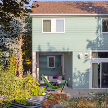
This rear elevation organizes a compact two-story massing through a clear play of solid and void. The upper level reads as a continuous clad volume—horizontal lap siding in two tones, with crisp white trim framing the window openings—while the ground floor is partially carved away to form a recessed, roofed outdoor room tucked beneath the second story. That cantilevered overhang shelters the porch and the multi-panel glazed door assembly without adding a separate roof structure, an economical move that keeps the silhouette simple and the footprint efficient. Fenestration is composed rather than uniform: a band of stacked openings and a generous sliding-glass-and-transom assembly anchor the connection between interior and the rear yard, while smaller punched windows handle secondary spaces. The gable roof with deep eaves caps the form, and the elevation steps directly out to a low concrete terrace that mediates between the building and a naturalized, drought-tolerant landscape of grasses and galvanized raised planters. A straightforward, daylight-driven approach to indoor–outdoor living on an urban infill lot.
 Powell Construction
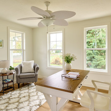
These homeowners came to us wanting to upgrade the curb appeal of their home and improve the layout of the interior. They hoped for an entry that would welcome guests to their home both inside and out, while also creating more defined and purposeful space within the home. The main goals of the project were to add a covered wrap around porch, add more windows for natural light, create a formal entry that housed the client’s baby grand piano, and add a home office for the clients to work from home.
With a dated exterior and facade that lacked dimension, there was little charm to be had. The front door was hidden from visitors and a lack of windows made the exterior unoriginal. We approached the exterior design pulling inspiration from the farmhouse style, southern porches, and craftsman style homes. Eventually we landed on a design that added numerous windows to the front façade, reminiscent of a farmhouse, and turned a Dutch hipped roof into an extended gable roof, creating a large front porch and adding curb appeal interest. By relocating the entry door to the front of the house and adding a gable accent over this new door, it created a focal point for guests and passersby. In addition to those design elements, we incorporated some exterior shutters rated for our northwest climate that echoed the southern style homes our client loved. A greige paint color (Benjamin Moore Cape May Cobblestone) accented with a white trim (Benjamin Moore Swiss Coffee) and a black front door, shutters, and window box (Sherwin Williams Black Magic) all work together to create a charming and welcoming façade.
On the interior we removed a half wall and coat closet that separated the original cramped entryway from the front room. The front room was a multipurpose space that didn’t have a designated use for the family, it became a catch-all space that was easily cluttered. Through the design process we came up with a plan to split the spaces into 2 rooms, a large open semi-formal entryway and a home office. The semi-formal entryway was intentionally designed to house the homeowner’s baby grand piano – a real showstopper. The flow created by this entryway is welcoming and ushers you into a beautifully curated home.
A new office now sits right off the entryway with beautiful French doors, built-in cabinetry, and an abundance of natural light – everything that one dreams of for their home office. The home office looks out to the front porch and front yard as well as the pastural side yard where the children frequently play. The office is an ideal location for a moment of inspiration, reflection, and focus. A warm white paint (Benjamin Moore Swiss Coffee) combined with the newly installed light oak luxury vinyl plank flooring runs throughout the home, creating continuity and a neutral canvas. Traditional and schoolhouse style statement light fixtures coordinate with the black door hardware for an added level of contrast.
There is one more improvement that made a big difference to this family. In the family room, we added a built-in window seat. This created a cozy nook that is used by all for reading and extra seating. This relatively small improvement had a big impact on how the family uses and enjoys the space.
 Steven Allen Designs, LLC
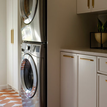
Originally built in 1958, the home became an opportunity to explore what midcentury modernism looks like when filtered through place and blending the optimism and color language of the late ’50s with influences from Santa Fe, the Texas Gulf Coast, and the relaxed, sun-washed rhythms of vacation architecture.
Rather than pursuing a strict restoration, the project embraces evolution over replication. Soft pinks, deep greens, terrazzo flooring, breeze-block screening, and warm wood tones nod to the home’s original era while allowing contemporary interventions to feel both intentional and playful. The new addition was designed to read as a natural continuation of the original structure, respecting scale, rooflines, and materiality, while opening the home to light, texture, and a stronger indoor-outdoor connection.
Throughout the interior, color and form work together to create rooms that feel collected rather than styled. A green-draped sitting area grounded in texture, a kitchen anchored by warm cabinetry and terrazzo, and a powder bath that leans fully into pattern and mood. The home reflects how we live today, but with an unmistakable sense of time and place.
 Lola Cwikowski Studio
A couple relocating to Lisbon found a property in a recently upgraded building with open layouts and modernized features. Our studio was entrusted to bring elegant comfort to the interior with carefully curated, custom-designed furniture and decor. From a blank canvas, the home was enlivened with walnut furnishings by Portuguese producers, warm-hued textiles in botanical motifs, and accents of delicate brass lighting.
The entryway leads toward a spacious living room, where hand-woven rugs delineate areas for different activities. The first features a dining collection with upholstered shell chairs that comfortably envelop end-of-evening conversation. Midway, a daybed and display shelving system nestled under the lowered ceiling offer an intimate, yet versatile space. Stepping into the lounge, theatrical curtains reveal the pastel medley of Lisbon’s built landscape, the river, and hills in the distance. The dialogue of the room continues around a multi-tiered center table and featherweight pendant: a Brazilian modernist armchair faces a bespoke tufted-leather sofa, its throw cushions tailored to the palette of the media cabinet.
Outside, the balcony’s slate lacquered dining set caters to convivial meals. Private appreciation is found in a pair of leisurely chairs adjacent to the bedroom, with a side table quoting the terracotta background.
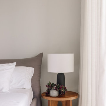
The main suite is endued with a crafted spindle bed dressed in deep blue linens and a lively made-to-measure embroidered bedspread. White Estremoz marble nightstands were designed to organize reading material and provide cable management. Circular ceramic lamps and bedside tables complement an ample upholstered bed to accommodate guests, and a floating console offers a discreet solution for remote meetings.
 Century Stair Company
On first glance, this staircase reads as restrained. White oak treads rise with natural warmth, metal balusters hold their disciplined rhythm, and the painted black railing traces a clean, straight path upward. Then you notice the elliptical stringer wrap, and the whole composition shifts. Unlike a circular curve drawn with a compass, an ellipse requires mathematical calculation and a craftsman who knows how to make that complexity disappear. Here, it does exactly that.
Natural light finishes the story. Moving through the space across the day, it deepens the oak grain, catches the metal, and lets the black railing guide the eye along the handrail's elliptical path from start to finish. Restraint brought the design this far. One well-executed curve made it memorable.
1976-2026 © Century Stair Company

Sponsored
Sunbury, OH

J.Holderby - Renovations
Franklin County's Leading General Contractors - 2X Best of Houzz!
 LaMantia Design and Remodeling
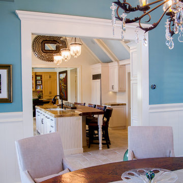
Our empty nester clients purchased a lovely Burr Ridge cottage with the plan to create their dream home. Their main objective when they first met with LaMantia architectural designer Jackie Prazak was to create a kitchen large enough to accommodate their extended (and now grown) family. After several design revisions the clients agreed to give up a Bedroom and a Powder Room to gain the enlarged Kitchen, Walk-in Master Closet and a separate double-entry Laundry Room they so desired.
By moving the kitchen wall 3’ we were able to accommodate the large Kitchen and Island the clients so desired.
The main entry to the Kitchen was both moved and enlarged to enhance the arrival and the view into the enlarged space.
We were also able to reclaim attic space and create the volume ceiling with added beams to continue the theme of the Living and Dining Room ceilings. At this point LaMantia kitchen designer Katie Suva, CKD, CBD joined the team to begin the detailing of the cabinet layout.
The Family Room, with its new large stone flooring was recreated with specialties galore; including a walk-up wet Bar. We were also able to re-purpose the existing Study into a Guest Bedroom with built-in closets and cabinetry. What was once a laundry space now became a new large Laundry Room accessed from both the Master Walk-in Closet and the hallway.
In the Master Bedroom the exterior entry door was replaced with large open glass window panels. The Master Bath ceiling was reworked to accommodate a soaring Master Shower. And then there was the enlarged Master Closet that speaks for itself!
The existing Solarium took on a different personality with a re-aligned entry door and built-in cabinetry. This room now houses all the home office and craft activities.
The scope of this project included every room in the residence, with the utmost attention paid to every detail, and the outcome is definitely worthy of the Professional Remodeling 2014 Gold Award it just won!
Follow the link below to read about the designer of this project Jackie Prazak http://lamantia.com/designers/jackie-prazak/
 Renovisions
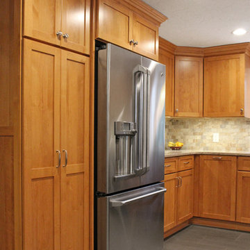
These Hanover, MA clients came to Renovisions as they wanted a local design-build company to rework and expand their small and outdated 1980’s colonial kitchen.
We collaborated and created an expanded 12’x15’ addition space to accommodate a newly designed kitchen which is now 21’x15’. Before we began with the construction process, proper structural engineering presented a challenge as the property was built on ledge. As expected, we determined that several concrete supports were necessary and needed to be built to support the expanded structure.
Our plan included both creative aesthetic and functional layout modifications to transform this ordinary kitchen into a spacious, well-lit, highly functional, stylish and welcoming space to cook, gather and entertain. The bump-out allowed for more functional cabinetry and a dining table which before was placed in a corner of the previous cramped kitchen. Now, there is a wide open space from the adjacent living room and a clear path to a 5’ French door opening to the pool deck. The homeowners also elected for us to extend a new roof over their existing deck creating a nice shaded space to entertain guests.
The island, which serves as the central gathering spot. is eye catching with contrasting dark cocoa colored cabinets and stunning natural looking Cambria quartz countertops. Large, easily accessible deep drawers provide much needed storage for pots, pans and lids as well as expansive countertop space for everyday prep and family get-togethers.
Overall, the clients were thrilled with their Renovision and cannot wait to throw a party to show off their stunning kitchen.
“There is not a single choice we aren’t happy with; it is so us! I love all of the storage and I have a feeling we are going to do a lot of entertaining this summer.”
“Dear Cathy and Ed, We are abundantly grateful for the entire Renovisions Team that have provided us with a beautiful kitchen and porch to enjoy. We will continue to make family memories for many years to come with this new addition. From the first time we met with you at the showroom, we were confident that high quality workmanship would go into our new construction. Mike, Brad, and Tom were very trustworthy and worked very hard every day they were on the job site. They were very flexible and always put the homeowners safety first. They even offered a bit of comic relief! Every night the site was cleaned meticulously, never leaving tools or sharp edges of any sort in the open space. We were also very pleased with the help offered when designing and choosing cabinets, tile and other finishes. Liz was always very helpful and patient to answer questions when we came by the showroom. We are extremely pleased with all the choices and on a daily basis we enjoy the warmth and amazing space it provides.
We recently hosted a retirement party for 70 people and it never felt crowed! We relax under the covered porch in the morning for coffee, the afternoon for lunch and to watch the grandkids in the pool. And of course in the evening while we read or catch up on emails. It is an amazing space! Thank you all again, for your hard work and passion for your craftsmanship. We will be in touch soon to set up a date for you all to drop by to see the finishing touches and to enjoy refreshments.”
- Paul & Beth H. (Hanover)
 Lola Cwikowski Studio
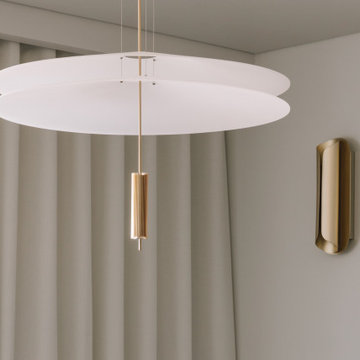
A couple relocating to Lisbon found a property in a recently upgraded building with open layouts and modernized features. Our studio was entrusted to bring elegant comfort to the interior with carefully curated, custom-designed furniture and decor. From a blank canvas, the home was enlivened with walnut furnishings by Portuguese producers, warm-hued textiles in botanical motifs, and accents of delicate brass lighting.
The entryway leads toward a spacious living room, where hand-woven rugs delineate areas for different activities. The first features a dining collection with upholstered shell chairs that comfortably envelop end-of-evening conversation. Midway, a daybed and display shelving system nestled under the lowered ceiling offer an intimate, yet versatile space. Stepping into the lounge, theatrical curtains reveal the pastel medley of Lisbon’s built landscape, the river, and hills in the distance. The dialogue of the room continues around a multi-tiered center table and featherweight pendant: a Brazilian modernist armchair faces a bespoke tufted-leather sofa, its throw cushions tailored to the palette of the media cabinet.
Outside, the balcony’s slate lacquered dining set caters to convivial meals. Private appreciation is found in a pair of leisurely chairs adjacent to the bedroom, with a side table quoting the terracotta background.
The main suite is endued with a crafted spindle bed dressed in deep blue linens and a lively made-to-measure embroidered bedspread. White Estremoz marble nightstands were designed to organize reading material and provide cable management. Circular ceramic lamps and bedside tables complement an ample upholstered bed to accommodate guests, and a floating console offers a discreet solution for remote meetings.
 Katie Hutchison Studio
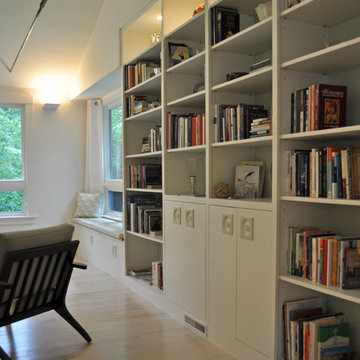
Constructed in two phases, this renovation, with a few small additions, touched nearly every room in this late ‘50’s ranch house. The owners raised their family within the original walls and love the house’s location, which is not far from town and also borders conservation land. But they didn’t love how chopped up the house was and the lack of exposure to natural daylight and views of the lush rear woods. Plus, they were ready to de-clutter for a more stream-lined look. As a result, KHS collaborated with them to create a quiet, clean design to support the lifestyle they aspire to in retirement.
To transform the original ranch house, KHS proposed several significant changes that would make way for a number of related improvements. Proposed changes included the removal of the attached enclosed breezeway (which had included a stair to the basement living space) and the two-car garage it partially wrapped, which had blocked vital eastern daylight from accessing the interior. Together the breezeway and garage had also contributed to a long, flush front façade. In its stead, KHS proposed a new two-car carport, attached storage shed, and exterior basement stair in a new location. The carport is bumped closer to the street to relieve the flush front facade and to allow access behind it to eastern daylight in a relocated rear kitchen. KHS also proposed a new, single, more prominent front entry, closer to the driveway to replace the former secondary entrance into the dark breezeway and a more formal main entrance that had been located much farther down the facade and curiously bordered the bedroom wing.
Inside, low ceilings and soffits in the primary family common areas were removed to create a cathedral ceiling (with rod ties) over a reconfigured semi-open living, dining, and kitchen space. A new gas fireplace serving the relocated dining area -- defined by a new built-in banquette in a new bay window -- was designed to back up on the existing wood-burning fireplace that continues to serve the living area. A shared full bath, serving two guest bedrooms on the main level, was reconfigured, and additional square footage was captured for a reconfigured master bathroom off the existing master bedroom. A new whole-house color palette, including new finishes and new cabinetry, complete the transformation. Today, the owners enjoy a fresh and airy re-imagining of their familiar ranch house.
Photos by Katie Hutchison
Sponsored
Sunbury, OH
J.Holderby - Renovations
Franklin County's Leading General Contractors - 2X Best of Houzz!
 TVL Creative Ltd.
[Our Clients]
We were so excited to help these new homeowners re-envision their split-level diamond in the rough. There was so much potential in those walls, and we couldn’t wait to delve in and start transforming spaces. Our primary goal was to re-imagine the main level of the home and create an open flow between the space. So, we started by converting the existing single car garage into their living room (complete with a new fireplace) and opening up the kitchen to the rest of the level.
[Kitchen]
The original kitchen had been on the small side and cut-off from the rest of the home, but after we removed the coat closet, this kitchen opened up beautifully. Our plan was to create an open and light filled kitchen with a design that translated well to the other spaces in this home, and a layout that offered plenty of space for multiple cooks. We utilized clean white cabinets around the perimeter of the kitchen and popped the island with a spunky shade of blue. To add a real element of fun, we jazzed it up with the colorful escher tile at the backsplash and brought in accents of brass in the hardware and light fixtures to tie it all together. Through out this home we brought in warm wood accents and the kitchen was no exception, with its custom floating shelves and graceful waterfall butcher block counter at the island.
[Dining Room]
The dining room had once been the home’s living room, but we had other plans in mind. With its dramatic vaulted ceiling and new custom steel railing, this room was just screaming for a dramatic light fixture and a large table to welcome one-and-all.
[Living Room]
We converted the original garage into a lovely little living room with a cozy fireplace. There is plenty of new storage in this space (that ties in with the kitchen finishes), but the real gem is the reading nook with two of the most comfortable armchairs you’ve ever sat in.
[Master Suite]
This home didn’t originally have a master suite, so we decided to convert one of the bedrooms and create a charming suite that you’d never want to leave. The master bathroom aesthetic quickly became all about the textures. With a sultry black hex on the floor and a dimensional geometric tile on the walls we set the stage for a calm space. The warm walnut vanity and touches of brass cozy up the space and relate with the feel of the rest of the home. We continued the warm wood touches into the master bedroom, but went for a rich accent wall that elevated the sophistication level and sets this space apart.
[Hall Bathroom]
The floor tile in this bathroom still makes our hearts skip a beat. We designed the rest of the space to be a clean and bright white, and really let the lovely blue of the floor tile pop. The walnut vanity cabinet (complete with hairpin legs) adds a lovely level of warmth to this bathroom, and the black and brass accents add the sophisticated touch we were looking for.
[Office]
We loved the original built-ins in this space, and knew they needed to always be a part of this house, but these 60-year-old beauties definitely needed a little help. We cleaned up the cabinets and brass hardware, switched out the formica counter for a new quartz top, and painted wall a cheery accent color to liven it up a bit. And voila! We have an office that is the envy of the neighborhood.
 Metta Home
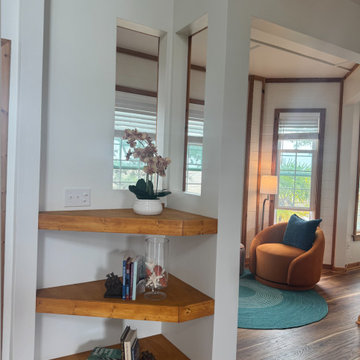
These custom corner shelves were designed to thoughtfully fill the footprint of a former fireplace reimagined rather than erased. Angled to echo the geometry of a newly designed fireplace elsewhere in the home, they create a subtle sense of continuity and intention throughout the space.
Now it will function as a small library for the adjacent reading nook, the shelves bring warmth, storage, and purpose to what could have been a forgotten corner.
 House of Meraki
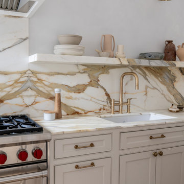
Taking on this pre-war building renovation was the ultimate design challenge. We combined two units into one massive home. By moving the dining table into the great room, we were able to double the size of the kitchen, allowing for a large island in the center of the space. The wolf range topped with a custom hood was on the utilitary side of the kitchen, next the the shaws sink and House of Rohl faucet. The Calacatta Paonazzo marble from Artistic tile in a honed finished continued from the counters to the backsplash and floating shelf, serving the wow factor this light kitchen deserved. On the opposite wall, floor to ceiling custom cabinetry housed a coffee station and ample storage. There’s even a reading nook window seat, perfect for morning coffee. The two glass blown pendants from Gabriel Scott float on top of the island while the Hudson Valley sconces illuminate the marble shelf. Lead designer, Stevi Fourouli added the final touch by painting lime-wash on the walls to accentuate the old-world feeling of this building.
69