Search results for "Cumbersome" in Home Design Ideas
Described by The New York Times as "the gold standard in office seating", the Freedom chair redefines the concept of traditional task chairs. Designer Niels Diffrient aimed to design an office chair that automatically adapts to the user, allowing them to move freely from posture to posture. Diffrient’s unique approach removed complexities found in other chairs, such as cumbersome recline levers and back tension dials for a truly ergonomic task chair. As a result, he developed a recline mechanism that perfectly adjusts to the user, definitively reinventing modern task seating to be truly simple, functional, and beautiful.

Easy DIY project to contain that cumbersome garden hose. Find the tutorial here on my blog: http://www.simplyorganized.me/2014/10/simple-diy-hose-holder.html

Download our free ebook, Creating the Ideal Kitchen. DOWNLOAD NOW
For many, extra time at home during COVID left them wanting more from their homes. Whether you realized the shortcomings of your space or simply wanted to combat boredom, a well-designed and functional home was no longer a want, it became a need. Tina found herself wanting more from her Old Irving Park home and reached out to The Kitchen Studio about adding function to her kitchen to make the most of the available real estate.
At the end of the day, there is nothing better than returning home to a bright and happy space you love. And this kitchen wasn’t that for Tina. Dark and dated, with a palette from the past and features that didn’t make the most of the available square footage, this remodel required vision and a fresh approach to the space. Lead designer, Stephanie Cole’s main design goal was better flow, while adding greater functionality with organized storage, accessible open shelving, and an overall sense of cohesion with the adjoining family room.
The original kitchen featured a large pizza oven, which was rarely used, yet its footprint limited storage space. The nearby pantry had become a catch-all, lacking the organization needed in the home. The initial plan was to keep the pizza oven, but eventually Tina realized she preferred the design possibilities that came from removing this cumbersome feature, with the goal of adding function throughout the upgraded and elevated space. Eliminating the pantry added square footage and length to the kitchen for greater function and more storage. This redesigned space reflects how she lives and uses her home, as well as her love for entertaining.
The kitchen features a classic, clean, and timeless palette. White cabinetry, with brass and bronze finishes, contrasts with rich wood flooring, and lets the large, deep blue island in Woodland’s custom color Harbor – a neutral, yet statement color – draw your eye.
The kitchen was the main priority. In addition to updating and elevating this space, Tina wanted to maximize what her home had to offer. From moving the location of the patio door and eliminating a window to removing an existing closet in the mudroom and the cluttered pantry, the kitchen footprint grew. Once the floorplan was set, it was time to bring cohesion to her home, creating connection between the kitchen and surrounding spaces.
The color palette carries into the mudroom, where we added beautiful new cabinetry, practical bench seating, and accessible hooks, perfect for guests and everyday living. The nearby bar continues the aesthetic, with stunning Carrara marble subway tile, hints of brass and bronze, and a design that further captures the vibe of the kitchen.
Every home has its unique design challenges. But with a fresh perspective and a bit of creativity, there is always a way to give the client exactly what they want [and need]. In this particular kitchen, the existing soffits and high slanted ceilings added a layer of complexity to the lighting layout and upper perimeter cabinets.
While a space needs to look good, it also needs to function well. This meant making the most of the height of the room and accounting for the varied ceiling features, while also giving Tina everything she wanted and more. Pendants and task lighting paired with an abundance of natural light amplify the bright aesthetic. The cabinetry layout and design compliments the soffits with subtle profile details that bring everything together. The tile selections add visual interest, drawing the eye to the focal area above the range. Glass-doored cabinets further customize the space and give the illusion of even more height within the room.
While her family may be grown and out of the house, Tina was focused on adding function without sacrificing a stunning aesthetic and dreamy finishes that make the kitchen the gathering place of any home. It was time to love her kitchen again, and if you’re wondering what she loves most, it’s the niche with glass door cabinetry and open shelving for display paired with the marble mosaic backsplash over the range and complimenting hood. Each of these features is a stunning point of interest within the kitchen – both brag-worthy additions to a perimeter layout that previously felt limited and lacking.
Whether your remodel is the result of special needs in your home or simply the excitement of focusing your energy on creating a fun new aesthetic, we are here for it. We love a good challenge because there is always a way to make a space better – adding function and beauty simultaneously.
Find the right local pro for your project
Download our free ebook, Creating the Ideal Kitchen. DOWNLOAD NOW
For many, extra time at home during COVID left them wanting more from their homes. Whether you realized the shortcomings of your space or simply wanted to combat boredom, a well-designed and functional home was no longer a want, it became a need. Tina found herself wanting more from her Old Irving Park home and reached out to The Kitchen Studio about adding function to her kitchen to make the most of the available real estate.
At the end of the day, there is nothing better than returning home to a bright and happy space you love. And this kitchen wasn’t that for Tina. Dark and dated, with a palette from the past and features that didn’t make the most of the available square footage, this remodel required vision and a fresh approach to the space. Lead designer, Stephanie Cole’s main design goal was better flow, while adding greater functionality with organized storage, accessible open shelving, and an overall sense of cohesion with the adjoining family room.
The original kitchen featured a large pizza oven, which was rarely used, yet its footprint limited storage space. The nearby pantry had become a catch-all, lacking the organization needed in the home. The initial plan was to keep the pizza oven, but eventually Tina realized she preferred the design possibilities that came from removing this cumbersome feature, with the goal of adding function throughout the upgraded and elevated space. Eliminating the pantry added square footage and length to the kitchen for greater function and more storage. This redesigned space reflects how she lives and uses her home, as well as her love for entertaining.
The kitchen features a classic, clean, and timeless palette. White cabinetry, with brass and bronze finishes, contrasts with rich wood flooring, and lets the large, deep blue island in Woodland’s custom color Harbor – a neutral, yet statement color – draw your eye.
The kitchen was the main priority. In addition to updating and elevating this space, Tina wanted to maximize what her home had to offer. From moving the location of the patio door and eliminating a window to removing an existing closet in the mudroom and the cluttered pantry, the kitchen footprint grew. Once the floorplan was set, it was time to bring cohesion to her home, creating connection between the kitchen and surrounding spaces.
The color palette carries into the mudroom, where we added beautiful new cabinetry, practical bench seating, and accessible hooks, perfect for guests and everyday living. The nearby bar continues the aesthetic, with stunning Carrara marble subway tile, hints of brass and bronze, and a design that further captures the vibe of the kitchen.
Every home has its unique design challenges. But with a fresh perspective and a bit of creativity, there is always a way to give the client exactly what they want [and need]. In this particular kitchen, the existing soffits and high slanted ceilings added a layer of complexity to the lighting layout and upper perimeter cabinets.
While a space needs to look good, it also needs to function well. This meant making the most of the height of the room and accounting for the varied ceiling features, while also giving Tina everything she wanted and more. Pendants and task lighting paired with an abundance of natural light amplify the bright aesthetic. The cabinetry layout and design compliments the soffits with subtle profile details that bring everything together. The tile selections add visual interest, drawing the eye to the focal area above the range. Glass-doored cabinets further customize the space and give the illusion of even more height within the room.
While her family may be grown and out of the house, Tina was focused on adding function without sacrificing a stunning aesthetic and dreamy finishes that make the kitchen the gathering place of any home. It was time to love her kitchen again, and if you’re wondering what she loves most, it’s the niche with glass door cabinetry and open shelving for display paired with the marble mosaic backsplash over the range and complimenting hood. Each of these features is a stunning point of interest within the kitchen – both brag-worthy additions to a perimeter layout that previously felt limited and lacking.
Whether your remodel is the result of special needs in your home or simply the excitement of focusing your energy on creating a fun new aesthetic, we are here for it. We love a good challenge because there is always a way to make a space better – adding function and beauty simultaneously.

We were hired to transform this small apartment into a tranquil pied-a-terre. Perched atop an historic landmark, the unit features unparalleled views of Manhattan. However, the layout was awkward and the finishes dated. One of the many challenges was staying within the confines of the numerous structural columns and plumbing risers.
A larger foyer was created by removing a cumbersome millwork unit. Folding glass panels open the new kitchen to the view. Two, discrete bathrooms were created from one large one. All mechanical and electrical systems were updated, and each of the windows replaced to meet stringent preservation requirements. A neutral palette for the interiors was chosen to bring a sense of calm to the urban surroundings.
The project was a collaboration between James Dixon Architect PC and Powell & Bonnell Decorators
Photos by John Bessler

Phil Bell
Inspiration for a small cottage master bedroom remodel in Other with gray walls and no fireplace

Light switch controls can be hard to reach on large expansive kitchen islands. Opening a cabinet when your hands wet equally cumbersome. An Air Switch or Air Button is a fantastic solution to control the garbage disposal unit. Credit to the homeowner for this DIY.

Described by The New York Times as "the gold standard in office seating", the Freedom chair redefines the concept of traditional task chairs. Designer Niels Diffrient aimed to design an office chair that automatically adapts to the user, allowing them to move freely from posture to posture. Diffrient’s unique approach removed complexities found in other chairs, such as cumbersome recline levers and back tension dials for a truly ergonomic task chair. As a result, he developed a recline mechanism that perfectly adjusts to the user, definitively reinventing modern task seating to be truly simple, functional, and beautiful.

Download our free ebook, Creating the Ideal Kitchen. DOWNLOAD NOW
For many, extra time at home during COVID left them wanting more from their homes. Whether you realized the shortcomings of your space or simply wanted to combat boredom, a well-designed and functional home was no longer a want, it became a need. Tina found herself wanting more from her Old Irving Park home and reached out to The Kitchen Studio about adding function to her kitchen to make the most of the available real estate.
At the end of the day, there is nothing better than returning home to a bright and happy space you love. And this kitchen wasn’t that for Tina. Dark and dated, with a palette from the past and features that didn’t make the most of the available square footage, this remodel required vision and a fresh approach to the space. Lead designer, Stephanie Cole’s main design goal was better flow, while adding greater functionality with organized storage, accessible open shelving, and an overall sense of cohesion with the adjoining family room.
The original kitchen featured a large pizza oven, which was rarely used, yet its footprint limited storage space. The nearby pantry had become a catch-all, lacking the organization needed in the home. The initial plan was to keep the pizza oven, but eventually Tina realized she preferred the design possibilities that came from removing this cumbersome feature, with the goal of adding function throughout the upgraded and elevated space. Eliminating the pantry added square footage and length to the kitchen for greater function and more storage. This redesigned space reflects how she lives and uses her home, as well as her love for entertaining.
The kitchen features a classic, clean, and timeless palette. White cabinetry, with brass and bronze finishes, contrasts with rich wood flooring, and lets the large, deep blue island in Woodland’s custom color Harbor – a neutral, yet statement color – draw your eye.
The kitchen was the main priority. In addition to updating and elevating this space, Tina wanted to maximize what her home had to offer. From moving the location of the patio door and eliminating a window to removing an existing closet in the mudroom and the cluttered pantry, the kitchen footprint grew. Once the floorplan was set, it was time to bring cohesion to her home, creating connection between the kitchen and surrounding spaces.
The color palette carries into the mudroom, where we added beautiful new cabinetry, practical bench seating, and accessible hooks, perfect for guests and everyday living. The nearby bar continues the aesthetic, with stunning Carrara marble subway tile, hints of brass and bronze, and a design that further captures the vibe of the kitchen.
Every home has its unique design challenges. But with a fresh perspective and a bit of creativity, there is always a way to give the client exactly what they want [and need]. In this particular kitchen, the existing soffits and high slanted ceilings added a layer of complexity to the lighting layout and upper perimeter cabinets.
While a space needs to look good, it also needs to function well. This meant making the most of the height of the room and accounting for the varied ceiling features, while also giving Tina everything she wanted and more. Pendants and task lighting paired with an abundance of natural light amplify the bright aesthetic. The cabinetry layout and design compliments the soffits with subtle profile details that bring everything together. The tile selections add visual interest, drawing the eye to the focal area above the range. Glass-doored cabinets further customize the space and give the illusion of even more height within the room.
While her family may be grown and out of the house, Tina was focused on adding function without sacrificing a stunning aesthetic and dreamy finishes that make the kitchen the gathering place of any home. It was time to love her kitchen again, and if you’re wondering what she loves most, it’s the niche with glass door cabinetry and open shelving for display paired with the marble mosaic backsplash over the range and complimenting hood. Each of these features is a stunning point of interest within the kitchen – both brag-worthy additions to a perimeter layout that previously felt limited and lacking.
Whether your remodel is the result of special needs in your home or simply the excitement of focusing your energy on creating a fun new aesthetic, we are here for it. We love a good challenge because there is always a way to make a space better – adding function and beauty simultaneously.

In order to open up the kitchen and create a brighter atmosphere, Sweeney Design Remodel widened the doorway between the kitchen and dining room and designed it to match the colonial-style archways found in the rest of the home.
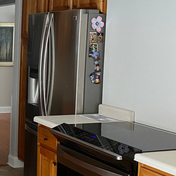
While the kitchen footprint did not change, new white DuraSupreme cabinets were designed into the space to accommodate modern built-in appliances, including a larger stainless steel refrigerator. This minor adjustment also had a significant impact on improving the visual balance of the kitchen. The new easy-to-clean, marble-inspired quartz on the peninsula now offers plenty of eat-in space for two. The classic white subway tile backsplash and large farmhouse sink anchor the room.
Hardwood flooring used in the dining and living rooms was extended into the kitchen to flow the rooms seamlessly together. The original kitchen window that was cumbersome for one person to operate was replaced with a new easy-to-open window. In addition, to create proper soft general lighting, Sweeney replaced a large fluorescent light fixture with disk lights.

Erin Williamson Design
Eat-in kitchen - mid-sized eclectic galley porcelain tile and beige floor eat-in kitchen idea in Austin with a double-bowl sink, flat-panel cabinets, dark wood cabinets, quartz countertops, stainless steel appliances and no island

The Challenge
When we first met with our clients, they had a number of dislikes about the master bathroom in their seasonal Bonita Springs home. While the space was palatial, it just didn’t function well for them. Furthermore, it didn’t reflect their sense of style. They wanted to update fixtures and finishes with a splash of color and redesign the large, cave-like shower to include additional drainage and ventilation.
Our Solution
Our design team concluded that a complete reconfiguration of the entire master bathroom was the best way to give our clients the functionality and open feel they envisioned.
We removed the cumbersome center island and the built-in Jacuzzi in favor of a new focal point – a freestanding soaker tub – and created a new footprint for the shower. The new curbless double-headed shower design with floor-to-ceiling glass on three sides was guaranteed to provide the openness our clients were looking for. We raised the shower floor to match the main level and ran a large linear drain to move water quickly out of the shower. For the final touch, we installed floating quartz shower seats and his-and-hers niches for extra storage.
In the toilet room, we installed a large double storage cabinet for linens and extra storage. We also installed separate his-and-hers vanities with floating dark wood cabinetry and quartz countertops, accented with stacked stone mosaic tile. We also added floating medicine cabinet mirrors and painted the bathroom walls in the striking blue color our clients selected to compliment the lively hues throughout their home.
The Result
Ultimately, the new layout brought our clients’ vision to life. With vibrant, updated finishes, the updated space was much more suited to their style. Since our clients only reside in Bonita Springs part of the year, we were also able to complete the project while they were away from home. Upon their return, our clients were so thrilled with the results that they sent us this review:
“Their integrity, quality, friendliness, and excellent communication added up to completely satisfied clients …we would definitely – and without question – use Progressive Builders again!”

Remodeled Master Suite includes new Master Spa opening directly into Bedroom via reclaimed wood barn doors with borrowed light from adjacent newly sky-lit corridor. Interior Architecture: HAUS | Architecture + BRUSFO - Construction Management: WERK - Photo: HAUS | Architecture For Modern Lifestyles

Download our free ebook, Creating the Ideal Kitchen. DOWNLOAD NOW
For many, extra time at home during COVID left them wanting more from their homes. Whether you realized the shortcomings of your space or simply wanted to combat boredom, a well-designed and functional home was no longer a want, it became a need. Tina found herself wanting more from her Old Irving Park home and reached out to The Kitchen Studio about adding function to her kitchen to make the most of the available real estate.
At the end of the day, there is nothing better than returning home to a bright and happy space you love. And this kitchen wasn’t that for Tina. Dark and dated, with a palette from the past and features that didn’t make the most of the available square footage, this remodel required vision and a fresh approach to the space. Lead designer, Stephanie Cole’s main design goal was better flow, while adding greater functionality with organized storage, accessible open shelving, and an overall sense of cohesion with the adjoining family room.
The original kitchen featured a large pizza oven, which was rarely used, yet its footprint limited storage space. The nearby pantry had become a catch-all, lacking the organization needed in the home. The initial plan was to keep the pizza oven, but eventually Tina realized she preferred the design possibilities that came from removing this cumbersome feature, with the goal of adding function throughout the upgraded and elevated space. Eliminating the pantry added square footage and length to the kitchen for greater function and more storage. This redesigned space reflects how she lives and uses her home, as well as her love for entertaining.
The kitchen features a classic, clean, and timeless palette. White cabinetry, with brass and bronze finishes, contrasts with rich wood flooring, and lets the large, deep blue island in Woodland’s custom color Harbor – a neutral, yet statement color – draw your eye.
The kitchen was the main priority. In addition to updating and elevating this space, Tina wanted to maximize what her home had to offer. From moving the location of the patio door and eliminating a window to removing an existing closet in the mudroom and the cluttered pantry, the kitchen footprint grew. Once the floorplan was set, it was time to bring cohesion to her home, creating connection between the kitchen and surrounding spaces.
The color palette carries into the mudroom, where we added beautiful new cabinetry, practical bench seating, and accessible hooks, perfect for guests and everyday living. The nearby bar continues the aesthetic, with stunning Carrara marble subway tile, hints of brass and bronze, and a design that further captures the vibe of the kitchen.
Every home has its unique design challenges. But with a fresh perspective and a bit of creativity, there is always a way to give the client exactly what they want [and need]. In this particular kitchen, the existing soffits and high slanted ceilings added a layer of complexity to the lighting layout and upper perimeter cabinets.
While a space needs to look good, it also needs to function well. This meant making the most of the height of the room and accounting for the varied ceiling features, while also giving Tina everything she wanted and more. Pendants and task lighting paired with an abundance of natural light amplify the bright aesthetic. The cabinetry layout and design compliments the soffits with subtle profile details that bring everything together. The tile selections add visual interest, drawing the eye to the focal area above the range. Glass-doored cabinets further customize the space and give the illusion of even more height within the room.
While her family may be grown and out of the house, Tina was focused on adding function without sacrificing a stunning aesthetic and dreamy finishes that make the kitchen the gathering place of any home. It was time to love her kitchen again, and if you’re wondering what she loves most, it’s the niche with glass door cabinetry and open shelving for display paired with the marble mosaic backsplash over the range and complimenting hood. Each of these features is a stunning point of interest within the kitchen – both brag-worthy additions to a perimeter layout that previously felt limited and lacking.
Whether your remodel is the result of special needs in your home or simply the excitement of focusing your energy on creating a fun new aesthetic, we are here for it. We love a good challenge because there is always a way to make a space better – adding function and beauty simultaneously.

We were hired to transform this small apartment into a tranquil pied-a-terre. Perched atop an historic landmark, the unit features unparalleled views of Manhattan. However, the layout was awkward and the finishes dated. One of the many challenges was staying within the confines of the numerous structural columns and plumbing risers.
A larger foyer was created by removing a cumbersome millwork unit. Folding glass panels open the new kitchen to the view. Two, discrete bathrooms were created from one large one. All mechanical and electrical systems were updated, and each of the windows replaced to meet stringent preservation requirements. A neutral palette for the interiors was chosen to bring a sense of calm to the urban surroundings.
The project was a collaboration between James Dixon Architect PC and Powell & Bonnell Decorators
Photos by John Bessler

Transforming a Master Bathroom
When our clients purchased their beautiful home in South Fort Myers, FL they fell in love with the expansive, sweeping space. It wasn’t long, however, before they realized the master bathroom just didn’t suit their taste. The large walk-in shower was practically cave-like. Consequentially, it completely dwarfed the bathroom. Along with bland colors, outdated finishes, and a dividing wall in the middle of the room, the whole space felt smaller than its ample dimensions implied. There was no question about it – the bathroom needed an update.
Making Room for More
First, we demolished the existing finishes and cut the concrete slab for new underground plumbing. We minimized the imposing shower and moved it to the other side of the room. Moving the shower also allowed for the installation of our Dura Supreme Alectra style cabinetry in cocoa brown. For increased functionality, we created split his-and-hers vanities. Then we added towers to match the cabinets. With interior outlets, the towers added smart storage for bathroom appliances, helping to keep the counters clutter-free. For a finishing touch, we outlined the large mirrors with crown molding trim in a complimentary finish – an essential detail to tie all the cabinetry together.
The Spa
To bring the feel of the spa to this gorgeous home, we installed our luxurious drop-in 72”x42” Kohler Air Massage bathtub. We completely surrounded it with 3cm granite countertops in Delicatus green and added a tub deck with tile backsplashes for a sumptuous ambiance.
Lighting
On either side of the his-and-hers vanity, we installed George Kovach tube sconces. Vertical placement of the sconces provided ample lighting while enhancing the contemporary style of the space. To frame the room, we added a drop ceiling with recessed lighting and outlined the tray ceiling with crown molding to match the rest of the design. To complete the bath remodel, we installed the final element – a stunningly unique 10-light polished chrome chandelier from Maxim lighting.
A Complete Transformation
When we met with our clients, it was instantly clear to us why they were unhappy with their master bathroom. The cave-like shower and cumbersome dividing wall overpowered a room in dire need of a modernizing. Furthermore, with two small children and a busy lifestyle, we could sense our clients not only desired a bathroom renovation, they needed a relaxing retreat.
Ultimately, this project was nothing less than a complete transformation of space. In fact, by the time we had finished, the only original fixtures left were the windows! With beautifully updated finishes and an improved layout, we were able to achieve the functionality our clients craved along with a new, spa-like feel. The end result was nothing short of a haven at home – the perfect spot to recharge at the end of a long day.

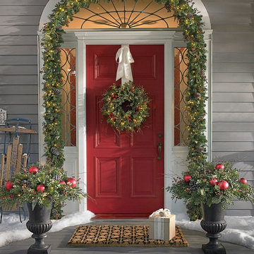
Welcome them home with the wondrous mix of our MacKinley Cordless Greenery Collection. Each lush and life-like arrangement of pine, berries and lightly frosted pinecones is designed to go anywhere, indoors or out. Most every piece is decked with twiggy tendrils and clusters of metallic red ornaments. The best thing about the whole collection: you get to enjoy a pre-lit, professionally decorated look without cumbersome cords. Wreath, urn filler, pathway trees and window swags are accented with red ball ornaments and twiggy tendrils.

We were hired to transform this small apartment into a tranquil pied-a-terre. Perched atop an historic landmark, the unit features unparalleled views of Manhattan. However, the layout was awkward and the finishes dated. One of the many challenges was staying within the confines of the numerous structural columns and plumbing risers.
A larger foyer was created by removing a cumbersome millwork unit. Folding glass panels open the new kitchen to the view. Two, discrete bathrooms were created from one large one. All mechanical and electrical systems were updated, and each of the windows replaced to meet stringent preservation requirements. A neutral palette for the interiors was chosen to bring a sense of calm to the urban surroundings.
The project was a collaboration between James Dixon Architect PC and Powell & Bonnell Decorators
Photos by John Bessler

We were hired to transform this small apartment into a tranquil pied-a-terre. Perched atop an historic landmark, the unit features unparalleled views of Manhattan. However, the layout was awkward and the finishes dated. One of the many challenges was staying within the confines of the numerous structural columns and plumbing risers.
A larger foyer was created by removing a cumbersome millwork unit. Folding glass panels open the new kitchen to the view. Two, discrete bathrooms were created from one large one. All mechanical and electrical systems were updated, and each of the windows replaced to meet stringent preservation requirements. A neutral palette for the interiors was chosen to bring a sense of calm to the urban surroundings.
The project was a collaboration between James Dixon Architect PC and Powell & Bonnell Decorators
Photos by John Bessler

Inspiration for a mid-sized modern master medium tone wood floor and brown floor bedroom remodel in Louisville with gray walls, a standard fireplace and a wood fireplace surround
4