
Search results for "Decide sheet s" in Home Design Ideas

 TKS Design Group
Free ebook, Creating the Ideal Kitchen. DOWNLOAD NOW
Our clients had been in their home since the early 1980’s and decided it was time for some updates. We took on the kitchen, two bathrooms and a powder room.
The layout in the kitchen was functional for them, so we kept that pretty much as is. Our client wanted a contemporary-leaning transitional look — nice clean lines with a gray and white palette. Light gray cabinets with a slightly darker gray subway tile keep the northern exposure light and airy. They also purchased some new furniture for their breakfast room and adjoining family room, so the whole space looks completely styled and new. The light fixtures are staggered and give a nice rhythm to the otherwise serene feel.
The homeowners were not 100% sold on the flooring choice for little powder room off the kitchen when I first showed it, but now they think it is one of the most interesting features of the design. I always try to “push” my clients a little bit because that’s when things can get really fun and this is what you are paying for after all, ideas that you may not come up with on your own.
We also worked on the two upstairs bathrooms. We started first on the hall bath which was basically just in need of a face lift. The floor is porcelain tile made to look like carrera marble. The vanity is white Shaker doors fitted with a white quartz top. We re-glazed the cast iron tub.
The master bath was a tub to shower conversion. We used a wood look porcelain plank on the main floor along with a Kohler Tailored vanity. The custom shower has a barn door shower door, and vinyl wallpaper in the sink area gives a rich textured look to the space. Overall, it’s a pretty sophisticated look for its smaller fooprint.
Designed by: Susan Klimala, CKD, CBD
Photography by: Michael Alan Kaskel
For more information on kitchen and bath design ideas go to: www.kitchenstudio-ge.com

 KZ Design, LLC
Open concept kitchen - rustic open concept kitchen idea in New York with raised-panel cabinets, dark wood cabinets, black appliances and an island

 place architecture:design
Tom Holdsworth Photography
Our clients wanted to create a room that would bring them closer to the outdoors; a room filled with natural lighting; and a venue to spotlight a modern fireplace.
Early in the design process, our clients wanted to replace their existing, outdated, and rundown screen porch, but instead decided to build an all-season sun room. The space was intended as a quiet place to read, relax, and enjoy the view.
The sunroom addition extends from the existing house and is nestled into its heavily wooded surroundings. The roof of the new structure reaches toward the sky, enabling additional light and views.
The floor-to-ceiling magnum double-hung windows with transoms, occupy the rear and side-walls. The original brick, on the fourth wall remains exposed; and provides a perfect complement to the French doors that open to the dining room and create an optimum configuration for cross-ventilation.
To continue the design philosophy for this addition place seamlessly merged natural finishes from the interior to the exterior. The Brazilian black slate, on the sunroom floor, extends to the outdoor terrace; and the stained tongue and groove, installed on the ceiling, continues through to the exterior soffit.
The room's main attraction is the suspended metal fireplace; an authentic wood-burning heat source. Its shape is a modern orb with a commanding presence. Positioned at the center of the room, toward the rear, the orb adds to the majestic interior-exterior experience.
This is the client's third project with place architecture: design. Each endeavor has been a wonderful collaboration to successfully bring this 1960s ranch-house into twenty-first century living.
Find the right local pro for your project
 Darci Hether
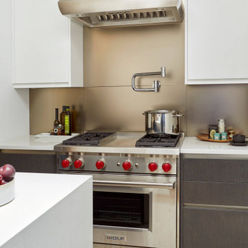
We completely gut renovated this pre-war Tribeca apartment but kept some of it's charm and history in tact! The building, which was built in the early 1900's, was home to different executive office operations and the original hallways had a beautiful and intricate mosaic floor pattern. To that point we decided to preserve the existing mosaic flooring and incorporate it into the new design. The open concept kitchen with cantilevered dining table top keeps the area feeling light and bright, casual and not stuffy. Additionally, the custom designed swing arm pendant light helps marry the dining table top area to that of the island.

 Moderne Builders
Gorgeous master bath with dramatic retro "wave" tile. Peak Photography
Example of a 1950s bathroom design in Los Angeles
Example of a 1950s bathroom design in Los Angeles

 Drewett Works
The genesis of design for this desert retreat was the informal dining area in which the clients, along with family and friends, would gather.
Located in north Scottsdale’s prestigious Silverleaf, this ranch hacienda offers 6,500 square feet of gracious hospitality for family and friends. Focused around the informal dining area, the home’s living spaces, both indoor and outdoor, offer warmth of materials and proximity for expansion of the casual dining space that the owners envisioned for hosting gatherings to include their two grown children, parents, and many friends.
The kitchen, adjacent to the informal dining, serves as the functioning heart of the home and is open to the great room, informal dining room, and office, and is mere steps away from the outdoor patio lounge and poolside guest casita. Additionally, the main house master suite enjoys spectacular vistas of the adjacent McDowell mountains and distant Phoenix city lights.
The clients, who desired ample guest quarters for their visiting adult children, decided on a detached guest casita featuring two bedroom suites, a living area, and a small kitchen. The guest casita’s spectacular bedroom mountain views are surpassed only by the living area views of distant mountains seen beyond the spectacular pool and outdoor living spaces.
Project Details | Desert Retreat, Silverleaf – Scottsdale, AZ
Architect: C.P. Drewett, AIA, NCARB; Drewett Works, Scottsdale, AZ
Builder: Sonora West Development, Scottsdale, AZ
Photographer: Dino Tonn
Featured in Phoenix Home and Garden, May 2015, “Sporting Style: Golf Enthusiast Christie Austin Earns Top Scores on the Home Front”
See more of this project here: http://drewettworks.com/desert-retreat-at-silverleaf/
 TKS Design Group
Download our free ebook, Creating the Ideal Kitchen. DOWNLOAD NOW
Lakefront property in the northwest suburbs of Chicago is hard to come by, so when we were hired by this young family with exactly that, we were immediately inspired by not just the unusually large footprint of this 1950’s colonial revival but also the lovely views of the manmade lake it was sited on. The large 5-bedroom home was solidly stuck in the 1980’s, but we saw tons of potential. We started out by updating the existing staircase with a fresh coat of paint and adding new herringbone slate to the entry hall.
The powder room off the entryway also got a refresh - new flooring, new cabinets and fixtures. We ran the new slate right through into this space for some consistency. A fun wallpaper and shiplap trim add a welcoming feel and set the tone for the home.
Next, we tackled the kitchen. Located away from the rest of the first floor, the kitchen felt a little isolated, so we immediately began planning for how to better connect it to the rest of the first floor. We landed on removing the wall between the kitchen and dining room and designed a modified galley style space with separate cooking and clean up zones. The cooking zone consists of the refrigerator, prep sink and cooktop, along with a nice long run of prep space at the island. The cleanup side of the kitchen consists of the main sink and dishwasher. Both areas are situated so that the user can view the lake during prep work and cleanup!
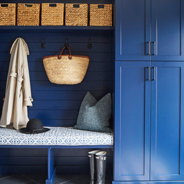
One of the home’s main puzzles was how to incorporate the mudroom and area in front of the patio doors at the back of the house. We already had a breakfast table area, so the space by the patio doors was a bit of a no man’s land. We decided to separate the kitchen proper from what became the new mudroom with a large set of barn doors. That way you can quickly hide any mudroom messes but have easy access to the light coming in through the patio doors as well as the outdoor grilling station. We also love the impact the barn doors add to the overall space.
The homeowners’ first words to us were “it’s time to ditch the brown,” so we did! We chose a lovely blue pallet that reflects the home’s location on the lake which is also vibrant yet easy on the eye. Countertops are white quartz, and the natural oak floor works well with the other honey accents. The breakfast table was given a refresh with new chairs, chandelier and window treatments that frame the gorgeous views of the lake out the back.
We coordinated the slate mudroom flooring with that used in the home’s main entrance for a consistent feel. The storage area consists of open and closed storage to allow for some clutter control as needed.
Next on our “to do” list was revamping the dated brown bar area in the neighboring dining room. We eliminated the clutter by adding some closed cabinets and did some easy updates to help the space feel more current. One snag we ran into here was the discovery of a beam above the existing open shelving that had to be modified with a smaller structural beam to allow for our new design to work. This was an unexpected surprise, but in the end we think it was well worth it!
We kept the colors here a bit more muted to blend with the homeowner’s existing furnishings. Open shelving and polished nickel hardware add some simple detail to the new entertainment zone which also looks out onto the lake!
Next we tackled the upstairs starting with the homeowner’s son’s bath. The bath originally had both a tub shower and a separate shower, so we decided to swap out the shower for a new laundry area. This freed up some space downstairs in what used to be the mudroom/laundry room and is much more convenient for daily laundry needs.
We continued the blue palette here with navy cabinetry and the navy tile in the shower. Porcelain floor tile and chrome fixtures keep maintenance to a minimum while matte black mirrors and lighting add some depth the design. A low maintenance runner adds some warmth underfoot and ties the whole space together.
We added a pocket door to the bathroom to minimize interference with the door swings. The left door of the laundry closet is on a 180 degree hinge to allow for easy full access to the machines. Next we tackled the master bath which is an en suite arrangement. The original was typical of the 1980’s with the vanity outside of the bathroom, situated near the master closet. And the brown theme continued here with multiple shades of brown.
Our first move was to segment off the bath and the closet from the master bedroom. We created a short hall from the bedroom to the bathroom with his and hers walk-in closets on the left and right as well as a separate toilet closet outside of the main bathroom for privacy and flexibility.
The original bathroom had a giant soaking tub with steps (dangerous!) as well as a small shower that did not work well for our homeowner who is 6’3”. With other bathtubs in the home, they decided to eliminate the tub and create an oversized shower which takes up the space where the old tub was located. The double vanity is on the opposite wall and a bench is located under the window for morning conversations and a place to set a couple of towels.
The pallet in here is light and airy with a mix of blond wood, creamy porcelain and marble tile, and brass accents. A simple roman shade adds some texture and it’s top-down mechanism allows for light and privacy.
This large whole house remodel gave our homeowners not only the ability to maximize the potential of their home but also created a lovely new frame from which to view their fabulous lake views.
Designed by: Susan Klimala, CKD, CBD
Photography by: Michael Kaskel
For more information on kitchen and bath design ideas go to: www.kitchenstudio-ge.com



 Coco Maison Design
We planned a thoughtful redesign of this beautiful home while retaining many of the existing features. We wanted this house to feel the immediacy of its environment. So we carried the exterior front entry style into the interiors, too, as a way to bring the beautiful outdoors in. In addition, we added patios to all the bedrooms to make them feel much bigger. Luckily for us, our temperate California climate makes it possible for the patios to be used consistently throughout the year.
The original kitchen design did not have exposed beams, but we decided to replicate the motif of the 30" living room beams in the kitchen as well, making it one of our favorite details of the house. To make the kitchen more functional, we added a second island allowing us to separate kitchen tasks. The sink island works as a food prep area, and the bar island is for mail, crafts, and quick snacks.
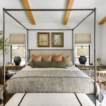
We designed the primary bedroom as a relaxation sanctuary – something we highly recommend to all parents. It features some of our favorite things: a cognac leather reading chair next to a fireplace, Scottish plaid fabrics, a vegetable dye rug, art from our favorite cities, and goofy portraits of the kids.
---
Project designed by Courtney Thomas Design in La Cañada. Serving Pasadena, Glendale, Monrovia, San Marino, Sierra Madre, South Pasadena, and Altadena.
For more about Courtney Thomas Design, see here: https://www.courtneythomasdesign.com/
To learn more about this project, see here:
https://www.courtneythomasdesign.com/portfolio/functional-ranch-house-design/

 Crown Point Cabinetry
This custom Arts & Crafts Crown Point Cabinetry kitchen and bar area features, Quartersawn White Oak with a Washington Cherry stained finish. The Island and custom Range Hood both feature, Bee’s Wax over Eco Brown stain and Burnished over Maple. The kitchen and bar area cabinetry have a Craftsman style door with Black Walnut pegs, while the island presents an Old Cupboard door style that blends seamlessly. Additionally, the doors and drawers also feature a soft close element. Photo by Crown Point Cabinetry


 KitchenLab Interiors
’ first, entirely new construction project in collaboration with GTH architects who designed the residence. KLI was responsible for all interior finishes, fixtures, furnishings, and design including the stairs, casework, interior doors, moldings and millwork. KLI also worked with the client on selecting the roof, exterior stucco and paint colors, stone, windows, and doors. The homeowners had purchased the existing home on a lakefront lot of the Valley Lo community in Glenview, thinking that it would be a gut renovation, but when they discovered a host of issues including mold, they decided to tear it down and start from scratch. The minute you look out the living room windows, you feel as though you're on a lakeside vacation in Wisconsin or Michigan. We wanted to help the homeowners achieve this feeling throughout the house - merging the causal vibe of a vacation home with the elegance desired for a primary residence. This project is unique and personal in many ways - Rebekah and the homeowner, Lorie, had grown up together in a small suburb of Columbus, Ohio. Lorie had been Rebekah's babysitter and was like an older sister growing up. They were both heavily influenced by the style of the late 70's and early 80's boho/hippy meets disco and 80's glam, and both credit their moms for an early interest in anything related to art, design, and style. One of the biggest challenges of doing a new construction project is that it takes so much longer to plan and execute and by the time tile and lighting is installed, you might be bored by the selections of feel like you've seen them everywhere already. “I really tried to pull myself, our team and the client away from the echo-chamber of Pinterest and Instagram. We fell in love with counter stools 3 years ago that I couldn't bring myself to pull the trigger on, thank god, because then they started showing up literally everywhere", Rebekah recalls. Lots of one of a kind vintage rugs and furnishings make the home feel less brand-spanking new. The best projects come from a team slightly outside their comfort zone. One of the funniest things Lorie says to Rebekah, "I gave you everything you wanted", which is pretty hilarious coming from a client to a designer.

Sponsored
Sunbury, OH

J.Holderby - Renovations
Franklin County's Leading General Contractors - 2X Best of Houzz!

 Bob Lancaster Designs
Sheet metal stretches across the ceiling to give a dramatic connector from one side of the room to the other. The client added a wooden vintage phone booth that was taken from her father’s drug store.

 Michael Nash Design, Build & Homes
2011 NARI CAPITAL COTY GRAND AWARD WINNER
Having a small 10’ x 12’ kitchen tucked in the back corner of their home wasn’t working for this this young and growing family. Its cramped layout didn’t allow for a breakfast area and storage space was non-existent, both major issues for their busy day-to-day lifestyle. After consulting with Michael Nash Design, Build & Homes, they decided to build a 300 square foot addition onto the back of this 1960’s vintage split level.
The planned addition expanded and updated the home’s kitchen via a contemporary design, added plenty of storage and provided a much needed breakfast seating area. More importantly, it created a great place for the family to gather.
The new kitchen contains a 48” professional-grade range and a large built-in refrigerator, as well as lots of cabinetry and counter space to meet client’s storage needs. Use of lighter shaker style custom painted cabinetry with honed black counter tops has lightened the space tremendously. A large island with distress black cherry cabinetry ans a mahogany countertop was installed and has become the focal point of the kitchen.
By removing a partition that previously separated the kitchen from the dining room, the new design has created a wide open floor plan. The casual dining room flows right into a casual seating area with a corner fireplace. French doors open onto a large new deck.
Best of all, the addition lets the family spend time together before, during and after mean preparation. It’s truly become the hearth of the home.

Small trendy gray tile and ceramic tile ceramic tile alcove bathtub photo in San Francisco with an undermount sink, flat-panel cabinets, medium tone wood cabinets, quartz countertops, a two-piece toilet and white walls

 Décor Aid
“Immediately upon seeing the space, I knew that we needed to create a narrative that allowed the design to control how you moved through the space,” reports Kimberly, senior interior designer.
After surveying each room and learning a bit more about their personal style, we started with the living room remodel. It was clear that the couple wanted to infuse mid-century modern into the design plan. Sourcing the Room & Board Jasper Sofa with its narrow arms and tapered legs, it offered the mid-century look, with the modern comfort the clients are used to. Velvet accent pillows from West Elm and Crate & Barrel add pops of colors but also a subtle touch of luxury, while framed pictures from the couple’s honeymoon personalize the space.
Moving to the dining room next, Kimberly decided to add a blue accent wall to emphasize the Horchow two piece Percussion framed art that was to be the focal point of the dining area. The Seno sideboard from Article perfectly accentuated the mid-century style the clients loved while providing much-needed storage space. The palette used throughout both rooms were very New York style, grays, blues, beiges, and whites, to add depth, Kimberly sourced decorative pieces in a mixture of different metals.
“The artwork above their bureau in the bedroom is photographs that her father took,”
Moving into the bedroom renovation, our designer made sure to continue to stick to the client’s style preference while once again creating a personalized, warm and comforting space by including the photographs taken by the client’s father. The Avery bed added texture and complimented the other colors in the room, while a hidden drawer at the foot pulls out for attached storage, which thrilled the clients. A deco-inspired Faceted mirror from West Elm was a perfect addition to the bedroom due to the illusion of space it provides. The result was a bedroom that was full of mid-century design, personality, and area so they can freely move around.
The project resulted in the form of a layered mid-century modern design with touches of luxury but a space that can not only be lived in but serves as an extension of the people who live there. Our designer was able to take a very narrowly shaped Manhattan apartment and revamp it into a spacious home that is great for sophisticated entertaining or comfortably lazy nights in.
Sponsored
Sunbury, OH
J.Holderby - Renovations
Franklin County's Leading General Contractors - 2X Best of Houzz!

 Control4
Striking high-tech kitchen features contemporary furnishings and smart home automation from Control4 to enhance the ambiance and add the ultimate in convenience. Broadcast the music of your choice using a whole-home audio solution, powered by Control4. The recessed smart lighting and access lighting is designed to create the perfect personalized ambiance. Other automation options may include smart appliances, programmable thermostat control for comfort and energy management, home security system integration, and full A/V control. And everything can be controlled from virtually anywhere - using your Control4 app with a smart phone or tablet device or a convenient touch screen.

 Coats Homes
Mid-sized trendy enclosed light wood floor and beige floor family room photo in Dallas with white walls, no fireplace and no tv

 BCN Homes
Hallway - contemporary light wood floor and gray floor hallway idea in DC Metro with white walls
131