
Search results for "Departure" in Home Design Ideas
 Artisan Builders LLC
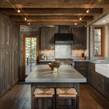
Example of a mid-sized mountain style l-shaped dark wood floor and brown floor enclosed kitchen design in Denver with a farmhouse sink, shaker cabinets, dark wood cabinets, stainless steel appliances, an island, gray countertops and concrete countertops
 Schwake Stone Ltd., LLC
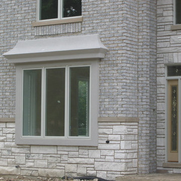
Stone serves as the base of the home then repeats as an architectural eyebrow crowning the front door. Grey wood trim and stone banding stand apart from the masonry as a smooth textural departure. Repeating stone blocks complete the stonework composition.

Find the right local pro for your project

 The Firefly Garden
Add a little spice to your home with our Mad Haberdashery wreath. This playful departure from traditional evergreen decor, featuring blue and iridescent peacock feathers with blueberry accents, brings a flirtatious charm to any setting.
 Ann Lowengart Interiors
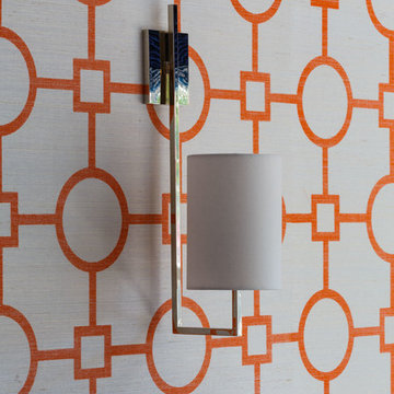
Phillip Jeffries’ Union Square wallpaper in orange on a white manila hemp plays off of the homeowners’ fun and playful attitude. A bold departure from the original plain white walls, it imbues the media room with character and charm.
 Dana King Design Build Remodeling
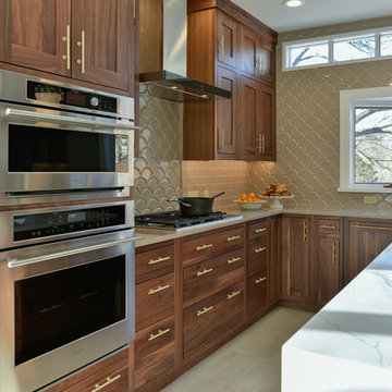
Gorgeous kitchen with midcentury touches.
Kitchen - large transitional u-shaped kitchen idea in St Louis with shaker cabinets, medium tone wood cabinets, marble countertops, gray backsplash, stainless steel appliances, an island and an undermount sink
Kitchen - large transitional u-shaped kitchen idea in St Louis with shaker cabinets, medium tone wood cabinets, marble countertops, gray backsplash, stainless steel appliances, an island and an undermount sink
 Art Van Furniture
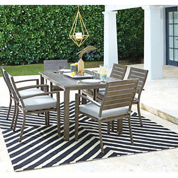
Contemporary homes don’t have to take a departure in style when it comes to designing the patio. This sleek dining set features slat-style chairs and table that look modern, with cushions that provide a sense of comfort. The bold patterned rug gives the area a sense of energy, creating the perfect setting for morning coffee or an afternoon barbecue.
Like this look? Grab it by clicking here.
 Secret Gardens
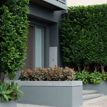
Secret Gardens is regularly presented with new and challenging designs. This warehouse renovation required a complete overhaul of the internal warehouse courtyard and front entrance. Previous renovations had ‘domesticated’ the building, a poor departure from its warehouse origins. The front was given a sophisticated finish with balconies added onto bedrooms and large garage and entrance doors created with a bronze/copper finish. The internal courtyard pool was modernised, BBQ and cabinetry added and the finishing touches of plants added in pots and hanging from the beams to bring greenery to this industrial space. The end result has enhanced the warehouse appeal with a modern touch.
 TKS Design Group
Free ebook, Creating the Ideal Kitchen. DOWNLOAD NOW
One of my favorite things to work on is older homes with a bit of history because I find it an interesting challenge to marry the historical architectural features of a home with modern design elements that work well for my client’s current lifestyle.
This home was particularly fun because it was the second kitchen we had done for this family and was quite a departure from the style of the first kitchen.
The before shot of the kitchen shows a view from the family room. See the dropped ceiling? We were curious, was this just part of the design or was the dropped ceiling there to hide mechanicals? Well we soon found out that it was mostly decorative (yay!), and with the exception of a little bit of work to some plumbing from an upstairs bathroom and rerouting of the ventilation system within the original floor joists, we were in the clear, phew! The shot of the completed kitchen from roughly the same vantage point shows how much taller the ceilings are. It makes a huge difference in the feel of the space. Dark and gloomy turned fresh and light!
Another serious consideration was what do we do with the skinny transom window above the refrigerator. After much back and forth, we decided to eliminate it and do some open shelving instead. This ended up being one of the nicest areas in the room. I am calling it the “fun zone” because it houses all the barware, wine cubbies and a bar fridge — the perfect little buffet spot for entertaining. It is flanked on either side by pull out pantries that I’m sure will get a ton of use. Since the neighboring room has literally three walls of almost full height windows, the kitchen gets plenty of light.
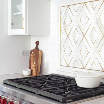
The gold shelving brackets, large pendant fixtures over the island and the tile mural behind the range all pay subtle homage to the home’s prairie style architecture and bring a bit of sparkle to the room.
Even though the room is quite large, the work triangle is very tight with the large Subzero fridge, sink and range all nearby for easy maneuvering during meal prep. There is seating for four at the island, and work aisles are generous.
Designed by: Susan Klimala, CKD, CBD
Photography by: LOMA Studios
For more information on kitchen and bath design ideas go to: www.kitchenstudio-ge.com
 American Home Improvement Inc.
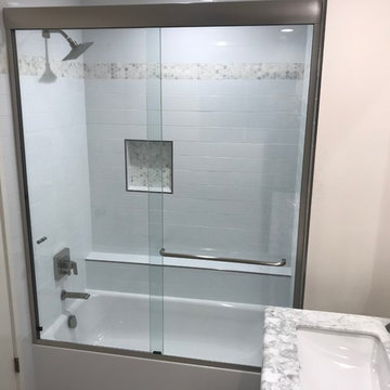
Lighter and earthier colors have been the trend in home design for the last 10 years, A departure from the darker tones that were used in the early 2000s.
This bathroom uses different tones of gray shown in the marble countertop and mosaic accent in the shower area. The brushed nickel fixtures add a contemporary touch to the the design.
Shown in this photo is a framed sliding shower door with the same brushed nickel finish.
 User
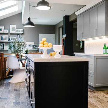
UserRustic flooring provides a chic departure from all of the other more polished surfaces.
Photographer: Melanie Duerkopp
Mid-sized trendy u-shaped laminate floor and brown floor eat-in kitchen photo in San Francisco with a farmhouse sink, shaker cabinets, gray cabinets, quartz countertops, white backsplash, ceramic backsplash, stainless steel appliances and an island
Mid-sized trendy u-shaped laminate floor and brown floor eat-in kitchen photo in San Francisco with a farmhouse sink, shaker cabinets, gray cabinets, quartz countertops, white backsplash, ceramic backsplash, stainless steel appliances and an island
 Venetian Stairs
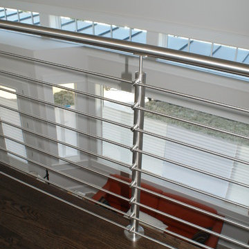
A bit of a departure from form for the Vertheen residence. Here, we installed new 1-2/3” 304 stainless steel railings and newel posts. The stainless posts are accompanied by our horizontal round bar and our 1-2/3” wall stainless steel wall rail. The over all effect – sleek and stylish.
 Urbanology Designs
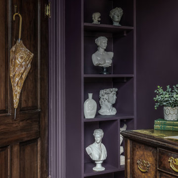
A teenage girl's room thats a departure from the ordinary. This space was meticulously crafted to capture her love for music, museums, literature, and moments of quiet contemplation. Our design journey took us on a quest to create a space that not only exudes a moody atmosphere but also serves as a haven for relaxation, study, and cherished gatherings with friends.
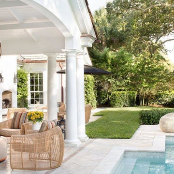
 Weaver Design Group
“The owners liked warmer tones,
something unexpected that was
a departure from South Florida’s
quintessential pinks and greens.”
- Amy Weaver
Photography:
Jessica Klewicki Glynn
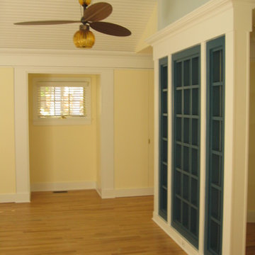
 Kevin Mason, Architect
THE FINAL SHOWING: the last screen in the series is freestanding in the master bedroom.
FOLDING WALL PANELS flanking the small window niche open to reveal 8-foot-tall closets.
A HIGHLY DECORATIVE CEILING FAN is a departure for me. I found it on the internet and my client fell in love with the amber glass forms.
 The Firefly Garden
Add a little spice to your home with our Mad Haberdashery wreath. This playful departure from traditional evergreen decor, featuring blue and iridescent peacock feathers with blueberry accents, brings a flirtatious charm to any setting.
 Venetian Stairs
A bit of a departure from form for the Vertheen residence. Here, we installed new 1-2/3” 304 stainless steel railings and newel posts. The stainless posts are accompanied by our horizontal round bar and our 1-2/3” wall stainless steel wall rail. The over all effect – sleek and stylish.
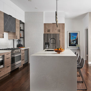
 avenue design inc
Example of a mid-sized minimalist single-wall medium tone wood floor and brown floor open concept kitchen design in Toronto with an undermount sink, flat-panel cabinets, light wood cabinets, quartz countertops, white backsplash, porcelain backsplash, stainless steel appliances, an island and white countertops
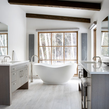
 The Callicrate Company
Example of a mountain style master beige floor freestanding bathtub design in Denver with flat-panel cabinets, gray cabinets, white walls, an undermount sink and white countertops
 Simply Home Decorating
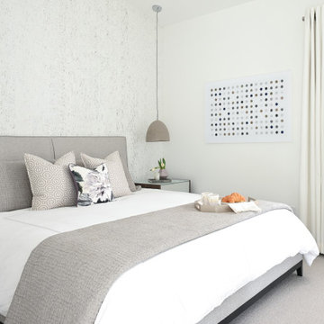
This 1990's home, located in North Vancouver's Lynn Valley neighbourhood, had high ceilings and a great open plan layout but the decor was straight out of the 90's complete with sponge painted walls in dark earth tones. The owners, a young professional couple, enlisted our help to take it from dated and dreary to modern and bright. We started by removing details like chair rails and crown mouldings, that did not suit the modern architectural lines of the home. We replaced the heavily worn wood floors with a new high end, light coloured, wood-look laminate that will withstand the wear and tear from their two energetic golden retrievers. Since the main living space is completely open plan it was important that we work with simple consistent finishes for a clean modern look. The all white kitchen features flat doors with minimal hardware and a solid surface marble-look countertop and backsplash. We modernized all of the lighting and updated the bathrooms and master bedroom as well. The only departure from our clean modern scheme is found in the dressing room where the client was looking for a more dressed up feminine feel but we kept a thread of grey consistent even in this more vivid colour scheme. This transformation, featuring the clients' gorgeous original artwork and new custom designed furnishings is admittedly one of our favourite projects to date!
32