
Search results for "Dividing" in Home Design Ideas

 Beth Dotolo, ASID, RID, NCIDQ
Stephen Karlisch // This lakeside home was completely refurbished inside and out to accommodate 16 guests in a stylish, hotel-like setting. Owned by a long-time client of Pulp, this home reflects the owner's personal style -- well-traveled and eclectic -- while also serving as a landing pad for her large family. With spa-like guest bathrooms equipped with robes and lotions, guest bedrooms with multiple beds and high-quality comforters, and a party deck with a bar/entertaining area, this is the ultimate getaway.

 Faure Halvorsen Architects
Bathroom - mid-sized rustic master dark wood floor and brown floor bathroom idea with an undermount sink, gray walls, flat-panel cabinets, light wood cabinets, marble countertops and white countertops

 Alicia Roche Interiors
Brooklyn backyard patio design in Prospect Heights for a young, professional couple who loves to both entertain and relax! This space includes a West Elm outdoor sectional and round concrete outdoor coffee table.
Find the right local pro for your project


 Mark P. Finlay Architects, AIA
Photo Credit: Michael Partenio
Inspiration for a mid-sized country u-shaped medium tone wood floor eat-in kitchen remodel in New York with beaded inset cabinets, granite countertops, white backsplash, ceramic backsplash, stainless steel appliances, an island and green cabinets
Inspiration for a mid-sized country u-shaped medium tone wood floor eat-in kitchen remodel in New York with beaded inset cabinets, granite countertops, white backsplash, ceramic backsplash, stainless steel appliances, an island and green cabinets

 W Design Interiors
Scott Hargis
Inspiration for a french country dark wood floor family room remodel in San Francisco with gray walls and a media wall
Inspiration for a french country dark wood floor family room remodel in San Francisco with gray walls and a media wall


 SINGLEPOINT DESIGN BUILD INC.
Large cottage white two-story concrete fiberboard gable roof photo in San Francisco
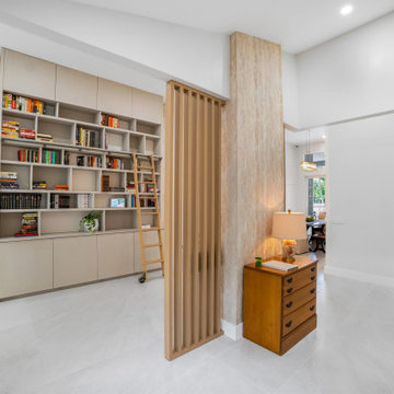
 OC Architectural Woodwork
Tucked into the built-in is a cozy corner designed for productivity and calm. A small desk and vertical slat divider create a semi-private workstation or reading area, surrounded by open shelves. This custom detail blends seamlessly into the cabinetry, perfect for hybrid living in a modern home.

 MODEL DESIGN INC.
Photography by Chipper Hatter
Example of a mid-sized classic u-shaped eat-in kitchen design in Los Angeles with a farmhouse sink, recessed-panel cabinets, white cabinets, marble countertops, gray backsplash, mosaic tile backsplash, colored appliances and an island
Example of a mid-sized classic u-shaped eat-in kitchen design in Los Angeles with a farmhouse sink, recessed-panel cabinets, white cabinets, marble countertops, gray backsplash, mosaic tile backsplash, colored appliances and an island

 Phinney Design Group
Randall Perry Photography
Example of a mid-sized country claw-foot bathtub design in New York with an undermount sink, medium tone wood cabinets and beige walls
Example of a mid-sized country claw-foot bathtub design in New York with an undermount sink, medium tone wood cabinets and beige walls

 RYAN ASSOCIATES GENERAL CONTRACTORS
Matthew Millman
Mid-sized minimalist dark wood floor home yoga studio photo in San Francisco
Mid-sized minimalist dark wood floor home yoga studio photo in San Francisco

 Kitchen & Bath Galleries
Inspiration for a transitional beige floor bathroom remodel in Raleigh with dark wood cabinets and flat-panel cabinets

 User
small shelving pantry with rustic sliding door re-using former barn door from stables
Kitchen pantry - small farmhouse single-wall kitchen pantry idea in San Francisco
Kitchen pantry - small farmhouse single-wall kitchen pantry idea in San Francisco

 TKS Design Group
Download our free ebook, Creating the Ideal Kitchen. DOWNLOAD NOW
The homeowners came to us looking to update the kitchen in their historic 1897 home. The home had gone through an extensive renovation several years earlier that added a master bedroom suite and updates to the front façade. The kitchen however was not part of that update and a prior 1990’s update had left much to be desired. The client is an avid cook, and it was just not very functional for the family.
The original kitchen was very choppy and included a large eat in area that took up more than its fair share of the space. On the wish list was a place where the family could comfortably congregate, that was easy and to cook in, that feels lived in and in check with the rest of the home’s décor. They also wanted a space that was not cluttered and dark – a happy, light and airy room. A small powder room off the space also needed some attention so we set out to include that in the remodel as well.
See that arch in the neighboring dining room? The homeowner really wanted to make the opening to the dining room an arch to match, so we incorporated that into the design.
Another unfortunate eyesore was the state of the ceiling and soffits. Turns out it was just a series of shortcuts from the prior renovation, and we were surprised and delighted that we were easily able to flatten out almost the entire ceiling with a couple of little reworks.
Other changes we made were to add new windows that were appropriate to the new design, which included moving the sink window over slightly to give the work zone more breathing room. We also adjusted the height of the windows in what was previously the eat-in area that were too low for a countertop to work. We tried to keep an old island in the plan since it was a well-loved vintage find, but the tradeoff for the function of the new island was not worth it in the end. We hope the old found a new home, perhaps as a potting table.
Designed by: Susan Klimala, CKD, CBD
Photography by: Michael Kaskel
For more information on kitchen and bath design ideas go to: www.kitchenstudio-ge.com

 Interiors by Maite Granda
Project Feature in: Luxe Magazine & Luxury Living Brickell
From skiing in the Swiss Alps to water sports in Key Biscayne, a relocation for a Chilean couple with three small children was a sea change. “They’re probably the most opposite places in the world,” says the husband about moving
from Switzerland to Miami. The couple fell in love with a tropical modern house in Key Biscayne with architecture by Marta Zubillaga and Juan Jose Zubillaga of Zubillaga Design. The white-stucco home with horizontal planks of red cedar had them at hello due to the open interiors kept bright and airy with limestone and marble plus an abundance of windows. “The light,” the husband says, “is something we loved.”
While in Miami on an overseas trip, the wife met with designer Maite Granda, whose style she had seen and liked online. For their interview, the homeowner brought along a photo book she created that essentially offered a roadmap to their family with profiles, likes, sports, and hobbies to navigate through the design. They immediately clicked, and Granda’s passion for designing children’s rooms was a value-added perk that the mother of three appreciated. “She painted a picture for me of each of the kids,” recalls Granda. “She said, ‘My boy is very creative—always building; he loves Legos. My oldest girl is very artistic— always dressing up in costumes, and she likes to sing. And the little one—we’re still discovering her personality.’”
To read more visit:
https://maitegranda.com/wp-content/uploads/2017/01/LX_MIA11_HOM_Maite_12.compressed.pdf
Rolando Diaz

 FBC Remodel
©Finished Basement Company
Large transitional beige floor home climbing wall photo in Denver with gray walls
Large transitional beige floor home climbing wall photo in Denver with gray walls

 Lake Flato Architects
Casey Dunn
Example of a trendy deck design in Austin with a roof extension and a bbq area
Example of a trendy deck design in Austin with a roof extension and a bbq area

 Klopf Architecture
, Arterra Landscape Architects and Henry Calvert of Calvert Ventures Designed and built a new warm, modern, Eichler-inspired, open, indoor-outdoor home on a deeper-than-usual San Mateo Highlands property where an original Eichler house had burned to the ground.
The owners wanted multi-generational living and larger spaces than the original home offered, but all parties agreed that the house should respect the neighborhood and blend in stylistically with the other Eichlers. At first the Klopf team considered re-using what little was left of the original home and expanding on it. But after discussions with the owner and builder, all parties agreed that the last few remaining elements of the house were not practical to re-use, so Klopf Architecture designed a new home that pushes the Eichler approach in new directions.
One disadvantage of Eichler production homes is that the house designs were not optimized for each specific lot. A new custom home offered the team a chance to start over. In this case, a longer house that opens up sideways to the south fit the lot better than the original square-ish house that used to open to the rear (west). Accordingly, the Klopf team designed an L-shaped “bar” house with a large glass wall with large sliding glass doors that faces sideways instead of to the rear like a typical Eichler. This glass wall opens to a pool and landscaped yard designed by Arterra Landscape Architects.
Driving by the house, one might assume at first glance it is an Eichler because of the horizontality, the overhanging flat roof eaves, the dark gray vertical siding, and orange solid panel front door, but the house is designed for the 21st Century and is not meant to be a “Likeler.” You won't see any posts and beams in this home. Instead, the ceiling decking is a western red cedar that covers over all the beams. Like Eichlers, this cedar runs continuously from inside to out, enhancing the indoor / outdoor feeling of the house, but unlike Eichlers it conceals a cavity for lighting, wiring, and insulation. Ceilings are higher, rooms are larger and more open, the master bathroom is light-filled and more generous, with a separate tub and shower and a separate toilet compartment, and there is plenty of storage. The garage even easily fits two of today's vehicles with room to spare.
A massive 49-foot by 12-foot wall of glass and the continuity of materials from inside to outside enhance the inside-outside living concept, so the owners and their guests can flow freely from house to pool deck to BBQ to pool and back.
During construction in the rough framing stage, Klopf thought the front of the house appeared too tall even though the house had looked right in the design renderings (probably because the house is uphill from the street). So Klopf Architecture paid the framer to change the roofline from how we had designed it to be lower along the front, allowing the home to blend in better with the neighborhood. One project goal was for people driving up the street to pass the home without immediately noticing there is an "imposter" on this lot, and making that change was essential to achieve that goal.
This 2,606 square foot, 3 bedroom, 3 bathroom Eichler-inspired new house is located in San Mateo in the heart of the Silicon Valley.
Klopf Architecture Project Team: John Klopf, AIA, Klara Kevane
Landscape Architect: Arterra Landscape Architects
Contractor: Henry Calvert of Calvert Ventures
Photography ©2016 Mariko Reed
Location: San Mateo, CA
Year completed: 2016


113