
Search results for "Elements consist" in Home Design Ideas
 Marvin
Architect: Blaine Bonadies, Bonadies Architect
Photography By: Jean Allsopp Photography
“Just as described, there is an edgy, irreverent vibe here, but the result has an appropriate stature and seriousness. Love the overscale windows. And the outdoor spaces are so great.”
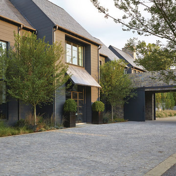
Situated atop an old Civil War battle site, this new residence was conceived for a couple with southern values and a rock-and-roll attitude. The project consists of a house, a pool with a pool house and a renovated music studio. A marriage of modern and traditional design, this project used a combination of California redwood siding, stone and a slate roof with flat-seam lead overhangs. Intimate and well planned, there is no space wasted in this home. The execution of the detail work, such as handmade railings, metal awnings and custom windows jambs, made this project mesmerizing.
Cues from the client and how they use their space helped inspire and develop the initial floor plan, making it live at a human scale but with dramatic elements. Their varying taste then inspired the theme of traditional with an edge. The lines and rhythm of the house were simplified, and then complemented with some key details that made the house a juxtaposition of styles.
The wood Ultimate Casement windows were all standard sizes. However, there was a desire to make the windows have a “deep pocket” look to create a break in the facade and add a dramatic shadow line. Marvin was able to customize the jambs by extruding them to the exterior. They added a very thin exterior profile, which negated the need for exterior casing. The same detail was in the stone veneers and walls, as well as the horizontal siding walls, with no need for any modification. This resulted in a very sleek look.
MARVIN PRODUCTS USED:
Marvin Ultimate Casement Window
 User
UserMichelle Peek Photography
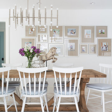
Dining room - mid-sized coastal light wood floor and beige floor dining room idea in Miami with white walls and no fireplace
Dining room - mid-sized coastal light wood floor and beige floor dining room idea in Miami with white walls and no fireplace
 Marvin
Architect: Blaine Bonadies, Bonadies Architect
Photography By: Jean Allsopp Photography
“Just as described, there is an edgy, irreverent vibe here, but the result has an appropriate stature and seriousness. Love the overscale windows. And the outdoor spaces are so great.”
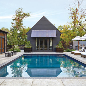
Situated atop an old Civil War battle site, this new residence was conceived for a couple with southern values and a rock-and-roll attitude. The project consists of a house, a pool with a pool house and a renovated music studio. A marriage of modern and traditional design, this project used a combination of California redwood siding, stone and a slate roof with flat-seam lead overhangs. Intimate and well planned, there is no space wasted in this home. The execution of the detail work, such as handmade railings, metal awnings and custom windows jambs, made this project mesmerizing.
Cues from the client and how they use their space helped inspire and develop the initial floor plan, making it live at a human scale but with dramatic elements. Their varying taste then inspired the theme of traditional with an edge. The lines and rhythm of the house were simplified, and then complemented with some key details that made the house a juxtaposition of styles.
The wood Ultimate Casement windows were all standard sizes. However, there was a desire to make the windows have a “deep pocket” look to create a break in the facade and add a dramatic shadow line. Marvin was able to customize the jambs by extruding them to the exterior. They added a very thin exterior profile, which negated the need for exterior casing. The same detail was in the stone veneers and walls, as well as the horizontal siding walls, with no need for any modification. This resulted in a very sleek look.
MARVIN PRODUCTS USED:
Marvin Ultimate Casement Window
Find the right local pro for your project
 Marvin
Architect: Blaine Bonadies, Bonadies Architect
Photography By: Jean Allsopp Photography
“Just as described, there is an edgy, irreverent vibe here, but the result has an appropriate stature and seriousness. Love the overscale windows. And the outdoor spaces are so great.”
Situated atop an old Civil War battle site, this new residence was conceived for a couple with southern values and a rock-and-roll attitude. The project consists of a house, a pool with a pool house and a renovated music studio. A marriage of modern and traditional design, this project used a combination of California redwood siding, stone and a slate roof with flat-seam lead overhangs. Intimate and well planned, there is no space wasted in this home. The execution of the detail work, such as handmade railings, metal awnings and custom windows jambs, made this project mesmerizing.
Cues from the client and how they use their space helped inspire and develop the initial floor plan, making it live at a human scale but with dramatic elements. Their varying taste then inspired the theme of traditional with an edge. The lines and rhythm of the house were simplified, and then complemented with some key details that made the house a juxtaposition of styles.
The wood Ultimate Casement windows were all standard sizes. However, there was a desire to make the windows have a “deep pocket” look to create a break in the facade and add a dramatic shadow line. Marvin was able to customize the jambs by extruding them to the exterior. They added a very thin exterior profile, which negated the need for exterior casing. The same detail was in the stone veneers and walls, as well as the horizontal siding walls, with no need for any modification. This resulted in a very sleek look.
MARVIN PRODUCTS USED:
Marvin Ultimate Casement Window
 Neubauer Ennis Architects
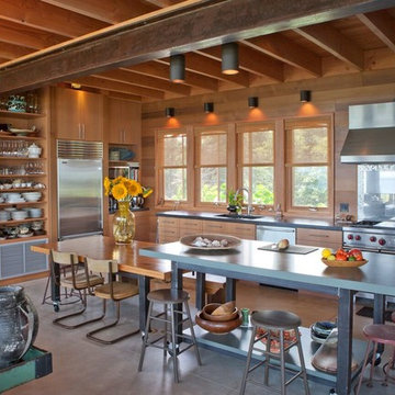
Eat-in kitchen - large coastal l-shaped concrete floor eat-in kitchen idea in Boston with light wood cabinets, stainless steel appliances, an undermount sink, open cabinets, glass sheet backsplash and an island
 Aardvark Architecture
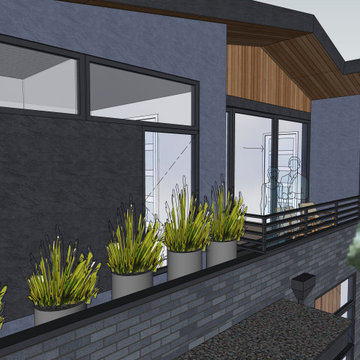
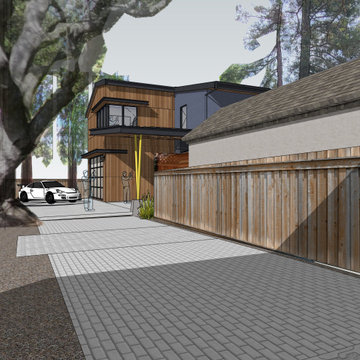
This proposal is for a new two-story home on the vacant heavily wooded lot with an existing 150-foot-long driveway lined by several beautiful oak trees culminating in a behemoth 43-inch oak tree where the driveway meets the main lot. The far end of the driveway terminates in a grove of three 43/40/43-inch redwoods and at the very center of the vacant lot stands a gargantuan V-twin 59-inch redwood tree paired with a “small” 29-inch redwood tree. The owners want to build a beautiful contemporary-styled home for their family that fully enjoys and embraces the mature trees on their cozy 65-foot by 100-foot lot.
As with all small, constrained lots, this project’s site design started first with meeting the relatively large parking and car maneuvering requirements. Menlo Park’s Department of Transportation typically requires side-facing garages to have 24-feet of backup space. So that they could give the largest feature redwood tree on site an added four feet (50%) of clearance outside of its critical root zone, the owners agreed to install a vehicle turntable at the end of their driveway to eliminate the extra four feet of space needed to back up and turnaround. This allowed them to pull their garage forward an additional four feet towards the front property line on the panhandle side, drastically reducing the rest of the home’s impact on the gargantuan V-Twin paired redwood tree at the center of the lot.
One of the owners has mobility issues, and accordingly, they first sought to design a one-story floor plan that incorporated all their family’s needs including plenty of covered patio and deck space to enjoy our fantastic California weather. But that single-story footprint spread too far into the critical root zones of several of the redwood trees on site, even despite the use of the vehicle turntable. During my interview process with the owners, they made it clear to me that one of their primary concerns is ensuring that the largest trees on site would thrive and become features of their new home after construction is complete. The single-story designs that removed the grove of three huge redwood trees were non-starters, as was the skimpy 5x10 master bath I designed when trying to squeeze the whole house program into an overly compromised single-story design. It was therefore deemed necessary to go with a two-story design despite the owner’s mobility issues. This two-story design has a much more compact ground floor footprint and has no bedrooms downstairs, other than the detached ADU. The owners must give up the floor area and incur the costs to install a residential elevator to access their upstairs master suite.
Our ground floor footprint is smaller due to the two-story design decision, and our foundation is pulled away from the trees thanks to the vehicle turntable. Yet, a tiny portion of the home’s ground floor footprint still encroaches into the critical root zones of the largest 59” redwood tree. Therefore, as outlined in the Arborist Report prepared by Aesculus Arboricultural Consulting, the structural engineers are incorporating an array of drilled piers and shallow-grade beams for the main home’s foundation and deck area nearest the redwood’s critical root zone. This drilled piers and grade beam foundation is a type of “bridging” foundation as outlined in Aesculus’ report to preserve the health of these trees that the property was designed around. The rest of the foundation will be constructed as an insulated slab-on-grade foundation to minimize the number of steps and ramps needed for the owners to enjoy their home and patio areas.
Despite the owner’s desire to keep as many trees as possible on site, and despite the smaller ground floor footprint and the advantage of the vehicle turntable, the need for a 20x20-foot garage and 20x20/25-foot guest parking space on our panhandle lot requires the removal of two heritage trees in the required driveway, a 16” coast redwood, and a 17” coast redwood. An alternate design, such as swapping the garage and guest parking locations north-to-south, still requires the removal of these two trees for vehicle maneuvering but has the added disadvantage of cutting off the home’s sightlines to the behemoth 43” oak tree just outside the currently proposed front patio space and living room. Jim Redman of Elements Landscape is proposing 13 new trees be planted on site to replace the lost value of these two heritage coast redwood trees.
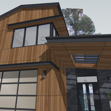
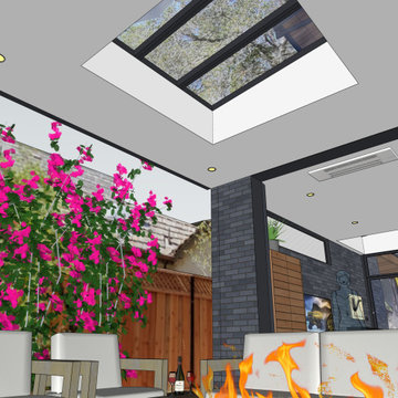
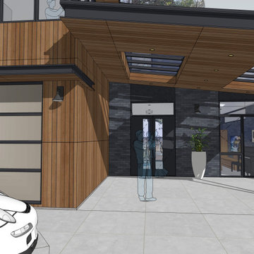
This contemporary architectural design features clean lines, and an abundance of full-height windows and large skylights to best take in the immense trees on site. To blend in with the forest-like setting, the home boasts a mix of rich textures and features a color palette of natural wood tones contrasted with dark blue and black. Once through the new steel gate at the street and down the 150-foot tree-lined driveway, a large covered front patio becomes visible past the neighbor’s detached accessory structure. The covered patio is just across the driveway from the beautiful 43” behemoth coast live oak. The single plane of the covered patio roof is delicately supported by a pair of steel posts in a “V-twin” configuration much like the largest redwood trees that tower over the center of the lot and will still be visible above the new two-story home, even from the front yard. The patio is covered in a dark-colored standing seam roof, with steel C-channel fascias, and tongue-and-groove wood ceiling planks on the underside. Generously sized skylights on the patio roof and inside the living area allow for impressive views of the amazing oak canopy as well as precious natural light.
Supporting the sloped covered patio on the other side is the two-car garage with a secondary bedroom suite stacked above the garage. This two-story volume is to be clad in vertical clear-coated redwood siding, to tie in with the grove of three 43-inch redwood trees just beyond. The garage door, and the bank of windows for Bedroom#2 above feature a steel fascia eyebrow header feature to provide shade and overhang protection, as we are not proposing a large overhang at this “redwood trunk”. The garage and bedroom volume are pulled 16 feet away from the side property line, instead of the minimum required setback of 6’-6”, thus leaving plenty of room for the redwood grove and existing mature pear tree to continue to thrive. This existing mature green screen in this 16-foot-wide side yard is a feature worth soaking in, which is why tall windows with low sill heights are proposed for both the stairs and the upstairs hallway. Though it may be infrequent to approve side-facing 2nd floor windows with sill heights as low as what we’re proposing, we are confident that the mature green screen and the over 16-foot-wide side yard are sufficient to provide for the continued privacy of our neighbor’s rear yard space, especially considering theses windows are in walkway zones.
The covered patio at the front entry is also bound by the 10-foot-tall living room. The great room is clad in a dark blue brick veneer, which wraps around all three sides of the living room. Upon entering the home from the covered patio, you are immediately greeted with one of the most impressive features of the home’s design: a 10-foot-tall by 24-foot-wide set of sliding glass doors. From the entry, this huge opening gives merely an initial glimpse of the massive trunks of the gargantuan V-twin redwoods sitting at the center of the lot. All three sliding glass panels open directly out into the smaller partially covered deck in the rear. This roof overhang element matches the design of the front patio with a steel C-channel fascia and a large skylight. But the rear deck’s roof element is set flat at a ten-foot ceiling height so that the living room’s ceiling seems to float above and out beyond the expanse of full-height sliding doors, thus creating an indoor-outdoor living space that will feel much larger than the home’s actual footprint. This rear covered deck is smaller than the patio in the front and also has a mix of solid and open-slatted roofing to allow for more solar access for the relatively small amount of open sky available.
The downstairs living room is open to the dining and kitchen areas, as well as the stair-and-elevator tower beyond. The stair tower is very open and glassy, and the stairs wind up and around the redwood-clad elevator tower. From certain perspectives in the 16-foot-wide side yard, it will almost seem as if the grove of three redwoods has a fourth tree that the house and the stairs were carefully built around. Other than the 3-foot-wide windows, the exterior walls of the stair tower, downstairs utility spaces, and Bedroom#3 above are finished in cement plaster, painted dark blue and black. The sloped roof over the stair-and-elevator tower continues cleanly over the area of upstairs Bedroom#3. This roof level is set by the side daylight plane and only yields an inside wall height of just under 6 feet in height. The owners are satisfied that the rest of this upstairs room has a nice vaulted ceiling to make up for the one short wall under the daylight plane.
The rest of the ground floor adjacent to the stair tower consists of a small utility wing containing a half-bath, laundry, storage area, and an exterior alcove for the electric heat pump HVAC unit. This short wing also gives more accessible access to the rear yard deck, as well as a backdrop for an outdoor kitchen. The bright white stone backsplash for the outdoor kitchen provides contrast to the otherwise consistent use of cement plaster painted dark blue and black for the two-story wing closest to the detached ADU. Though Bedroom#3 is stacked directly above this small wing, it is relatively short to comply with the side daylight plane of this narrow lot. Still, to further help break up the scale of this wall, another steel fascia eyebrow element is set about 8 feet above the rear deck.
The master suite sits centered above the ten-foot-tall great room. The master bedroom and its balcony, as well as the master bathtub area, have a commanding view of the central redwood trees and their impressive canopy, though the balcony is mostly recessed and should pose no privacy concerns to the neighbor’s rear yards. The master balcony parapet is clad in the same brick veneer continuing up from the living room below. A dark-painted metal rail makes up the rest of the open guardrail height. The entire length of the master balcony is comprised of 9-foot-tall sliding glass doors, but the area above the doors, as well as the area below the master bathroom windows, is accented with more redwood siding. The remainder of the master suite bathroom and walk-in closet is finished in cement plaster painted dark blue. The master bathroom has one side yard-facing window but will be frosted glass for both the owner’s and the neighbor’s privacy.
The 2nd floor is capped under a simple gable roof design with one roof ridge and varying eave and rake overhangs depending on the 2nd-floor layout and solar orientation. Since these roof planes are quite difficult to see in the middle of the heavily wooded panhandle lot, we are proposing a white TPO roofing for these two upper roof planes as a more sustainable choice compared to more dark-colored roofing like the covered patios and detached ADU.
The owners also wish to build a detached 292-square-foot Accessory Dwelling Unit (ADU) as an office and guest suite. For the ADU foundation to be situated outside the central redwood tree’s critical root zone, this relatively tiny structure takes advantage of the narrower 4-foot side and rear setbacks allowed for ADUs smaller than 800 square feet. The small L-shaped detached ADU frames a wonderful quasi-courtyard around the gargantuan V-twin redwoods at the center of the lot. The ADU shares a matching material palette consisting of cement plaster painted blue and black, vertical redwood siding and soffits, and thin brick veneer. The ADU also features large full-height windows. The only difference between the main home and the ADU material palette is that the roofing will be a dark composition shingle roofing since it will be quite visible from the master balcony.
 Dream Outdoor Solutions
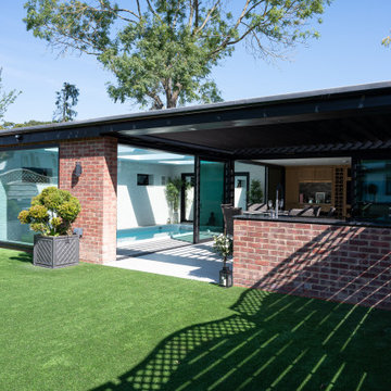
The Louvered Roof Pergola with Folding Doors and Outdoor Kitchen project aims to create an exquisite outdoor living space that seamlessly blends functionality, aesthetics, and versatility. By incorporating a louvered roof system, folding doors, and an outdoor kitchen, this project offers the perfect setting for relaxation, entertainment, and culinary experiences.
The centerpiece of this project is the louvered roof pergola. The louvered roof consists of adjustable slats that can be opened or closed, allowing for precise control over sunlight, shade, and ventilation. This feature enables occupants to adapt to changing weather conditions and preferences, providing a comfortable environment throughout the year.
The pergola's folding doors provide a seamless transition between indoor and outdoor spaces. These doors can be fully opened to extend the living area or closed to create a more intimate setting. The doors are designed to maximize natural light and offer unobstructed views of the surrounding landscape, while also providing privacy and security when needed.
The outdoor kitchen complements the pergola, offering a convenient and functional space for cooking and dining. Equipped with high-quality appliances, ample counter space, and storage options, the kitchen enables the preparation of gourmet meals in an outdoor setting. It can include features such as a grill, sink, refrigerator, and seating area, creating an inviting space for socializing and culinary delights.
Benefits and Uses:
The Louvered Roof Pergola with Folding Doors and Outdoor Kitchen project provides numerous benefits and uses, including:
Outdoor Entertainment: The pergola and outdoor kitchen create an ideal space for hosting gatherings, parties, and barbecues. The versatile design allows for flexible seating arrangements and the integration of audiovisual equipment for an immersive entertainment experience.
Relaxation and Recreation: The outdoor living area offers a tranquil retreat for relaxation, reading, or enjoying the beauty of nature. The adjustable louvered roof provides control over sunlight and shade, ensuring comfort and protection from the elements.
Al Fresco Dining: The outdoor kitchen encourages al fresco dining experiences, enabling homeowners to enjoy meals in the fresh air and picturesque surroundings. The well-equipped kitchen facilitates effortless food preparation and enhances the overall dining experience.
Increased Property Value: The addition of a louvered roof pergola with folding doors and an outdoor kitchen enhances the aesthetic appeal and functionality of the property. This can increase the value of the home and attract potential buyers in the future.
Sustainability Considerations:
Incorporating sustainable elements into the project is crucial. The louvered roof system can be designed to capture rainwater for irrigation purposes, reducing water consumption. The use of energy-efficient appliances and LED lighting in the outdoor kitchen minimizes energy consumption. Additionally, the choice of eco-friendly materials and landscaping practices ensures a sustainable and environmentally conscious design.
Project Timeline and Budget:
The project timeline will depend on the size and complexity of the outdoor living space. A professional design and construction team will be required to ensure the successful implementation of the project. The budget will vary based on the desired features, materials, and appliances, and should be established after careful consideration of all elements involved.
In conclusion, the Louvered Roof Pergola with Folding Doors and Outdoor Kitchen project presents an opportunity to transform an ordinary outdoor space into a luxurious and functional oasis. By incorporating a louvered roof system, folding doors, and a well-equipped outdoor kitchen, this project offers a versatile and aesthetically pleasing environment for entertainment, relaxation, and culinary experiences.

Sponsored
Columbus, OH

Wannemacher Interiors
Customized Award-Winning Interior Design Solutions in Franklin Cnty OH
 Aardvark Architecture
This proposal is for a new two-story home on the vacant heavily wooded lot with an existing 150-foot-long driveway lined by several beautiful oak trees culminating in a behemoth 43-inch oak tree where the driveway meets the main lot. The far end of the driveway terminates in a grove of three 43/40/43-inch redwoods and at the very center of the vacant lot stands a gargantuan V-twin 59-inch redwood tree paired with a “small” 29-inch redwood tree. The owners want to build a beautiful contemporary-styled home for their family that fully enjoys and embraces the mature trees on their cozy 65-foot by 100-foot lot.
As with all small, constrained lots, this project’s site design started first with meeting the relatively large parking and car maneuvering requirements. Menlo Park’s Department of Transportation typically requires side-facing garages to have 24-feet of backup space. So that they could give the largest feature redwood tree on site an added four feet (50%) of clearance outside of its critical root zone, the owners agreed to install a vehicle turntable at the end of their driveway to eliminate the extra four feet of space needed to back up and turnaround. This allowed them to pull their garage forward an additional four feet towards the front property line on the panhandle side, drastically reducing the rest of the home’s impact on the gargantuan V-Twin paired redwood tree at the center of the lot.
One of the owners has mobility issues, and accordingly, they first sought to design a one-story floor plan that incorporated all their family’s needs including plenty of covered patio and deck space to enjoy our fantastic California weather. But that single-story footprint spread too far into the critical root zones of several of the redwood trees on site, even despite the use of the vehicle turntable. During my interview process with the owners, they made it clear to me that one of their primary concerns is ensuring that the largest trees on site would thrive and become features of their new home after construction is complete. The single-story designs that removed the grove of three huge redwood trees were non-starters, as was the skimpy 5x10 master bath I designed when trying to squeeze the whole house program into an overly compromised single-story design. It was therefore deemed necessary to go with a two-story design despite the owner’s mobility issues. This two-story design has a much more compact ground floor footprint and has no bedrooms downstairs, other than the detached ADU. The owners must give up the floor area and incur the costs to install a residential elevator to access their upstairs master suite.
Our ground floor footprint is smaller due to the two-story design decision, and our foundation is pulled away from the trees thanks to the vehicle turntable. Yet, a tiny portion of the home’s ground floor footprint still encroaches into the critical root zones of the largest 59” redwood tree. Therefore, as outlined in the Arborist Report prepared by Aesculus Arboricultural Consulting, the structural engineers are incorporating an array of drilled piers and shallow-grade beams for the main home’s foundation and deck area nearest the redwood’s critical root zone. This drilled piers and grade beam foundation is a type of “bridging” foundation as outlined in Aesculus’ report to preserve the health of these trees that the property was designed around. The rest of the foundation will be constructed as an insulated slab-on-grade foundation to minimize the number of steps and ramps needed for the owners to enjoy their home and patio areas.
Despite the owner’s desire to keep as many trees as possible on site, and despite the smaller ground floor footprint and the advantage of the vehicle turntable, the need for a 20x20-foot garage and 20x20/25-foot guest parking space on our panhandle lot requires the removal of two heritage trees in the required driveway, a 16” coast redwood, and a 17” coast redwood. An alternate design, such as swapping the garage and guest parking locations north-to-south, still requires the removal of these two trees for vehicle maneuvering but has the added disadvantage of cutting off the home’s sightlines to the behemoth 43” oak tree just outside the currently proposed front patio space and living room. Jim Redman of Elements Landscape is proposing 13 new trees be planted on site to replace the lost value of these two heritage coast redwood trees.
This contemporary architectural design features clean lines, and an abundance of full-height windows and large skylights to best take in the immense trees on site. To blend in with the forest-like setting, the home boasts a mix of rich textures and features a color palette of natural wood tones contrasted with dark blue and black. Once through the new steel gate at the street and down the 150-foot tree-lined driveway, a large covered front patio becomes visible past the neighbor’s detached accessory structure. The covered patio is just across the driveway from the beautiful 43” behemoth coast live oak. The single plane of the covered patio roof is delicately supported by a pair of steel posts in a “V-twin” configuration much like the largest redwood trees that tower over the center of the lot and will still be visible above the new two-story home, even from the front yard. The patio is covered in a dark-colored standing seam roof, with steel C-channel fascias, and tongue-and-groove wood ceiling planks on the underside. Generously sized skylights on the patio roof and inside the living area allow for impressive views of the amazing oak canopy as well as precious natural light.
Supporting the sloped covered patio on the other side is the two-car garage with a secondary bedroom suite stacked above the garage. This two-story volume is to be clad in vertical clear-coated redwood siding, to tie in with the grove of three 43-inch redwood trees just beyond. The garage door, and the bank of windows for Bedroom#2 above feature a steel fascia eyebrow header feature to provide shade and overhang protection, as we are not proposing a large overhang at this “redwood trunk”. The garage and bedroom volume are pulled 16 feet away from the side property line, instead of the minimum required setback of 6’-6”, thus leaving plenty of room for the redwood grove and existing mature pear tree to continue to thrive. This existing mature green screen in this 16-foot-wide side yard is a feature worth soaking in, which is why tall windows with low sill heights are proposed for both the stairs and the upstairs hallway. Though it may be infrequent to approve side-facing 2nd floor windows with sill heights as low as what we’re proposing, we are confident that the mature green screen and the over 16-foot-wide side yard are sufficient to provide for the continued privacy of our neighbor’s rear yard space, especially considering theses windows are in walkway zones.
The covered patio at the front entry is also bound by the 10-foot-tall living room. The great room is clad in a dark blue brick veneer, which wraps around all three sides of the living room. Upon entering the home from the covered patio, you are immediately greeted with one of the most impressive features of the home’s design: a 10-foot-tall by 24-foot-wide set of sliding glass doors. From the entry, this huge opening gives merely an initial glimpse of the massive trunks of the gargantuan V-twin redwoods sitting at the center of the lot. All three sliding glass panels open directly out into the smaller partially covered deck in the rear. This roof overhang element matches the design of the front patio with a steel C-channel fascia and a large skylight. But the rear deck’s roof element is set flat at a ten-foot ceiling height so that the living room’s ceiling seems to float above and out beyond the expanse of full-height sliding doors, thus creating an indoor-outdoor living space that will feel much larger than the home’s actual footprint. This rear covered deck is smaller than the patio in the front and also has a mix of solid and open-slatted roofing to allow for more solar access for the relatively small amount of open sky available.
The downstairs living room is open to the dining and kitchen areas, as well as the stair-and-elevator tower beyond. The stair tower is very open and glassy, and the stairs wind up and around the redwood-clad elevator tower. From certain perspectives in the 16-foot-wide side yard, it will almost seem as if the grove of three redwoods has a fourth tree that the house and the stairs were carefully built around. Other than the 3-foot-wide windows, the exterior walls of the stair tower, downstairs utility spaces, and Bedroom#3 above are finished in cement plaster, painted dark blue and black. The sloped roof over the stair-and-elevator tower continues cleanly over the area of upstairs Bedroom#3. This roof level is set by the side daylight plane and only yields an inside wall height of just under 6 feet in height. The owners are satisfied that the rest of this upstairs room has a nice vaulted ceiling to make up for the one short wall under the daylight plane.
The rest of the ground floor adjacent to the stair tower consists of a small utility wing containing a half-bath, laundry, storage area, and an exterior alcove for the electric heat pump HVAC unit. This short wing also gives more accessible access to the rear yard deck, as well as a backdrop for an outdoor kitchen. The bright white stone backsplash for the outdoor kitchen provides contrast to the otherwise consistent use of cement plaster painted dark blue and black for the two-story wing closest to the detached ADU. Though Bedroom#3 is stacked directly above this small wing, it is relatively short to comply with the side daylight plane of this narrow lot. Still, to further help break up the scale of this wall, another steel fascia eyebrow element is set about 8 feet above the rear deck.
The master suite sits centered above the ten-foot-tall great room. The master bedroom and its balcony, as well as the master bathtub area, have a commanding view of the central redwood trees and their impressive canopy, though the balcony is mostly recessed and should pose no privacy concerns to the neighbor’s rear yards. The master balcony parapet is clad in the same brick veneer continuing up from the living room below. A dark-painted metal rail makes up the rest of the open guardrail height. The entire length of the master balcony is comprised of 9-foot-tall sliding glass doors, but the area above the doors, as well as the area below the master bathroom windows, is accented with more redwood siding. The remainder of the master suite bathroom and walk-in closet is finished in cement plaster painted dark blue. The master bathroom has one side yard-facing window but will be frosted glass for both the owner’s and the neighbor’s privacy.
The 2nd floor is capped under a simple gable roof design with one roof ridge and varying eave and rake overhangs depending on the 2nd-floor layout and solar orientation. Since these roof planes are quite difficult to see in the middle of the heavily wooded panhandle lot, we are proposing a white TPO roofing for these two upper roof planes as a more sustainable choice compared to more dark-colored roofing like the covered patios and detached ADU.
The owners also wish to build a detached 292-square-foot Accessory Dwelling Unit (ADU) as an office and guest suite. For the ADU foundation to be situated outside the central redwood tree’s critical root zone, this relatively tiny structure takes advantage of the narrower 4-foot side and rear setbacks allowed for ADUs smaller than 800 square feet. The small L-shaped detached ADU frames a wonderful quasi-courtyard around the gargantuan V-twin redwoods at the center of the lot. The ADU shares a matching material palette consisting of cement plaster painted blue and black, vertical redwood siding and soffits, and thin brick veneer. The ADU also features large full-height windows. The only difference between the main home and the ADU material palette is that the roofing will be a dark composition shingle roofing since it will be quite visible from the master balcony.
 DesignARC
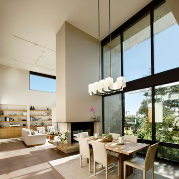
The Tice Residences replace a run-down and aging duplex with two separate, modern, Santa Barbara homes. Although the unique creek-side site (which the client’s original home looked toward across a small ravine) proposed significant challenges, the clients were certain they wanted to live on the lush “Riviera” hillside.
The challenges presented were ultimately overcome through a thorough and careful study of site conditions. With an extremely efficient use of space and strategic placement of windows and decks, privacy is maintained while affording expansive views from each home to the creek, downtown Santa Barbara and Pacific Ocean beyond. Both homes appear to have far more openness than their compact lots afford.
The solution strikes a balance between enclosure and openness. Walls and landscape elements divide and protect two private domains, and are in turn, carefully penetrated to reveal views.
Both homes are variations on one consistent theme: elegant composition of contemporary, “warm” materials; strong roof planes punctuated by vertical masses; and floating decks. The project forms an intimate connection with its setting by using site-excavated stone, terracing landscape planters with native plantings, and utilizing the shade provided by its ancient Riviera Oak trees.
2012 AIA Santa Barbara Chapter Merit Award
Jim Bartsch Photography
 building Lab, inc.
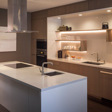
The remodeling of the kitchen and bathroom forms the core of this interior renovation.
The existing peninsula design and cabinetry broke up the ‘great room’ and stood the kitchen as a distinct element within the room. Our design strategy operates more on a principle of integration. As such, we created a galley condition with a spine of cabinetry and appliances that anchors to the long wall of the room. The feature design element is the solid Caesarstone backsplash which appears to be carved from the wall itself.
The particular challenge in the windowless bathroom was how to create an inviting, expanded sense of depth without a resulting cave-like feel. Removal of a half wall, soffit and tub unified the space overall. We reinforced the unification with the deployment of a single large format tile spec. Smaller details such as touch latch cabinetry hardware and flush conditions between tile, wall and mirror further the principle that simpler is bigger, deeper and more inviting.
We were also charged with elevating what was a pedestrian 1990’s townhouse to something more sophisticated and engaging. Our approach was to first remove builder grade detailing around windows and railings. Then, we introduced simplified profiles and glass guardrails that would extend a consistency established in the new kitchen and bathroom designs.
photo by Scott Hargis
 Murphy Deesign
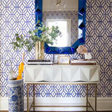
This is a New York pre-war apartment that was done through E-Design (see more on designer's website). Jenny J. Norris photography
Entryway - transitional entryway idea in New York with multicolored walls
Entryway - transitional entryway idea in New York with multicolored walls
 Décor Aid
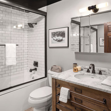
Another designer had already been hired to redo the interior, but once Ryan and Michael saw the finished backyard, they decided to hire Decor Aid to redesign the entire apartment, which included gut renovations of the kitchen and bathroom, a custom-made bar in the foyer, and a restyling of the bedroom and living room.
The apartment already featured some wood and leather furniture pieces, and so the redesign had to incorporate these existing pieces, while balancing the couple’s neutral palette and welcoming personalities.
Darker elements in the kitchen and bathroom were brought in to fit the couple’s modern, yet masculine style, and were contrasted with lighter, airy pieces, to keep smaller spaces from feeling claustrophobic. White marble and grey-washed wood tile was used to balance the matte black accents in the bathroom, while white cabinets and stainless steel appliances were used to balance the black tile backsplash and black countertops in the kitchen.
To fit the hip industrial vibe of Hoboken, rustic wood details were incorporated to offset the sleek modern finish that is consistent throughout the apartment. A lighter wood flooring was used in the bathroom, to complement the other wood elements in the apartment.
The living room and bedroom had already been repainted and refurnished, and so the restyling of each space had to feel cohesive with the existing elements. An organic cowhide rug offset the crisp lines in the bedroom, and dark linens were used to compliment the wood dresser and leather chair. The custom-built wood bar fit Ryan and Michael’s desire to transform their apartment into a space ready for entertaining, while tying together the apartment’s modern industrial look.
 Dream Outdoor Solutions
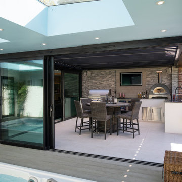
The Louvered Roof Pergola with Folding Doors and Outdoor Kitchen project aims to create an exquisite outdoor living space that seamlessly blends functionality, aesthetics, and versatility. By incorporating a louvered roof system, folding doors, and an outdoor kitchen, this project offers the perfect setting for relaxation, entertainment, and culinary experiences.
The centerpiece of this project is the louvered roof pergola. The louvered roof consists of adjustable slats that can be opened or closed, allowing for precise control over sunlight, shade, and ventilation. This feature enables occupants to adapt to changing weather conditions and preferences, providing a comfortable environment throughout the year.
The pergola's folding doors provide a seamless transition between indoor and outdoor spaces. These doors can be fully opened to extend the living area or closed to create a more intimate setting. The doors are designed to maximize natural light and offer unobstructed views of the surrounding landscape, while also providing privacy and security when needed.
The outdoor kitchen complements the pergola, offering a convenient and functional space for cooking and dining. Equipped with high-quality appliances, ample counter space, and storage options, the kitchen enables the preparation of gourmet meals in an outdoor setting. It can include features such as a grill, sink, refrigerator, and seating area, creating an inviting space for socializing and culinary delights.
Benefits and Uses:
The Louvered Roof Pergola with Folding Doors and Outdoor Kitchen project provides numerous benefits and uses, including:
Outdoor Entertainment: The pergola and outdoor kitchen create an ideal space for hosting gatherings, parties, and barbecues. The versatile design allows for flexible seating arrangements and the integration of audiovisual equipment for an immersive entertainment experience.
Relaxation and Recreation: The outdoor living area offers a tranquil retreat for relaxation, reading, or enjoying the beauty of nature. The adjustable louvered roof provides control over sunlight and shade, ensuring comfort and protection from the elements.
Al Fresco Dining: The outdoor kitchen encourages al fresco dining experiences, enabling homeowners to enjoy meals in the fresh air and picturesque surroundings. The well-equipped kitchen facilitates effortless food preparation and enhances the overall dining experience.
Increased Property Value: The addition of a louvered roof pergola with folding doors and an outdoor kitchen enhances the aesthetic appeal and functionality of the property. This can increase the value of the home and attract potential buyers in the future.
Sustainability Considerations:
Incorporating sustainable elements into the project is crucial. The louvered roof system can be designed to capture rainwater for irrigation purposes, reducing water consumption. The use of energy-efficient appliances and LED lighting in the outdoor kitchen minimizes energy consumption. Additionally, the choice of eco-friendly materials and landscaping practices ensures a sustainable and environmentally conscious design.
Project Timeline and Budget:
The project timeline will depend on the size and complexity of the outdoor living space. A professional design and construction team will be required to ensure the successful implementation of the project. The budget will vary based on the desired features, materials, and appliances, and should be established after careful consideration of all elements involved.
In conclusion, the Louvered Roof Pergola with Folding Doors and Outdoor Kitchen project presents an opportunity to transform an ordinary outdoor space into a luxurious and functional oasis. By incorporating a louvered roof system, folding doors, and a well-equipped outdoor kitchen, this project offers a versatile and aesthetically pleasing environment for entertainment, relaxation, and culinary experiences.
Sponsored
Columbus, OH

Trish Takacs Design
Award Winning & Highly Skilled Kitchen & Bath Designer in Columbus
 Aardvark Architecture
This proposal is for a new two-story home on the vacant heavily wooded lot with an existing 150-foot-long driveway lined by several beautiful oak trees culminating in a behemoth 43-inch oak tree where the driveway meets the main lot. The far end of the driveway terminates in a grove of three 43/40/43-inch redwoods and at the very center of the vacant lot stands a gargantuan V-twin 59-inch redwood tree paired with a “small” 29-inch redwood tree. The owners want to build a beautiful contemporary-styled home for their family that fully enjoys and embraces the mature trees on their cozy 65-foot by 100-foot lot.
As with all small, constrained lots, this project’s site design started first with meeting the relatively large parking and car maneuvering requirements. Menlo Park’s Department of Transportation typically requires side-facing garages to have 24-feet of backup space. So that they could give the largest feature redwood tree on site an added four feet (50%) of clearance outside of its critical root zone, the owners agreed to install a vehicle turntable at the end of their driveway to eliminate the extra four feet of space needed to back up and turnaround. This allowed them to pull their garage forward an additional four feet towards the front property line on the panhandle side, drastically reducing the rest of the home’s impact on the gargantuan V-Twin paired redwood tree at the center of the lot.
One of the owners has mobility issues, and accordingly, they first sought to design a one-story floor plan that incorporated all their family’s needs including plenty of covered patio and deck space to enjoy our fantastic California weather. But that single-story footprint spread too far into the critical root zones of several of the redwood trees on site, even despite the use of the vehicle turntable. During my interview process with the owners, they made it clear to me that one of their primary concerns is ensuring that the largest trees on site would thrive and become features of their new home after construction is complete. The single-story designs that removed the grove of three huge redwood trees were non-starters, as was the skimpy 5x10 master bath I designed when trying to squeeze the whole house program into an overly compromised single-story design. It was therefore deemed necessary to go with a two-story design despite the owner’s mobility issues. This two-story design has a much more compact ground floor footprint and has no bedrooms downstairs, other than the detached ADU. The owners must give up the floor area and incur the costs to install a residential elevator to access their upstairs master suite.
Our ground floor footprint is smaller due to the two-story design decision, and our foundation is pulled away from the trees thanks to the vehicle turntable. Yet, a tiny portion of the home’s ground floor footprint still encroaches into the critical root zones of the largest 59” redwood tree. Therefore, as outlined in the Arborist Report prepared by Aesculus Arboricultural Consulting, the structural engineers are incorporating an array of drilled piers and shallow-grade beams for the main home’s foundation and deck area nearest the redwood’s critical root zone. This drilled piers and grade beam foundation is a type of “bridging” foundation as outlined in Aesculus’ report to preserve the health of these trees that the property was designed around. The rest of the foundation will be constructed as an insulated slab-on-grade foundation to minimize the number of steps and ramps needed for the owners to enjoy their home and patio areas.
Despite the owner’s desire to keep as many trees as possible on site, and despite the smaller ground floor footprint and the advantage of the vehicle turntable, the need for a 20x20-foot garage and 20x20/25-foot guest parking space on our panhandle lot requires the removal of two heritage trees in the required driveway, a 16” coast redwood, and a 17” coast redwood. An alternate design, such as swapping the garage and guest parking locations north-to-south, still requires the removal of these two trees for vehicle maneuvering but has the added disadvantage of cutting off the home’s sightlines to the behemoth 43” oak tree just outside the currently proposed front patio space and living room. Jim Redman of Elements Landscape is proposing 13 new trees be planted on site to replace the lost value of these two heritage coast redwood trees.
This contemporary architectural design features clean lines, and an abundance of full-height windows and large skylights to best take in the immense trees on site. To blend in with the forest-like setting, the home boasts a mix of rich textures and features a color palette of natural wood tones contrasted with dark blue and black. Once through the new steel gate at the street and down the 150-foot tree-lined driveway, a large covered front patio becomes visible past the neighbor’s detached accessory structure. The covered patio is just across the driveway from the beautiful 43” behemoth coast live oak. The single plane of the covered patio roof is delicately supported by a pair of steel posts in a “V-twin” configuration much like the largest redwood trees that tower over the center of the lot and will still be visible above the new two-story home, even from the front yard. The patio is covered in a dark-colored standing seam roof, with steel C-channel fascias, and tongue-and-groove wood ceiling planks on the underside. Generously sized skylights on the patio roof and inside the living area allow for impressive views of the amazing oak canopy as well as precious natural light.
Supporting the sloped covered patio on the other side is the two-car garage with a secondary bedroom suite stacked above the garage. This two-story volume is to be clad in vertical clear-coated redwood siding, to tie in with the grove of three 43-inch redwood trees just beyond. The garage door, and the bank of windows for Bedroom#2 above feature a steel fascia eyebrow header feature to provide shade and overhang protection, as we are not proposing a large overhang at this “redwood trunk”. The garage and bedroom volume are pulled 16 feet away from the side property line, instead of the minimum required setback of 6’-6”, thus leaving plenty of room for the redwood grove and existing mature pear tree to continue to thrive. This existing mature green screen in this 16-foot-wide side yard is a feature worth soaking in, which is why tall windows with low sill heights are proposed for both the stairs and the upstairs hallway. Though it may be infrequent to approve side-facing 2nd floor windows with sill heights as low as what we’re proposing, we are confident that the mature green screen and the over 16-foot-wide side yard are sufficient to provide for the continued privacy of our neighbor’s rear yard space, especially considering theses windows are in walkway zones.
The covered patio at the front entry is also bound by the 10-foot-tall living room. The great room is clad in a dark blue brick veneer, which wraps around all three sides of the living room. Upon entering the home from the covered patio, you are immediately greeted with one of the most impressive features of the home’s design: a 10-foot-tall by 24-foot-wide set of sliding glass doors. From the entry, this huge opening gives merely an initial glimpse of the massive trunks of the gargantuan V-twin redwoods sitting at the center of the lot. All three sliding glass panels open directly out into the smaller partially covered deck in the rear. This roof overhang element matches the design of the front patio with a steel C-channel fascia and a large skylight. But the rear deck’s roof element is set flat at a ten-foot ceiling height so that the living room’s ceiling seems to float above and out beyond the expanse of full-height sliding doors, thus creating an indoor-outdoor living space that will feel much larger than the home’s actual footprint. This rear covered deck is smaller than the patio in the front and also has a mix of solid and open-slatted roofing to allow for more solar access for the relatively small amount of open sky available.
The downstairs living room is open to the dining and kitchen areas, as well as the stair-and-elevator tower beyond. The stair tower is very open and glassy, and the stairs wind up and around the redwood-clad elevator tower. From certain perspectives in the 16-foot-wide side yard, it will almost seem as if the grove of three redwoods has a fourth tree that the house and the stairs were carefully built around. Other than the 3-foot-wide windows, the exterior walls of the stair tower, downstairs utility spaces, and Bedroom#3 above are finished in cement plaster, painted dark blue and black. The sloped roof over the stair-and-elevator tower continues cleanly over the area of upstairs Bedroom#3. This roof level is set by the side daylight plane and only yields an inside wall height of just under 6 feet in height. The owners are satisfied that the rest of this upstairs room has a nice vaulted ceiling to make up for the one short wall under the daylight plane.
The rest of the ground floor adjacent to the stair tower consists of a small utility wing containing a half-bath, laundry, storage area, and an exterior alcove for the electric heat pump HVAC unit. This short wing also gives more accessible access to the rear yard deck, as well as a backdrop for an outdoor kitchen. The bright white stone backsplash for the outdoor kitchen provides contrast to the otherwise consistent use of cement plaster painted dark blue and black for the two-story wing closest to the detached ADU. Though Bedroom#3 is stacked directly above this small wing, it is relatively short to comply with the side daylight plane of this narrow lot. Still, to further help break up the scale of this wall, another steel fascia eyebrow element is set about 8 feet above the rear deck.
The master suite sits centered above the ten-foot-tall great room. The master bedroom and its balcony, as well as the master bathtub area, have a commanding view of the central redwood trees and their impressive canopy, though the balcony is mostly recessed and should pose no privacy concerns to the neighbor’s rear yards. The master balcony parapet is clad in the same brick veneer continuing up from the living room below. A dark-painted metal rail makes up the rest of the open guardrail height. The entire length of the master balcony is comprised of 9-foot-tall sliding glass doors, but the area above the doors, as well as the area below the master bathroom windows, is accented with more redwood siding. The remainder of the master suite bathroom and walk-in closet is finished in cement plaster painted dark blue. The master bathroom has one side yard-facing window but will be frosted glass for both the owner’s and the neighbor’s privacy.
The 2nd floor is capped under a simple gable roof design with one roof ridge and varying eave and rake overhangs depending on the 2nd-floor layout and solar orientation. Since these roof planes are quite difficult to see in the middle of the heavily wooded panhandle lot, we are proposing a white TPO roofing for these two upper roof planes as a more sustainable choice compared to more dark-colored roofing like the covered patios and detached ADU.
The owners also wish to build a detached 292-square-foot Accessory Dwelling Unit (ADU) as an office and guest suite. For the ADU foundation to be situated outside the central redwood tree’s critical root zone, this relatively tiny structure takes advantage of the narrower 4-foot side and rear setbacks allowed for ADUs smaller than 800 square feet. The small L-shaped detached ADU frames a wonderful quasi-courtyard around the gargantuan V-twin redwoods at the center of the lot. The ADU shares a matching material palette consisting of cement plaster painted blue and black, vertical redwood siding and soffits, and thin brick veneer. The ADU also features large full-height windows. The only difference between the main home and the ADU material palette is that the roofing will be a dark composition shingle roofing since it will be quite visible from the master balcony.
 Aardvark Architecture
This proposal is for a new two-story home on the vacant heavily wooded lot with an existing 150-foot-long driveway lined by several beautiful oak trees culminating in a behemoth 43-inch oak tree where the driveway meets the main lot. The far end of the driveway terminates in a grove of three 43/40/43-inch redwoods and at the very center of the vacant lot stands a gargantuan V-twin 59-inch redwood tree paired with a “small” 29-inch redwood tree. The owners want to build a beautiful contemporary-styled home for their family that fully enjoys and embraces the mature trees on their cozy 65-foot by 100-foot lot.
As with all small, constrained lots, this project’s site design started first with meeting the relatively large parking and car maneuvering requirements. Menlo Park’s Department of Transportation typically requires side-facing garages to have 24-feet of backup space. So that they could give the largest feature redwood tree on site an added four feet (50%) of clearance outside of its critical root zone, the owners agreed to install a vehicle turntable at the end of their driveway to eliminate the extra four feet of space needed to back up and turnaround. This allowed them to pull their garage forward an additional four feet towards the front property line on the panhandle side, drastically reducing the rest of the home’s impact on the gargantuan V-Twin paired redwood tree at the center of the lot.
One of the owners has mobility issues, and accordingly, they first sought to design a one-story floor plan that incorporated all their family’s needs including plenty of covered patio and deck space to enjoy our fantastic California weather. But that single-story footprint spread too far into the critical root zones of several of the redwood trees on site, even despite the use of the vehicle turntable. During my interview process with the owners, they made it clear to me that one of their primary concerns is ensuring that the largest trees on site would thrive and become features of their new home after construction is complete. The single-story designs that removed the grove of three huge redwood trees were non-starters, as was the skimpy 5x10 master bath I designed when trying to squeeze the whole house program into an overly compromised single-story design. It was therefore deemed necessary to go with a two-story design despite the owner’s mobility issues. This two-story design has a much more compact ground floor footprint and has no bedrooms downstairs, other than the detached ADU. The owners must give up the floor area and incur the costs to install a residential elevator to access their upstairs master suite.
Our ground floor footprint is smaller due to the two-story design decision, and our foundation is pulled away from the trees thanks to the vehicle turntable. Yet, a tiny portion of the home’s ground floor footprint still encroaches into the critical root zones of the largest 59” redwood tree. Therefore, as outlined in the Arborist Report prepared by Aesculus Arboricultural Consulting, the structural engineers are incorporating an array of drilled piers and shallow-grade beams for the main home’s foundation and deck area nearest the redwood’s critical root zone. This drilled piers and grade beam foundation is a type of “bridging” foundation as outlined in Aesculus’ report to preserve the health of these trees that the property was designed around. The rest of the foundation will be constructed as an insulated slab-on-grade foundation to minimize the number of steps and ramps needed for the owners to enjoy their home and patio areas.
Despite the owner’s desire to keep as many trees as possible on site, and despite the smaller ground floor footprint and the advantage of the vehicle turntable, the need for a 20x20-foot garage and 20x20/25-foot guest parking space on our panhandle lot requires the removal of two heritage trees in the required driveway, a 16” coast redwood, and a 17” coast redwood. An alternate design, such as swapping the garage and guest parking locations north-to-south, still requires the removal of these two trees for vehicle maneuvering but has the added disadvantage of cutting off the home’s sightlines to the behemoth 43” oak tree just outside the currently proposed front patio space and living room. Jim Redman of Elements Landscape is proposing 13 new trees be planted on site to replace the lost value of these two heritage coast redwood trees.
This contemporary architectural design features clean lines, and an abundance of full-height windows and large skylights to best take in the immense trees on site. To blend in with the forest-like setting, the home boasts a mix of rich textures and features a color palette of natural wood tones contrasted with dark blue and black. Once through the new steel gate at the street and down the 150-foot tree-lined driveway, a large covered front patio becomes visible past the neighbor’s detached accessory structure. The covered patio is just across the driveway from the beautiful 43” behemoth coast live oak. The single plane of the covered patio roof is delicately supported by a pair of steel posts in a “V-twin” configuration much like the largest redwood trees that tower over the center of the lot and will still be visible above the new two-story home, even from the front yard. The patio is covered in a dark-colored standing seam roof, with steel C-channel fascias, and tongue-and-groove wood ceiling planks on the underside. Generously sized skylights on the patio roof and inside the living area allow for impressive views of the amazing oak canopy as well as precious natural light.
Supporting the sloped covered patio on the other side is the two-car garage with a secondary bedroom suite stacked above the garage. This two-story volume is to be clad in vertical clear-coated redwood siding, to tie in with the grove of three 43-inch redwood trees just beyond. The garage door, and the bank of windows for Bedroom#2 above feature a steel fascia eyebrow header feature to provide shade and overhang protection, as we are not proposing a large overhang at this “redwood trunk”. The garage and bedroom volume are pulled 16 feet away from the side property line, instead of the minimum required setback of 6’-6”, thus leaving plenty of room for the redwood grove and existing mature pear tree to continue to thrive. This existing mature green screen in this 16-foot-wide side yard is a feature worth soaking in, which is why tall windows with low sill heights are proposed for both the stairs and the upstairs hallway. Though it may be infrequent to approve side-facing 2nd floor windows with sill heights as low as what we’re proposing, we are confident that the mature green screen and the over 16-foot-wide side yard are sufficient to provide for the continued privacy of our neighbor’s rear yard space, especially considering theses windows are in walkway zones.
The covered patio at the front entry is also bound by the 10-foot-tall living room. The great room is clad in a dark blue brick veneer, which wraps around all three sides of the living room. Upon entering the home from the covered patio, you are immediately greeted with one of the most impressive features of the home’s design: a 10-foot-tall by 24-foot-wide set of sliding glass doors. From the entry, this huge opening gives merely an initial glimpse of the massive trunks of the gargantuan V-twin redwoods sitting at the center of the lot. All three sliding glass panels open directly out into the smaller partially covered deck in the rear. This roof overhang element matches the design of the front patio with a steel C-channel fascia and a large skylight. But the rear deck’s roof element is set flat at a ten-foot ceiling height so that the living room’s ceiling seems to float above and out beyond the expanse of full-height sliding doors, thus creating an indoor-outdoor living space that will feel much larger than the home’s actual footprint. This rear covered deck is smaller than the patio in the front and also has a mix of solid and open-slatted roofing to allow for more solar access for the relatively small amount of open sky available.
The downstairs living room is open to the dining and kitchen areas, as well as the stair-and-elevator tower beyond. The stair tower is very open and glassy, and the stairs wind up and around the redwood-clad elevator tower. From certain perspectives in the 16-foot-wide side yard, it will almost seem as if the grove of three redwoods has a fourth tree that the house and the stairs were carefully built around. Other than the 3-foot-wide windows, the exterior walls of the stair tower, downstairs utility spaces, and Bedroom#3 above are finished in cement plaster, painted dark blue and black. The sloped roof over the stair-and-elevator tower continues cleanly over the area of upstairs Bedroom#3. This roof level is set by the side daylight plane and only yields an inside wall height of just under 6 feet in height. The owners are satisfied that the rest of this upstairs room has a nice vaulted ceiling to make up for the one short wall under the daylight plane.
The rest of the ground floor adjacent to the stair tower consists of a small utility wing containing a half-bath, laundry, storage area, and an exterior alcove for the electric heat pump HVAC unit. This short wing also gives more accessible access to the rear yard deck, as well as a backdrop for an outdoor kitchen. The bright white stone backsplash for the outdoor kitchen provides contrast to the otherwise consistent use of cement plaster painted dark blue and black for the two-story wing closest to the detached ADU. Though Bedroom#3 is stacked directly above this small wing, it is relatively short to comply with the side daylight plane of this narrow lot. Still, to further help break up the scale of this wall, another steel fascia eyebrow element is set about 8 feet above the rear deck.
The master suite sits centered above the ten-foot-tall great room. The master bedroom and its balcony, as well as the master bathtub area, have a commanding view of the central redwood trees and their impressive canopy, though the balcony is mostly recessed and should pose no privacy concerns to the neighbor’s rear yards. The master balcony parapet is clad in the same brick veneer continuing up from the living room below. A dark-painted metal rail makes up the rest of the open guardrail height. The entire length of the master balcony is comprised of 9-foot-tall sliding glass doors, but the area above the doors, as well as the area below the master bathroom windows, is accented with more redwood siding. The remainder of the master suite bathroom and walk-in closet is finished in cement plaster painted dark blue. The master bathroom has one side yard-facing window but will be frosted glass for both the owner’s and the neighbor’s privacy.
The 2nd floor is capped under a simple gable roof design with one roof ridge and varying eave and rake overhangs depending on the 2nd-floor layout and solar orientation. Since these roof planes are quite difficult to see in the middle of the heavily wooded panhandle lot, we are proposing a white TPO roofing for these two upper roof planes as a more sustainable choice compared to more dark-colored roofing like the covered patios and detached ADU.
The owners also wish to build a detached 292-square-foot Accessory Dwelling Unit (ADU) as an office and guest suite. For the ADU foundation to be situated outside the central redwood tree’s critical root zone, this relatively tiny structure takes advantage of the narrower 4-foot side and rear setbacks allowed for ADUs smaller than 800 square feet. The small L-shaped detached ADU frames a wonderful quasi-courtyard around the gargantuan V-twin redwoods at the center of the lot. The ADU shares a matching material palette consisting of cement plaster painted blue and black, vertical redwood siding and soffits, and thin brick veneer. The ADU also features large full-height windows. The only difference between the main home and the ADU material palette is that the roofing will be a dark composition shingle roofing since it will be quite visible from the master balcony.
 Aardvark Architecture
This proposal is for a new two-story home on the vacant heavily wooded lot with an existing 150-foot-long driveway lined by several beautiful oak trees culminating in a behemoth 43-inch oak tree where the driveway meets the main lot. The far end of the driveway terminates in a grove of three 43/40/43-inch redwoods and at the very center of the vacant lot stands a gargantuan V-twin 59-inch redwood tree paired with a “small” 29-inch redwood tree. The owners want to build a beautiful contemporary-styled home for their family that fully enjoys and embraces the mature trees on their cozy 65-foot by 100-foot lot.
As with all small, constrained lots, this project’s site design started first with meeting the relatively large parking and car maneuvering requirements. Menlo Park’s Department of Transportation typically requires side-facing garages to have 24-feet of backup space. So that they could give the largest feature redwood tree on site an added four feet (50%) of clearance outside of its critical root zone, the owners agreed to install a vehicle turntable at the end of their driveway to eliminate the extra four feet of space needed to back up and turnaround. This allowed them to pull their garage forward an additional four feet towards the front property line on the panhandle side, drastically reducing the rest of the home’s impact on the gargantuan V-Twin paired redwood tree at the center of the lot.
One of the owners has mobility issues, and accordingly, they first sought to design a one-story floor plan that incorporated all their family’s needs including plenty of covered patio and deck space to enjoy our fantastic California weather. But that single-story footprint spread too far into the critical root zones of several of the redwood trees on site, even despite the use of the vehicle turntable. During my interview process with the owners, they made it clear to me that one of their primary concerns is ensuring that the largest trees on site would thrive and become features of their new home after construction is complete. The single-story designs that removed the grove of three huge redwood trees were non-starters, as was the skimpy 5x10 master bath I designed when trying to squeeze the whole house program into an overly compromised single-story design. It was therefore deemed necessary to go with a two-story design despite the owner’s mobility issues. This two-story design has a much more compact ground floor footprint and has no bedrooms downstairs, other than the detached ADU. The owners must give up the floor area and incur the costs to install a residential elevator to access their upstairs master suite.
Our ground floor footprint is smaller due to the two-story design decision, and our foundation is pulled away from the trees thanks to the vehicle turntable. Yet, a tiny portion of the home’s ground floor footprint still encroaches into the critical root zones of the largest 59” redwood tree. Therefore, as outlined in the Arborist Report prepared by Aesculus Arboricultural Consulting, the structural engineers are incorporating an array of drilled piers and shallow-grade beams for the main home’s foundation and deck area nearest the redwood’s critical root zone. This drilled piers and grade beam foundation is a type of “bridging” foundation as outlined in Aesculus’ report to preserve the health of these trees that the property was designed around. The rest of the foundation will be constructed as an insulated slab-on-grade foundation to minimize the number of steps and ramps needed for the owners to enjoy their home and patio areas.
Despite the owner’s desire to keep as many trees as possible on site, and despite the smaller ground floor footprint and the advantage of the vehicle turntable, the need for a 20x20-foot garage and 20x20/25-foot guest parking space on our panhandle lot requires the removal of two heritage trees in the required driveway, a 16” coast redwood, and a 17” coast redwood. An alternate design, such as swapping the garage and guest parking locations north-to-south, still requires the removal of these two trees for vehicle maneuvering but has the added disadvantage of cutting off the home’s sightlines to the behemoth 43” oak tree just outside the currently proposed front patio space and living room. Jim Redman of Elements Landscape is proposing 13 new trees be planted on site to replace the lost value of these two heritage coast redwood trees.
This contemporary architectural design features clean lines, and an abundance of full-height windows and large skylights to best take in the immense trees on site. To blend in with the forest-like setting, the home boasts a mix of rich textures and features a color palette of natural wood tones contrasted with dark blue and black. Once through the new steel gate at the street and down the 150-foot tree-lined driveway, a large covered front patio becomes visible past the neighbor’s detached accessory structure. The covered patio is just across the driveway from the beautiful 43” behemoth coast live oak. The single plane of the covered patio roof is delicately supported by a pair of steel posts in a “V-twin” configuration much like the largest redwood trees that tower over the center of the lot and will still be visible above the new two-story home, even from the front yard. The patio is covered in a dark-colored standing seam roof, with steel C-channel fascias, and tongue-and-groove wood ceiling planks on the underside. Generously sized skylights on the patio roof and inside the living area allow for impressive views of the amazing oak canopy as well as precious natural light.
Supporting the sloped covered patio on the other side is the two-car garage with a secondary bedroom suite stacked above the garage. This two-story volume is to be clad in vertical clear-coated redwood siding, to tie in with the grove of three 43-inch redwood trees just beyond. The garage door, and the bank of windows for Bedroom#2 above feature a steel fascia eyebrow header feature to provide shade and overhang protection, as we are not proposing a large overhang at this “redwood trunk”. The garage and bedroom volume are pulled 16 feet away from the side property line, instead of the minimum required setback of 6’-6”, thus leaving plenty of room for the redwood grove and existing mature pear tree to continue to thrive. This existing mature green screen in this 16-foot-wide side yard is a feature worth soaking in, which is why tall windows with low sill heights are proposed for both the stairs and the upstairs hallway. Though it may be infrequent to approve side-facing 2nd floor windows with sill heights as low as what we’re proposing, we are confident that the mature green screen and the over 16-foot-wide side yard are sufficient to provide for the continued privacy of our neighbor’s rear yard space, especially considering theses windows are in walkway zones.
The covered patio at the front entry is also bound by the 10-foot-tall living room. The great room is clad in a dark blue brick veneer, which wraps around all three sides of the living room. Upon entering the home from the covered patio, you are immediately greeted with one of the most impressive features of the home’s design: a 10-foot-tall by 24-foot-wide set of sliding glass doors. From the entry, this huge opening gives merely an initial glimpse of the massive trunks of the gargantuan V-twin redwoods sitting at the center of the lot. All three sliding glass panels open directly out into the smaller partially covered deck in the rear. This roof overhang element matches the design of the front patio with a steel C-channel fascia and a large skylight. But the rear deck’s roof element is set flat at a ten-foot ceiling height so that the living room’s ceiling seems to float above and out beyond the expanse of full-height sliding doors, thus creating an indoor-outdoor living space that will feel much larger than the home’s actual footprint. This rear covered deck is smaller than the patio in the front and also has a mix of solid and open-slatted roofing to allow for more solar access for the relatively small amount of open sky available.
The downstairs living room is open to the dining and kitchen areas, as well as the stair-and-elevator tower beyond. The stair tower is very open and glassy, and the stairs wind up and around the redwood-clad elevator tower. From certain perspectives in the 16-foot-wide side yard, it will almost seem as if the grove of three redwoods has a fourth tree that the house and the stairs were carefully built around. Other than the 3-foot-wide windows, the exterior walls of the stair tower, downstairs utility spaces, and Bedroom#3 above are finished in cement plaster, painted dark blue and black. The sloped roof over the stair-and-elevator tower continues cleanly over the area of upstairs Bedroom#3. This roof level is set by the side daylight plane and only yields an inside wall height of just under 6 feet in height. The owners are satisfied that the rest of this upstairs room has a nice vaulted ceiling to make up for the one short wall under the daylight plane.
The rest of the ground floor adjacent to the stair tower consists of a small utility wing containing a half-bath, laundry, storage area, and an exterior alcove for the electric heat pump HVAC unit. This short wing also gives more accessible access to the rear yard deck, as well as a backdrop for an outdoor kitchen. The bright white stone backsplash for the outdoor kitchen provides contrast to the otherwise consistent use of cement plaster painted dark blue and black for the two-story wing closest to the detached ADU. Though Bedroom#3 is stacked directly above this small wing, it is relatively short to comply with the side daylight plane of this narrow lot. Still, to further help break up the scale of this wall, another steel fascia eyebrow element is set about 8 feet above the rear deck.
The master suite sits centered above the ten-foot-tall great room. The master bedroom and its balcony, as well as the master bathtub area, have a commanding view of the central redwood trees and their impressive canopy, though the balcony is mostly recessed and should pose no privacy concerns to the neighbor’s rear yards. The master balcony parapet is clad in the same brick veneer continuing up from the living room below. A dark-painted metal rail makes up the rest of the open guardrail height. The entire length of the master balcony is comprised of 9-foot-tall sliding glass doors, but the area above the doors, as well as the area below the master bathroom windows, is accented with more redwood siding. The remainder of the master suite bathroom and walk-in closet is finished in cement plaster painted dark blue. The master bathroom has one side yard-facing window but will be frosted glass for both the owner’s and the neighbor’s privacy.
The 2nd floor is capped under a simple gable roof design with one roof ridge and varying eave and rake overhangs depending on the 2nd-floor layout and solar orientation. Since these roof planes are quite difficult to see in the middle of the heavily wooded panhandle lot, we are proposing a white TPO roofing for these two upper roof planes as a more sustainable choice compared to more dark-colored roofing like the covered patios and detached ADU.
The owners also wish to build a detached 292-square-foot Accessory Dwelling Unit (ADU) as an office and guest suite. For the ADU foundation to be situated outside the central redwood tree’s critical root zone, this relatively tiny structure takes advantage of the narrower 4-foot side and rear setbacks allowed for ADUs smaller than 800 square feet. The small L-shaped detached ADU frames a wonderful quasi-courtyard around the gargantuan V-twin redwoods at the center of the lot. The ADU shares a matching material palette consisting of cement plaster painted blue and black, vertical redwood siding and soffits, and thin brick veneer. The ADU also features large full-height windows. The only difference between the main home and the ADU material palette is that the roofing will be a dark composition shingle roofing since it will be quite visible from the master balcony.
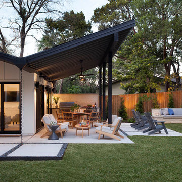

 Lindye Galloway Interiors
Modern regency bedroom design by Lindye Galloway Design. Vintage gold chandelier, teal headboard and gold polka dot ceiling treatment.
Bedroom - small transitional guest light wood floor bedroom idea in Los Angeles with white walls and no fireplace
Bedroom - small transitional guest light wood floor bedroom idea in Los Angeles with white walls and no fireplace
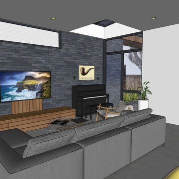 Aardvark Architecture
This proposal is for a new two-story home on the vacant heavily wooded lot with an existing 150-foot-long driveway lined by several beautiful oak trees culminating in a behemoth 43-inch oak tree where the driveway meets the main lot. The far end of the driveway terminates in a grove of three 43/40/43-inch redwoods and at the very center of the vacant lot stands a gargantuan V-twin 59-inch redwood tree paired with a “small” 29-inch redwood tree. The owners want to build a beautiful contemporary-styled home for their family that fully enjoys and embraces the mature trees on their cozy 65-foot by 100-foot lot.
As with all small, constrained lots, this project’s site design started first with meeting the relatively large parking and car maneuvering requirements. Menlo Park’s Department of Transportation typically requires side-facing garages to have 24-feet of backup space. So that they could give the largest feature redwood tree on site an added four feet (50%) of clearance outside of its critical root zone, the owners agreed to install a vehicle turntable at the end of their driveway to eliminate the extra four feet of space needed to back up and turnaround. This allowed them to pull their garage forward an additional four feet towards the front property line on the panhandle side, drastically reducing the rest of the home’s impact on the gargantuan V-Twin paired redwood tree at the center of the lot.
One of the owners has mobility issues, and accordingly, they first sought to design a one-story floor plan that incorporated all their family’s needs including plenty of covered patio and deck space to enjoy our fantastic California weather. But that single-story footprint spread too far into the critical root zones of several of the redwood trees on site, even despite the use of the vehicle turntable. During my interview process with the owners, they made it clear to me that one of their primary concerns is ensuring that the largest trees on site would thrive and become features of their new home after construction is complete. The single-story designs that removed the grove of three huge redwood trees were non-starters, as was the skimpy 5x10 master bath I designed when trying to squeeze the whole house program into an overly compromised single-story design. It was therefore deemed necessary to go with a two-story design despite the owner’s mobility issues. This two-story design has a much more compact ground floor footprint and has no bedrooms downstairs, other than the detached ADU. The owners must give up the floor area and incur the costs to install a residential elevator to access their upstairs master suite.
Our ground floor footprint is smaller due to the two-story design decision, and our foundation is pulled away from the trees thanks to the vehicle turntable. Yet, a tiny portion of the home’s ground floor footprint still encroaches into the critical root zones of the largest 59” redwood tree. Therefore, as outlined in the Arborist Report prepared by Aesculus Arboricultural Consulting, the structural engineers are incorporating an array of drilled piers and shallow-grade beams for the main home’s foundation and deck area nearest the redwood’s critical root zone. This drilled piers and grade beam foundation is a type of “bridging” foundation as outlined in Aesculus’ report to preserve the health of these trees that the property was designed around. The rest of the foundation will be constructed as an insulated slab-on-grade foundation to minimize the number of steps and ramps needed for the owners to enjoy their home and patio areas.
Despite the owner’s desire to keep as many trees as possible on site, and despite the smaller ground floor footprint and the advantage of the vehicle turntable, the need for a 20x20-foot garage and 20x20/25-foot guest parking space on our panhandle lot requires the removal of two heritage trees in the required driveway, a 16” coast redwood, and a 17” coast redwood. An alternate design, such as swapping the garage and guest parking locations north-to-south, still requires the removal of these two trees for vehicle maneuvering but has the added disadvantage of cutting off the home’s sightlines to the behemoth 43” oak tree just outside the currently proposed front patio space and living room. Jim Redman of Elements Landscape is proposing 13 new trees be planted on site to replace the lost value of these two heritage coast redwood trees.
This contemporary architectural design features clean lines, and an abundance of full-height windows and large skylights to best take in the immense trees on site. To blend in with the forest-like setting, the home boasts a mix of rich textures and features a color palette of natural wood tones contrasted with dark blue and black. Once through the new steel gate at the street and down the 150-foot tree-lined driveway, a large covered front patio becomes visible past the neighbor’s detached accessory structure. The covered patio is just across the driveway from the beautiful 43” behemoth coast live oak. The single plane of the covered patio roof is delicately supported by a pair of steel posts in a “V-twin” configuration much like the largest redwood trees that tower over the center of the lot and will still be visible above the new two-story home, even from the front yard. The patio is covered in a dark-colored standing seam roof, with steel C-channel fascias, and tongue-and-groove wood ceiling planks on the underside. Generously sized skylights on the patio roof and inside the living area allow for impressive views of the amazing oak canopy as well as precious natural light.
Supporting the sloped covered patio on the other side is the two-car garage with a secondary bedroom suite stacked above the garage. This two-story volume is to be clad in vertical clear-coated redwood siding, to tie in with the grove of three 43-inch redwood trees just beyond. The garage door, and the bank of windows for Bedroom#2 above feature a steel fascia eyebrow header feature to provide shade and overhang protection, as we are not proposing a large overhang at this “redwood trunk”. The garage and bedroom volume are pulled 16 feet away from the side property line, instead of the minimum required setback of 6’-6”, thus leaving plenty of room for the redwood grove and existing mature pear tree to continue to thrive. This existing mature green screen in this 16-foot-wide side yard is a feature worth soaking in, which is why tall windows with low sill heights are proposed for both the stairs and the upstairs hallway. Though it may be infrequent to approve side-facing 2nd floor windows with sill heights as low as what we’re proposing, we are confident that the mature green screen and the over 16-foot-wide side yard are sufficient to provide for the continued privacy of our neighbor’s rear yard space, especially considering theses windows are in walkway zones.
The covered patio at the front entry is also bound by the 10-foot-tall living room. The great room is clad in a dark blue brick veneer, which wraps around all three sides of the living room. Upon entering the home from the covered patio, you are immediately greeted with one of the most impressive features of the home’s design: a 10-foot-tall by 24-foot-wide set of sliding glass doors. From the entry, this huge opening gives merely an initial glimpse of the massive trunks of the gargantuan V-twin redwoods sitting at the center of the lot. All three sliding glass panels open directly out into the smaller partially covered deck in the rear. This roof overhang element matches the design of the front patio with a steel C-channel fascia and a large skylight. But the rear deck’s roof element is set flat at a ten-foot ceiling height so that the living room’s ceiling seems to float above and out beyond the expanse of full-height sliding doors, thus creating an indoor-outdoor living space that will feel much larger than the home’s actual footprint. This rear covered deck is smaller than the patio in the front and also has a mix of solid and open-slatted roofing to allow for more solar access for the relatively small amount of open sky available.
The downstairs living room is open to the dining and kitchen areas, as well as the stair-and-elevator tower beyond. The stair tower is very open and glassy, and the stairs wind up and around the redwood-clad elevator tower. From certain perspectives in the 16-foot-wide side yard, it will almost seem as if the grove of three redwoods has a fourth tree that the house and the stairs were carefully built around. Other than the 3-foot-wide windows, the exterior walls of the stair tower, downstairs utility spaces, and Bedroom#3 above are finished in cement plaster, painted dark blue and black. The sloped roof over the stair-and-elevator tower continues cleanly over the area of upstairs Bedroom#3. This roof level is set by the side daylight plane and only yields an inside wall height of just under 6 feet in height. The owners are satisfied that the rest of this upstairs room has a nice vaulted ceiling to make up for the one short wall under the daylight plane.
The rest of the ground floor adjacent to the stair tower consists of a small utility wing containing a half-bath, laundry, storage area, and an exterior alcove for the electric heat pump HVAC unit. This short wing also gives more accessible access to the rear yard deck, as well as a backdrop for an outdoor kitchen. The bright white stone backsplash for the outdoor kitchen provides contrast to the otherwise consistent use of cement plaster painted dark blue and black for the two-story wing closest to the detached ADU. Though Bedroom#3 is stacked directly above this small wing, it is relatively short to comply with the side daylight plane of this narrow lot. Still, to further help break up the scale of this wall, another steel fascia eyebrow element is set about 8 feet above the rear deck.
The master suite sits centered above the ten-foot-tall great room. The master bedroom and its balcony, as well as the master bathtub area, have a commanding view of the central redwood trees and their impressive canopy, though the balcony is mostly recessed and should pose no privacy concerns to the neighbor’s rear yards. The master balcony parapet is clad in the same brick veneer continuing up from the living room below. A dark-painted metal rail makes up the rest of the open guardrail height. The entire length of the master balcony is comprised of 9-foot-tall sliding glass doors, but the area above the doors, as well as the area below the master bathroom windows, is accented with more redwood siding. The remainder of the master suite bathroom and walk-in closet is finished in cement plaster painted dark blue. The master bathroom has one side yard-facing window but will be frosted glass for both the owner’s and the neighbor’s privacy.
The 2nd floor is capped under a simple gable roof design with one roof ridge and varying eave and rake overhangs depending on the 2nd-floor layout and solar orientation. Since these roof planes are quite difficult to see in the middle of the heavily wooded panhandle lot, we are proposing a white TPO roofing for these two upper roof planes as a more sustainable choice compared to more dark-colored roofing like the covered patios and detached ADU.
The owners also wish to build a detached 292-square-foot Accessory Dwelling Unit (ADU) as an office and guest suite. For the ADU foundation to be situated outside the central redwood tree’s critical root zone, this relatively tiny structure takes advantage of the narrower 4-foot side and rear setbacks allowed for ADUs smaller than 800 square feet. The small L-shaped detached ADU frames a wonderful quasi-courtyard around the gargantuan V-twin redwoods at the center of the lot. The ADU shares a matching material palette consisting of cement plaster painted blue and black, vertical redwood siding and soffits, and thin brick veneer. The ADU also features large full-height windows. The only difference between the main home and the ADU material palette is that the roofing will be a dark composition shingle roofing since it will be quite visible from the master balcony.
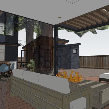 Aardvark Architecture
This proposal is for a new two-story home on the vacant heavily wooded lot with an existing 150-foot-long driveway lined by several beautiful oak trees culminating in a behemoth 43-inch oak tree where the driveway meets the main lot. The far end of the driveway terminates in a grove of three 43/40/43-inch redwoods and at the very center of the vacant lot stands a gargantuan V-twin 59-inch redwood tree paired with a “small” 29-inch redwood tree. The owners want to build a beautiful contemporary-styled home for their family that fully enjoys and embraces the mature trees on their cozy 65-foot by 100-foot lot.
As with all small, constrained lots, this project’s site design started first with meeting the relatively large parking and car maneuvering requirements. Menlo Park’s Department of Transportation typically requires side-facing garages to have 24-feet of backup space. So that they could give the largest feature redwood tree on site an added four feet (50%) of clearance outside of its critical root zone, the owners agreed to install a vehicle turntable at the end of their driveway to eliminate the extra four feet of space needed to back up and turnaround. This allowed them to pull their garage forward an additional four feet towards the front property line on the panhandle side, drastically reducing the rest of the home’s impact on the gargantuan V-Twin paired redwood tree at the center of the lot.
One of the owners has mobility issues, and accordingly, they first sought to design a one-story floor plan that incorporated all their family’s needs including plenty of covered patio and deck space to enjoy our fantastic California weather. But that single-story footprint spread too far into the critical root zones of several of the redwood trees on site, even despite the use of the vehicle turntable. During my interview process with the owners, they made it clear to me that one of their primary concerns is ensuring that the largest trees on site would thrive and become features of their new home after construction is complete. The single-story designs that removed the grove of three huge redwood trees were non-starters, as was the skimpy 5x10 master bath I designed when trying to squeeze the whole house program into an overly compromised single-story design. It was therefore deemed necessary to go with a two-story design despite the owner’s mobility issues. This two-story design has a much more compact ground floor footprint and has no bedrooms downstairs, other than the detached ADU. The owners must give up the floor area and incur the costs to install a residential elevator to access their upstairs master suite.
Our ground floor footprint is smaller due to the two-story design decision, and our foundation is pulled away from the trees thanks to the vehicle turntable. Yet, a tiny portion of the home’s ground floor footprint still encroaches into the critical root zones of the largest 59” redwood tree. Therefore, as outlined in the Arborist Report prepared by Aesculus Arboricultural Consulting, the structural engineers are incorporating an array of drilled piers and shallow-grade beams for the main home’s foundation and deck area nearest the redwood’s critical root zone. This drilled piers and grade beam foundation is a type of “bridging” foundation as outlined in Aesculus’ report to preserve the health of these trees that the property was designed around. The rest of the foundation will be constructed as an insulated slab-on-grade foundation to minimize the number of steps and ramps needed for the owners to enjoy their home and patio areas.
Despite the owner’s desire to keep as many trees as possible on site, and despite the smaller ground floor footprint and the advantage of the vehicle turntable, the need for a 20x20-foot garage and 20x20/25-foot guest parking space on our panhandle lot requires the removal of two heritage trees in the required driveway, a 16” coast redwood, and a 17” coast redwood. An alternate design, such as swapping the garage and guest parking locations north-to-south, still requires the removal of these two trees for vehicle maneuvering but has the added disadvantage of cutting off the home’s sightlines to the behemoth 43” oak tree just outside the currently proposed front patio space and living room. Jim Redman of Elements Landscape is proposing 13 new trees be planted on site to replace the lost value of these two heritage coast redwood trees.
This contemporary architectural design features clean lines, and an abundance of full-height windows and large skylights to best take in the immense trees on site. To blend in with the forest-like setting, the home boasts a mix of rich textures and features a color palette of natural wood tones contrasted with dark blue and black. Once through the new steel gate at the street and down the 150-foot tree-lined driveway, a large covered front patio becomes visible past the neighbor’s detached accessory structure. The covered patio is just across the driveway from the beautiful 43” behemoth coast live oak. The single plane of the covered patio roof is delicately supported by a pair of steel posts in a “V-twin” configuration much like the largest redwood trees that tower over the center of the lot and will still be visible above the new two-story home, even from the front yard. The patio is covered in a dark-colored standing seam roof, with steel C-channel fascias, and tongue-and-groove wood ceiling planks on the underside. Generously sized skylights on the patio roof and inside the living area allow for impressive views of the amazing oak canopy as well as precious natural light.
Supporting the sloped covered patio on the other side is the two-car garage with a secondary bedroom suite stacked above the garage. This two-story volume is to be clad in vertical clear-coated redwood siding, to tie in with the grove of three 43-inch redwood trees just beyond. The garage door, and the bank of windows for Bedroom#2 above feature a steel fascia eyebrow header feature to provide shade and overhang protection, as we are not proposing a large overhang at this “redwood trunk”. The garage and bedroom volume are pulled 16 feet away from the side property line, instead of the minimum required setback of 6’-6”, thus leaving plenty of room for the redwood grove and existing mature pear tree to continue to thrive. This existing mature green screen in this 16-foot-wide side yard is a feature worth soaking in, which is why tall windows with low sill heights are proposed for both the stairs and the upstairs hallway. Though it may be infrequent to approve side-facing 2nd floor windows with sill heights as low as what we’re proposing, we are confident that the mature green screen and the over 16-foot-wide side yard are sufficient to provide for the continued privacy of our neighbor’s rear yard space, especially considering theses windows are in walkway zones.
The covered patio at the front entry is also bound by the 10-foot-tall living room. The great room is clad in a dark blue brick veneer, which wraps around all three sides of the living room. Upon entering the home from the covered patio, you are immediately greeted with one of the most impressive features of the home’s design: a 10-foot-tall by 24-foot-wide set of sliding glass doors. From the entry, this huge opening gives merely an initial glimpse of the massive trunks of the gargantuan V-twin redwoods sitting at the center of the lot. All three sliding glass panels open directly out into the smaller partially covered deck in the rear. This roof overhang element matches the design of the front patio with a steel C-channel fascia and a large skylight. But the rear deck’s roof element is set flat at a ten-foot ceiling height so that the living room’s ceiling seems to float above and out beyond the expanse of full-height sliding doors, thus creating an indoor-outdoor living space that will feel much larger than the home’s actual footprint. This rear covered deck is smaller than the patio in the front and also has a mix of solid and open-slatted roofing to allow for more solar access for the relatively small amount of open sky available.
The downstairs living room is open to the dining and kitchen areas, as well as the stair-and-elevator tower beyond. The stair tower is very open and glassy, and the stairs wind up and around the redwood-clad elevator tower. From certain perspectives in the 16-foot-wide side yard, it will almost seem as if the grove of three redwoods has a fourth tree that the house and the stairs were carefully built around. Other than the 3-foot-wide windows, the exterior walls of the stair tower, downstairs utility spaces, and Bedroom#3 above are finished in cement plaster, painted dark blue and black. The sloped roof over the stair-and-elevator tower continues cleanly over the area of upstairs Bedroom#3. This roof level is set by the side daylight plane and only yields an inside wall height of just under 6 feet in height. The owners are satisfied that the rest of this upstairs room has a nice vaulted ceiling to make up for the one short wall under the daylight plane.
The rest of the ground floor adjacent to the stair tower consists of a small utility wing containing a half-bath, laundry, storage area, and an exterior alcove for the electric heat pump HVAC unit. This short wing also gives more accessible access to the rear yard deck, as well as a backdrop for an outdoor kitchen. The bright white stone backsplash for the outdoor kitchen provides contrast to the otherwise consistent use of cement plaster painted dark blue and black for the two-story wing closest to the detached ADU. Though Bedroom#3 is stacked directly above this small wing, it is relatively short to comply with the side daylight plane of this narrow lot. Still, to further help break up the scale of this wall, another steel fascia eyebrow element is set about 8 feet above the rear deck.
The master suite sits centered above the ten-foot-tall great room. The master bedroom and its balcony, as well as the master bathtub area, have a commanding view of the central redwood trees and their impressive canopy, though the balcony is mostly recessed and should pose no privacy concerns to the neighbor’s rear yards. The master balcony parapet is clad in the same brick veneer continuing up from the living room below. A dark-painted metal rail makes up the rest of the open guardrail height. The entire length of the master balcony is comprised of 9-foot-tall sliding glass doors, but the area above the doors, as well as the area below the master bathroom windows, is accented with more redwood siding. The remainder of the master suite bathroom and walk-in closet is finished in cement plaster painted dark blue. The master bathroom has one side yard-facing window but will be frosted glass for both the owner’s and the neighbor’s privacy.
The 2nd floor is capped under a simple gable roof design with one roof ridge and varying eave and rake overhangs depending on the 2nd-floor layout and solar orientation. Since these roof planes are quite difficult to see in the middle of the heavily wooded panhandle lot, we are proposing a white TPO roofing for these two upper roof planes as a more sustainable choice compared to more dark-colored roofing like the covered patios and detached ADU.
The owners also wish to build a detached 292-square-foot Accessory Dwelling Unit (ADU) as an office and guest suite. For the ADU foundation to be situated outside the central redwood tree’s critical root zone, this relatively tiny structure takes advantage of the narrower 4-foot side and rear setbacks allowed for ADUs smaller than 800 square feet. The small L-shaped detached ADU frames a wonderful quasi-courtyard around the gargantuan V-twin redwoods at the center of the lot. The ADU shares a matching material palette consisting of cement plaster painted blue and black, vertical redwood siding and soffits, and thin brick veneer. The ADU also features large full-height windows. The only difference between the main home and the ADU material palette is that the roofing will be a dark composition shingle roofing since it will be quite visible from the master balcony.
3