
Search results for "Extra far reaching" in Home Design Ideas
 InnovationLand
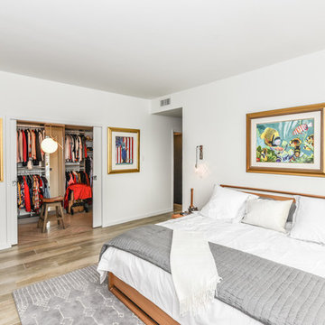
Houston Interior Designer Lisha Maxey took this Museum District condo from the dated, mirrored walls of the 1980s to Mid Century Modern with a gallery look featuring the client's art collection.
"The place was covered with glued-down, floor-to-ceiling mirrors," says Lisha Maxey, senior designer for Homescapes of Houston and principal at LGH Design Services in Houston. "When we took them off the walls, the walls came apart. We ended up taking them down to the studs."
The makeover took six months to complete, primarily because of strict condo association rules that only gave the Houston interior designers very limited access to the elevator - through which all materials and team members had to go.
"Monday through Friday, we could only be noisy from 10 a.m. to 2 p.m., and if we had to do something extra loud, like sawing or drilling, we had to schedule it with the management and they had to communicate that to the condo owners. So it was just a lot of coordination. But a lot of Inner City Loopers live in these kinds of buildings, so we're used to handling that kind of thing."
The client, a child psychiatrist in her 60s, recently moved to Houston from northeast Texas to be with friends. After being widowed three years ago, she decided it was time to let go of the traditionally styled estate that wasn't really her style anyway. An avid diver who has traveled around the world to pursue her passion, she has amassed a large collection of art from her travels. Downsizing to 1,600 feet and wanting to go more contemporary, she wanted the display - and the look - more streamlined.
"She wanted clean lines and muted colors, with the main focus being her artwork," says Maxey. "So we made the space a palette for that."
Enter the white, gallery-grade paint she chose for the walls: "It's halfway between satin and flat," explains Maxey. "It's not glossy and it's not chalky - just very smooth and clean."
Adding to the gallery theme is the satin nickel track lighting with lamps aimed to highlight pieces of art. "This lighting has no wires," notes Maxey. "It's powered by a positive and negative conduit."
The new flooring throughout is a blended-grey porcelain tile that looks like wood planks. "It's gorgeous, natural-looking and combines all the beauty of wood with the durability of tile," says Maxey. "We used it throughout the condo to unify the space."
After Maxey started looking at the client's bright, vibrant, colorful artwork, she felt the palette couldn't stay as muted anymore. Hence the Mid Century Modern orange leather sofas from West Elm and bright green chairs from Joybird, plus the throw pillows in different textures, patterns and shades of gold, orange and green.
The concave lines of the Danish-inspired chairs, she notes, help them look beautiful from all the way around - a key to designing spaces for loft living.
"The table in the living room is very interesting," notes Maxey. "It was handmade for the client in 1974 and has a signature on it from the artist. She was adamant about including the piece, which has all these hand-painted black-and-white art tiles on the top. I took one look at it and said 'It's not really going to go.'"
However, after cutting 6 inches off the bottom and making it look a little distressed, the table ended up being the perfect complement to the sofas.
The dining room table - from Design Within Reach - is a solid piece of mahogany, the chair upholstery a mix of grey velvet and leather and the legs a shiny brass. "The side chairs are leather and the end ones are velvet," says Maxey. "It's a nice textural mix that lends depth and texture."
The galley kitchen, meanwhile, has been lightened and brightened, with white quartz countertops and backsplashes mimicking the look of Carrara marble, stainless steel appliances and a velvet green bench seat for a punch of color. The cabinets are painted a cool grey color called "Silverplate."
The two bathrooms have been updated with contemporary white vanities and vessel sinks and the master bath now features a walk-in shower tiled in Dolomite white marble (the floor is Bianco Carrara marble mosaic, done in a herringbone pattern.
In the master bedroom, Homescapes of Houston knocked down a wall between two smaller closets with swing doors to make one large walk-in closet with pocket doors. The closet in the guest bedroom also came out 13 more inches.
The client's artwork throughout personalizes the space and tells the story of a life. There's a huge bowl of shells from the client's diving adventures, framed art from her child psychiatry patients and a 16th century wood carving from a monastery that's been in her family forever.
"Her collection is quite impressive," says Maxey. "There's even a framed piece of autographed songs written by John Lennon." (You can see this black-framed piece of art on the wall in the photo above of two green chairs).
"We're extremely happy with how the project turned out, and so is the client," says Maxey. "No expense was spared for her. It was a labor of love and we were excited to do it."


 Thyme & Place Design LLC
When my client had to move from her company office to work at home, she set up in the dining room. Despite her best efforts, this was not the long-term solution she was looking for. My client realized she needed a dedicated space not on the main floor of the home. On one hand, having your office space right next to the kitchen is handy. On the other hand, it made separating work and home life was not that easy.
The house was a ranch. In essence, the basement would run entire length of the home. As we came down the steps, we entered a time capsule. The house was built in the 1950’s. The walls were covered with original knotty pine paneling. There was a wood burning fireplace and considering this was a basement, high ceilings. In addition, there was everything her family could not store at their own homes. As we wound though the space, I though “wow this has potential”, Eventually, after walking through the laundry room we came to a small nicely lit room. This would be the office.
My client looked at me and asked what I thought. Undoubtedly, I said, this can be a great workspace, but do you really want to walk through this basement and laundry to get here? Without reservation, my client said where do we start?
Once the design was in place, we started the renovation. The knotty pine paneling had to go. Specifically, to add some insulation and control the dampness and humidity. The laundry room wall was relocated to create a hallway to the office.
At the far end of the room, we designated a workout zone. Weights, mats, exercise bike and television are at the ready for morning or afternoon workouts. The space can be concealed by a folding screen for party time. Doors to an old closet under the stairs were relocated to the workout area for hidden storage. Now we had nice wall for a beautiful console and mirror for storage and serving during parties.
In order to add architectural details, we covered the old ugly support columns with simple recessed millwork panels. This detail created a visual division between the bar area and the seating area in front of the fireplace. The old red brick on the fireplace surround was replaced with stack stone. A mantle was made from reclaimed wood. Additional reclaimed wood floating shelves left and right of the fireplace provides decorative display while maintaining a rustic element balancing the copper end table and leather swivel rocker.
We found an amazing rug which tied all of the colors together further defining the gathering space. Russet and burnt orange became the accent color unifying each space. With a bit of whimsy, a rather unusual light fixture which looks like roots from a tree growing through the ceiling is a conversation piece.
The office space is quite and removed from the main part of the basement. There is a desk large enough for multiple screens, a small bookcase holding office supplies and a comfortable chair for conference calls. Because working from home requires many online meetings, we added a shiplap wall painted in Hale Navy to contrast with the orange fabric on the chair. We finished the décor with a painting from my client’s father. This is the background online visitors will see.
The last and best part of the renovation is the beautiful bar. My client is an avid collector of wine. She already had the EuroCave refrigerator, so I incorporated it into the design. The cabinets are painted Temptation Grey from Benjamin Moore. The counter tops are my favorite hard working quartzite Brown Fantasy. The backsplash is a combination of rustic wood and old tin ceiling like porcelain tiles. Together with the textures of the reclaimed wood and hide poofs balanced against the smooth finish of the cabinets, we created a comfortable luxury for relaxing.
There is ample storage for bottles, cans, glasses, and anything else you can think of for a great party. In addition to the wine storage, we incorporated a beverage refrigerator, an ice maker, and a sink. Floating shelves with integrated lighting illuminate the back bar. The raised height of the front bar provides the perfect wine tasting and paring spot. I especially love the pendant lights which look like wine glasses.
Finally, I selected carpet for the stairs and office. It is perfect for noise reduction. Meanwhile for the overall flooring, I specifically selected a high-performance vinyl plank floor. We often use this product as it is perfect to install on a concrete floor. It is soft to walk on, easy to clean and does not reduce the overall height of the space.
Find the right local pro for your project
 Lee Lormand Design
Lee Lormand
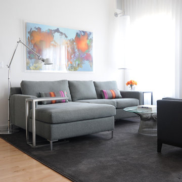
Inspiration for a small contemporary formal and open concept light wood floor and brown floor living room remodel in Dallas with white walls, no fireplace and no tv
Inspiration for a small contemporary formal and open concept light wood floor and brown floor living room remodel in Dallas with white walls, no fireplace and no tv
 Searl Lamaster Howe Architects
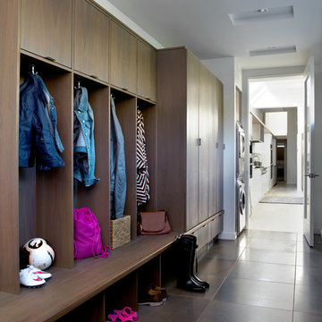
The mudroom runs alongside of the rear patio, linking the kitchen to the original coach house that was on the property. The coach house was converted into a garage and a home theater. The mudroom features ample, easily accessible storage to organize clutter before it has the chance to reach into the rest of the house. Likewise a stacked washer and dryer (which complement those in the main laundry room on the second floor) capture muddy uniforms and the like. Closed cabinets hold additional coat storage, brooms, and cleaning supplies. A frosted glass panel door can close off views to the mudroom from the kitchen.
 Miller-Roodell Architects Ltd
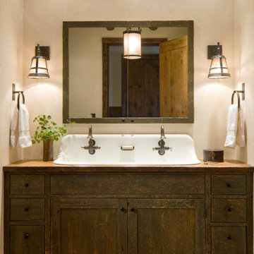
Example of a mountain style bathroom design in Other with beige walls, a trough sink, shaker cabinets and dark wood cabinets
 Hammond Design
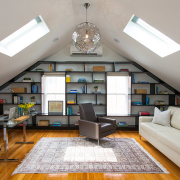
In the third floor library we had custom built bookcases constructed with a strong geometric pattern. The shelves were finished in a high gloss black to make them stand out against the white walls.
Photo: Eric Roth

Sponsored
Westerville, OH

Inspired Closets Columbus
Innovative & Creative Custom Closet Designer Servicing Franklin County
 Kitchen Design Concepts
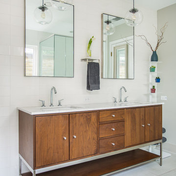
After reviving their kitchen, this couple was ready to tackle the master bathroom by getting rid of some Venetian plaster and a built in tub, removing fur downs and a bulky shower surround, and just making the entire space feel lighter, brighter, and bringing into a more mid-century style space.
The cabinet is a freestanding furniture piece that we allowed the homeowner to purchase themselves to save a little bit on cost, and it came with prefabricated with a counter and undermount sinks. We installed 2 floating shelves in walnut above the commode to match the vanity piece.
The faucets are Hansgrohe Talis S widespread in chrome, and the tub filler is from the same collection. The shower control, also from Hansgrohe, is the Ecostat S Pressure Balance with a Croma SAM Set Plus shower head set.
The gorgeous freestanding soaking tub if from Jason - the Forma collection. The commode is a Toto Drake II two-piece, elongated.
Tile was really fun to play with in this space so there is a pretty good mix. The floor tile is from Daltile in their Fabric Art Modern Textile in white. We kept is fairly simple on the vanity back wall, shower walls and tub surround walls with an Interceramic IC Brites White in their wall tile collection. A 1" hex on the shower floor is from Daltile - the Keystones collection. The accent tiles were very fun to choose and we settled on Daltile Natural Hues - Paprika in the shower, and Jade by the tub.
The wall color was updated to a neutral Gray Screen from Sherwin Williams, with Extra White as the ceiling color.
 Clark & Chapin Architects
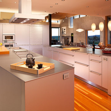
Inspiration for a large contemporary medium tone wood floor kitchen remodel in Denver with an undermount sink, flat-panel cabinets, stainless steel appliances, two islands and gray cabinets
 Supple Homes, Inc
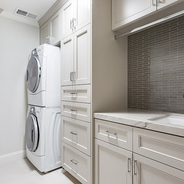
Example of a transitional single-wall laundry room design in San Francisco with an undermount sink, beige cabinets, marble countertops, gray walls, a stacked washer/dryer, white countertops and recessed-panel cabinets
 Vela Interior Design
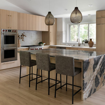
Modern kitchen with rift-cut white oak cabinetry and a natural stone island.
Inspiration for a mid-sized contemporary light wood floor and beige floor kitchen remodel in Minneapolis with a double-bowl sink, flat-panel cabinets, light wood cabinets, quartzite countertops, beige backsplash, quartz backsplash, stainless steel appliances, an island and beige countertops
Inspiration for a mid-sized contemporary light wood floor and beige floor kitchen remodel in Minneapolis with a double-bowl sink, flat-panel cabinets, light wood cabinets, quartzite countertops, beige backsplash, quartz backsplash, stainless steel appliances, an island and beige countertops
 Elizabeth Herrmann architecture + design
Jim Westphalen
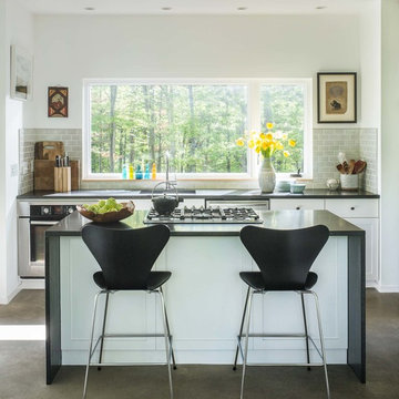
Example of a small trendy single-wall concrete floor and gray floor open concept kitchen design in Burlington with a single-bowl sink, gray backsplash, subway tile backsplash, stainless steel appliances, an island, shaker cabinets, solid surface countertops and black countertops
Example of a small trendy single-wall concrete floor and gray floor open concept kitchen design in Burlington with a single-bowl sink, gray backsplash, subway tile backsplash, stainless steel appliances, an island, shaker cabinets, solid surface countertops and black countertops
 Terrain
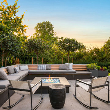
When the client reached out to assemble the team to execute their dream backyard, they chose Williamson Landscape Architecture, Coburn Construction, and Terrain Seattle to bring their vision to life. The work included a custom pool, hot tub, bocce ball court, and multiple seating areas with detailed flatwork.
Sponsored
Westerville, OH
Inspired Closets Columbus
Innovative & Creative Custom Closet Designer Servicing Franklin County
 Closet POSSIBLE
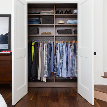
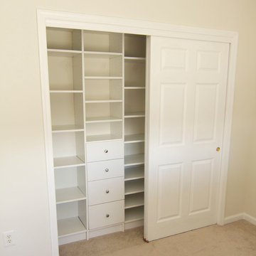
Hidden behind sliding doors, this reach-in closet system includes drawers that easily clear the doors and lots of shelving. In white and with toe kicks, a pleasure to look at when the doors are open. White. 2015. Monroe, NJ 08531.
 Jeff Soderbergh Custom Sustainable Furnishings
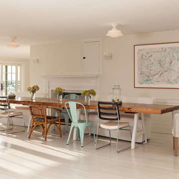
My client came to us with a request to make a contemporary meets warm and inviting 17 foot dining table using only 15 foot long, extra wide "Kingswood" boards from their 1700's attic floor. The bases are vintage cast iron circa 1900 Adam's Brothers - Providence, RI.
 Bravas Boca Raton
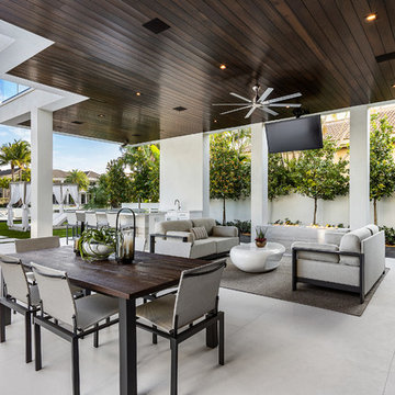
Infinity pool with outdoor living room, cabana, and two in-pool fountains and firebowls.
Signature Estate featuring modern, warm, and clean-line design, with total custom details and finishes. The front includes a serene and impressive atrium foyer with two-story floor to ceiling glass walls and multi-level fire/water fountains on either side of the grand bronze aluminum pivot entry door. Elegant extra-large 47'' imported white porcelain tile runs seamlessly to the rear exterior pool deck, and a dark stained oak wood is found on the stairway treads and second floor. The great room has an incredible Neolith onyx wall and see-through linear gas fireplace and is appointed perfectly for views of the zero edge pool and waterway. The center spine stainless steel staircase has a smoked glass railing and wood handrail.
Photo courtesy Royal Palm Properties
 Lindsey Markel
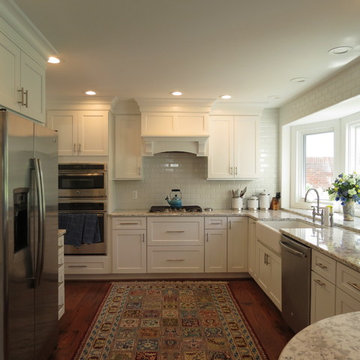
My customers came to me wanting a big change in their small colonial kitchen. They knew they had extra space from a previous addition and dining room. As far as layout they didn't give me any limitations. They asked for more counter space, storage, and something they can comfortably entertain in with their growing family. We knocked down the wall between the old kitchen and dining room and added another doorway to the front room. This allowed me to double the size of the kitchen and add an angled peninsula with seating. The kitchen is now open to the existing addition which serves as great room with a built in desk area. All new windows were put in throughout the house and the patio door was moved to the back wall of great room. This allows for a better flow to the in ground pool where we added new steps and decking. My customers love their new open concept living space. They especially enjoy it with the grandkids during the summer months. Photo By: Lindsey Markel
Sponsored
Columbus, OH

HomeCraft Remodeling
Custom Craftsmanship & Build Solutions in Franklin County, Ohio
 TKS Design Group
Download our free ebook, Creating the Ideal Kitchen. DOWNLOAD NOW
For many, extra time at home during COVID left them wanting more from their homes. Whether you realized the shortcomings of your space or simply wanted to combat boredom, a well-designed and functional home was no longer a want, it became a need. Tina found herself wanting more from her Old Irving Park home and reached out to The Kitchen Studio about adding function to her kitchen to make the most of the available real estate.
At the end of the day, there is nothing better than returning home to a bright and happy space you love. And this kitchen wasn’t that for Tina. Dark and dated, with a palette from the past and features that didn’t make the most of the available square footage, this remodel required vision and a fresh approach to the space. Lead designer, Stephanie Cole’s main design goal was better flow, while adding greater functionality with organized storage, accessible open shelving, and an overall sense of cohesion with the adjoining family room.
The original kitchen featured a large pizza oven, which was rarely used, yet its footprint limited storage space. The nearby pantry had become a catch-all, lacking the organization needed in the home. The initial plan was to keep the pizza oven, but eventually Tina realized she preferred the design possibilities that came from removing this cumbersome feature, with the goal of adding function throughout the upgraded and elevated space. Eliminating the pantry added square footage and length to the kitchen for greater function and more storage. This redesigned space reflects how she lives and uses her home, as well as her love for entertaining.
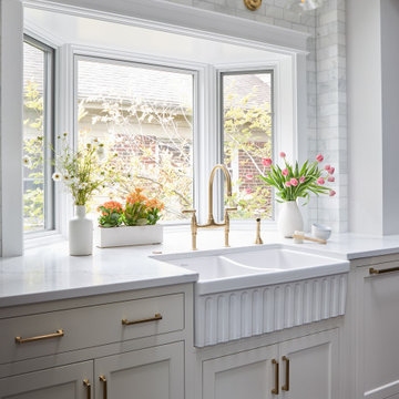
The kitchen features a classic, clean, and timeless palette. White cabinetry, with brass and bronze finishes, contrasts with rich wood flooring, and lets the large, deep blue island in Woodland’s custom color Harbor – a neutral, yet statement color – draw your eye.
The kitchen was the main priority. In addition to updating and elevating this space, Tina wanted to maximize what her home had to offer. From moving the location of the patio door and eliminating a window to removing an existing closet in the mudroom and the cluttered pantry, the kitchen footprint grew. Once the floorplan was set, it was time to bring cohesion to her home, creating connection between the kitchen and surrounding spaces.
The color palette carries into the mudroom, where we added beautiful new cabinetry, practical bench seating, and accessible hooks, perfect for guests and everyday living. The nearby bar continues the aesthetic, with stunning Carrara marble subway tile, hints of brass and bronze, and a design that further captures the vibe of the kitchen.
Every home has its unique design challenges. But with a fresh perspective and a bit of creativity, there is always a way to give the client exactly what they want [and need]. In this particular kitchen, the existing soffits and high slanted ceilings added a layer of complexity to the lighting layout and upper perimeter cabinets.
While a space needs to look good, it also needs to function well. This meant making the most of the height of the room and accounting for the varied ceiling features, while also giving Tina everything she wanted and more. Pendants and task lighting paired with an abundance of natural light amplify the bright aesthetic. The cabinetry layout and design compliments the soffits with subtle profile details that bring everything together. The tile selections add visual interest, drawing the eye to the focal area above the range. Glass-doored cabinets further customize the space and give the illusion of even more height within the room.
While her family may be grown and out of the house, Tina was focused on adding function without sacrificing a stunning aesthetic and dreamy finishes that make the kitchen the gathering place of any home. It was time to love her kitchen again, and if you’re wondering what she loves most, it’s the niche with glass door cabinetry and open shelving for display paired with the marble mosaic backsplash over the range and complimenting hood. Each of these features is a stunning point of interest within the kitchen – both brag-worthy additions to a perimeter layout that previously felt limited and lacking.
Whether your remodel is the result of special needs in your home or simply the excitement of focusing your energy on creating a fun new aesthetic, we are here for it. We love a good challenge because there is always a way to make a space better – adding function and beauty simultaneously.
 Décor Aid
When a young, hip couple from Hong Kong purchased a waterfront condominium in New Jersey, they reached out to Decor Aid for assistance in transforming their new space into a home away from home. The couple wanted the space to be modern, homey, and traditional, while also being wholly representative of their laid-back sensibility.
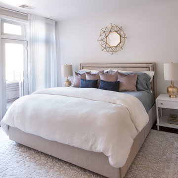
When the couple moved in, the walls of the apartment were painted dark green, with a grey trim. The effect was dark and somber, which was exactly what they did not want their apartment to feel like. So the first thing we did was repaint the walls, which immediately gave the space a lighter, airier feel, and set the tone for the neutral palette that would be incorporated throughout the space.
Besides a few pieces that the couple had brought with them from Hong Kong, there was no existing furniture to work with. The couple stressed that they wanted the option to entertain, but that they didn’t want the apartment to be designed like a party house. The dining room table perfectly captures the couple’s refined yet rustic aesthetic, but also has the ability to expand, and accommodate a few extra guests for a small dinner party.
The couple wanted their space to feel distinguished, but also wanted the apartment to feel young and hip. To offset the comfortable and neutral tones, brass elements were added throughout the apartment, which added a cohesive feel, without sacrificing the desired look. The final result is a comfortable, modern, and grown-up space that this vibrant young couple can now call home.
 MMI Design
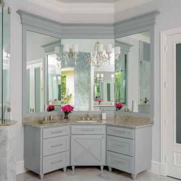
This existing client reached out to MMI Design for help shortly after the flood waters of Harvey subsided. Her home was ravaged by 5 feet of water throughout the first floor. What had been this client's long-term dream renovation became a reality, turning the nightmare of Harvey's wrath into one of the loveliest homes designed to date by MMI. We led the team to transform this home into a showplace. Our work included a complete redesign of her kitchen and family room, master bathroom, two powders, butler's pantry, and a large living room. MMI designed all millwork and cabinetry, adjusted the floor plans in various rooms, and assisted the client with all material specifications and furnishings selections. Returning these clients to their beautiful '"new" home is one of MMI's proudest moments!
50