
Search results for "Focuses" in Home Design Ideas
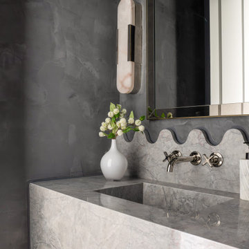
 Jessica Koltun Home
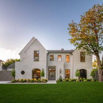
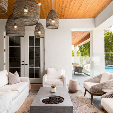
Located at 5827 Del Roy, this new construction home by Jessica Koltun Home reflects a refined approach to residential design, where architecture, proportion, and material selection come together seamlessly. Designed and built with a focus on clean lines and timeless curb appeal, the home showcases a balanced exterior elevation, cohesive finishes, and thoughtfully integrated details that elevate the overall structure.
From initial concept through construction, this project emphasizes functional layout planning and buildable design, ensuring both visual impact and long-term durability. Jessica Koltun Home worked closely within the construction process to deliver a home that feels intentional from every angle—blending modern and transitional elements with a focus on simplicity and structure.
As with all Jessica Koltun Home projects, 5827 Del Roy highlights a commitment to designing and building high-quality new construction homes while collaborating with builders to create cohesive, well-executed residential spaces.
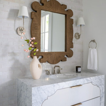 Jessica Koltun Home
Located at 5827 Del Roy, this new construction home by Jessica Koltun Home reflects a refined approach to residential design, where architecture, proportion, and material selection come together seamlessly. Designed and built with a focus on clean lines and timeless curb appeal, the home showcases a balanced exterior elevation, cohesive finishes, and thoughtfully integrated details that elevate the overall structure.
From initial concept through construction, this project emphasizes functional layout planning and buildable design, ensuring both visual impact and long-term durability. Jessica Koltun Home worked closely within the construction process to deliver a home that feels intentional from every angle—blending modern and transitional elements with a focus on simplicity and structure.
As with all Jessica Koltun Home projects, 5827 Del Roy highlights a commitment to designing and building high-quality new construction homes while collaborating with builders to create cohesive, well-executed residential spaces.
 Jessica Koltun Home
Located at 5827 Del Roy, this new construction home by Jessica Koltun Home reflects a refined approach to residential design, where architecture, proportion, and material selection come together seamlessly. Designed and built with a focus on clean lines and timeless curb appeal, the home showcases a balanced exterior elevation, cohesive finishes, and thoughtfully integrated details that elevate the overall structure.
From initial concept through construction, this project emphasizes functional layout planning and buildable design, ensuring both visual impact and long-term durability. Jessica Koltun Home worked closely within the construction process to deliver a home that feels intentional from every angle—blending modern and transitional elements with a focus on simplicity and structure.
As with all Jessica Koltun Home projects, 5827 Del Roy highlights a commitment to designing and building high-quality new construction homes while collaborating with builders to create cohesive, well-executed residential spaces.
Find the right local pro for your project
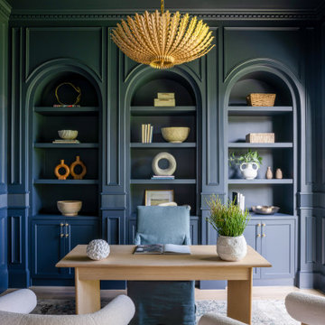 Jessica Koltun Home
Located at 5827 Del Roy, this new construction home by Jessica Koltun Home reflects a refined approach to residential design, where architecture, proportion, and material selection come together seamlessly. Designed and built with a focus on clean lines and timeless curb appeal, the home showcases a balanced exterior elevation, cohesive finishes, and thoughtfully integrated details that elevate the overall structure.
From initial concept through construction, this project emphasizes functional layout planning and buildable design, ensuring both visual impact and long-term durability. Jessica Koltun Home worked closely within the construction process to deliver a home that feels intentional from every angle—blending modern and transitional elements with a focus on simplicity and structure.
As with all Jessica Koltun Home projects, 5827 Del Roy highlights a commitment to designing and building high-quality new construction homes while collaborating with builders to create cohesive, well-executed residential spaces.
 Keeping Interiors
Jim Bartsch
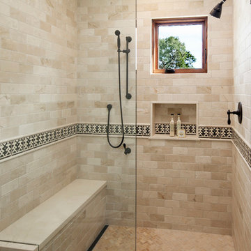
Mid-sized tuscan beige tile and stone tile walk-in shower photo in Santa Barbara with an undermount sink, recessed-panel cabinets, medium tone wood cabinets, a two-piece toilet and beige walls
Mid-sized tuscan beige tile and stone tile walk-in shower photo in Santa Barbara with an undermount sink, recessed-panel cabinets, medium tone wood cabinets, a two-piece toilet and beige walls
 Choate + Hertlein Architects
Fred Housel Photographer
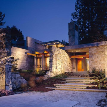
Large modern gray two-story mixed siding exterior home idea in Seattle
Large modern gray two-story mixed siding exterior home idea in Seattle
 Flooret
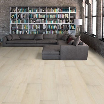
Part of the Modin Vinyl Plank Collection, Available Exclusively From www.Flooret.com
$3.49 / sq ft, 22.08 sq ft per box
50% WIDER. 25% LONGER. TWICE AS DURABLE
Luxury Vinyl Plank, 5 mm x 9" x 60" (1.0 mm / 40 mil wear-layer)
Lifetime Residential Warranty, 20 year Commercial Warranty
Nordic simplicity. White floors can be challenging to use, but when pulled off correctly are extremely rewarding. An instant statement-maker, they often present the challenge of maintenance. For Nordland, we specifically created a slightly weathered pattern with darker knots, so that they do not reveal dirt as quickly.
REDEFINING DURABILITY
The most important specification for determining the durability of vinyl flooring is the thickness of the wear-layer. The best wear-layers are made of thick, clear virgin PVC, which covers the paper print-film that gives the floor its unique appearance. Once the wear-layer wears through, the paper is damaged and the floor will need replacement.
Most vinyl floors come with a 8-12 mil wear-layer (0.2-3 mm). The top commercial specs in the industry are higher, at 20-22 mil (0.5 mm). A select few manufacturers offer a "super" commercial spec of 28 mil (0.7 mm).
For Modin, we decided to set a new standard: 40 mil (1.0 mm) of premium virgin PVC. This allows us to offer an industry-leading 20 year Commercial Warranty (Lifetime Residential), compared to nearly all other commercial vinyl floors' 10 year Commercial Warranty.
Beyond our superior wear-layer, we also use a patented click mechanism for superior hold, and a ceramic-bead coating.
SIZE MATTERS
Wider and longer planks create a sense of space and luxury. Most vinyl floors come in 6" or 7" widths, and 36" or 48" lengths.
For Modin, we designed our planks to be 9" wide, and 60" long. This extra large size allows our gorgeous designs to be fully expressed.
DETAILS THAT COUNT
We made sure to get all the details right. Real texture, to create the feel of wire-brushed wood. Low sheen level, to ensure a natural look that wears well over time. 4-sided bevels, to more accurately emulate the look of real planks. When added together they help create the unique look that is Modin.
DESIGNS THAT INSPIRE
We spent nearly a year just focusing on our designs, to ensure they provide the right mix of color and depth. Focusing on timeless wire-brush and European Oak styles, as well as more contemporary modern washes, our collection offers truly beautiful design that is both functional and inspiring.

 Advance Design Studio, Ltd.
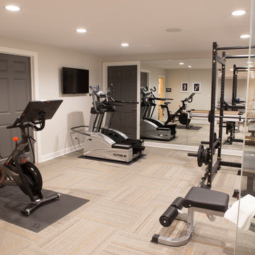
Karen and Chad of Tower Lakes, IL were tired of their unfinished basement functioning as nothing more than a storage area and depressing gym. They wanted to increase the livable square footage of their home with a cohesive finished basement design, while incorporating space for the kids and adults to hang out.
“We wanted to make sure that upon renovating the basement, that we can have a place where we can spend time and watch movies, but also entertain and showcase the wine collection that we have,” Karen said.
After a long search comparing many different remodeling companies, Karen and Chad found Advance Design Studio. They were drawn towards the unique “Common Sense Remodeling” process that simplifies the renovation experience into predictable steps focused on customer satisfaction.
“There are so many other design/build companies, who may not have transparency, or a focused process in mind and I think that is what separated Advance Design Studio from the rest,” Karen said.
Karen loved how designer Claudia Pop was able to take very high-level concepts, “non-negotiable items” and implement them in the initial 3D drawings. Claudia and Project Manager DJ Yurik kept the couple in constant communication through the project. “Claudia was very receptive to the ideas we had, but she was also very good at infusing her own points and thoughts, she was very responsive, and we had an open line of communication,” Karen said.
A very important part of the basement renovation for the couple was the home gym and sauna. The “high-end hotel” look and feel of the openly blended work out area is both highly functional and beautiful to look at. The home sauna gives them a place to relax after a long day of work or a tough workout. “The gym was a very important feature for us,” Karen said. “And I think (Advance Design) did a very great job in not only making the gym a functional area, but also an aesthetic point in our basement”.
An extremely unique wow-factor in this basement is the walk in glass wine cellar that elegantly displays Karen and Chad’s extensive wine collection. Immediate access to the stunning wet bar accompanies the wine cellar to make this basement a popular spot for friends and family.
The custom-built wine bar brings together two natural elements; Calacatta Vicenza Quartz and thick distressed Black Walnut. Sophisticated yet warm Graphite Dura Supreme cabinetry provides contrast to the soft beige walls and the Calacatta Gold backsplash. An undermount sink across from the bar in a matching Calacatta Vicenza Quartz countertop adds functionality and convenience to the bar, while identical distressed walnut floating shelves add an interesting design element and increased storage. Rich true brown Rustic Oak hardwood floors soften and warm the space drawing all the areas together.
Across from the bar is a comfortable living area perfect for the family to sit down at a watch a movie. A full bath completes this finished basement with a spacious walk-in shower, Cocoa Brown Dura Supreme vanity with Calacatta Vicenza Quartz countertop, a crisp white sink and a stainless-steel Voss faucet.
Advance Design’s Common Sense process gives clients the opportunity to walk through the basement renovation process one step at a time, in a completely predictable and controlled environment. “Everything was designed and built exactly how we envisioned it, and we are really enjoying it to it’s full potential,” Karen said.
Constantly striving for customer satisfaction, Advance Design’s success is heavily reliant upon happy clients referring their friends and family. “We definitely will and have recommended Advance Design Studio to friends who are looking to embark on a remodeling project small or large,” Karen exclaimed at the completion of her project.
 Flavin Architects
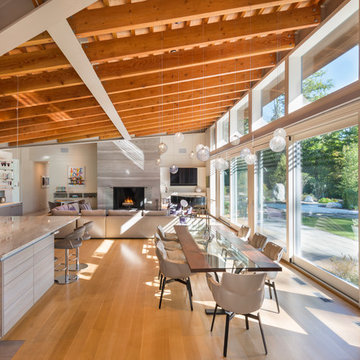
This new modern house is located in a meadow in Lenox MA. The house is designed as a series of linked pavilions to connect the house to the nature and to provide the maximum daylight in each room. The center focus of the home is the largest pavilion containing the living/dining/kitchen, with the guest pavilion to the south and the master bedroom and screen porch pavilions to the west. While the roof line appears flat from the exterior, the roofs of each pavilion have a pronounced slope inward and to the north, a sort of funnel shape. This design allows rain water to channel via a scupper to cisterns located on the north side of the house. Steel beams, Douglas fir rafters and purlins are exposed in the living/dining/kitchen pavilion.
Photo by: Nat Rea Photography
 Le Klein
Photo: Le Michelle Nguyen © 2015 Houzz
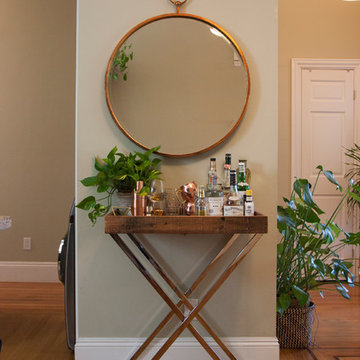
Inspiration for an eclectic home bar remodel in San Francisco
Inspiration for an eclectic home bar remodel in San Francisco
 Jess Cooney Interiors
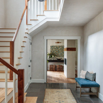
Beautiful grand front entry with plaster walls and limestone flooring
Example of an entryway design in Boston
Example of an entryway design in Boston
 Mackenzie Collier Interiors
James Stewart
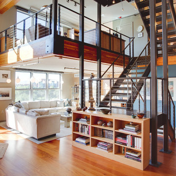
Large urban loft-style medium tone wood floor living room photo in Phoenix with no fireplace, no tv and beige walls
Large urban loft-style medium tone wood floor living room photo in Phoenix with no fireplace, no tv and beige walls
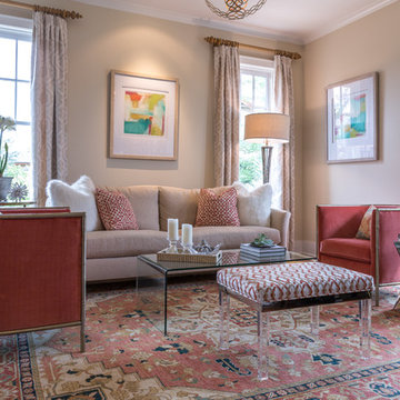
Inspiration for a mid-sized transitional formal and enclosed medium tone wood floor and brown floor living room remodel in Denver with beige walls, no fireplace and no tv

 a Blade of Grass
Photo by Pete Cadieux
Inspiration for a mid-sized traditional full sun backyard landscaping in Boston.
Inspiration for a mid-sized traditional full sun backyard landscaping in Boston.
 TKS Design Group
Free ebook, Creating the Ideal Kitchen. DOWNLOAD NOW
Having a space for their teenage kids to hang out after school, study and interact with Mom & Dad was at the top of the list for this remodel. The 1928 home, sits in a lovely Glen Ellyn neighborhood, near downtown and near all the action of the local high school and lake. It’s was a great house with great bones but the kitchen was in need of some TLC. The remodel project had been a long time coming, and since both the homeowners work from home, they had been nervous about disrupting their bustling daily schedules to get the project in motion.
Once we had a plan in place, we dug in and got to work. The first step was to remove a non-load bearing wall between the kitchen and dining room. We then reworked the space a bit, eliminating a redundant passage way to the hall, and reworking a closet to allow for a large galley style kitchen and small bar area open to the dining room. The new kitchen has a small peninsula for the family to have casual meals and for the kids to hang out after school. A window was eliminated to give more space for cabinetry and storage, and another window was made larger to allow for a grander view into the backyard.
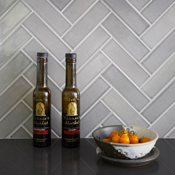
We decided upon a layered approach to this space to provide character appropriate to the older home. White painted cabinetry provides a backdrop for interesting touches such as gray herringbone tile, a reeded farmhouse sink and bronze hardware and lighting. The bar has its own unique look featuring gray cabinetry with a patterned cement tile backsplash and walnut top. A bar fridge, glass cabinets and baskets for tucking away homework give this little multi-functional area loads of character. A miniature mudroom area was also added to the dining room so that the new space can be kept neat and tidy.
The stylish result looks both appropriate to the 1928 home and provides loads of functionality for this active family that can now take advantage of every square inch their home.
Designed by: Susan Klimala, CKD, CBD
Photography by: Michael Alan Kaskel
For more information on kitchen and bath design ideas go to: www.kitchenstudio-ge.com
 Choate + Hertlein Architects
Fred Housel Photographer
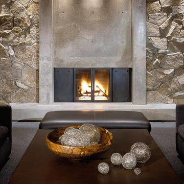
Living room - large modern formal and open concept concrete floor living room idea in Seattle with gray walls, a standard fireplace and a concrete fireplace
Living room - large modern formal and open concept concrete floor living room idea in Seattle with gray walls, a standard fireplace and a concrete fireplace
 Vetter Architects
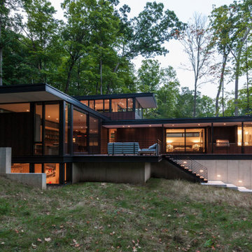
The client’s request was quite common - a typical 2800 sf builder home with 3 bedrooms, 2 baths, living space, and den. However, their desire was for this to be “anything but common.” The result is an innovative update on the production home for the modern era, and serves as a direct counterpoint to the neighborhood and its more conventional suburban housing stock, which focus views to the backyard and seeks to nullify the unique qualities and challenges of topography and the natural environment.
The Terraced House cautiously steps down the site’s steep topography, resulting in a more nuanced approach to site development than cutting and filling that is so common in the builder homes of the area. The compact house opens up in very focused views that capture the natural wooded setting, while masking the sounds and views of the directly adjacent roadway. The main living spaces face this major roadway, effectively flipping the typical orientation of a suburban home, and the main entrance pulls visitors up to the second floor and halfway through the site, providing a sense of procession and privacy absent in the typical suburban home.
Clad in a custom rain screen that reflects the wood of the surrounding landscape - while providing a glimpse into the interior tones that are used. The stepping “wood boxes” rest on a series of concrete walls that organize the site, retain the earth, and - in conjunction with the wood veneer panels - provide a subtle organic texture to the composition.
The interior spaces wrap around an interior knuckle that houses public zones and vertical circulation - allowing more private spaces to exist at the edges of the building. The windows get larger and more frequent as they ascend the building, culminating in the upstairs bedrooms that occupy the site like a tree house - giving views in all directions.
The Terraced House imports urban qualities to the suburban neighborhood and seeks to elevate the typical approach to production home construction, while being more in tune with modern family living patterns.
Overview:
Elm Grove
Size:
2,800 sf,
3 bedrooms, 2 bathrooms
Completion Date:
September 2014
Services:
Architecture, Landscape Architecture
Interior Consultants: Amy Carman Design


29