
Search results for "Geometry" in Home Design Ideas
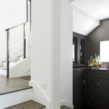

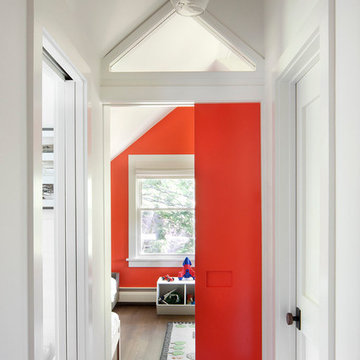

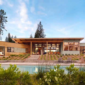
 William Duff Architects, Inc.
This functional, light-filled home takes full advantage of its bucolic site. With the introduction of the butterfly roof, natural light, ventilation and views are brought into the main gathering spaces. Distance between the private and public zones is created by a shift in geometry where those two meet in plan, to provide a calming and rejuvenating private retreat for the occupants. The structured juxtaposition of materials brings order and warmth to the home’s overall experience, complementing the textures and beauty of the site.
Photo: ©Cesar Rubio
Find the right local pro for your project
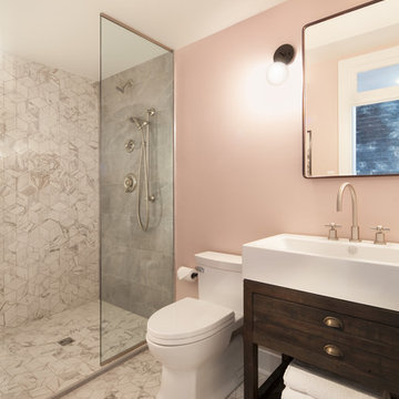
 Four Brothers Design + Build
Mid-sized transitional kids' beige tile and stone tile mosaic tile floor walk-in shower photo in DC Metro with furniture-like cabinets, dark wood cabinets, a two-piece toilet, pink walls and a vessel sink
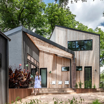
 Matt Fajkus Architecture
The cabin typology redux came out of the owner’s desire to have a house that is warm and familiar, but also “feels like you are on vacation.” The basis of the “Hewn House” design starts with a cabin’s simple form and materiality: a gable roof, a wood-clad body, a prominent fireplace that acts as the hearth, and integrated indoor-outdoor spaces. However, rather than a rustic style, the scheme proposes a clean-lined and “hewned” form, sculpted, to best fit on its urban infill lot.
The plan and elevation geometries are responsive to the unique site conditions. Existing prominent trees determined the faceted shape of the main house, while providing shade that projecting eaves of a traditional log cabin would otherwise offer. Deferring to the trees also allows the house to more readily tuck into its leafy East Austin neighborhood, and is therefore more quiet and secluded.
Natural light and coziness are key inside the home. Both the common zone and the private quarters extend to sheltered outdoor spaces of varying scales: the front porch, the private patios, and the back porch which acts as a transition to the backyard. Similar to the front of the house, a large cedar elm was preserved in the center of the yard. Sliding glass doors open up the interior living zone to the backyard life while clerestory windows bring in additional ambient light and tree canopy views. The wood ceiling adds warmth and connection to the exterior knotted cedar tongue & groove. The iron spot bricks with an earthy, reddish tone around the fireplace cast a new material interest both inside and outside. The gable roof is clad with standing seam to reinforced the clean-lined and faceted form. Furthermore, a dark gray shade of stucco contrasts and complements the warmth of the cedar with its coolness.
A freestanding guest house both separates from and connects to the main house through a small, private patio with a tall steel planter bed.
Photo by Charles Davis Smith

 Elise Landscapes & Nursery, LLC
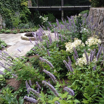
Inspiration for a mid-sized traditional courtyard stone retaining wall landscape in New York.

 Urban Oasis Design & Construction LLC
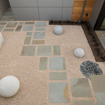
This new construction home was in need of a complete landscape design and installation. All details were considered to create intimate spaces as well as a sweeping backyard landscape to compliment the views from the home.
The home sits on two lots which allowed it to be built at the desired size.
The front yard includes a modern entry courtyard featuring bluestone, decorative gravel and granite sculpture - as well as decorative concrete planters.
The backyard has several levels. The upper level is an expanse of lawn with hedging. The middle tier planting softens the poured concrete wall. A steep slope descends to the street below. The homeowners wanted to create access from parking below to the home above, so a series of pavers and granite risers was designed to create a comfortable pathway that also forms the focal point of the backyard. Ecoturf lawn was installed on the slope to minimize the need for water and mowing. Concrete edging deliniates the lawn from the beds where a mixture of evergreen and deciduous plants create year-round interest.
The overall result includes modern details and some sweeping curves that draw the eye up to the home from the street below
Wiilam Wright Photography
 Uptic Studios
Oliver Irwin Photography
www.oliveriphoto.com
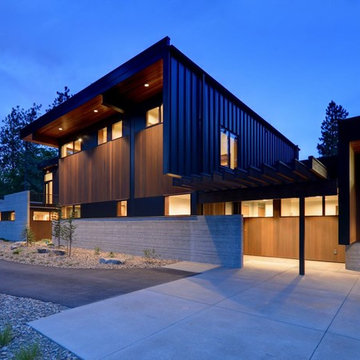
Park Lane Residence is a single family house designed in a unique, northwest modern style. The goal of the project is to create a space that allows the family to entertain their guests in a welcoming one-of-a-kind environment. Uptic Studios took into consideration the relation between the exterior and interior spaces creating a smooth transition with an open concept design and celebrating the natural environment. The Clean geometry and contrast in materials creates an integrative design that is both artistic, functional and in harmony with its surroundings. Uptic Studios provided the privacy needed, while also opening the space to the surrounding environment with large floor to ceiling windows. The large overhangs and trellises reduce solar exposure in the summer, while provides protection from the elements and letting in daylight in the winter. The crisp hardwood, metal and stone blends the exterior with the beautiful surrounding nature.
 Reverse Architecture
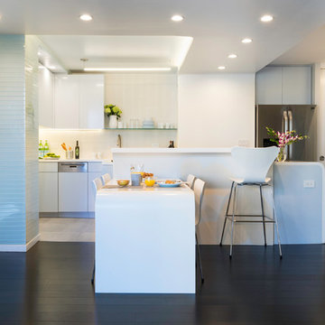
Massive sliding closet doors continue the lines of the kitchen down the hall toward the entry. The main hallway of the apartment is a runway of gray porcelain tiles which run through the kitchen. Suspended lines of light over the hallway draw visitors from the entry toward the kitchen.
Photo by Heidi Solander
 Locati Architects
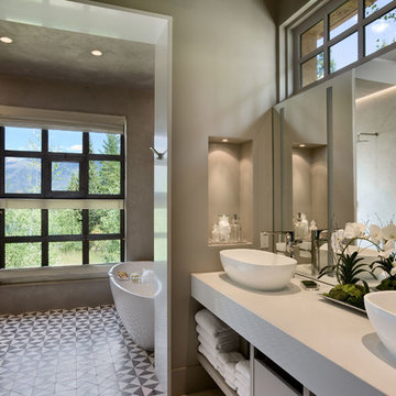
The Homestead Residence by Locati Architects, Interior Design by Joszi Meskan Associates, Photography by Roger Wade
Bathroom photo in Other
Bathroom photo in Other
 Irene Designs
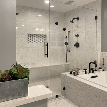
This Master Suite while being spacious, was poorly planned in the beginning. Master Bathroom and Walk-in Closet were small relative to the Bedroom size. Bathroom, being a maze of turns, offered a poor traffic flow. It only had basic fixtures and was never decorated to look like a living space. Geometry of the Bedroom (long and stretched) allowed to use some of its' space to build two Walk-in Closets while the original walk-in closet space was added to adjacent Bathroom. New Master Bathroom layout has changed dramatically (walls, door, and fixtures moved). The new space was carefully planned for two people using it at once with no sacrifice to the comfort. New shower is huge. It stretches wall-to-wall and has a full length bench with granite top. Frame-less glass enclosure partially sits on the tub platform (it is a drop-in tub). Tiles on the walls and on the floor are of the same collection. Elegant, time-less, neutral - something you would enjoy for years. This selection leaves no boundaries on the decor. Beautiful open shelf vanity cabinet was actually made by the Home Owners! They both were actively involved into the process of creating their new oasis. New Master Suite has two separate Walk-in Closets. Linen closet which used to be a part of the Bathroom, is now accessible from the hallway. Master Bedroom, still big, looks stunning. It reflects taste and life style of the Home Owners and blends in with the overall style of the House. Some of the furniture in the Bedroom was also made by the Home Owners.
 Isla Homes
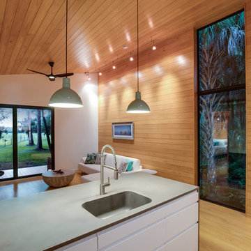
I built this on my property for my aging father who has some health issues. Handicap accessibility was a factor in design. His dream has always been to try retire to a cabin in the woods. This is what he got.
It is a 1 bedroom, 1 bath with a great room. It is 600 sqft of AC space. The footprint is 40' x 26' overall.
The site was the former home of our pig pen. I only had to take 1 tree to make this work and I planted 3 in its place. The axis is set from root ball to root ball. The rear center is aligned with mean sunset and is visible across a wetland.
The goal was to make the home feel like it was floating in the palms. The geometry had to simple and I didn't want it feeling heavy on the land so I cantilevered the structure beyond exposed foundation walls. My barn is nearby and it features old 1950's "S" corrugated metal panel walls. I used the same panel profile for my siding. I ran it vertical to match the barn, but also to balance the length of the structure and stretch the high point into the canopy, visually. The wood is all Southern Yellow Pine. This material came from clearing at the Babcock Ranch Development site. I ran it through the structure, end to end and horizontally, to create a seamless feel and to stretch the space. It worked. It feels MUCH bigger than it is.
I milled the material to specific sizes in specific areas to create precise alignments. Floor starters align with base. Wall tops adjoin ceiling starters to create the illusion of a seamless board. All light fixtures, HVAC supports, cabinets, switches, outlets, are set specifically to wood joints. The front and rear porch wood has three different milling profiles so the hypotenuse on the ceilings, align with the walls, and yield an aligned deck board below. Yes, I over did it. It is spectacular in its detailing. That's the benefit of small spaces.
Concrete counters and IKEA cabinets round out the conversation.
For those who cannot live tiny, I offer the Tiny-ish House.
Photos by Ryan Gamma
Staging by iStage Homes
Design Assistance Jimmy Thornton
 Studio McGee
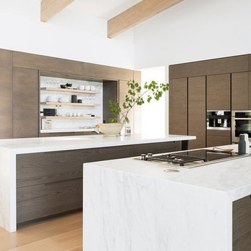
Inspiration for a large modern light wood floor eat-in kitchen remodel in Salt Lake City with dark wood cabinets, multicolored backsplash, marble backsplash, stainless steel appliances, two islands and white countertops
 Drewett Works
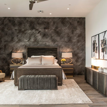
Above and Beyond is the third residence in a four-home collection in Paradise Valley, Arizona. Originally the site of the abandoned Kachina Elementary School, the infill community, appropriately named Kachina Estates, embraces the remarkable views of Camelback Mountain.
Nestled into an acre sized pie shaped cul-de-sac lot, the lot geometry and front facing view orientation created a remarkable privacy challenge and influenced the forward facing facade and massing. An iconic, stone-clad massing wall element rests within an oversized south-facing fenestration, creating separation and privacy while affording views “above and beyond.”
Above and Beyond has Mid-Century DNA married with a larger sense of mass and scale. The pool pavilion bridges from the main residence to a guest casita which visually completes the need for protection and privacy from street and solar exposure.
The pie-shaped lot which tapered to the south created a challenge to harvest south light. This was one of the largest spatial organization influencers for the design. The design undulates to embrace south sun and organically creates remarkable outdoor living spaces.
This modernist home has a palate of granite and limestone wall cladding, plaster, and a painted metal fascia. The wall cladding seamlessly enters and exits the architecture affording interior and exterior continuity.
Kachina Estates was named an Award of Merit winner at the 2019 Gold Nugget Awards in the category of Best Residential Detached Collection of the Year. The annual awards ceremony was held at the Pacific Coast Builders Conference in San Francisco, CA in May 2019.
Project Details: Above and Beyond
Architecture: Drewett Works
Developer/Builder: Bedbrock Developers
Interior Design: Est Est
Land Planner/Civil Engineer: CVL Consultants
Photography: Dino Tonn and Steven Thompson
Awards:
Gold Nugget Award of Merit - Kachina Estates - Residential Detached Collection of the Year
 Margot Hartford Photography
Photo: Margot Hartford © 2018 Houzz
Living room - eclectic living room idea in Other
Living room - eclectic living room idea in Other
 Isla Homes
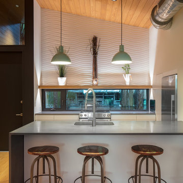
I built this on my property for my aging father who has some health issues. Handicap accessibility was a factor in design. His dream has always been to try retire to a cabin in the woods. This is what he got.
It is a 1 bedroom, 1 bath with a great room. It is 600 sqft of AC space. The footprint is 40' x 26' overall.
The site was the former home of our pig pen. I only had to take 1 tree to make this work and I planted 3 in its place. The axis is set from root ball to root ball. The rear center is aligned with mean sunset and is visible across a wetland.
The goal was to make the home feel like it was floating in the palms. The geometry had to simple and I didn't want it feeling heavy on the land so I cantilevered the structure beyond exposed foundation walls. My barn is nearby and it features old 1950's "S" corrugated metal panel walls. I used the same panel profile for my siding. I ran it vertical to match the barn, but also to balance the length of the structure and stretch the high point into the canopy, visually. The wood is all Southern Yellow Pine. This material came from clearing at the Babcock Ranch Development site. I ran it through the structure, end to end and horizontally, to create a seamless feel and to stretch the space. It worked. It feels MUCH bigger than it is.
I milled the material to specific sizes in specific areas to create precise alignments. Floor starters align with base. Wall tops adjoin ceiling starters to create the illusion of a seamless board. All light fixtures, HVAC supports, cabinets, switches, outlets, are set specifically to wood joints. The front and rear porch wood has three different milling profiles so the hypotenuse on the ceilings, align with the walls, and yield an aligned deck board below. Yes, I over did it. It is spectacular in its detailing. That's the benefit of small spaces.
Concrete counters and IKEA cabinets round out the conversation.
For those who cannot live tiny, I offer the Tiny-ish House.
Photos by Ryan Gamma
Staging by iStage Homes
Design Assistance Jimmy Thornton
 Interiors & Architecture Photography by Ken Hayden
Ken Hayden Photography 305 781 9364
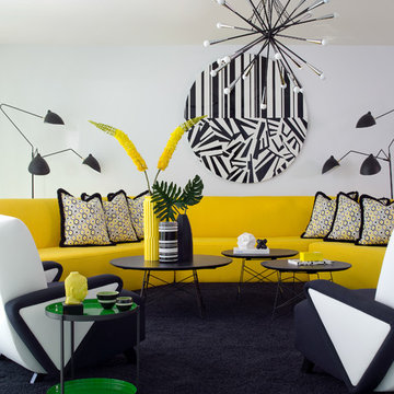
Living room - mid-sized contemporary open concept carpeted living room idea in Miami with white walls
Living room - mid-sized contemporary open concept carpeted living room idea in Miami with white walls
 David Thorne Landscape Architect
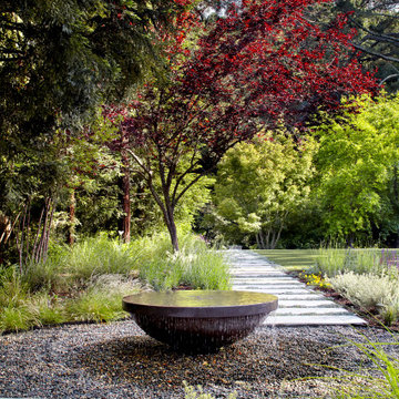
Design ideas for a huge contemporary drought-tolerant and full sun backyard stone water fountain landscape in San Francisco.
63