
Search results for "Introduction" in Home Design Ideas
 Coco Maison Design
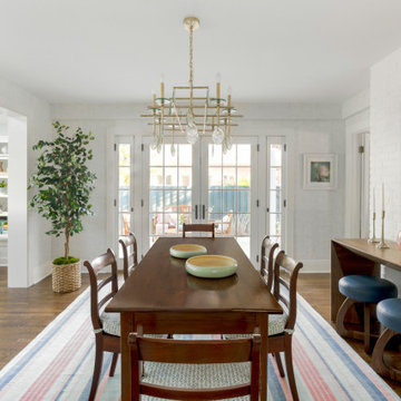
Our La Cañada studio designed this lovely home, keeping with the fun, cheerful personalities of the homeowner. The entry runner from Annie Selke is the perfect introduction to the house and its playful palette, adding a welcoming appeal. In the dining room, a beautiful, iconic Schumacher wallpaper was one of our happy finishes whose vines and garden colors begged for more vibrant colors to complement it. So we added bold green color to the trims, doors, and windows, enhancing the playful appeal. In the family room, we used a soft palette with pale blue, soft grays, and warm corals, reminiscent of pastel house palettes and crisp white trim that reflects the turquoise waters and white sandy beaches of Bermuda! The formal living room looks elegant and sophisticated, with beautiful furniture in soft blue and pastel green. The curtains nicely complement the space, and the gorgeous wooden center table anchors the space beautifully. In the kitchen, we added a custom-built, happy blue island that sits beneath the house’s namesake fabric, Hydrangea Heaven.
---Project designed by Courtney Thomas Design in La Cañada. Serving Pasadena, Glendale, Monrovia, San Marino, Sierra Madre, South Pasadena, and Altadena.
For more about Courtney Thomas Design, see here: https://www.courtneythomasdesign.com/
To learn more about this project, see here:
https://www.courtneythomasdesign.com/portfolio/elegant-family-home-la-canada/
 Coco Maison Design
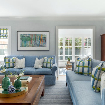
Our La Cañada studio designed this lovely home, keeping with the fun, cheerful personalities of the homeowner. The entry runner from Annie Selke is the perfect introduction to the house and its playful palette, adding a welcoming appeal. In the dining room, a beautiful, iconic Schumacher wallpaper was one of our happy finishes whose vines and garden colors begged for more vibrant colors to complement it. So we added bold green color to the trims, doors, and windows, enhancing the playful appeal. In the family room, we used a soft palette with pale blue, soft grays, and warm corals, reminiscent of pastel house palettes and crisp white trim that reflects the turquoise waters and white sandy beaches of Bermuda! The formal living room looks elegant and sophisticated, with beautiful furniture in soft blue and pastel green. The curtains nicely complement the space, and the gorgeous wooden center table anchors the space beautifully. In the kitchen, we added a custom-built, happy blue island that sits beneath the house’s namesake fabric, Hydrangea Heaven.
---Project designed by Courtney Thomas Design in La Cañada. Serving Pasadena, Glendale, Monrovia, San Marino, Sierra Madre, South Pasadena, and Altadena.
For more about Courtney Thomas Design, see here: https://www.courtneythomasdesign.com/
To learn more about this project, see here:
https://www.courtneythomasdesign.com/portfolio/elegant-family-home-la-canada/
 Baron's Major Brands
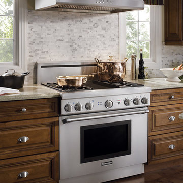
With the introduction of the Professional Grill, culinary enthusiasts will have more flexibility when selecting their ultimate Thermador surface cooking appliance, including the option to feature the Professional Grill and the electric griddle side-by-side, and a mix of options when selecting the number of Thermador Star® Burners and grill/griddle desired for their unique cooking needs.
Find the right local pro for your project
 Coco Maison Design
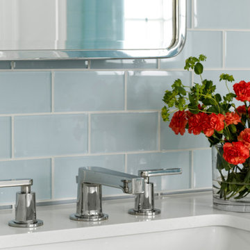
Our La Cañada studio designed this lovely home, keeping with the fun, cheerful personalities of the homeowner. The entry runner from Annie Selke is the perfect introduction to the house and its playful palette, adding a welcoming appeal. In the dining room, a beautiful, iconic Schumacher wallpaper was one of our happy finishes whose vines and garden colors begged for more vibrant colors to complement it. So we added bold green color to the trims, doors, and windows, enhancing the playful appeal. In the family room, we used a soft palette with pale blue, soft grays, and warm corals, reminiscent of pastel house palettes and crisp white trim that reflects the turquoise waters and white sandy beaches of Bermuda! The formal living room looks elegant and sophisticated, with beautiful furniture in soft blue and pastel green. The curtains nicely complement the space, and the gorgeous wooden center table anchors the space beautifully. In the kitchen, we added a custom-built, happy blue island that sits beneath the house’s namesake fabric, Hydrangea Heaven.
---Project designed by Courtney Thomas Design in La Cañada. Serving Pasadena, Glendale, Monrovia, San Marino, Sierra Madre, South Pasadena, and Altadena.
For more about Courtney Thomas Design, see here: https://www.courtneythomasdesign.com/
To learn more about this project, see here:
https://www.courtneythomasdesign.com/portfolio/elegant-family-home-la-canada/
 Donald Lococo Architects
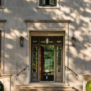
Awarded by the Classical institute of art and architecture , the linnean house has a restrained and simple elevation of doors and windows. Nestled in the Forest Hills neighborhood of Washington, D.C., the Linnean House is classical in both plan and elevation throughout its award-winning house plans. The main mass, comprising of the most formal and public spaces, is a spatial triptych along a symmetrical main axis. Inside the luxury home, the limestone façade, simple but well-proportioned with classical elements, extends itself into both the entry portico and main foyer with consistent proportions and materiality. This introduction allows the flanking living and dining rooms to be perceived as separate pavilions, each equipped with eight equal-proportioned French doors symmetrical of the main axis.
Beyond the classical spaces are two wings which lead to the master suite and a kitchen/family space, respectively. Both of which are situated to queue from the French door axis, a focal feature in the repeatedly published home design. At the entry foyer, the stark stone luxury architecture is warmed by two symmetrical wood armoire-like freestanding sculptural objects, a persistent theme throughout the luxury house. In the kitchen, for instance, stand four similar wood armoire objects at opposite corners that act as columns and help give this space a sense of boundary and enclosure. The master bath vanity, in similar fashion, is introduced as a central free-standing form anchoring itself as a notable presence in the space. Lastly, the wine room is designed as a series of free-standing heavy wood cavity walls spanned only by a hint of glass.
 DH Audio and Home Theater
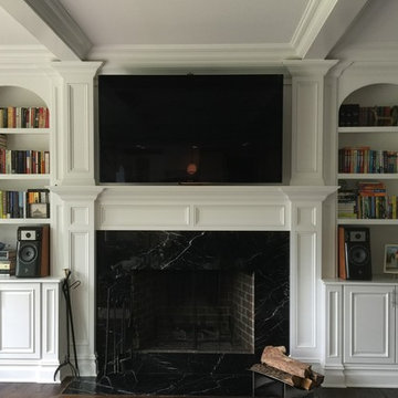
The client moved into this space with a pair of high-end speakers he had from his last house. The built-ins were already there in his new family room. No other speaker which could fit on those shelves was going to be any better, or even as good, as the speakers he already owned--not without spending many thousands of dollars. It made sense to modify the built-ins to better fit the existing speakers. This photo shows the built-ins after that modification. Another photo shows the speaker and the shelves before the modification.
An upgradeable TV and audio system, commensurate in quality to the speakers, was provided by DH Audio and Home Theater. The system is upgradeable by both software updates and by virtue of its NAD Master Series surround sound processor which uses a design much like a PC tower with its removable card slots. New technologies (4k video, MQA) have already come along since the introduction of this surround processor for which the owner can buy and or upgrade the removable cards.
This cabinet is also the heart of a Bluesound wireless and expandable multi-room music system that the customer favored for its superior sound quality (e.g. over Sonos).
Ease-of-use was also a must, so DH Audio & Home Theater custom programmed a remote so that one button press is all that's required to call up Fios HD TV, Netflix, Blu-ray discs, family photos and video, or music.
 Charlie Allen Renovations, Inc.
A homeowner who we’d worked with previously (a bathroom we’d remodeled for him was named ‘Bathroom of the Year’ by Boston Globe Magazine in 2007.) contacted us with a new project in mind.
Following a divorce and second marriage, he and his family had moved into mid-sized home that felt too cramped for two adults and four children. Working within its existing frame, we set to work creating a more functional and pleasant living experience.
The family’s main gathering area is the kitchen. We began improving the space by absorbing square footage from what had been a mudroom/laundry area behind the kitchen. This allowed us to introduce an island, creating a focal point for meal prep, cooking, and socializing. New custom cabinetry increased storage. We added a homework nook for the kids.
Wider openings to the foyer and the dining room made flow between spaces easier.
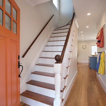
At the home’s entry, we re-treaded and re-finished the staircase, adding new railings and newell post. An orange fiberglass exterior door contrasts playfully with the home’s deep blue exterior.
Finishing the basement allowed the introduction of a new laundry area, a cozy family room/kids play space, and a workshop. In this last space we reconfigured some kitchen items that had been ordered but were unusable due to a last-minute change in plans, including a cabinet now used for tool storage and a wall panel that became a workbench.
On the home’s second floor, one bedroom had been accessible only by passing through another bedroom. The family’s two teenage children had been enduring this arrangement via solutions that included placing duct tape along the floor to mark passage boundaries. We were able to give each child much-desired private space by borrowing square-footage from a closet and carving out a hallway with separate entries for each room. Another bedroom on the second floor was refreshed with a new coat of paint.
Photo by Shelly Harrison
 Simply Baths & Kitchens
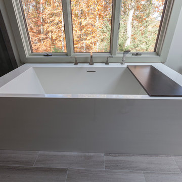
The priorities for this master bath remodel included an increased shower area, room for a dresser/clothes storage & the introduction of some sustainable materials. A custom built-in was created to house all of the husband’s clothes and was tucked neatly into the space formerly occupied by the shower. A local fabricator created countertops using concrete and recycled glass. The big, boxy tub, a floor model bought at an extreme discount, is the focal point of the room. Many of the other lines in the room echo its geometric and modern clean lines. The end result is a crisp, clean aesthetic that feels spacious and is filled with light.
 Treasure in the Detail
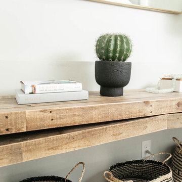
The first thing you see when walking into a home is the entry table. It is important that this space is welcoming as it is the introduction the the rest of the home. We kept this space soft but adding different textures and finishes to bring interest.Natalie Ryan Photography
 Dwellify
In this kitchen renovation, the aim was to revamp the space, making it not just functional, but stylish and inviting too. The decision to paint the walls predominantly white instantly promoted brightness and airiness into the room, setting the stage for a modern makeover. Knocking down the wall separating the kitchen from the family room added a touch of spaciousness and promoted seamless interaction between the two areas. Introducing a sleek floating island became the centerpiece, offering both practicality and a contemporary aesthetic. Upgrading to all new appliances ensured efficiency without sacrificing style. The end result? A chic, welcoming kitchen that's as perfect for cooking up a storm as it is for gathering with loved ones.
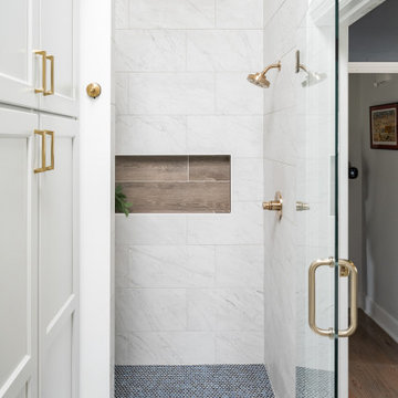
In this extensive bathroom remodel, a once cluttered and cramped primary bathroom has been meticulously transformed into a spacious and bright oasis. By prioritizing additional storage and leveraging the existing skylight, the space underwent a remarkable renovation without the need for significant structural changes. The skylight was maximized to its full potential by surrounding it with pristine white walls, creating an airy and luminous atmosphere. The introduction of a luxurious marble shower not only adds a touch of sophistication but also contributes to the overall cleanliness and sophistication of the space. Soft gray cabinets and warm wood accents were strategically incorporated to create a bathroom with a serene and welcoming ambiance, evoking a sense of tranquility and comfort. Every detail was meticulously considered, from the placement of storage solutions to the selection of materials, ensuring that the remodeled bathroom exudes both functionality and elegance.
The result is a blend of style and practicality, where every aspect of the design works in harmony to create a serene sanctuary where relaxation and rejuvenation are effortlessly embraced.

 Business_Name_Placeholder
?? 24/7 Support
⭐️ Top-Rated Service
? Fast Response
? Premium Quality
✈️◆► Telegram: @Pvatopzone
?◆► WhatsApp: +1 (579) 550-8030
?◆► Discord: accountservice
✈️◆► https://t.me/Pvatopzone
?◆► Email: Pvatopzone@gmail.com
 Miró Rivera Architects
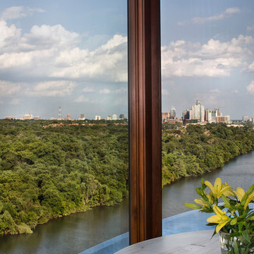
The introduction of clean lines and more contemporary materials was done in such a way to complement the existing material palette, while drawing the gaze outward to emphasize the home’s newfound openness.
 Lewis Builders
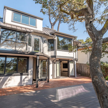
Beginning with the entrance to the home. An undulation of steps down from the street, up into the house, and back down into the kitchen was simplified by elevating the patio and entry to the main level of the house. The introduction of a shed dormer enabled the entrance to accommodate a full-sized front door.
 Reico Kitchen & Bath
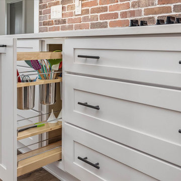
Gregg Waller of Reico Kitchen and Bath in Wilmington, NC collaborated with JC Hazelton Builders to design a farmhouse inspired kitchen featuring Green Forest and Masterpiece cabinetry.
The kitchen features Green Forest cabinets in the Park Place door style with a White finish for the perimeter, complemented with an island in the Masterpiece door style Turner in Maple with a Shortbread finish. Appliances and countertops were provided by others.
The client expressed their appreciation saying, “I literally love every aspect of our kitchen. It is exactly what we wanted. We did not have to sacrifice our vision which was a welcome experience. Gregg was so helpful in hearing what we wanted and then delivering. His knowledge about the products available really helped us achieve our design goals. He created digital examples of our kitchen, laundry and bathrooms which helped us in making our final decision.”
“The biggest challenge that I faced was creating the look the client wanted in their new home while staying within a budget that was set prior to our introduction. I decided that Green Forest Park Place cabinets would be the best choice for the majority of the project. Masterpiece cabinets were needed to get the exact color that the client wanted for the kitchen island,” explained Gregg.
“My favorite part of the design is the range wall. I like the way the warm wood tones of the hood balance the white shaker cabinets and brick backsplash. The clients were an absolute pleasure to work with. The excellent communication that I received from the client throughout definitely helped in the successful completion of the project!”
Photos courtesy of ShowSpaces Photography.
 TKS Design Group
Download our free ebook, Creating the Ideal Kitchen. DOWNLOAD NOW
The homeowners built their traditional Colonial style home 17 years’ ago. It was in great shape but needed some updating. Over the years, their taste had drifted into a more contemporary realm, and they wanted our help to bridge the gap between traditional and modern.
We decided the layout of the kitchen worked well in the space and the cabinets were in good shape, so we opted to do a refresh with the kitchen. The original kitchen had blond maple cabinets and granite countertops. This was also a great opportunity to make some updates to the functionality that they were hoping to accomplish.
After re-finishing all the first floor wood floors with a gray stain, which helped to remove some of the red tones from the red oak, we painted the cabinetry Benjamin Moore “Repose Gray” a very soft light gray. The new countertops are hardworking quartz, and the waterfall countertop to the left of the sink gives a bit of the contemporary flavor.
We reworked the refrigerator wall to create more pantry storage and eliminated the double oven in favor of a single oven and a steam oven. The existing cooktop was replaced with a new range paired with a Venetian plaster hood above. The glossy finish from the hood is echoed in the pendant lights. A touch of gold in the lighting and hardware adds some contrast to the gray and white. A theme we repeated down to the smallest detail illustrated by the Jason Wu faucet by Brizo with its similar touches of white and gold (the arrival of which we eagerly awaited for months due to ripples in the supply chain – but worth it!).
The original breakfast room was pleasant enough with its windows looking into the backyard. Now with its colorful window treatments, new blue chairs and sculptural light fixture, this space flows seamlessly into the kitchen and gives more of a punch to the space.
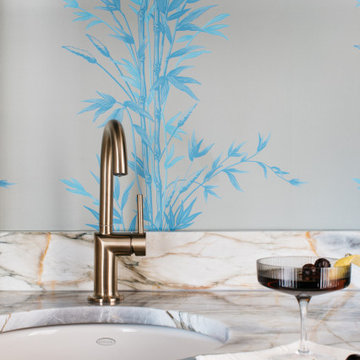
The original butler’s pantry was functional but was also starting to show its age. The new space was inspired by a wallpaper selection that our client had set aside as a possibility for a future project. It worked perfectly with our pallet and gave a fun eclectic vibe to this functional space. We eliminated some upper cabinets in favor of open shelving and painted the cabinetry in a high gloss finish, added a beautiful quartzite countertop and some statement lighting. The new room is anything but cookie cutter.
Next the mudroom. You can see a peek of the mudroom across the way from the butler’s pantry which got a facelift with new paint, tile floor, lighting and hardware. Simple updates but a dramatic change! The first floor powder room got the glam treatment with its own update of wainscoting, wallpaper, console sink, fixtures and artwork. A great little introduction to what’s to come in the rest of the home.
The whole first floor now flows together in a cohesive pallet of green and blue, reflects the homeowner’s desire for a more modern aesthetic, and feels like a thoughtful and intentional evolution. Our clients were wonderful to work with! Their style meshed perfectly with our brand aesthetic which created the opportunity for wonderful things to happen. We know they will enjoy their remodel for many years to come!
Photography by Margaret Rajic Photography
 Trevor Fulmer Design
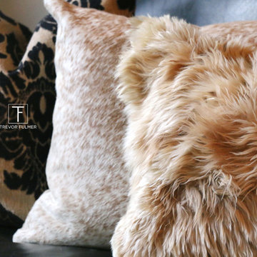
Brownstones are synonymous for being long and narrow with few windows, so we developed an open-concept floor plan that melded seamlessly with this space. The introduction of metallic surfaces helped highlight and reflect the sun while the layering of leathers and fabrics help this space feel cozy and welcoming.
 komandor
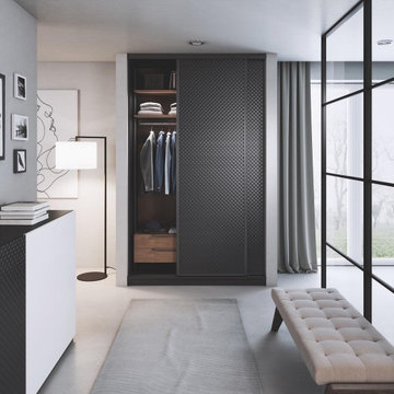
Hallway by Komandor. Often overlooked…it’s the introduction to your home…make it count! A few simple and coordinated Komandor products really elevate this hallway to the next level. The coordinated sliding door black mat frames & room divider help to anchor the room and create interest. The textured sliding door insert is repeated on the side cabinet creating a cohesive look that is not overdone. Add in all the black and white accessories and voila!
 Western Cabinets
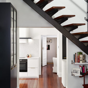
With its decorative mouldings and traditional influences throughout the home, this renovation is a classic take on modernism. Approaching the gates to the property, rich red brick surrounds a beautiful traditional white lacquered timber door with lead lite coloured panels on either side. Entering into the home, deep jarrah planked timber floors lead the way through to the kitchen and living areas.
The kitchen was small for my client who loved to cook as well as her daughter’s love for baking, needing a re- configure of the space to allow the kitchen to flow and function between the existing kitchen and small meals room. Outdated cabinetry made their home look tired and needed a fresh take on the newly architecturally extended home.
Traditional pairings of fresh whites, marbles and glass are delicately detailed within the design, modernising the homes interior. Lacquered chalky slabbed fronts surrounded by marbled benches and splashbacks, the introduction of curves to the isolated hood and island centre piece and depth injected with deep navy to create a monochrome palette. Warmth is then allowed in by brass hardware, reeded glass, a play on texture with tiles and warmly lit surfaces. Now a cook’s kitchen.

 Ernest M. Ferizi
German Embassy in Pristina - Kosovo, contracted the architecture office “Ferizi + Ferizi Architects” to plan and implement an Annex Office building for their purposes. As detached part of this building is designed the waiting area, as alone standing structure.
This Office Building is constructed by assembling of Eight used office containers that were delivered on trucks and set up after only a few hours on the basis of the LEGO principle, according to the planning on strip foundations.
By removing the flexible exterior wall panels, a large room of 115 m² was created, with the counter wall as a room partition between two office spaces, each with seven workstations as well as three counters for agents on one side and a room for visitors on the other side.
With this system, room solutions can be easily implemented in all dimensions.
The container, seen as a geometric shape, is a simple, octagonal, solid box.
The standardized perfection of its dimensions is striking: 2.44 meters wide, 2.59 meters high and 6.06 meters or 12.19 meters long.
Since its introduction in 1956 by the American transport entrepreneur Malcom McLean, the container has become a standardized transport module worldwide, whether on ships, trucks or construction sites.
The shipping containers have additionally revolutionized the transport industry, pushed the globalization noticeably, and thus directly or indirectly influenced all our lives.
But after only a few years, when the first overseas containers wore out, many engineers recognized the positive properties of used shipping containers for building houses, especially since they are robust, flexible, multifunctional and second-hand relatively inexpensive to purchase. The time has long passed by to treat containers exclusively as transport objects.
As a "measure of all things", containers can hardly be ignored in construction.
Their use is no longer limited to temporary use since school containers, information containers, office containers or entire residential buildings are now part of our everyday life in the construction industry.
However, current examples of the container architecture prove that even the most demanding solutions for container building are feasible. For their specific aesthetic and spatial qualities, containers also serve as design parameters for the development of new forms of architecture and urbanity.
The office building as an extension of the visa section, characterized by modern materials and contemporary aesthetics has been designed and built mainly as a low-energy building.
Extensive insulation to achieve a comfortable and sustainable constant temperature in the interior, high window quality and low energy consumption make the building energy-efficient.
The sophisticated lighting technology, networks, heating systems and air-conditioning systems are also components of this equipment.
It creates an overall harmonic picture and guarantees the highest standard in sustainable construction, taking into consideration the fact that environmentally friendly recycling and reutilization have become an increasingly important issue in our society.
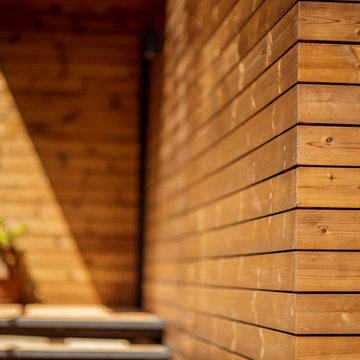
West and East side of the wooden facade is compact and has few openings, while the southern facade is completely open with lot of glass. Its spatial openness ensures a transparent, friendly work environment, which allows a lot of light into the space.
This openness allows an uninterrupted, pleasant and close-to-nature view from interior spaces into the beautiful garden. During the installation of sophisticated light sources in the garden, emphasis was not only put on functionality and security, but also on the beauty of the garden shown through the illumination in the evening.
Large, horizontal white “brisole” serve as external sun protection systems, mounted on the canopies of the entrance areas of the modular construction and the enclosure, adeptly cast shade on these areas and at the same time shape the entire architectural language.
While on one hand, the two quadratic ledges suspended in the air, are docked with steel stairs and match the wooden façade, lead the staff to their office space, the artful modern interior, on the other hand, perfectly unites the functionality, innovative technology, culture and positive effects on the employees' efficiency and wellbeing.
A lot of white, interjected by warm wooden and colored accents, determines the ambience.
In the case of the lighting solution, the mainly linear ceiling lighting is used as the overlapping design element both for the offices of the visa section as well as for the counters and the waiting area for the visitors.
They underline the puristic design in order to create a pleasant light for a desired general illumination and ensure optimal light conditions without causing disturbing reflections on the computer screens.
In addition, precisely positioned pendant luminaires are installed at the workstations, which ensure pleasant room brightness.
In the entrance area, the harmonic and uniform lighting effect from the ground highlights the integration of photography and architecture.
Photographs of landscapes, people, places, expressing unforgettable, impressive moments and memories have been lovingly engraved on 8 x 8cm square oak blocks.
The idea of an effective, impressive environment that stimulates and inspires the work was the premiss on which the whole design concept was based. Consequently, the modular construction was no longer viewed through its history of utilization and scars, but rather as a structure of work ambiance, art and elegance.
FERIZI + FERIZI Architects
Photo: Arben Llapashtica
34