
Search results for "Introduction" in Home Design Ideas
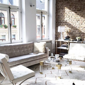
 Barcelona Designs
Available in full grain Italian leather, the Barcelona Chair Replica by Barcelona Designs needs little or no introduction. Built on a single piece of the highest quality unabridged stainless steel, the Barcelona Chair Replica ensures durability. The seat of Barcelona Chair Replica by Barcelona Designs is laid out in an angle creating a V - shape.
Originally, designed by Ludwig Mies van der Rohe and Lilly Reich, this classic, often seen in movies, adorns hotels or big business establishments. The cushions eloquently rest on thick, high grade cowhide saddle straps, which are color coordinated with the upholstery of the Barcelona Chair Replica. This ensures added comfort to the chair, yet making it look sophisticated.
For supreme comfort, single panels of leather upholstering the cushion are cut, tailored and tufted by hand. Patterning this luxury, are panels and buttons which are designed using a single hide. Adding to the magnificence, the cushions are drafted in such a manner, that they adapt to the body of the person sitting on the chair.
 User
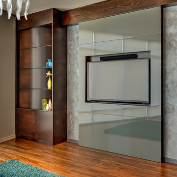
UserDesign symmetry and the introduction of rich sophisticated materials incorporated with existing elements transform this stark white walled high rise condominium into a luxury home. The unexpected details of glass bead wall paper, back painted glass, and textural metallic hand applied wall finish set the tone for this elegant space.
Design by Robin Colton Studio
Photographer : Jerry Hayes
 Coco Maison Design
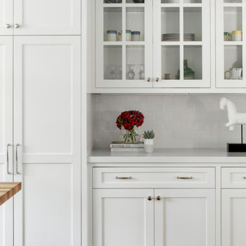
Our La Cañada studio designed this lovely home, keeping with the fun, cheerful personalities of the homeowner. The entry runner from Annie Selke is the perfect introduction to the house and its playful palette, adding a welcoming appeal. In the dining room, a beautiful, iconic Schumacher wallpaper was one of our happy finishes whose vines and garden colors begged for more vibrant colors to complement it. So we added bold green color to the trims, doors, and windows, enhancing the playful appeal. In the family room, we used a soft palette with pale blue, soft grays, and warm corals, reminiscent of pastel house palettes and crisp white trim that reflects the turquoise waters and white sandy beaches of Bermuda! The formal living room looks elegant and sophisticated, with beautiful furniture in soft blue and pastel green. The curtains nicely complement the space, and the gorgeous wooden center table anchors the space beautifully. In the kitchen, we added a custom-built, happy blue island that sits beneath the house’s namesake fabric, Hydrangea Heaven.
---Project designed by Courtney Thomas Design in La Cañada. Serving Pasadena, Glendale, Monrovia, San Marino, Sierra Madre, South Pasadena, and Altadena.
For more about Courtney Thomas Design, see here: https://www.courtneythomasdesign.com/
To learn more about this project, see here:
https://www.courtneythomasdesign.com/portfolio/elegant-family-home-la-canada/
Find the right local pro for your project
 Barcelona Designs
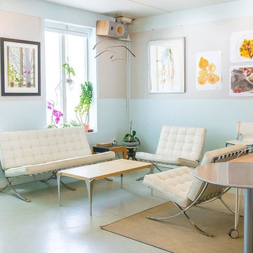
Available in full grain Italian leather, the Barcelona Chair Replica by Barcelona Designs needs little or no introduction. Built on a single piece of the highest quality unabridged stainless steel, the Barcelona Chair Replica ensures durability. The seat of Barcelona Chair Replica by Barcelona Designs is laid out in an angle creating a V - shape.
Originally, designed by Ludwig Mies van der Rohe and Lilly Reich, this classic, often seen in movies, adorns hotels or big business establishments. The cushions eloquently rest on thick, high grade cowhide saddle straps, which are color coordinated with the upholstery of the Barcelona Chair Replica. This ensures added comfort to the chair, yet making it look sophisticated.
For supreme comfort, single panels of leather upholstering the cushion are cut, tailored and tufted by hand. Patterning this luxury, are panels and buttons which are designed using a single hide. Adding to the magnificence, the cushions are drafted in such a manner, that they adapt to the body of the person sitting on the chair.
 Designel
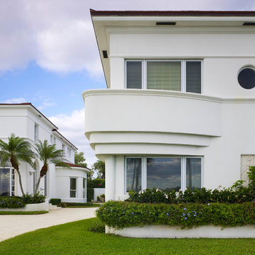
The existing two story residence was built in 1937 and has a footprint of approximately 2,850 sq. ft. While much of the plan at both levels remained in its original “formal” layout with spacious rooms, the home did not meet the current day needs for this modern family. The lack of an “informal” family-room, no space to accommodate overnight guests, only a small powder room tucked under the main stair at the ground floor, and barely enough room for one car in the garage, not to mention the lack of storage space were the problems to solve.
After investigating numerous options the decision was made to introduce a new two story addition with maid’s quarters, a new laundry room, and a three car garage with plenty of additional storage space at the first floor, and a two bedroom guest suite with a kitchenette and living quarters at the second floor. Together with a small addition, this move delivered over 600 sq. ft in the main structure for a new family room with game tables and a full bathroom for guests which also serves as a cabana for the pool area.
The design of the additions, including the introduction of new fenestration to capitalize on daylight and views was sensitive to the original architecture and unanimously approved by the Historic Preservation Board of West Palm Beach.
 TKS Design Group
Download our free ebook, Creating the Ideal Kitchen. DOWNLOAD NOW
The homeowners built their traditional Colonial style home 17 years’ ago. It was in great shape but needed some updating. Over the years, their taste had drifted into a more contemporary realm, and they wanted our help to bridge the gap between traditional and modern.
We decided the layout of the kitchen worked well in the space and the cabinets were in good shape, so we opted to do a refresh with the kitchen. The original kitchen had blond maple cabinets and granite countertops. This was also a great opportunity to make some updates to the functionality that they were hoping to accomplish.
After re-finishing all the first floor wood floors with a gray stain, which helped to remove some of the red tones from the red oak, we painted the cabinetry Benjamin Moore “Repose Gray” a very soft light gray. The new countertops are hardworking quartz, and the waterfall countertop to the left of the sink gives a bit of the contemporary flavor.
We reworked the refrigerator wall to create more pantry storage and eliminated the double oven in favor of a single oven and a steam oven. The existing cooktop was replaced with a new range paired with a Venetian plaster hood above. The glossy finish from the hood is echoed in the pendant lights. A touch of gold in the lighting and hardware adds some contrast to the gray and white. A theme we repeated down to the smallest detail illustrated by the Jason Wu faucet by Brizo with its similar touches of white and gold (the arrival of which we eagerly awaited for months due to ripples in the supply chain – but worth it!).
The original breakfast room was pleasant enough with its windows looking into the backyard. Now with its colorful window treatments, new blue chairs and sculptural light fixture, this space flows seamlessly into the kitchen and gives more of a punch to the space.
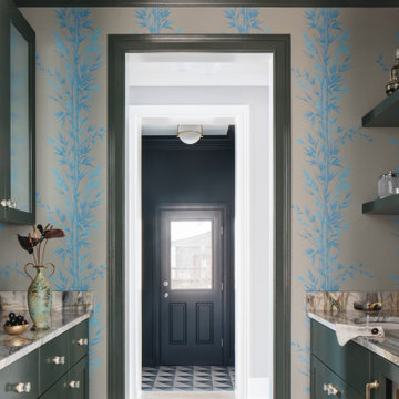
The original butler’s pantry was functional but was also starting to show its age. The new space was inspired by a wallpaper selection that our client had set aside as a possibility for a future project. It worked perfectly with our pallet and gave a fun eclectic vibe to this functional space. We eliminated some upper cabinets in favor of open shelving and painted the cabinetry in a high gloss finish, added a beautiful quartzite countertop and some statement lighting. The new room is anything but cookie cutter.
Next the mudroom. You can see a peek of the mudroom across the way from the butler’s pantry which got a facelift with new paint, tile floor, lighting and hardware. Simple updates but a dramatic change! The first floor powder room got the glam treatment with its own update of wainscoting, wallpaper, console sink, fixtures and artwork. A great little introduction to what’s to come in the rest of the home.
The whole first floor now flows together in a cohesive pallet of green and blue, reflects the homeowner’s desire for a more modern aesthetic, and feels like a thoughtful and intentional evolution. Our clients were wonderful to work with! Their style meshed perfectly with our brand aesthetic which created the opportunity for wonderful things to happen. We know they will enjoy their remodel for many years to come!
Photography by Margaret Rajic Photography
 de-spec
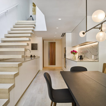
In this project, we identified the challenge of renovating a triplex as finding a way to integrate the stairs, so as to not take up the entire width of a narrow house, as well as to minimize the feeling of constantly having to run up and down to connect floors. This twelve-foot-wide townhouse consists of a cellar living room, a master bedroom suite on the upper floor, and a kitchen and dining area on the entry level. In trying to weave together these different floors, the aim of the project was to transform the stairs and steps into a fluid space that combines transition and rest.
The steps were designed to be integrated with the architecture, cantilevering from the wall and almost disappearing. The living room on the ground plane folds into the garden through steps and a full-window wall, effectively extending the garden into the living room. From the garden to the entry level, the stairs were transformed into a platform and space for meditation within the open-space living room, dining room and kitchen.
The introduction of a skylight midway through the length of the triplex permits natural light to flow to the back of the home, blending into the natural light coming in through the window facing the garden. The skylight also revealed a view of the trees hanging over the townhouse, framing the master bedroom suite from above and extending down with a view towards the garden.
 MOTIV Interiors
Interior Designer: MOTIV Interiors LLC
Photographer: Sam Angel Photography
Design Challenge: This 8 year-old boy and girl were outgrowing their existing setup and needed to update their rooms with a plan that would carry them forward into middle school and beyond. In addition to gaining storage and study areas, could these twins show off their big personalities? Absolutely, we said! MOTIV Interiors tackled the rooms of these youngsters living in Nashville's 12th South Neighborhood and created an environment where the dynamic duo can learn, create, and grow together for years to come.
Design Solution:
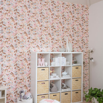
In her room, we wanted to create a fun-filled space that supports softball, sleepovers, science, and anything else a girl might want to get into. The star of the show is a beautiful hand-printed wallpaper by Brooklyn designer Aimee Wilder, whose FSC-certified papers contain no VOC’s (Volatile Organic Compounds). That means that in addition to packing a powerful visual punch, they meet our standard for excellent indoor air quality. We also love this wallpaper because it is composed of so many different neutral colors - this room can organically evolve over time without necessarily replacing the paper (which was installed with a no-VOC adhesive).
We refreshed the remaining walls with a scrubbable no-VOC paint from Sherwin Williams (7008 Alabaster) and gave the carpets in both of the twins’ rooms a good cleaning and simple stretch as opposed to replacing them. In order to provide more functional light in her room, we incorporated a corner floor lamp for reading, a telescoping desk lamp for studying, and an eye-catching LED flower pendant on a dimmer switch sourced from Lightology. Custom window treatments in a linen/cotton blend emphasize the height of the room and bring in a little “bling” with antiqued gold hardware.
Before we even thought about aesthetics, however, MOTIV Interiors got to work right away on increasing functionality. We added a spacious storage unit with plenty of baskets for all of our young client’s animal friends, and we made sure to include ample shelf space for books and hobbies as she finds new passions to explore down the road. We always prefer eco-friendly furnishings that are manufactured responsibly, made with sustainably harvested wood (FSC Certified), and use no glue or non-toxic glues and paints.
The bedding in this project is 100% cotton and contains no synthetic fibers. When purchasing bedding, check for the GOTS Certification (Global Organic Textile Standard). The introduction of a desk and drawer unit created a calming space to study and reflect, or write a letter to a friend. Gold accents add a bit of warmth to the workspace, where she can display her memories, goals, and game plans for a bright future.
We hope you enjoyed this project as much as we did! Each design challenge is an opportunity to push the envelope, by creating a new and exciting aesthetic or finding creative ways to incorporate sustainable design principles.
 SV Design
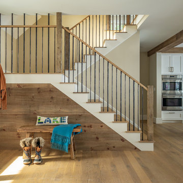
Nestled on the shore of New Hampshire’s Lake Winnipesaukee, is a family’s winter ski retreat. Contrary to the norm, this vacation home sees more use in the winter months than in the summer season. Breathtaking views of Mount Washington against a backdrop of shoreline dominate the scene; this vista was a driving force in the decision-making process. Doors and windows on the lakeside of the house were enlarged and expanded on to enhance the owners’ appreciation of their vantage point. The homeowners embraced, with a bit of convincing, a dark blue trim color for the exterior rather than the ubiquitous forest green common in the White Mountains. What began as a small renovation project morphed into a full renovation; the location warranted the upgrade. The client’s trust in the design team resulted in a home that is unique: contemporary while still offering the warmth and coziness of a winter retreat. The introduction of soft wood tones, a custom copper kitchen hood, and a warm muted color palate for interior trim and doors brings a coziness to the space without evoking a mountain ski lodge. The materials chosen further enhanced the natural elements of the site location: organic features include an antler chandelier, salvaged wood throughout for the mantel, ceilings, stair newels, and interior barn doors, and a live edge built-in bench in the mudroom.
Spaces were designed to encourage family interaction and togetherness. The importance of solitude was thoughtfully crafted into the architecture and interiors of the family’s vacation home. SV Design made sure there were spaces where individual family members can pursue their own interests: a dedicated craft space, a family office, and a kids’ loft area.
The redesign was forward thinking, to take the family into future phases in life, from the current teenage years through college years, and into the beyond of expanded family possibilities.
 Paper Moon Painting
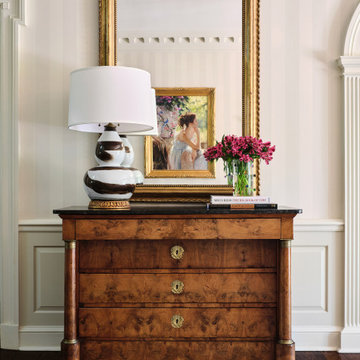
The entry foyer in this traditional home features striped wallpaper paired with a classic console, creating a polished and welcoming introduction to the space.
 Sheila Rich Interiors, LLC
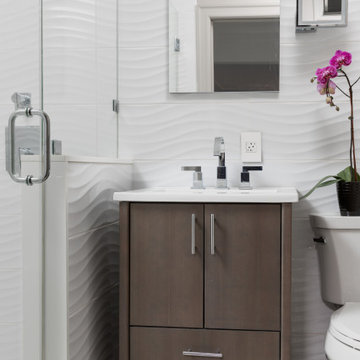
Bright white, textured wall tiles and a glass shower enclosure create a crisp, fresh new look for this once-dark and dated 5' x 7' guest bathroom. The introduction of cement floor tiles added interest and contrast.
Photography Lauren Hagerstrom
 Donald Lococo Architects
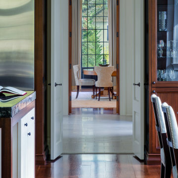
Awarded by the Classical institute of art and architecture , the linnean house has a restrained and simple elevation of doors and windows. Nestled in the Forest Hills neighborhood of Washington, D.C., the Linnean House is classical in both plan and elevation throughout its award-winning house plans. The main mass, comprising of the most formal and public spaces, is a spatial triptych along a symmetrical main axis. Inside the luxury home, the limestone façade, simple but well-proportioned with classical elements, extends itself into both the entry portico and main foyer with consistent proportions and materiality. This introduction allows the flanking living and dining rooms to be perceived as separate pavilions, each equipped with eight equal-proportioned French doors symmetrical of the main axis.
Beyond the classical spaces are two wings which lead to the master suite and a kitchen/family space, respectively. Both of which are situated to queue from the French door axis, a focal feature in the repeatedly published home design. At the entry foyer, the stark stone luxury architecture is warmed by two symmetrical wood armoire-like freestanding sculptural objects, a persistent theme throughout the luxury house. In the kitchen, for instance, stand four similar wood armoire objects at opposite corners that act as columns and help give this space a sense of boundary and enclosure. The master bath vanity, in similar fashion, is introduced as a central free-standing form anchoring itself as a notable presence in the space. Lastly, the wine room is designed as a series of free-standing heavy wood cavity walls spanned only by a hint of glass.
 Hemphill's Rugs & Carpets
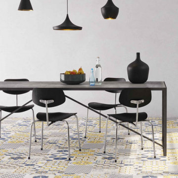
New product introduction. Digitally printed cork floors! Water resistant and offers some "cushion". 1000 DPI gives a very realistic visual translation with 20 plank variations per box.
 Phoenix Home Remodeling
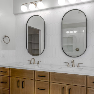
Karol and Matthew embarked on a journey to transform their master bathroom in their 2000' home. The vision was to modernize the space, enhance functionality to their needs, and incorporate luxurious features for a contemporary spa-like experience.
The project began with a thorough demolition, clearing out the old to make room for new windows, shower, cabinets, countertops, and various other updates, setting the stage for a complete transformation.
A new Milgard slider window was installed to replace the window, enhancing the natural light and aesthetics of the space while allowing natural air flow if desired.
The dry-off area, formerly occupied by the bathtub, was reimagined with regular floor tile and continued shower tile walls for the window wall, highlighting the attention to detail and customization of the space. Multiple towel hooks were added along with a towel bar for ample storage.
Picket tiles in the Paloma Cotton finish were chosen for the shower and vanity accent wall. Then, for another fun geometric touch, Diamond in White were selected for the shower flooring and accent tile in their new over-sized storage niches.
The vanity area looks like an entirely different bathroom with the introduction of Sollid Designer Series cabinets in the Scottsdale door style with the warm Honey finish on alder wood. These beautiful cabinets were paired with Calacatta Luccia Quartz countertops, new storage mirrors, and vanity lights completely changing the vibe of their vanity to a fun and modern area with maximized storage.
The completion of Karol and Matthew's master bathroom remodel presented a stunningly reimagined space that exceeded their expectations.
The careful selection of materials, colors, and fixtures, along with the coordination of custom features, brought their vision to life, creating a luxurious and functional retreat reflective of their personal style.
 Ganim's Garden Center and Florist, LLC
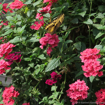
Annual Verbena brings the "Spiller" factor to containers, window boxes, and hanging baskets. Lots of colors and bi-colors to choose from, newer introductions are mildew-resistant. Needs dead heading, but the blooms do last quite a while, and butterflies love them. Great combination plant, but not a monoculture favorite.
Ganim's Garden Center & Florist
 Schwake Stone Ltd., LLC
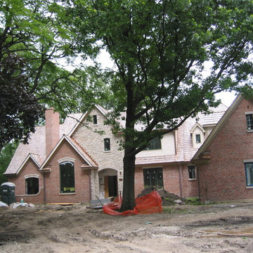
A stately brick home and its impressive exterior is emphasized with a front door stone introduction. Not only does the detail uplift the architecture, but front door wayfinding will be awarded once the driveway, walk and gardens appear.
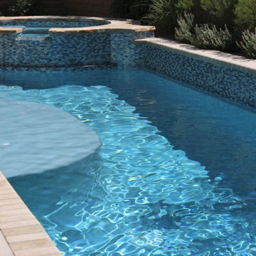
 Paragon Pools
AFTER...
Amazing Backyard Transformations! Pool Renovation from dull to Dazzling!
This amazing transformation is the result of a pool renovation by Paragon Pools in Las Vegas.
The homeowner was seeking to update the pool with a more vibrant look. The pool renovation included a redesign of the spa spillway, new tile, new interior finish, and flagstone accents on the spa, spa steps, and seating bench.
Before and after photos.
Designers:
Joseph Michael Vassallo, CBP, PHTA Fellow, PHTA Builder of the Year 2012
Joseph Anthony Vassallo, CBP, PHTA Builder of the Year 2021
If your pool is more than 10 years old… you could benefit from a pool renovation.
New technology:
• Reduce utility consumption with energy efficient equipment, LED lights, and remote connectivity with smart phone app
• Better health by reducing chemical use with the introduction of UV and Ozone water quality systems and
• Improve safety with the latest safety devices and by replacing old drains with VGB compliant drains
What about an overall facelift to enhance the appearance and versatility of the backyard space.
• Is the interior finish/plaster chipping or stained?
• Do you have missing, cracked, or calcified tile?
• Discolored, uneven, or chipped decks?
• Water features that no longer work?
• Do you lack in-pool sitting space for your family and guests?
• Have you dreamed of having a wet deck to place a lounger on?
• Would you love to have a swim up bar for entertaining?
Serving these areas and communities: Lake Las Vegas * Boulder City * Henderson * Seven Hills * Anthem * MacDonald Highlands * MacDonald Ranch * Silverado Ranch * Green Valley Ranch * Inspirada * Southern Highlands * Summerlin * Sun City * Aliante * North Las Vegas * Sky Canyon * Centennial Hills * Providence * Spring Valley * Paradise, and others.
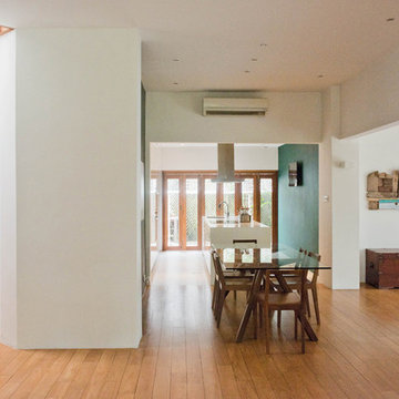
 Studio Roundtop LLC
The owners of this house appreciate living in a home that is connected with its tropical context. Set in a dense residential neighborhood, the challenge was to create a home with a garden as an extension of its interior, whilst retaining a sense of privacy that the owners valued. Working within the existing shell of an old semi-detatched house, the interior layout was reconfigured to create a series spaces that open out to the lush tropical garden.
The existing kitchen was converted into an open kitchen, connecting the backyard to the dining and living room. Large sliding windows open the living/dining space to its patio and garden to offer an outdoor dining experience.
The existing hallway and common bathroom also suffered from daylight and natural ventilation. A skylight was inserted to brighten the otherwise existing dim hallway. The previously mechanically ventilated bathroom was also converted into a semi-outdoor bathroom with the introduction of an air-well and feature rock wall.
The guest bedroom, previously accessible through the kitchen, was turned into a home office now exclusive to the master bedroom. A private courtyard was introduced to connect the master bedroom and home office to create a private sanctuary for one residing in the the bedroom or working in the office.
 La-Z-Boy Ottawa & Kingston
Cesar ArraisPhotos by: Cesar Henrique Arrais
Before & After: Orleans Living Room
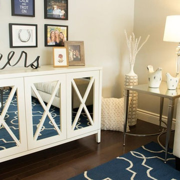
Here is a great example of how our in-home designers can work with furniture and accessories you already have and add to them to create a functional and beautiful space. Designer Dea Attar accomplished this with her Orleans living room project.
The Before:
This client had already begun the project and needed a designer to help finish the room. She wanted to keep the sofa, new rug and artwork and work around them to complete the look. The room is used occasionally for socializing purposes. As it is the first room you see when you come in to the house, the goal was to give it the WOW factor!
The designer’s concept and vision:
Inspired by the vibrant colours in the artwork, Dea planned to use the blues and greens as accents. She wanted the bigger pieces such as the furniture to remain neutral in order to make the accents pop. Dea selected a chair-and-a-half that had similar arms to the sofa and mixed the two styles together. Since the room was to be used occasionally, the chair-and-a-half could fit 2 people in a pinch but wouldn’t overwhelm the space. A small armless chair was introduced in the opposite corner of the room to create a circle of seating and accommodate socializing and conversations. She selected a fresh paisley pattern that combines the greens and blues together.
The after:
The result, a happy room with bright colours and strong accents that express exactly what the client had requested. Dea played with patterns of different scales and proportions to create a nice balance in the room. The multiple pillows used tied the mixed pieces together to complement the design and the accent colours. The introduction of mirrors created elegant reflections and made the room brighter. The chest and photo combo are a statement and a conversation starter that catch the eye of anyone entering the home.
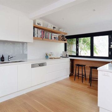
 Smith & Sons Renovations & Extensions Australia
This lush inner-city renovation in New South Whales highlights just what can be done in a small space and the luxury feel that can be achieved on a low budget. This pristine, modern unit design offers clean lines, easy flow and plenty of natural light! The client requested an ultra-luxe design and construction that catered to their functional needs with their own style and personal taste incorporated.
Soft timbers enhance this space with a richness of colour, though the room maintains a light and airy feel and strong spacial lines with the introduction of black framed windows.
Stunning soft modern stylings pieced together by Smith & Sons Dural.
46