
Search results for "Lacking" in Home Design Ideas


 Rocky Mountain Cabinet Company
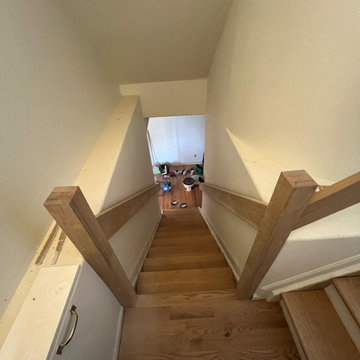
Stairway with custom oak handrails and new oak stairs
Example of a mid-sized eclectic wooden l-shaped wood railing staircase design in Denver with painted risers
Example of a mid-sized eclectic wooden l-shaped wood railing staircase design in Denver with painted risers

Find the right local pro for your project

 Interiors Joan and Associates
Inspiration for a contemporary carpeted living room remodel in Omaha with a ribbon fireplace, a wall-mounted tv and beige walls

 Leicht Westchester-Greenwich
Open concept kitchen - large modern single-wall concrete floor open concept kitchen idea in New York with a double-bowl sink, flat-panel cabinets, gray cabinets, solid surface countertops, brown backsplash, stainless steel appliances and an island


 Metropolitan Bath And Tile
Crystal Clear Photography
Inspiration for a transitional master beige tile and porcelain tile porcelain tile drop-in bathtub remodel in DC Metro with shaker cabinets, brown cabinets, a two-piece toilet, green walls, an undermount sink and quartz countertops
Inspiration for a transitional master beige tile and porcelain tile porcelain tile drop-in bathtub remodel in DC Metro with shaker cabinets, brown cabinets, a two-piece toilet, green walls, an undermount sink and quartz countertops

 Voce Di ID
Mid-sized farmhouse formal light wood floor and beige floor living room photo in New York with white walls, a standard fireplace and a stone fireplace


 Levitch Associates, Incorporated
Treve Johnson
Mid-sized farmhouse l-shaped dark wood floor and brown floor open concept kitchen photo in San Francisco with a farmhouse sink, shaker cabinets, white cabinets, white backsplash, subway tile backsplash, stainless steel appliances, an island and soapstone countertops
Mid-sized farmhouse l-shaped dark wood floor and brown floor open concept kitchen photo in San Francisco with a farmhouse sink, shaker cabinets, white cabinets, white backsplash, subway tile backsplash, stainless steel appliances, an island and soapstone countertops

 Design Harmony
This great room is stunning!
Tall wood windows and doors, exposed trusses and the private view make the room a perfect blank canvas.
The room was lacking contrast, lighting, window treatments and functional furniture to make the space usable by the entire family.
By creating custom furniture we maximized seating while keeping the furniture scale within proportion for the room.
New carpet, beautiful herringbone fabric wallpaper and a very long console to house the children's toys rounds out this spectacular room.
Photo Credit: Holland Photography - Cory Holland - hollandphotography.biz

 TKS Design Group
Download our free ebook, Creating the Ideal Kitchen. DOWNLOAD NOW
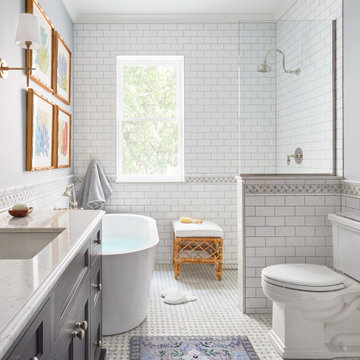
This master bath remodel is the cat's meow for more than one reason! The materials in the room are soothing and give a nice vintage vibe in keeping with the rest of the home. We completed a kitchen remodel for this client a few years’ ago and were delighted when she contacted us for help with her master bath!
The bathroom was fine but was lacking in interesting design elements, and the shower was very small. We started by eliminating the shower curb which allowed us to enlarge the footprint of the shower all the way to the edge of the bathtub, creating a modified wet room. The shower is pitched toward a linear drain so the water stays in the shower. A glass divider allows for the light from the window to expand into the room, while a freestanding tub adds a spa like feel.
The radiator was removed and both heated flooring and a towel warmer were added to provide heat. Since the unit is on the top floor in a multi-unit building it shares some of the heat from the floors below, so this was a great solution for the space.
The custom vanity includes a spot for storing styling tools and a new built in linen cabinet provides plenty of the storage. The doors at the top of the linen cabinet open to stow away towels and other personal care products, and are lighted to ensure everything is easy to find. The doors below are false doors that disguise a hidden storage area. The hidden storage area features a custom litterbox pull out for the homeowner’s cat! Her kitty enters through the cutout, and the pull out drawer allows for easy clean ups.
The materials in the room – white and gray marble, charcoal blue cabinetry and gold accents – have a vintage vibe in keeping with the rest of the home. Polished nickel fixtures and hardware add sparkle, while colorful artwork adds some life to the space.



 Curtain Call
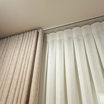
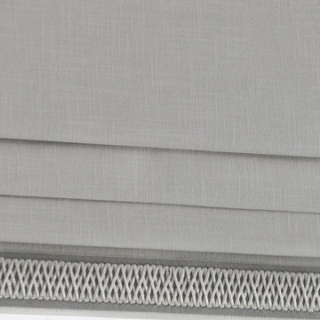
My client owns a three story vintage home in a charming neighborhood in Connecticut. It's filled with rugs and objects from around the world. This cozy living room serves as a TV and reading room. The drapery fabric is elegant and softens up the room while providing some privacy.






 GMT Home Designs Inc.
The original kitchen was dark and lacked storage space. It was cut off from the rest of the house and needed an update. We removed the wall between the dining room and kitchen and bumped the kitchen out in the rear of the house. We created lots of storage, a new island with seating and added windows bringing in much needed natural light. The kitchen is now a hub of activity for the whole family.
5