
Search results for "Maximized" in Home Design Ideas
 Khoury Design
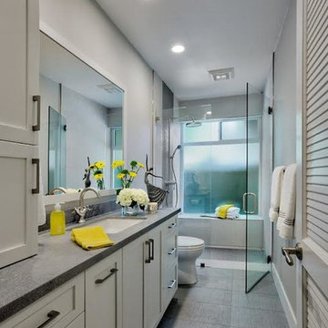
While the use of simplicity, clean lines, and fairly neutral colors bring a sense of calmness and comfort to space, this transitional style bathroom brings interesting traditional features as well. The white painted shaker door cabinets with textured Caesarstone “Rugged Concrete” countertop and backsplash, mixed with the timeless dual cross handles’ lavatory faucet and exposed shower pipe, set the scene for traditional luxury. To maximize the function of the vanity, a wall tower cabinet, two sets of drawers and grooming pull-out provides plenty of storage for fresh clean towels, a hairdryer and toiletries essential for guests. Additional functional elements include a curbless shower with tiled linear drain, tempered frameless glass shower with a door that swings (opens in both directions), a shower seat, walls prepared for future grab bars and a multi-functional jet showerhead and hand shower. The no-slip soft linen-look porcelain tile shower flooring and walls maximize safety. The contrast of the linear woven look of sand and white for the floor tile adds visual interest while the hexagon shaped tile provides a waterfall look.
 Kimberlee Marie Interiors
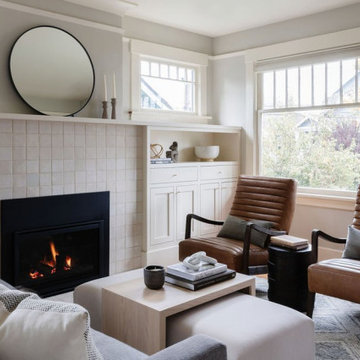
When our client came to us, she was stumped with how to turn her small living room into a cozy, useable family room. The living room and dining room blended together in a long and skinny open concept floor plan. It was difficult for our client to find furniture that fit the space well. It also left an awkward space between the living and dining areas that she didn’t know what to do with. She also needed help reimagining her office, which is situated right off the entry. She needed an eye-catching yet functional space to work from home.
In the living room, we reimagined the fireplace surround and added built-ins so she and her family could store their large record collection, games, and books. We did a custom sofa to ensure it fits the space and maximized the seating. We added texture and pattern through accessories and balanced the sofa with two warm leather chairs. We updated the dining room furniture and added a little seating area to help connect the spaces. Now there is a permanent home for their record player and a cozy spot to curl up in when listening to music.
For the office, we decided to add a pop of color, so it contrasted well with the neutral living space. The office also needed built-ins for our client’s large cookbook collection and a desk where she and her sons could rotate between work, homework, and computer games. We decided to add a bench seat to maximize space below the window and a lounge chair for additional seating.
 User
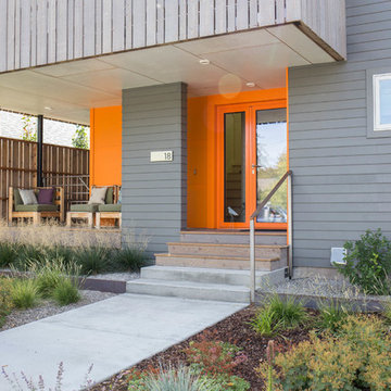
UserThis Bozeman, Montana tiny house residence blends an innovative use of space with high-performance Glo aluminum doors and proper building orientation. Situated specifically, taking advantage of the sun to power the Solar panels located on the southern side of the house. Careful consideration given to the floor plan allows this home to maximize space and keep the small footprint.
Full light exterior doors provide multiple access points across this house. The full lite entry doors provide plenty of natural light to this minimalist home. A full lite entry door adorned with a sidelite provide natural light for the cozy entrance.
This home uses stairs to connect the living spaces and bedrooms. The living and dining areas have soaring ceiling heights thanks to the inventive use of a loft above the kitchen. The living room space is optimized with a well placed window seat and the dining area bench provides comfortable seating on one side of the table to maximize space. Modern design principles and sustainable building practices create a comfortable home with a small footprint on an urban lot. The one car garage complements this home and provides extra storage for the small footprint home.
Find the right local pro for your project
 50 Degrees North Architects
Overview
Extension and complete refurbishment.
The Brief
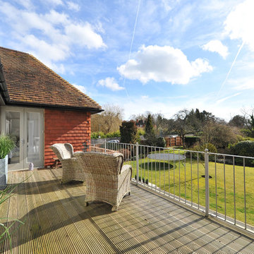
The existing house had very shallow rooms with a need for more depth throughout the property by extending into the rear garden which is large and south facing. We were to look at extending to the rear and to the end of the property, where we had redundant garden space, to maximise the footprint and yield a series of WOW factor spaces maximising the value of the house.
The brief requested 4 bedrooms plus a luxurious guest space with separate access; large, open plan living spaces with large kitchen/entertaining area, utility and larder; family bathroom space and a high specification ensuite to two bedrooms. In addition, we were to create balconies overlooking a beautiful garden and design a ‘kerb appeal’ frontage facing the sought-after street location.
Buildings of this age lend themselves to use of natural materials like handmade tiles, good quality bricks and external insulation/render systems with timber windows. We specified high quality materials to achieve a highly desirable look which has become a hit on Houzz.
Our Solution
One of our specialisms is the refurbishment and extension of detached 1930’s properties.
Taking the existing small rooms and lack of relationship to a large garden we added a double height rear extension to both ends of the plan and a new garage annex with guest suite.
We wanted to create a view of, and route to the garden from the front door and a series of living spaces to meet our client’s needs. The front of the building needed a fresh approach to the ordinary palette of materials and we re-glazed throughout working closely with a great build team.
 SV Design
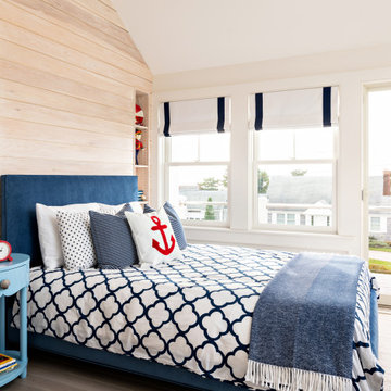
The challenge: take a run-of-the mill colonial-style house and turn it into a vibrant, Cape Cod beach home. The creative and resourceful crew at SV Design rose to the occasion and rethought the box. Given a coveted location and cherished ocean view on a challenging lot, SV’s architects looked for the best bang for the buck to expand where possible and open up the home inside and out. Windows were added to take advantage of views and outdoor spaces—also maximizing water-views were added in key locations.
The result: a home that causes the neighbors to stop the new owners and express their appreciation for making such a stunning improvement. A home to accommodate everyone and many years of enjoyment to come.
 Andersen Windows + Doors
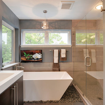
Andersen 100 Series picture windows are stationary and designed to be used alone to maximize a view or combined with venting windows to create large combinations.
 Kimberlee Marie Interiors
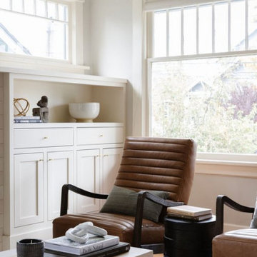
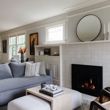
When our client came to us, she was stumped with how to turn her small living room into a cozy, useable family room. The living room and dining room blended together in a long and skinny open concept floor plan. It was difficult for our client to find furniture that fit the space well. It also left an awkward space between the living and dining areas that she didn’t know what to do with. She also needed help reimagining her office, which is situated right off the entry. She needed an eye-catching yet functional space to work from home.
In the living room, we reimagined the fireplace surround and added built-ins so she and her family could store their large record collection, games, and books. We did a custom sofa to ensure it fits the space and maximized the seating. We added texture and pattern through accessories and balanced the sofa with two warm leather chairs. We updated the dining room furniture and added a little seating area to help connect the spaces. Now there is a permanent home for their record player and a cozy spot to curl up in when listening to music.
For the office, we decided to add a pop of color, so it contrasted well with the neutral living space. The office also needed built-ins for our client’s large cookbook collection and a desk where she and her sons could rotate between work, homework, and computer games. We decided to add a bench seat to maximize space below the window and a lounge chair for additional seating.

 Kimberlee Marie Interiors
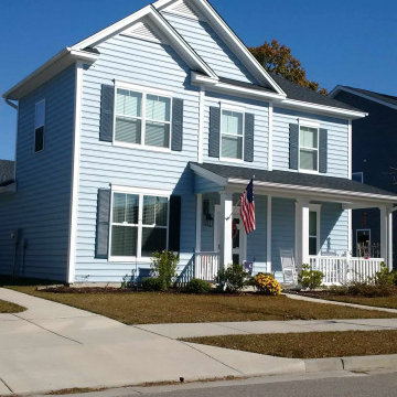
When our client came to us, she was stumped with how to turn her small living room into a cozy, useable family room. The living room and dining room blended together in a long and skinny open concept floor plan. It was difficult for our client to find furniture that fit the space well. It also left an awkward space between the living and dining areas that she didn’t know what to do with. She also needed help reimagining her office, which is situated right off the entry. She needed an eye-catching yet functional space to work from home.
In the living room, we reimagined the fireplace surround and added built-ins so she and her family could store their large record collection, games, and books. We did a custom sofa to ensure it fits the space and maximized the seating. We added texture and pattern through accessories and balanced the sofa with two warm leather chairs. We updated the dining room furniture and added a little seating area to help connect the spaces. Now there is a permanent home for their record player and a cozy spot to curl up in when listening to music.
For the office, we decided to add a pop of color, so it contrasted well with the neutral living space. The office also needed built-ins for our client’s large cookbook collection and a desk where she and her sons could rotate between work, homework, and computer games. We decided to add a bench seat to maximize space below the window and a lounge chair for additional seating.
 TVL Creative Ltd.
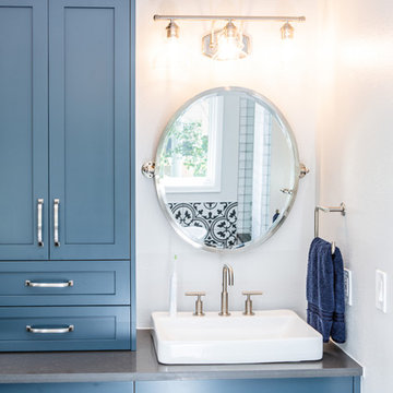
This project is an incredible transformation and the perfect example of successful style mixing! This client, and now a good friend of TVL (as they all become), is a wonderfully eclectic and adventurous one with immense interest in texture play, pops of color, and unique applications. Our scope in this home included a full kitchen renovation, main level powder room renovation, and a master bathroom overhaul. Taking just over a year to complete from the first design phases to final photos, this project was so insanely fun and packs an amazing amount of fun details and lively surprises. The original kitchen was large and fairly functional. However, the cabinetry was dated, the lighting was inefficient and frankly ugly, and the space was lacking personality in general. Our client desired maximized storage and a more personalized aesthetic. The existing cabinets were short and left the nice height of the space under-utilized. We integrated new gray shaker cabinets from Waypoint Living Spaces and ran them to the ceiling to really exaggerate the height of the space and to maximize usable storage as much as possible. The upper cabinets are glass and lit from within, offering display space or functional storage as the client needs. The central feature of this space is the large cobalt blue range from Viking as well as the custom made reclaimed wood range hood floating above. The backsplash along this entire wall is vertical slab of marble look quartz from Pental Surfaces. This matches the expanse of the same countertop that wraps the room. Flanking the range, we installed cobalt blue lantern penny tile from Merola Tile for a playful texture that adds visual interest and class to the entire room. We upgraded the lighting in the ceiling, under the cabinets, and within cabinets--we also installed accent sconces over each window on the sink wall to create cozy and functional illumination. The deep, textured front Whitehaven apron sink is a dramatic nod to the farmhouse aesthetic from KOHLER, and it's paired with the bold and industrial inspired Tournant faucet, also from Kohler. We finalized this space with other gorgeous appliances, a super sexy dining table and chair set from Room & Board, the Paxton dining light from Pottery Barn and a small bar area and pantry on the far end of the space. In the small powder room on the main level, we converted a drab builder-grade space into a super cute, rustic-inspired washroom. We utilized the Bonner vanity from Signature Hardware and paired this with the cute Ashfield faucet from Pfister. The most unique statements in this room include the water-drop light over the vanity from Shades Of Light, the copper-look porcelain floor tile from Pental Surfaces and the gorgeous Cashmere colored Tresham toilet from Kohler. Up in the master bathroom, elegance abounds. Using the same footprint, we upgraded everything in this space to reflect the client's desire for a more bright, patterned and pretty space. Starting at the entry, we installed a custom reclaimed plank barn door with bold large format hardware from Rustica Hardware. In the bathroom, the custom slate blue vanity from Tharp Cabinet Company is an eye catching statement piece. This is paired with gorgeous hardware from Amerock, vessel sinks from Kohler, and Purist faucets also from Kohler. We replaced the old built-in bathtub with a new freestanding soaker from Signature Hardware. The floor tile is a bold, graphic porcelain tile with a classic color scheme. The shower was upgraded with new tile and fixtures throughout: new clear glass, gorgeous distressed subway tile from the Castle line from TileBar, and a sophisticated shower panel from Vigo. We finalized the space with a small crystal chandelier and soft gray paint. This project is a stunning conversion and we are so thrilled that our client can enjoy these personalized spaces for years to come. Special thanks to the amazing Ian Burks of Burks Wurks Construction for bringing this to life!
 Cantoni Irvine
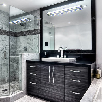
When Irvine designer, Richard Bustos’ client decided to remodel his Orange County 4,900 square foot home into a contemporary space, he immediately thought of Cantoni. His main concern though was based on the assumption that our luxurious modern furnishings came with an equally luxurious price tag. It was only after a visit to our Irvine store, where the client and Richard connected that the client realized our extensive collection of furniture and accessories was well within his reach.
“Richard was very thorough and straight forward as far as pricing,” says the client. "I became very intrigued that he was able to offer high quality products that I was looking for within my budget.”
The next phases of the project involved looking over floor plans and discussing the client’s vision as far as design. The goal was to create a comfortable, yet stylish and modern layout for the client, his wife, and their three kids. In addition to creating a cozy and contemporary space, the client wanted his home to exude a tranquil atmosphere. Drawing most of his inspiration from Houzz, (the leading online platform for home remodeling and design) the client incorporated a Zen-like ambiance through the distressed greyish brown flooring, organic bamboo wall art, and with Richard’s help, earthy wall coverings, found in both the master bedroom and bathroom.
Over the span of approximately two years, Richard helped his client accomplish his vision by selecting pieces of modern furniture that possessed the right colors, earthy tones, and textures so as to complement the home’s pre-existing features.
The first room the duo tackled was the great room, and later continued furnishing the kitchen and master bedroom. Living up to its billing, the great room not only opened up to a breathtaking view of the Newport coast, it also was one great space. Richard decided that the best option to maximize the space would be to break the room into two separate yet distinct areas for living and dining.
While exploring our online collections, the client discovered the Jasper Shag rug in a bold and vibrant green. The grassy green rug paired with the sleek Italian made Montecarlo glass dining table added just the right amount of color and texture to compliment the natural beauty of the bamboo sculpture. The client happily adds, “I’m always receiving complements on the green rug!”
Once the duo had completed the dining area, they worked on furnishing the living area, and later added pieces like the classic Renoir bed to the master bedroom and Crescent Console to the kitchen, which adds both balance and sophistication. The living room, also known as the family room was the central area where Richard’s client and his family would spend quality time. As a fellow family man, Richard understood that that meant creating an inviting space with comfortable and durable pieces of furniture that still possessed a modern flare. The client loved the look and design of the Mercer sectional. With Cantoni’s ability to customize furniture, Richard was able to special order the sectional in a fabric that was both durable and aesthetically pleasing.
Selecting the color scheme for the living room was also greatly influenced by the client’s pre-existing artwork as well as unique distressed floors. Richard recommended adding dark pieces of furniture as seen in the Mercer sectional along with the Viera area rug. He explains, “The darker colors and contrast of the rug’s material worked really well with the distressed wood floor.” Furthermore, the comfortable American Leather Recliner, which was customized in red leather not only maximized the space, but also tied in the client’s picturesque artwork beautifully. The client adds gratefully, “Richard was extremely helpful with color; He was great at seeing if I was taking it too far or not enough.”
It is apparent that Richard and his client made a great team. With the client’s passion for great design and Richard’s design expertise, together they transformed the home into a modern sanctuary. Working with this particular client was a very rewarding experience for Richard. He adds, “My client and his family were so easy and fun to work with. Their enthusiasm, focus, and involvement are what helped me bring their ideas to life. I think we created a unique environment that their entire family can enjoy for many years to come.”
https://www.cantoni.com/project/a-contemporary-sanctuary
 Kimberlee Marie Interiors
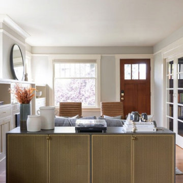
When our client came to us, she was stumped with how to turn her small living room into a cozy, useable family room. The living room and dining room blended together in a long and skinny open concept floor plan. It was difficult for our client to find furniture that fit the space well. It also left an awkward space between the living and dining areas that she didn’t know what to do with. She also needed help reimagining her office, which is situated right off the entry. She needed an eye-catching yet functional space to work from home.
In the living room, we reimagined the fireplace surround and added built-ins so she and her family could store their large record collection, games, and books. We did a custom sofa to ensure it fits the space and maximized the seating. We added texture and pattern through accessories and balanced the sofa with two warm leather chairs. We updated the dining room furniture and added a little seating area to help connect the spaces. Now there is a permanent home for their record player and a cozy spot to curl up in when listening to music.
For the office, we decided to add a pop of color, so it contrasted well with the neutral living space. The office also needed built-ins for our client’s large cookbook collection and a desk where she and her sons could rotate between work, homework, and computer games. We decided to add a bench seat to maximize space below the window and a lounge chair for additional seating.
 Saree Parry Design - Decorating Den Interiors
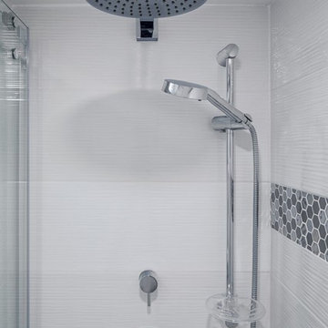
Our services were engaged to refurbish the guest bathroom, which over time had become the wife's main bathroom. The design was driven by our Client's desire for maximized storage space within the confines of this small room.
Lighting was selected for both general and task functions, as well as to create ambiance. The custom vanity with quartz counter-top, accomplished the task of maximizing storage. The new walk-in shower features a wall-mounted, rain showerhead, a hand-held shower wand, sliding doors, and a sleek safety bar. The colour pallet is subtle, mostly consisting of white with coloured and textured accents to help open up the space. Even though the new bathroom was designed with one person in mind, it can easily accommodate shared use between four people when there are guest.
 Custom Creative Remodeling
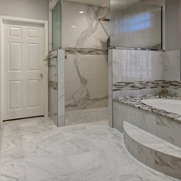
Our clients requested a dramatic, yet classy look for their master and guest bathroom remodels. The clients desperately needed more storage space and wanted to maximize functionality. We were excited to share our ideas and design a timeless look that the clients could enjoy for many years.
Our clients wanted the look of marble, without the maintenance of natural stone, in addition to a bold contrasting element within this space. The goal was to use similar materials throughout, but implement various patterns and textures to create a visual flow from one area to the next. To maximize storage and propose a contrasting element, we designed the cabinetry using maple cabinets with an Onyx finish for a classic look. Outback granite countertops were fabricated for the vanities. We installed the same granite on the tub deck and within the shower to create a smooth visual flow. The cabinet finish allowed the natural light from the window to provide colorful dimension to the overall look of the cabinets.
The shower is wrapped in breathtaking porcelain slabs intended to look like marble, and provide little to no maintenance. We addressed safety by incorporating sleek grab bars near the entry of the shower and on the back wall near the shower head.
Are you thinking about remodeling your bathroom? We offer complimentary design consultations. Call us to schedule yours today!
602-428-6112
www.CustomCreativeRemodeling.com
 Simply Home Decorating
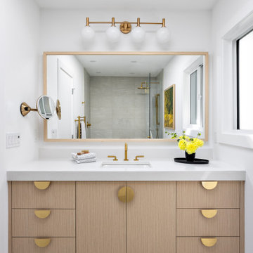
Our clients, a couple with four children, wanted to update their 1952 home with a mid-century feel, focusing on the main floor. The renovation emphasized enhancing finishes, optimizing storage, and maximizing seating in the dining and living areas. The entryway was designed to be inviting and practical, while the living room featured a statement sectional and a stunning terrazzo fireplace. The kitchen and dining area were transformed to be both functional and elegant, with playful touches like “Drunk Monkeys” wallpaper in the powder room.
 My House Design|Build|Team
The family who owned this 1965 home chose a dramatic upgrade for their Coquitlam full home renovation. They wanted more room for gatherings, an open concept kitchen, and upgrades to bathrooms and the rec room. Their neighbour knew of our work, and we were glad to bring our skills to another project in the area.
Choosing Dramatic Lines
In the original house, the entryway was cramped, with a closet being the first thing everyone saw.
We opened the entryway and moved the closet, all while maintaining separation between the entry and the living space.
To draw the attention from the entry into the living room, we used a dramatic, flush, black herringbone ceiling detail across the ceiling. This detail goes all the way to the entertainment area on the main floor.
The eye arrives at a stunning waterfall edge walnut mantle, modern fireplace.
Open Concept Kitchen with Lots of Seating
The dividing wall between the kitchen and living areas was removed to create a larger, integrated entertaining space. The kitchen also has easy access to a new outdoor social space.
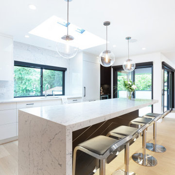
A new large skylight directly over the kitchen floods the space with natural light.
The kitchen now has gloss white cabinetry, with matte black accents and the same herringbone detail as the living room, and is tied together with a low maintenance Caesarstone’s white Attica quartz for the island countertop.
This over-sized island has barstool seating for five while leaving plenty of room for homework, snacking, socializing, and food prep in the same space.
To maximize space and minimize clutter, we integrated the kitchen appliances into the kitchen island, including a food warming drawer, a hidden fridge, and the dishwasher. This takes the eyes to focus off appliances, and onto the design elements which feed throughout the home.
We also installed a beverage center just beside the kitchen so family and guests can fix themselves a drink, without disrupting the flow of the kitchen.
Updated Downstairs Space, Updated Guest Room, Updated Bathrooms
It was a treat to update this entire house. Upstairs, we renovated the master bedroom with new blackout drapery, new decor, and a warm light grey paint colour. The tight bathroom was transformed with modern fixtures and gorgeous grey tile the homeowners loved.
The two teen girls’ rooms were updated with new lighting and furniture that tied in with the whole home decor, but which also reflected their personal taste.
In the basement, we updated the rec room with a bright modern look and updated fireplace. We added a needed door to the garage. We upgraded the bathrooms and created a legal second suite which the young adult daughter will use, for now.
Laundry Its Own Room, Finally
In a family with four women, you can imagine how much laundry gets done in this house. As part of the renovation, we built a proper laundry room with plenty of storage space, countertops, and a large sink.
 Amy Pearson Design
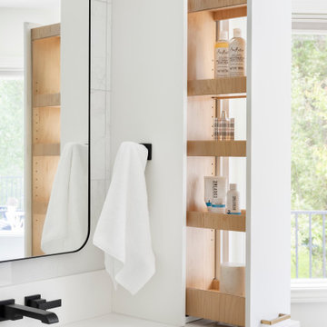
A dated and non-functional primary bathroom receives a modern refresh! Crisp whites combined with charcoal gray ground the space with contrast. Matte black fixtures combined with brushed brass cabinet hardware and sconces for a casual mixed metal look. A luxurious freestanding tub and floor mount tub filler create a relaxing oasis and restful space to enjoy the lush landscape beyond. Ample storage is provided at the vanity, including towers with clever pull-out storage. Marble look tiles are combined for a cohesive look filled with texture and movement.
 Thompson Remodeling
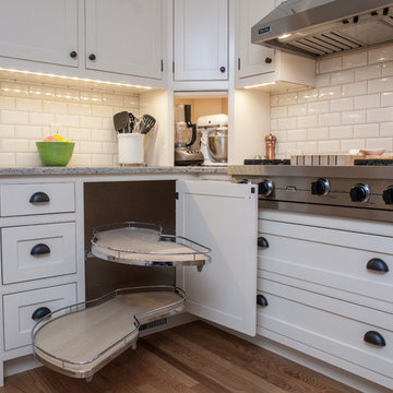
The kitchen in this 1950’s home needed a complete overhaul. It was dark, outdated and inefficient.
The homeowners wanted to give the space a modern feel without losing the 50’s vibe that is consistent throughout the rest of the home.
The homeowner’s needs included:
- Working within a fixed space, though reconfiguring or moving walls was okay
- Incorporating work space for two chefs
- Creating a mudroom
- Maintaining the existing laundry chute
- A concealed trash receptacle
The new kitchen makes use of every inch of space. To maximize counter and cabinet space, we closed in a second exit door and removed a wall between the kitchen and family room. This allowed us to create two L shaped workspaces and an eat-in bar space. A new mudroom entrance was gained by capturing space from an existing closet next to the main exit door.
The industrial lighting fixtures and wrought iron hardware bring a modern touch to this retro space. Inset doors on cabinets and beadboard details replicate details found throughout the rest of this 50’s era house.
 In Detail Interiors
Small coastal condo gets a new life!
This project started as a consultation that really focused on whether or not it was feasible to maximize functionality out of a tight kitchen area in a condo on the beach. The cabinetry was sort of dated but not terrible terrible.
Refresh or total gut of this small kitchen
The client wanted to give it a refresh worked but we had worked with her before…so she could not quite decide how far to go. Maybe just repaint the existing cabinets? She needed some furniture. She wanted a little more ambiance and pizazz. And she wanted the Cheryl magic.
Ok finally, decision made. Kitchen had to go@!
Decision made- a new kitchen to go with the new living!
After further review on site with her during the consult meeting, and pitching a few inquiries around for bids on cabinetry and countertops – she ultimately decided to gut and re-do the whole layout. And man-oh-man what a difference some well executed design makes!!
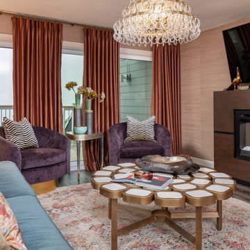
This layout was unique and truly optimized every inch we could muster from the kitchen. (Working around that spiral staircase and navigating the soffit that wrapped the entire kitchen and adjacent living room!!) Colors needed to be bold while still feeling fresh so we paired a deep aubergine and a sort of “matte” Caribbean blue which laid the groundwork for a stunning living area palette.
Tough layout to enlarge much
There were a lot of other “givens” in this space that made the execution of the design a highly strategized process. We knew we had to work around the large wall space that starts the kitchen because it had the laundry room hiding on the other side… the awkward nook with windows on all sides that was a small breakfast area before the remodel… oh, and did we mention that dang spiral staircase?! Multiple site visits to plot the cabinetry and countertop curve paid off all said and done, though!
Living space that work with the open floor plan kitchen
Designing the furnishings then became the fun part! With a smaller living space flanked by windows and sliders – but one that needed to balance the kitchen in substance – we had to break a few preferred design rules to make up the amount of seating desired.
The deep grape-y purple barrel swivels were the perfect “transition” piece by the slider offering access to the views while being versatile enough to still afford safe use of the slider and passage outside. Adding some graphic punch with the droplet shaped, stone and brass cocktail table and bold multicolored rug we love the balance of these weightier aesthetic choices with the adjacent kitchen.
Signature pieces make all the difference
Carrying through little pops of that blue green between the counter stools (I die! Seriously! SO GORGEOUS) and the sofa (with those brass nails!) — these colors really created a sturdy but eclectic tonal feel that the client was just over the moon for. The art and grasscloth on the walls throughout developed the architecture of the space in an overall structure that was really lacking – it feels warm, inviting, comfortable – BEAUTIFUL – but not too priss and pomp.
Now if we could just keep the pup off the sofa!
 The Myers Touch
In collaboration with the client’s architect, AR Design the layout of the kitchen was already in place. However, upon meeting the client it was clear she wanted a ‘wow’ island, symmetry in design and plenty of functional storage.
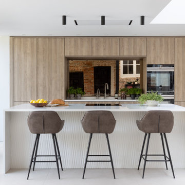
As well as a contemporary, family-friendly space it was also important the space that still respected the heritage of the house. The original walls of the property had many angled walls and featured some tight spaces, so careful consideration of SieMatic's cabinetry choices was given to ensure maximum functionality in those spaces. After much consideration, The Myers Touch specified SieMatic’s SC10 Cabinetry in a Provence Oak Laminate finish which was placed in a framed-style at the rear wall.
The same cabinetry was specified for under the island to create contrast with the new and original material features in the space. In order for the family to keep the kitchen uncluttered, careful planning of internal storage systems was considered in the form of using SieMatic’s internal Drawer boxes and their MultiMatic internal storage system which were used to store smaller items such as spices and sauces, as well whilst providing space for slide-out drawers and storage baskets.
To ensure an elegant yet ‘wow’ factor central island, The Myers Touch combined contrasting textures by using 30mm Silestone Eternal Calacatta natural stone, polished worktops with ‘waterfall island’ edges and a Corian solid surface back panel. The distinctive geometric patterned Corian panel in Cameo White looks particularly spectacular at night when the owner's turn on the architectural-toned lighting under the island.
Appliances chosen for the island included a sophisticated Elica Illusion extractor hood so it could be totally integrated in the new architectural space without visual distraction, a Siemens iQ500 Induction Hob with touch-slide control and a Caple Under-counter Wine cabinet.
To maximise every inch of the new space, and to ensure the owners had a place for everything, The Myers Touch also used additional cabinetry and storage options in the island such as extra deep drawers to store saucepans, cutlery, and everyday crockery.
The eye-catching Antique-bronze mirrored splashback not only helps to provide the illusion of extra space, but reinforces family ‘togetherness’ as it reflects and links the rear of the kitchen ‘snug’ area where family members can sit and relax or work when not in the main kitchen extension area.
The original toned brickwork and 18th Century steel windows in the original part of the extension also helps to tell the story about the older part of the house which now juxtaposes to the new, contemporary kitchen living extension. A handy door was also included in the extension which leads to the garage on the main road for family convenience and over-flow storage.
Photography by Paul Craig (Reproduction of image by request only - joy@bakerpr.co.uk)

153