
Search results for "Openly challenging" in Home Design Ideas
 Emerick Architects
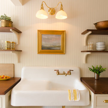
This vintage sink was given a new life in the remodeled kitchen. A new faucet was purchased and stripped down to its original brass base to give it a vintage look suitable for the age of the sink.

 Blackband Design
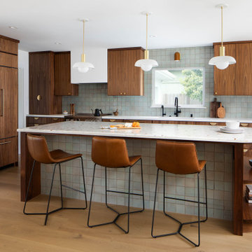
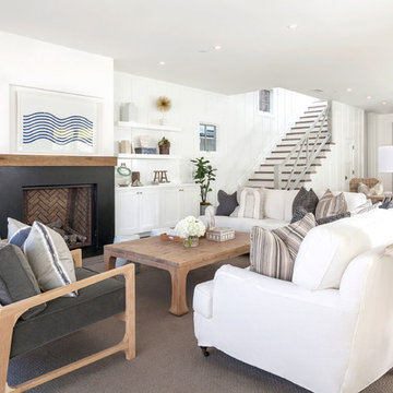
This Coastal Inspired Farmhouse with bay views puts a casual and sophisticated twist on beach living.
Interior Design by Blackband Design and Home Build by Arbor Real Estate.
Find the right local pro for your project

 Kimberlee Marie Interiors
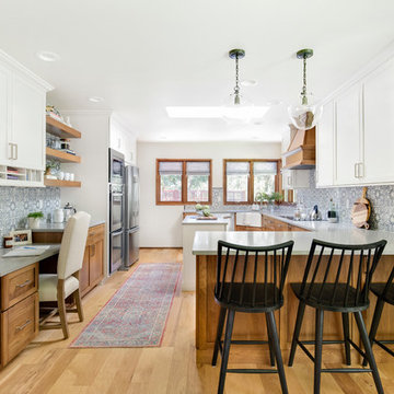
It’s always a blessing when your clients become friends - and that’s exactly what blossomed out of this two-phase remodel (along with three transformed spaces!). These clients were such a joy to work with and made what, at times, was a challenging job feel seamless. This project consisted of two phases, the first being a reconfiguration and update of their master bathroom, guest bathroom, and hallway closets, and the second a kitchen remodel.
In keeping with the style of the home, we decided to run with what we called “traditional with farmhouse charm” – warm wood tones, cement tile, traditional patterns, and you can’t forget the pops of color! The master bathroom airs on the masculine side with a mostly black, white, and wood color palette, while the powder room is very feminine with pastel colors.
When the bathroom projects were wrapped, it didn’t take long before we moved on to the kitchen. The kitchen already had a nice flow, so we didn’t need to move any plumbing or appliances. Instead, we just gave it the facelift it deserved! We wanted to continue the farmhouse charm and landed on a gorgeous terracotta and ceramic hand-painted tile for the backsplash, concrete look-alike quartz countertops, and two-toned cabinets while keeping the existing hardwood floors. We also removed some upper cabinets that blocked the view from the kitchen into the dining and living room area, resulting in a coveted open concept floor plan.
Our clients have always loved to entertain, but now with the remodel complete, they are hosting more than ever, enjoying every second they have in their home.
 DesignARC
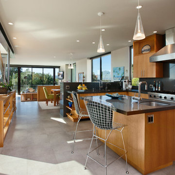
The Tice Residences replace a run-down and aging duplex with two separate, modern, Santa Barbara homes. Although the unique creek-side site (which the client’s original home looked toward across a small ravine) proposed significant challenges, the clients were certain they wanted to live on the lush “Riviera” hillside.
The challenges presented were ultimately overcome through a thorough and careful study of site conditions. With an extremely efficient use of space and strategic placement of windows and decks, privacy is maintained while affording expansive views from each home to the creek, downtown Santa Barbara and Pacific Ocean beyond. Both homes appear to have far more openness than their compact lots afford.
The solution strikes a balance between enclosure and openness. Walls and landscape elements divide and protect two private domains, and are in turn, carefully penetrated to reveal views.
Both homes are variations on one consistent theme: elegant composition of contemporary, “warm” materials; strong roof planes punctuated by vertical masses; and floating decks. The project forms an intimate connection with its setting by using site-excavated stone, terracing landscape planters with native plantings, and utilizing the shade provided by its ancient Riviera Oak trees.
2012 AIA Santa Barbara Chapter Merit Award
Jim Bartsch Photography
 The Design Gallery
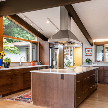
Because the kitchen was surrounded by windows, we needed to provide optimal storage solutions. We used large lower drawers for ease of use and to keep the design streamlined. A back pantry and laundry room were redesigned to provide ample backup.

Sponsored
Columbus, OH

Structural Remodeling
Franklin County's Heavy Timber Specialists | Best of Houzz 2020!
 Kimberly Timmons Interiors
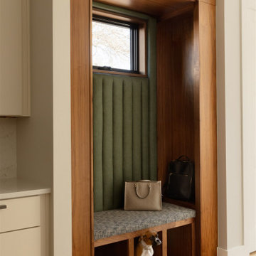
This entryway bench is wrapped in walnut with built-in cubbies below an upholstered bench, serving as a place to stop and take off shoes and drop your bag. The vertical channel upholstered back in olive green leather makes a statement.
 JRP Design & Remodel
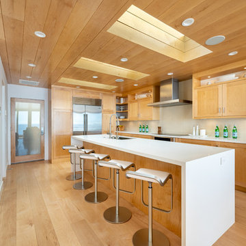
Our clients are seasoned home renovators. Their Malibu oceanside property was the second project JRP had undertaken for them. After years of renting and the age of the home, it was becoming prevalent the waterfront beach house, needed a facelift. Our clients expressed their desire for a clean and contemporary aesthetic with the need for more functionality. After a thorough design process, a new spatial plan was essential to meet the couple’s request. This included developing a larger master suite, a grander kitchen with seating at an island, natural light, and a warm, comfortable feel to blend with the coastal setting.
Demolition revealed an unfortunate surprise on the second level of the home: Settlement and subpar construction had allowed the hillside to slide and cover structural framing members causing dangerous living conditions. Our design team was now faced with the challenge of creating a fix for the sagging hillside. After thorough evaluation of site conditions and careful planning, a new 10’ high retaining wall was contrived to be strategically placed into the hillside to prevent any future movements.
With the wall design and build completed — additional square footage allowed for a new laundry room, a walk-in closet at the master suite. Once small and tucked away, the kitchen now boasts a golden warmth of natural maple cabinetry complimented by a striking center island complete with white quartz countertops and stunning waterfall edge details. The open floor plan encourages entertaining with an organic flow between the kitchen, dining, and living rooms. New skylights flood the space with natural light, creating a tranquil seaside ambiance. New custom maple flooring and ceiling paneling finish out the first floor.
Downstairs, the ocean facing Master Suite is luminous with breathtaking views and an enviable bathroom oasis. The master bath is modern and serene, woodgrain tile flooring and stunning onyx mosaic tile channel the golden sandy Malibu beaches. The minimalist bathroom includes a generous walk-in closet, his & her sinks, a spacious steam shower, and a luxurious soaking tub. Defined by an airy and spacious floor plan, clean lines, natural light, and endless ocean views, this home is the perfect rendition of a contemporary coastal sanctuary.
PROJECT DETAILS:
• Style: Contemporary
• Colors: White, Beige, Yellow Hues
• Countertops: White Ceasarstone Quartz
• Cabinets: Bellmont Natural finish maple; Shaker style
• Hardware/Plumbing Fixture Finish: Polished Chrome
• Lighting Fixtures: Pendent lighting in Master bedroom, all else recessed
• Flooring:
Hardwood - Natural Maple
Tile – Ann Sacks, Porcelain in Yellow Birch
• Tile/Backsplash: Glass mosaic in kitchen
• Other Details: Bellevue Stand Alone Tub
Photographer: Andrew, Open House VC

 TKS Design Group
Download our free ebook, Creating the Ideal Kitchen. DOWNLOAD NOW
For many, extra time at home during COVID left them wanting more from their homes. Whether you realized the shortcomings of your space or simply wanted to combat boredom, a well-designed and functional home was no longer a want, it became a need. Tina found herself wanting more from her Old Irving Park home and reached out to The Kitchen Studio about adding function to her kitchen to make the most of the available real estate.
At the end of the day, there is nothing better than returning home to a bright and happy space you love. And this kitchen wasn’t that for Tina. Dark and dated, with a palette from the past and features that didn’t make the most of the available square footage, this remodel required vision and a fresh approach to the space. Lead designer, Stephanie Cole’s main design goal was better flow, while adding greater functionality with organized storage, accessible open shelving, and an overall sense of cohesion with the adjoining family room.
The original kitchen featured a large pizza oven, which was rarely used, yet its footprint limited storage space. The nearby pantry had become a catch-all, lacking the organization needed in the home. The initial plan was to keep the pizza oven, but eventually Tina realized she preferred the design possibilities that came from removing this cumbersome feature, with the goal of adding function throughout the upgraded and elevated space. Eliminating the pantry added square footage and length to the kitchen for greater function and more storage. This redesigned space reflects how she lives and uses her home, as well as her love for entertaining.
The kitchen features a classic, clean, and timeless palette. White cabinetry, with brass and bronze finishes, contrasts with rich wood flooring, and lets the large, deep blue island in Woodland’s custom color Harbor – a neutral, yet statement color – draw your eye.
The kitchen was the main priority. In addition to updating and elevating this space, Tina wanted to maximize what her home had to offer. From moving the location of the patio door and eliminating a window to removing an existing closet in the mudroom and the cluttered pantry, the kitchen footprint grew. Once the floorplan was set, it was time to bring cohesion to her home, creating connection between the kitchen and surrounding spaces.
The color palette carries into the mudroom, where we added beautiful new cabinetry, practical bench seating, and accessible hooks, perfect for guests and everyday living. The nearby bar continues the aesthetic, with stunning Carrara marble subway tile, hints of brass and bronze, and a design that further captures the vibe of the kitchen.
Every home has its unique design challenges. But with a fresh perspective and a bit of creativity, there is always a way to give the client exactly what they want [and need]. In this particular kitchen, the existing soffits and high slanted ceilings added a layer of complexity to the lighting layout and upper perimeter cabinets.
While a space needs to look good, it also needs to function well. This meant making the most of the height of the room and accounting for the varied ceiling features, while also giving Tina everything she wanted and more. Pendants and task lighting paired with an abundance of natural light amplify the bright aesthetic. The cabinetry layout and design compliments the soffits with subtle profile details that bring everything together. The tile selections add visual interest, drawing the eye to the focal area above the range. Glass-doored cabinets further customize the space and give the illusion of even more height within the room.
While her family may be grown and out of the house, Tina was focused on adding function without sacrificing a stunning aesthetic and dreamy finishes that make the kitchen the gathering place of any home. It was time to love her kitchen again, and if you’re wondering what she loves most, it’s the niche with glass door cabinetry and open shelving for display paired with the marble mosaic backsplash over the range and complimenting hood. Each of these features is a stunning point of interest within the kitchen – both brag-worthy additions to a perimeter layout that previously felt limited and lacking.
Whether your remodel is the result of special needs in your home or simply the excitement of focusing your energy on creating a fun new aesthetic, we are here for it. We love a good challenge because there is always a way to make a space better – adding function and beauty simultaneously.
 Locale Design Build
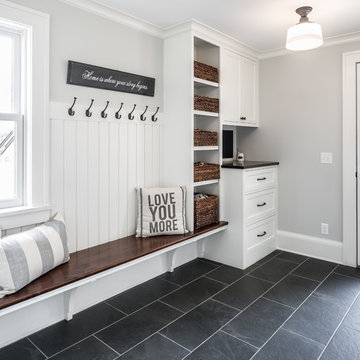
Inspiration for a farmhouse black floor entryway remodel in Minneapolis with gray walls and a glass front door
 DANIELLE Interior Design & Decor
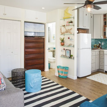
Accenting the teal glass backsplash tile with the vivid black and white rug is just what this small apartment needed. In this small spaces we tried to maximize space and organize effectively. We used minimal dicor and kept the tiny living room to the essentials.
Designed by Interior Designer Danielle Perkins @ DANIELLE Interior Design & Decor.
Photography by Taylor Abeel Photography.
 309design
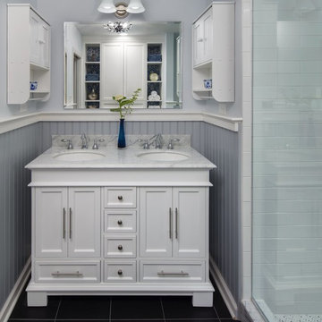
After! The newly renovated bathroom features a totally open space with a frameless shower enclosure, white furniture style vanity, soft grey beadboard wainscotting, white woodwork, black porcelain tile flooring and a soft gray wall color. Note the newly constructed custom storage reflected in the mirror. The open shelving has a metallic patterned modern damask wall covering.
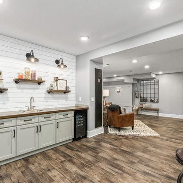
Sponsored
Sunbury, OH

J.Holderby - Renovations
Franklin County's Leading General Contractors - 2X Best of Houzz!
 Alison Kandler Interior Design
Kitchen
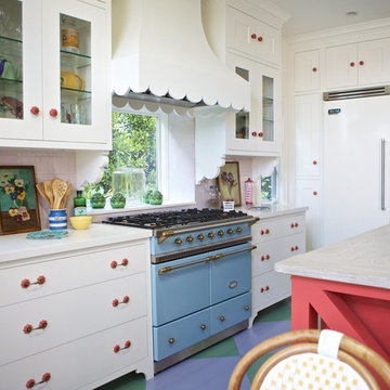
Open concept kitchen - eclectic painted wood floor open concept kitchen idea in Los Angeles with white cabinets, wood countertops, ceramic backsplash, colored appliances and shaker cabinets
Open concept kitchen - eclectic painted wood floor open concept kitchen idea in Los Angeles with white cabinets, wood countertops, ceramic backsplash, colored appliances and shaker cabinets
 Next Level Remodeling
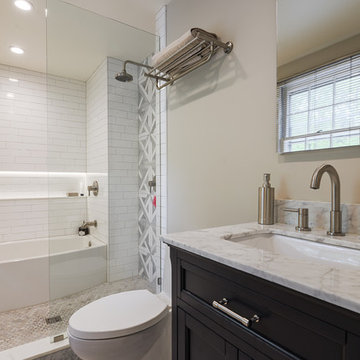
Transitional master white tile and subway tile bathroom photo in Philadelphia with an undermount sink, marble countertops, white countertops, recessed-panel cabinets, black cabinets and beige walls
 Electric Mirror
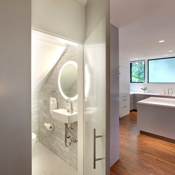
Photo by JH Jackson Photography; Design by Hugh Randolph Architects; Trinity Mirror by Electric Mirror.
For more info about purchasing our mirrors, visit www.electricmirror.com.
 Haus Interior Design
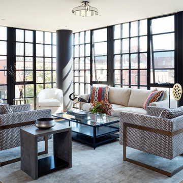
Who wouldn't fall in love with the Water Street building, and the elegant industrial vibe? The light that floods in through the floor-to-ceiling windows makes this a perfect spot to entertain and host friends from California or adult kids who visit. The location can't be beat--these clients ride their bikes to meet friends for lunch or a tour through the Hirschhorn. We knocked down a wall to open the kitchen, and added modern furnishings punctuated by splashes of deep orangey-red. High contrast and lots of rich textures can be found throughout this urban loft.
Photography: Stacy Zarin Goldberg


 Blue Heron Signature Homes
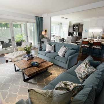
Designed and built by Terramor Homes in Raleigh, NC. This open design concept was an exciting challenge. Kitchen, Family Room and Large Eat in Kitchen are entirely open to each other for family enjoyment. When we enjoy a large family gathering, we envisioned it to be while enjoying the view of the woods, greenway and river seen from the back of the home. Since most of our gatherings extend past single table seating spaces, we wanted to plan properly for spill over onto the huge screened porch that adjoins all of the rooms for extended seating that remains all-inclusive. The screened porch is accessible from the dining area, but more impressively, by a 16 foot wide sliding glass door across the back wall of the Family Room. When fully opened, an 8 foot wide opening is created- making a complete extension of our living and eating areas fully integrated.
Photography: M. Eric Honeycutt
 Olamar Interiors
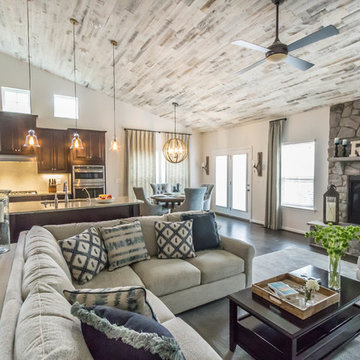
These clients hired us to add warmth and personality to their builder home. The fell in love with the layout and main level master bedroom, but found the home lacked personality and style. They hired us, with the caveat that they knew what they didn't like, but weren't sure exactly what they wanted. They were challenged by the narrow layout for the family room. They wanted to ensure that the fireplace remained the focal point of the space, while giving them a comfortable space for TV watching. They wanted an eating area that expanded for holiday entertaining. They were also challenged by the fact that they own two large dogs who are like their children.
The entry is very important. It's the first space guests see. This one is subtly dramatic and very elegant. We added a grasscloth wallpaper on the walls and painted the tray ceiling a navy blue. The hallway to the guest room was painted a contrasting glue green. A rustic, woven rugs adds to the texture. A simple console is simply accessorized.
Our first challenge was to tackle the layout. The family room space was extremely narrow. We custom designed a sectional that defined the family room space, separating it from the kitchen and eating area. A large area rug further defined the space. The large great room lacked personality and the fireplace stone seemed to get lost. To combat this, we added white washed wood planks to the entire vaulted ceiling, adding texture and creating drama. We kept the walls a soft white to ensure the ceiling and fireplace really stand out. To help offset the ceiling, we added drama with beautiful, rustic, over-sized lighting fixtures. An expandable dining table is as comfortable for two as it is for ten. Pet-friendly fabrics and finishes were used throughout the design. Rustic accessories create a rustic, finished look.
Liz Ernest Photography
 Fredman Design Group
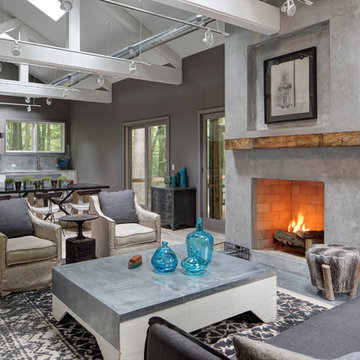
The juxtaposition of raw, weathered and finished woods with sleek whites, mixed metals and soft textured elements strike a fabulous balance between industrial, rustic and glamorous – exactly what the designers envisioned for this dream retreat. This unique home’s design combines recycled shipping containers with traditional stick-building methods and resulted in a luxury hybrid home, inside and out. The design team was particularly challenged with overcoming various preconceived notions about containers to truly create something new, luxurious and sustainable.
1