
Search results for "Optimize iphone">optimize" in Home Design Ideas
 Arise Art Group
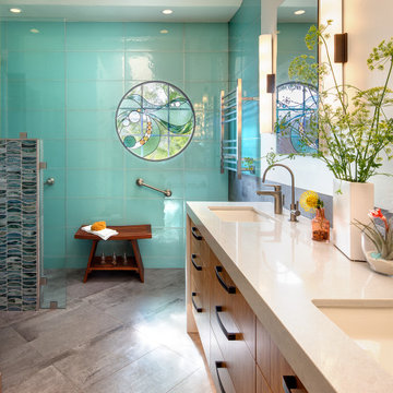
These clients have a high sense of design and have always built their own homes. They just downsized into a typical town home and needed this new space to stand out but also be accommodating of aging in place. The client, Jim, has a handful of challenges ahead of him with dealing with Parkinson and all of it symptoms. We optimized the shower, enlarging it by eliminating the tub and not using a shower door. We were able to do a curbless shower, reducing the likelihood of falling. We used larger tiles in the bathroom and shower but added the anti slip porcelain. I included a built-in seat in the shower and a stand-alone bench on the other side. We used a separate hand shower and easy to grab handles.
A natural palette peppered with some aqua and green breathes fresh, new life into a re-imagined UTC town home. Choosing materials and finishes that have higher contrast helps make the change from flooring to wall, as well as cabinet to counter, more obvious. Large glass wall tiles make the bathroom seem much larger. A flush installation of drywall to tile is easy on the eye while showing the attention to detail.
A modern custom floating vanity allows for walker wheels if needed. Personal touches like adding a filter faucet at the sink makes his trips to take medicine a bit easier.
One of my favorite things in design for any project is lighting. Not only can lighting add to the look and feel of the space, but it can also create a safer environment. Installing different types of lighting, including scones on either side of the mirror, recessed can lights both inside and outside of the shower, and LED strip lighting under the floating vanity, keep this modern bathroom current and very functional. Because of the skylight and the round window, light is allowed in to play with the different colors in the glass and the shapes around the room, which created a bright and playful bathroom.
It is not often that I get to play with stain-glass, but this existing circular window, that we could NOT change, needed some love. We used a local craftsman that allowed us to design a playful stain-glass piece for the inside of the bathroom window, reminding them of their front door in their custom home years ago.
 Saikley Architects
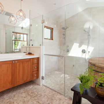
Down-to-studs remodel and second floor addition. The original house was a simple plain ranch house with a layout that didn’t function well for the family. We changed the house to a contemporary Mediterranean with an eclectic mix of details. Space was limited by City Planning requirements so an important aspect of the design was to optimize every bit of space, both inside and outside. The living space extends out to functional places in the back and front yards: a private shaded back yard and a sunny seating area in the front yard off the kitchen where neighbors can easily mingle with the family. A Japanese bath off the master bedroom upstairs overlooks a private roof deck which is screened from neighbors’ views by a trellis with plants growing from planter boxes and with lanterns hanging from a trellis above.
Photography by Kurt Manley.
https://saikleyarchitects.com/portfolio/modern-mediterranean/
 Lorraine G Vale, ASID Allied
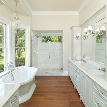
One of the main features of the space is the natural lighting. The windows allow someone to feel they are in their own private oasis. The wide plank European oak floors, with a brushed finish, contribute to the warmth felt in this bathroom, along with warm neutrals, whites and grays. The counter tops are a stunning Calcatta Latte marble as is the basket weaved shower floor, 1x1 square mosaics separating each row of the large format, rectangular tiles, also marble. Lighting is key in any bathroom and there is more than sufficient lighting provided by Ralph Lauren, by Circa Lighting. Classic, custom designed cabinetry optimizes the space by providing plenty of storage for toiletries, linens and more. Holger Obenaus Photography did an amazing job capturing this light filled and luxurious master bathroom. Built by Novella Homes and designed by Lorraine G Vale
Holger Obenaus Photography
Find the right local pro for your project
 Klopf Architecture
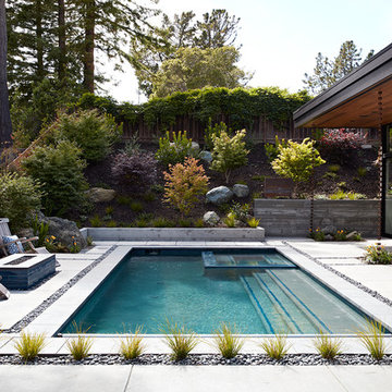
Klopf Architecture, Arterra Landscape Architects and Henry Calvert of Calvert Ventures Designed and built a new warm, modern, Eichler-inspired, open, indoor-outdoor home on a deeper-than-usual San Mateo Highlands property where an original Eichler house had burned to the ground.
The owners wanted multi-generational living and larger spaces than the original home offered, but all parties agreed that the house should respect the neighborhood and blend in stylistically with the other Eichlers. At first the Klopf team considered re-using what little was left of the original home and expanding on it. But after discussions with the owner and builder, all parties agreed that the last few remaining elements of the house were not practical to re-use, so Klopf Architecture designed a new home that pushes the Eichler approach in new directions.
One disadvantage of Eichler production homes is that the house designs were not optimized for each specific lot. A new custom home offered the team a chance to start over. In this case, a longer house that opens up sideways to the south fit the lot better than the original square-ish house that used to open to the rear (west). Accordingly, the Klopf team designed an L-shaped “bar” house with a large glass wall with large sliding glass doors that faces sideways instead of to the rear like a typical Eichler. This glass wall opens to a pool and landscaped yard designed by Arterra Landscape Architects.
Driving by the house, one might assume at first glance it is an Eichler because of the horizontality, the overhanging flat roof eaves, the dark gray vertical siding, and orange solid panel front door, but the house is designed for the 21st Century and is not meant to be a “Likeler.” You won't see any posts and beams in this home. Instead, the ceiling decking is a western red cedar that covers over all the beams. Like Eichlers, this cedar runs continuously from inside to out, enhancing the indoor / outdoor feeling of the house, but unlike Eichlers it conceals a cavity for lighting, wiring, and insulation. Ceilings are higher, rooms are larger and more open, the master bathroom is light-filled and more generous, with a separate tub and shower and a separate toilet compartment, and there is plenty of storage. The garage even easily fits two of today's vehicles with room to spare.
A massive 49-foot by 12-foot wall of glass and the continuity of materials from inside to outside enhance the inside-outside living concept, so the owners and their guests can flow freely from house to pool deck to BBQ to pool and back.
During construction in the rough framing stage, Klopf thought the front of the house appeared too tall even though the house had looked right in the design renderings (probably because the house is uphill from the street). So Klopf Architecture paid the framer to change the roofline from how we had designed it to be lower along the front, allowing the home to blend in better with the neighborhood. One project goal was for people driving up the street to pass the home without immediately noticing there is an "imposter" on this lot, and making that change was essential to achieve that goal.
This 2,606 square foot, 3 bedroom, 3 bathroom Eichler-inspired new house is located in San Mateo in the heart of the Silicon Valley.
Klopf Architecture Project Team: John Klopf, AIA, Klara Kevane
Landscape Architect: Arterra Landscape Architects
Contractor: Henry Calvert of Calvert Ventures
Photography ©2016 Mariko Reed
Location: San Mateo, CA
Year completed: 2016
 Drewett Works
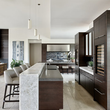
This photo: For a couple's house in Paradise Valley, architect C.P. Drewett created a sleek modern kitchen with Caesarstone counters and tile backsplashes from Art Stone LLC. Porcelain-tile floors from Villagio Tile & Stone provide contrast to the dark-stained vertical-grain white-oak cabinetry fabricated by Reliance Custom Cabinets.
Positioned near the base of iconic Camelback Mountain, “Outside In” is a modernist home celebrating the love of outdoor living Arizonans crave. The design inspiration was honoring early territorial architecture while applying modernist design principles.
Dressed with undulating negra cantera stone, the massing elements of “Outside In” bring an artistic stature to the project’s design hierarchy. This home boasts a first (never seen before feature) — a re-entrant pocketing door which unveils virtually the entire home’s living space to the exterior pool and view terrace.
A timeless chocolate and white palette makes this home both elegant and refined. Oriented south, the spectacular interior natural light illuminates what promises to become another timeless piece of architecture for the Paradise Valley landscape.
Project Details | Outside In
Architect: CP Drewett, AIA, NCARB, Drewett Works
Builder: Bedbrock Developers
Interior Designer: Ownby Design
Photographer: Werner Segarra
Publications:
Luxe Interiors & Design, Jan/Feb 2018, "Outside In: Optimized for Entertaining, a Paradise Valley Home Connects with its Desert Surrounds"
Awards:
Gold Nugget Awards - 2018
Award of Merit – Best Indoor/Outdoor Lifestyle for a Home – Custom
The Nationals - 2017
Silver Award -- Best Architectural Design of a One of a Kind Home - Custom or Spec
http://www.drewettworks.com/outside-in/
 ZeroEnergy Design
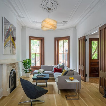
This renovated brick rowhome in Boston’s South End offers a modern aesthetic within a historic structure, creative use of space, exceptional thermal comfort, a reduced carbon footprint, and a passive stream of income.
DESIGN PRIORITIES. The goals for the project were clear - design the primary unit to accommodate the family’s modern lifestyle, rework the layout to create a desirable rental unit, improve thermal comfort and introduce a modern aesthetic. We designed the street-level entry as a shared entrance for both the primary and rental unit. The family uses it as their everyday entrance - we planned for bike storage and an open mudroom with bench and shoe storage to facilitate the change from shoes to slippers or bare feet as they enter their home. On the main level, we expanded the kitchen into the dining room to create an eat-in space with generous counter space and storage, as well as a comfortable connection to the living space. The second floor serves as master suite for the couple - a bedroom with a walk-in-closet and ensuite bathroom, and an adjacent study, with refinished original pumpkin pine floors. The upper floor, aside from a guest bedroom, is the child's domain with interconnected spaces for sleeping, work and play. In the play space, which can be separated from the work space with new translucent sliding doors, we incorporated recreational features inspired by adventurous and competitive television shows, at their son’s request.
MODERN MEETS TRADITIONAL. We left the historic front facade of the building largely unchanged - the security bars were removed from the windows and the single pane windows were replaced with higher performing historic replicas. We designed the interior and rear facade with a vision of warm modernism, weaving in the notable period features. Each element was either restored or reinterpreted to blend with the modern aesthetic. The detailed ceiling in the living space, for example, has a new matte monochromatic finish, and the wood stairs are covered in a dark grey floor paint, whereas the mahogany doors were simply refinished. New wide plank wood flooring with a neutral finish, floor-to-ceiling casework, and bold splashes of color in wall paint and tile, and oversized high-performance windows (on the rear facade) round out the modern aesthetic.
RENTAL INCOME. The existing rowhome was zoned for a 2-family dwelling but included an undesirable, single-floor studio apartment at the garden level with low ceiling heights and questionable emergency egress. In order to increase the quality and quantity of space in the rental unit, we reimagined it as a two-floor, 1 or 2 bedroom, 2 bathroom apartment with a modern aesthetic, increased ceiling height on the lowest level and provided an in-unit washer/dryer. The apartment was listed with Jackie O'Connor Real Estate and rented immediately, providing the owners with a source of passive income.
ENCLOSURE WITH BENEFITS. The homeowners sought a minimal carbon footprint, enabled by their urban location and lifestyle decisions, paired with the benefits of a high-performance home. The extent of the renovation allowed us to implement a deep energy retrofit (DER) to address air tightness, insulation, and high-performance windows. The historic front facade is insulated from the interior, while the rear facade is insulated on the exterior. Together with these building enclosure improvements, we designed an HVAC system comprised of continuous fresh air ventilation, and an efficient, all-electric heating and cooling system to decouple the house from natural gas. This strategy provides optimal thermal comfort and indoor air quality, improved acoustic isolation from street noise and neighbors, as well as a further reduced carbon footprint. We also took measures to prepare the roof for future solar panels, for when the South End neighborhood’s aging electrical infrastructure is upgraded to allow them.
URBAN LIVING. The desirable neighborhood location allows the both the homeowners and tenant to walk, bike, and use public transportation to access the city, while each charging their respective plug-in electric cars behind the building to travel greater distances.
OVERALL. The understated rowhouse is now ready for another century of urban living, offering the owners comfort and convenience as they live life as an expression of their values.
Eric Roth Photo
 Misiaszek Turpin pllc
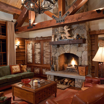
 The 7,600 square-foot residence was designed for large, memorable gatherings of family and friends at the lake, as well as creating private spaces for smaller family gatherings. Keeping in dialogue with the surrounding site, a palette of natural materials and finishes was selected to provide a classic backdrop for all activities, bringing importance to the adjoining environment.
In optimizing the views of the lake and developing a strategy to maximize natural ventilation, an ideal, open-concept living scheme was implemented. The kitchen, dining room, living room and screened porch are connected, allowing for the large family gatherings to take place inside, should the weather not cooperate. Two main level master suites remain private from the rest of the program; yet provide a complete sense of incorporation. Bringing the natural finishes to the interior of the residence, provided the opportunity for unique focal points that complement the stunning stone fireplace and timber trusses.
Photographer: John Hession
 User
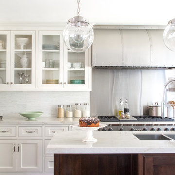
UserThe original kitchen was confined within four walls and our clients were eager to create a more open floor plan to provide more social interaction between the home chef (mom) and the 4 men in her life.
By removing walls and borrowing a few extra square feet from the adjacent laundry room we were able to incorporate a 48” refrigerator and range, extra storage, a central island, increased workspaces and banquette seating into this modestly sized kitchen.
This project was designed to provide both high function and high style while optimizing the influx of natural light from the enlarged kitchen windows. We maximized the space and created an open floor plan that improved traffic flow between the adjacent rooms.
The custom cabinetry, stainless hood, shelves, and the professional faucet gives this rather traditional white kitchen a more modern design sensibility.
Photo Credit: Bethany Nauert
 Saikley Architects
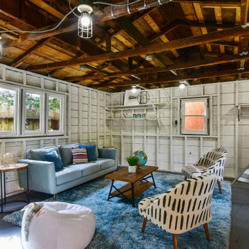
We updated this 1907 two-story family home for re-sale. We added modern design elements and amenities while retaining the home’s original charm in the layout and key details. The aim was to optimize the value of the property for a prospective buyer, within a reasonable budget.
New French doors from kitchen and a rear bedroom open out to a new bi-level deck that allows good sight lines, functional outdoor living space, and easy access to a garden full of mature fruit trees. French doors from an upstairs bedroom open out to a private high deck overlooking the garden. The garage has been converted to a family room that opens to the garden.
The bathrooms and kitchen were remodeled the kitchen with simple, light, classic materials and contemporary lighting fixtures. New windows and skylights flood the spaces with light. Stained wood windows and doors at the kitchen pick up on the original stained wood of the other living spaces.
New redwood picture molding was created for the living room where traces in the plaster suggested that picture molding has originally been. A sweet corner window seat at the living room was restored. At a downstairs bedroom we created a new plate rail and other redwood trim matching the original at the dining room. The original dining room hutch and woodwork were restored and a new mantel built for the fireplace.
We built deep shelves into space carved out of the attic next to upstairs bedrooms and added other built-ins for character and usefulness. Storage was created in nooks throughout the house. A small room off the kitchen was set up for efficient laundry and pantry space.
We provided the future owner of the house with plans showing design possibilities for expanding the house and creating a master suite with upstairs roof dormers and a small addition downstairs. The proposed design would optimize the house for current use while respecting the original integrity of the house.
Photography: John Hayes, Open Homes Photography
https://saikleyarchitects.com/portfolio/classic-craftsman-update/
 TVL Creative Ltd.
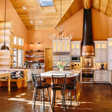
This project's final result exceeded even our vision for the space! This kitchen is part of a stunning traditional log home in Evergreen, CO. The original kitchen had some unique touches, but was dated and not a true reflection of our client. The existing kitchen felt dark despite an amazing amount of natural light, and the colors and textures of the cabinetry felt heavy and expired. The client wanted to keep with the traditional rustic aesthetic that is present throughout the rest of the home, but wanted a much brighter space and slightly more elegant appeal. Our scope included upgrades to just about everything: new semi-custom cabinetry, new quartz countertops, new paint, new light fixtures, new backsplash tile, and even a custom flue over the range. We kept the original flooring in tact, retained the original copper range hood, and maintained the same layout while optimizing light and function. The space is made brighter by a light cream primary cabinetry color, and additional feature lighting everywhere including in cabinets, under cabinets, and in toe kicks. The new kitchen island is made of knotty alder cabinetry and topped by Cambria quartz in Oakmoor. The dining table shares this same style of quartz and is surrounded by custom upholstered benches in Kravet's Cowhide suede. We introduced a new dramatic antler chandelier at the end of the island as well as Restoration Hardware accent lighting over the dining area and sconce lighting over the sink area open shelves. We utilized composite sinks in both the primary and bar locations, and accented these with farmhouse style bronze faucets. Stacked stone covers the backsplash, and a handmade elk mosaic adorns the space above the range for a custom look that is hard to ignore. We finished the space with a light copper paint color to add extra warmth and finished cabinetry with rustic bronze hardware. This project is breathtaking and we are so thrilled our client can enjoy this kitchen for many years to come!
 Saikley Architects
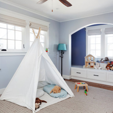
This house was a very small mid-century bungalow with previous additions that resulted in a large but chaotic layout. The owners wanted to convert the house to a super-efficient, and charming Craftsman-style, 6 bedroom home for their large family and work at home.
We achieved the space needs by moving a few walls for a more efficient, organized layout, setting up spaces for overlapping uses, and making a small upstairs addition. Every bit of square footage was optimized to meet the goals of the project without making the house huge or adding unnecessary cost.
Much thought was given to the entry sequence near the front door. A large flow-through mudroom with storage for each family member, and adjacent laundry, make it easy for children to be taught to keep their things organized and to contribute to household chores. A mail station and central home admin area at the mudroom help keep clutter down at other areas and minimize home management tasks. A garage door near the kitchen gives quick access to bulk items.
The existing house had too much view to the street from the living room through large corner windows, and too little entry transition, to the extent that the family did not feel comfortable using the living room much without shades drawn. We raised the window sills and brought the new windows in from the corner of the house, allowing plenty of light while protecting privacy and a sense of enclosure in the living room. We enlarged the front porch to create a more graceful transition from the public to private space. We located the front door so that the circulation from entry into the house would allow for furnishing the living room with a sitting circle that is not intruded upon by people walking through the room.
Sight lines through the living spaces were an important consideration in the design. The owners wanted discreet spaces for living room, kitchen, dining and family room, but also wanted the living spaces to feel connected and to be able to easily watch their children. Being able to see the children playing in the yard while getting things done inside the house was also important. While largely working with the existing structure, we opened walls and rearranged the use of spaces to make a series of connected living spaces with long views through them.
The character of the remodeled house is a contemporary Craftsman with classic materials and cool, consistent colors. A few arches echo through the house to frame spaces and soften the feeling of the rooms.
Photography: Kurt Manley
https://saikleyarchitects.com/portfolio/bungalow-expansion/
 Design Opera Inc.
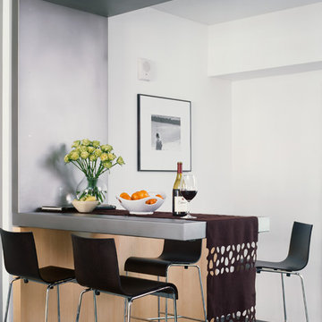
The Floating Bar:
The condo’s main entry door inconveniently opens into what should be the kitchen nook, leaving the space unusable. The new bar optimizes the area by creating it’s own space.
Photo by: Jonn Coolidge
 Cathie Hong Interiors
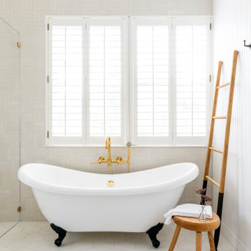
This project was a joy to work on, as we married our firm’s modern design aesthetic with the client’s more traditional and rustic taste. We gave new life to all three bathrooms in her home, making better use of the space in the powder bathroom, optimizing the layout for a brother & sister to share a hall bath, and updating the primary bathroom with a large curbless walk-in shower and luxurious clawfoot tub. Though each bathroom has its own personality, we kept the palette cohesive throughout all three.
 TVL Creative Ltd.
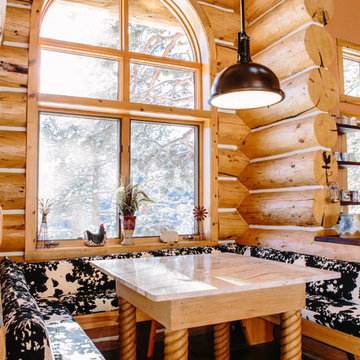
This project's final result exceeded even our vision for the space! This kitchen is part of a stunning traditional log home in Evergreen, CO. The original kitchen had some unique touches, but was dated and not a true reflection of our client. The existing kitchen felt dark despite an amazing amount of natural light, and the colors and textures of the cabinetry felt heavy and expired. The client wanted to keep with the traditional rustic aesthetic that is present throughout the rest of the home, but wanted a much brighter space and slightly more elegant appeal. Our scope included upgrades to just about everything: new semi-custom cabinetry, new quartz countertops, new paint, new light fixtures, new backsplash tile, and even a custom flue over the range. We kept the original flooring in tact, retained the original copper range hood, and maintained the same layout while optimizing light and function. The space is made brighter by a light cream primary cabinetry color, and additional feature lighting everywhere including in cabinets, under cabinets, and in toe kicks. The new kitchen island is made of knotty alder cabinetry and topped by Cambria quartz in Oakmoor. The dining table shares this same style of quartz and is surrounded by custom upholstered benches in Kravet's Cowhide suede. We introduced a new dramatic antler chandelier at the end of the island as well as Restoration Hardware accent lighting over the dining area and sconce lighting over the sink area open shelves. We utilized composite sinks in both the primary and bar locations, and accented these with farmhouse style bronze faucets. Stacked stone covers the backsplash, and a handmade elk mosaic adorns the space above the range for a custom look that is hard to ignore. We finished the space with a light copper paint color to add extra warmth and finished cabinetry with rustic bronze hardware. This project is breathtaking and we are so thrilled our client can enjoy this kitchen for many years to come!
 Saikley Architects
Down-to-studs remodel and second floor addition. The original house was a simple plain ranch house with a layout that didn’t function well for the family. We changed the house to a contemporary Mediterranean with an eclectic mix of details. Space was limited by City Planning requirements so an important aspect of the design was to optimize every bit of space, both inside and outside. The living space extends out to functional places in the back and front yards: a private shaded back yard and a sunny seating area in the front yard off the kitchen where neighbors can easily mingle with the family. A Japanese bath off the master bedroom upstairs overlooks a private roof deck which is screened from neighbors’ views by a trellis with plants growing from planter boxes and with lanterns hanging from a trellis above.
Photography by Kurt Manley.
https://saikleyarchitects.com/portfolio/modern-mediterranean/
 Dawson & Clinton
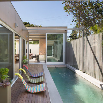
The design for this home in Palo Alto looked to create a union between the interior and exterior, blending the spaces in such a way as to allow residents to move seamlessly between the two environments. Expansive glazing was used throughout the home to complement this union, looking out onto a swimming pool centrally located within the courtyard.
Within the living room, a large operable skylight brings in plentiful sunlight, while utilizing self tinting glass that adjusts to various lighting conditions throughout the day to ensure optimal comfort.
For the exterior, a living wall was added to the garage that continues into the backyard. Extensive landscaping and a gabion wall was also created to provide privacy and contribute to the sense of the home as a tranquil oasis.
 Amanda Martocchio Architecture
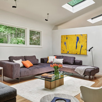
Time had stood still at this 1970s ranch in Armonk when the owners invited us to collaborate with them to transform it into a modern, light-filled home for their young family. The budget was lean, so economy was a primary consideration for every design decision. The challenge was to identify the modest home’s virtues – vaulted ceilings and a lovely backyard – and accentuate them by strategically optimizing available funds.
We were tasked with rectifying a dysfunctional interior stair, connecting to the outdoors with new large windows, and updating the exterior. We focused our attention on a finite set of architectural moves which would have the biggest impact and improve our clients’ daily experience of the home. Detailing was kept simple, using common grade materials and standard components. All exterior walls were revamped with new windows and siding. Although these materials were not particularly costly, thoughtful layout of boards, battens, and openings produced a cohesive, rigorous composition at each facade.
Since the budget would not cover the homeowners’ complete wish list, some items were bracketed for subsequent phases. The challenge was to establish a framework that would allow future work – including a new roof and kitchen renovation – to proceed smoothly.
The homeowners, both scientists, were enthusiastic collaborators, contributing their outstanding design sensibilities to selection of fixtures and finishes. Construction ended just in time for the arrival of their baby – and with that, the transformation of their family home was complete.
 California Closets HQ
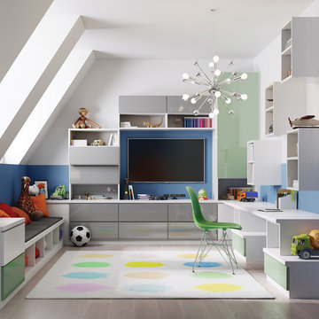
This multipurpose design helps to optimize the kids' space while keeping the room fun and functional.
• Lago® Bellissima White finish blends in with the room's fresh, youthful palette.
• High-gloss acrylic Parapan Mint and Stone Grey slab drawer and door fronts create a timeless, modern look.
• Floating cabinets offer additional storage with a playful aesthetic.
• Push-to-open hardware offer ease of use.
• Cabinets and drawers provide concealed storage.
• Integrated bench and workstation provide seating and a designated project space.
 Saikley Architects
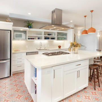
Down-to-studs remodel and second floor addition. The original house was a simple plain ranch house with a layout that didn’t function well for the family. We changed the house to a contemporary Mediterranean with an eclectic mix of details. Space was limited by City Planning requirements so an important aspect of the design was to optimize every bit of space, both inside and outside. The living space extends out to functional places in the back and front yards: a private shaded back yard and a sunny seating area in the front yard off the kitchen where neighbors can easily mingle with the family. A Japanese bath off the master bedroom upstairs overlooks a private roof deck which is screened from neighbors’ views by a trellis with plants growing from planter boxes and with lanterns hanging from a trellis above.
Photography by Kurt Manley.
https://saikleyarchitects.com/portfolio/modern-mediterranean/
 Hammer Architects
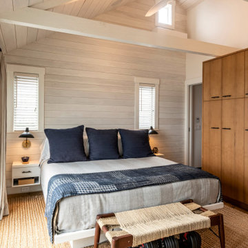
The upper level Provincetown condominium was fully renovated to optimize its waterfront location and enhance the visual connection to the harbor
The program included a new kitchen, two bathrooms a primary bedroom and a convertible study/guest room that incorporates an accordion pocket door for privacy
2