
Search results for "Outdated thinking" in Home Design Ideas
 PowerSmith Design
XL Visions
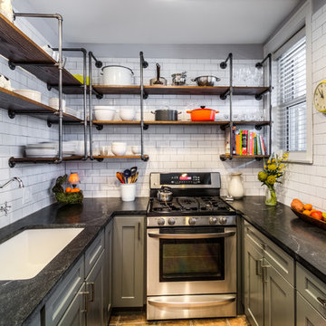
Enclosed kitchen - small industrial u-shaped slate floor and brown floor enclosed kitchen idea in Boston with an undermount sink, shaker cabinets, gray cabinets, white backsplash, subway tile backsplash, no island, stainless steel appliances and soapstone countertops
Enclosed kitchen - small industrial u-shaped slate floor and brown floor enclosed kitchen idea in Boston with an undermount sink, shaker cabinets, gray cabinets, white backsplash, subway tile backsplash, no island, stainless steel appliances and soapstone countertops
 Wood Customs
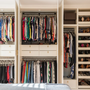
Inspiration for a mid-sized contemporary gender-neutral reach-in closet remodel in Houston with flat-panel cabinets and white cabinets
 Diane Durocher Interiors
Peter Rymwid Architectural Photography
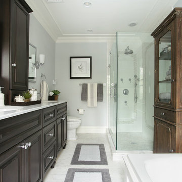
Example of a classic bathroom design in New York with an undermount sink, raised-panel cabinets, dark wood cabinets and gray walls
Example of a classic bathroom design in New York with an undermount sink, raised-panel cabinets, dark wood cabinets and gray walls
Find the right local pro for your project
 Pacwest Builders LLC
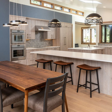
Vaulted Dining, Kitchen, and Nook (beyond).
Eat-in kitchen - large rustic light wood floor and beige floor eat-in kitchen idea in Other with an undermount sink, flat-panel cabinets, light wood cabinets, quartz countertops, gray backsplash, ceramic backsplash, paneled appliances, two islands and white countertops
Eat-in kitchen - large rustic light wood floor and beige floor eat-in kitchen idea in Other with an undermount sink, flat-panel cabinets, light wood cabinets, quartz countertops, gray backsplash, ceramic backsplash, paneled appliances, two islands and white countertops
 Alair Homes Plano
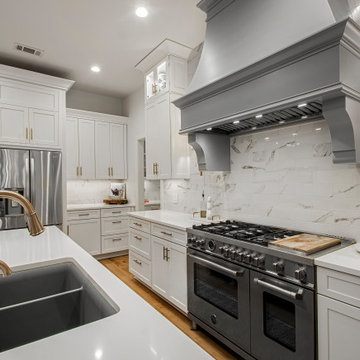
Our clients came to us wanting to maximize the space they had. They were not planning on moving anytime soon, as they loved their neighborhood. They wanted to renovate the front of their house, which included the front atrium, living room, kitchen, and powder bath. They hated their kitchen because it was completely closed off, had low ceilings, was dark and outdated, not to mention the floors were different in each of these rooms! The pantry was in the breakfast area and the kitchen table became a junk catcher, being the first thing you see when coming in from the garage/laundry room. In their living room, they wanted the spaces on either side of the fireplace to be symmetrical, whether that be bookshelves, a wet bar or closed off. Both parents are working professionals with no time and/or desire to design, create and figure this out on their own. They needed help figuring out how to reconfigure their current space in order to maximize what they already had, as they could not see an obvious solution. They could not envision how it would look so the fact that our designers were able to show them their new kitchen in 3D was pertinent.
We removed the pass-through windows that surrounded the atrium and front dining room, as well as the entire kitchen wall, completely opening up those two rooms. We removed a hall that used to lead between the kitchen and the living room since it was a complete waste of space! The ceilings were raised to 10’ in the kitchen and we were able to leave the skylight, letting in that natural light they wanted. We were able to give them a much larger pantry with tons of shelving and increase the size of their laundry room by utilizing the space of their old breakfast nook.
We relocated the door to the garage into their new elongated laundry room, built a wet bar across from their new larger pantry (with a pocket door) and the flow and functionality of these new spaces is just perfect! All new Waypoint cabinets were installed one two main kitchen surrounding walls painted Linen. Calacatta Bianco Polished Porcelain Tile 4x12 was used for the backsplash. A large eat-at island was installed, painted Stone, where the family can now gather for homework, meals, and mingling. The soft champagne bronze hardware and accent lighting really give this white and gray kitchen a soft classic look.
In the living room, we removed the built-in bookshelves to the left of the fireplace and closed off the wet-bar on the other side, giving them more space in their master suite. White Oak wood flooring, stained Putney, was installed throughout the entire new space, giving it the continuity they were looking for.
In the guest bathroom, Carrara white herringbone marble mosaic 12x12 tile was used on the shower floor and niche, while basic marble Bianco polished 12x24 porcelain tile was used on the walls. Luxart polished chrome traditional hardware gives this timeless bathroom the perfect shine.
Our clients are so happy with the new functionality and look of their space. It has definitely changed their lives in a way they could have never imagined!
 Alair Homes Plano
This project is a Houzz Kitchen of the Week! Click below to read the full story!
https://www.houzz.com/ideabooks/116547325/list/kitchen-of-the-week-better-brighter-and-no-longer-basic
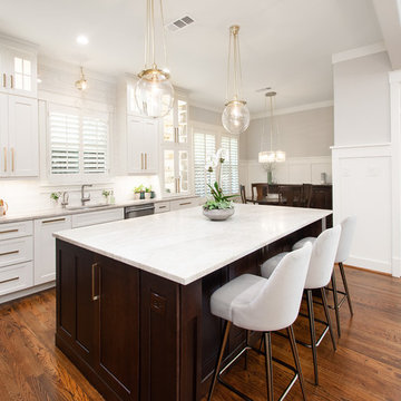
Our clients came to us wanting an elegant and functional kitchen and brighter living room. Their kitchen was dark and inefficient. The cabinets felt cluttered and the storage was there, but not functional for this family. They wanted all new finishes; especially new cabinets, but the floors were going to stay and be refinished. No wall relocation was needed but adding a door into the dining room to block the view from the front into the kitchen was discussed. They wanted to bring in more light somehow and preferably natural light. There was an unused sink in the butler’s pantry that they wanted capped, giving them more space and organized storage was a must! In their living room, they love their fireplace because it reminds her of her home in Colorado, so that definitely had to stay but everything else was left to the designers.
After all decisions were made, this gorgeous kitchen and living space came to life! It is bright, open and airy, just like our clients wanted. Soft White Shiloh cabinetry was installed with a contrasting Cocoa island. Honed Levantina Taj Mahal quartzite was a beautiful countertop for this space. Bedrosians Grace 4”x 12” wall tile in Panna was the backsplash throughout the kitchen. The stove wall is flanked with dark wooden shelves on either side of vent-a-hood creating a feature area to the cook area. A beautiful maple barn door with seeded baroque tempered glass inserts was installed to close off the pantry and giving them more room than a traditional door. The original wainscoting remained in the kitchen and living areas but was modified in the kitchen where the cabinets were slightly extended and painted white throughout. LED tape lighting was installed under the cabinets, LED lighting was also added to the top of the upper glass cabinets, in addition to the grow lights installed for their herbs. All of the light fixtures were updated to a timeless classic look and feel. Imbrie articulating wall sconces were installed over the kitchen window/sink and in the butler’s pantry and aged brass Hood classic globe pendants were hung over the island, really drawing your attention to the kitchen. The Alturas fixture from SeaGull Lighing now hangs in the center of the living room, where there was once an outdated ceiling fan. In the living room, the walls were painted white, while leaving the wood and stone fireplace, as requested, leaving an absolutely amazing contrast!
Design/Remodel by Hatfield Builders & Remodelers | Photography by Versatile Imaging
 Advance Design Studio, Ltd.
After six years of living in their Huntley IL home, Chris and Meghan were tired of their dark, dingy, outdated kitchen and it was finally time for a long-anticipated change. “The kitchen is the place where we live, it’s where we do everything,” Meghan said. “It was important that it be a space where we wanted to be.” Meghan loves cooking and enjoys including their girls in healthy meal prepping, this led them to want a brighter, more enjoyable kitchen with increased functionality and improved storage.
For Chris especially, the laundry room was an entirely dysfunctional eyesore. “We had a washer and a dryer, but it was all kind-of cobbled together!” Chris said. “There were always laundry piles everywhere, we weren’t really sure what we wanted to do in there, but it was time for us to make a change.” The mess of the space was stressful every time they walked in the door from the garage each day. Kids’ backpacks and shoes piled up haphazardly in the makeshift boot-bench closet left the family feeling disorganized and stressed. They needed space for folding clothes and locker cubbies to help keep the family organized.
Having known Christine and Todd in the Huntley community for years, Chris and Meghan were familiar with their work. “We already trusted them personally and having seen their projects for years we knew they did top notch work. After we reviewed the initial round of designs, we knew that hiring them was definitely the right choice,” Meghan and Chris said. Although Chris had done a lot of work in their home himself, the kitchen and laundry room renovation was such a large undertaking that he didn’t want to steal time away from his family to spend what would surely be many long weekends doing the job himself. “That would not have been a wise choice for us,” Chris laughed.
“Our designer, Michelle was very, very, easy to work with; anything we wanted to see or weren’t sure about, she went above and beyond to make this easy for us. She was easy to get hold of and always quick to respond,” the couple said. Michelle pulled ideas that mirrored the couple’s taste and style and was adept at directing the couple to limited choices that didn’t overwhelm them and kept the process moving. “I have a hard time making decisions. Michelle made the decision-making process so easy. I loved how she listened to what I liked and then presented three great options for me to choose from,” Meghan said.
The main objectives for the kitchen were better storage solutions, they wanted the space to reflect their lifestyle and taste, and they wanted it to last for years with low maintenance. One of the first steps in creating a more functional kitchen was relocating the refrigerator, creating an improved workflow for the busy family.
“We didn’t know that we could even move the refrigerator to a new location where it is now, that was something that we never would have thought of,” Chris said. “The new refrigerator location makes the kitchen feel so much bigger. We didn’t add any space, but our whole kitchen with the new design just seems like it’s so much larger than before!” Meghan said.
The perimeter mist colored cabinets helped warm and brighten the entire room, while the graphite colored cabinets on the island added contrast. Using this fresh, clean color palette satisfied the couple’s desire for a bright space that was the exact opposite of what they had before. Organization accessories were also added to the cabinets such as a spice drawer tray and roll outs to create hidden convenience.
“I absolutely love the hidden spices – it makes cooking so much more enjoyable!” Chris said. “And all the pull outs, and the double trash bin, who would think you could get so excited about organization!” the couple said in unison.
One thing they hated in their original kitchen was how dark the space felt. Added lighting on the ceiling with the new light fixtures combined with the lighter cabinetry colors throughout solved this problem. “Our new kitchen has this warm, almost cozy feeling that our old kitchen never had, it’s just a space that I love spending my time in now,” Meghan said. The light airy feeling was accentuated with the use of floating white shelves on either side of the decorative range hood. “We have so much cabinetry space, the new design is amazing we actually have more storage space than we will ever need,” Meghan said.
The island was extended to create more work surface and added space for stool seating. “The new island changes how we live. Now the kids can be in the kitchen with us, doing homework, eating breakfast, and the three of us have special dinners there when Chris is working late,” Meghan said.
The Carrara Marmi Quartz countertops were chosen because they are, not only beautiful, but are made from hard-working material that doesn’t require maintenance. The white subway tile backsplash that wraps to the ceiling behind the focal point cooktop range/hood compliments the crisp white countertops perfectly, while brushed brass hardware and light fixtures keep the design fresh and new.
The couple had a few fears at the beginning of the project, as most homeowners do. Their biggest fear was being out of their kitchen and laundry room for an extended time. The crew made it very easy for the family to work in a limited space keeping the washer and dryer hooked up the majority of the time, and also getting appliances working with minimal downtime.
“They above and beyond accommodated us to get us through the process,” Meghan said. “They did a great job making sure we were as comfortable as possible throughout the process,” Chris added.
“Our project manager DJ did a great job. He was very good at updating us on schedule changes, getting guys in as quickly as possible. Everyone that stepped in the house was nice and did great work,” said Chris. They thought Advance’s carpenter was phenomenal and were impressed when he took a conceptual idea from a photograph and worked with designer Michelle to create a one of a kind range/hood that has become the topic of conversation with friends and family who visit the new kitchen. “He was in our house literally every day for several weeks. He was easy to work with and good at what he did,” Meghan and Chris said.
The focal point of the kitchen; a hand-crafted, custom-built ventilation hood was clad with handpicked reclaimed barnwood. Advance Design’s carpenter built the framework and the cladding to create a one-of-a-kind design element that the couple loves.
“I think it was especially fun for him to create something unique from scratch, showcasing his talent in this area,” Meghan said. “I love that my kitchen is not like everyone else’s. I got to pick out the wood on my hood and watch it being built and was able to choose what pieces of wood went where on it. It’s totally unique.”
Red Oak flooring was toothed-in throughout the kitchen and the rest of the first floor anywhere changes were made. Then the whole floor was refinished to tone down the orange undertones in the existing floor stain, ultimately changing the color complexion of the entire first floor. The result is a completely new feeling to the entire home.
Renovating the laundry room was extremely important to Meghan and Chris, but they had trouble visualizing what the possibilities were for the seemingly small space. Michelle produced beautiful 3D illustrations that helped them envision the space in a whole new way.
“I must have told Michelle 100 times that I am a visual person, seeing the designs in 3D made it so easy to make decisions and see what we could really do with our space,” Meghan said.
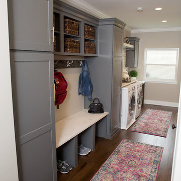
A dividing wall and doorway were removed between the existing laundry room and hallway formerly containing a coat closet, providing space to design specialized graphite colored cabinetry matching the kitchen island to house custom storage cubbies for each family member. Adding the tall utility cabinetry in the new laundry area helped solve the storage issue, tucking away cleaning supplies, household items, and even the cat got its own cubby.
“I love how everything is now hidden in its own space. I can’t tell you how much I hated coming home and seeing everything sitting around on counters,” Chris said.
Electrical outlets were planned for the inside of utility cabinets, so devices could charge in hidden locations. Stacking the washer and dryer allowed for wider countertop space to provide a folding area and a special space for clothes to hang. “The way I do laundry has been completely transformed! I can actually fold clothes and hang them now right out of the washer and dryer,” Meghan said.
“The end result in the kitchen and the laundry/mud room was an updated light and bright space, with a smarter work flow that better meets the needs of this family,” Michelle said.
“I would totally recommend Advance Design,” Meghan said. “Sometimes I sit and just look at my kitchen and laundry room and think ‘Wow, I can’t believe I get to live here!’ It’s an understatement to say we love our new space.”
Sponsored
Sunbury, OH

J.Holderby - Renovations
Franklin County's Leading General Contractors - 2X Best of Houzz!
 Pink Door Designs
Bryan Baltzar
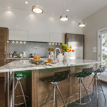
An outdated kitchen get's an over haul with warm finises cool marble, glass accents, stainless steel appliance and a rethink in the overall layout to enhance functionality. All to modernize the design to fit the Client's Santa Fe/Modern style they wanted to achieve.
 Thompson Remodeling
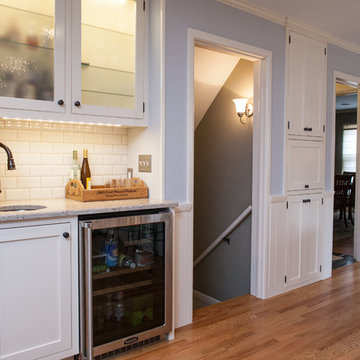
The kitchen in this 1950’s home needed a complete overhaul. It was dark, outdated and inefficient.
The homeowners wanted to give the space a modern feel without losing the 50’s vibe that is consistent throughout the rest of the home.
The homeowner’s needs included:
- Working within a fixed space, though reconfiguring or moving walls was okay
- Incorporating work space for two chefs
- Creating a mudroom
- Maintaining the existing laundry chute
- A concealed trash receptacle
The new kitchen makes use of every inch of space. To maximize counter and cabinet space, we closed in a second exit door and removed a wall between the kitchen and family room. This allowed us to create two L shaped workspaces and an eat-in bar space. A new mudroom entrance was gained by capturing space from an existing closet next to the main exit door.
The industrial lighting fixtures and wrought iron hardware bring a modern touch to this retro space. Inset doors on cabinets and beadboard details replicate details found throughout the rest of this 50’s era house.
 Advance Design Studio, Ltd.
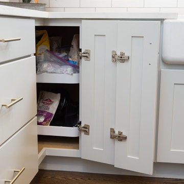
After six years of living in their Huntley IL home, Chris and Meghan were tired of their dark, dingy, outdated kitchen and it was finally time for a long-anticipated change. “The kitchen is the place where we live, it’s where we do everything,” Meghan said. “It was important that it be a space where we wanted to be.” Meghan loves cooking and enjoys including their girls in healthy meal prepping, this led them to want a brighter, more enjoyable kitchen with increased functionality and improved storage.
For Chris especially, the laundry room was an entirely dysfunctional eyesore. “We had a washer and a dryer, but it was all kind-of cobbled together!” Chris said. “There were always laundry piles everywhere, we weren’t really sure what we wanted to do in there, but it was time for us to make a change.” The mess of the space was stressful every time they walked in the door from the garage each day. Kids’ backpacks and shoes piled up haphazardly in the makeshift boot-bench closet left the family feeling disorganized and stressed. They needed space for folding clothes and locker cubbies to help keep the family organized.
Having known Christine and Todd in the Huntley community for years, Chris and Meghan were familiar with their work. “We already trusted them personally and having seen their projects for years we knew they did top notch work. After we reviewed the initial round of designs, we knew that hiring them was definitely the right choice,” Meghan and Chris said. Although Chris had done a lot of work in their home himself, the kitchen and laundry room renovation was such a large undertaking that he didn’t want to steal time away from his family to spend what would surely be many long weekends doing the job himself. “That would not have been a wise choice for us,” Chris laughed.
“Our designer, Michelle was very, very, easy to work with; anything we wanted to see or weren’t sure about, she went above and beyond to make this easy for us. She was easy to get hold of and always quick to respond,” the couple said. Michelle pulled ideas that mirrored the couple’s taste and style and was adept at directing the couple to limited choices that didn’t overwhelm them and kept the process moving. “I have a hard time making decisions. Michelle made the decision-making process so easy. I loved how she listened to what I liked and then presented three great options for me to choose from,” Meghan said.
The main objectives for the kitchen were better storage solutions, they wanted the space to reflect their lifestyle and taste, and they wanted it to last for years with low maintenance. One of the first steps in creating a more functional kitchen was relocating the refrigerator, creating an improved workflow for the busy family.
“We didn’t know that we could even move the refrigerator to a new location where it is now, that was something that we never would have thought of,” Chris said. “The new refrigerator location makes the kitchen feel so much bigger. We didn’t add any space, but our whole kitchen with the new design just seems like it’s so much larger than before!” Meghan said.
The perimeter mist colored cabinets helped warm and brighten the entire room, while the graphite colored cabinets on the island added contrast. Using this fresh, clean color palette satisfied the couple’s desire for a bright space that was the exact opposite of what they had before. Organization accessories were also added to the cabinets such as a spice drawer tray and roll outs to create hidden convenience.
“I absolutely love the hidden spices – it makes cooking so much more enjoyable!” Chris said. “And all the pull outs, and the double trash bin, who would think you could get so excited about organization!” the couple said in unison.
One thing they hated in their original kitchen was how dark the space felt. Added lighting on the ceiling with the new light fixtures combined with the lighter cabinetry colors throughout solved this problem. “Our new kitchen has this warm, almost cozy feeling that our old kitchen never had, it’s just a space that I love spending my time in now,” Meghan said. The light airy feeling was accentuated with the use of floating white shelves on either side of the decorative range hood. “We have so much cabinetry space, the new design is amazing we actually have more storage space than we will ever need,” Meghan said.
The island was extended to create more work surface and added space for stool seating. “The new island changes how we live. Now the kids can be in the kitchen with us, doing homework, eating breakfast, and the three of us have special dinners there when Chris is working late,” Meghan said.
The Carrara Marmi Quartz countertops were chosen because they are, not only beautiful, but are made from hard-working material that doesn’t require maintenance. The white subway tile backsplash that wraps to the ceiling behind the focal point cooktop range/hood compliments the crisp white countertops perfectly, while brushed brass hardware and light fixtures keep the design fresh and new.
The couple had a few fears at the beginning of the project, as most homeowners do. Their biggest fear was being out of their kitchen and laundry room for an extended time. The crew made it very easy for the family to work in a limited space keeping the washer and dryer hooked up the majority of the time, and also getting appliances working with minimal downtime.
“They above and beyond accommodated us to get us through the process,” Meghan said. “They did a great job making sure we were as comfortable as possible throughout the process,” Chris added.
“Our project manager DJ did a great job. He was very good at updating us on schedule changes, getting guys in as quickly as possible. Everyone that stepped in the house was nice and did great work,” said Chris. They thought Advance’s carpenter was phenomenal and were impressed when he took a conceptual idea from a photograph and worked with designer Michelle to create a one of a kind range/hood that has become the topic of conversation with friends and family who visit the new kitchen. “He was in our house literally every day for several weeks. He was easy to work with and good at what he did,” Meghan and Chris said.
The focal point of the kitchen; a hand-crafted, custom-built ventilation hood was clad with handpicked reclaimed barnwood. Advance Design’s carpenter built the framework and the cladding to create a one-of-a-kind design element that the couple loves.
“I think it was especially fun for him to create something unique from scratch, showcasing his talent in this area,” Meghan said. “I love that my kitchen is not like everyone else’s. I got to pick out the wood on my hood and watch it being built and was able to choose what pieces of wood went where on it. It’s totally unique.”
Red Oak flooring was toothed-in throughout the kitchen and the rest of the first floor anywhere changes were made. Then the whole floor was refinished to tone down the orange undertones in the existing floor stain, ultimately changing the color complexion of the entire first floor. The result is a completely new feeling to the entire home.
Renovating the laundry room was extremely important to Meghan and Chris, but they had trouble visualizing what the possibilities were for the seemingly small space. Michelle produced beautiful 3D illustrations that helped them envision the space in a whole new way.
“I must have told Michelle 100 times that I am a visual person, seeing the designs in 3D made it so easy to make decisions and see what we could really do with our space,” Meghan said.
A dividing wall and doorway were removed between the existing laundry room and hallway formerly containing a coat closet, providing space to design specialized graphite colored cabinetry matching the kitchen island to house custom storage cubbies for each family member. Adding the tall utility cabinetry in the new laundry area helped solve the storage issue, tucking away cleaning supplies, household items, and even the cat got its own cubby.
“I love how everything is now hidden in its own space. I can’t tell you how much I hated coming home and seeing everything sitting around on counters,” Chris said.
Electrical outlets were planned for the inside of utility cabinets, so devices could charge in hidden locations. Stacking the washer and dryer allowed for wider countertop space to provide a folding area and a special space for clothes to hang. “The way I do laundry has been completely transformed! I can actually fold clothes and hang them now right out of the washer and dryer,” Meghan said.
“The end result in the kitchen and the laundry/mud room was an updated light and bright space, with a smarter work flow that better meets the needs of this family,” Michelle said.
“I would totally recommend Advance Design,” Meghan said. “Sometimes I sit and just look at my kitchen and laundry room and think ‘Wow, I can’t believe I get to live here!’ It’s an understatement to say we love our new space.”
 Paper Moon Painting
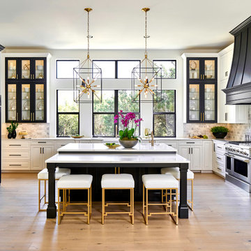
Stunning kitchen remodel and update by Haven Design and Construction! We painted the island, refrigerator wall, insets of the upper cabinets, and range hood in a satin lacquer tinted to Benjamin Moore's 2133-10 "Onyx, and the perimeter cabinets in Sherwin Williams' SW 7005 "Pure White". Photo by Matthew Niemann

 JRP Design & Remodel
Our client's Tudor-style home felt outdated. She was anxious to be rid of the warm antiquated tones and to introduce new elements of interest while keeping resale value in mind. It was at a Boys & Girls Club luncheon that she met Justin and Lori through a four-time repeat client sitting at the same table. For her, reputation was a key factor in choosing a design-build firm. She needed someone she could trust to help design her vision. Together, JRP and our client solidified a plan for a sweeping home remodel that included a bright palette of neutrals and knocking down walls to create an open-concept first floor.
Now updated and expanded, the home has great circulation space for entertaining. The grand entryway, once partitioned by a wall, now bespeaks the spaciousness of the home. An eye catching chandelier floats above the spacious entryway. High ceilings and pale neutral colors make the home luminous. Medium oak hardwood floors throughout add a gentle warmth to the crisp palette. Originally U-shaped and closed, the kitchen is now as beautiful as it is functional. A grand island with luxurious Calacatta quartz spilling across the counter and twin candelabra pendants above the kitchen island bring the room to life. Frameless, two-tone cabinets set against ceramic rhomboid tiles convey effortless style. Just off the second-floor master bedroom is an elevated nook with soaring ceilings and a sunlit rotunda glowing in natural light. The redesigned master bath features a free-standing soaking tub offset by a striking statement wall. Marble-inspired quartz in the shower creates a sense of breezy movement and soften the space. Removing several walls, modern finishes, and the open concept creates a relaxing and timeless vibe. Each part of the house feels light as air. After a breathtaking renovation, this home reflects transitional design at its best.
PROJECT DETAILS:
•Style: Transitional
•Countertops: Vadara Quartz, Calacatta Blanco
•Cabinets: (Dewils) Frameless Recessed Panel Cabinets, Maple - Painted White / Kitchen Island: Stained Cacao
•Hardware/Plumbing Fixture Finish: Polished Nickel, Chrome
•Lighting Fixtures: Chandelier, Candelabra (in kitchen), Sconces
•Flooring:
oMedium Oak Hardwood Flooring with Oil Finish
oBath #1, Floors / Master WC: 12x24 “marble inspired” Porcelain Tiles (color: Venato Gold Matte)
oBath #2 & #3 Floors: Ceramic/Porcelain Woodgrain Tile
•Tile/Backsplash: Ceramic Rhomboid Tiles – Finish: Crackle
•Paint Colors: White/Light Grey neutrals
•Other Details: (1) Freestanding Soaking Tub (2) Elevated Nook off Master Bedroom
Photographer: J.R. Maddox


 C-Starr Construction
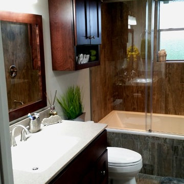
This was a very outdated, poorly designed bathroom that we wanted to update with a much more modern, functional design; but keep a bit of a rustic appeal to fit in this comfy country home. We combined a small 1 1/2 bathroom design into a much larger open bathroom. By moving the wet area, we were able to give them a more functional design, with plenty of badly needed storage space. We used a distressed wood look porcelain tile to keep the rustic appeal, while incorporating some cleaner lines and modern features.
 Cipriani Remodeling Solutions
Mid-sized transitional l-shaped slate floor open concept kitchen photo in Philadelphia with a farmhouse sink, shaker cabinets, white cabinets, white backsplash, subway tile backsplash, stainless steel appliances, an island and marble countertops
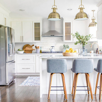
 Asha Maía Design
Transforming key spaces in a home can really change the overall look and feel, especially in main living areas such as a kitchen or primary bathroom! Our goal was to create a bright, fresh, and timeless design in each space. We accomplished this by incorporating white cabinetry and by swapping out the small, seemingly useless island for a large and much more functional peninsula. And to transform the primary bathroom into a serene sanctuary, we incorporated a new open and spacious glass shower enclosure as well as a luxurious free-standing soaking tub, perfect for ultimate relaxation.
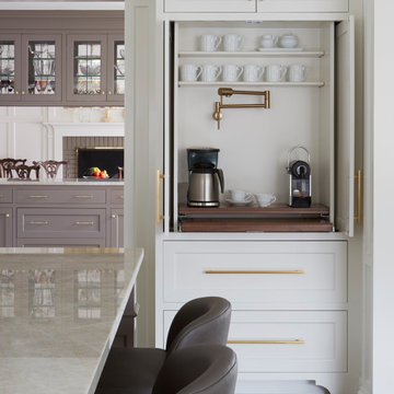
 DeBaker Design Group, Ltd.
Example of a large transitional l-shaped medium tone wood floor and brown floor open concept kitchen design in Chicago with an undermount sink, recessed-panel cabinets, white cabinets, marble countertops, white backsplash, ceramic backsplash, stainless steel appliances, an island and beige countertops


 Kowalske Kitchen & Bath
This exciting ‘whole house’ project began when a couple contacted us while house shopping. They found a 1980s contemporary colonial in Delafield with a great wooded lot on Nagawicka Lake. The kitchen and bathrooms were outdated but it had plenty of space and potential.
We toured the home, learned about their design style and dream for the new space. The goal of this project was to create a contemporary space that was interesting and unique. Above all, they wanted a home where they could entertain and make a future.
At first, the couple thought they wanted to remodel only the kitchen and master suite. But after seeing Kowalske Kitchen & Bath’s design for transforming the entire house, they wanted to remodel it all. The couple purchased the home and hired us as the design-build-remodel contractor.
First Floor Remodel
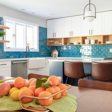
The biggest transformation of this home is the first floor. The original entry was dark and closed off. By removing the dining room walls, we opened up the space for a grand entry into the kitchen and dining room. The open-concept kitchen features a large navy island, blue subway tile backsplash, bamboo wood shelves and fun lighting.
On the first floor, we also turned a bathroom/sauna into a full bathroom and powder room. We were excited to give them a ‘wow’ powder room with a yellow penny tile wall, floating bamboo vanity and chic geometric cement tile floor.
Second Floor Remodel
The second floor remodel included a fireplace landing area, master suite, and turning an open loft area into a bedroom and bathroom.
In the master suite, we removed a large whirlpool tub and reconfigured the bathroom/closet space. For a clean and classic look, the couple chose a black and white color pallet. We used subway tile on the walls in the large walk-in shower, a glass door with matte black finish, hexagon tile on the floor, a black vanity and quartz counters.
Flooring, trim and doors were updated throughout the home for a cohesive look.
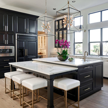 Paper Moon Painting
Stunning kitchen remodel and update by Haven Design and Construction! We painted the island, refrigerator wall, and range hood in a satin lacquer tinted to Benjamin Moore's 2133-10 "Onyx, and the perimeter cabinets in Sherwin Williams' SW 7005 "Pure White". Photo by Matthew Niemann
 Kitchen Associates
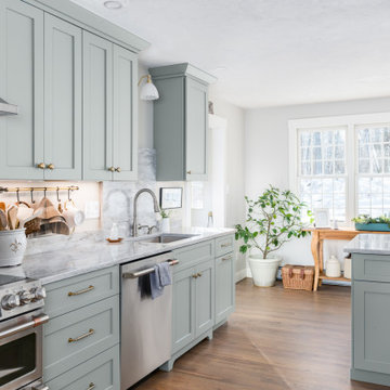
This couple came to us as newly transplanted homeowners in Sterling, MA, uprooted from Rochester, MA so they could be closer to their growing family and granddaughter.
The former kitchen was a bit of a “Plain Jane”, but we transformed it into a charming, modern country farmhouse kitchen. The custom paint color on the cabinets came from a Wood-Mode sample called “Agate.” This lovely paint color is a chameleon, ranging from gray/green, to a beautiful blue hue depending on the lighting conditions. The uniqueness of this color is what caught the homeowner’s eye and it has become a customer favorite. This Sterling home is the perfect setting for such a beautiful color!
As a trained chef and former restaurant owner, the husband does all the cooking in the house. Ample room was needed for prepping and serving, so he loves the long, wide peninsula. A full-height quartz backsplash behind the range and sink make for easy clean up.
Very deep drawers flank both sides of the range, and the top drawer has special storage for spices. The cabinet over the refrigerator has vertical partitions for both cookie sheets, trays and pans. A tall pantry to the right of the refrigerator is equipped with heavy duty wood rollouts perfect for storing dry goods. Conveniently located to the right of the sink is a double trash cabinet. The end of the peninsula also has a 27” wide cabinet with dual rollouts storing small appliances, casserole dishes & Tupperware.
The new space has plenty of room for prepping, cooking and entertaining family and guests in the adjacent dining room. Stepping outside the “white & gray” of common paints into this beautiful custom color has delighted these customers and their friends. We find it both inviting and soothing, a cool color that will be stylish for years to come!
BRAND: Brighton Cabinetry
DOOR STYLE: Thompson
FINISH: Custom Paint Match - Wood-Mode “Agate”
COUNTERTOP: “Matterhorn” Hanstone Quartz
HARDWARE: Top Knobs TK824HB Pulls, TK832HB Knobs
DESIGNER: Ruth Bergstrom
PHOTOS: Baumgart Creative Media
1