
Search results for "Outdated thinking" in Home Design Ideas
 Casework Inter Design
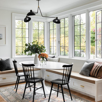
When the homeowners first purchased the 1925 house, it was compartmentalized, outdated, and completely unfunctional for their growing family. Casework designed the owner's previous kitchen and family room and was brought in to lead up the creative direction for the project. Casework teamed up with architect Paul Crowther and brother sister team Ainslie Davis on the addition and remodel of the Colonial.
The existing kitchen and powder bath were demoed and walls expanded to create a new footprint for the home. This created a much larger, more open kitchen and breakfast nook with mudroom, pantry and more private half bath. In the spacious kitchen, a large walnut island perfectly compliments the homes existing oak floors without feeling too heavy. Paired with brass accents, Calcutta Carrera marble countertops, and clean white cabinets and tile, the kitchen feels bright and open - the perfect spot for a glass of wine with friends or dinner with the whole family.
There was no official master prior to the renovations. The existing four bedrooms and one separate bathroom became two smaller bedrooms perfectly suited for the client’s two daughters, while the third became the true master complete with walk-in closet and master bath. There are future plans for a second story addition that would transform the current master into a guest suite and build out a master bedroom and bath complete with walk in shower and free standing tub.
Overall, a light, neutral palette was incorporated to draw attention to the existing colonial details of the home, like coved ceilings and leaded glass windows, that the homeowners fell in love with. Modern furnishings and art were mixed in to make this space an eclectic haven.
 Alair Homes Plano
This project is a Houzz Kitchen of the Week! Click below to read the full story!
https://www.houzz.com/ideabooks/116547325/list/kitchen-of-the-week-better-brighter-and-no-longer-basic
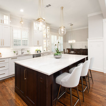
Our clients came to us wanting an elegant and functional kitchen and brighter living room. Their kitchen was dark and inefficient. The cabinets felt cluttered and the storage was there, but not functional for this family. They wanted all new finishes; especially new cabinets, but the floors were going to stay and be refinished. No wall relocation was needed but adding a door into the dining room to block the view from the front into the kitchen was discussed. They wanted to bring in more light somehow and preferably natural light. There was an unused sink in the butler’s pantry that they wanted capped, giving them more space and organized storage was a must! In their living room, they love their fireplace because it reminds her of her home in Colorado, so that definitely had to stay but everything else was left to the designers.
After all decisions were made, this gorgeous kitchen and living space came to life! It is bright, open and airy, just like our clients wanted. Soft White Shiloh cabinetry was installed with a contrasting Cocoa island. Honed Levantina Taj Mahal quartzite was a beautiful countertop for this space. Bedrosians Grace 4”x 12” wall tile in Panna was the backsplash throughout the kitchen. The stove wall is flanked with dark wooden shelves on either side of vent-a-hood creating a feature area to the cook area. A beautiful maple barn door with seeded baroque tempered glass inserts was installed to close off the pantry and giving them more room than a traditional door. The original wainscoting remained in the kitchen and living areas but was modified in the kitchen where the cabinets were slightly extended and painted white throughout. LED tape lighting was installed under the cabinets, LED lighting was also added to the top of the upper glass cabinets, in addition to the grow lights installed for their herbs. All of the light fixtures were updated to a timeless classic look and feel. Imbrie articulating wall sconces were installed over the kitchen window/sink and in the butler’s pantry and aged brass Hood classic globe pendants were hung over the island, really drawing your attention to the kitchen. The Alturas fixture from SeaGull Lighing now hangs in the center of the living room, where there was once an outdated ceiling fan. In the living room, the walls were painted white, while leaving the wood and stone fireplace, as requested, leaving an absolutely amazing contrast!
Design/Remodel by Hatfield Builders & Remodelers | Photography by Versatile Imaging
 Asha Maía Design
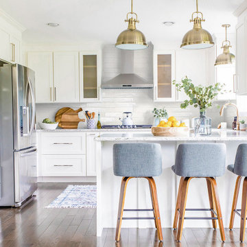
Transforming key spaces in a home can really change the overall look and feel, especially in main living areas such as a kitchen or primary bathroom! Our goal was to create a bright, fresh, and timeless design in each space. We accomplished this by incorporating white cabinetry and by swapping out the small, seemingly useless island for a large and much more functional peninsula. And to transform the primary bathroom into a serene sanctuary, we incorporated a new open and spacious glass shower enclosure as well as a luxurious free-standing soaking tub, perfect for ultimate relaxation.
Find the right local pro for your project
 Alair Homes Plano
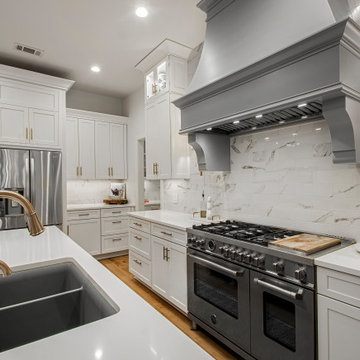
Our clients came to us wanting to maximize the space they had. They were not planning on moving anytime soon, as they loved their neighborhood. They wanted to renovate the front of their house, which included the front atrium, living room, kitchen, and powder bath. They hated their kitchen because it was completely closed off, had low ceilings, was dark and outdated, not to mention the floors were different in each of these rooms! The pantry was in the breakfast area and the kitchen table became a junk catcher, being the first thing you see when coming in from the garage/laundry room. In their living room, they wanted the spaces on either side of the fireplace to be symmetrical, whether that be bookshelves, a wet bar or closed off. Both parents are working professionals with no time and/or desire to design, create and figure this out on their own. They needed help figuring out how to reconfigure their current space in order to maximize what they already had, as they could not see an obvious solution. They could not envision how it would look so the fact that our designers were able to show them their new kitchen in 3D was pertinent.
We removed the pass-through windows that surrounded the atrium and front dining room, as well as the entire kitchen wall, completely opening up those two rooms. We removed a hall that used to lead between the kitchen and the living room since it was a complete waste of space! The ceilings were raised to 10’ in the kitchen and we were able to leave the skylight, letting in that natural light they wanted. We were able to give them a much larger pantry with tons of shelving and increase the size of their laundry room by utilizing the space of their old breakfast nook.
We relocated the door to the garage into their new elongated laundry room, built a wet bar across from their new larger pantry (with a pocket door) and the flow and functionality of these new spaces is just perfect! All new Waypoint cabinets were installed one two main kitchen surrounding walls painted Linen. Calacatta Bianco Polished Porcelain Tile 4x12 was used for the backsplash. A large eat-at island was installed, painted Stone, where the family can now gather for homework, meals, and mingling. The soft champagne bronze hardware and accent lighting really give this white and gray kitchen a soft classic look.
In the living room, we removed the built-in bookshelves to the left of the fireplace and closed off the wet-bar on the other side, giving them more space in their master suite. White Oak wood flooring, stained Putney, was installed throughout the entire new space, giving it the continuity they were looking for.
In the guest bathroom, Carrara white herringbone marble mosaic 12x12 tile was used on the shower floor and niche, while basic marble Bianco polished 12x24 porcelain tile was used on the walls. Luxart polished chrome traditional hardware gives this timeless bathroom the perfect shine.
Our clients are so happy with the new functionality and look of their space. It has definitely changed their lives in a way they could have never imagined!
 Kitchen Associates
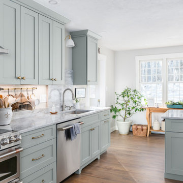
This couple came to us as newly transplanted homeowners in Sterling, MA, uprooted from Rochester, MA so they could be closer to their growing family and granddaughter.
The former kitchen was a bit of a “Plain Jane”, but we transformed it into a charming, modern country farmhouse kitchen. The custom paint color on the cabinets came from a Wood-Mode sample called “Agate.” This lovely paint color is a chameleon, ranging from gray/green, to a beautiful blue hue depending on the lighting conditions. The uniqueness of this color is what caught the homeowner’s eye and it has become a customer favorite. This Sterling home is the perfect setting for such a beautiful color!
As a trained chef and former restaurant owner, the husband does all the cooking in the house. Ample room was needed for prepping and serving, so he loves the long, wide peninsula. A full-height quartz backsplash behind the range and sink make for easy clean up.
Very deep drawers flank both sides of the range, and the top drawer has special storage for spices. The cabinet over the refrigerator has vertical partitions for both cookie sheets, trays and pans. A tall pantry to the right of the refrigerator is equipped with heavy duty wood rollouts perfect for storing dry goods. Conveniently located to the right of the sink is a double trash cabinet. The end of the peninsula also has a 27” wide cabinet with dual rollouts storing small appliances, casserole dishes & Tupperware.
The new space has plenty of room for prepping, cooking and entertaining family and guests in the adjacent dining room. Stepping outside the “white & gray” of common paints into this beautiful custom color has delighted these customers and their friends. We find it both inviting and soothing, a cool color that will be stylish for years to come!
BRAND: Brighton Cabinetry
DOOR STYLE: Thompson
FINISH: Custom Paint Match - Wood-Mode “Agate”
COUNTERTOP: “Matterhorn” Hanstone Quartz
HARDWARE: Top Knobs TK824HB Pulls, TK832HB Knobs
DESIGNER: Ruth Bergstrom
PHOTOS: Baumgart Creative Media
 Dado Interior Design
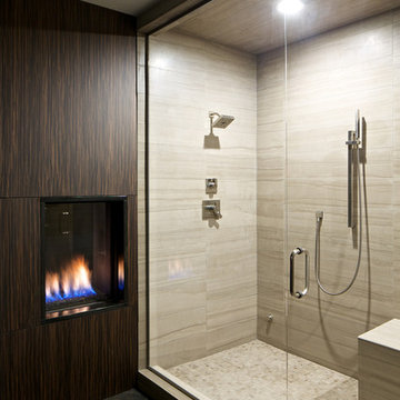
Location: Denver, CO, USA
THE CHALLENGE: Transform an outdated, uninspired condo into a unique, forward thinking home, while dealing with a limited capacity to remodel due to the buildings’ high-rise architectural restrictions.
THE SOLUTION: Warm wood clad walls were added throughout the home, creating architectural interest, as well as a sense of unity. Soft, textured furnishing was selected to elevate the home’s sophistication, while attention to layout and detail ensures its functionality.
Dado Interior Design
DAVID LAUER PHOTOGRAPHY
 Studio Sage Interiors
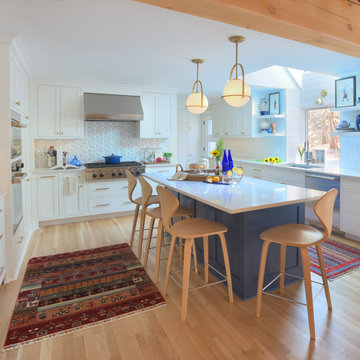
The original kitchen, although generous in size, was out of touch with our clients personal style. When a plumbing mishap caused significant damage to the space, the homeowners seized the opportunity to create the culinary workspace of their dreams.
At the top of their wish list was a well designed kitchen, both aesthetically and functionally. State of the art appliances were selected based on the client's functional requirements and the optimal layout was tailored to family dinners and occasional entertaining. At the heart of the existing kitchen was a large and highly utilized island, keeping this was a high priority. An unused audio cabinet with outdated components was removed to create a much needed dry bar. The large refrigerator, and beverage fridge drawers were concealed behind custom made cabinetry panels and were positioned adjacent to the family seating area for easy access. Attributes such as spice storage, silver dividers and a tall pantry storage ensured everything had its place.
Sherwin Williams, indigo batik (as seen on the island) was carried through the home allowing a visual connection throughout the home while the bright white perimeter cabinets created lightness and dramatic contrast. Brass hardware and decorative lighting gave the space a hint of understated glamour while pulling the warm tones found in the lattice of veining in the cambria quartz countertop.
It is hard not to notice, however, the dramatic impact of the large ceramic, three dimensional, hexagon tiles that highlight the range wall. Companion subway tiles created continuity throughout the expansive kitchen, adorning the backsplash through the rest of the space.

 Paper Moon Painting
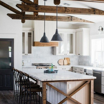
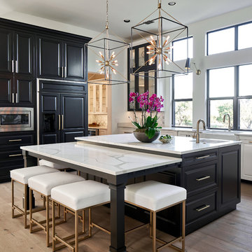
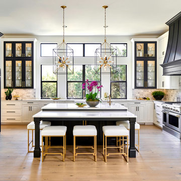
Stunning kitchen remodel and update by Haven Design and Construction! We painted the island, refrigerator wall, and range hood in a satin lacquer tinted to Benjamin Moore's 2133-10 "Onyx, and the perimeter cabinets in Sherwin Williams' SW 7005 "Pure White". Photo by Matthew Niemann
 Advance Design Studio, Ltd.
After six years of living in their Huntley IL home, Chris and Meghan were tired of their dark, dingy, outdated kitchen and it was finally time for a long-anticipated change. “The kitchen is the place where we live, it’s where we do everything,” Meghan said. “It was important that it be a space where we wanted to be.” Meghan loves cooking and enjoys including their girls in healthy meal prepping, this led them to want a brighter, more enjoyable kitchen with increased functionality and improved storage.
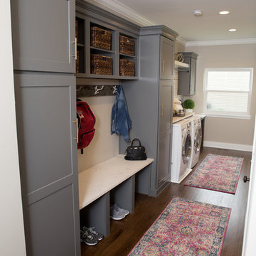
For Chris especially, the laundry room was an entirely dysfunctional eyesore. “We had a washer and a dryer, but it was all kind-of cobbled together!” Chris said. “There were always laundry piles everywhere, we weren’t really sure what we wanted to do in there, but it was time for us to make a change.” The mess of the space was stressful every time they walked in the door from the garage each day. Kids’ backpacks and shoes piled up haphazardly in the makeshift boot-bench closet left the family feeling disorganized and stressed. They needed space for folding clothes and locker cubbies to help keep the family organized.
Having known Christine and Todd in the Huntley community for years, Chris and Meghan were familiar with their work. “We already trusted them personally and having seen their projects for years we knew they did top notch work. After we reviewed the initial round of designs, we knew that hiring them was definitely the right choice,” Meghan and Chris said. Although Chris had done a lot of work in their home himself, the kitchen and laundry room renovation was such a large undertaking that he didn’t want to steal time away from his family to spend what would surely be many long weekends doing the job himself. “That would not have been a wise choice for us,” Chris laughed.
“Our designer, Michelle was very, very, easy to work with; anything we wanted to see or weren’t sure about, she went above and beyond to make this easy for us. She was easy to get hold of and always quick to respond,” the couple said. Michelle pulled ideas that mirrored the couple’s taste and style and was adept at directing the couple to limited choices that didn’t overwhelm them and kept the process moving. “I have a hard time making decisions. Michelle made the decision-making process so easy. I loved how she listened to what I liked and then presented three great options for me to choose from,” Meghan said.
The main objectives for the kitchen were better storage solutions, they wanted the space to reflect their lifestyle and taste, and they wanted it to last for years with low maintenance. One of the first steps in creating a more functional kitchen was relocating the refrigerator, creating an improved workflow for the busy family.
“We didn’t know that we could even move the refrigerator to a new location where it is now, that was something that we never would have thought of,” Chris said. “The new refrigerator location makes the kitchen feel so much bigger. We didn’t add any space, but our whole kitchen with the new design just seems like it’s so much larger than before!” Meghan said.
The perimeter mist colored cabinets helped warm and brighten the entire room, while the graphite colored cabinets on the island added contrast. Using this fresh, clean color palette satisfied the couple’s desire for a bright space that was the exact opposite of what they had before. Organization accessories were also added to the cabinets such as a spice drawer tray and roll outs to create hidden convenience.
“I absolutely love the hidden spices – it makes cooking so much more enjoyable!” Chris said. “And all the pull outs, and the double trash bin, who would think you could get so excited about organization!” the couple said in unison.
One thing they hated in their original kitchen was how dark the space felt. Added lighting on the ceiling with the new light fixtures combined with the lighter cabinetry colors throughout solved this problem. “Our new kitchen has this warm, almost cozy feeling that our old kitchen never had, it’s just a space that I love spending my time in now,” Meghan said. The light airy feeling was accentuated with the use of floating white shelves on either side of the decorative range hood. “We have so much cabinetry space, the new design is amazing we actually have more storage space than we will ever need,” Meghan said.
The island was extended to create more work surface and added space for stool seating. “The new island changes how we live. Now the kids can be in the kitchen with us, doing homework, eating breakfast, and the three of us have special dinners there when Chris is working late,” Meghan said.
The Carrara Marmi Quartz countertops were chosen because they are, not only beautiful, but are made from hard-working material that doesn’t require maintenance. The white subway tile backsplash that wraps to the ceiling behind the focal point cooktop range/hood compliments the crisp white countertops perfectly, while brushed brass hardware and light fixtures keep the design fresh and new.
The couple had a few fears at the beginning of the project, as most homeowners do. Their biggest fear was being out of their kitchen and laundry room for an extended time. The crew made it very easy for the family to work in a limited space keeping the washer and dryer hooked up the majority of the time, and also getting appliances working with minimal downtime.
“They above and beyond accommodated us to get us through the process,” Meghan said. “They did a great job making sure we were as comfortable as possible throughout the process,” Chris added.
“Our project manager DJ did a great job. He was very good at updating us on schedule changes, getting guys in as quickly as possible. Everyone that stepped in the house was nice and did great work,” said Chris. They thought Advance’s carpenter was phenomenal and were impressed when he took a conceptual idea from a photograph and worked with designer Michelle to create a one of a kind range/hood that has become the topic of conversation with friends and family who visit the new kitchen. “He was in our house literally every day for several weeks. He was easy to work with and good at what he did,” Meghan and Chris said.
The focal point of the kitchen; a hand-crafted, custom-built ventilation hood was clad with handpicked reclaimed barnwood. Advance Design’s carpenter built the framework and the cladding to create a one-of-a-kind design element that the couple loves.
“I think it was especially fun for him to create something unique from scratch, showcasing his talent in this area,” Meghan said. “I love that my kitchen is not like everyone else’s. I got to pick out the wood on my hood and watch it being built and was able to choose what pieces of wood went where on it. It’s totally unique.”
Red Oak flooring was toothed-in throughout the kitchen and the rest of the first floor anywhere changes were made. Then the whole floor was refinished to tone down the orange undertones in the existing floor stain, ultimately changing the color complexion of the entire first floor. The result is a completely new feeling to the entire home.
Renovating the laundry room was extremely important to Meghan and Chris, but they had trouble visualizing what the possibilities were for the seemingly small space. Michelle produced beautiful 3D illustrations that helped them envision the space in a whole new way.
“I must have told Michelle 100 times that I am a visual person, seeing the designs in 3D made it so easy to make decisions and see what we could really do with our space,” Meghan said.
A dividing wall and doorway were removed between the existing laundry room and hallway formerly containing a coat closet, providing space to design specialized graphite colored cabinetry matching the kitchen island to house custom storage cubbies for each family member. Adding the tall utility cabinetry in the new laundry area helped solve the storage issue, tucking away cleaning supplies, household items, and even the cat got its own cubby.
“I love how everything is now hidden in its own space. I can’t tell you how much I hated coming home and seeing everything sitting around on counters,” Chris said.
Electrical outlets were planned for the inside of utility cabinets, so devices could charge in hidden locations. Stacking the washer and dryer allowed for wider countertop space to provide a folding area and a special space for clothes to hang. “The way I do laundry has been completely transformed! I can actually fold clothes and hang them now right out of the washer and dryer,” Meghan said.
“The end result in the kitchen and the laundry/mud room was an updated light and bright space, with a smarter work flow that better meets the needs of this family,” Michelle said.
“I would totally recommend Advance Design,” Meghan said. “Sometimes I sit and just look at my kitchen and laundry room and think ‘Wow, I can’t believe I get to live here!’ It’s an understatement to say we love our new space.”
 StudioLAB
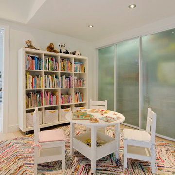
A young couple with three small children purchased this full floor loft in Tribeca in need of a gut renovation. The existing apartment was plagued with awkward spaces, limited natural light and an outdated décor. It was also lacking the required third child’s bedroom desperately needed for their newly expanded family. StudioLAB aimed for a fluid open-plan layout in the larger public spaces while creating smaller, tighter quarters in the rear private spaces to satisfy the family’s programmatic wishes. 3 small children’s bedrooms were carved out of the rear lower level connected by a communal playroom and a shared kid’s bathroom. Upstairs, the master bedroom and master bathroom float above the kid’s rooms on a mezzanine accessed by a newly built staircase. Ample new storage was built underneath the staircase as an extension of the open kitchen and dining areas. A custom pull out drawer containing the food and water bowls was installed for the family’s two dogs to be hidden away out of site when not in use. All wall surfaces, existing and new, were limited to a bright but warm white finish to create a seamless integration in the ceiling and wall structures allowing the spatial progression of the space and sculptural quality of the midcentury modern furniture pieces and colorful original artwork, painted by the wife’s brother, to enhance the space. The existing tin ceiling was left in the living room to maximize ceiling heights and remain a reminder of the historical details of the original construction. A new central AC system was added with an exposed cylindrical duct running along the long living room wall. A small office nook was built next to the elevator tucked away to be out of site.

 Kate Roos Design LLC
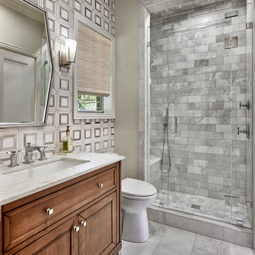
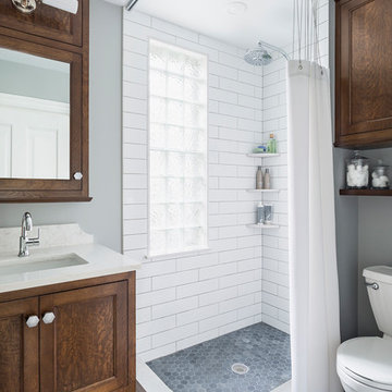
A corner shower with a radial curb maximizes space. Glass blocks, built into the existing window opening add light and the solid surface window sill and window surround provide a waterproof barrier.
Andrea Rugg
 C-Starr Construction
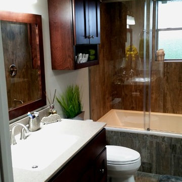
This was a very outdated, poorly designed bathroom that we wanted to update with a much more modern, functional design; but keep a bit of a rustic appeal to fit in this comfy country home. We combined a small 1 1/2 bathroom design into a much larger open bathroom. By moving the wet area, we were able to give them a more functional design, with plenty of badly needed storage space. We used a distressed wood look porcelain tile to keep the rustic appeal, while incorporating some cleaner lines and modern features.


 Cipriani Remodeling Solutions
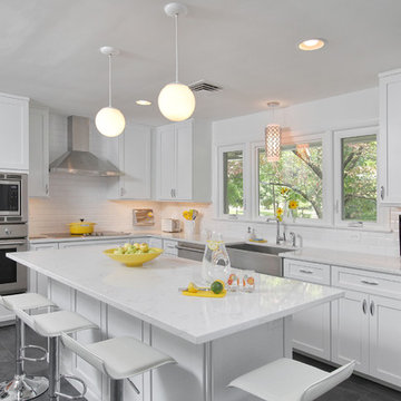
Mid-sized transitional l-shaped slate floor open concept kitchen photo in Philadelphia with a farmhouse sink, shaker cabinets, white cabinets, white backsplash, subway tile backsplash, stainless steel appliances, an island and marble countertops
 Mosaik Design & Remodeling
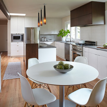
This outdated Mid Century ranch built in late 1950’s was in serious need of an update. Our clients wanted a fresh contemporary feel that was simple in design and reflected the original Mid Century feel of the home.
The new frosted Plexiglas railing allows the now open staircase and modern pendant to become part of the small dining area. White painted cabinetry with slab doors and minimal pulls add a lighter component and balance out the dark walnut cabinetry. The (3) built-in charging drawers, Legrand retractable outlets and a single door hood that opens with a light touch add a "cool" functional vibe to the space.,
Gray quartz countertops and a rectilinear white tile backsplash add serenity and tie in the stainless appliances giving the kitchen a modern feel.
A wood waterfall countertop detail on the back of the island adds interest to the space and is anchored by the unique handblown wave glass pendants in a soft grey color.
The new exposed support is both dramatic and functional in that it hides a support post in open bookcase cabinet.
Wendi Nordeck Photography
 Paper Moon Painting
Stunning kitchen remodel and update by Haven Design and Construction! We painted the island, refrigerator wall, insets of the upper cabinets, and range hood in a satin lacquer tinted to Benjamin Moore's 2133-10 "Onyx, and the perimeter cabinets in Sherwin Williams' SW 7005 "Pure White". Photo by Matthew Niemann
 Lincoln Lighthill Architect
Lincoln Lighthill Architect employed several discrete updates that collectively transform this existing row house.
At the heart of the home, a section of floor was removed at the top level to open up the existing stair and allow light from a new skylight to penetrate deep into the home. The stair itself received a new maple guardrail and planter, with a Fiddle-leaf fig tree growing up through the opening towards the skylight.
On the top living level, an awkwardly located entrance to a full bathroom directly off the main stair was moved around the corner and out of the way by removing a little used tub from the bathroom, as well as an outdated heater in the back corner. This created a more discrete entrance to the existing, now half-bath, and opened up a space for a wall of pantry cabinets with built-in refrigerator, and an office nook at the rear of the house with a huge new awning window to let in light and air.
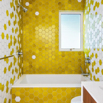
Downstairs, the two existing bathrooms were reconfigured and recreated as dedicated master and kids baths. The kids bath uses yellow and white hexagonal Heath tile to create a pixelated celebration of color. The master bath, hidden behind a flush wall of walnut cabinetry, utilizes another Heath tile color to create a calming retreat.
Throughout the home, walnut thin-ply cabinetry creates a strong contrast to the existing maple flooring, while the exposed blond edges of the material tie the two together. Rounded edges on integral pulls and door edges create pinstripe detailing that adds richness and a sense of playfulness to the design.
This project was featured by Houzz: https://tinyurl.com/stn2hcze
Sponsored
Sunbury, OH

J.Holderby - Renovations
Franklin County's Leading General Contractors - 2X Best of Houzz!
 threshold interiors
Location: Brooklyn, NY, United States
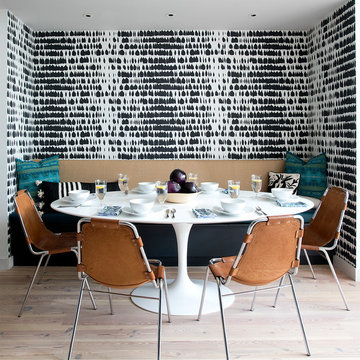
This brand-new townhouse at Pierhouse, Brooklyn was a gorgeous space, but was crying out for some personalization to reflect our clients vivid, sophisticated and lively design aesthetic. Bold Patterns and Colors were our friends in this fun and eclectic project. Our amazing clients collaborated with us to select the fabrics for the den's custom Roche Bobois Mah Jong sofa and we also customized a vintage swedish rug from Doris Leslie Blau. for the Living Room Our biggest challenge was to capture the space under the Staircase so that it would become usable for this family. We created cubby storage, a desk area, coat closet and oversized storage. We even managed to fit in a 12' ladder - not an easy feat!
Photographed by: James Salomon
 Dado Interior Design
Location: Denver, CO, USA
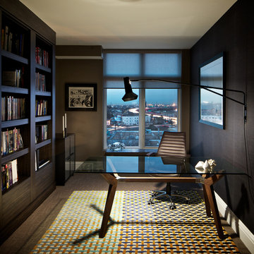
THE CHALLENGE: Transform an outdated, uninspired condo into a unique, forward thinking home, while dealing with a limited capacity to remodel due to the buildings’ high-rise architectural restrictions.
THE SOLUTION: Warm wood clad walls were added throughout the home, creating architectural interest, as well as a sense of unity. Soft, textured furnishing was selected to elevate the home’s sophistication, while attention to layout and detail ensures its functionality.
Dado Interior Design
DAVID LAUER PHOTOGRAPHY
 TVL Creative Ltd.
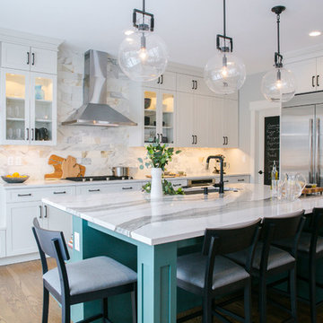
Our clients had just recently closed on their new house in Stapleton and were excited to transform it into their perfect forever home. They wanted to remodel the entire first floor to create a more open floor plan and develop a smoother flow through the house that better fit the needs of their family. The original layout consisted of several small rooms that just weren’t very functional, so we decided to remove the walls that were breaking up the space and restructure the first floor to create a wonderfully open feel.
After removing the existing walls, we rearranged their spaces to give them an office at the front of the house, a large living room, and a large dining room that connects seamlessly with the kitchen. We also wanted to center the foyer in the home and allow more light to travel through the first floor, so we replaced their existing doors with beautiful custom sliding doors to the back yard and a gorgeous walnut door with side lights to greet guests at the front of their home.
Living Room
Our clients wanted a living room that could accommodate an inviting sectional, a baby grand piano, and plenty of space for family game nights. So, we transformed what had been a small office and sitting room into a large open living room with custom wood columns. We wanted to avoid making the home feel too vast and monumental, so we designed custom beams and columns to define spaces and to make the house feel like a home. Aesthetically we wanted their home to be soft and inviting, so we utilized a neutral color palette with occasional accents of muted blues and greens.
Dining Room
Our clients were also looking for a large dining room that was open to the rest of the home and perfect for big family gatherings. So, we removed what had been a small family room and eat-in dining area to create a spacious dining room with a fireplace and bar. We added custom cabinetry to the bar area with open shelving for displaying and designed a custom surround for their fireplace that ties in with the wood work we designed for their living room. We brought in the tones and materiality from the kitchen to unite the spaces and added a mixed metal light fixture to bring the space together
Kitchen
We wanted the kitchen to be a real show stopper and carry through the calm muted tones we were utilizing throughout their home. We reoriented the kitchen to allow for a big beautiful custom island and to give us the opportunity for a focal wall with cooktop and range hood. Their custom island was perfectly complimented with a dramatic quartz counter top and oversized pendants making it the real center of their home. Since they enter the kitchen first when coming from their detached garage, we included a small mud-room area right by the back door to catch everyone’s coats and shoes as they come in. We also created a new walk-in pantry with plenty of open storage and a fun chalkboard door for writing notes, recipes, and grocery lists.
Office
We transformed the original dining room into a handsome office at the front of the house. We designed custom walnut built-ins to house all of their books, and added glass french doors to give them a bit of privacy without making the space too closed off. We painted the room a deep muted blue to create a glimpse of rich color through the french doors
Powder Room
The powder room is a wonderful play on textures. We used a neutral palette with contrasting tones to create dramatic moments in this little space with accents of brushed gold.
Master Bathroom
The existing master bathroom had an awkward layout and outdated finishes, so we redesigned the space to create a clean layout with a dream worthy shower. We continued to use neutral tones that tie in with the rest of the home, but had fun playing with tile textures and patterns to create an eye-catching vanity. The wood-look tile planks along the floor provide a soft backdrop for their new free-standing bathtub and contrast beautifully with the deep ash finish on the cabinetry.
1