
Search results for "Overpower" in Home Design Ideas
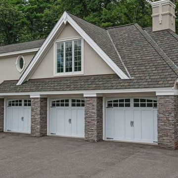
 United Garage Door Company
C.H.I. 5232A Carriage House Door with White Overlays and Arched Stockton Windows
Inspiration for a large timeless attached three-car garage remodel in Cleveland
Inspiration for a large timeless attached three-car garage remodel in Cleveland
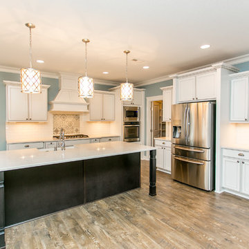
 Prodigy Homes Inc.
This gorgeous kitchen is a fantastic example of how color can be used without overpowering a space. The Languid Blue (SW 6226) walls in this room bring a warmth to the space while pairing beautifully with the other more neutral finishes in the space. This cheerful shade of blue doesn't command attention, but rather compliments the room's comfortable feel.

Find the right local pro for your project
 Robin's Nest Interiors
Updated Spec Home: The Bathrooms
The last stop on the main level of this Updated Spec Home are the Bathrooms. Every surface of the Guest Bath and Master Bath was touched- even some renovations in the Master bedroom. All I can say is thank goodness these two love wallpaper – we selected classic patterns for each bath that will stand the test of time!
Guest Bathroom
The Guest Bath also doubles as my mom’s bath. The footprint remained the same but we updated everything. A new vanity was chosen to give her that furniture look while still providing some storage – although there is a linen closet located just outside the bath. We topped it off with a beautiful mirror with great detail and an equally great light fixture. Also, we mixed the finishes in the bath between nickel and champagne, i.e., gold/silver mix. Mixing metals is perfectly acceptable and quite frankly way more interesting the everything matching. Updated Spec Home Bathrooms - Robin's Nest Interiors
Updated Spec Home Bathrooms - Robin's Nest Interiors
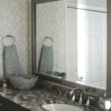
We found this amazing wallpaper with its subtle colors and pattern and selected a large square tile to coordinate for the floor. Yes, you can do a large tile in a small bath because it actually makes the space feel larger. For finishing touches, we had this gorgeous shower curtain made. Above the new toilet, we added interesting abstract artwork framed in a large mat so it would not clash with the wallpaper.
Master Bathroom
Originally, the Master Bath had a large garden tub as the focal point and a tiny stand up shower in the corner. We removed the garden tub, moved the shower to this area as the focal point and turned the tiny shower into a much needed linen closet. At this point, I know you are thinking, what about resale with no tub? There is a tub in the Guest Bath so the house will still be appealing to young families or bath lovers alike.
© 2016 RealTourCast | Tim Furlong Jr.
Tile selections came first – my sister fell in love with this gorgeous dark greige glass tile. We used it in the upper half of the shower while keeping the lower half light with this plank tile in a striated pattern. We carried the plank tile onto the floor for a seamless look.
Updated Spec Home Bathrooms - Robin's Nest Interiors
We replaced the two vanities with stock cabinetry that looks custom in a rich wood stain. Also, we found a gorgeous granite remnant for the countertop and finished off the vanity area with oversized mirrors, sleek lighting, and striking hardware.Updated Spec Home Bathrooms - Robin's Nest Interiors
The wallpaper is absolutely perfect for this space – it adds an interesting backdrop without overpowering the room. Her fantastic artwork was able to fit in the niche next to the new toilet. This is one gorgeous bath!
Updated Spec Home Bathrooms - Robin's Nest Interiors
Coming Soon
Spoiler Alert – my mom and sister have decided to update their Basement Family Room and add a small Powder Bath so look for Season 2 of the Updated Spec Home series!
See the rest of this house through these links! Foyer & Great Room, Kitchen & Breakfast Area, Bedrooms, Guest Bedroom.
 RWH Architect PLLC
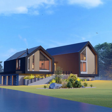
Set within a serene natural landscape and abutting the scenic Campbell's Scottish Highlands Golf Course, this striking custom modern home by RWH Architect blends contemporary architecture, functional living, and site-sensitive design into a residence that feels both dramatic and welcoming. Inspired by Scandinavian architectural principles and modern New England design, the home was carefully crafted to balance bold geometric forms with warm natural materials, creating a timeless luxury residence deeply connected to its surroundings. Expansive views overlooking the rolling fairways and natural landscape of the golf course further reinforce the home’s strong relationship to the site.
One of the primary design challenges of the project was fitting the home between two existing houses while maintaining a high level of privacy for both interior and exterior living spaces, while also maximizing expansive views of the course. Rather than allowing the surrounding structures to limit the design, RWH Architect carefully positioned and shaped the residence to create a sense of separation, openness, and visual connection where appropriate. Through thoughtful massing and strategic orientation, the home is able to open toward the golf course while shielding key living areas from neighboring properties, resulting in a balance of privacy, light, and uninterrupted views.
The architectural composition is defined by two soaring gabled structures connected through a recessed central entry, establishing a bold visual identity while maintaining clean, minimalist lines. A significant challenge in the design process was balancing the large-scale modern forms with a sense of warmth and livability. Through the use of natural wood accents, expansive glazing, and carefully proportioned massing, the home achieves a refined balance between contemporary minimalism and inviting residential comfort. Dark exterior cladding contrasts beautifully against warm materials and the surrounding landscape, allowing the structure to feel sophisticated without appearing cold or overpowering.
Another critical design challenge involved maximizing natural light while preserving energy efficiency and maintaining privacy throughout the home. RWH Architect carefully oriented the structure and strategically positioned the expansive floor-to-ceiling windows to capture sweeping golf course and landscape views while maintaining the comfort and privacy of the interior spaces. The result is a home filled with natural light that maintains a strong connection to the outdoors while still providing private, comfortable living environments.
Inside, the thoughtfully designed floor plan prioritizes openness, comfort, and flexibility for modern living. The residence was intentionally organized into two distinct architectural zones: a private wing dedicated to the bedrooms and personal retreats, and a public living wing centered around the kitchen, dining, and gathering spaces. This separation creates a natural balance between entertaining and privacy, allowing the home to function seamlessly for both intimate daily living and larger social gatherings.
The main living level centers around an expansive open-concept kitchen, dining area, and great room designed to function as the social heart of the home. One challenge within the interior layout was creating a highly open floor plan while still maintaining distinct functional zones and practical circulation. Through careful spatial planning, ceiling volume transitions, and strategic room positioning, the design creates separation without sacrificing openness. Large windows and direct access to the rear outdoor living spaces further reinforce the seamless indoor-outdoor connection, allowing the living spaces to fully embrace the surrounding views of the course and the natural landscape beyond.
Rather than existing on a single flat plane, the residence was thoughtfully designed across multiple levels that respond directly to the site’s natural topography. As occupants move through the home, subtle level changes and transitional stair sequences create a dynamic spatial experience that guides movement between the public and private zones of the residence. This layered circulation approach enhances the architectural character of the interior while creating moments of progression, discovery, and connection between spaces. The result is a home that feels immersive and expansive, where movement throughout the residence becomes part of the overall architectural experience itself.
The first floor also incorporates flexible private accommodations, including a guest suite with ensuite bathroom and additional secondary bedrooms positioned to create privacy away from the primary gathering spaces. This approach allows the residence to comfortably support multigenerational living, guests, and evolving family needs over time.
On the upper level, the luxurious primary suite serves as a private sanctuary complete with dual walk-in closets, a spacious spa-inspired bathroom, and access to a private balcony overlooking the property and adjacent golf course. Dedicated office spaces were intentionally integrated into the design to address the growing demand for functional remote work environments without compromising the home’s residential character. A centrally located laundry room further improves day-to-day convenience and efficiency. Vaulted ceilings, oversized glazing, and carefully framed sightlines enhance the sense of openness and light throughout the upper level.
Throughout the home, minimalist detailing and carefully selected materials reinforce the project’s modern architectural identity while preserving warmth and livability. The interplay of sharp rooflines, expansive glass, natural textures, and integrated landscaping creates a residence that feels sculptural from every angle while remaining exceptionally functional for everyday life.
This custom luxury residence exemplifies RWH Architect’s expertise in contemporary residential architecture, innovative problem solving, and personalized home design. By transforming complex site conditions and modern living demands into opportunities for architectural creativity, the project delivers a sophisticated home that is visually striking, highly functional, and thoughtfully connected to its environment for generations to come.
 Le Gourmet Kitchen Ltd.
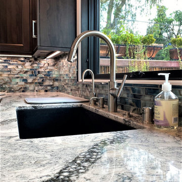
The mosaic tile backsplash adds texture and visual interest without overpowering the space, reflecting light and enhancing the kitchen’s airy feel.
Inspiration for a mid-sized transitional l-shaped vinyl floor and multicolored floor open concept kitchen remodel in Orange County with an undermount sink, recessed-panel cabinets, quartz countertops, multicolored backsplash, glass tile backsplash, stainless steel appliances, an island and multicolored countertops
Inspiration for a mid-sized transitional l-shaped vinyl floor and multicolored floor open concept kitchen remodel in Orange County with an undermount sink, recessed-panel cabinets, quartz countertops, multicolored backsplash, glass tile backsplash, stainless steel appliances, an island and multicolored countertops
 Drury Design
The Setup:
After purchasing this home, the homeowners faced a unique opportunity to reimagine their kitchen and nearby spaces. Water damage from a burst pipe had left much of the home’s interior in need of repair, and while the existing kitchen was functional and in relatively good shape, it didn’t align with the family’s vision for their new home. The layout included a peninsula that wasn’t ideal, and there were some druthers with the nearby pantry.
Since the space needed to be rebuilt anyway, the homeowners saw this as a chance to create a kitchen that was both highly functional for their four young children and timeless in its design. The project also included a refresh of the adjacent message center and dining room — spaces that play key roles in the family’s daily life. The goal was to create a cohesive flow between these areas, balancing modern functionality with the craftsman-inspired character of the rest of the home.
Design Objectives:
- Replace the outdated peninsula with a large island to maximize counter space and create new seating options.
- Open up the space visually by removing soffits and rethinking the cabinetry layout.
Incorporate concealed refrigeration and freezer units to provide significant storage for the family while maintaining a streamlined aesthetic.
- Integrate black cabinetry into the design without making the space feel harsh or heavy.
- Ensure the lighting plan balances functional task lighting with ambient accent lighting.
- Avoid visual clutter in the cabinetry design while still giving a nod to the craftsman aesthetic.
- Incorporate a slab backsplash as a key design feature.
Design Challenges:
- The outdated peninsula left dead space in the kitchen and lacked sufficient seating for the family.
- The cooktop wall was cramped, with small cabinets flanking the hood, limited storage, and soffits that made the space feel closed-in.
- The family needed significant refrigeration space (two refrigerators and a freezer) but wanted to avoid a cluttered look with visible stainless steel appliances.
- Adding black cabinetry risked making the space feel too dark or heavy.
- The original lighting plan was insufficient, particularly over the dining table where a decorative fixture proved too dim.
- The family wanted shaker-style drawer fronts to match the home’s arts-and-crafts design but worried that too much shaker cabinetry might look overly busy.
- Prioritizing a slab backsplash in the wish list priority planning.
The Renewed Space
Design Solutions:
- A functional island: The peninsula was replaced with a large island that provides continuous countertop space for prepping and serving. The island also features seating for four people, creating a central hub for informal meals and activities.
- Streamlined cooktop wall: The soffits were removed, and the upper cabinets on the cooktop wall were eliminated to create a more open, streamlined design. A custom oversized hood became the focal point of the wall, with the blower unit offset inside it to align with the cooktop while maintaining exterior visual symmetry.
- Concealed refrigeration: Two column refrigerators and one freezer were integrated into the cabinetry, concealing them behind wood paneling that blends seamlessly with the overall design.
- Warm black cabinetry: The black cabinetry was crafted from hickory with a visible grain, softening its appearance and adding warmth. The grain detail gives the cabinetry a rich, textured look that avoids feeling stark or overpowering.
- Additional lighting: In the dining area, recessed can lights were added during an additional installation phase to supplement the gorgeous decorative fixture’s dim output. The new lighting plan creates a layered effect, combining functional task lighting with softer ambient lighting.
- Simplified cabinetry details: Slab drawer fronts were used on the upper drawers, while five-piece shaker fronts (with slightly less prominent rail and stile pieces) were reserved for the middle and lower drawers. This approach simplified the overall look while maintaining the craftsman-inspired aesthetic.
- Slab backsplash priority: The slab backsplash was prioritized by making thoughtful adjustments elsewhere, like opting not to extend cabinetry to the ceiling, which also helped visually prioritize the gorgeous slab backsplash. This decision also enhanced the kitchen’s furniture-like feel, aligning with the home’s craftsman character.
- This kitchen perfectly balances practicality with timeless style. By addressing the family’s functional needs — ample seating, smart storage, and effective lighting — while incorporating thoughtful design elements like warm black cabinetry and a striking slab backsplash, Alicia created a space that works beautifully for a busy household. The result is a cohesive, inviting kitchen that honors the home’s craftsman roots and will serve the family well for years to come.
 OakWood Designers & Builders
From tiny to trendy!
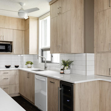
This client wanted to refresh their condo by expanding the kitchen area to create a modern and free-flowing space without overpowering the rest of the living area.
Most condos have smaller kitchens compared to single-family homes, which often makes it difficult to create a design that efficiently utilizes the available space. However, with the right team, your kitchen can be transformed into one of the most exquisite spaces in your building.
No matter the size or style, the OakWood Team can work with you to create a custom solution that supports your vision, distinct tastes, and lifestyle.
 Linda Stotts Interiors
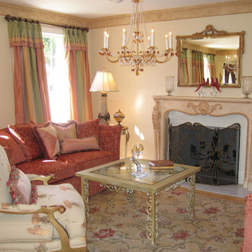
This French Country style living room became alive by adding a custom made coffee table with salvaged iron legs from a New Orleans warehouse with a see through beveled glass top to show off the hand made needle point rug. Crown molding which was much too ornate was glazed to soften the look of the overpowering pattern.
 LuxDrape
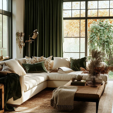
LuxDrape’s custom curtains are a defining element in this living room, perfectly tailored to enhance its cozy yet sophisticated ambiance. Crafted from a premium linen blend, these curtains feature a soft, neutral palette of beige and taupe tones, harmonizing with the room’s earthy color scheme. The lightweight, breathable fabric gently filters natural sunlight, creating a warm, inviting glow while maintaining a serene and airy atmosphere. The subtle sheen and smooth texture of the material add a touch of elegance, elevating the space without overpowering its tranquil aesthetic.
 UpScapers: Landscape, Elevated
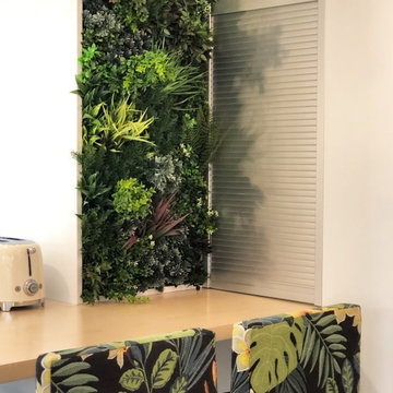
With kitchen Design, sometimes less is more, and in this case study from a private client’s home, it is very clear that Vistafolia® can transform any space, regardless of whether it be a vast expanse of wall, or something very simplistic. They say the kitchen is the heart of the home, so why wouldn’t you want to add your own piece of luxury to the most important room without breaking the bank?
This client requested that a small area be covered using the panels to add a stunning burst of greenery that is neither looked bland and fake, nor overpowered the simple minimalist scheme already in place. By having just a few panels installed to cover the wall, Vistafolia® Privacy Screening achieved an attractive aesthetic that enhanced the space and offered a low-maintenance, realistic green wall to be enjoyed by all the family.
 romero + obeji interior design
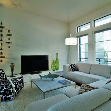
Custom sectional sofa maximizes space without overpowering the room. An extra low and long storage piece keeps clutter away so the brass hanging art chains become the focal point, minimizing the tv and adding movement to the space. The other strong element in the room - the modern rocker with 60’s inspired fabric, anchors the area and adds a youthful note for the young clients. Iron and marble cocktail table adds sophistication but also is sturdy enough to allow the occasional feet. Low shag rug provides comfort and a bit of glamour at the same time while the burl wood side table is essential for a feeling of warmth and nature. Full story on our website: http://www.romero-obeji-interiordesign.com
 JBB | architecture + interiors
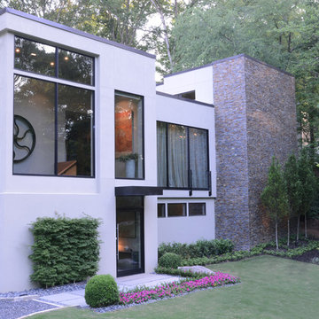
This natural house design sits nestled within a hillside and looks out over the natural creek that flows from behind the home, underneath the home and diagonally across the front yard. The design intent of the home was to not overpower the natural elements of the site, but to work with nature to create vistas for enjoying nature. The home was designed to look smaller than its actual size so it doesn’t seem foreign to the site and the hillside.
The home embraces an open floor plan and uses multiple design features to define the many spaces and to enable connection with nature. Design features include varying ceiling heights defining space, usage of large 13 foot high movable glass walls, usage of rich wood floors and numerous architectural elements and design features that integrate nature and the modern vocabulary.
Even though the site is large, the buildable area is small due to the natural waterway traveling underneath (underground and is not visible) the home and across the site and significantly limited the buildable area. As a solution, the architect designed the home to nestle into the hillside above the underground waterway and by raising the primary living areas, courtyard with pool, and rear yard. The rear lawn is made of natural looking synthetic material and is surrounded by indigenous Georgia vegetation. The first floor spaces were optimized and include entryway, art gallery, theater, workshop, in-law suite, garages and multiple utility spaces.
 Solid Apollo LED
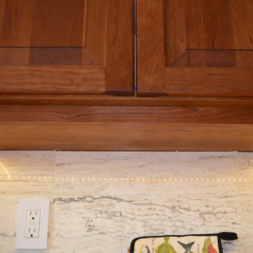
Jack Korlann. Solid Apollo LED. In this beautiful under cabinet lighting installation, our customer wanted to bring subtle lighting to his recently renovated kitchen area. Here Warm White High Brightness LED Strip Light was carefully placed under each cabinet area. In each of the pictures, you can see how this subtle amount of light adds another element without overpowering the carefully chosen colors and tones from the rest of the elements in the kitchen. The 5-Zone wireless remote control dimmer was used and as several of the pictures show, the lights can be brought down to 10% of their brightness, for incredibly gentle mood lighting, and even works great as a night light. To connect the LED Strip Lights together, matching Snap&Lite Interconnectors and Power Adapters were used, and the power supply, receiver and other accessories were carefully tucked away in the cabinets.
 Renovisions
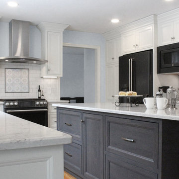
This client requested that we design her new kitchen space to look and function with her and her family’s usage in mind. She was not happy with her existing kitchen due to builder-grade ceramic flooring, lack of countertop space, poor lighting, inadequate and unorganized storage and the closed off feel of the area. Renovisions resolved all of these issues by designing and building an impressive, transitional styled kitchen; delivering a beautifully well thought-out space that provides a multi-functional approach and meets the needs of this busy and dynamic household.
Typically, we encounter challenges in every project, and this was no different. The upstairs bathroom plumbing ran across the entire length of the kitchen sink wall and it was necessary to work with it by moving the plumbing as far up as possible and then building a soffit to hide it.
Creating a space that has a more open feel was top of mind for our client. Installing a new wood floor that matched the existing dining room floor helped with this and in addition, warmed up the room. By relocating the refrigerator to the opposite wall and adding a bar area at the end toward the family room, the flow of traffic for family members and guests became more managed.
The open floor plan allowed for additional island cabinets to accommodate smart storage and better functionality when prepping meals, sitting to eat or gathering with friends and family. We believe having ample countertop surface space is a critical improvement in any renovation and this particular project now boasts a large countertop area with a stunning wide vein pattern that accentuates the design instead of overpowering it. The soft look of the Blanco Arabescato quartz enhances the space and looks lovely with the white inset styled cabinetry.
Beauty and function go hand-in-hand in this kitchen with several exceptional elements such as under-cabinet lighting with dimmers to control the mood light. Glass doors were added to the wall cabinets which flank the wine rack for displaying their decorative glassware and a beverage cooler below provided added convenience and access to cold beverages. The GE Café line of appliances in ‘Slate’ and ‘Stainless Steel’ finishes are a stunning contrast here.
The sensational looking decorative marble 6”x6” backsplash tile over the gas range and in the bar area creates nice focal points by creating a unique look for her that family and guests love.
Convenient and functional elements were added such as a blind corner pull-out for easier pot/pan storage, a sweep-o-vac under cabinet vacuum system for those constant quick clean-ups, a pull-out caddy under the sink base for storage of cleaning products and a protective mat to collect potential spills.
Our client let us know it was time for a change and we listened. She shared a few pictures she loved from a home magazine, we shared our insight and then designed/built the kitchen of her dreams! … A fabulous and functional space.
 Jackson Construction, Inc.
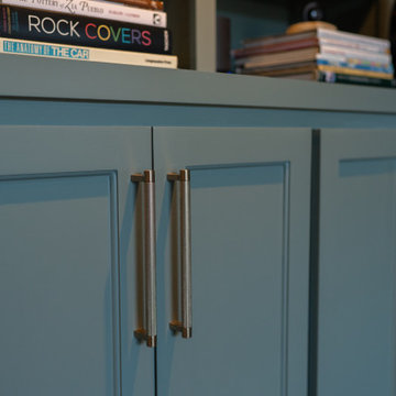
This close-up showcases the elegant detailing of the lower cabinet, highlighting the sleek satin brass hardware. The warm, brushed finish stands out beautifully against the muted green of Sherwin Williams Dried Thyme, adding a refined touch without overpowering the design. It’s a small detail that brings a sense of polish and warmth, tying together the room’s calm, cohesive palette with just the right hint of shine.
 Kitchen Solvers of McCook
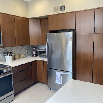
This kitchen remodel was all about honoring the home’s beautiful midcentury modern character while giving the space a fresh, updated feel. The homeowners wanted an upgrade that felt seamless with the rest of their home — not trendy, not overdone, but perfectly in tune with the original architecture. We installed new cabinetry in rich cherry wood using the Scandia door style in a warm Caramel finish. The clean lines and natural wood tones stay true to midcentury design while adding depth and warmth to the space. A Newport quartz countertop brings durability and a subtle, modern elegance, while the Souvenir Faro backsplash adds texture and visual interest without overpowering the aesthetic. The result is a kitchen that feels refined, cohesive, and completely at home in its midcentury setting — thoughtfully updated while respecting the original style.
 Novu Designs
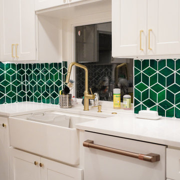
Our goal is to make your kitchen remodel as comfortable as possible. After establishing rapport with our client, we used our ingenuity to redesign and build their ideal kitchen in this stunning 10-foot-ceiling Brooklyn home. The warm tones of wood, quartz, and rich greens strike the ideal balance in creating this appealing design.
How did we achieve this look?
The Backsplash
Our client wanted a simple kitchen remodel in the shaker design, but she also wanted to include green. Initially, we proposed green cabinets to create a bold green look in the kitchen. The main objective was to incorporate our complimenting colors while keeping a feeling of lightness. After going through a number of ideas and 3D prototypes, installing as many cabinets as we could without overpowering the kitchen was our goal of optimizing space. We determined that the best way to brighten the space would be to install white shaker cabinets in addition to higher lumen recessed LED lighting. We decided that finding exquisite green backsplash tiles would be the best way to give it the desired green pop. After numerous searches, we came across a company called Mercury Mosaics.
While there were many green backsplash tiles to choose from, we opted for the mercury mosaics bluegrass diamond tiles. We loved these tiles because its created an illusion of cubes but at times, diamonds. The pattern is an art of illusion and its really gave us the personality we were looking for.
The Flooring of Choice
The flooring of choice was made by our client. We wanted the floors to feel soft and natural while capturing every bit of warmth to balance the whites and the greens and bring them together. While we could’ve opted for wood look tiles or luxury vinyl plank flooring, we ended up going with a premium slightly distressed white oak engineered hardwood flooring from Floor and Decor.
Accents
Although the flooring and the backsplash brought most of the kitchen together, we were still missing the cherry on top. The hardware and maybe something else?
We decided on thin profiled brushed brass hardware to give us that luxurious feel we were looking for every time we opened the cabinet. The cherry on top for us were the hand made quarter round oak shelves which really tied in the floors and cabinets together and gave us that final pop we were looking for. It truly added the perfect character for our client who is also a teen-fiction author of multiple books.
 StoneUnlimited Kitchen and Bath Remodeling
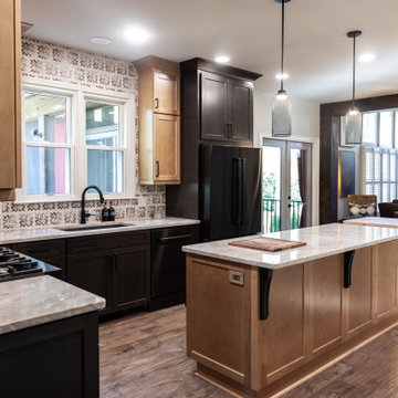
2024 interior design trends are moving beyond the classic white and gray toward warmer tones that create an ambience of comfort and connection with nature. This year, the spotlight has been on warm tones paired with green accents that are both inviting and rejuvenating. This Stoneunlimited Kitchen and Bath client's home serves as a beautiful example getting back to warmer neutral tones of incorporates deep chocolate tones, warm browns and taupe to create a harmonious feeling as you walk through each space. Creamy gray painted walls are the perfect backdrop for the bolder design elements found in the exposed beams, backsplash, two tone cabinetry and accent walls.
This home remodel has been inspired by nature. The dynamic sage green paint on the wall of the dedicated beverage station and in the living room bring life to each space. Our client has tastefully placed accent foliage and other decor throughout the home that has brought the outdoors into each room. Textures in the backsplash, natural wood grains in the cabinetry and exposed beams create a forest feel which is both inviting and peaceful.
Stoneunlimited Kitchen and Bath Remodeling had the opportunity to help this customer achieve their dream of a fully remodeled main floor which included: kitchen, guest bathroom, dining room, kitchenette, pantry, living room and office. Extensive carpentry work was performed in what used to be a dinning and sitting room on the main level. A large wall was removed, and a new wall was created with a door entry and a recessed beverage station was installed with two tone upper and lower cabinets that house a small fridge. The upper cabinets with lighting were installed inside the glass upper cabinetry to add layered lighting to the space. Three wood beams were installed in the ceiling and a new kitchenette/pantry area was created behind the newly constructed wall. The kitchenette/pantry area includes a tall storage area as well as upper and lower cabinetry with a sink and small fridge. The kitchenette pantry is a perfect place to house countertop mixers, crock pots, air fryers or other small appliances that are accessible for immediate use. The main kitchen tops remain free of small appliance clutter and the countertops become an expansive workspace.
The existing kitchen had a peninsula that made the area feel confined, prior to the kitchen remodel portion of the project. The peninsula was removed, and the fridge was relocated to the opposite wall, across the room to create a more open feel. Although a working island was installed, the flow through the kitchen feels more open and fluid than it did previously. The work island houses the microwave as well as additional storage. Spice and utensil pull outs to the left and right side of the range keep prepping utensils and seasonings conveniently tucked away.
Other projects that were completed included in the home included new cabinetry and floating shelves that were installed in the living area. The two-tone aesthetic of the cabinetry is consistent with the other areas of the home and merge beautifully with the natural stacked stone feature in the fireplace wall. Darker lower cabinets anchor the room while lighter warmer upper tones provide a lighter feel without overpowering the space. The guest bathroom off of the living area was also remodeled. Taupe tones were introduced with the natural warm tones of newly installed cabinetry and countertops to maximize the storage space. 6 1/2 x 40" nut brown plank tile was installed and can be seen throughout the expanse of the first floor, giving the appearance of wood but are porcelain which are highly durable and easy to maintain. The homeowner also opted to have their main stairwell redone which included removing existing carpet, installation of stair treads and hardwood for the steps and landing area which included sanding and staining.
Overall, the interior remodel of the main floor of this client's home was extensive and the impact of the changes that were made are incredible! The choices that were made with our client make this remodel not only specialized and customized to their everyday needs but a beautiful representation of how a dream home remodel can be achieved and accomplished. This home remodel checks all the boxes for what's in trend in 2024.
Here are some of the items used in this project:
Cabinetry: Waypoint Living Spaces: Cherry Wood Slate and Maple Wood Rye
Countertops: Natural Quartzite Taj Mahal
Tile: Cevica Cottage Off White, Dom Logwood Nut, San Marcos Tortora
Sinks: Bianco Performa
Faucets: Delta Trinsic
Appliances: Zline
 Chi Renovation & Design
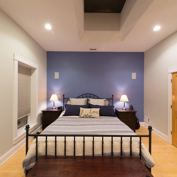
A hip master bedroom that combines contemporary warmth with unique finishes. We wanted to give this client the best of both worlds - trendy and inviting. To do so, we made sure to add in plenty of warm earth tones, through the high-end wardrobes, textiles, and soft lighting. To ensure that this room stays current for years to come (and not too overpowered with warm woods), we accentuated the high ceilings with a new skylight, a modern fireplace surround, and two blue accent walls. The result is a mix of timeless and functional with stylish and unique.
For more about Chi Renovation & Design, click here: https://www.chirenovation.com/
32