
Search results for "Paste like consistency" in Home Design Ideas
 Advance Design Studio, Ltd.
Jennifer and Dan have lived in their Deer Park Illinois home for 15 years, slowly making minor fixes like painting and decorating; but they had a new plan for their kitchen the entire time. An awkwardly placed garage door, and an island cooktop with a terrible downdraft made a full-scale kitchen remodel an absolute must. Jennifer had many ideas in mind and wanted to work with a company that could provide high-end work, while partnering with a designer that would tailor the kitchen to her ideas.
She was intrigued by the phrase “Common Sense Remodeling” in Advance Design’s feature she discovered while perusing an issue of the community’s Quintessential Barrington Magazine. Doing further research on the company’s website, as she looked through project profiles and read about Advance Design’s “Common Sense Remodeling” philosophy, she promptly scheduled an appointment to see if the people and ideas she read about were truly who they said they were. The more she read, the more she knew that the “Common Sense” approach to remodeling they described was exactly the type of company she was looking for.
The partnership was sealed after an initial consultation with Owner Todd Jurs and Project Designer Michelle Lecinski. They displayed a combination of friendliness, professionalism and respect that was unmatched by any of the other companies Jennifer talked to. She knew that with Advance Design, she would be able to retain the vision that she had in mind with high-quality craftsmanship.
“I reached out to Advance Design because of the ‘Common Sense Remodeling’ tagline,” Jennifer said. “That’s what lingered for me”. “Advance Design was the most respectful- of the house and of my design ideas, and the most professional of the handful of companies that looked at my project”.
Soon after the meeting Jennifer began working with Michelle on the project design. They quickly developed chemistry. Jennifer loved how Michelle researched and located every detail that Jennifer wanted for the kitchen. Between the two of them, every concept and idea was worked through and perfected. “Jennifer had definite ideas about what she wanted the new kitchen to look like, she just didn’t know how to bring it all together. We worked together really well to make her ideas into the practical reality necessary for a well-functioning kitchen, with the look and feel that she had envisioned”, says Michelle.
“Michelle was wonderful in using the CAD system she would show me new drawings every time we changed the layout while working through the design,” Jennifer said. “She was a really wonderful partner in execution, she made sure everything happened quickly and easily.”
The finished design drew out elements of Jennifer’s style and personality. The pair call the look “sophisticated farmhouse” to describe the kitchen renovation to family and friends. The result was a beautifully crafted, authentic-feeling space that satisfied Jennifer’s dreams 15 years in the making. The whole project consisted of a kitchen remodel, mudroom upgrade with powder room, and garage entry relocation. “The projects I personally like the best, are the ones that put the client’s dreams on display,” Project Designer Michelle said. “And this is one of those projects.”
The main focal point of the kitchen is custom zinc and brass ventilation hood with a vintage sheen, which was hand made to order by a small company in Indiana named Vogler Metalworking. “It’s like sculpture, a true work of art”, says Jennifer. Your eye is immediately drawn towards this elegant yet practical hood that eliminated the home’s downdraft problem and added a striking conversation piece at the same time. The carpenters had to use special gloves when transporting and installing it, so they didn’t smudge it with fingerprints. The beautiful hood centers proudly over the stunning black enamel and brass LaCornue Range. “I had a friend who had a LaCornue range and after learning how easy it was to cook perfect meals, I was convinced I wanted to have one”, says Jennifer. This unique, breathtaking combination anchors the entire kitchen and is apparent immediately as you walk into the great room the surrounds the space.
DuraSupreme Crestwood cabinets with a Kendall Panel add function and sophistication. A custom gray paint color paired with a storm blue was developed so that the new kitchen looked like it belonged to the existing space. Unlacquered brass faucets and hardware were important to Jennifer because she wanted the living finishes to age over time. Remarkable brass diamond mesh cabinet door inserts imported from the UK continue to add this one-of-a-kind kitchen renovation; giving it a “you won’t see this everywhere” quality. The use of old railcar flooring for the coffee bar countertop and reclaimed oak for the open shelving gives an authenticity to the space uncommon in kitchens today.
Jennifer and Michelle fell in love with the Limestone Grey Stone while they were investigating unique island countertop ideas. They liked the fact that the limestone as a living finish will age and change over time. Calcutta Miel Quartz countertops made for an excellent pairing around the perimeter, as it’s durable and perfect for cooking preparations. A textured white subway tile backsplash that runs to the ceiling keeps your eye moving towards the open shelving, and to the main focal point of the stunning range hood combination.
“The kitchen functions beautifully, and it’s gorgeous,” beams Jennifer as she gestures with both hands while smiling ear to ear. “The most important thing was I wanted a kitchen that had a wonderful flow, cooked beautiful meals and was a great gathering place for family and friends, and this space does that perfectly! Beauty wise, it turned out exactly how I had envisioned. I felt the function part was the hardest part, and that was nailed”!
Relocating the garage entry to the new mudroom was a huge priority and has finally separated the family’s arriving home functions from their kitchen. Now coats and shoes and bags have their own area for dropping once members arrive home. Matching gray DuraSupreme cabinetry helped create gorgeous, purposeful lockers for the family. A reclaimed vintage sink and custom wall paper were added to the tiny powder room to beautify the once previously only functional space. Advance Design was even able to create a custom space for their dog to sleep while the family is away.
“It was unbelievable that a project of this size was completed in such a short time, and I think that’s because of the large amount of planning and preparation that went into it,” Jennifer marveled, “When we started, we were ready, and everything was prepared”.
When it came to execution, Project Manager Justin Davis and his crew were quick, accessible, and organized. Projects like this kitchen are typically completed in as little as 8-10 weeks. Jennifer’s kitchen however despite the relocation of some challenging HVAC in a soffit and moving of an exterior door was completed remarkably fast in part because the team was working with an existing tile floor that ran throughout the first floor that the client really loved.
“You get to know these people really well because they’re living in your house while you’re living in your house. They were so fast and really good, it didn’t take as long as even planned” reported Jennifer. “I would text Justin and he always responded almost immediately. I got to know all the guys who were working in our house and they were all wonderful people”.
Details in a customized kitchen like this one require skill and care from the people who install it. “All the guys on the job were skilled at what the did. I wanted small details like little feet to look like furniture, that is where their carpentry skill came in to make these all perfect”, said Jennifer. “The tile guys were wonderful. They even let me determine how I wanted the texture with the grout to appear for a salt and pepper look; now that is a very skilled trade person making it custom”.
In Jennifer’s interview, she continued to reference Advance Design’s “Common Sense Remodeling”, so I took a minute to ask her exactly what that phrase meant to her and how it played out in her experience with her project and the Advance Design team. Here is what she said: “I was intrigued about Common Sense Remodeling and in my head that there would be clear costs and prices, great communication between the design team, the execution team and me”, said Jennifer. They did deliver on that, it was so clear about the cost breakdown, what I could expect from everyone who came to my house, and everything that we had ordered. That to me is the Common Sense”!
It’s great to see a client take literally our assertion that a well-planned remodeling project is simply “Common Sense”! She anticipated each step of the way would be clear, concise, and predictable, all the while protecting the outcome due to the careful upfront planning. “Advance Design delivered on their ‘Common Sense Remodeling’ promise,” Jennifer said. “From the design team, to the execution team - everything was straight forward like I imagined. The project turned out exactly how I envisioned, I enjoyed this process and absolutely would recommend Advance Design Studio to anyone.”
 Conklin Limestone
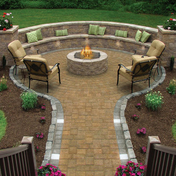
A perfect addition to your outdoor living is a seating wall surrounding a firepit. Cambridge Maytrx wall, Pyzique Fire Pit, Round table Pavers. Installed by Natural Green Landsacpe & Design in Lincoln, RI
 JM Lifestyles
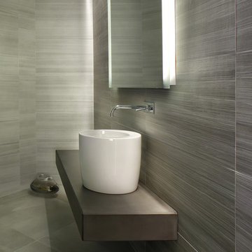
Peter Rymwid photography. Designed by Brad Jenkins Inc.
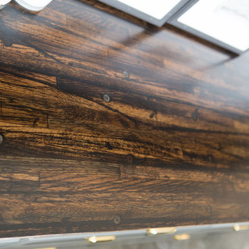
"WoodForm Concrete® is a lightweight engineered composite that looks like wood and acts like stone. It will not split, crack, splinter, stain or rot. Multiple color choices, edge details, accessories and more make this material a must-have if you truly want the look of, “wood without the worry”. This revolutionary product enables wood to be used in areas that real wood would be impossible or impractical. This product has more than 50% recycled content, 0% waste in its production, it's lightweight and easy to transport, will last longer than wood and has a lower Embodied Energy in its production.
Find the right local pro for your project
 Visbeen Architects
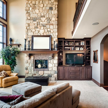
To the manor born… or at least it will feel like it in this elegant yet easygoing French Country home designed by Visbeen Architects with a busy family who wants the best of the past and the present in mind. Drawn from both French and English traditional architecture, this two-story 5,463-square-foot home is a pleasing and timeless blend of two perennially popular styles.
Driving up the circular driveway, the home’s front façade impresses with its distinctive details, including a covered porch, iron and stone accents, a roofline with multiple peaks, large windows and its central turret capping two bay windows. The back is no less eye-catching, with a series of large central windows on all three floors overlooking the backyard, two private balconies and both a covered second-floor screen porch and an open-air main-level patio perfect for al fresco entertaining.
There’s magic on the inside too. The expansive 2,900-square-foot main level revolves around a welcoming two-story foyer with a grand curved staircase that leads into the rest of the luxurious yet not excessive floor plan. Highlights of the public spaces on the left include a spacious two-story light-filled living room with a wall of windows overlooking the backyard and a fireplace, an adjacent dining room perfect for entertaining with its own deck, and a open-plan kitchen with central island, convenient home management area and walk-in pantry. A nearby screened porch is the perfect place for enjoying outdoors meals bug-free. Private rooms are concentrated on the first-floor’s right side, with a secluded master suite that includes spa-like bath with his and her vanities and a large tub as well as a private balcony, large walk-in closet and secluded nearby study/office.
Upstairs, another 1,100 square feet of living space is designed with family living in mind, including two bedrooms, each with private bath and large closet, and a convenient kids study with peaked ceiling overlooking the street. The central circular staircase leads to another 1,800 square-feet in the lower level, with a large family room with kitchen /bar, a guest bedroom suite, a handy exercise area and access to a nearby covered patio.
Photographer: Brad Gillette
 InnovationLand
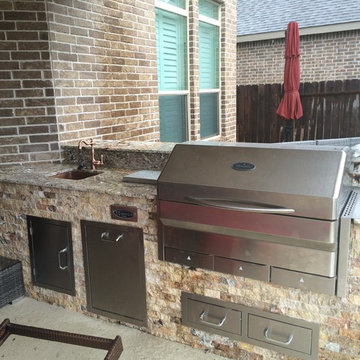
Patio kitchen plans these days require the ability to incorporate high-tech, modern appliances into rustic, timeless – even ancient-looking – outdoor design styles.
You can see this juxtaposition pulled off perfectly in this outdoor kitchen by Outdoor Homescapes of Houston.
“A smart patio kitchen plan requires not only a balance of the new and old,” says Outdoor Homescapes owner Wayne Franks, “but a blending of new elements – like an outdoor kitchen – with the existing home and outdoor living features like a pool, hardscaping or landscaping.”
In this case, explains Franks, the existing 25-by-15-foot pool had a craggy edge of moss rock boulders, plus a spa and firepit faced with a rough Scabos splitface travertine.
“The overall look was rustic and naturalistic,” says Franks, “so we of course wanted the new outdoor kitchen island to match.”
Hence the 14-foot-long outdoor kitchen island with a raised bar, also faced in the Scabos splitface travertine and topped with a Normandy granite countertop. The hardscaping around it is Kool Deck® textured concrete.
“People used to shy away from busy textures in outside patio kitchen plans, but now they’re embracing them,” notes Franks. “They’re increasingly attracted to the beautiful imperfections and irregularities of nature – there’s more of an authenticity and character to it.”
Now, for the high-tech part: A Memphis wood grill. Memphis Wood Fire pellet grills are becoming increasingly popular for their ability to infuse amazing, rich flavor and for their versatility (they can grill, bake, smoke, slow cook, braise and barbecue).
This premier model, the Memphis Pro 304, features 562 square inches of cooking space and a three-in-one cooking system (high-temperature grill, low-and-low smoker and true-convection-oven roasting and baking). It also has an intuitive Intelligent Temperature Control (see the display panel to the left of the grill) that can be set for cooking and internal temperature.
A programmable food probe tells you when the internal temperature is reached and drops the grill down to a programmed lower temperature to keep the food warm till serving.
The dual-fan convection system, with reliable metal blades, circulates heat evenly for tender, juicy results. Double-walled and sealed construction of 304 stainless steel allows for optimum heat retention and consistent temperatures in all weather conditions. A direct-flame “flavorizer” insert delivers the added flavor of a seared finish.
Outdoor Homescapes also added a mount sink with a custom oil-rubbed bronze faucet by Moen and the following RCS stainless steel accessories: a pull-out trash door, a countertop trash chute, dual horizontal grill utensil drawers and a swing-out storage door.
“At first, you’d think all this technology and the smooth, modern stainless steel would fight with the rustic look of the rough-faced stone in outdoor patio kitchen plans,” says Franks. “But it actually provides some visual rest from all the rugged textures and busyness.”
Serving a similar function is the smooth, polished Scabos travertine tile used for the pool coping and firepit ledge.
“It’s a perfect environment for the client to entertain business associates,” says Franks. “He’s very happy with the old-meets-new approach, and so are we.”
More patio kitchen plans can be found at Outdoor Homescapes of Houston’s website, at www.outdoorhomescapes.com
 Simply Home Decorating
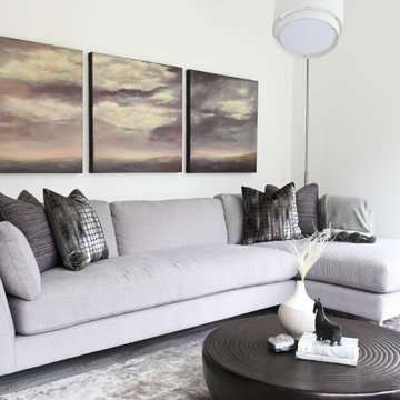
This 1990's home, located in North Vancouver's Lynn Valley neighbourhood, had high ceilings and a great open plan layout but the decor was straight out of the 90's complete with sponge painted walls in dark earth tones. The owners, a young professional couple, enlisted our help to take it from dated and dreary to modern and bright. We started by removing details like chair rails and crown mouldings, that did not suit the modern architectural lines of the home. We replaced the heavily worn wood floors with a new high end, light coloured, wood-look laminate that will withstand the wear and tear from their two energetic golden retrievers. Since the main living space is completely open plan it was important that we work with simple consistent finishes for a clean modern look. The all white kitchen features flat doors with minimal hardware and a solid surface marble-look countertop and backsplash. We modernized all of the lighting and updated the bathrooms and master bedroom as well. The only departure from our clean modern scheme is found in the dressing room where the client was looking for a more dressed up feminine feel but we kept a thread of grey consistent even in this more vivid colour scheme. This transformation, featuring the clients' gorgeous original artwork and new custom designed furnishings is admittedly one of our favourite projects to date!
 Pro-Land Landscape Construction Inc.
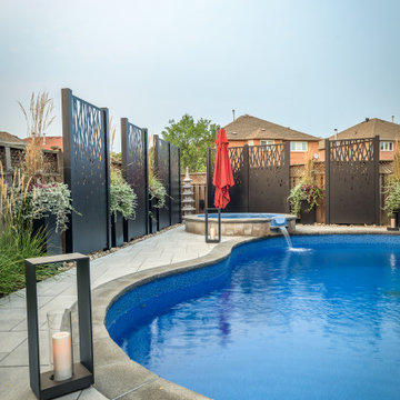
The client wanted a better flow throughout their landscape, as well as introduce straight lines to a space to modernize the irregular shaped pool.
Their upper deck was where they did a majority of their entertaining so ensuring this space was large enough for both dining and lounge was the starting point of the design. Introducing privacy from the many on looking neighbours, without completely blocking it off from the rest of their own yard was important. Laser cut privacy screens added this filtered privacy.
A round hot tub was added to the back corner of the property, which otherwise seemed like wasted space. Highlighted by the privacy panels in the same pattern used on the deck to create some consistency.
Trees were both maintained and added where needs along the property to add greenery and privacy. The entire space now feels open within the backyard, but private from neighbours.
Sponsored
Columbus, OH

Hope Restoration & General Contracting
Columbus Design-Build, Kitchen & Bath Remodeling, Historic Renovations
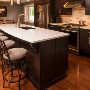
 Artisan Kitchens and Baths
Cabinetry – Kemper Echo Cabinetry
Hardware- Jeffrey Alexander stainless bar pulls
Countertops- Cambria Quartz Torquay
Sinks and Faucets- Blanco Anthracite undermount Silgranite sink. Moen Faucet Nickel
Appliances- Samsung French door refrigerator in stainless, Samsung slide in gas range, Whirlpool wall Oven/ Microwave combination, Bosch 500 series dishwasher, and Broan Elite series pro range hood.
Flooring- prefinished 3/4 oak hardwood.
Backsplash- Natural stone subway tile.
-Inspiration and Design Challenges
The Original kitchen in this 1970’s raised ranch was bright an open yet left the dining room closed off from the home and wasn’t large enough for the island that Joe and his wife would have liked. Joe and Tim from THI Co. had developed a plan relocate the kitchen to one exterior wall and allow for an island that would function for both seating and entertaining. The challenge we faced was the original windows of the kitchen had to completely go. Relying solely on the open floor plan for natural light, Tim opened up the Dining room wall, removed the dividing half wall to the family room and widened doorways to the great room leading from the kitchen and dining room. The removal of the soffits and consistent wood flooring help tie together the adjacent rooms. The plan was for simple clean lines with subtle detail brought out in the trim on the cabinetry and custom 10ft island back panel. Finding a set of appliances was the next task. The kitchen was designed with the intention of being used. The Whirlpool convection wall ovens give the kitchen 3 possible functioning ovens with along with the Samsung 5 burner range. The end result is a simple elegant design that has all the functionality of galley kitchen yet the feel of an open kitchen with twice the square footage.
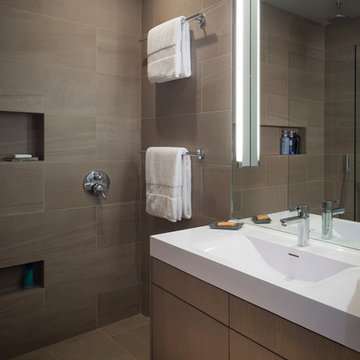
 building Lab, inc.
The remodeling of the kitchen and bathroom forms the core of this interior renovation.
The existing peninsula design and cabinetry broke up the ‘great room’ and stood the kitchen as a distinct element within the room. Our design strategy operates more on a principle of integration. As such, we created a galley condition with a spine of cabinetry and appliances that anchors to the long wall of the room. The feature design element is the solid Caesarstone backsplash which appears to be carved from the wall itself.
The particular challenge in the windowless bathroom was how to create an inviting, expanded sense of depth without a resulting cave-like feel. Removal of a half wall, soffit and tub unified the space overall. We reinforced the unification with the deployment of a single large format tile spec. Smaller details such as touch latch cabinetry hardware and flush conditions between tile, wall and mirror further the principle that simpler is bigger, deeper and more inviting.
We were also charged with elevating what was a pedestrian 1990’s townhouse to something more sophisticated and engaging. Our approach was to first remove builder grade detailing around windows and railings. Then, we introduced simplified profiles and glass guardrails that would extend a consistency established in the new kitchen and bathroom designs.
photo by Scott Hargis
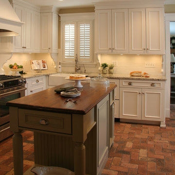 Advance Design Studio, Ltd.
Located on a partially wooded lot in Elburn, Illinois, this home needed an eye-catching interior redo to match the unique period exterior. The residence was originally designed by Bow House, a company that reproduces the look of 300-year old bow roof Cape-Cod style homes. Since typical kitchens in old Cape Cod-style homes tend to run a bit small- or as some would like to say, cozy – this kitchen was in need of plenty of efficient storage to house a modern day family of three.
Advance Design Studio, Ltd. was able to evaluate the kitchen’s adjacent spaces and determine that there were several walls that could be relocated to allow for more usable space in the kitchen. The refrigerator was moved to the newly excavated space and incorporated into a handsome dinette, an intimate banquette, and a new coffee bar area. This allowed for more countertop and prep space in the primary area of the kitchen. It now became possible to incorporate a ball and claw foot tub and a larger vanity in the elegant new full bath that was once just an adjacent guest powder room.
Reclaimed vintage Chicago brick paver flooring was carefully installed in a herringbone pattern to give the space a truly unique touch and feel. And to top off this revamped redo, a handsome custom green-toned island with a distressed black walnut counter top graces the center of the room, the perfect final touch in this charming little kitchen.
 Breathe Design Studio
Our Austin studio decided to go bold with this project by ensuring that each space had a unique identity in the Mid-Century Modern style bathroom, butler's pantry, and mudroom. We covered the bathroom walls and flooring with stylish beige and yellow tile that was cleverly installed to look like two different patterns. The mint cabinet and pink vanity reflect the mid-century color palette. The stylish knobs and fittings add an extra splash of fun to the bathroom.
The butler's pantry is located right behind the kitchen and serves multiple functions like storage, a study area, and a bar. We went with a moody blue color for the cabinets and included a raw wood open shelf to give depth and warmth to the space. We went with some gorgeous artistic tiles that create a bold, intriguing look in the space.
In the mudroom, we used siding materials to create a shiplap effect to create warmth and texture – a homage to the classic Mid-Century Modern design. We used the same blue from the butler's pantry to create a cohesive effect. The large mint cabinets add a lighter touch to the space.
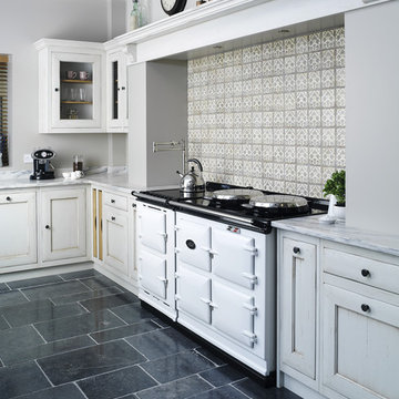
 AGA & Fired Earth Danmark
As kitchens grew larger throughout the 20th century to accommodate new inventions such as automatic washing machines, and smaller rooms like sculleries and larders were incorporated into the kitchen itself, a greater emphasis on utility and function ensued. In the post-war world the urge for a bright new future also made the most of new materials like plastic laminates which changed the face of kitchens in Europe for years to come. We wanted to reverse this trend and introduce a warmer and more liveable kitchen designed around our lifestyles. Bastide was born from this demand for beauty with utility; combining form and function with a continental twist.
Capturing the simplicity and charm of a country kitchen, Bastide is timeless, robust and built for a lifetime at the heart of your home, by applying heritage ideas to modern culture.
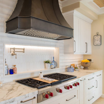
 Signature Designs Kitchen | Bath | Interiors
Our client desired a bespoke farmhouse kitchen and sought unique items to create this one of a kind farmhouse kitchen their family. We transformed this kitchen by changing the orientation, removed walls and opened up the exterior with a 3 panel stacking door.
The oversized pendants are the subtle frame work for an artfully made metal hood cover. The statement hood which I discovered on one of my trips inspired the design and added flare and style to this home.
Nothing is as it seems, the white cabinetry looks like shaker until you look closer it is beveled for a sophisticated finish upscale finish.
The backsplash looks like subway until you look closer it is actually 3d concave tile that simply looks like it was formed around a wine bottle.
We added the coffered ceiling and wood flooring to create this warm enhanced featured of the space. The custom cabinetry then was made to match the oak wood on the ceiling. The pedestal legs on the island enhance the characterizes for the cerused oak cabinetry.
Fabulous clients make fabulous projects.

 TVL Creative Ltd.
Our clients had just recently closed on their new house in Stapleton and were excited to transform it into their perfect forever home. They wanted to remodel the entire first floor to create a more open floor plan and develop a smoother flow through the house that better fit the needs of their family. The original layout consisted of several small rooms that just weren’t very functional, so we decided to remove the walls that were breaking up the space and restructure the first floor to create a wonderfully open feel.
After removing the existing walls, we rearranged their spaces to give them an office at the front of the house, a large living room, and a large dining room that connects seamlessly with the kitchen. We also wanted to center the foyer in the home and allow more light to travel through the first floor, so we replaced their existing doors with beautiful custom sliding doors to the back yard and a gorgeous walnut door with side lights to greet guests at the front of their home.
Living Room
Our clients wanted a living room that could accommodate an inviting sectional, a baby grand piano, and plenty of space for family game nights. So, we transformed what had been a small office and sitting room into a large open living room with custom wood columns. We wanted to avoid making the home feel too vast and monumental, so we designed custom beams and columns to define spaces and to make the house feel like a home. Aesthetically we wanted their home to be soft and inviting, so we utilized a neutral color palette with occasional accents of muted blues and greens.
Dining Room
Our clients were also looking for a large dining room that was open to the rest of the home and perfect for big family gatherings. So, we removed what had been a small family room and eat-in dining area to create a spacious dining room with a fireplace and bar. We added custom cabinetry to the bar area with open shelving for displaying and designed a custom surround for their fireplace that ties in with the wood work we designed for their living room. We brought in the tones and materiality from the kitchen to unite the spaces and added a mixed metal light fixture to bring the space together
Kitchen
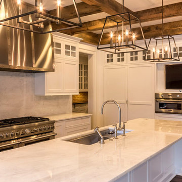
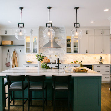
We wanted the kitchen to be a real show stopper and carry through the calm muted tones we were utilizing throughout their home. We reoriented the kitchen to allow for a big beautiful custom island and to give us the opportunity for a focal wall with cooktop and range hood. Their custom island was perfectly complimented with a dramatic quartz counter top and oversized pendants making it the real center of their home. Since they enter the kitchen first when coming from their detached garage, we included a small mud-room area right by the back door to catch everyone’s coats and shoes as they come in. We also created a new walk-in pantry with plenty of open storage and a fun chalkboard door for writing notes, recipes, and grocery lists.
Office
We transformed the original dining room into a handsome office at the front of the house. We designed custom walnut built-ins to house all of their books, and added glass french doors to give them a bit of privacy without making the space too closed off. We painted the room a deep muted blue to create a glimpse of rich color through the french doors
Powder Room
The powder room is a wonderful play on textures. We used a neutral palette with contrasting tones to create dramatic moments in this little space with accents of brushed gold.
Master Bathroom
The existing master bathroom had an awkward layout and outdated finishes, so we redesigned the space to create a clean layout with a dream worthy shower. We continued to use neutral tones that tie in with the rest of the home, but had fun playing with tile textures and patterns to create an eye-catching vanity. The wood-look tile planks along the floor provide a soft backdrop for their new free-standing bathtub and contrast beautifully with the deep ash finish on the cabinetry.
 TKS Design Group
Free ebook, Creating the Ideal Kitchen. DOWNLOAD NOW
Our clients and their three teenage kids had outgrown the footprint of their existing home and felt they needed some space to spread out. They came in with a couple of sets of drawings from different architects that were not quite what they were looking for, so we set out to really listen and try to provide a design that would meet their objectives given what the space could offer.
We started by agreeing that a bump out was the best way to go and then decided on the size and the floor plan locations of the mudroom, powder room and butler pantry which were all part of the project. We also planned for an eat-in banquette that is neatly tucked into the corner and surrounded by windows providing a lovely spot for daily meals.
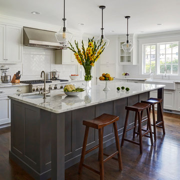
The kitchen itself is L-shaped with the refrigerator and range along one wall, and the new sink along the exterior wall with a large window overlooking the backyard. A large island, with seating for five, houses a prep sink and microwave. A new opening space between the kitchen and dining room includes a butler pantry/bar in one section and a large kitchen pantry in the other. Through the door to the left of the main sink is access to the new mudroom and powder room and existing attached garage.
White inset cabinets, quartzite countertops, subway tile and nickel accents provide a traditional feel. The gray island is a needed contrast to the dark wood flooring. Last but not least, professional appliances provide the tools of the trade needed to make this one hardworking kitchen.
Designed by: Susan Klimala, CKD, CBD
Photography by: Mike Kaskel
For more information on kitchen and bath design ideas go to: www.kitchenstudio-ge.com

 Curt Hofer & Associates
Example of a classic light wood floor kitchen design in Omaha with an undermount sink, recessed-panel cabinets, medium tone wood cabinets, gray backsplash and stainless steel appliances
 Ward Jewell Architect AIA
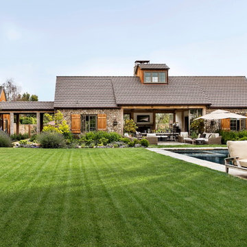
Ward Jewell, AIA was asked to design a comfortable one-story stone and wood pool house that was "barn-like" in keeping with the owner’s gentleman farmer concept. Thus, Mr. Jewell was inspired to create an elegant New England Stone Farm House designed to provide an exceptional environment for them to live, entertain, cook and swim in the large reflection lap pool.
Mr. Jewell envisioned a dramatic vaulted great room with hand selected 200 year old reclaimed wood beams and 10 foot tall pocketing French doors that would connect the house to a pool, deck areas, loggia and lush garden spaces, thus bringing the outdoors in. A large cupola “lantern clerestory” in the main vaulted ceiling casts a natural warm light over the graceful room below. The rustic walk-in stone fireplace provides a central focal point for the inviting living room lounge. Important to the functionality of the pool house are a chef’s working farm kitchen with open cabinetry, free-standing stove and a soapstone topped central island with bar height seating. Grey washed barn doors glide open to reveal a vaulted and beamed quilting room with full bath and a vaulted and beamed library/guest room with full bath that bookend the main space.
The private garden expanded and evolved over time. After purchasing two adjacent lots, the owners decided to redesign the garden and unify it by eliminating the tennis court, relocating the pool and building an inspired "barn". The concept behind the garden’s new design came from Thomas Jefferson’s home at Monticello with its wandering paths, orchards, and experimental vegetable garden. As a result this small organic farm, was born. Today the farm produces more than fifty varieties of vegetables, herbs, and edible flowers; many of which are rare and hard to find locally. The farm also grows a wide variety of fruits including plums, pluots, nectarines, apricots, apples, figs, peaches, guavas, avocados (Haas, Fuerte and Reed), olives, pomegranates, persimmons, strawberries, blueberries, blackberries, and ten different types of citrus. The remaining areas consist of drought-tolerant sweeps of rosemary, lavender, rockrose, and sage all of which attract butterflies and dueling hummingbirds.
Photo Credit: Laura Hull Photography. Interior Design: Jeffrey Hitchcock. Landscape Design: Laurie Lewis Design. General Contractor: Martin Perry Premier General Contractors
Sponsored
Columbus, OH
Free consultation for landscape design!

Peabody Landscape Group
Franklin County's Reliable Landscape Design & Contracting
 Lucy Call
Photo: Lucy Call © 2014 Houzz
Design: Imbue Design
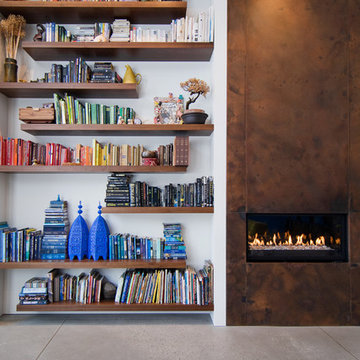
Inspiration for a contemporary concrete floor living room remodel in Salt Lake City with a metal fireplace
Inspiration for a contemporary concrete floor living room remodel in Salt Lake City with a metal fireplace
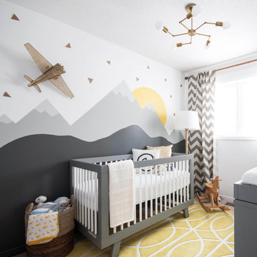
 Leclair Decor
When we found out we were expecting in June, we had already put a plan in motion to merge our home offices to eventually make way for a nursery. After the excitement of the big news we kicked it into high gear!
First off we painted the room a crisp white to contrast from the past 2 tone dark office colours. Our amazing painter Carolyn from Roll Her Sleeves then traced out and painted our vision for the mural. At first we wanted to go very minimal but after looking at it for a few weeks, we asked her to come back and add a forefront layer of grey mountains, details in the peaks and the yellow sun.
During that time the search for the perfect modern crib was on. We found the Hudson model from Babyletto which we loved from one of our suppliers in the states but after duties and shipping it ended up being more practical to buy it here in town.
At the Artemano opening we hosted in November, we connected with Jonathan from Obasan mattresses. He graciously offered to supply us with one of their locally made high quality mattresses. We can’t wait for our baby boy to sleep on it!
Our rocking chair has quite the story behind it. We originally found it for $8 ( yes eight ) dollars last spring. We weren’t sure at the time where and how we were going to use it so we had stored it in one of the garages where we were keeping furniture for an ongoing model home project. One morning we arrived and noticed the chair was missing. We made a call to our construction contact and he relayed the message. Next thing we know a worker was jumping in the garbage bins across the street. They had believed the chair was to be thrown away. Although a bit dusty it was recovered in decent shape. A few months passed and we started entertaining the idea of using it as our rocker. We asked Melissa’s dad if he would be interested in converting it to a rocker for us, and always up for a challenge he accepted and came through big time! At least was the task of reupholstering. We kind of liked the fun bright orange it was but decided to keep it safe with a nice grey material.
After trying numerous curtains ( we lost count ) we finally settled on a old fav, the west elm chevrons. As well, 3 or 4 rugs were attempted until we tried the yellow rug from Urban Barn and instantly knew that was the one.
We slid a couple small Ikea hacks in there. We wrapped an inexpensive floor lamp with rope to give it a different look ( and hide the silver since everything is brass ) and spray painted the shelf hinges to match the rest of the finishes.
Photo: Sacha Leclair
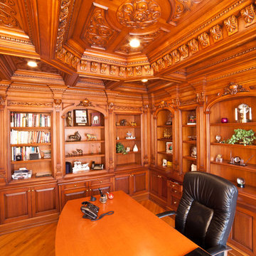
 WL Kitchen & Home
If you work from home, you owe it to yourself to set up a proper office space like this gallery.
Photo: © wlinteriors.us / Julian Buitrago
Example of a mid-sized classic freestanding desk medium tone wood floor study room design in Philadelphia
Example of a mid-sized classic freestanding desk medium tone wood floor study room design in Philadelphia
33