
Search results for "Perception" in Home Design Ideas
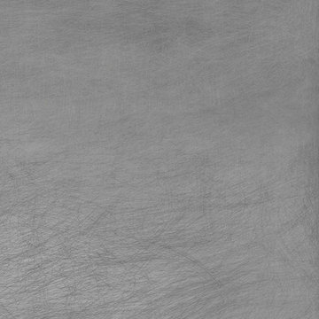
 Ollin Stone
Seta was coined with the desire to experiment and the intention of astounding the end users as they observe and touch it. Its name is due to a thread which is repeated on all the surfaces, to produce the perception of scratches on plain-coloured slabs. The concept is very similar to that of the Collection line, but in this case the material involvement is different.
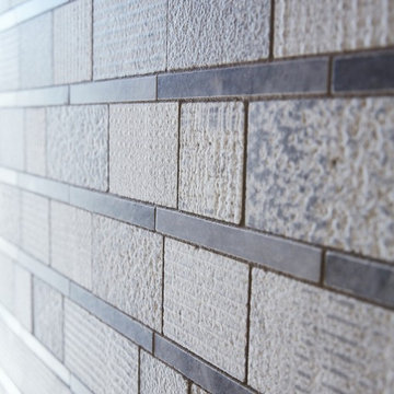
 Walker Zanger
Stone Mosaic
Combining multiple textures of stone in a variety of geometric shapes, the Shift Collection changes our perception of stone as a decorative surface. Chiseled, scrapped and hammered, the stone surfaces shift from one texture to another in an almost lyrical fashion, creating visual interest that changes with the play of light and shadow.
Usage:
Residential: All interior surfaces, including bathroom walls / floors*, shower walls/floors, kitchen backsplashes, general flooring and exterior patios and walls. Commercial: Interior and exterior walls and interior flooring. See Tools | Usage Guide for more details. *Cream not recommended for shower floors.
See this product on the Walker Zanger website for more information: http://bit.ly/1ozfidZ
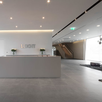
 LeichtUSA
A momentous occasion in the history of LEICHT - the day the decision was made to build a new training and showroom centre. A decision which represented an investment. This not only set the course for the successful further development of the company and brand;
it was also the first step on the road to a new LEICHT| WORLD. A world in which the values the LEICHT
brand represents are already perceptible from the outside: modernity, timeless architecture, openness and
elegance. The LEICHT | WORLD, a centre of communication and exchange with German and international
customers, with architects and planners from all over the world. And not least also an attraction for end customers
interested in kitchens as the showroom opens its doors to them three or four times a year as a veritable
source of inspiratio
Find the right local pro for your project
 MostWanted Design
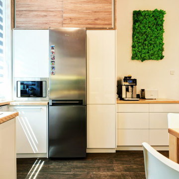
This small house needed a makeover to be suitable for a family of four, therefore the original layout has been changed in such way that the hall entrance and kitchen are fully optimized spaces. We opted for a glass brick wall to let the light flow between the entrance and kitchen and maximize perception of space, on both sides. All furniture in the hall area and in the kitchen goes up to the ceiling in order to create extra storage space, whilst in the living room there is large storage space under the stairs, without taking any space from the room. What is left in sight is light, airy furniture in white and woody textures and a touch of green moss used as decoration.
 Alure Home Improvements
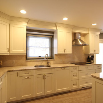
The term "working triangle" in reference to the relative position of the sink, refrigerator and oven, is elongated in perception by the plank tile as well as having the refrigerator and ovens on opposing walls.
 MostWanted Design
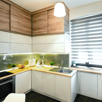
This small house needed a makeover to be suitable for a family of four, therefore the original layout has been changed in such way that the hall entrance and kitchen are fully optimized spaces. We opted for a glass brick wall to let the light flow between the entrance and kitchen and maximize perception of space, on both sides. All furniture in the hall area and in the kitchen goes up to the ceiling in order to create extra storage space, whilst in the living room there is large storage space under the stairs, without taking any space from the room. What is left in sight is light, airy furniture in white and woody textures and a touch of green moss used as decoration.
 Ollin Stone
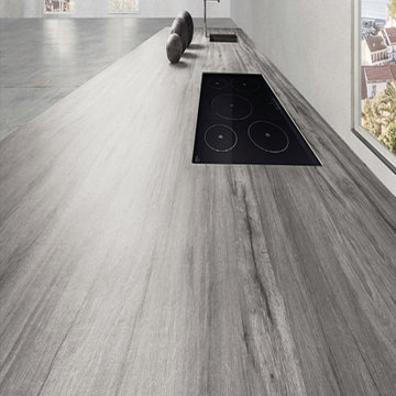
Legno Venezia was coined with the desire to experiment and the intention of astounding the end users as they observe and touch it. Its name is due to a thread which is repeated on all the surfaces, to produce the perception of scratches on plain-coloured slabs. The concept is very similar to that of the Collection line, but in this case the material involvement is different.
 Darcy Bean Custom Construction Inc.
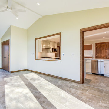
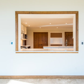
When hosting or entertaining, entry passages can "bottle neck" and become crowded. Opening up a space can be simple and complimentary as well as functional with a pass through window. Additionally, opening up the wall allows for the perception of a more grand space and allows additional light in.
 Darcy Bean Custom Construction Inc.
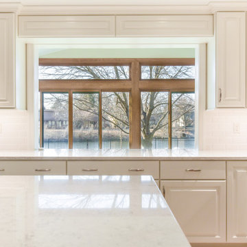
When hosting or entertaining, entry passages can "bottle neck" and become crowded. Opening up a space can be simple and complimentary as well as functional with a pass through window. Additionally, opening up the wall allows for the perception of a more grand space and allows additional light in.
 Darcy Bean Custom Construction Inc.
When hosting or entertaining, entry passages can "bottle neck" and become crowded. Opening up a space can be simple and complimentary as well as functional with a pass through window. Additionally, opening up the wall allows for the perception of a more grand space and allows additional light in.
 DC Design LLC
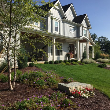
With the front yard being rather shallow, we extended the planting beds and used a diverse range of foliage to create a sense of depth. The curved walk leading to the front door creates the perception of a more spacial front yard. We took design cues from the formal nature of the architecture to inform the plantings and included formal flowing grasses, boxwood hedge, calamint and geraniums.
 Terra Studio
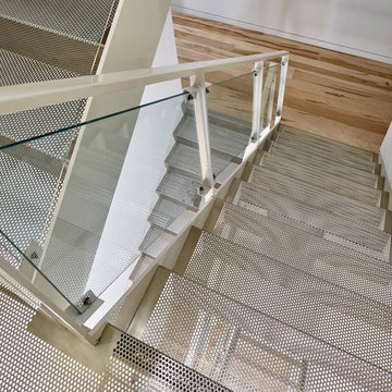
The stairway at the center of this Philadelphia rowhouse is an experiment of translucency and perception. The folded runs of perforated stainless steel dematerialize and the layered views and filtered light serve to connect the residents across the multiple levels.
Photo: Jeffrey Totaro
 Walker Zanger
STUDIO MODERNE
Ceramic and Terracotta
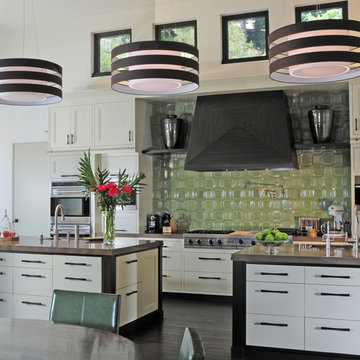
Studio Moderne is a groundbreaking collection of ceramic tile and stone created for Walker Zanger by noted interior designer Michael Berman. Inspired by Hollywood Regency, Art Deco and Classic Modernism, the bold architectural designs of Studio Moderne transcend the boundaries of the kitchen and bathroom. Featuring ceramic tile with dimensions as large as 18 inches by 20 inches, the collection inspires homeowners and designers alike to redefine their perception of tile. Studio Moderne provides the tools to create new focal points in the home, using tile as distinctive pieces of architectural decoration for applications as diverse as a dining room wall, foyer or outdoor patio.
Usage:
Residential: Bathroom walls/floors, shower walls, vanity tops and kitchen backsplashes. Not recommended for kitchen counters or shower floors. Commercial: Interior vertical surfaces.
For more information on this collection, please visit http://walkerzanger.com/collections/products.php?view=style&mat=Modern&coll=Studio%20Moderne
 Junaid Design
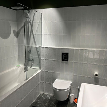
A modern bathroom composition featuring a built-in bathtub with wall-mounted shower system, a wall-hung toilet, and a compact washbasin with mirror. White subway tiles are installed vertically to full height in the wet zone, creating a clean architectural rhythm and enhancing the perception of height. The white ceramic finishes contrast with deep green painted walls above the tile line, while a vertical brushed metal flush plate adds a subtle contemporary accent. The layout is designed for a compact apartment, balancing visual clarity, functionality, and ease of maintenance.
 ALP Home
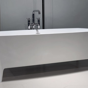
An unusual shape, rectangular at its base, shaped and stretched to change its perception seemingly timeless, comfortable, elegant and practical.
Starting from a rectangular block the lines, corners and edges are softened. It has slightly curved sides. The overall effect is very light and raised off the ground on four corner legs. Edonia is a bathtub made of Cristalplant designed to blend in with the elements of ILBagno yet used in any context from the most classical to the most minimalist. The soft and embracing lines define a warm and inviting interior.
 BLUE RIBBON BUILDERS INC
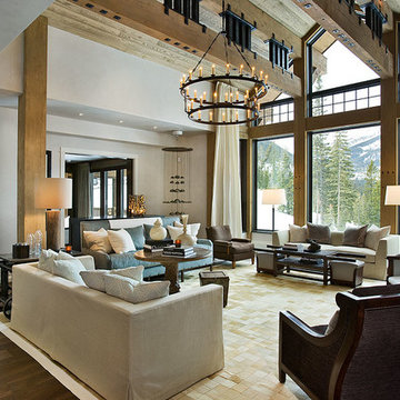
Approaching this beautiful mountain home is a feast for the eyes. The allure and stunning beauty not only comes from the minute details of the home and landscaping but from the grand vistas that encompass it. Be prepared ….the moment one steps over the threshold all perception of what a typical mountain home can be changes in an instant.
A perfect explanation of what is presented is modern meets mountain. The elegant, simply unique home features a fresh approach to mountain living. Consistency and continuity are the fundamental features of this special home. Certain elements run throughout the interior; engineered wide oak flooring, white horizontal plank paneling, and gray fresh split stone adorn the walls and limestone countertops in various rooms. However, as your eye follows the quiet, clean lines they are intermittently interrupted with a dash of splash here and a pop of color there that are placed precisely in the right spots.
Photography: Rodger Wade
 LeichtUSA
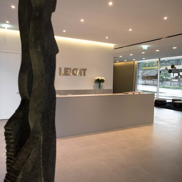
A momentous occasion in the history of LEICHT - the day the decision was made to build a new training and showroom centre. A decision which represented an investment. This not only set the course for the successful further development of the company and brand;
it was also the first step on the road to a new LEICHT| WORLD. A world in which the values the LEICHT
brand represents are already perceptible from the outside: modernity, timeless architecture, openness and
elegance. The LEICHT | WORLD, a centre of communication and exchange with German and international
customers, with architects and planners from all over the world. And not least also an attraction for end customers
interested in kitchens as the showroom opens its doors to them three or four times a year as a veritable
source of inspiratio
 InsideOut interior | landscape design
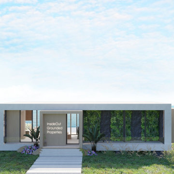
Welcome to InsideOutDesign! We're your passport to Portugal's stunning real estate, interior design, and landscape design. Our mission is to turn your property dreams into reality.
Our vision is to create the design of lifestyle in harmony, balance, and a clear positive mind through space functionality and aesthetic perception.
Creating thoughtful spaces with individual approaches according to the desired lifestyle and expected feelings of the space, reaching essential and aesthetic objectives.
Based in Lisbon. Design worldwide.
#InsideOut #RealEstatePortugal #InteriorDesign #LandscapeDesign #InsideOutDesign #RealEstateLisbon
 Taylor Lombardo Architects
Photo by Michele Wilson
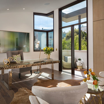
Example of a trendy freestanding desk dark wood floor and brown floor study room design in San Francisco with white walls and no fireplace
Example of a trendy freestanding desk dark wood floor and brown floor study room design in San Francisco with white walls and no fireplace
 Junaid Design
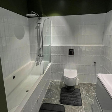
A modern bathroom composition featuring a built-in bathtub with wall-mounted shower system, a wall-hung toilet, and a compact washbasin with mirror. White subway tiles are installed vertically to full height in the wet zone, creating a clean architectural rhythm and enhancing the perception of height. The white ceramic finishes contrast with deep green painted walls above the tile line, while a vertical brushed metal flush plate adds a subtle contemporary accent. The layout is designed for a compact apartment, balancing visual clarity, functionality, and ease of maintenance.
37