
Search results for "Physics" in Home Design Ideas
 AoDK Inc.
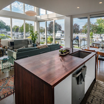
A couple wanted a weekend retreat without spending a majority of their getaway in an automobile. Therefore, a lot was purchased along the Rocky River with the vision of creating a nearby escape less than five miles away from their home. This 1,300 sf 24’ x 24’ dwelling is divided into a four square quadrant with the goal to create a variety of interior and exterior experiences while maintaining a rather small footprint.
Typically, when going on a weekend retreat one has the drive time to decompress. However, without this, the goal was to create a procession from the car to the house to signify such change of context. This concept was achieved through the use of a wood slatted screen wall which must be passed through. After winding around a collection of poured concrete steps and walls one comes to a wood plank bridge and crosses over a Japanese garden leaving all the stresses of the daily world behind.
The house is structured around a nine column steel frame grid, which reinforces the impression one gets of the four quadrants. The two rear quadrants intentionally house enclosed program space but once passed through, the floor plan completely opens to long views down to the mouth of the river into Lake Erie.
On the second floor the four square grid is stacked with one quadrant removed for the two story living area on the first floor to capture heightened views down the river. In a move to create complete separation there is a one quadrant roof top office with surrounding roof top garden space. The rooftop office is accessed through a unique approach by exiting onto a steel grated staircase which wraps up the exterior facade of the house. This experience provides an additional retreat within their weekend getaway, and serves as the apex of the house where one can completely enjoy the views of Lake Erie disappearing over the horizon.
Visually the house extends into the riverside site, but the four quadrant axis also physically extends creating a series of experiences out on the property. The Northeast kitchen quadrant extends out to become an exterior kitchen & dining space. The two-story Northwest living room quadrant extends out to a series of wrap around steps and lounge seating. A fire pit sits in this quadrant as well farther out in the lawn. A fruit and vegetable garden sits out in the Southwest quadrant in near proximity to the shed, and the entry sequence is contained within the Southeast quadrant extension. Internally and externally the whole house is organized in a simple and concise way and achieves the ultimate goal of creating many different experiences within a rationally sized footprint.
Photo: Sergiu Stoian

 Bonnie McCarthy
Photo: Bonnie McCarthy © 2015 Houzz
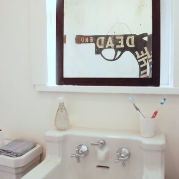
Bathroom - traditional bathroom idea in Los Angeles
Bathroom - traditional bathroom idea in Los Angeles
Find the right local pro for your project
 Advance Design Studio, Ltd.
Curtis and Peggy had been thinking of a kitchen remodel for quite some time, but they knew their house would have a unique set of challenges. Their older Victorian house was built in 1891. The kitchen cabinetry was original, and they wanted to keep the authenticity of their period home while adding modern comforts that would improve their quality of life.
A friend recommended Advance Design Studio for their exceptional experience and quality of work. After meeting with designer Michelle Lecinski at Advance Design, they were confident they could partner with Advance to accomplish the unique kitchen renovation they’d been talking about for years. “We wanted to do the kitchen for a long, long time,” Curtis said. “(We asked ourselves) what are we actually going to do? How are we going to do this? And who are we going to find to do exactly what we want?”
The goal for the project was to keep the home renovation and new kitchen feeling authentic to the time in which it was built. They desperately wanted the modern comforts that come with a larger refrigerator and the dishwasher that they never had! The old home was also a bit drafty so adding a fireplace, wall insulation and new windows became a priority. They very much wanted to create a comfortable hearth room adjacent to the kitchen, complete with old world brick.
The original cabinetry had to go to make way for beautiful new kitchen cabinetry that appears as if it was a hundred years old, but with all the benefits of cutting-edge storage, self-closing drawers, and a brand-new look. “We just wanted to keep it old looking, but with some modern updates,” Peggy said.
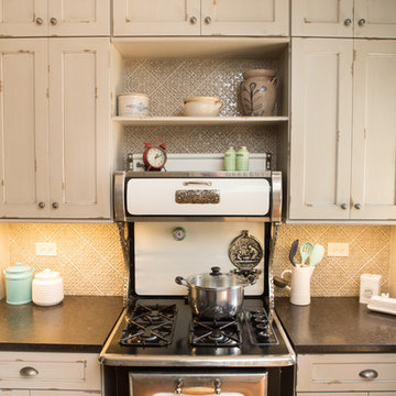
Dura Supreme Highland Cabinets with a Heritage Old World Painted Finish replaced the original 1891 cabinets. The hand-applied careful rubbed-off detailing makes these exquisite cabinets look as if they came from a far-gone era. Despite the small size of the kitchen, Peggy, Curtis and Michelle utilized every inch with custom cabinet sizes to increase storage capacity. The custom cabinets allowed for the addition of a 24” Fisher Paykel dishwasher with a concealing Dura Supreme door panel. Michelle was also able to work into the new design a larger 30” Fisher Paykel French refrigerator. “We made every ¼ inch count in this small space,” designer Michelle said. “Having the ability to custom size the cabinetry was the only way to achieve this.”
“The kitchen essentially was designed around the Heartland Vintage range and oven,” says Michelle. A classic appliance that combines nostalgic beauty and craftsmanship for modern cooking, with nickel plated trim and elegantly shaped handles and legs; the not to miss range is a striking focal point of the entire room and an engaging conversation piece.
Granite countertops in Kodiak Satin with subtle veining kept with the old-world style. The delicate porcelain La Vie Crackle Sonoma tile kitchen backsplash compliments the home’s style perfectly. A handcrafted passthrough designed to show off Peggy’s fine china was custom built by project carpenters Justin Davis and Jeff Dallain to physically and visually open the space. Additional storage was created in the custom panty room with Latte Edinburg cabinets, hand-made weathered wood shelving with authentic black iron brackets, and an intricate tin copper ceiling.
Peggy and Curtis loved the idea of adding a Vermont stove to make the hearth-room not only functional, but a truly beckoning place to be. A stunning Bordeaux red Vermont Castings Stove with crisp black ventilation was chosen and combined with the authentic reclaimed Chicago brick wall. Advance’s talented carpenters custom-built elegant weathered shelves to house family memorabilia, installed carefully chosen barn sconces, and made the hearth room an inviting place to relax with a cup of coffee and a good book.
“Peggy and Curtis’ project was so much fun to work on. Creating a space that looks and feels like it always belonged in this beautiful old Victorian home is a designer’s dream. To see the delight in their faces when they saw the design details coming together truly made it worth the time and effort that went into making the very compact kitchen space work”, said Michelle. “The result is an amazing custom kitchen, packed with functionality in every inch, nook and cranny!” exclaims Michelle.
The renovation didn’t end with the kitchen. New Pella windows were added to help lessen the drafts. The removal of the original windows and trim necessitated the re-creation of hand-made corbels and trim details no longer available today. The talented carpenter team came to the rescue, crafting new pieces and masterfully finishing them as if they were always there. New custom gutters were formed and installed with a front entry rework necessary to accommodate the changes.
The whole house functions better, but it still feels like the original 1891 home. “From start to finish it’s just a much better space than we used to have,” Peggy said. “Jeff and Justin were amazing.” Curtis added; “We were lucky to find Advance Design, because they really came through for us. I loved that they had everything in house, anything you needed to have done, they could do it”.
 Flavin Architects
Our clients wanted to replace an existing suburban home with a modern house at the same Lexington address where they had lived for years. The structure the clients envisioned would complement their lives and integrate the interior of the home with the natural environment of their generous property. The sleek, angular home is still a respectful neighbor, especially in the evening, when warm light emanates from the expansive transparencies used to open the house to its surroundings. The home re-envisions the suburban neighborhood in which it stands, balancing relationship to the neighborhood with an updated aesthetic.
The floor plan is arranged in a “T” shape which includes a two-story wing consisting of individual studies and bedrooms and a single-story common area. The two-story section is arranged with great fluidity between interior and exterior spaces and features generous exterior balconies. A staircase beautifully encased in glass stands as the linchpin between the two areas. The spacious, single-story common area extends from the stairwell and includes a living room and kitchen. A recessed wooden ceiling defines the living room area within the open plan space.
Separating common from private spaces has served our clients well. As luck would have it, construction on the house was just finishing up as we entered the Covid lockdown of 2020. Since the studies in the two-story wing were physically and acoustically separate, zoom calls for work could carry on uninterrupted while life happened in the kitchen and living room spaces. The expansive panes of glass, outdoor balconies, and a broad deck along the living room provided our clients with a structured sense of continuity in their lives without compromising their commitment to aesthetically smart and beautiful design.
 Natural Stone Institute
Tucker Design Awards celebrate the innovation and vision that designers bring to their projects through the specification and use of natural stone materials. For members of the Natural Stone Institute, acknowledgment as a contributor to a Tucker Design Awards winning project is a genuine tribute to their traditional values, physicality of work, and dedication to precise specifications required in the realization of such accomplished architectural design.
Landscape Architect
Design Workshop, Aspen, CO
Landscape Contractor/
Installer
Landscape Workshop, Carbondale, CO
Stone Installer
JD Masonry, Arvada, CO
Stone Suppliers
Coldspring, Cold Spring, MN
Gallegos Corporation, Vail, CO
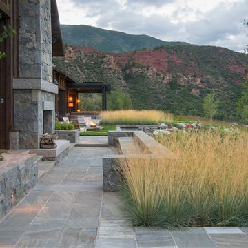
Through a collective dialogue between landscape, architecture and interior design, a new vision reimagines the disturbed site into a livable landscape, emblematic of our American West. The residence – an ensemble of structures designed in a modern ranch vernacular – is effortlessly unified through layered, interconnected outdoor gathering spaces and regional materials that elaborates upon the experience of moving between structures, heightening and renewing one’s sense of place. Upon entering the courtyard, one is immediately aware of seamless and unfolding relationships between architecture and landscape through a sophisticated, regional palette of natural stone, water, and plants. Set upon architectural focal points, two perpendicular sandstone paths descend into the space and converge upon a monolithic, hand-carved granite fountain. The design of the fountain is purposefully quiet, both in its detailing and operation. The feature includes a recessed interior, allowing water to become still before it reaches the surface, with lightly cleft sides, allowing the water to delicately bounce as it descends into the geometric lower granite basin. The landscape architect’s selection of various stone material extends the tones of the home’s granite walls and contextual surroundings into the garden, but also be detailed in a manner that balances rural and modern qualities. The majority of the paving is constructed of rectilinear gray sandstone with a natural finish and snapped edges, laid in a staggered running bond organization. Throughout the garden, thoughtful attention was also given to the configuration and layout of terraces, pathways, and steps. In doing so, this ensured that the edges of the terrace and its interface to other elements were designed so that no “leftover” stone paver pieces would be found. Within the central courtyard, split-faced stone stairs descend into a rectilinear plinth of lawn, punctuated by a carved granite fire pit. Leveraging the property’s existing topographic relief, a shallow infinity-edge dipping pool abstracts the transparent and cavity-like pools found throughout the Rocky Mountains. The design purposefully achieves the illusion of a larger water feature with the distant pond and offers a refreshing recreational element. Containing the infinity edge, a designed granite escarpment emerges from the meadow, juxtaposing the geometric water feature and providing informal seating ledges. The site’s prior use required the landscape architect to incorporate a highly technical and complex sub-surface structural system. The initial geotechnical report identified the building envelopes rested on 12 feet of man-placed fill. Assuming a 1 percent settlement, the team faced concerns that the terraces would settle up to 12 inches. In response, a grid of structural micro-piles provides the necessary foundation for the construction of terraces immediately outside of the architecture, under the water features and site walls. The solution enabled the crisp detailing and design resolution of the architectural structures to seamlessly connect with the horizontal stone terraces.
 Main Line Kitchen Design
Main Line Kitchen Design is a brand new business model! We are a group of skilled Kitchen Designers each with many years of experience planning kitchens around the Delaware Valley. And we are cabinet dealers for 6 nationally distributed cabinet lines like traditional showrooms. At Main Line Kitchen Design instead of a full showroom we use a small office and selection center, and 100’s of sample doorstyles, finish and sample kitchen cabinets, as well as photo design books and CAD on laptops to display your kitchen. This way we eliminate the need and the cost associated with a showroom business model. This makes the design process more convenient for our customers, and we pass the significant savings on to them as well.
We believe that since a web site like Houzz.com has over half a million kitchen photos any advantage to going to a full kitchen showroom with full kitchen displays has been lost. Almost no customer today will ever get to see a display kitchen in their door style and finish there are just too many possibilities. And of course the design of each kitchen is unique anyway.

 Homes by Design
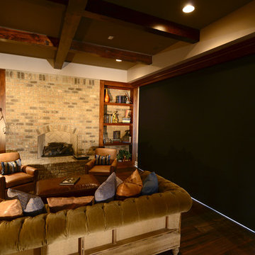
This lower level combines several areas into the perfect space to have a party or just hang out. The theater area features a starlight ceiling that even include a comet that passes through every minute. Premium sound and custom seating make it an amazing experience.
The sitting area has a brick wall and fireplace that is flanked by built in bookshelves. To the right, is a set of glass doors that open all of the way across. This expands the living area to the outside. Also, with the press of a button, blackout shades on all of the windows... turn day into night.
Seating around the bar makes playing a game of pool a real spectator sport... or just a place for some fun. The area also has a large workout room. Perfect for the times that pool isn't enough physical activity for you.
 User
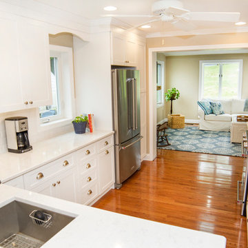
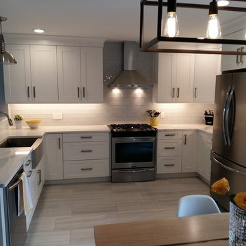
UserWhile the layout was functional, the kitchen lacked proper storage. Dated bleached oak cabinets and laminate tops were replaced by shaker style cabinets in a soft white and a quartz countertop in Cambria's "Brittanica". Porcelain flooring in an up-to-date rectangular format form the foundation for this light and bright kitchen.
 Bellingham Bay Builders
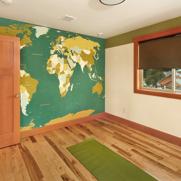
The owners of this home came to us with a plan to build a new high-performance home that physically and aesthetically fit on an infill lot in an old well-established neighborhood in Bellingham. The Craftsman exterior detailing, Scandinavian exterior color palette, and timber details help it blend into the older neighborhood. At the same time the clean modern interior allowed their artistic details and displayed artwork take center stage.
We started working with the owners and the design team in the later stages of design, sharing our expertise with high-performance building strategies, custom timber details, and construction cost planning. Our team then seamlessly rolled into the construction phase of the project, working with the owners and Michelle, the interior designer until the home was complete.
The owners can hardly believe the way it all came together to create a bright, comfortable, and friendly space that highlights their applied details and favorite pieces of art.
Photography by Radley Muller Photography
Design by Deborah Todd Building Design Services
Interior Design by Spiral Studios
 AoDK Inc.
A couple wanted a weekend retreat without spending a majority of their getaway in an automobile. Therefore, a lot was purchased along the Rocky River with the vision of creating a nearby escape less than five miles away from their home. This 1,300 sf 24’ x 24’ dwelling is divided into a four square quadrant with the goal to create a variety of interior and exterior experiences while maintaining a rather small footprint.
Typically, when going on a weekend retreat one has the drive time to decompress. However, without this, the goal was to create a procession from the car to the house to signify such change of context. This concept was achieved through the use of a wood slatted screen wall which must be passed through. After winding around a collection of poured concrete steps and walls one comes to a wood plank bridge and crosses over a Japanese garden leaving all the stresses of the daily world behind.
The house is structured around a nine column steel frame grid, which reinforces the impression one gets of the four quadrants. The two rear quadrants intentionally house enclosed program space but once passed through, the floor plan completely opens to long views down to the mouth of the river into Lake Erie.
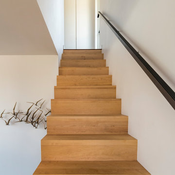
On the second floor the four square grid is stacked with one quadrant removed for the two story living area on the first floor to capture heightened views down the river. In a move to create complete separation there is a one quadrant roof top office with surrounding roof top garden space. The rooftop office is accessed through a unique approach by exiting onto a steel grated staircase which wraps up the exterior facade of the house. This experience provides an additional retreat within their weekend getaway, and serves as the apex of the house where one can completely enjoy the views of Lake Erie disappearing over the horizon.
Visually the house extends into the riverside site, but the four quadrant axis also physically extends creating a series of experiences out on the property. The Northeast kitchen quadrant extends out to become an exterior kitchen & dining space. The two-story Northwest living room quadrant extends out to a series of wrap around steps and lounge seating. A fire pit sits in this quadrant as well farther out in the lawn. A fruit and vegetable garden sits out in the Southwest quadrant in near proximity to the shed, and the entry sequence is contained within the Southeast quadrant extension. Internally and externally the whole house is organized in a simple and concise way and achieves the ultimate goal of creating many different experiences within a rationally sized footprint.
Photo: Sergiu Stoian
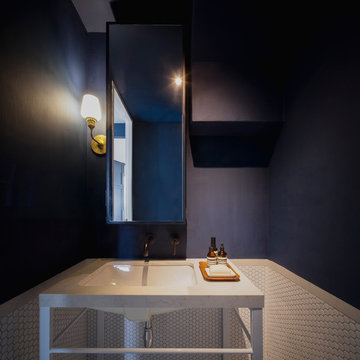
 Studio Wills + Architects
Within the BLUE BOX is a Blue Powder Room.
Photography by Beton Brut.
Powder room photo in Singapore
Powder room photo in Singapore
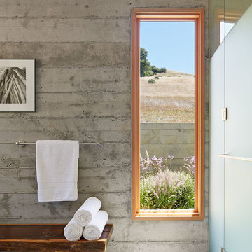
 Schwartz and Architecture
The proposal analyzes the site as a series of existing flows or “routes” across the landscape. The negotiation of both constructed and natural systems establishes the logic of the site plan and the orientation and organization of the new home. Conceptually, the project becomes a highly choreographed knot at the center of these routes, drawing strands in, engaging them with others, and propelling them back out again. The project’s intent is to capture and harness the physical and ephemeral sense of these latent natural movements as a way to promote in the architecture the wanderlust the surrounding landscape inspires. At heart, the client’s initial family agenda--a home as antidote to the city and basecamp for exploration--establishes the ethos and design objectives of the work.
Photography - Bruce Damonte
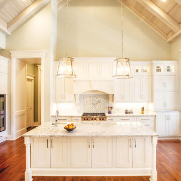
 Fieldstone Cabinetry
This kitchen was created with Fieldstone Cabinetry's Mackenna inset door style in Maple finished in Marshmallow Cream.
Photographed by Arpad Ronaszegi
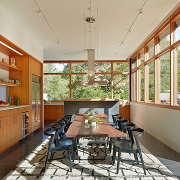 Schwartz and Architecture
The proposal analyzes the site as a series of existing flows or “routes” across the landscape. The negotiation of both constructed and natural systems establishes the logic of the site plan and the orientation and organization of the new home. Conceptually, the project becomes a highly choreographed knot at the center of these routes, drawing strands in, engaging them with others, and propelling them back out again. The project’s intent is to capture and harness the physical and ephemeral sense of these latent natural movements as a way to promote in the architecture the wanderlust the surrounding landscape inspires. At heart, the client’s initial family agenda--a home as antidote to the city and basecamp for exploration--establishes the ethos and design objectives of the work.
Photography - Bruce Damonte
 Schwartz and Architecture
The proposal analyzes the site as a series of existing flows or “routes” across the landscape. The negotiation of both constructed and natural systems establishes the logic of the site plan and the orientation and organization of the new home. Conceptually, the project becomes a highly choreographed knot at the center of these routes, drawing strands in, engaging them with others, and propelling them back out again. The project’s intent is to capture and harness the physical and ephemeral sense of these latent natural movements as a way to promote in the architecture the wanderlust the surrounding landscape inspires. At heart, the client’s initial family agenda--a home as antidote to the city and basecamp for exploration--establishes the ethos and design objectives of the work.
Photography - Bruce Damonte
 Dion Designs
Kitchen update/redesign. The goal with this kitchen was to unite both rooms, visually heighten the ceilings and to make the room feel inviting, interesting and larger. We accomplished this by neutralizing the walls and ceilings in both rooms. The original soffits were reduced and pushed back to the cabinets, trimmed and painted to match the cabinets and new can lights were placed in the ceiling. The before photo of the kitchen shows a hint of what the old soffits looked like. They originally extended about a foot beyond and in front of the cabinets. The original soffits were housing can lights. Because they lights were physically lower than the ceiling, the ceiling height felt right on top of you. By pushing back the soffits and installing the lights into the ceiling the room now feels much bigger and taller. We added visual weight and interest to the eat-in area and balanced both rooms. The beautiful outdoors is now framed with new sliding doors which replaced the bay window in the before shot. Using a dark color to frame the outside of the sliding doors lengthens the room and draws interest and visual weight to the eat-in side of the Kitchen. This kitchen and owner were truly a delight to work with.
Gary G. Schempp www.garygschempp.com
 Geneva Cabinet
 http://genevacabinet.com
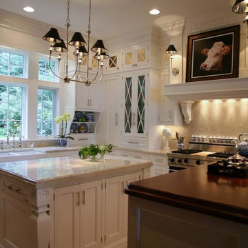
Geneva Cabinet Company, LLC, Lake Geneva, Wi Islands featuring contrasting counter top materials of quartz and solid wood. Transom windows above farmhouse apron front sink. Traditional lighting from double shaded chandeliers, sconces above Viking range and recessed can lighting.

35