
Search results for "Physics" in Home Design Ideas
 Advance Design Studio, Ltd.
Curtis and Peggy had been thinking of a kitchen remodel for quite some time, but they knew their house would have a unique set of challenges. Their older Victorian house was built in 1891. The kitchen cabinetry was original, and they wanted to keep the authenticity of their period home while adding modern comforts that would improve their quality of life.
A friend recommended Advance Design Studio for their exceptional experience and quality of work. After meeting with designer Michelle Lecinski at Advance Design, they were confident they could partner with Advance to accomplish the unique kitchen renovation they’d been talking about for years. “We wanted to do the kitchen for a long, long time,” Curtis said. “(We asked ourselves) what are we actually going to do? How are we going to do this? And who are we going to find to do exactly what we want?”
The goal for the project was to keep the home renovation and new kitchen feeling authentic to the time in which it was built. They desperately wanted the modern comforts that come with a larger refrigerator and the dishwasher that they never had! The old home was also a bit drafty so adding a fireplace, wall insulation and new windows became a priority. They very much wanted to create a comfortable hearth room adjacent to the kitchen, complete with old world brick.
The original cabinetry had to go to make way for beautiful new kitchen cabinetry that appears as if it was a hundred years old, but with all the benefits of cutting-edge storage, self-closing drawers, and a brand-new look. “We just wanted to keep it old looking, but with some modern updates,” Peggy said.
Dura Supreme Highland Cabinets with a Heritage Old World Painted Finish replaced the original 1891 cabinets. The hand-applied careful rubbed-off detailing makes these exquisite cabinets look as if they came from a far-gone era. Despite the small size of the kitchen, Peggy, Curtis and Michelle utilized every inch with custom cabinet sizes to increase storage capacity. The custom cabinets allowed for the addition of a 24” Fisher Paykel dishwasher with a concealing Dura Supreme door panel. Michelle was also able to work into the new design a larger 30” Fisher Paykel French refrigerator. “We made every ¼ inch count in this small space,” designer Michelle said. “Having the ability to custom size the cabinetry was the only way to achieve this.”
“The kitchen essentially was designed around the Heartland Vintage range and oven,” says Michelle. A classic appliance that combines nostalgic beauty and craftsmanship for modern cooking, with nickel plated trim and elegantly shaped handles and legs; the not to miss range is a striking focal point of the entire room and an engaging conversation piece.
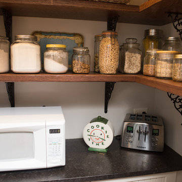
Granite countertops in Kodiak Satin with subtle veining kept with the old-world style. The delicate porcelain La Vie Crackle Sonoma tile kitchen backsplash compliments the home’s style perfectly. A handcrafted passthrough designed to show off Peggy’s fine china was custom built by project carpenters Justin Davis and Jeff Dallain to physically and visually open the space. Additional storage was created in the custom panty room with Latte Edinburg cabinets, hand-made weathered wood shelving with authentic black iron brackets, and an intricate tin copper ceiling.
Peggy and Curtis loved the idea of adding a Vermont stove to make the hearth-room not only functional, but a truly beckoning place to be. A stunning Bordeaux red Vermont Castings Stove with crisp black ventilation was chosen and combined with the authentic reclaimed Chicago brick wall. Advance’s talented carpenters custom-built elegant weathered shelves to house family memorabilia, installed carefully chosen barn sconces, and made the hearth room an inviting place to relax with a cup of coffee and a good book.
“Peggy and Curtis’ project was so much fun to work on. Creating a space that looks and feels like it always belonged in this beautiful old Victorian home is a designer’s dream. To see the delight in their faces when they saw the design details coming together truly made it worth the time and effort that went into making the very compact kitchen space work”, said Michelle. “The result is an amazing custom kitchen, packed with functionality in every inch, nook and cranny!” exclaims Michelle.
The renovation didn’t end with the kitchen. New Pella windows were added to help lessen the drafts. The removal of the original windows and trim necessitated the re-creation of hand-made corbels and trim details no longer available today. The talented carpenter team came to the rescue, crafting new pieces and masterfully finishing them as if they were always there. New custom gutters were formed and installed with a front entry rework necessary to accommodate the changes.
The whole house functions better, but it still feels like the original 1891 home. “From start to finish it’s just a much better space than we used to have,” Peggy said. “Jeff and Justin were amazing.” Curtis added; “We were lucky to find Advance Design, because they really came through for us. I loved that they had everything in house, anything you needed to have done, they could do it”.
 Independent Home Walk in Tubs of Florida
Independent Home just recently completed a Florida walk in tub installation in the city of Pensacola for our customer Claire S. Learn about the process and why it may be a good idea to add one to your home!
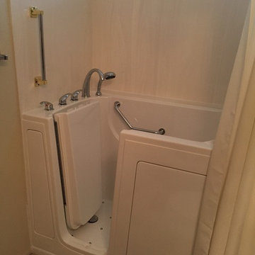
Our installation process starts with a pre-installation meeting with the customer to go over what type of walk in tub is best for their needs, what the best location would be, and what type of the finish the customer wants. At the meeting with Claire, she told us that she wanted a tub that could prove a safe bathing experience but also help with her arthritis and leg pain. Our installation experts decided that the celebrity walk in tub was the best option for Claire.
The celebrity walk in tub was the best option for Claire’s Florida home because of the safety features it is able to provide. Claire’s previous bathtub had a 15 inch edge, which made her nervous of getting in and out. Her old tub also had a non-secure seat giving Claire the fear that she may fall. The celebrity walk in tub has a low threshold eliminating the high edge. It also has a 17” ADA compliant seat, giving Claire that extra security that she needed.
As stated before Claire suffers from arthritis and leg pain and she wanted her new tub to help with the pain. The celebrity walk in tub was a great choice because you are able to add hydrotherapy features. Hydrotherapy is the use of water to help decrease physical discomfort. It works by the jets greater range of motion. The jets waves allow an increase in circulation causing the joint inflammation to decrease, which will help eliminate Claire’s pain.
Installing Claire’s walk in tub took just a couple of days to complete. The process included removing Claire’s old tub including the foundation, putting in the proper plumbing, connecting the water, making sure there weren’t any leaks, and finally building the shelf area around the tub.
Claire is extremely happy with her new walk in tub. Her worries of falling are behind her. She enjoys that when she is in a hurry and can’t enjoy a full soak there is an extendable shower wand. Overall, every time Claire gets a bath she feels like she is at her own private spa.
 Homes by Design
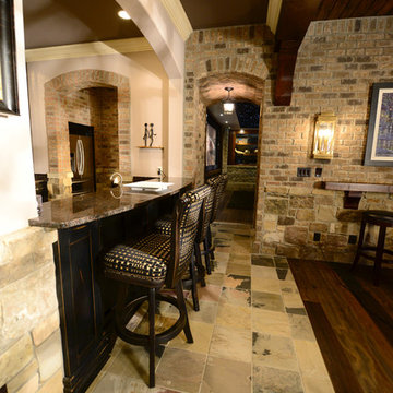
This lower level combines several areas into the perfect space to have a party or just hang out. The theater area features a starlight ceiling that even include a comet that passes through every minute. Premium sound and custom seating make it an amazing experience.
The sitting area has a brick wall and fireplace that is flanked by built in bookshelves. To the right, is a set of glass doors that open all of the way across. This expands the living area to the outside. Also, with the press of a button, blackout shades on all of the windows... turn day into night.
Seating around the bar makes playing a game of pool a real spectator sport... or just a place for some fun. The area also has a large workout room. Perfect for the times that pool isn't enough physical activity for you.
Find the right local pro for your project
 Flavin Architects
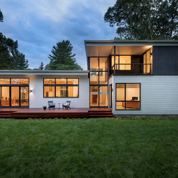
Our clients wanted to replace an existing suburban home with a modern house at the same Lexington address where they had lived for years. The structure the clients envisioned would complement their lives and integrate the interior of the home with the natural environment of their generous property. The sleek, angular home is still a respectful neighbor, especially in the evening, when warm light emanates from the expansive transparencies used to open the house to its surroundings. The home re-envisions the suburban neighborhood in which it stands, balancing relationship to the neighborhood with an updated aesthetic.
The floor plan is arranged in a “T” shape which includes a two-story wing consisting of individual studies and bedrooms and a single-story common area. The two-story section is arranged with great fluidity between interior and exterior spaces and features generous exterior balconies. A staircase beautifully encased in glass stands as the linchpin between the two areas. The spacious, single-story common area extends from the stairwell and includes a living room and kitchen. A recessed wooden ceiling defines the living room area within the open plan space.
Separating common from private spaces has served our clients well. As luck would have it, construction on the house was just finishing up as we entered the Covid lockdown of 2020. Since the studies in the two-story wing were physically and acoustically separate, zoom calls for work could carry on uninterrupted while life happened in the kitchen and living room spaces. The expansive panes of glass, outdoor balconies, and a broad deck along the living room provided our clients with a structured sense of continuity in their lives without compromising their commitment to aesthetically smart and beautiful design.
 Montana Timber Products
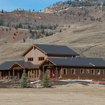
This Wyoming home feature's Montana Timber Products prefinished ranchwood™ Eastern square edge lap wood siding and ranchwood™ Yellowstone reverse board and batten siding.
-
As the sun moves across the horizon, light beautifully contrasts with the vertical installation of ranchwood Yellowstone with the lower installation of ranchwood™ Eastern, blending seamlessly into the gorgeous Wyoming landscape.
-
Montana Timber Products' flagship product, ranchwood™, is a reclaimed barnwood alternative milled from new, kiln dried, chemical free, rough stock wood.
Put through a colorizing and texturizing process, ranchwood™ is an aesthetically pleasing authentic reclaimed barn wood, rustic wood siding.
ranchwood™ offers uncompromising rustic wood beauty typically less expensive than antique reclaimed barnwood.
-
Contrasting square edge lap profile with the reverse board batten profile extenuates the rich color of ranchwood™ Eastern, providing depth to the the siding with a 3-dimensional exposure.
-
Montana Timber Products is a custom millwork shop as shown with this application of a vertically installed shiplap milled with a 1/4" reveal. This reveal creates nice shadow lines and a multi-dimensional aesthetic to the finish of this siding.
Wire Brushed and Circle Sawn are Montana Timber Products typical texturizing options. Circle Sawn texture seen on Montana Timber Products natural wood siding is created by large circular saw blades used in more traditional milling practices. Added physical and aesthetic depth to the wood grain is available as the Wire Brushed option.
Greater surface area is added during the texturizing process, allowing Seal-Once, 100% NO VOC waterfproofer to more effectively penetrate the wood.
Seal-Once is guaranteed for ten years from water ingress and is safe for exterior and interior use, pets and children.
-
The Yellowstone color is the lighter color, vertically installed on the top levels. Yellowstone’s lighter tones of gray — representing weathering through long windswept days — are perhaps one of the most treasured colors utilized from the feel of the old barn pallet.
-
Montana Timber Products does not use degenerative chemicals like some companies do to achieve texture and color. Environmentally responsible, Montana Timber Products produces wood siding, interior accents, flooring, reclaimed wood, beams, barn wood alternatives with environmentally friendly manufacturing techniques.

 Jacobson Construction
“If everyone is moving forward together,
then success takes care of itself.”
- Henry Ford
It’s no secret that one big reason for Jacobson Construction’s success is because of our people. I’ve always hired the best people who work together as a team while respecting our customers. These are real professionals who work together and get the job done.
Sean, our project leader, has been with me since 1995, and my electrician has been with me even longer. Many of my current staff have been with me for over 15 years. I am fortunate to have these skilled professionals working with me.
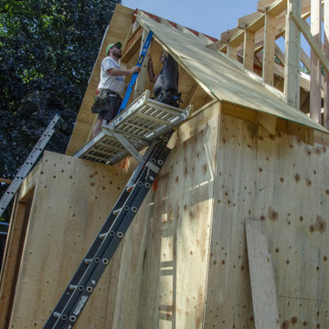
The addition is coming along. There’s a hole in the kitchen where there used to be a supporting wall. Framing’s done in the basement, and a gas fireplace is ready to be installed. The second-floor dormers are framed, and all of our windows have been delivered.
Now that it’s taking shape, looks like one of our new favorite spaces will be the new second-floor bedroom. Because it’s adjacent to the master suite it could make an ideal nursery and add value to my home.
Paying for things you can’t see is hard. For example, putting on a new roof is expensive, and because you can’t see it this seems like an even bigger expense.
What you can’t see on this addition is how much effort is made in securely tying the addition to the existing home – originally built in 1936.
We needed to support part of the old roof and all the new roof with stacked support posts. To do that we installed 3 stacked posts to carry the load from new footings in the basement to the beam three stories up.
The red marked beam in the photo at the top of the page is supported by footings three stories below, halfway into the existing home.
We also physically connected the new addition with beams that extend halfway into the current home.
 Natural Stone Institute
Tucker Design Awards celebrate the innovation and vision that designers bring to their projects through the specification and use of natural stone materials. For members of the Natural Stone Institute, acknowledgement as a contributor to a Tucker Design Awards winning project is a genuine tribute to their traditional values, physicality of work and dedication to precise specifications required in the realization of such accomplished architectural design.
Landscape Architect
Design Workshop, Aspen, CO
Architect
Poss Architecture, Aspen, CO
Landscape Contractor
Landscape Workshop, Carbondale, CO
Stone Supplier/Installer
Gallegos Corporation, Wolcott, CO
Stone Quarry
Arkins Park Stone, Loveland, CO
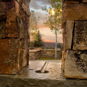
Within walled boundaries, Woody Creek Garden embraces its high alpine environment through explorations of stone and water that serve as unifying elements of form in the design of the various outdoor spaces. Through striking and distinctively detailed stonework, water is portrayed in its various states and forms – atmospheric mist, single rivulets, cascades, and still pools. Two courtyards interlink the residence allowing each room to enjoy the visual landscape. In the entrance courtyard, the sound from a carved 24”x 24” cut-granite fountain reverberates throughout the walled space. Placed for gathering and quiet contemplation, a pin-wheel arrangement of sculptural, granite slabs provide a honed surface for sitting while providing year-round interest. Each stone was individually specified with intentionally spaced core fractures, utilizing the extraction method to serve as sculpted details. Large sandstone pavers, set in sand and cut in an irregular, but geometric fashion bring a sense of modernity to the space. Throughout the property, stone detailing seek to heighten one’s experience of the landscape and views. Upon the home’s entry, an 18” rectilinear cut in the freestanding stone wall frames a distant peak, creating a singular reference to the outside world in this encased space. Emerging from the center of an organically-shaped carved sandstone slab, water is carried along a narrow 2” runnel sandstone cap, disappearing into the framed horizon. This glimpse to the west is the only opening in the tightly enclosed courtyard. From its opposite aspect, the feature creates a welcoming gesture at the home’s front entrance. The slender rivulet of water trickles from the sandstone slab above onto a honed granite plane, set within a sandstone terrace In contrast, a second promontory courtyard commands a strong presence over its alpine setting, leaving the steeply sloping site undisturbed. A 12’x 40’ reflecting pool – a thin sheet of water over honed black granite – captures the form and silence of the everchanging natural environment on its taut surface. Along its edge, water flows over a ½” radius edge, disappearing into a recirculating slot. Commissioned by Italian artist Bruno Romeda, a bronze sculpture rests upon an elevated granite plinth. Along its western edge, designers crafted a two-tiered, infinity edge detail. In the first vertical drop, water flows between the pool and perimeter stone walls, landing onto an intermediate bench, while the second drop introduces a chamfered edge, allowing water to embrace the vertical relief without splashing. Sandstone terraces provide continuous access to the various landscape features of the garden. At the base of the battered perimeter walls, a sandstone path leads to a fire pit, encircled by lichen-covered boulders. Along the courtyard’s eastern perimeter, water appears to emerge from the hillside, fracturing and falling against the irregular vertical stone wall, melting in a curtain-like formation behind the spa. The colors, distinctive detailing and striking stonework were selected based on their appropriateness to the context. From above, a rectilinear pool lies behind the wall, silently mirroring the sky above and offering no ostensible connection to the structure or to its source.
 MCDW + Architecture
Kitchen Cube 1
Upper East- Residence
Work: Full Gut renovation- 2 apartments- in the same ‘S’ line
Size: 650 Sq Ft of space in both apartments, 5S and 4S
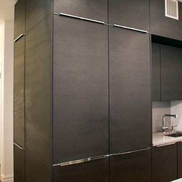
Using the Frankfurt Kitchen of 1926 for inspiration, Ms.Cianfaglione began asking herself how the typology of the NYC kitchenette for her building, in the ‘S’ line, needed to be upgraded to fit today’s physical and aesthetic needs. The Frankfurt Kitchen was the forerunner of modern fitted kitchens and had an unified concept to enable efficient work, consolidating a woman’s efforts and allowing her more time to spend else ware. But unlike the Frankfurt kitchen, Ms. Cianfaglione wanted to take this a step further and open it up rather than concealing it, and its user, inside a room. This would showcase the designer’s evolved notion of “cooking”,that would now become an orchestrated dance to be put on display.
Ms. Cianfaglione had a typical NYC kitchenette, a small room with an air grille for ventilation, and in this case, there was a small window that was currently blocked by a refrigerator. There was also the problem of the foyer space, which was just a waste in an apartment this small, and the structural wall that could not be removed. Ms. Cianfaglione responded to these conditions by designing the kitchen to become a wrap around condition, in an ‘L’ shape, that would use the foyer more effectively and at the same time, face the living area, and all the while concealing the structural wall that separates them.
The interesting thing about the ‘L’ shape was that it allows for a beautifully orchestrated flow that makes cooking look like a beautiful dance that moves back and forth along the’ L.’
The appliances are designed within the cabinetry to give a tailored look that does not allow for distraction, and you instead focus on the user. This renovation made the otherwise small, unused foyer and ineffective kitchen, now a focal point that dictates movement throughout. The kitchen has unified and designed an otherwise standard one bedroom apartment and seeks to become a new standard in this building’s typology.
 MuralbyDesign
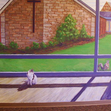
This is an original mural that was created and painted by Mural by Design, Grand Rapids, Michigan, for a church in Kentwood, MI. The building that is painted outside is the same the same one you are physically inside, and the architectural elements on the mural are the same as the actual once used in the building.
 Cantoni Dallas
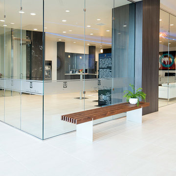
A prominent entrepreneur and developer looks to Cantoni design consultant Nicole George for a workspace as inventive and statement-making as his projects. Read the full story here: http://cantoni.com/interior-design-services/projects/a-modern-workplace/
Photo by David Deleon
 Seachrome Corporation
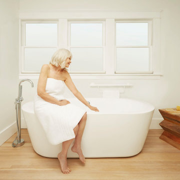
Our in-depth knowledge of manufacturing and craftsmanship assures that Seachrome’s Lifestyle & Wellness Series meets the highest standards in its class. Comfort, safety, and beauty combine in each of these bold, innovative designs. The Lifestyle & Wellness Series integrates our decades of experience in providing stable and secure structural options in a bathroom environment — proven to create confidence, self-reliance — and peace of mind — for the elderly and physically impaired. Underlying the fluid lines and elegant simplicity is our commitment to functional support, durability, and intelligent style — all in service to health and quality of life.
 Dylan Baliski
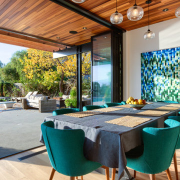
Residential architecture must always have a connection with its landscape: physically and visually.
The previous home, despite being located on a beautiful waterfront site, was derelict and not fit for purpose anymore. There was little connection to the water and beach, thus not taking advantage of its waterfront location. A true connection to the water was achieved through adaptable glazing covering the majority of the rear facade and a roof line that is set outwards. Furthermore, the protruding massing orients and aligns itself toward the waterfront, bringing the interior spaces and beach together. Despite the small plot, two accessory dwelling units were erected on the east end, providing additional affordable housing near the city centre.
Knowing the clients personally, I was fortunate enough to be trusted with leading the design of this project from its inception. 3D models and plans helped the clients and myself come to design decisions in the context of the site. My plans were signed off by a local drafting company with very minimal changes. The residence has won multiple awards including a first place in the “Residential Infill “ category from the Canadian Homebuilders Association.
 RAJ Kitchen and Bath, LLC
**Check out the video of this transformation on our website**
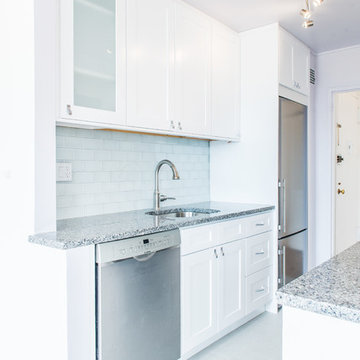
This small kitchen was way too small for this 2 bedrooms, 2 bathrooms apartment. Not only was it a very small kitchen, but the physical location of it made it very difficult to make it any bigger. There wasn't much that could have been done without incurring astronomical cost, which would get little or no return on the investment. The client wanted a kitchen that can be optimized in its current location to add a ton of value for resale.
This was difficult to do, because there was no moving of any mechanical around in the kitchen and even if we wanted to, the management of the building would not allow. For those of you who live in condos, co-ops or apartment building, you know how difficult it is to rework these foot prints. When we showed up, we saw the problems, but we also saw a huge opportunity where we can achieve those goals in the small space. This was accomplished by making some key changes and to incorporate some new things that was not possible when this kitchen was built years ago.
The crucial part of the design that would drive the entire new layout, was selecting the only appliance; that was the Refrigerator. Once we nailed down that refrigerator, we then proceeded to design the kitchen around it. We moved it to the other side of the wall where the sink was so that we can tap into the water line from the sink plumbing. It was crucial that it stays exactly 24" deep, not an inch more because we had to keep the entry as open as possible. Also, it was going to be directly in front of another big storage unit - The pantry. It is not ideal in most cases, but we needed the rest of the space to ramp up the design and open feel towards the side where all of the activities would take place, which happend to be the dining room and the view.
Once all that was figured out, we re-positioned the sink, dishwasher and the range and proceeded to wrap the cabinets around the columns to integrate them into the space. Thirty- six inches cabinets height was used so that they can be installed higher towards the ceiling height to give more room rather than the standard 18" required height between the counter tops. This was done to make the room feel a lot bigger than it really was. Not to mention, we also didn't want the faucet to be buried under the cabinets so that was also a necessary design detail for the space.
We then lowered both knee walls so that the counter top can sit on top of them, by removing that stop point that would have otherwise defined the kitchen area. This allowed us to pick up that extra footprint into the room for added prep space and enabled us to create the illusion of a kitchen that is looking longer than it really is. Every inch mattered when designing this kitchen and we made a conscious decision to use every one of that inch.
White cabinets were selected to do just what white cabinets are design to do; make a small or dark room appear bigger, brighter and more open. In this kitchen, this was amplified the more because of the kitchen location. It was perfect! We knew we did justice to the space because while we were there taking some photos, a few potential buyers walked in and went straight for the kitchen! They said its design just to fit the apartment.
Pantry roll out shelving, Double recycle bin, fancy handles, LED lighting, Quartz counter top, beautiful backslash tiles and grey linen floors finished off the kitchen which looked over a beautiful view of the George Washington Bridge from the top of this lovely 4th floor apartment.
Credit to Masterpiece Tile and Marble (Annmarie on the selection of Tiles and countertop and Val on the Construction to complete this project).
Davor Kokic Photography
 Thayer Design Build
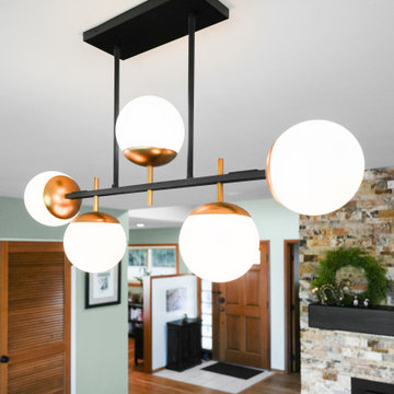
Shannon’s kitchen transformation focused on removing barriers—both physical and functional. By opening up the floor plan, upgrading storage, and modernizing finishes, our team delivered a kitchen and living area that are bright, spacious, and tailored to her style. The result is a cohesive, inviting home that combines beauty and practicality.
 S Interior Design
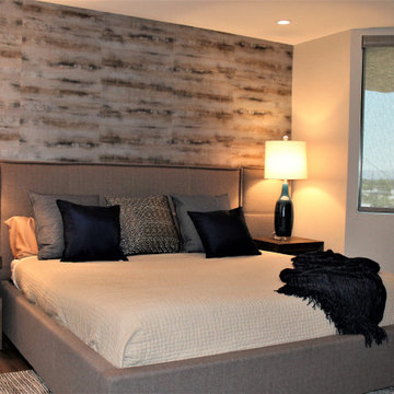
The master bedroom is a great mix of materials . An upholstered bed with side wings visually and physically soften the space. Once again the mostly neutral palette is accented with pops of varying rich shades of blue.
 3SI Design
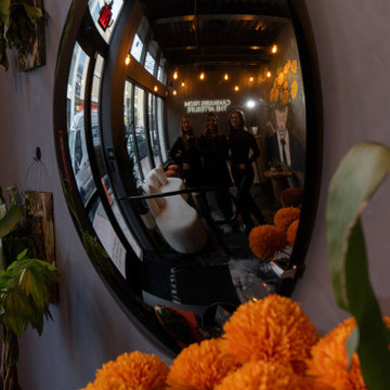
Meet Don Fuego—a bold, luxurious, and unforgettable experience. ?
Bringing this vision to life was an incredible journey alongside talented vendors and artists. We began designing Don Fuego at the start of 2024, keeping four key elements at the forefront: Moody, Sophisticated, Bold, and Memorable.
Inspired by Día de los Muertos, this space pays homage to those who are no longer with us physically but remain with us spiritually. Every design choice reflects this essence—deep, rich textures, dramatic lighting, and custom elements that make Don Fuego a true work of art.
One of the focal points is the custom-designed checkout counter, featuring a striking porcelain slab that embodies everything Don Fuego stands for: fire, intensity, and individuality. The moment we saw it, we knew it was destined for this space.
Design is all about the details, and Don Fuego is no exception. From late-night idea exchanges to meticulous material selections, every element was chosen with intention. We introduced texture through limewash, mimicking the organic feel of a grave, and Roman clay, sculpted into arches reminiscent of traditional Mexican architecture.
Lighting is the jewelry of a space, and in Don Fuego, it sets the mood. We layered task, decorative, ambient, and accent lighting to create an immersive atmosphere. One of our favorite details? A light fixture inspired by the cascarón, a cracked egg symbolizing good luck and prosperity in Mexican culture. The moment we discovered it, we knew it belonged here—to bring blessings to our clients and everyone who steps inside this curated experience.
Don Fuego isn’t just a space—it’s a feeling, a story, a tribute. ✨
 Shannon Davidson Design
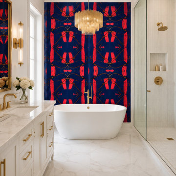
Each motif begins as a hand painted artwork, then is carefully transformed into repeat for tile application. Blending traditional craftsmenship with modern surface design.
These image are AI generated renderings to demonstrate possible applications and mood. Real tile samples and physical finishes can be viewed on my website and social media.
 2Fold® - Custom Folding Glass Doors
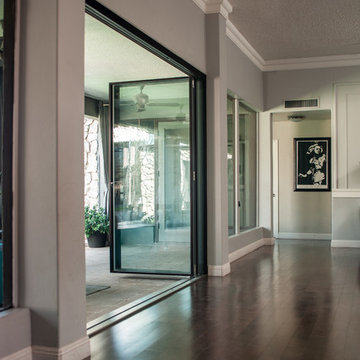
2Fold® is the world’s thinnest, totally custom to you bi fold door system. It is designed to allow the dramatic mingling of inside and outside spaces, opened or closed, both visually and physically, enhancing the beauty and functionality of any living space. We serve San Francisco, Manhattan, and Worldwide!
37