
Search results for "Poor decision making" in Home Design Ideas
 John R. Schroeder, AIA
Photo by Jody Dole
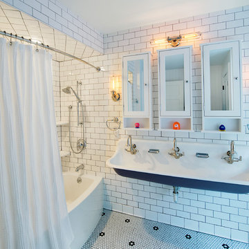
This was a fast-track design-build project which began design in July and ended construction before Christmas. The scope included additions and first and second floor renovations. The house is an early 1900’s gambrel style with painted wood shingle siding and mission style detailing. On the first and second floor we removed previously constructed awkward additions and extended the gambrel style roof to make room for a large kitchen on the first floor and a master bathroom and bedroom on the second floor. We also added two new dormers to match the existing dormers to bring light into the master shower and new bedroom. We refinished the wood floors, repainted all of the walls and trim, added new vintage style light fixtures, and created a new half and kid’s bath. We also added new millwork features to continue the existing level of detail and texture within the house. A wrap-around covered porch with a corner trellis was also added, which provides a perfect opportunity to enjoy the back-yard. A wonderful project!
 Eden LA Furniture and Interiors
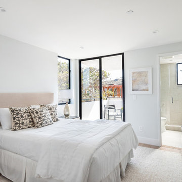
Modern living with ocean breezes
__
This is another development project EdenLA assisted the client to finish quickly and for top dollar. The fun challenge of more contemporary spaces is how to make them warm and inviting while still maintaining the overall masculine appeal of their architecture. Water features, playful custom abstract art, unique furniture layouts, and warm stone and cabinetry decisions all helped to achieve that in this space. Beach Life Construction implemented the architect's indoor-outdoor flow on the top floor beautifully as well.
__
Kim Pritchard Photography
 Joni Spear Interior Design
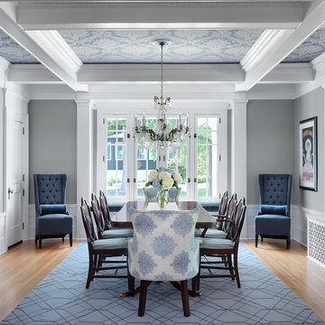
With the original tray ceiling being a dominant feature in this space we decided to add a luxurious damask wall covering to make the room more elegant. The abstract rug adds a touch of modernity. Host and hostess chairs were custom-made for the project.
Find the right local pro for your project
 Michael Nash Design, Build & Homes
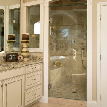
After moving into a luxurious home in Ashburn, Virginia, the homeowners decided the master bathroom needed to be revamped. The existing whirlpool tub was far too big, the shower too small and the make-up area poorly designed.
From a functional standpoint, they wanted lots of storage, his and her separate vanities with a large make-up area, better lighting, a large steam shower and a vaulted ceiling. Aesthetics were also important, however, and the lady of the house had always dreamed of having a Venetian style spa.
Taking some space from an adjacent closet has allowed for a much larger shower stall with an arched transom window letting plenty of natural light into the space. Using various sizes of tumbled limestone to build its walls, it includes a rain shower head, a hand shower and body sprayers. A seating bench and storage niches make it easier to use.
New plumbing was put in place to add a large vanity with upper glass cabinets for the man of the house, while one corner of the space was used to create a make-up desk complete with a seamless mirror and embedded sconce lights
A free standing Neapolitan-style soaking tub with fluted columns and arched header is the real focal point of this space. Set among large corner windows, under a stylish chandelier, this elegant design sets this bathroom apart from any bathroom in its category.
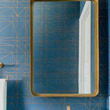
 Breathe Design Studio
Breathe Design Studio helped this young family select their design finishes and furniture. Before the house was built, we were brought in to make selections from what the production builder offered and then make decisions about what to change after completion. Every detail from design to furnishing was accounted for from the beginning and the result is a serene modern home in the beautiful rolling hills of Bee Caves, Austin.
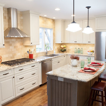
 Advance Design Studio, Ltd.
Bud Kane has remodeled nearly every room in his own home over many years. Now reaching his 70’s, he contemplated heading up a major kitchen and laundry room renovation himself, planning on doing the carpentry work with his own hands. “I was not convinced I would ever meet anyone who could do it as well as I could do it myself”, said Bud. Ruth and Bud spent 5 years visiting kitchen firms and interviewing designers. They couldn’t however bring themselves to pull the trigger on the project, until they met Advance Design Studio in 2015.
“No one understood what I wanted”, said Ruth. She was continually frustrated by experiences with designers who weren’t hearing what was important to her. “Everyone kept designing my kitchen with what they thought it should look like; I couldn’t find anyone who would listen to me”!
When they met designer Scott Christensen from Advance Design Studio, they liked him right away. He listened to Ruth and designed a kitchen that she loved, all the while interjecting years of wisdom and design expertise that Ruth appreciated. “The finished product is better than I expected”, says Ruth. “I respected Scott’s opinions and together we created the perfect place for me to bake with my grandkids and truly enjoy the kitchen and laundry room I’ve been dreaming of for many years!”
The kitchen transformation began with removing the home’s soffits, and extending new painted maple cabinetry to the ceiling with the addition of an elegant crown molding. Ruth’s new Vita Mix holds a coveted place on her counter, and adjustments were planned to size the cabinets in conjunction with the under cabinet decorative light molding to fit this appliance just right. “This one small detail was really important to me”, says Ruth smiling. An elegant new island replaced the original island, complete with room for 3 stools where her grandchildren will sit to make home-made pasta every Thanksgiving, and cookies at Christmas time. “Traditions are very important in my family, and making my kitchen work to suit cherished activities with my family was the number one reason this renovation was so desired”, replied Ruth when asked about the island.
A picture perfect new tea station replaced a cluttered unused desk area, creating a wonderful place to prepare hot drinks for sipping any season of the year while overlooking the couple’s wonderfully manicured gardens from the lovely 3 season’s room just off the kitchen. The soft sage island bead panel detail was repeated on the backsplash, replicating the feel of a fine old piece of furniture.
The biggest problem with the laundry room was 3 doors, one from the garage, one from the closet, and one to the hallway. “Scott designed a pocket door, and oh what a dream it is now to bring groceries in from the garage!” exclaims Bud who grew to disdain this task! Doing laundry is now a breeze in this attractive new space that doubles as a wonderful pantry for the kitchen with room to store food items that didn’t have a home in the poorly designed original space.
New Hickory distressed wood flooring was laid both in the kitchen and leading to the hall foyer. Soft gray wood-replicating porcelain was placed in the laundry area, making for an easily cleanable surface for what doubles as a mud room from the garage. Creamy tumbled marble graces an unobtrusive backsplash spilling onto shiny granite counter tops in a rich earthy pattern of fall colors that mimic colors throughout the home. Advance is known details that included custom crafted furniture toe kicks, luxurious crown moldings, and beaded under cabinet moldings. The kitchen is complete with a glass display cabinet showing Ruth’s treasured china tea collection.
Early on, it was initially only their intention of purchasing cabinets for the new design. They were so impressed however with Advance Design’s complete program for budgeting, design, installation and management that it became clear to them both that they wanted Advance to handle the entire project from start to finish. “After seeing the quality work they did, coupled with the in-house team completely dedicated to our satisfaction, it became apparent there was no other choice but to hire them to handle everything. And we’re so glad we did, we have not one regret”, says Bud.
“The attention to detail by the carpentry crew more than satisfied my perfectionist expectations of the finished carpentry,” exclaimed Bud. “Every one of Advance Design’s people we encountered from design through construction was wonderful. We’ve never met a group of people so dedicated to making sure we were happy with every single detail, and every single part of this experience”, said Ruth and Bud.
Designer: Scott Christensen
Photographer: Joe Nowak
 Plain & Posh
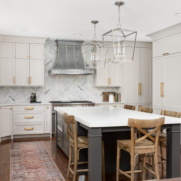
This large space did not function well for this family of 6. The cabinetry they had did not go to the ceiling and offered very poor storage options. The island that existed was tiny in comparrison to the space.
By taking the cabinets to the ceiling, enlarging the island and adding large pantry's we were able to achieve the storage needed. Then the fun began, all of the decorative details that make this space so stunning. Beautiful tile for the backsplash and a custom metal hood. Lighting and hardware to complement the hood.
Then, the vintage runner and natural wood elements to make the space feel more homey.

Sponsored
Columbus, OH

Wannemacher Interiors
Customized Award-Winning Interior Design Solutions in Franklin Cnty OH
 Haven Design and Construction
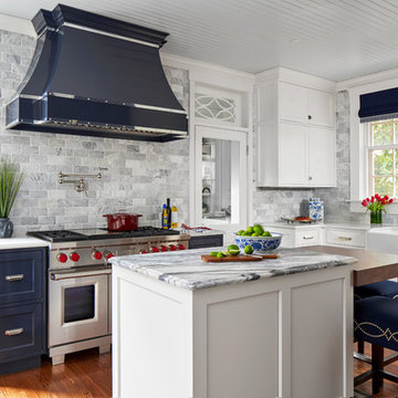
This 1902 San Antonio home was beautiful both inside and out, except for the kitchen, which was dark and dated. The original kitchen layout consisted of a breakfast room and a small kitchen separated by a wall. There was also a very small screened in porch off of the kitchen. The homeowners dreamed of a light and bright new kitchen and that would accommodate a 48" gas range, built in refrigerator, an island and a walk in pantry. At first, it seemed almost impossible, but with a little imagination, we were able to give them every item on their wish list. We took down the wall separating the breakfast and kitchen areas, recessed the new Subzero refrigerator under the stairs, and turned the tiny screened porch into a walk in pantry with a gorgeous blue and white tile floor. The french doors in the breakfast area were replaced with a single transom door to mirror the door to the pantry. The new transoms make quite a statement on either side of the 48" Wolf range set against a marble tile wall. A lovely banquette area was created where the old breakfast table once was and is now graced by a lovely beaded chandelier. Pillows in shades of blue and white and a custom walnut table complete the cozy nook. The soapstone island with a walnut butcher block seating area adds warmth and character to the space. The navy barstools with chrome nailhead trim echo the design of the transoms and repeat the navy and chrome detailing on the custom range hood. A 42" Shaws farmhouse sink completes the kitchen work triangle. Off of the kitchen, the small hallway to the dining room got a facelift, as well. We added a decorative china cabinet and mirrored doors to the homeowner's storage closet to provide light and character to the passageway. After the project was completed, the homeowners told us that "this kitchen was the one that our historic house was always meant to have." There is no greater reward for what we do than that.
 Innovative Design Build
Five stars isn’t enough! Our project was to reconfigure and update the main floor of a house we recently purchased that was built in 1961. We wanted to maintain some of the unique feeling it originally had but bring it up-to-date and eliminate the closed-in rooms and downright weird layout that was the result of multiple, partial remodeling projects. We began with a long wishlist of changes which also required replacement of very antiquated plumbing, electrical wiring and HVAC. We even found a fireplace that had been walled in and needed major re-construction. Many other aspects and details on this incredible list we made included an all new kitchen layout, converting a bedroom into a master closet, adding new half-bath, completely rebuilding the master bath, and adding stone, tile and custom built cabinetry. Our design plans included many fixtures and details that we specified and required professional installation and careful handling. Innovative helped us make reasonable decisions. Their skilled staff took us through a design process that made sense. There were many questions and all were answered with sincere conversation and positive – innovation – on how we could achieve our goals. Innovative provided us with professional consultants, who listened and were courteous and creative, with solid knowledge and informative judgement. When they didn’t have an answer, they did the research. They developed a comprehensive project plan that exceeded our expectations. Every item on our long list was checked-off. All agreed on work was fulfilled and they completed all this in just under four months. Innovative took care of putting together a team of skilled professional specialists who were all dedicated to make everything right. Engineering, construction, supervision, and I cannot even begin to describe how much thanks we have for the demolition crew! Our multiple, detailed project designs from Raul and professional design advice from Mindy and the connections she recommended are all of the best quality. Diego Jr., Trevor and his team kept everything on track and neat and tidy every single day and Diego Sr., Mark, Ismael, Albert, Santiago and team are true craftsmen who follow-up and make the most minuscule woodworking details perfect. The cabinets by Tim and electrical work and installation of fixtures by Kemchan Harrilal-BB and Navindra Doolratram, and Augustine and his crew on tile and stone work – all perfection. Aisling and the office crew were always responsive to our calls and requests. And of course Clark and Eric who oversaw everything and gave us the best of the best! Apologies if we didn’t get everyone on this list – you’re all great! Thank you for your hard work and dedication. We can’t thank you enough Innovative Construction – we kind of want to do it again!
Dave Hallman & Matt DeGraffenreid
 Model Remodel
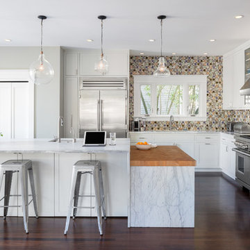
The kitchen and sunroom were closed off by walls that hindered the flow of traffic and natural light. The new layout is open, airy and features folding LaCantina doors that allow for seamless access to the patio during warmer months. Radiant heating warms the spaces during cooler months. The large kitchen island matches the impressiveness of the rest of the home, especially as your eye catches the cascading marble of the waterfall edge that extends the countertop down to the floor. Sleek Miele, Subzero and Wolf appliances, as well as a portion of butcher block counter make it a chef’s kitchen without detracting from the bright aesthetic.
© Cindy Apple Photography
 Renovisions
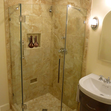
When it was time to update their small and poorly functional master bath, these homeowners approached Renovisions for help. The small 5’x8’ size constraints was a challenge but ‘Team Renovisions’ was up for the task and came up with a beautiful creative use of space which incorporates a spacious walk-in shower, a curved furniture-styled vanity with porcelain lavatory top, a sleek and energy efficient luxury performance toilet, with faucet and shower fixtures in chrome finish. Safety is a must for our projects and this decorative grab bar that matches the towel holder accessories is evidence of that as it provides both functional and aesthetic attributes.
18”x18” porcelain tiles in a brown marble pattern was a great choice as these over-sized tiles increased the feeling of the room while the rich cherry finish of the vanity complimented the brown veining of the tile nicely.
This newly remodeled master bath is clearly an example of making the most out of a small space. Beauty, functionality and style – it has it all!
 Dura Supreme Cabinetry
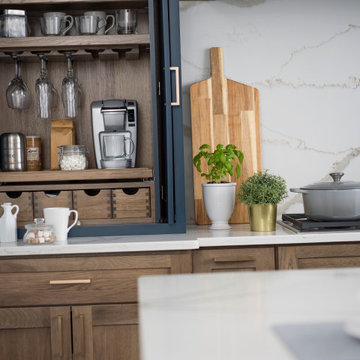
This modern farmhouse kitchen features a beautiful combination of Navy Blue painted and gray stained Hickory cabinets that’s sure to be an eye-catcher. The elegant “Morel” stain blends and harmonizes the natural Hickory wood grain while emphasizing the grain with a subtle gray tone that beautifully coordinated with the cool, deep blue paint.
The “Gale Force” SW 7605 blue paint from Sherwin-Williams is a stunning deep blue paint color that is sophisticated, fun, and creative. It’s a stunning statement-making color that’s sure to be a classic for years to come and represents the latest in color trends. It’s no surprise this beautiful navy blue has been a part of Dura Supreme’s Curated Color Collection for several years, making the top 6 colors for 2017 through 2020.
Beyond the beautiful exterior, there is so much well-thought-out storage and function behind each and every cabinet door. The two beautiful blue countertop towers that frame the modern wood hood and cooktop are two intricately designed larder cabinets built to meet the homeowner’s exact needs.
The larder cabinet on the left is designed as a beverage center with apothecary drawers designed for housing beverage stir sticks, sugar packets, creamers, and other misc. coffee and home bar supplies. A wine glass rack and shelves provides optimal storage for a full collection of glassware while a power supply in the back helps power coffee & espresso (machines, blenders, grinders and other small appliances that could be used for daily beverage creations. The roll-out shelf makes it easier to fill clean and operate each appliance while also making it easy to put away. Pocket doors tuck out of the way and into the cabinet so you can easily leave open for your household or guests to access, but easily shut the cabinet doors and conceal when you’re ready to tidy up.
Beneath the beverage center larder is a drawer designed with 2 layers of multi-tasking storage for utensils and additional beverage supplies storage with space for tea packets, and a full drawer of K-Cup storage. The cabinet below uses powered roll-out shelves to create the perfect breakfast center with power for a toaster and divided storage to organize all the daily fixings and pantry items the household needs for their morning routine.
On the right, the second larder is the ultimate hub and center for the homeowner’s baking tasks. A wide roll-out shelf helps store heavy small appliances like a KitchenAid Mixer while making them easy to use, clean, and put away. Shelves and a set of apothecary drawers help house an assortment of baking tools, ingredients, mixing bowls and cookbooks. Beneath the counter a drawer and a set of roll-out shelves in various heights provides more easy access storage for pantry items, misc. baking accessories, rolling pins, mixing bowls, and more.
The kitchen island provides a large worktop, seating for 3-4 guests, and even more storage! The back of the island includes an appliance lift cabinet used for a sewing machine for the homeowner’s beloved hobby, a deep drawer built for organizing a full collection of dishware, a waste recycling bin, and more!
All and all this kitchen is as functional as it is beautiful!
Request a FREE Dura Supreme Brochure Packet:
http://www.durasupreme.com/request-brochure
 Twelve Stones Designs, LLC
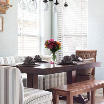
The owners of this kitchen had spent the money to upgrade the finishes in their kitchen upon building the home 12 years ago, but after living in the space for several years they realized how nonfunctional the layout really was. The (then) two preschool aged children had grown into busy, hungry teenagers with many friends who also liked to hang out at the house. So the family needed a more functional kitchen with better traffic flow, space for daily activities revolving around the kitchen at different times of day, and a kitchen that could accommodate cooking for and serving large groups. Furthermore, the dark, traditional finishes no longer reflected the homeowners’ style. They requested a brighter, more relaxed, coastal style that reflected their love of the seaside cities they like to visit.
Originally, the kitchen was U-shaped with a narrow island in the middle. The island created narrow aisles that bottle-necked at the dishwasher, refrigerator, and cooktop areas. There was a pass-through from the foyer into the kitchen, but the owners never liked that the pass-through was also located so close to the powder room. The awkward proximity was unappealing and made guests feel uncomfortable.
The kitchen’s storage was made up of lots of narrow cabinets, apothecary drawers, clipped corner units, and very few drawers. It lacked useful storage for the larger items the family used on a daily basis. And the kitchen’s only pantry was small closet that had only builder-grade, narrow shelving with no illumination to be able to see the contents inside.
Overall, the kitchen’s lighting plan was poorly executed. Only six recessed cans illuminated the entire kitchen and nook areas. The under cabinet lighting was not evenly distributed either. In fact, the builder had mis-placed the under cabinet lighting around the decorative pilasters which made for choppy, dark cubbies. Further, the builder didn’t include any lighting over the sink or the bar area, which meant whoever was doing the dishes was always in their own shadow. That, coupled with the steep overhang of the game room above made the bar area feel like a dim, cavernous space that wasn’t inviting or task oriented. The kitchen looked out into the main living space, but the raised bar and a narrow wall (which held the only large cabinet in the kitchen) created more of a barrier than a relationship to the living room or breakfast nook. In fact, one couldn’t even see the breakfast nook from the cooktop or sink areas due to its orientation. The raised bar top was too narrow to comfortably sit to either dine at or chat from due to the lack of knee space. The the homeowners confided that the kitchen felt more like a dark, dirty prison than place where the family, or their guests, wanted to gather and commune.
The clients' needs and desires were:
➢ to create a kitchen that would be a space the family loved to be in; to relate to the adjacent spaces all around, and to have better flow for entertaining large groups
➢ to remove the walls between the breakfast nook and living area and to be able to utilize the natural light from the windows in both those areas
➢ to incorporate a functional chopping block for prepping fresh food for home cooked meals, an island with a large sink and drain board, 2 pull out trash cans, and seating for at least the 2 teens to eat or do homework
➢ to design a kitchen and breakfast nook with an airy, coastal, relaxed vibe that blended with the rest of the house's coastal theme
➢ to integrate a layered lighting plan which would include ample general illumination, specific task lighting, decorative lighting, and lots of illuminated storage
➢ to design a kitchen with not only more storage for all the husband’s kitchen gadgets and collection of oils and spices, but smart storage, including a coffee/breakfast bar and a place to store and conceal the toaster oven and microwave
➢ to find a way to utilize the large open space between the kitchen, pantry area, and breakfast nook
Twelve Stones Designs achieved the owner's goals by:
➢ removing the walls between the kitchen and living room to allow the natural light to filter in from the adjacent rooms and to create a connection between the kitchen, nook, and living spaces for a sense of unity and communion
➢ removing the existing pantry and designing 3 large pantry style cabinets with LED tape lights and rollout drawers to house lots of kitchen appliances, gadgets, and tons of groceries. We also took the cabinets all the way up to the 9’ ceiling for additional storage for seasonal items and bulk storage.
➢ designing 2 islands - 1 with a gorgeous black walnut chopping block that houses a drawer for chopping and carving knives and a custom double pull out trash unit for point of use utilization - and 1 that houses the dishwasher, a large Blanco Gourmet sink with integrated drain board, woven baskets for fresh root vegetables and kitchen towels, plenty of drawer storage for kitchen items, and bar seating for up to 4 diners.
➢ closing off the space between the kitchen and the powder room to create a beautiful new private alcove for the powder room as well as adding some decorative storage. This also gave us space to include more tall storage near the new range for precision placement of the husband’s extensive oil and spice collection as well as a location for a combo-steam oven the wife wanted for baking and cooking healthy meals.
The project is enhanced functionally by:
➢ incorporated USB and standard receptacles for the kids’ laptops and phone charging in the large island
➢ designing the small island to include additional open shelving for items used on a daily basis such as a variety of bowls, plates, and colanders. This set up also works well for the husband who prefers to “plate” his dinners in restaurant-style fashion before presenting them to the table.
➢ the integration of specific storage units, such as double stacked cutlery drawers, a custom spice pull-out, a Kuerig coffee and tea pod drawer, and custom double stacked utensil drawers
➢ moving the refrigerator to the old oven location - this eliminated the bottle neck as well as created a better relationship to the eating table. It also utilizes the floor space between the pantry, nook, and kitchen
➢ creating a banquet style breakfast nook - this banquette seating not only doubles the amount of seating for large gatherings but it better utilizes the odd space between the kitchen and the previous nook area. It also helps to create a distinct pathway from the mudroom room through the pantry area, kitchen, nook, and living room.
➢ the coffee/breakfast bar area which includes the perfect location for the concealed microwave and toaster oven, convenient storage for the coffee pods and tea accoutrements. Roll-out drawers below also house the smoothie maker, hot water kettle, and a plethora of smoothie-making ingredients such as protein powders, smoothie additives, etc. Furthermore, the drawers below the Keurig house measuring utensil, cutlery, baking supplies and tupperware storage.
➢ incorporating lots of wide drawers and pullouts to accommodate large cookware.
➢ utilizing as much vertical space as possible by building storage to the ceiling which accommodates the family’s abundant amount of serving platters, baking sheets, bakeware, casserole dishes, and additional cutting boards.
The project is enhanced aesthetically by:
➢ new 5-piece Versailles pattern porcelain tile that now seamlessly joins the entire down stairs area together creating a bright, cohesiveness feeling instead of choppy separated spaces - it also adds a coastal feeling
➢ designing a cabinet to conceal the microwave and toaster oven
➢ the coastal influenced light fixtures over the nook table and island
➢ the sandy colors of the Langdon Cambria countertops. The swirling pattern and sparkling quartz pieces remind the homeowner of black-and-tan sandy beaches
➢ the striped banquet seating whose creamy white background and blue-green stripes were the inspiration for the cabinet and wall colors.
➢ All the interior doors were painted black to coordinate with the blacks and grays in the backsplash tile and countertop. This also adds a hint of tailored formality to an otherwise casual space.
➢ the use of WAC's Oculux small aperture LED units for the overhead lighting complimented with Diode LED strips for task lighting under the cabinets and inside the pantry and glass wall cabinets. All of the lighting applications are on separate dimmer switches.
Innovative uses of materials or construction methods by Realty Restoration LLC:
➢ Each 1-1/2” x 3” block of reclaimed end-grain black walnut that makes up the center island chopping block was hand milled and built in the shop. It was designed to look substantial and proportional to the surrounding elements, executed by creating the 4 inch tall top with a solid wood chamfered edge band.
➢ The metal doors on either side of the vent hood were also custom designed for this project and built in the Realty Restoration LLC shop. They are made 1x2, 11-gauge mild steel with ribbed glass. Weighing 60 lbs a piece, heavy duty cabinet hinges were added to support the weight of the door and keep them from sagging.
➢ Under-cabinet receptacles were added along the range wall in order to have a clean, uninterrupted backsplash.
Design obstacles to overcome:
➢ Because we were removing the demising walls between the kitchen and living room, we had to find a way to plumb and vent the new island. We did this by tunneling through the slab (the slab had post tension cables which prevented us from just trenching) to run a new wet vent through a nearby structural wall. We pulled the existing hot and cold lines between upper floor joists and ran them down the structural wall as well and up through a conduit in the tunnel.
➢ Since we were converting from wall overs to a gas range it allowed us to utilize the 220 feed for the wall ovens to provide a new sub panel for all the new kitchen circuits
➢ Due to framing deficiencies inherited from the original build there was a 1-1/2” differential in the floor-to-ceiling height over a 20 foot span; by utilizing the process of cutting and furring coupled with the crown moulding details on the cabinet elevations we were able to mask the problem and provide seamless transitions between the cabinet components.
Evidence of superior craftsmanship:
➢ uniquely designed, one-of-a-kind metal “X” end panels on the large island. The end panels were custom made in the Realty Restoration LLC shop and fitted to the exact dimensions of the island. The welding seams are completely indistinguishable - the posts look like they are cut from a single sheet of metal
➢ square metal posts on the small island were also custom made and designed to compliment and carry through the metal element s throughout the kitchen
➢ the beautiful, oversized end panels on the pantry cabinets which give the breakfast nook a tailored look
➢ integrating a large format 5 piece Versailles tile pattern to seamlessly flow from the existing spaces into the new kitchen space
➢ By constructing a custom cabinet that jogged around a corner we could not remodel (housing the entry way coat closet) we were able to camouflage the adjacent wall offset within the upper and lower cabinets. By designing around the existing jog in the structural walls we accomplished a few things: we were able to find the space to house, and hide, the microwave and toaster oven yet still have a clean cohesive appearance from the kitchen side. Additionally, the owners were able to keep their much needed coat closet and we didn’t have to increase the budget with unnecessary structural work.

Sponsored
Columbus, OH

Hope Restoration & General Contracting
Columbus Design-Build, Kitchen & Bath Remodeling, Historic Renovations
 Dimensions in Wood Inc
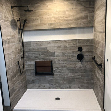
This Columbia, Missouri home’s master bathroom was a full gut remodel. Dimensions In Wood’s expert team handled everything including plumbing, electrical, tile work, cabinets, and more!
Electric, Heated Tile Floor
Starting at the bottom, this beautiful bathroom sports electrical radiant, in-floor heating beneath the wood styled non-slip tile. With the style of a hardwood and none of the drawbacks, this tile will always be warm, look beautiful, and be completely waterproof. The tile was also carried up onto the walls of the walk in shower.
Full Tile Low Profile Shower with all the comforts
A low profile Cloud Onyx shower base is very low maintenance and incredibly durable compared to plastic inserts. Running the full length of the wall is an Onyx shelf shower niche for shampoo bottles, soap and more. Inside a new shower system was installed including a shower head, hand sprayer, water controls, an in-shower safety grab bar for accessibility and a fold-down wooden bench seat.
Make-Up Cabinet
On your left upon entering this renovated bathroom a Make-Up Cabinet with seating makes getting ready easy. A full height mirror has light fixtures installed seamlessly for the best lighting possible. Finally, outlets were installed in the cabinets to hide away small appliances.
Every Master Bath needs a Dual Sink Vanity
The dual sink Onyx countertop vanity leaves plenty of space for two to get ready. The durable smooth finish is very easy to clean and will stand up to daily use without complaint. Two new faucets in black match the black hardware adorning Bridgewood factory cabinets.
Robern medicine cabinets were installed in both walls, providing additional mirrors and storage.
Contact Us Today to discuss Translating Your Master Bathroom Vision into a Reality.
 Kitchen Kraft
John Evans
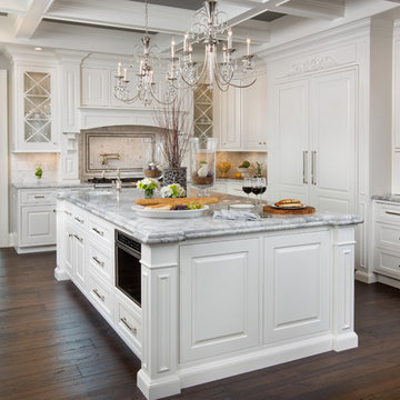
Inspiration for a huge timeless u-shaped dark wood floor kitchen remodel in Columbus with beaded inset cabinets, white cabinets, white backsplash, paneled appliances, an island, granite countertops and stone tile backsplash
Inspiration for a huge timeless u-shaped dark wood floor kitchen remodel in Columbus with beaded inset cabinets, white cabinets, white backsplash, paneled appliances, an island, granite countertops and stone tile backsplash
 SV Design
Located on the flat of Beacon Hill, this iconic building is rich in history and in detail. Constructed in 1828 as one of the first buildings in a series of row houses, it was in need of a major renovation to improve functionality and to restore as well as re-introduce charm.Originally designed by noted architect Asher Benjamin, the renovation was respectful of his early work. “What would Asher have done?” was a common refrain during design decision making, given today’s technology and tools.
Photographer: Bruce Buck
 Kristyn Harvey Interiors
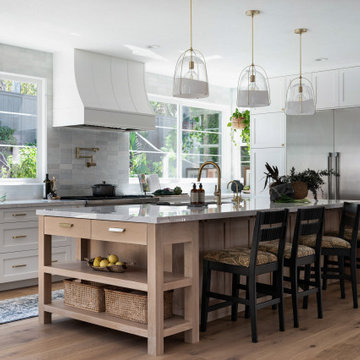
Client wanted a spacious kitchen with separate work zones so she could cook while her husband helped clean up. Kitchen island was designed to grow with the family and features seating for up to 5 people and a homework station, complete with outlets in the drawers, at the end of the island.
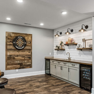
Bar was intentionally designed as a more masculine version of the kitchen. The left side houses drinkware while the right side is a coffee and tea nook. Porcelain countertop runs the entirety of the bar to provide an anxiety-free coffee making experience (for us slightly OCD people out there!). Custom built parquet dining table with easy to maintain black chairs for the couples 2 young kids.
Sponsored
Sunbury, OH

J.Holderby - Renovations
Franklin County's Leading General Contractors - 2X Best of Houzz!
 Blueribbon 3D Animation Studio
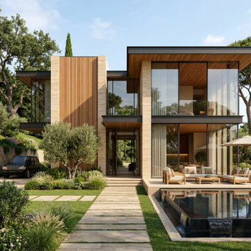
Choosing the right facade, materials, colors, landscaping, and exterior details can be challenging when you're working only from drawings.
Professional exterior 3d rendering services can help homeowners, architects, interior designers, and developers visualize the complete exterior before making important design decisions.
With realistic materials, natural daylight, landscaping, windows, doors, and surrounding elements, a 3D exterior visualization provides a clearer picture of how the finished project could come together.
Blue Ribbon 3D creates detailed architectural visuals designed to make exterior concepts easier to understand and discuss.
Blue Ribbon 3D — Helping you see the possibilities behind every exterior design.

 safe ZOnea
If you’re active on GardenWeb sharing plant photos, asking for advice, tracking seasonal progress you already understand how much detail goes into gardening. Soil pH, rainfall, emerging leaves, bloom counts, fertilizer schedules it adds up fast. But all that rich information often remains buried in posts, lists or memory. What if you could visualize that data and turn it into clear quick insights? That’s where a graph maker becomes a game-changer for your gardening workflow.
1. Why garden data belongs on a graph
On GardenWeb, you’ll find forums for everything from perennial care, vegetable gardening, patios, herbs, even cooking and craft projects. While plant lovers share observations and ask questions, many track progress manually in spreadsheets or memory. A graph maker flips that around:
Instead of a list of numbers (e.g., “Soil test: pH 6.4 in May, 6.1 in October”), you get a line graph showing the decline over time.
Instead of guessing which plant bloomed most, you see a bar chart comparing counts across plants.
Instead of manually calculating average rainfall effect, you plot scatter points of bloom count vs. rainfall.
By turning your data into visuals, you’re not just recording—you’re analysing, learning and improving. For GardenWeb users this means smarter decisions: Which fertilizer actually improves bloom count? Which shady spot recovers slower? A graph maker gives clarity.
2. What is a graph maker and how to use one
A graph maker is a web tool or software that lets you input raw data (numbers, dates, categories) and output visual charts like line graphs, bar charts, scatter plots, etc. It might allow you to import a spreadsheet, select chart type, customize colours, label axes, and export the image for your blog, forum post or personal log.
Here’s how you could apply it for gardening:
Log blooms per week for each rose plant.
Using the graph maker, choose line graph to track changes over weeks.
Label your y-axis “Number of Blooms”, x-axis “Week of Year”.
Add colour lines for each plant for easy comparison.
Export as PNG and embed it in a GardenWeb forum post: “See bloom trend for my ‘Peace’ vs ‘Knock Out’ roses”.
This isn’t just pretty-to-look-at: it makes the trend obvious, invites discussion (“Hey, your ‘Knock Out’ line dips after week 28—what changed?”) and helps you refine your routine.
3. Use these specific scenarios on GardenWeb
A. Soil pH and plant health tracking
After multiple tests you have pH values over time and bloom results. Upload both datasets into the graph maker, produce a dual-axis line graph: soil pH on one axis, bloom count on the other. Post your findings in the “Soil, Fertility & Nutrients” forum and get feedback.
B. Seasonal pest or disease appearance
Record number of aphids spotted each month and whether you used treatment. A bar chart via the graph maker can show pre- and post-treatment figures. Then ask the “Insect & Disease Control” forum for advice based on your visual data.
C. Yield comparison between varieties
You grow two zucchini varieties. You keep weekly yield in pounds. Use the graph maker for a side-by-side bar chart. Share in the “Vegetable Gardening” forum: “Which was better this year? See the chart”.
D. Rainfall vs growth rate
You log weekly rainfall and growth (in cm) of your tomato plants. Use scatter plot in graph maker. If a pattern emerges, you’re ready to post: “Is my growth plateau due to drought? Chart shows a clear correlation.”
4. Why this elevates your GardenWeb contributions
When you post with a chart made by a graph maker, you’re doing more than asking or showing off. You’re investigating. You’re analysing. You invite the community to give feedback on data, not just anecdotes. That elevates the discussion. Instead of “My plant died, any ideas?” you post “See this graph of pH drop and bloom count—what might be the limiting factor?” High-quality visuals raise your post’s value and garner more thoughtful responses.
Plus, your posts become useful references for others: someone else can say, “Cool graphic, can you share your data sheet?” You build credibility and help the forum become a learning hub—not just a Q&A board.
5. Tips for using a graph maker effectively in the GardenWeb context
Keep it simple: One chart, one insight. Don’t overcrowd.
Label clearly: Titles, axis labels, units (e.g., cm/week, mg/L, °F).
Use readable colours: Avoid faint tones that vanish on mobile.
Annotate when needed: Add notes like “Fertiliser switched week 12” or “Shade cloth added”.
Provide context in your post: Don’t leave the chart alone—write a few sentences explaining what it shows and what you’re seeking.
Embed carefully: Make sure your image displays properly in GardenWeb; check mobile view.
Share raw data: If possible link to your spreadsheet so others can replicate or comment.
Be open to feedback: The chart invites questions; embrace them.
6. Possible pitfalls and how to avoid them
Bad data = bad chart: If your measurements aren’t consistent, your graph will mislead. Use standardized data collection.
Too much complexity: Multi-axis charts, too many variables—confusing. Stick to one or two variables.
Overlooking mobile viewers: Many GardenWeb users browse via phones. Use large fonts and simple visuals.
Ignoring the narrative: Chart alone won’t answer. Explain what it means and what you need.
Outdated charts: If you update your data annually, keep your visuals current or label them clearly as “2024 data”.
7. Final thoughts
On GardenWeb you’ll find a vibrant community of gardeners, DIYers, cooks and design lovers.Using a graph maker for your posts and progress turns your experience from casual hobby-logging into smart data-driven gardening. You’ll not only learn more—your peers will learn more, too.
So next time you log your plant growth, record your yield, test your soil or track pests—don’t just note it. Plot it. Use a graph maker. Share it in the forum. Let your garden tell the story, and let the community help you write the next chapter.
 Plain & Posh
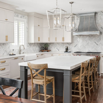
This large space did not function well for this family of 6. The cabinetry they had did not go to the ceiling and offered very poor storage options. The island that existed was tiny in comparrison to the space.
By taking the cabinets to the ceiling, enlarging the island and adding large pantry's we were able to achieve the storage needed. Then the fun began, all of the decorative details that make this space so stunning. Beautiful tile for the backsplash and a custom metal hood. Lighting and hardware to complement the hood.
Then, the vintage runner and natural wood elements to make the space feel more homey.
19