
Search results for "Posting updates" in Home Design Ideas

 Watts Builders
Large elegant single-wall dark wood floor eat-in kitchen photo in Charleston with recessed-panel cabinets, white cabinets, marble countertops and two islands

 Chattanooga eXteriors
Project Details: We completely updated the look of this home with help from James Hardie siding and Renewal by Andersen windows. Here's a list of the products and colors used.
- Iron Gray JH Lap Siding
- Boothbay Blue JH Staggered Shake
- Light Mist JH Board & Batten
- Arctic White JH Trim
- Simulated Double-Hung Farmhouse Grilles (RbA)
- Double-Hung Farmhouse Grilles (RbA)
- Front Door Color: Behr paint in the color, Script Ink

 Reiko Feng Shui Design
Staircase with wooden stair treads.
Photo by: Yorgos Efthymiadis
Example of a beach style staircase design in New York
Example of a beach style staircase design in New York
Find the right local pro for your project

 KB Lueck Building Consultants, LLC.
The addition of a new covered front porch really expands the front of this 1950's home... a newly redesigned and constructed cover entry changes this home's look and feel. We were able to update the exterior finishes at the same time, replacing the old windows with new dark framed more energy efficient windows. The exterior trim is now all pvc; this lowers maintenance and upkeep. New fiber cement lap and shake siding improve weather durability. Proper overhangs give an added architectural details while improving rainwater control and weather protection. Square tapered columns accent the stained, craftsmen style, douglas fir wood front door. The entire porch has some type of stone - Eldorado stone veneer faces the foundation and porch with natural bluestone on the porch steps and porch floor.

 Tammara Stroud Design
Nestled in the heart of the Laurelhurst neighborhood of Seattle, this charming home has been completed updated. Our clients desired a design that is fresh, understated and family friendly. The original kitchen was crowded and disconnected from other parts of the home. Our focus was to open up the spaces while maintaining the home’s integratory. The kitchen is now the center of the home with a large island for gathering. We selected classic finishes with modern touches throughout each space, thus providing a fresh look. Simple and smart furnishings were selected. We layered texture, color and scale with textiles and art to offer clean, uncluttered design lines that our clients wanted.


 River Valley Landscapes
This project presented unique opportunities that are not often found in residential landscaping. The homeowners were not only restoring their 1840's era farmhouse, a piece of their family’s history, but also enlarging and updating the home for modern living. The landscape designers continued this idea by creating a space that is a modern day interpretation of an 1840s era farm rather then a strict recreation. The resulting design combines elements of farm living from that time, as well as acknowledging the property’s history as a horse farm, with staples of 21st century landscapes such as space for outdoor living, lighting, and newer plant varieties.
Guests approach from the main driveway which winds through the property and ends at the main barn. There is secondary gated driveway just for the homeowners. Connected to this main driveway is a narrower gravel lane which leads directly to the residence. The lane passes near fruit trees planted in broken rows to give the illusion that they are the remains of an orchard that once existed on the site. The lane widens at the entrance to the gardens where there is a hitching post built into the fence that surrounds the gardens and a watering trough. The widened section is intended as a place to park a golf cart or, in a nod to the home’s past, tie up horses before entering. The gravel lane passes between two stone pillars and then ends at a square gravel court edged in cobblestones. The gravel court transitions into a wide flagstone walk bordered with yew hedges and lavender leading to the front door.
Directly to the right, upon entering the gravel court, is located a gravel and cobblestone edged walk leading to a secondary entrance into the residence. The walk is gated where it connects with the gravel court to close it off so as not to confuse visitors and guests to the main residence and to emphasize the primary entrance. An area for a bench is provided along this walk to encourage stopping to view and enjoy the gardens.
On either side of the front door, gravel and cobblestone walks branch off into the garden spaces. The one on the right leads to a flagstone with cobblestone border patio space. Since the home has no designated backyard like most modern suburban homes the outdoor living space had to be placed in what would traditionally be thought of as the front of the house. The patio is separated from the entrance walk by the yew hedge and further enclosed by three Amelanchiers and a variety of plantings including modern cultivars of old fashioned plants such as Itea and Hydrangea. A third entrance, the original front door to the 1840’s era section, connects to the patio from the home’s kitchen, making the space ideal for outdoor dining.
The gravel and cobblestone walk branching off to the left of the front door leads to the vegetable and perennial gardens. The idea for the vegetable garden was to recreate the tradition of a kitchen garden which would have been planted close to the residence for easy access. The vegetable garden is surrounded by mixed perennial beds along the inside of the wood picket fence which surrounds the entire garden space. Another area designated for a bench is provided here to encourage stopping and viewing. The home’s original smokehouse, completely restored and used as a garden shed, provides a strong architectural focal point to the vegetable garden. Behind the smokehouse is planted lilacs and other plants to give mass and balance to the corner and help screen the garden from the neighboring subdivision. At the rear corner of the garden a wood arbor was constructed to provide a structure on which to grow grapes or other vines should the homeowners choose to.
The landscape and gardens for this restored farmhouse and property are a thoughtfully designed and planned recreation of a historic landscape reinterpreted for modern living. The idea was to give a sense of timelessness when walking through the gardens as if they had been there for years but had possibly been updated and rejuvenated as lifestyles changed. The attention to materials and craftsmanship blend seamlessly with the residence and insure the gardens and landscape remain an integral part of the property. The farm has been in the homeowner’s family for many years and they are thrilled at the results and happy to see respect given to the home’s history and to its meticulous restoration.


 CCR Renovations
Our Whitby based clients chose CCR Renovations to take on the mammoth task of renovating their entire main floor including a new kitchen, with reconfigured floor plan, by the removal of a load bearing wall.
The benefits of open floor plans are endless: an abundance of natural light, the illusion of more space, and even the convenience that comes along with entertaining.
We also updated their main floor powder room, replaced flooring and trim throughout the main and upper level as well as capping, painting and staining their staircase, along with new handrail, balusters and newel posts.
Our clients chose a neutral colour palette throughout creating a cohesive look but maintaining ‘zones’ on the main level.
Custom, wrought iron air return and vent covers, a black Blanco sink and matching faucet/soap dispenser made the spaces ‘pop’.
If you would like to create a similar space in your own home, please call Matt on (289) 675 7366 to set up an onsite consultation.

 KOENIG Building + Restoration
KOENIG Building
Inspiration for a timeless kitchen remodel in Kansas City
Inspiration for a timeless kitchen remodel in Kansas City

 Wilson Kelsey Design
This formal traditional dining room contains a curated collection of the family's treasured antiques. Pieces of the house's original first period rough wood framing are intentionally left visible, highlighting the home's long history.
WKD’s experience in historic preservation and antique curation restored this gentleman’s farm into a casual, comfortable, livable home for the next chapter in this couple’s lives.
The project included a new family entrance and mud room, new powder room, and opening up some of the rooms for better circulation. While WKD curated the client’s existing collection of art and antiques, refurbishing where necessary, new furnishings were also added to give the home a new lease on life.
Working with older homes, and historic homes, is one of Wilson Kelsey Design’s specialties.
This project was featured on the cover of Design New England's September/October 2013 issue. Read the full article at: http://wilsonkelseydesign.com/wp-content/uploads/2014/12/Heritage-Restored1.pdf
It was also featured in the Sept. issue of Old House Journal, 2016 - article is at http://wilsonkelseydesign.com/wp-content/uploads/2016/08/2016-09-OHJ.pdf
Photo by Michael Lee

 King's Court Builders, Inc.
While your eye is drawn to the gracefully curving staircase of the foyer, you can’t help but notice the expansive wall of arched top windows in the family room.

 Robin's Nest Interiors
Updated Spec Home: Foyer and Great Room
In our last post, we introduced you to my mom and sister’s Updated Spec Home; the Foyer and Great Room will be featured in this post.
Foyer
As you enter their home, to the right is a hall closet and a french door which leads to the Basement. To the left is a long wall which was perfect for an extra long console table in a rustic finish that served as a sofa table in their previous home. I love repositioning furniture, and by using this table in the entry, it makes it feel new.
Additionally, we placed a vibrant piece of art previously used in my sister’s Bedroom above the table. This piece not only sets the tone for our color palette, it also makes the kind of statement you want in your Foyer – Wow! We added accessories and an unique lamp to complete the space.
Great Room
In the Great Room which is open to the Foyer, we installed our inspiration artwork in the place of honor over the mantel. Since the piece was vertical, it did not take up enough space. I do not like a “fussy” mantel with lots of accessories so we found these two vases in a silver leaf finish. They were perfect because they were large enough, but not too deep. Accessorizing mantels can be tricky because the majority of them are not deep. We went to Jan’s Floral Design to add vibrant color and interesting textures to the vases.
The original mantel was too small and uninspired. Therefore, we had our contractor Brad Anderson built a new one based on a photo of a mantel we liked. The new mantel has lots of great detail and is the appropriate proportion for the fireplace. We replaced beige 12×12 ceramic tiles with gorgeous large pieces of smoked carrara marble for a striking fireplace surround. Check out this other mantel that we updated.
For furniture, we purchased a shorter sofa in a gray tweed fabric. Typically, two throw pillows come with a sofa.We added a fun fringe to the pillows that came with the sofa. I recommend ordering pillows that match your sofa fabric and layering with custom pillows that support your color palette. We added a patterned custom pillow and a striped throw.
Next, we got a small scale recliner in a yummy gray leather for my mom and a chair and ottoman in a small scale mint and gray geometric pattern for my sister. We added an accent chair in a fun small scale stripe to fill a corner and add additional seating – which is always a good thing.
Remember that this was a Spec Home so there were no built-ins. As a result, we needed a media cabinet for the television and some bookcases to display my mom’s decorative box collection and my sister’s collection of blown colored glass. This set from Ballard Designs fit the bill perfectly. The back is open and airy with nice detail. The wood finish also adds a richness to the space.
My mom needed a space for her computer, and this small writing desk fit the space perfectly.
Finally, for finishing touches, we added a patterned rug, cornice boards in a mint leaf fabric, and great lamps for ambient lighting. These two rooms are stunning, vibrant and livable. Can’t wait to show you more in our next post! Enjoy!
Photo by Tim Furlong Jr.

 Arcadea Architecture
This remodel updates a typical 1960’s design that was dark and enclosed by raising windows and doors, removing low eaves and interior partitions that blocked views to the outside. The ceiling is sandblasted, interior dividers are taken out, and bathrooms are enlarged and updated.
Sponsored
Columbus, OH
Free consultation for landscape design!

Peabody Landscape Group
Columbus' Reliable Landscape Design & Contracting

 Serra Design Inc
This poor dining room was suffering from post traumatic stress syndrome, before it received this update. You are welcomed to enter the space by these 2 very early 16th century wooden reliefs. The empty niches received crystal lucite shelving and these chinese figures (part of the clients personal collection) were added. The walls were brightened over a dreary faux sandy venetian plaster job. The iron chandelier was removed and this Murano Glass Chandelier was imported from Justine's of Paris, France. Previously there was an inserted commercial rug around the jerusalem tile floor, this was removed and this beautiful antique was laid. The antique Venetian mirror hangs opposite two 18th century Italianate commodes. The drapes are dual layered incorporated to create an elegant golden shimmer. The fabric for the chairs is from Bergamo. The China hutch was custom finished to match the 18th century commodes.

 Native Edge Landscape
These modest homeowners were looking for drainage solutions, low maintenance plantings, and an entertainment space they could enjoy outside. Mowing the grass had been a pain in the past, so with this design we decided to remove it entirely. Instead, more native grasses were utilized to take in water and reduce erosion. A new fence modernized and updated the space and allowed the interior of the backyard to be leveled providing more opportunities for design elements like a floating bench and custom built fire pit.

 Advance Design Studio, Ltd.
This 1930's Barrington Hills farmhouse was in need of some TLC when it was purchased by this southern family of five who planned to make it their new home. The renovation taken on by Advance Design Studio's designer Scott Christensen and master carpenter Justin Davis included a custom porch, custom built in cabinetry in the living room and children's bedrooms, 2 children's on-suite baths, a guest powder room, a fabulous new master bath with custom closet and makeup area, a new upstairs laundry room, a workout basement, a mud room, new flooring and custom wainscot stairs with planked walls and ceilings throughout the home.
The home's original mechanicals were in dire need of updating, so HVAC, plumbing and electrical were all replaced with newer materials and equipment. A dramatic change to the exterior took place with the addition of a quaint standing seam metal roofed farmhouse porch perfect for sipping lemonade on a lazy hot summer day.
In addition to the changes to the home, a guest house on the property underwent a major transformation as well. Newly outfitted with updated gas and electric, a new stacking washer/dryer space was created along with an updated bath complete with a glass enclosed shower, something the bath did not previously have. A beautiful kitchenette with ample cabinetry space, refrigeration and a sink was transformed as well to provide all the comforts of home for guests visiting at the classic cottage retreat.
The biggest design challenge was to keep in line with the charm the old home possessed, all the while giving the family all the convenience and efficiency of modern functioning amenities. One of the most interesting uses of material was the porcelain "wood-looking" tile used in all the baths and most of the home's common areas. All the efficiency of porcelain tile, with the nostalgic look and feel of worn and weathered hardwood floors. The home’s casual entry has an 8" rustic antique barn wood look porcelain tile in a rich brown to create a warm and welcoming first impression.
Painted distressed cabinetry in muted shades of gray/green was used in the powder room to bring out the rustic feel of the space which was accentuated with wood planked walls and ceilings. Fresh white painted shaker cabinetry was used throughout the rest of the rooms, accentuated by bright chrome fixtures and muted pastel tones to create a calm and relaxing feeling throughout the home.
Custom cabinetry was designed and built by Advance Design specifically for a large 70” TV in the living room, for each of the children’s bedroom’s built in storage, custom closets, and book shelves, and for a mudroom fit with custom niches for each family member by name.
The ample master bath was fitted with double vanity areas in white. A generous shower with a bench features classic white subway tiles and light blue/green glass accents, as well as a large free standing soaking tub nestled under a window with double sconces to dim while relaxing in a luxurious bath. A custom classic white bookcase for plush towels greets you as you enter the sanctuary bath.

 North Shore Kitchen & Bath
The original kitchen had wood cabinets which made the space seem dark and small, as well as not enough storage. It was in need of an update and brightening up. Working closely with the client we were able to come up with creative storage solutions to take advantage of every nook and cranny to maximize storage and ensure there was space for everything. To highlight the beautiful view form the window, we added glass cabinets on either side, as well as in the hutch cabinet to draw the eye around the room. By using white cabinetry, we were able to make the space seem larger within the same footprint of the kitchen. A custom wood hood adds an additional focal point. The beautiful soapstone countertops tie the whole space together and work with the look of the traditional home. The custom wood posts on the end of the peninsula add extra detail to the cabinetry and an extra detail to the countertop. The addition of wood floors ties the space to the rest of the home.
Sponsored
Columbus, OH

Structural Remodeling
Franklin County's Heavy Timber Specialists | Best of Houzz 2020!
 Plain & Posh
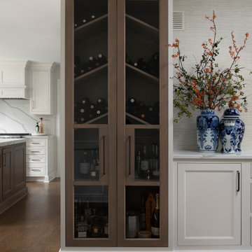
Thse clients came to me for a kitchen refresh. Keeping the existing floor plan but updating as much as possible. After explaining my thoughts, they chose to go with a much larger project. The wall to the garage wash pushed bach 12" to allow for the island to happen. This almost couldn't happen as there is a support post in the garage we had to keep. I designed the last pantry area as on 10" deep, allowing us to conceal that behind the cabinets. Then, we opend up the wall to the dining room to make the rooms one large space. The wall to the family room was also openend up, leaving the half wall to allow for the kitchen eating area. They wanted to incorporate a bar area, without it feeling like a "bar" The fabulous tall custom unit houses their wine collection and then half of the dining room buffet area holds glassware and other bar items. I helped the clients with all of the design choices.We all wanted to keep the space classic, war, functional and with mixed materials. I chose to use the same countertop material for the backsplash, to keep the space feeling as large as possible.
 Robin's Nest Interiors
Updated Spec Home: Foyer and Great Room
In our last post, we introduced you to my mom and sister’s Updated Spec Home; the Foyer and Great Room will be featured in this post.
Foyer
As you enter their home, to the right is a hall closet and a french door which leads to the Basement. To the left is a long wall which was perfect for an extra long console table in a rustic finish that served as a sofa table in their previous home. I love repositioning furniture, and by using this table in the entry, it makes it feel new.
Additionally, we placed a vibrant piece of art previously used in my sister’s Bedroom above the table. This piece not only sets the tone for our color palette, it also makes the kind of statement you want in your Foyer – Wow! We added accessories and an unique lamp to complete the space.
Great Room
In the Great Room which is open to the Foyer, we installed our inspiration artwork in the place of honor over the mantel. Since the piece was vertical, it did not take up enough space. I do not like a “fussy” mantel with lots of accessories so we found these two vases in a silver leaf finish. They were perfect because they were large enough, but not too deep. Accessorizing mantels can be tricky because the majority of them are not deep. We went to Jan’s Floral Design to add vibrant color and interesting textures to the vases.
The original mantel was too small and uninspired. Therefore, we had our contractor Brad Anderson built a new one based on a photo of a mantel we liked. The new mantel has lots of great detail and is the appropriate proportion for the fireplace. We replaced beige 12×12 ceramic tiles with gorgeous large pieces of smoked carrara marble for a striking fireplace surround. Check out this other mantel that we updated.
For furniture, we purchased a shorter sofa in a gray tweed fabric. Typically, two throw pillows come with a sofa.We added a fun fringe to the pillows that came with the sofa. I recommend ordering pillows that match your sofa fabric and layering with custom pillows that support your color palette. We added a patterned custom pillow and a striped throw.
Next, we got a small scale recliner in a yummy gray leather for my mom and a chair and ottoman in a small scale mint and gray geometric pattern for my sister. We added an accent chair in a fun small scale stripe to fill a corner and add additional seating – which is always a good thing.
Remember that this was a Spec Home so there were no built-ins. As a result, we needed a media cabinet for the television and some bookcases to display my mom’s decorative box collection and my sister’s collection of blown colored glass. This set from Ballard Designs fit the bill perfectly. The back is open and airy with nice detail. The wood finish also adds a richness to the space.
My mom needed a space for her computer, and this small writing desk fit the space perfectly.
Finally, for finishing touches, we added a patterned rug, cornice boards in a mint leaf fabric, and great lamps for ambient lighting. These two rooms are stunning, vibrant and livable. Can’t wait to show you more in our next post! Enjoy!

 Tami Smight Interiors
A neutral color palette is visually interesting when mixing in textures and natural materials. The wood stairs compliment the travertine floors on main level. The wood handrail is balanced by the iron posts.
102