
Search results for "Pre existing challenges" in Home Design Ideas
 Donald Lococo Architects
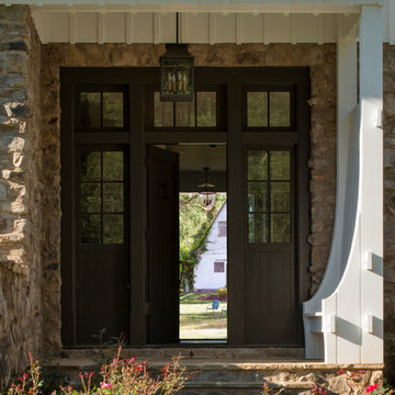
Located on farmland in McLean, Virginia, the American Farmhouse balances the expected comforts of a new home with the bucolic beauty of an old farmhouse. The final site plan still has evidence showing parallel courses of the barn’s destiny. The house mass is broken and lowered so that the home can remain secondary to the monolithic barn structure. Earthy and elemental materials are selected for the home that reference the barn without directly mimicking it. Wooden members found inside the barn and from other barns bridge ceilings and are used in floors along with rustic slate adding to a sense of simplicity to the farmhouse design.
The age and patina of the barn is reflected in the house’s textural use of board and batten and field stone layered similar to stone foundations. The original development plan was to demolish the existing barn and construct three suburban homes. Part of an endangered breed, as one of the few remaining barns in the area, it was originally viewed as a challenge in a luxury home construction with several difficulties posed to the impending project: it would be expensive to renovate, vulnerable to demolition, and threatened by urban sprawl. However, instead of trying to alter or destroy the barn, the structure was fully embraced into the traditional architecture project as a centerpiece and was used as the inspiration for the home. The new house was sited parallel to the barn so that views to the barn gable were accessible.
 Yates Desygn
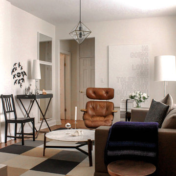
Set at pre-war, mid-rise apartment building amongst the hustle and bustle of New York City's Hell's Kitchen, the client's main objective was to construct a sanctuary and quiet space while incorporating their love of mid-century modern furniture.
This perfect challenge for Yates Desygn allowed us to add life and visual stimulation to a limited footprint.
In this space, we incorporated our client's existing furniture blending in new pieces to create a peaceful haven in the fast-paced city they love.
 Yates Desygn
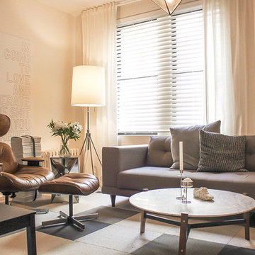
Set at pre-war, mid-rise apartment building amongst the hustle and bustle of New York City's Hell's Kitchen, the client's main objective was to construct a sanctuary and quiet space while incorporating their love of mid-century modern furniture.
This perfect challenge for Yates Desygn allowed us to add life and visual stimulation to a limited footprint.
In this space, we incorporated our client's existing furniture blending in new pieces to create a peaceful haven in the fast-paced city they love.
Find the right local pro for your project
 Yates Desygn
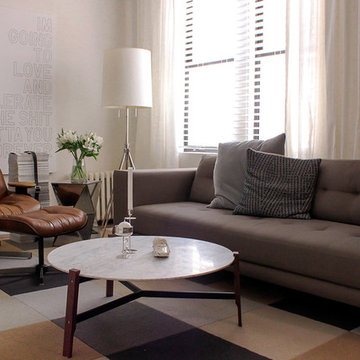
Set at pre-war, mid-rise apartment building amongst the hustle and bustle of New York City's Hell's Kitchen, the client's main objective was to construct a sanctuary and quiet space while incorporating their love of mid-century modern furniture.
This perfect challenge for Yates Desygn allowed us to add life and visual stimulation to a limited footprint.
In this space, we incorporated our client's existing furniture blending in new pieces to create a peaceful haven in the fast-paced city they love.
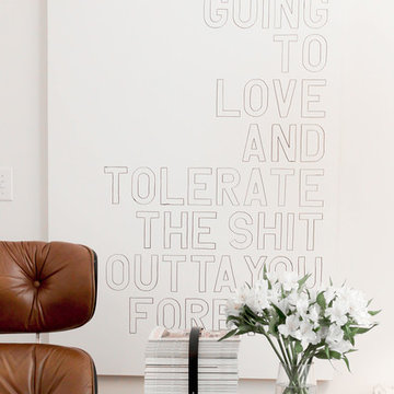 Yates Desygn
Set at pre-war, mid-rise apartment building amongst the hustle and bustle of New York City's Hell's Kitchen, the client's main objective was to construct a sanctuary and quiet space while incorporating their love of mid-century modern furniture.
This perfect challenge for Yates Desygn allowed us to add life and visual stimulation to a limited footprint.
In this space, we incorporated our client's existing furniture blending in new pieces to create a peaceful haven in the fast-paced city they love.
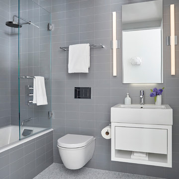
 Darci Hether
We completely gut renovated this pre-war Tribeca apartment but kept some of it's charm and history in tact! The building, which was built in the early 1900's, was home to different executive office operations and the original hallways had a beautiful and intricate mosaic floor pattern. To that point we decided to preserve the existing mosaic flooring and incorporate it into the new design. The open concept kitchen with cantilevered dining table top keeps the area feeling light and bright, casual and not stuffy. Additionally, the custom designed swing arm pendant light helps marry the dining table top area to that of the island.
 Home & Office Cabinetry of Delaware Inc.
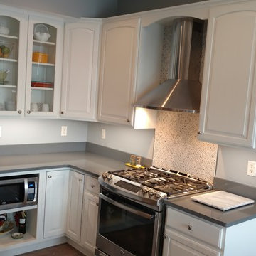
The microwave was moved from above the range to a shelf, making room for the modern stainless steel hood above the stove.
Inspiration for a mid-sized transitional u-shaped kitchen remodel with a double-bowl sink, raised-panel cabinets, white cabinets, quartz countertops, gray backsplash, ceramic backsplash, stainless steel appliances and an island
Inspiration for a mid-sized transitional u-shaped kitchen remodel with a double-bowl sink, raised-panel cabinets, white cabinets, quartz countertops, gray backsplash, ceramic backsplash, stainless steel appliances and an island

Sponsored
Columbus, OH

Hope Restoration & General Contracting
Columbus Design-Build, Kitchen & Bath Remodeling, Historic Renovations
 TKS Design Group
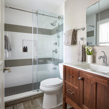
Our clients had been in their home since the early 1980’s and decided it was time for some updates. We took on the kitchen, two bathrooms and a powder room.
This petite master bathroom primarily had storage and space planning challenges. Since the wife uses a larger bath down the hall, this bath is primarily the husband’s domain and was designed with his needs in mind. We started out by converting an existing alcove tub to a new shower since the tub was never used. The custom shower base and decorative tile are now visible through the glass shower door and help to visually elongate the small room. A Kohler tailored vanity provides as much storage as possible in a small space, along with a small wall niche and large medicine cabinet to supplement. “Wood” plank tile, specialty wall covering and the darker vanity and glass accents give the room a more masculine feel as was desired. Floor heating and 1 piece ceramic vanity top add a bit of luxury to this updated modern feeling space.
Designed by: Susan Klimala, CKD, CBD
Photography by: Michael Alan Kaskel
For more information on kitchen and bath design ideas go to: www.kitchenstudio-ge.com
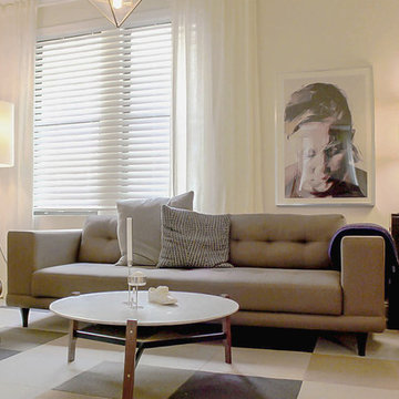 Yates Desygn
Set at pre-war, mid-rise apartment building amongst the hustle and bustle of New York City's Hell's Kitchen, the client's main objective was to construct a sanctuary and quiet space while incorporating their love of mid-century modern furniture.
This perfect challenge for Yates Desygn allowed us to add life and visual stimulation to a limited footprint.
In this space, we incorporated our client's existing furniture blending in new pieces to create a peaceful haven in the fast-paced city they love.
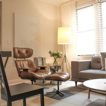 Yates Desygn
Set at pre-war, mid-rise apartment building amongst the hustle and bustle of New York City's Hell's Kitchen, the client's main objective was to construct a sanctuary and quiet space while incorporating their love of mid-century modern furniture.
This perfect challenge for Yates Desygn allowed us to add life and visual stimulation to a limited footprint.
In this space, we incorporated our client's existing furniture blending in new pieces to create a peaceful haven in the fast-paced city they love.
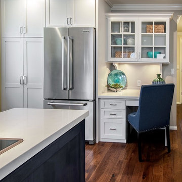
 Zieba Builders, Inc.
Our clients loved the location of their duplex home with its peak-a-boo ocean view, but their existing kitchen was not suited for their growing family. They wanted a kitchen with a coastal vibe, plenty of storage space, and an eat-in area.
We started by bringing the far wall into the kitchen space to accommodate a large panty and communication center for the family. Doing this allowed us to move the refrigerator out of the main traffic area and doubled the amount of storage space. Several new windows were added to bring in natural light. A half wall was moved to allow more countertop area and open up sight lines. The previously awkwardly shaped island was slimmed down to create better flow.
There were a few venting challenges to overcome; gas lines and plumbing had to be re-routed without disturbing the unit below. To open up sight lines, soffits were eliminated which allowed the extension of cabinets to the ceiling. To stay within the homeowner’s budget, we match existing scraped flooring by lacing in and repairing patches.
The old dining area was too small for table, so we designed and built a custom banquette to maximize the space and take advantage of the outdoor views. The overall space works for family meals as well as entertaining.
A light summer palette was used to reflect the shades of the sand, sea and sky. Even though the new kitchen is actually smaller than the original space, its now far more functional and open.
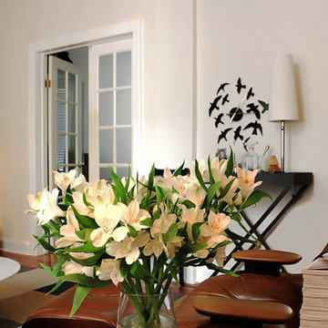 Yates Desygn
Set at pre-war, mid-rise apartment building amongst the hustle and bustle of New York City's Hell's Kitchen, the client's main objective was to construct a sanctuary and quiet space while incorporating their love of mid-century modern furniture.
This perfect challenge for Yates Desygn allowed us to add life and visual stimulation to a limited footprint.
In this space, we incorporated our client's existing furniture blending in new pieces to create a peaceful haven in the fast-paced city they love.
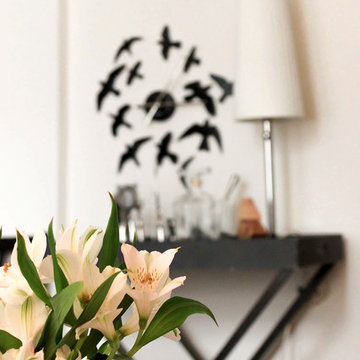 Yates Desygn
Set at pre-war, mid-rise apartment building amongst the hustle and bustle of New York City's Hell's Kitchen, the client's main objective was to construct a sanctuary and quiet space while incorporating their love of mid-century modern furniture.
This perfect challenge for Yates Desygn allowed us to add life and visual stimulation to a limited footprint.
In this space, we incorporated our client's existing furniture blending in new pieces to create a peaceful haven in the fast-paced city they love.
Sponsored
Columbus, OH
Hope Restoration & General Contracting
Columbus Design-Build, Kitchen & Bath Remodeling, Historic Renovations
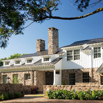 Donald Lococo Architects
Located on farmland in McLean, Virginia, the American Farmhouse balances the expected comforts of a new home with the bucolic beauty of an old farmhouse. The final site plan still has evidence showing parallel courses of the barn’s destiny. The house mass is broken and lowered so that the home can remain secondary to the monolithic barn structure. Earthy and elemental materials are selected for the home that reference the barn without directly mimicking it. Wooden members found inside the barn and from other barns bridge ceilings and are used in floors along with rustic slate adding to a sense of simplicity to the farmhouse design.
The age and patina of the barn is reflected in the house’s textural use of board and batten and field stone layered similar to stone foundations. The original development plan was to demolish the existing barn and construct three suburban homes. Part of an endangered breed, as one of the few remaining barns in the area, it was originally viewed as a challenge in a luxury home construction with several difficulties posed to the impending project: it would be expensive to renovate, vulnerable to demolition, and threatened by urban sprawl. However, instead of trying to alter or destroy the barn, the structure was fully embraced into the traditional architecture project as a centerpiece and was used as the inspiration for the home. The new house was sited parallel to the barn so that views to the barn gable were accessible.
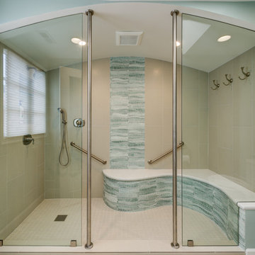
 Gilmans Kitchens and Baths
The client's purchased an 80's condo unit of the 4th floor.
The main goal(s): To create a space suitable for aging-in-place and to successfully incorporate pre-existing furniture and decor from the client's previous home.
The challenges:
- To be able to fully incorporate existing furniture into a smaller space, as the client's had down-sized by moving into a condo unit.
- Creating and providing a wide range of accessibility and universal design to accommodate certain health issues of one of the clients.
Inspiration: Existing arches throughout the home.
Treve Johnson Photography
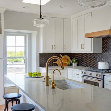 TKS Design Group
Free ebook, Creating the Ideal Kitchen. DOWNLOAD NOW
Our clients came to us looking to do some updates to their new condo unit primarily in the kitchen and living room. The couple has a lifelong love of Arts and Crafts and Modernism, and are the co-founders of PrairieMod, an online retailer that offers timeless modern lifestyle through American made, handcrafted, and exclusively designed products. So, having such a design savvy client was super exciting for us, especially since the couple had many unique pieces of pottery and furniture to provide inspiration for the design.
The condo is a large, sunny top floor unit, with a large open feel. The existing kitchen was a peninsula which housed the sink, and they wanted to change that out to an island, relocating the new sink there as well. This can sometimes be tricky with all the plumbing for the building potentially running up through one stack. After consulting with our contractor team, it was determined that our plan would likely work and after confirmation at demo, we pushed on.
The new kitchen is a simple L-shaped space, featuring several storage devices for trash, trays dividers and roll out shelving. To keep the budget in check, we used semi-custom cabinetry, but added custom details including a shiplap hood with white oak detail that plays off the oak “X” endcaps at the island, as well as some of the couple’s existing white oak furniture. We also mixed metals with gold hardware and plumbing and matte black lighting that plays well with the unique black herringbone backsplash and metal barstools. New weathered oak flooring throughout the unit provides a nice soft backdrop for all the updates. We wanted to take the cabinets to the ceiling to obtain as much storage as possible, but an angled soffit on two of the walls provided a bit of a challenge. We asked our carpenter to field modify a few of the wall cabinets where necessary and now the space is truly custom.
Part of the project also included a new fireplace design including a custom mantle that houses a built-in sound bar and a Panasonic Frame TV, that doubles as hanging artwork when not in use. The TV is mounted flush to the wall, and there are different finishes for the frame available. The TV can display works of art or family photos while not in use. We repeated the black herringbone tile for the fireplace surround here and installed bookshelves on either side for storage and media components.
Designed by: Susan Klimala, CKD, CBD
Photography by: Michael Alan Kaskel
For more information on kitchen and bath design ideas go to: www.kitchenstudio-ge.com
 Stairworks
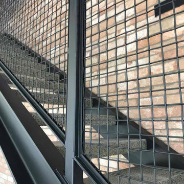
These Auckland homeowners wanted an industrial style look for their interior home design. So when it came to building the staircase, handrail and balustrades, we knew the exposed steel in a matte black was going to be the right look for them.
Due to the double stringers and concrete treads, this style of staircase is extremely solid and has zero movement, massively reducing noise.
Our biggest challenge on this project was that the double stringer staircase was designed with concrete treads that needed to be colour matched to the pre-existing floor.

Sponsored
Columbus, OH
Hope Restoration & General Contracting
Columbus Design-Build, Kitchen & Bath Remodeling, Historic Renovations
 Renovisions
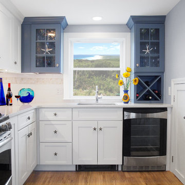
To create a unique kitchen, we take inspiration from the personality of our clients; it’s a collaborative effort to develop the exact look and feel that best suits their lifestyles.
The challenge of this kitchen was to re-build the existing kitchen and adjoining full bath, creating a much better flow with plenty of storage for this active family (as they often entertain seaside).
The two-toned cabinetry in both white and laguna blue reflected a true beach-feel adorned with a terrific choice of starfish and shell shaped hardware to draw attention to this creative and beautifully transformed seaside kitchen.
We remind our clients that in order to be unique, do something unique! And this is nicely demonstrated in both the layout, color scheme and backsplash design details. Our client selected several hand painted decorative ocean creatures for the backsplash, drawing from colors in the room, and this created a truly unique conversation piece!
A glint of sparkle from the white quartz countertops brings you closer to the beach in this impressive oceanfront home.
From flooring to ceiling, we created a picture perfect beautiful beach house kitchen that is not only functional but provides a relaxed and inviting feel for these seaside owners.
 Liz Schupanitz Designs
A PLACE TO GATHER
Location: Eagan, MN, USA
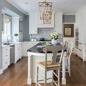
This family of five wanted an inviting space to gather with family and friends. Mom, the primary cook, wanted a large island with more organized storage – everything in its place – and a crisp white kitchen with the character of an older home.
Challenges:
Design an island that could accommodate this family of five for casual weeknight dinners.
Create more usable storage within the existing kitchen footprint.
Design a better transition between the upper cabinets on the 8-foot sink wall and the adjoining 9-foot cooktop wall.
Make room for more counter space around the cooktop. It was poorly lit, cluttered with small appliances and confined by the tall oven cabinet.
Solutions:
A large island, that seats 5 comfortably, replaced the small island and kitchen table. This allowed for more storage including cookbook shelves, a heavy-duty roll out shelf for the mixer, a 2-bin recycling center and a bread drawer.
Tall pantries with decorative grilles were placed between the kitchen and family room. These created ample storage and helped define each room, making each one feel larger, yet more intimate.
A space intentionally separates the upper cabinets on the sink wall from those on the cooktop wall. This created symmetry on the sink wall and made room for an appliance garage, which keeps the countertops uncluttered.
Moving the double ovens to the former pantry location made way for more usable counter space around the cooktop and a dramatic focal point with the hood, cabinets and marble backsplash.
Special Features:
Custom designed corbels and island legs lend character.
Gilt open lanterns, antiqued nickel grilles on the pantries, and the soft linen shade at the kitchen sink add personality and charm.
The unique bronze hardware with a living finish creates the patina of an older home.
A walnut island countertop adds the warmth and feel of a kitchen table.
This homeowner truly understood the idea of living with the patina of marble. Her grandmother’s marble-topped antique table inspired the Carrara countertops.
The result is a highly organized kitchen with a light, open feel that invites you to stay a while.
Liz Schupanitz Designs
Photographed by: Andrea Rugg
 Kimberlee Marie Interiors
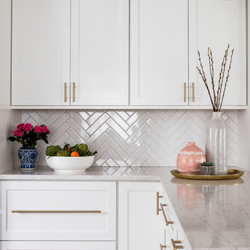
When my clients purchased this charming 1940's home in the Seattle neighborhood of Wedgwood, they were amazed by how intact the original kitchen was. It was like a perfect time capsule. The color palette was avocado green and buttercream yellow. The highlights were an original retro built-in banquette and vintage oven! The challenge we faced (besides the awesome but dated finishes) was the closed floor plan typical in this era of homes and the lack of storage. So, we opened the kitchen to the adjacent dining and living room, bringing it up to speed with modern-day living. In opening it up, we also walled off a doorway that went from the kitchen to the hallway, but it was completely unnecessary and allowed us to gain an entire wall of cabinets that didn't exist previously.
For the finishes, we kept it classic with mostly gray and white but brought in a little flare and interest with the herringbone backsplash and brushed brass finishes because who doesn't love a little gold? Also, we added color with the finishing details like the rug and countertop decor because those things are a great way to add interest and warmth to a space and can be easily changed when it's time for a fresh new look.
3