
Search results for "Pre existing challenges" in Home Design Ideas
 TKS Design Group
Download our free ebook, Creating the Ideal Kitchen. DOWNLOAD NOW
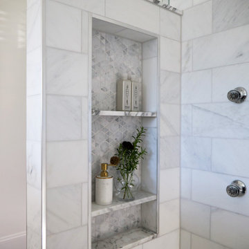
A tired primary bathroom, with varying ceiling heights and a beige-on-beige color scheme, was screaming for love. Squaring the room and adding natural materials erased the memory of the lack luster space and converted it to a bright and welcoming spa oasis. The home was a new build in 2005 and it looked like all the builder’s material choices remained. The client was clear on their design direction but were challenged by the differing ceiling heights and were looking to hire a design-build firm that could resolve that issue.
This local Glen Ellyn couple found us on Instagram (@kitchenstudioge, follow us ?). They loved our designs and felt like we fit their style. They requested a full primary bath renovation to include a large shower, soaking tub, double vanity with storage options, and heated floors. The wife also really wanted a separate make-up vanity. The biggest challenge presented to us was to architecturally marry the various ceiling heights and deliver a streamlined design.
The existing layout worked well for the couple, so we kept everything in place, except we enlarged the shower and replaced the built-in tub with a lovely free-standing model. We also added a sitting make-up vanity. We were able to eliminate the awkward ceiling lines by extending all the walls to the highest level. Then, to accommodate the sprinklers and HVAC, lowered the ceiling height over the entrance and shower area which then opens to the 2-story vanity and tub area. Very dramatic!
This high-end home deserved high-end fixtures. The homeowners also quickly realized they loved the look of natural marble and wanted to use as much of it as possible in their new bath. They chose a marble slab from the stone yard for the countertops and back splash, and we found complimentary marble tile for the shower. The homeowners also liked the idea of mixing metals in their new posh bathroom and loved the look of black, gold, and chrome.
Although our clients were very clear on their style, they were having a difficult time pulling it all together and envisioning the final product. As interior designers it is our job to translate and elevate our clients’ ideas into a deliverable design. We presented the homeowners with mood boards and 3D renderings of our modern, clean, white marble design. Since the color scheme was relatively neutral, at the homeowner’s request, we decided to add of interest with the patterns and shapes in the room.
We were first inspired by the shower floor tile with its circular/linear motif. We designed the cabinetry, floor and wall tiles, mirrors, cabinet pulls, and wainscoting to have a square or rectangular shape, and then to create interest we added perfectly placed circles to contrast with the rectangular shapes. The globe shaped chandelier against the square wall trim is a delightful yet subtle juxtaposition.
The clients were overjoyed with our interpretation of their vision and impressed with the level of detail we brought to the project. It’s one thing to know how you want a space to look, but it takes a special set of skills to create the design and see it thorough to implementation. Could hiring The Kitchen Studio be the first step to making your home dreams come to life?
 Stairworks
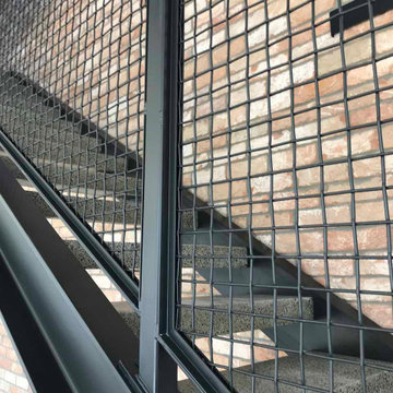
These Auckland homeowners wanted an industrial style look for their interior home design. So when it came to building the staircase, handrail and balustrades, we knew the exposed steel in a matte black was going to be the right look for them.
Due to the double stringers and concrete treads, this style of staircase is extremely solid and has zero movement, massively reducing noise.
Our biggest challenge on this project was that the double stringer staircase was designed with concrete treads that needed to be colour matched to the pre-existing floor.
 Stairworks
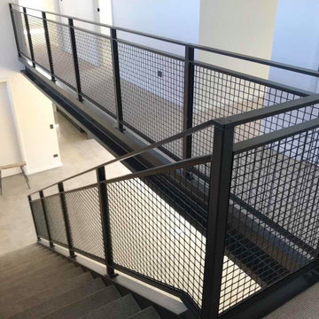
These Auckland homeowners wanted an industrial style look for their interior home design. So when it came to building the staircase, handrail and balustrades, we knew the exposed steel in a matte black was going to be the right look for them.
Due to the double stringers and concrete treads, this style of staircase is extremely solid and has zero movement, massively reducing noise.
Our biggest challenge on this project was that the double stringer staircase was designed with concrete treads that needed to be colour matched to the pre-existing floor.
Find the right local pro for your project
 Stairworks
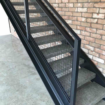
These Auckland homeowners wanted an industrial style look for their interior home design. So when it came to building the staircase, handrail and balustrades, we knew the exposed steel in a matte black was going to be the right look for them.
Due to the double stringers and concrete treads, this style of staircase is extremely solid and has zero movement, massively reducing noise.
Our biggest challenge on this project was that the double stringer staircase was designed with concrete treads that needed to be colour matched to the pre-existing floor.
 MyHome Renovation Experts
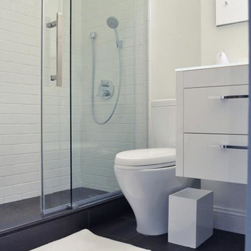
Complete bathroom remodel in a pre-war building. MyHome removed the existing tub, converting it into a sleek white subway tiled shower with sliding glass door and chrome accents. A floating wall mounted white lacquer vanity and large dark gray tile floor completes the modern transformation.
 StudioLAB
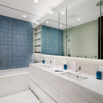
Boasting views of the Museum of Natural History and Central Park, the Beaux Arts and French Renaissance style building built in 1900 was once home to a luxury hotel. Over the years multiple hotel rooms were combined into the larger apartment residences that exist today. The resulting units, while large in size, lacked the continuity of a single formed space. StudioLAB was presented with the challenge of re-designing the space to fit a modern family’s lifestyle today with the flexibility to adjust as they evolve into their tomorrow. Thus, the existing configuration was completely abandoned with new programmatic elements being relocated in each and every corner of the space. For clients that are big wine connoisseurs, the focal point of entry and circulation lies in a 400 bottle, custom built, blackened steel and glass, temperature controlled wine cabinet. The once enclosed living room was demolished to create one main entertaining space that includes a new dining area and open kitchen. Hafele bi-folding pocket door slides were used in the Living room wall unit to conceal the television, bar and display shelves when not in use. Posing as kitchen cabinetry, a hidden integrated door opens to reveal a guest bedroom with an en suite bathroom. Down the hallway of wide plank ebony stained walnut flooring, a compact powder room was built to house an original Paul Villinski installation of small butterflies cut from recycled aluminum cans, entitled Mistral. Continuing down the hall, and through one of the walnut veneered doors, is the shared kids bedroom where a custom-built bunk bed with integrated storage steps and desk was designed to allow for play space and a reading corner. The kids bathroom across the hall is decorated with custom Lego inspired hand cast concrete tiles and integrated pull-out footstools residing underneath the floating vanity. The master suite features a bio-ethanol fireplace wrapped in blackened steel and integrated into the Tabu veneered built-in. The spacious walk-in closet serves several purposes, which include housing the apartment’s new central HVAC system as well as a sleeping spot for the family’s dog. An integrated URC control system paired with Lutron Radio RA lighting keypads were installed to control the AV, HVAC, lighting and solar shades all by the use of smartphones.
 Vetter Architects
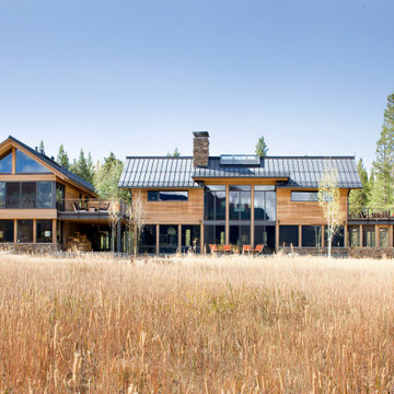
The owners requested that their home harmonize with the spirit of the surrounding Colorado mountain setting and enhance their outdoor recreational lifestyle - while reflecting their contemporary architectural tastes. The site was burdened with a myriad of strict design criteria enforced by the neighborhood covenants and architectural review board. Creating a distinct design challenge, the covenants included a narrow interpretation of a “mountain style” home which established predetermined roof pitches, glazing percentages and material palettes - at direct odds with the client‘s vision of a flat-roofed, glass, “contemporary” home.
Our solution finds inspiration and opportunities within the site covenant’s strict definitions. It promotes and celebrates the client’s outdoor lifestyle and resolves the definition of a contemporary “mountain style” home by reducing the architecture to its most basic vernacular forms and relying upon local materials.
The home utilizes a simple base, middle and top that echoes the surrounding mountains and vegetation. The massing takes its cues from the prevalent lodgepole pine trees that grow at the mountain’s high altitudes. These pine trees have a distinct growth pattern, highlighted by a single vertical trunk and a peaked, densely foliated growth zone above a sparse base. This growth pattern is referenced by placing the wood-clad body of the home at the second story above an open base composed of wood posts and glass. A simple peaked roof rests lightly atop the home - visually floating above a triangular glass transom. The home itself is neatly inserted amongst an existing grove of lodgepole pines and oriented to take advantage of panoramic views of the adjacent meadow and Continental Divide beyond.
The main functions of the house are arranged into public and private areas and this division is made apparent on the home’s exterior. Two large roof forms, clad in pre-patinated zinc, are separated by a sheltering central deck - which signals the main entry to the home. At this connection, the roof deck is opened to allow a cluster of aspen trees to grow – further reinforcing nature as an integral part of arrival.
Outdoor living spaces are provided on all levels of the house and are positioned to take advantage of sunrise and sunset moments. The distinction between interior and exterior space is blurred via the use of large expanses of glass. The dry stacked stone base and natural cedar cladding both reappear within the home’s interior spaces.
This home offers a unique solution to the client’s requests while satisfying the design requirements of the neighborhood covenants. The house provides a variety of indoor and outdoor living spaces that can be utilized in all seasons. Most importantly, the house takes its cues directly from its natural surroundings and local building traditions to become a prototype solution for the “modern mountain house”.
Overview
Ranch Creek Ranch
Winter Park, Colorado
Completion Date
October, 2007
Services
Architecture, Interior Design, Landscape Architecture

Sponsored
Columbus, OH

Hope Restoration & General Contracting
Columbus Design-Build, Kitchen & Bath Remodeling, Historic Renovations
 Stairworks
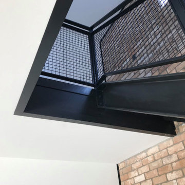
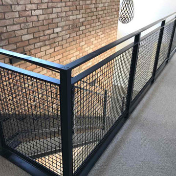
These Auckland homeowners wanted an industrial style look for their interior home design. So when it came to building the staircase, handrail and balustrades, we knew the exposed steel in a matte black was going to be the right look for them.
Due to the double stringers and concrete treads, this style of staircase is extremely solid and has zero movement, massively reducing noise.
Our biggest challenge on this project was that the double stringer staircase was designed with concrete treads that needed to be colour matched to the pre-existing floor.
 Stairworks
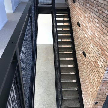
These Auckland homeowners wanted an industrial style look for their interior home design. So when it came to building the staircase, handrail and balustrades, we knew the exposed steel in a matte black was going to be the right look for them.
Due to the double stringers and concrete treads, this style of staircase is extremely solid and has zero movement, massively reducing noise.
Our biggest challenge on this project was that the double stringer staircase was designed with concrete treads that needed to be colour matched to the pre-existing floor.
 Stairworks
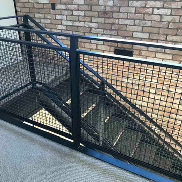
These Auckland homeowners wanted an industrial style look for their interior home design. So when it came to building the staircase, handrail and balustrades, we knew the exposed steel in a matte black was going to be the right look for them.
Due to the double stringers and concrete treads, this style of staircase is extremely solid and has zero movement, massively reducing noise.
Our biggest challenge on this project was that the double stringer staircase was designed with concrete treads that needed to be colour matched to the pre-existing floor.
 Stairworks
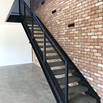
These Auckland homeowners wanted an industrial style look for their interior home design. So when it came to building the staircase, handrail and balustrades, we knew the exposed steel in a matte black was going to be the right look for them.
Due to the double stringers and concrete treads, this style of staircase is extremely solid and has zero movement, massively reducing noise.
Our biggest challenge on this project was that the double stringer staircase was designed with concrete treads that needed to be colour matched to the pre-existing floor.
 Stairworks
These Auckland homeowners wanted an industrial style look for their interior home design. So when it came to building the staircase, handrail and balustrades, we knew the exposed steel in a matte black was going to be the right look for them.
Due to the double stringers and concrete treads, this style of staircase is extremely solid and has zero movement, massively reducing noise.
Our biggest challenge on this project was that the double stringer staircase was designed with concrete treads that needed to be colour matched to the pre-existing floor.
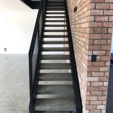 Stairworks
These Auckland homeowners wanted an industrial style look for their interior home design. So when it came to building the staircase, handrail and balustrades, we knew the exposed steel in a matte black was going to be the right look for them.
Due to the double stringers and concrete treads, this style of staircase is extremely solid and has zero movement, massively reducing noise.
Our biggest challenge on this project was that the double stringer staircase was designed with concrete treads that needed to be colour matched to the pre-existing floor.

Sponsored
Columbus, OH
Hope Restoration & General Contracting
Columbus Design-Build, Kitchen & Bath Remodeling, Historic Renovations
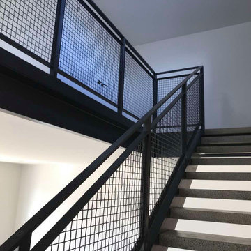 Stairworks
These Auckland homeowners wanted an industrial style look for their interior home design. So when it came to building the staircase, handrail and balustrades, we knew the exposed steel in a matte black was going to be the right look for them.
Due to the double stringers and concrete treads, this style of staircase is extremely solid and has zero movement, massively reducing noise.
Our biggest challenge on this project was that the double stringer staircase was designed with concrete treads that needed to be colour matched to the pre-existing floor.
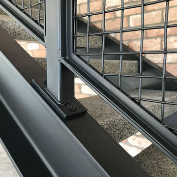 Stairworks
These Auckland homeowners wanted an industrial style look for their interior home design. So when it came to building the staircase, handrail and balustrades, we knew the exposed steel in a matte black was going to be the right look for them.
Due to the double stringers and concrete treads, this style of staircase is extremely solid and has zero movement, massively reducing noise.
Our biggest challenge on this project was that the double stringer staircase was designed with concrete treads that needed to be colour matched to the pre-existing floor.
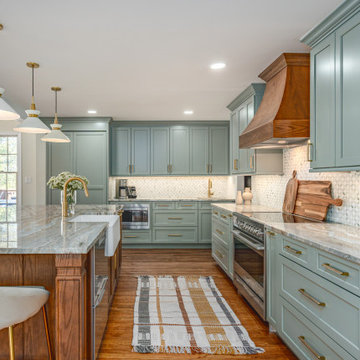
 FineLine Kitchens, Inc.
Hi everyone, I'm Sarah and Ogun we are here with fine line kitchens. So we are a couple working together. I do the interior design and remodeling of the space material selection meeting with the clients. And I handled operations outside, you know meaning all the construction work that is taking place the inside. The houses that we work in. I handle all the aspects of the construction, so today's project is very special. We're in Vienna and the client had a very big family. It's a family of seven that lives here. So we had a few aspects that we needed to keep in mind while designing this one. Having everybody be able to sit on the island. So we wanted plenty of seating all the way around. We didn't want anybody standing or anything like that. So what we did is we maximize the space. The center island is the biggest part of the kitchen. We use a natural stone to kind of give it a beautiful texture versus quartz. It's kind of standard white or kind of fabricated, so I wanted something very natural. We did this because I took my inspiration from the outside, so the inspiration if you look at the view right in front of me is there are so many greens there's a lot of brass accents and I wanted to bring this. Into this kitchen while designing it for my clients. She is very warm very. She wanted a very homey, comfy kind of look for the kitchen. So that's what we did today. As you can see, the cabinets are sage green, very light, so I still think it's a neutral, but it's a lighter color that again brings the outside in and we combine that with the oak right behind me so it's a slightly warm oak. It's not very dark. It's not very light. It's a medium brown and the same color went on the island. To kind of tie these two in and the backsplash, my favorite part is where you can see a little bit of design. It is, in my opinion still classic, but includes a pattern so the outside part is as we said in the beginning, is handled by my husband. I'd like him to speak a little bit about that. Thanks, Sarah, I want to talk to you guys a little bit about the construction part of this project. Originally this kitchen was located mostly in this area. They had their stove there sing. It was more of a peninsula layout in Sarah's and the customer vision they wanted. They wanted to get rid of the peninsula and they want to be able to have a huge island that can at least sit seven people because they're familiar with seven. So we wanted to make sure that we can achieve this design and bring it to life so that they can be happy with this layout. Some of the challenges we had, the house, the home being, you know, old home. There were a lot of you know the older electrical and plumbing that had to be replaced. We had to relocate the stove from here to this area. Over here we had put a nice foot fan that we had to relocate all the ductwork and the plumbing. Was being on the peninsula area. We had to relocate it to the center islands. So we achieved all this and kind of like bring it to bring in this kitchen up to date it looks beautiful. That's true, so yes, the old layout did not function for my clients because everything was kind of gathered on one side of the kitchen. So there was like a peninsula right there. So the end of this island kind of continued straight. And that was just the L shape. Kind of where everything was and there used to be another big table here, so they were using only kind of half of the space. So like I said at the beginning, our vision was to kind of feed everybody at the island, create some symmetry. 'cause I love that. So as you can see behind me, this is kind of the focal point symmetrical. Everything is kind of even we wanted to also panel the fridge here so it mimics the pantry and another size. So when you're looking at it, it is bringing again that symmetry back again. I hope you enjoyed this kitchen and this video and I'll see you soon. So how do you think this project turned out? It's nice. I like the color. I think it turned out nice. It's kind of like a little bit different color than what we always do. So I realize. Are you giving me a little bit of credit here that I did something different? Are you proud? I'm so proud of you. Other than that I like it. That they have kind of like a two sink. So if this was our kitchen, if we ever like you can have your own. I can have mine if we ever get into a fight then this can be like my own kitchen. Why are we gonna bring in a fight right now? So I'm cooking anyway. You're grilling most of the time, So what are you even talking about? My kitchen? That's my kitchen. You can just take the small sink. That's fine. It's always good to have your own space right there, so anyways. Thank you guys for watching. We hope to see you soon and if you have any questions please click the link below. It'll lead you to our website, house, YouTube and all of the social media is so nice to have you guys. We'll see you soon. Thanks bye bye-bye.
 AMB2 Architects, LLC
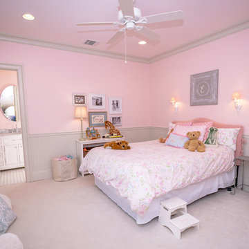
A little girls room with a pale pink ceiling and pale gray wainscoat
This fast pace second level addition in Lakeview has received a lot of attention in this quite neighborhood by neighbors and house visitors. Ana Borden designed the second level addition on this previous one story residence and drew from her experience completing complicated multi-million dollar institutional projects. The overall project, including designing the second level addition included tieing into the existing conditions in order to preserve the remaining exterior lot for a new pool. The Architect constructed a three dimensional model in Revit to convey to the Clients the design intent while adhering to all required building codes. The challenge also included providing roof slopes within the allowable existing chimney distances, stair clearances, desired room sizes and working with the structural engineer to design connections and structural member sizes to fit the constraints listed above. Also, extensive coordination was required for the second addition, including supports designed by the structural engineer in conjunction with the existing pre and post tensioned slab. The Architect’s intent was also to create a seamless addition that appears to have been part of the existing residence while not impacting the remaining lot. Overall, the final construction fulfilled the Client’s goals of adding a bedroom and bathroom as well as additional storage space within their time frame and, of course, budget.
Smart Media
Sponsored
Columbus, OH
Hope Restoration & General Contracting
Columbus Design-Build, Kitchen & Bath Remodeling, Historic Renovations
 David Thorne Landscape Architect
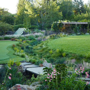
The trellised terrace opens up to a quieter view of a magnificent existing redwood grove. A bluestone footbridge crosses a bioswale filled with clusters of ornamental grasses and perennials. In the distance, an existing below-grade greenhouse, renovated as part of the project program.
Photography by Marion Brenner

 Advance Design Studio, Ltd.
Jennifer and Dan have lived in their Deer Park Illinois home for 15 years, slowly making minor fixes like painting and decorating; but they had a new plan for their kitchen the entire time. An awkwardly placed garage door, and an island cooktop with a terrible downdraft made a full-scale kitchen remodel an absolute must. Jennifer had many ideas in mind and wanted to work with a company that could provide high-end work, while partnering with a designer that would tailor the kitchen to her ideas.
She was intrigued by the phrase “Common Sense Remodeling” in Advance Design’s feature she discovered while perusing an issue of the community’s Quintessential Barrington Magazine. Doing further research on the company’s website, as she looked through project profiles and read about Advance Design’s “Common Sense Remodeling” philosophy, she promptly scheduled an appointment to see if the people and ideas she read about were truly who they said they were. The more she read, the more she knew that the “Common Sense” approach to remodeling they described was exactly the type of company she was looking for.
The partnership was sealed after an initial consultation with Owner Todd Jurs and Project Designer Michelle Lecinski. They displayed a combination of friendliness, professionalism and respect that was unmatched by any of the other companies Jennifer talked to. She knew that with Advance Design, she would be able to retain the vision that she had in mind with high-quality craftsmanship.
“I reached out to Advance Design because of the ‘Common Sense Remodeling’ tagline,” Jennifer said. “That’s what lingered for me”. “Advance Design was the most respectful- of the house and of my design ideas, and the most professional of the handful of companies that looked at my project”.
Soon after the meeting Jennifer began working with Michelle on the project design. They quickly developed chemistry. Jennifer loved how Michelle researched and located every detail that Jennifer wanted for the kitchen. Between the two of them, every concept and idea was worked through and perfected. “Jennifer had definite ideas about what she wanted the new kitchen to look like, she just didn’t know how to bring it all together. We worked together really well to make her ideas into the practical reality necessary for a well-functioning kitchen, with the look and feel that she had envisioned”, says Michelle.
“Michelle was wonderful in using the CAD system she would show me new drawings every time we changed the layout while working through the design,” Jennifer said. “She was a really wonderful partner in execution, she made sure everything happened quickly and easily.”
The finished design drew out elements of Jennifer’s style and personality. The pair call the look “sophisticated farmhouse” to describe the kitchen renovation to family and friends. The result was a beautifully crafted, authentic-feeling space that satisfied Jennifer’s dreams 15 years in the making. The whole project consisted of a kitchen remodel, mudroom upgrade with powder room, and garage entry relocation. “The projects I personally like the best, are the ones that put the client’s dreams on display,” Project Designer Michelle said. “And this is one of those projects.”
The main focal point of the kitchen is custom zinc and brass ventilation hood with a vintage sheen, which was hand made to order by a small company in Indiana named Vogler Metalworking. “It’s like sculpture, a true work of art”, says Jennifer. Your eye is immediately drawn towards this elegant yet practical hood that eliminated the home’s downdraft problem and added a striking conversation piece at the same time. The carpenters had to use special gloves when transporting and installing it, so they didn’t smudge it with fingerprints. The beautiful hood centers proudly over the stunning black enamel and brass LaCornue Range. “I had a friend who had a LaCornue range and after learning how easy it was to cook perfect meals, I was convinced I wanted to have one”, says Jennifer. This unique, breathtaking combination anchors the entire kitchen and is apparent immediately as you walk into the great room the surrounds the space.
DuraSupreme Crestwood cabinets with a Kendall Panel add function and sophistication. A custom gray paint color paired with a storm blue was developed so that the new kitchen looked like it belonged to the existing space. Unlacquered brass faucets and hardware were important to Jennifer because she wanted the living finishes to age over time. Remarkable brass diamond mesh cabinet door inserts imported from the UK continue to add this one-of-a-kind kitchen renovation; giving it a “you won’t see this everywhere” quality. The use of old railcar flooring for the coffee bar countertop and reclaimed oak for the open shelving gives an authenticity to the space uncommon in kitchens today.
Jennifer and Michelle fell in love with the Limestone Grey Stone while they were investigating unique island countertop ideas. They liked the fact that the limestone as a living finish will age and change over time. Calcutta Miel Quartz countertops made for an excellent pairing around the perimeter, as it’s durable and perfect for cooking preparations. A textured white subway tile backsplash that runs to the ceiling keeps your eye moving towards the open shelving, and to the main focal point of the stunning range hood combination.
“The kitchen functions beautifully, and it’s gorgeous,” beams Jennifer as she gestures with both hands while smiling ear to ear. “The most important thing was I wanted a kitchen that had a wonderful flow, cooked beautiful meals and was a great gathering place for family and friends, and this space does that perfectly! Beauty wise, it turned out exactly how I had envisioned. I felt the function part was the hardest part, and that was nailed”!
Relocating the garage entry to the new mudroom was a huge priority and has finally separated the family’s arriving home functions from their kitchen. Now coats and shoes and bags have their own area for dropping once members arrive home. Matching gray DuraSupreme cabinetry helped create gorgeous, purposeful lockers for the family. A reclaimed vintage sink and custom wall paper were added to the tiny powder room to beautify the once previously only functional space. Advance Design was even able to create a custom space for their dog to sleep while the family is away.
“It was unbelievable that a project of this size was completed in such a short time, and I think that’s because of the large amount of planning and preparation that went into it,” Jennifer marveled, “When we started, we were ready, and everything was prepared”.
When it came to execution, Project Manager Justin Davis and his crew were quick, accessible, and organized. Projects like this kitchen are typically completed in as little as 8-10 weeks. Jennifer’s kitchen however despite the relocation of some challenging HVAC in a soffit and moving of an exterior door was completed remarkably fast in part because the team was working with an existing tile floor that ran throughout the first floor that the client really loved.
“You get to know these people really well because they’re living in your house while you’re living in your house. They were so fast and really good, it didn’t take as long as even planned” reported Jennifer. “I would text Justin and he always responded almost immediately. I got to know all the guys who were working in our house and they were all wonderful people”.
Details in a customized kitchen like this one require skill and care from the people who install it. “All the guys on the job were skilled at what the did. I wanted small details like little feet to look like furniture, that is where their carpentry skill came in to make these all perfect”, said Jennifer. “The tile guys were wonderful. They even let me determine how I wanted the texture with the grout to appear for a salt and pepper look; now that is a very skilled trade person making it custom”.
In Jennifer’s interview, she continued to reference Advance Design’s “Common Sense Remodeling”, so I took a minute to ask her exactly what that phrase meant to her and how it played out in her experience with her project and the Advance Design team. Here is what she said: “I was intrigued about Common Sense Remodeling and in my head that there would be clear costs and prices, great communication between the design team, the execution team and me”, said Jennifer. They did deliver on that, it was so clear about the cost breakdown, what I could expect from everyone who came to my house, and everything that we had ordered. That to me is the Common Sense”!
It’s great to see a client take literally our assertion that a well-planned remodeling project is simply “Common Sense”! She anticipated each step of the way would be clear, concise, and predictable, all the while protecting the outcome due to the careful upfront planning. “Advance Design delivered on their ‘Common Sense Remodeling’ promise,” Jennifer said. “From the design team, to the execution team - everything was straight forward like I imagined. The project turned out exactly how I envisioned, I enjoyed this process and absolutely would recommend Advance Design Studio to anyone.”
 Living with Lolo
Bathroom in Lexington Ave | Room Type:
Primary Bathroom (Master Bath Remodel) |
Project Name:
Lexington Ave |
Key Feature:
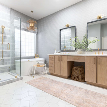
A modern, luxury bathroom with a subtle boho influence, featuring unique tile placement, statement lighting, and layered materials that create visual interest in a compact footprint.
Challenge:
The client wanted a full bathroom transformation while keeping all plumbing in its existing locations to minimize renovation costs, requiring creative design solutions within structural limitations.
Solution:
The design team reimagined the space by introducing updated finishes, distinctive tile layouts, wallpaper, and statement lighting to elevate the bathroom while working within the existing layout. The project was executed entirely remotely, demonstrating a seamless virtual design process.
Materials:
Bedrosians tile, Thibaut wallpaper, Arteriors lighting, Kohler plumbing fixtures, Jaipur Living rugs, Made Goods bath mirrors, and Bungalow5 bath stool.
Budget:
Not specified
Timeline:
Completed April 2021.
4