
Search results for "Pre existing challenges" in Home Design Ideas
 TKS Design Group
Free ebook, Creating the Ideal Kitchen. DOWNLOAD NOW
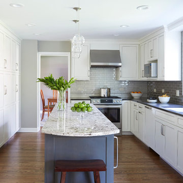
The homeowners of this mid-century Colonial and family of four were frustrated with the layout of their existing kitchen which was a small, narrow peninsula layout but that was adjoining a large space that they could not figure out how to use. Stealing part of the unused space seemed like an easy solution, except that there was an existing transition in floor height which made that a bit tricky. The solution of bringing the floor height up to meet the height of the existing kitchen allowed us to do just that.
This solution also offered some challenges. The exterior door had to be raised which resulted in some exterior rework, and the floor transition had to happen somewhere to get out to the garage, so we ended up “pushing” it towards what is now a new mudroom and powder room area. This solution allows for a small but functional and hidden mudroom area and more private powder room situation.
Another challenge of the design was the very narrow space. To minimize issues with this, we moved the location of the refrigerator into the newly found space which gave us an L-shaped layout allowing for an island and even some shallow pantry storage. The windows over the kitchen sink were expanded in size and relocated to allow more light into the room. A breakfast table fits perfectly in the area adjacent to the existing French doors and there was even room for a small bar area that helps transition from inside to outside for entertaining. The confusing unused space now makes sense and provides functionality on a daily basis.
To help bring some calm to this busy family, a pallet of soft neutrals was chosen -- gray glass tile with a simple metal accent strip, clear modern pendant lights and a neutral color scheme for cabinetry and countertops.
For more information on kitchen and bath design ideas go to: www.kitchenstudio-ge.com
 User
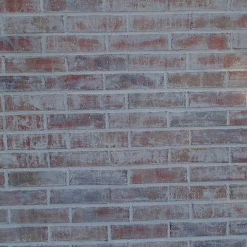
UserThis is an organic Lime Wash done with a true lime wash product as opposed to a brick mortar or concrete that is often seen on new houses. This product can be applied as a solid coating making the surface completely white, or can be applied and "washed off" in many artistic ways, as seen here. If you hate your brick or just want something unique this is a great option!
Photo credit: Jeff Murrey

Find the right local pro for your project
 Koby's Garden Alchemy, Inc.
Koby's Garden Alchemy, Inc.
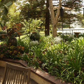
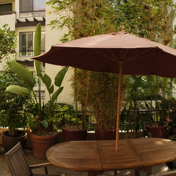
Example of a small courtyard patio design in San Diego
Example of a small courtyard patio design in San Diego
 Koby's Garden Alchemy, Inc.
Koby's Garden Alchemy, Inc.
Inspiration for a small courtyard patio remodel in San Diego
Inspiration for a small courtyard patio remodel in San Diego
 Koby's Garden Alchemy, Inc.
Koby's Garden Alchemy, Inc.
Example of a small courtyard patio design in San Diego
Example of a small courtyard patio design in San Diego


Sponsored
Columbus, OH

Hope Restoration & General Contracting
Columbus Design-Build, Kitchen & Bath Remodeling, Historic Renovations
 Nathan Taylor for Obelisk Home
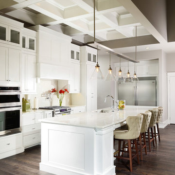
Preliminary architecture renderings were given to Obelisk Home with a challenge. The homeowners needed us to create an unusual but family friendly home, but also a home-based business functioning environment. Working with the architect, modifications were made to incorporate the desired functions for the family. Starting with the exterior, including landscape design, stone, brick and window selections a one-of-a-kind home was created. Every detail of the interior was created with the homeowner and the Obelisk Home design team.
Furnishings, art, accessories, and lighting were provided through Obelisk Home. We were challenged to incorporate existing furniture. So the team repurposed, re-finished and worked these items into the new plan. Custom paint colors and upholstery were purposely blended to add cohesion. Custom light fixtures were designed and manufactured for the main living areas giving the entire home a unique and personal feel.
Photos by Jeremy Mason McGraw
 Kimberlee Marie Interiors
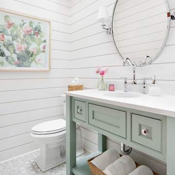
It’s always a blessing when your clients become friends - and that’s exactly what blossomed out of this two-phase remodel (along with three transformed spaces!). These clients were such a joy to work with and made what, at times, was a challenging job feel seamless. This project consisted of two phases, the first being a reconfiguration and update of their master bathroom, guest bathroom, and hallway closets, and the second a kitchen remodel.
In keeping with the style of the home, we decided to run with what we called “traditional with farmhouse charm” – warm wood tones, cement tile, traditional patterns, and you can’t forget the pops of color! The master bathroom airs on the masculine side with a mostly black, white, and wood color palette, while the powder room is very feminine with pastel colors.
When the bathroom projects were wrapped, it didn’t take long before we moved on to the kitchen. The kitchen already had a nice flow, so we didn’t need to move any plumbing or appliances. Instead, we just gave it the facelift it deserved! We wanted to continue the farmhouse charm and landed on a gorgeous terracotta and ceramic hand-painted tile for the backsplash, concrete look-alike quartz countertops, and two-toned cabinets while keeping the existing hardwood floors. We also removed some upper cabinets that blocked the view from the kitchen into the dining and living room area, resulting in a coveted open concept floor plan.
Our clients have always loved to entertain, but now with the remodel complete, they are hosting more than ever, enjoying every second they have in their home.

 Flooring Direct
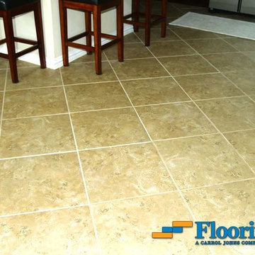
“We needed talented professionals and that’s why we chose Carrol John Flooring. Dan and his team were awesome; matching the tile, grout color, pattern and more importantly the installation and integration.”
 Décor Aid
Having a small child, loving to entertain and looking to declutter and kid-proof the gathering spaces of their home in the quaint village of Rockville Centre, Long Island, a stone’s throw from Manhattan, our client’s main objective was to have their living room and den transformed with a family friendly home makeover with mid-century modern tones boasting a formal, yet relaxed spirit
Stepping into the home we found their living room and den both architecturally well appointed yet in need of modern transitional furniture pieces and the pops of color our clients admired, as there was a substantial amount of cool, cold grays in the rooms.
Decor Aid designer Vivian C. approached the design and placement of the pieces sourced to be kid-friendly while remaining sophisticated and practical for entertaining.
“We played off of the clients love for blush pinks, mid-century modern and turquoise. We played with the use of gold and silver metals to mix it up.”
In the living room, we used the prominent bay window and its illuminating natural light as the main architectural focal point, while the fireplace and mantels soft white tone helped inform the minimalist color palette for which we styled the room around.
To add warmth to the living room we played off of the clients love for blush pinks and turquoise while elevating the room with flashes of gold and silver metallic pieces. For a sense of play and to tie the space together we punctuated the kid-friendly living room with an eclectic juxtaposition of colors and materials, from a beautifully patchworked geometric cowhide rug from All Modern, to a whimsical mirror placed over an unexpected, bold geometric credenza, to the blush velvet barrel chair and abstract blue watercolor pillows.
“When sourcing furniture and objects, we chose items that had rounded edges and were shatter proof as it was vital to keep each room’s decor childproof.” Vivian ads.
Their vision for the den remained chic, with comfort and practical functionality key to create an area for the young family to come together.
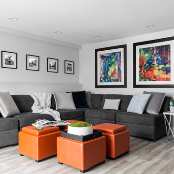
For the den, our main challenge was working around the pre-existing dark gray sectional sofa. To combat its chunkiness, we played off of the hues in the cubist framed prints placed above and focused on blue and orange accents which complement and play off of each other well. We selected orange storage ottomans in easy to clean, kid-friendly leather to maximize space and functionality. To personalize the appeal of the den we included black and white framed family photos. In the end, the result created a fun, relaxed space where our clients can enjoy family moments or watch a game while taking in the scenic view of their backyard.
For harmony between the rooms, the overall tone for each room is mid-century modern meets bold, yet classic contemporary through the use of mixed materials and fabrications including marble, stone, metals and plush velvet, creating a cozy yet sophisticated enough atmosphere for entertaining family and friends and raising a young children.
“The result od this family friendly room was really fantastic! Adding some greenery, more pillows and throws really made the space pop.” Vivian C. Decor Aid’s Designer
 SimpleTwig Architecture.llc
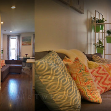
This very narrow space was a challenge to make into a legal one bedroom and keep the interior feeling fresh and open. With some ingenuity to connect to existing plumbing lines in this pre-war building we managed to pull this run down space into a contemporary apartment. Besides offering a walk-in closet and other closets to help tenants keep their space neat and tidy, we exposed the brick on the parti-wall to make it feel more urban, and to save space.
 Gilmans Kitchens and Baths
The client's purchased an 80's condo unit of the 4th floor.
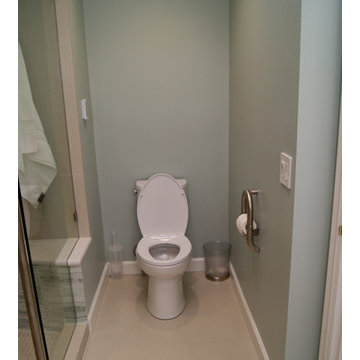
The main goal(s): To create a space suitable for aging-in-place and to successfully incorporate pre-existing furniture and decor from the client's previous home.
The challenges:
- To be able to fully incorporate existing furniture into a smaller space, as the client's had down-sized by moving into a condo unit.
- Creating and providing a wide range of accessibility and universal design to accommodate certain health issues of one of the clients.
Inspiration: Existing arches throughout the home.
Treve Johnson Photography


 Kimberlee Marie Interiors
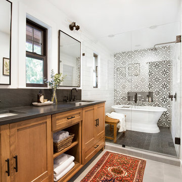
It’s always a blessing when your clients become friends - and that’s exactly what blossomed out of this two-phase remodel (along with three transformed spaces!). These clients were such a joy to work with and made what, at times, was a challenging job feel seamless. This project consisted of two phases, the first being a reconfiguration and update of their master bathroom, guest bathroom, and hallway closets, and the second a kitchen remodel.
In keeping with the style of the home, we decided to run with what we called “traditional with farmhouse charm” – warm wood tones, cement tile, traditional patterns, and you can’t forget the pops of color! The master bathroom airs on the masculine side with a mostly black, white, and wood color palette, while the powder room is very feminine with pastel colors.
When the bathroom projects were wrapped, it didn’t take long before we moved on to the kitchen. The kitchen already had a nice flow, so we didn’t need to move any plumbing or appliances. Instead, we just gave it the facelift it deserved! We wanted to continue the farmhouse charm and landed on a gorgeous terracotta and ceramic hand-painted tile for the backsplash, concrete look-alike quartz countertops, and two-toned cabinets while keeping the existing hardwood floors. We also removed some upper cabinets that blocked the view from the kitchen into the dining and living room area, resulting in a coveted open concept floor plan.
Our clients have always loved to entertain, but now with the remodel complete, they are hosting more than ever, enjoying every second they have in their home.
 Black Knight Group
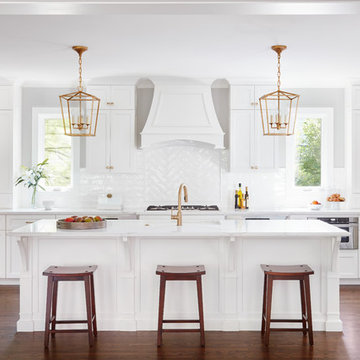
This 1966 contemporary home was completely renovated into a beautiful, functional home with an up-to-date floor plan more fitting for the way families live today. Removing all of the existing kitchen walls created the open concept floor plan. Adding an addition to the back of the house extended the family room. The first floor was also reconfigured to add a mudroom/laundry room and the first floor powder room was transformed into a full bath. A true master suite with spa inspired bath and walk-in closet was made possible by reconfiguring the existing space and adding an addition to the front of the house.
 The Rinfret Group
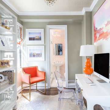
Example of a mid-sized transitional freestanding desk dark wood floor and brown floor study room design in New York with beige walls and no fireplace
 Zieba Builders, Inc.
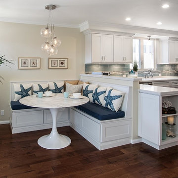
Our clients loved the location of their duplex home with its peak-a-boo ocean view, but their existing kitchen was not suited for their growing family. They wanted a kitchen with a coastal vibe, plenty of storage space, and an eat-in area.
We started by bringing the far wall into the kitchen space to accommodate a large panty and communication center for the family. Doing this allowed us to move the refrigerator out of the main traffic area and doubled the amount of storage space. Several new windows were added to bring in natural light. A half wall was moved to allow more countertop area and open up sight lines. The previously awkwardly shaped island was slimmed down to create better flow.
There were a few venting challenges to overcome; gas lines and plumbing had to be re-routed without disturbing the unit below. To open up sight lines, soffits were eliminated which allowed the extension of cabinets to the ceiling. To stay within the homeowner’s budget, we match existing scraped flooring by lacing in and repairing patches.
The old dining area was too small for table, so we designed and built a custom banquette to maximize the space and take advantage of the outdoor views. The overall space works for family meals as well as entertaining.
A light summer palette was used to reflect the shades of the sand, sea and sky. Even though the new kitchen is actually smaller than the original space, its now far more functional and open.

Sponsored
Columbus, OH
Hope Restoration & General Contracting
Columbus Design-Build, Kitchen & Bath Remodeling, Historic Renovations
 JWT Associates
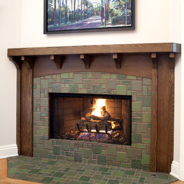
A new stained wood surround and Arts and Crafts tile were added to an existing pre-fab fireplace.
Living room - craftsman master light wood floor living room idea in Los Angeles with a corner fireplace and a tile fireplace
Living room - craftsman master light wood floor living room idea in Los Angeles with a corner fireplace and a tile fireplace
 Flooring Direct
“Project was done on schedule and on budget and the final result totally delighted us. We could not be any more pleased! We would not hesitate to recommend Dan’s Carrol John Flooring team to those requiring custom design and installation.”
-Sherri and Barry Conroe
 Yates Desygn
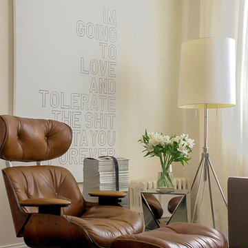
Set at pre-war, mid-rise apartment building amongst the hustle and bustle of New York City's Hell's Kitchen, the client's main objective was to construct a sanctuary and quiet space while incorporating their love of mid-century modern furniture.
This perfect challenge for Yates Desygn allowed us to add life and visual stimulation to a limited footprint.
In this space, we incorporated our client's existing furniture blending in new pieces to create a peaceful haven in the fast-paced city they love.
2