
Search results for "Quick running" in Home Design Ideas
 Karndean Designflooring
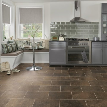
Eisen is one of a group of tiles originally inspired by weathered steel yet its blend of dark tones and subtle patterning allow it to masquerade as a number of natural materials, providing you with a floor that can blend seamlessly into any décor.
Add our new Quadrant border to frame your floor in a modern, minimalistic manner. The beveled edges of this single color border use light to highlight its framework. Alternatively, add grout strips between tiles to introduce a more traditional look with dark colored strips adding subtle separation or light colored strips adding contrast.

 safe ZOnea
Every year, the same thing happens. The first real snowfall arrives, demand for de-icing materials spikes overnight, and the businesses that waited too long find themselves scrambling for supply at the worst possible moment. Facility managers, property owners, contractors, and municipalities all depend on a steady supply of salt and ice melt to keep their properties safe and operational through winter. The ones who plan ahead sail through. The ones who don't pay more, wait longer, and take on real risk.
Sourcing de-icing materials well is not complicated, but it does require thinking ahead and understanding the options. The choices you make about what to buy, how to buy it, and who to buy it from have a direct effect on your costs, your reliability, and your ability to keep people safe when conditions turn dangerous. This article lays out what matters.
Why Your Choice of Supplier Matters More Than You Think
It is easy to treat de-icing material as a commodity, something you grab whenever you need it without much thought about where it comes from. That works fine until the moment it doesn't, usually in the middle of a storm when everyone needs supply at once and the casual sources have run dry. At that point, the relationships you built before the season become the difference between staying stocked and being stuck.
Reliable supply is the whole game in winter operations. A property that runs out of ice melt during a storm faces safety hazards, liability exposure, and disruption, none of which can wait for a back-ordered shipment. This is why establishing relationships with dependable rock salt suppliers before the season starts is one of the smartest moves a facility manager or contractor can make. It locks in supply, often locks in better pricing, and removes a major source of mid-winter stress.
The lesson here is to treat sourcing as a planning decision rather than a last-minute errand. The businesses that come through winter smoothly are almost always the ones that secured their supply chain early, chose suppliers who could actually deliver when it counted, and never had to gamble on finding material during a shortage. Reliability bought in advance is far cheaper than scarcity paid for in a crisis.
Bagged or Bulk: Matching the Material to the Job
One of the first practical decisions is whether to buy de-icing material in bags or in bulk, and the right answer depends entirely on the operation. Each format has clear advantages, and many operations end up using both for different purposes.
Bagged material offers convenience, control, and easy storage. It is simple to handle, easy to distribute to different locations or crews, straightforward to store without special equipment, and convenient for spot application by hand. It suits smaller properties, businesses without bulk storage, and situations where portion control and tidiness matter. Bulk material, on the other hand, tends to make sense for large operations that go through high volumes, where buying in quantity lowers the per-unit cost and the operation has the equipment and space to store and handle it. The tradeoff is between the convenience and flexibility of bags and the volume economics of bulk.
For many operations, the right approach is a mix: bulk for the high-volume core of the work and bags for flexibility, spot treatment, and locations where bulk handling is impractical. The key is to match the format to how the material will actually be stored, moved, and applied, rather than defaulting to one or the other out of habit. Thinking this through in advance avoids both the waste of over-buying bulk you can't handle and the expense of relying entirely on bags for a large operation.
Rock Salt Is Not Your Only Option
Rock salt, or sodium chloride, is the workhorse of winter de-icing for good reason. It is effective, widely available, and cost-efficient, which makes it the default choice for most operations most of the time. But it has limits, and understanding the alternatives helps you choose the right material for the conditions you actually face.
The most important limitation is temperature. Rock salt becomes less effective as temperatures drop, and in genuinely cold conditions it can struggle to do the job at all. This is where alternatives come in. Calcium chloride, for instance, works at much lower temperatures than rock salt and acts quickly, which makes it valuable when conditions are severe or when fast melting matters. Operations that face hard freezes or need dependable performance in extreme cold often keep calcium chloride for sale on hand for exactly those situations, using it alongside rock salt rather than instead of it.
The practical approach is to understand the conditions your property faces and stock accordingly. For many operations, rock salt handles the bulk of the work while a faster, colder-rated material like calcium chloride covers the extreme days when ordinary salt falls short. Matching the material to the temperature and the urgency of the situation is what separates an operation that stays ahead of winter from one that is constantly reacting to it.
Securing Your Supply Before the Season
Knowing what to buy is only half the equation. The other half is making sure you can actually get it when you need it, which means securing your supply before winter arrives rather than after it has already started. Timing is one of the most underrated factors in winter operations.
The logic is simple. Demand for de-icing materials is highly seasonal and spikes sharply during storms, when everyone needs supply simultaneously. Prices and availability both move against the buyer at exactly those moments. By contrast, planning ahead, estimating your needs and arranging supply before the season, puts you in a far stronger position. Working with established rock salt suppliers ahead of time means your material is accounted for before the rush, often at better pricing and with the confidence that it will be there when the first storm hits.
This kind of planning also lets you think clearly rather than react under pressure. You can estimate your seasonal needs based on your property and past winters, decide on the right mix of materials and formats, and arrange storage in advance. Operations that do this consistently spend less, worry less, and never find themselves making frantic calls during a storm. The effort of planning ahead is modest, and the payoff in reliability and cost savings is substantial.
Storing and Handling What You Buy
Securing supply is not much use if the material degrades before you can use it, which makes proper storage and handling an important and often overlooked part of the equation. De-icing materials are sensitive to moisture, and poor storage can turn a good supply into a clumped, hardened mess that is difficult to apply.
The fundamentals are straightforward. Keep material dry and protected from moisture, since salt and ice melt readily absorb water and can harden if exposed. Store it in a way that suits the format, whether that means a proper bulk storage area or a dry space for stacked bags. Keep it accessible, so crews can get to it quickly when a storm hits and time is short. And handle it with the right equipment for the format and volume, which protects both the material and the people working with it. None of this is complicated, but neglecting it can undermine even a well-planned supply.
Good storage practices protect the investment you made in securing supply early. There is little point in arranging your materials ahead of the season only to have them degrade before use. Treating storage and handling as part of the overall plan, rather than an afterthought, ensures that the material you secured is actually usable when the moment comes. It is the final link in a supply chain built to perform under winter conditions.
Estimating How Much You Actually Need
One question trips up operations of every size: how much de-icing material to buy. Order too little and you risk running short during a storm. Order too much and you tie up money and storage space in material you may not use. Getting the estimate reasonably right is a meaningful part of sourcing well.
Several factors shape the answer. The size and type of the areas you treat, sidewalks, lots, entrances, and drive lanes, set the baseline for how much material each application consumes. The local climate matters too, since colder regions and those with frequent snowfall go through far more material than milder ones. Application frequency depends on how often storms hit and how quickly surfaces need to be cleared, which varies with the kind of property and the expectations of the people who use it. And the type of material plays a role, since different products are applied at different rates.
Past experience is often the best guide. Operations that track what they used in previous winters, adjusted for the size of the property and the severity of the season, can estimate their needs with reasonable confidence. For newer operations without that history, it helps to plan conservatively and to work with a supplier who can replenish stock reliably, so that a low estimate does not turn into a mid-storm shortage.
The goal is not perfect precision but a sound, slightly cautious estimate paired with a dependable supply relationship. That combination lets an operation keep enough material on hand to handle the season without over-committing to volume it cannot store or use. Thinking this through before winter, rather than guessing during it, is one more way that planning ahead pays off when the snow starts to fall.
The Bottom Line
Sourcing de-icing materials well comes down to a few straightforward principles: plan ahead, choose reliable suppliers before the season, match your materials and formats to your actual needs and conditions, and store what you buy properly. The operations that follow these principles move through winter with confidence, while those that improvise pay more and take on needless risk.
Winter is predictable in one respect: it arrives every year, and demand for de-icing material spikes the moment it does. The businesses that prepare for that reality, rather than being surprised by it, are the ones that keep their properties safe, their costs controlled, and their operations running no matter what the season throws at them. A little foresight before the first snowfall pays off through every storm that follows.
 TVL Creative Ltd.
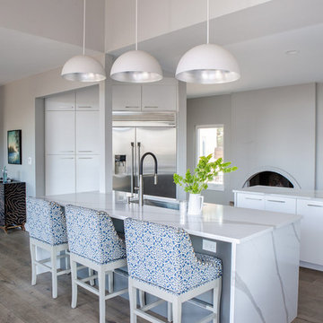
These wonderful clients returned to us for their newest home remodel adventure. Their newly purchased custom built 1970s modern ranch sits in one of the loveliest neighborhoods south of the city but the current conditions of the home were out-dated and not so lovely. Upon entering the front door through the court you were greeted abruptly by a very boring staircase and an excessive number of doors. Just to the left of the double door entry was a large slider and on your right once inside the home was a soldier line up of doors. This made for an uneasy and uninviting entry that guests would quickly forget and our clients would often avoid. We also had our hands full in the kitchen. The existing space included many elements that felt out of place in a modern ranch including a rustic mountain scene backsplash, cherry cabinets with raised panel and detailed profile, and an island so massive you couldn’t pass a drink across the stone. Our design sought to address the functional pain points of the home and transform the overall aesthetic into something that felt like home for our clients.
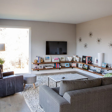
For the entry, we re-worked the front door configuration by switching from the double door to a large single door with side lights. The sliding door next to the main entry door was replaced with a large window to eliminate entry door confusion. In our re-work of the entry staircase, guesta are now greeted into the foyer which features the Coral Pendant by David Trubridge. Guests are drawn into the home by stunning views of the front range via the large floor-to-ceiling glass wall in the living room. To the left, the staircases leading down to the basement and up to the master bedroom received a massive aesthetic upgrade. The rebuilt 2nd-floor staircase has a center spine with wood rise and run appearing to float upwards towards the master suite. A slatted wall of wood separates the two staircases which brings more light into the basement stairwell. Black metal railings add a stunning contrast to the light wood.
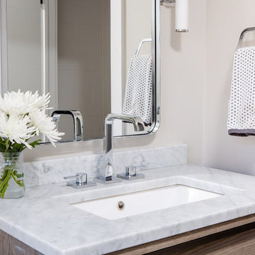
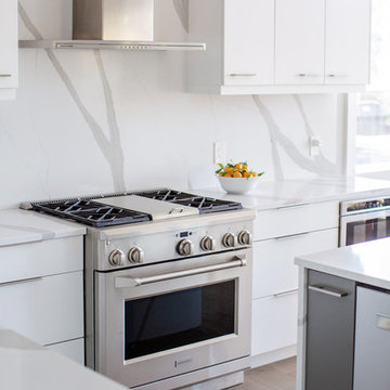
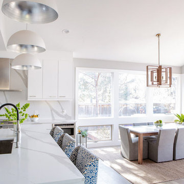
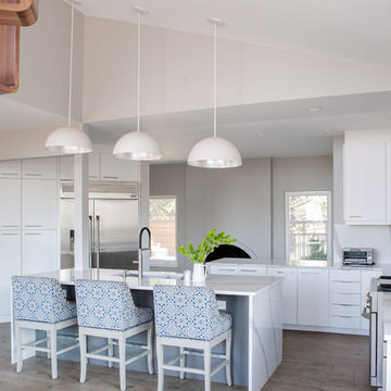
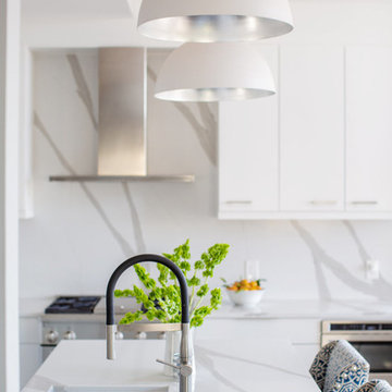
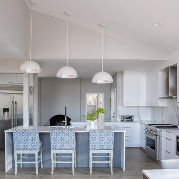
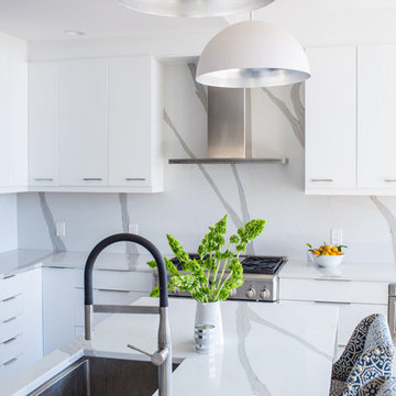
Other fabulous upgrades to this home included new wide plank flooring throughout the home, which offers both modernity and warmth. The once too-large kitchen island was downsized to create a functional focal point that is still accessible and intimate. The old dark and heavy kitchen cabinetry was replaced with sleek white cabinets, brightening up the space and elevating the aesthetic of the entire room. The kitchen countertops are marble look quartz with dramatic veining that offers an artistic feature behind the range and across all horizontal surfaces in the kitchen. As a final touch, cascading island pendants were installed which emphasize the gorgeous ceiling vault and provide warm feature lighting over the central point of the kitchen.
This transformation reintroduces light and simplicity to this gorgeous home, and we are so happy that our clients can reap the benefits of this elegant and functional design for years to come.
Find the right local pro for your project
 TVL Creative Ltd.
These wonderful clients returned to us for their newest home remodel adventure. Their newly purchased custom built 1970s modern ranch sits in one of the loveliest neighborhoods south of the city but the current conditions of the home were out-dated and not so lovely. Upon entering the front door through the court you were greeted abruptly by a very boring staircase and an excessive number of doors. Just to the left of the double door entry was a large slider and on your right once inside the home was a soldier line up of doors. This made for an uneasy and uninviting entry that guests would quickly forget and our clients would often avoid. We also had our hands full in the kitchen. The existing space included many elements that felt out of place in a modern ranch including a rustic mountain scene backsplash, cherry cabinets with raised panel and detailed profile, and an island so massive you couldn’t pass a drink across the stone. Our design sought to address the functional pain points of the home and transform the overall aesthetic into something that felt like home for our clients.
For the entry, we re-worked the front door configuration by switching from the double door to a large single door with side lights. The sliding door next to the main entry door was replaced with a large window to eliminate entry door confusion. In our re-work of the entry staircase, guesta are now greeted into the foyer which features the Coral Pendant by David Trubridge. Guests are drawn into the home by stunning views of the front range via the large floor-to-ceiling glass wall in the living room. To the left, the staircases leading down to the basement and up to the master bedroom received a massive aesthetic upgrade. The rebuilt 2nd-floor staircase has a center spine with wood rise and run appearing to float upwards towards the master suite. A slatted wall of wood separates the two staircases which brings more light into the basement stairwell. Black metal railings add a stunning contrast to the light wood.
Other fabulous upgrades to this home included new wide plank flooring throughout the home, which offers both modernity and warmth. The once too-large kitchen island was downsized to create a functional focal point that is still accessible and intimate. The old dark and heavy kitchen cabinetry was replaced with sleek white cabinets, brightening up the space and elevating the aesthetic of the entire room. The kitchen countertops are marble look quartz with dramatic veining that offers an artistic feature behind the range and across all horizontal surfaces in the kitchen. As a final touch, cascading island pendants were installed which emphasize the gorgeous ceiling vault and provide warm feature lighting over the central point of the kitchen.
This transformation reintroduces light and simplicity to this gorgeous home, and we are so happy that our clients can reap the benefits of this elegant and functional design for years to come.
 TVL Creative Ltd.
These wonderful clients returned to us for their newest home remodel adventure. Their newly purchased custom built 1970s modern ranch sits in one of the loveliest neighborhoods south of the city but the current conditions of the home were out-dated and not so lovely. Upon entering the front door through the court you were greeted abruptly by a very boring staircase and an excessive number of doors. Just to the left of the double door entry was a large slider and on your right once inside the home was a soldier line up of doors. This made for an uneasy and uninviting entry that guests would quickly forget and our clients would often avoid. We also had our hands full in the kitchen. The existing space included many elements that felt out of place in a modern ranch including a rustic mountain scene backsplash, cherry cabinets with raised panel and detailed profile, and an island so massive you couldn’t pass a drink across the stone. Our design sought to address the functional pain points of the home and transform the overall aesthetic into something that felt like home for our clients.
For the entry, we re-worked the front door configuration by switching from the double door to a large single door with side lights. The sliding door next to the main entry door was replaced with a large window to eliminate entry door confusion. In our re-work of the entry staircase, guesta are now greeted into the foyer which features the Coral Pendant by David Trubridge. Guests are drawn into the home by stunning views of the front range via the large floor-to-ceiling glass wall in the living room. To the left, the staircases leading down to the basement and up to the master bedroom received a massive aesthetic upgrade. The rebuilt 2nd-floor staircase has a center spine with wood rise and run appearing to float upwards towards the master suite. A slatted wall of wood separates the two staircases which brings more light into the basement stairwell. Black metal railings add a stunning contrast to the light wood.
Other fabulous upgrades to this home included new wide plank flooring throughout the home, which offers both modernity and warmth. The once too-large kitchen island was downsized to create a functional focal point that is still accessible and intimate. The old dark and heavy kitchen cabinetry was replaced with sleek white cabinets, brightening up the space and elevating the aesthetic of the entire room. The kitchen countertops are marble look quartz with dramatic veining that offers an artistic feature behind the range and across all horizontal surfaces in the kitchen. As a final touch, cascading island pendants were installed which emphasize the gorgeous ceiling vault and provide warm feature lighting over the central point of the kitchen.
This transformation reintroduces light and simplicity to this gorgeous home, and we are so happy that our clients can reap the benefits of this elegant and functional design for years to come.
 Tile Doctor Ltd
Recently I was called to a house in the very small town of Marton in Warwickshire which is known for its proximity to the medieval “Marton Bridge”, which lies just to the north, crossing the River Leam.
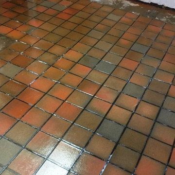
The entire downstairs flooring of my client’s house consisted of Quarry tiles apart from one room where the tiles had been covered by screed and then linoleum. Quarry tiles are a classic hard wearing tile used for both internal and external commercial and residential flooring due to its ability to withstand heavy usage. Reception areas, outdoor patios and porches, for example, are commonly tiled using Quarry.
My client wanted to restore the covered floor back to its original state so that it would match the rest of the downstairs. Realising that this would be a complex and physically demanding task, my client decided to call in Tile Doctor to carry out the restoration.
Removing the Linoleum covering was a relatively straightforward process, so I was able to do this relatively quickly. The main issue concerned removing the screed, which is far more difficult to remove, requiring a lot of physical scraping. Thus I opted to call in some extra manpower in the form of the Nottinghamshire Tile Doctor, Steve Carpenter. With the two of us armed with scrapers we set about removing the screed, taking extra care not to damage the Quarry tile underneath.
Once Steve and I had scraped off as much of the screed as physically possible, I applied a strong dilution of Tile Doctor Remove & Go, a stripper with cleaning properties that is particularly effective at breaking down coatings such as adhesives, plasters and sealers. The product was left to dwell for ten minutes before I worked it into the stone with a scrubbing pad.
After cleaning the tiles, I noticed a layer of grout haze on the surface of the exposed Quarry tiles, so I applied Tile Doctor Grout Clean-Up to remove it. Once the cleaning process was complete I gave the floor a thorough rinse with clean water, before soaking up the resulting residue with a wet-vac machine. The first day of work was a gruelling 12 hours long, but I was very pleased with the results and left the floor to dry overnight.
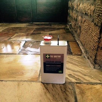
On day two I returned to finish the job by sealing the newly uncovered Quarry tiles, but not before using a damp meter to check that they were completely dry. Any excess moisture left on unsealed tiles can potentially effect the performance of any sealers that are applied. I sealed the tiles using Tile Doctor Colour Grow, an impregnating, colour-enhancing sealer which gave the surface an aesthetically pleasing shine, as well as durable protection against dirt and wear for the future.
After two long days of work the job was done and the transformation was fantastic and highly rewarding to see, the house now has a fantastic looking Quarry tiled floor running throughout the entirety of the lower level.
Mick Gayton
Warwickshire Tile Doctor
 TVL Creative Ltd.
These wonderful clients returned to us for their newest home remodel adventure. Their newly purchased custom built 1970s modern ranch sits in one of the loveliest neighborhoods south of the city but the current conditions of the home were out-dated and not so lovely. Upon entering the front door through the court you were greeted abruptly by a very boring staircase and an excessive number of doors. Just to the left of the double door entry was a large slider and on your right once inside the home was a soldier line up of doors. This made for an uneasy and uninviting entry that guests would quickly forget and our clients would often avoid. We also had our hands full in the kitchen. The existing space included many elements that felt out of place in a modern ranch including a rustic mountain scene backsplash, cherry cabinets with raised panel and detailed profile, and an island so massive you couldn’t pass a drink across the stone. Our design sought to address the functional pain points of the home and transform the overall aesthetic into something that felt like home for our clients.
For the entry, we re-worked the front door configuration by switching from the double door to a large single door with side lights. The sliding door next to the main entry door was replaced with a large window to eliminate entry door confusion. In our re-work of the entry staircase, guesta are now greeted into the foyer which features the Coral Pendant by David Trubridge. Guests are drawn into the home by stunning views of the front range via the large floor-to-ceiling glass wall in the living room. To the left, the staircases leading down to the basement and up to the master bedroom received a massive aesthetic upgrade. The rebuilt 2nd-floor staircase has a center spine with wood rise and run appearing to float upwards towards the master suite. A slatted wall of wood separates the two staircases which brings more light into the basement stairwell. Black metal railings add a stunning contrast to the light wood.
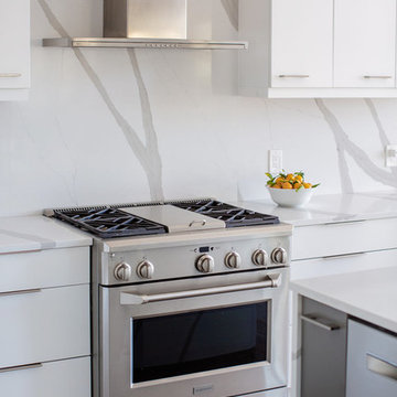
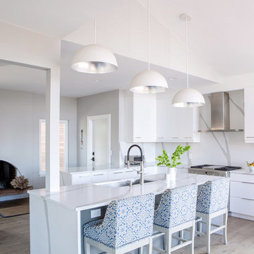
Other fabulous upgrades to this home included new wide plank flooring throughout the home, which offers both modernity and warmth. The once too-large kitchen island was downsized to create a functional focal point that is still accessible and intimate. The old dark and heavy kitchen cabinetry was replaced with sleek white cabinets, brightening up the space and elevating the aesthetic of the entire room. The kitchen countertops are marble look quartz with dramatic veining that offers an artistic feature behind the range and across all horizontal surfaces in the kitchen. As a final touch, cascading island pendants were installed which emphasize the gorgeous ceiling vault and provide warm feature lighting over the central point of the kitchen.
This transformation reintroduces light and simplicity to this gorgeous home, and we are so happy that our clients can reap the benefits of this elegant and functional design for years to come.


 TVL Creative Ltd.
These wonderful clients returned to us for their newest home remodel adventure. Their newly purchased custom built 1970s modern ranch sits in one of the loveliest neighborhoods south of the city but the current conditions of the home were out-dated and not so lovely. Upon entering the front door through the court you were greeted abruptly by a very boring staircase and an excessive number of doors. Just to the left of the double door entry was a large slider and on your right once inside the home was a soldier line up of doors. This made for an uneasy and uninviting entry that guests would quickly forget and our clients would often avoid. We also had our hands full in the kitchen. The existing space included many elements that felt out of place in a modern ranch including a rustic mountain scene backsplash, cherry cabinets with raised panel and detailed profile, and an island so massive you couldn’t pass a drink across the stone. Our design sought to address the functional pain points of the home and transform the overall aesthetic into something that felt like home for our clients.
For the entry, we re-worked the front door configuration by switching from the double door to a large single door with side lights. The sliding door next to the main entry door was replaced with a large window to eliminate entry door confusion. In our re-work of the entry staircase, guesta are now greeted into the foyer which features the Coral Pendant by David Trubridge. Guests are drawn into the home by stunning views of the front range via the large floor-to-ceiling glass wall in the living room. To the left, the staircases leading down to the basement and up to the master bedroom received a massive aesthetic upgrade. The rebuilt 2nd-floor staircase has a center spine with wood rise and run appearing to float upwards towards the master suite. A slatted wall of wood separates the two staircases which brings more light into the basement stairwell. Black metal railings add a stunning contrast to the light wood.
Other fabulous upgrades to this home included new wide plank flooring throughout the home, which offers both modernity and warmth. The once too-large kitchen island was downsized to create a functional focal point that is still accessible and intimate. The old dark and heavy kitchen cabinetry was replaced with sleek white cabinets, brightening up the space and elevating the aesthetic of the entire room. The kitchen countertops are marble look quartz with dramatic veining that offers an artistic feature behind the range and across all horizontal surfaces in the kitchen. As a final touch, cascading island pendants were installed which emphasize the gorgeous ceiling vault and provide warm feature lighting over the central point of the kitchen.
This transformation reintroduces light and simplicity to this gorgeous home, and we are so happy that our clients can reap the benefits of this elegant and functional design for years to come.
 TVL Creative Ltd.
These wonderful clients returned to us for their newest home remodel adventure. Their newly purchased custom built 1970s modern ranch sits in one of the loveliest neighborhoods south of the city but the current conditions of the home were out-dated and not so lovely. Upon entering the front door through the court you were greeted abruptly by a very boring staircase and an excessive number of doors. Just to the left of the double door entry was a large slider and on your right once inside the home was a soldier line up of doors. This made for an uneasy and uninviting entry that guests would quickly forget and our clients would often avoid. We also had our hands full in the kitchen. The existing space included many elements that felt out of place in a modern ranch including a rustic mountain scene backsplash, cherry cabinets with raised panel and detailed profile, and an island so massive you couldn’t pass a drink across the stone. Our design sought to address the functional pain points of the home and transform the overall aesthetic into something that felt like home for our clients.
For the entry, we re-worked the front door configuration by switching from the double door to a large single door with side lights. The sliding door next to the main entry door was replaced with a large window to eliminate entry door confusion. In our re-work of the entry staircase, guesta are now greeted into the foyer which features the Coral Pendant by David Trubridge. Guests are drawn into the home by stunning views of the front range via the large floor-to-ceiling glass wall in the living room. To the left, the staircases leading down to the basement and up to the master bedroom received a massive aesthetic upgrade. The rebuilt 2nd-floor staircase has a center spine with wood rise and run appearing to float upwards towards the master suite. A slatted wall of wood separates the two staircases which brings more light into the basement stairwell. Black metal railings add a stunning contrast to the light wood.
Other fabulous upgrades to this home included new wide plank flooring throughout the home, which offers both modernity and warmth. The once too-large kitchen island was downsized to create a functional focal point that is still accessible and intimate. The old dark and heavy kitchen cabinetry was replaced with sleek white cabinets, brightening up the space and elevating the aesthetic of the entire room. The kitchen countertops are marble look quartz with dramatic veining that offers an artistic feature behind the range and across all horizontal surfaces in the kitchen. As a final touch, cascading island pendants were installed which emphasize the gorgeous ceiling vault and provide warm feature lighting over the central point of the kitchen.
This transformation reintroduces light and simplicity to this gorgeous home, and we are so happy that our clients can reap the benefits of this elegant and functional design for years to come.
 TVL Creative Ltd.
These wonderful clients returned to us for their newest home remodel adventure. Their newly purchased custom built 1970s modern ranch sits in one of the loveliest neighborhoods south of the city but the current conditions of the home were out-dated and not so lovely. Upon entering the front door through the court you were greeted abruptly by a very boring staircase and an excessive number of doors. Just to the left of the double door entry was a large slider and on your right once inside the home was a soldier line up of doors. This made for an uneasy and uninviting entry that guests would quickly forget and our clients would often avoid. We also had our hands full in the kitchen. The existing space included many elements that felt out of place in a modern ranch including a rustic mountain scene backsplash, cherry cabinets with raised panel and detailed profile, and an island so massive you couldn’t pass a drink across the stone. Our design sought to address the functional pain points of the home and transform the overall aesthetic into something that felt like home for our clients.
For the entry, we re-worked the front door configuration by switching from the double door to a large single door with side lights. The sliding door next to the main entry door was replaced with a large window to eliminate entry door confusion. In our re-work of the entry staircase, guesta are now greeted into the foyer which features the Coral Pendant by David Trubridge. Guests are drawn into the home by stunning views of the front range via the large floor-to-ceiling glass wall in the living room. To the left, the staircases leading down to the basement and up to the master bedroom received a massive aesthetic upgrade. The rebuilt 2nd-floor staircase has a center spine with wood rise and run appearing to float upwards towards the master suite. A slatted wall of wood separates the two staircases which brings more light into the basement stairwell. Black metal railings add a stunning contrast to the light wood.
Other fabulous upgrades to this home included new wide plank flooring throughout the home, which offers both modernity and warmth. The once too-large kitchen island was downsized to create a functional focal point that is still accessible and intimate. The old dark and heavy kitchen cabinetry was replaced with sleek white cabinets, brightening up the space and elevating the aesthetic of the entire room. The kitchen countertops are marble look quartz with dramatic veining that offers an artistic feature behind the range and across all horizontal surfaces in the kitchen. As a final touch, cascading island pendants were installed which emphasize the gorgeous ceiling vault and provide warm feature lighting over the central point of the kitchen.
This transformation reintroduces light and simplicity to this gorgeous home, and we are so happy that our clients can reap the benefits of this elegant and functional design for years to come.
 Tile Doctor Ltd
Here we have a six year old Indian Sandstone tiled floor located a property on the outskirts of Lancaster. Measuring 100 metres squared, the very large floor had under floor heating in the concrete sub base. The type of stone used inside the property is what we commonly refer to as ‘patio Sandstone’, a material which is usually used outside because of its very rough texture. It’s not particularly comfortable to walk across in bare feet, hence why many people consider it be impractical for internal flooring.
Nonetheless, the property owner was keen to make the rough textured floor as feet-friendly as possible for people walking over it. At Tile Doctor we have developed a process known as milling, which utilises diamond encrusted pads combined with a weighted rotary machine to smooth the rough surface, leaving it looking and feeling a lot nicer and more practical to live with. The milling process is only done once, but while the Sandstone will still need cleaning and sealing in the future, it won’t be nearly as difficult as when it was rough.
The job would take over two weeks to complete due to the fact that the existing grout needed to be removed and replaced with a flexible floor grout: a very time consuming process.
As mentioned, the surface of the Sandstone was very rough, and so needed to be milled down to make it a lot smoother to look after and make it easy to clean and seal. This was achieved by using Tile Doctor’s 50 Grit diamond encrusted burnishing pads, fitted to a weighed rotary machine and run along the entire surface area of the floor. Through this process the stone became much smoother and more aesthetic – completing one of our main objectives for the customer.
Next, we started breaking out the already loose and badly applied grout with our grout removal tools. The builder who had installed the floor had used a sand/cement-based grout which wasn’t flexible. As a result, it started to crumble and loosen quite quickly after exposure to the underfloor heating. We removed this and replaced it with a far more flexible grout.
Once the whole area had been successfully milled and the grout replaced, the Sandstone floor was left to dry out over the weekend. Upon our return to the property, we cleaned off any dust and resin left over from the milling and grouting processes, before leaving it to dry for a further 24 hours.
The next day we returned to seal the whole floor with two coats of our impregnating sealer Tile Doctor Colour Grow. The sealer fills the pores of the Sandstone to prevent ingrained dirt and stains, while also emphasising the natural colours in the stone. It also provides a robust matte finish, which is what the customer wished for.
It wasn’t the easiest of processes to get the Indian Sandstone into a condition where it would be both suitable for internal flooring and aesthetically pleasing, but the results proved to be very much worth the time and effort invested. The customer was very pleased with the transformation.
Russell Taylor
Lancashire Tile Doctor
 TVL Creative Ltd.
These wonderful clients returned to us for their newest home remodel adventure. Their newly purchased custom built 1970s modern ranch sits in one of the loveliest neighborhoods south of the city but the current conditions of the home were out-dated and not so lovely. Upon entering the front door through the court you were greeted abruptly by a very boring staircase and an excessive number of doors. Just to the left of the double door entry was a large slider and on your right once inside the home was a soldier line up of doors. This made for an uneasy and uninviting entry that guests would quickly forget and our clients would often avoid. We also had our hands full in the kitchen. The existing space included many elements that felt out of place in a modern ranch including a rustic mountain scene backsplash, cherry cabinets with raised panel and detailed profile, and an island so massive you couldn’t pass a drink across the stone. Our design sought to address the functional pain points of the home and transform the overall aesthetic into something that felt like home for our clients.
For the entry, we re-worked the front door configuration by switching from the double door to a large single door with side lights. The sliding door next to the main entry door was replaced with a large window to eliminate entry door confusion. In our re-work of the entry staircase, guesta are now greeted into the foyer which features the Coral Pendant by David Trubridge. Guests are drawn into the home by stunning views of the front range via the large floor-to-ceiling glass wall in the living room. To the left, the staircases leading down to the basement and up to the master bedroom received a massive aesthetic upgrade. The rebuilt 2nd-floor staircase has a center spine with wood rise and run appearing to float upwards towards the master suite. A slatted wall of wood separates the two staircases which brings more light into the basement stairwell. Black metal railings add a stunning contrast to the light wood.
Other fabulous upgrades to this home included new wide plank flooring throughout the home, which offers both modernity and warmth. The once too-large kitchen island was downsized to create a functional focal point that is still accessible and intimate. The old dark and heavy kitchen cabinetry was replaced with sleek white cabinets, brightening up the space and elevating the aesthetic of the entire room. The kitchen countertops are marble look quartz with dramatic veining that offers an artistic feature behind the range and across all horizontal surfaces in the kitchen. As a final touch, cascading island pendants were installed which emphasize the gorgeous ceiling vault and provide warm feature lighting over the central point of the kitchen.
This transformation reintroduces light and simplicity to this gorgeous home, and we are so happy that our clients can reap the benefits of this elegant and functional design for years to come.
 TKS Design Group
Download our free ebook, Creating the Ideal Kitchen. DOWNLOAD NOW
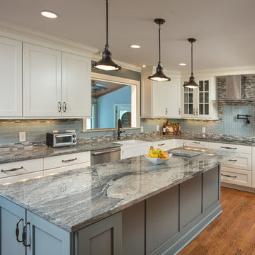
Lakefront property in the northwest suburbs of Chicago is hard to come by, so when we were hired by this young family with exactly that, we were immediately inspired by not just the unusually large footprint of this 1950’s colonial revival but also the lovely views of the manmade lake it was sited on. The large 5-bedroom home was solidly stuck in the 1980’s, but we saw tons of potential. We started out by updating the existing staircase with a fresh coat of paint and adding new herringbone slate to the entry hall.
The powder room off the entryway also got a refresh - new flooring, new cabinets and fixtures. We ran the new slate right through into this space for some consistency. A fun wallpaper and shiplap trim add a welcoming feel and set the tone for the home.
Next, we tackled the kitchen. Located away from the rest of the first floor, the kitchen felt a little isolated, so we immediately began planning for how to better connect it to the rest of the first floor. We landed on removing the wall between the kitchen and dining room and designed a modified galley style space with separate cooking and clean up zones. The cooking zone consists of the refrigerator, prep sink and cooktop, along with a nice long run of prep space at the island. The cleanup side of the kitchen consists of the main sink and dishwasher. Both areas are situated so that the user can view the lake during prep work and cleanup!
One of the home’s main puzzles was how to incorporate the mudroom and area in front of the patio doors at the back of the house. We already had a breakfast table area, so the space by the patio doors was a bit of a no man’s land. We decided to separate the kitchen proper from what became the new mudroom with a large set of barn doors. That way you can quickly hide any mudroom messes but have easy access to the light coming in through the patio doors as well as the outdoor grilling station. We also love the impact the barn doors add to the overall space.
The homeowners’ first words to us were “it’s time to ditch the brown,” so we did! We chose a lovely blue pallet that reflects the home’s location on the lake which is also vibrant yet easy on the eye. Countertops are white quartz, and the natural oak floor works well with the other honey accents. The breakfast table was given a refresh with new chairs, chandelier and window treatments that frame the gorgeous views of the lake out the back.
We coordinated the slate mudroom flooring with that used in the home’s main entrance for a consistent feel. The storage area consists of open and closed storage to allow for some clutter control as needed.
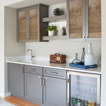
Next on our “to do” list was revamping the dated brown bar area in the neighboring dining room. We eliminated the clutter by adding some closed cabinets and did some easy updates to help the space feel more current. One snag we ran into here was the discovery of a beam above the existing open shelving that had to be modified with a smaller structural beam to allow for our new design to work. This was an unexpected surprise, but in the end we think it was well worth it!
We kept the colors here a bit more muted to blend with the homeowner’s existing furnishings. Open shelving and polished nickel hardware add some simple detail to the new entertainment zone which also looks out onto the lake!
Next we tackled the upstairs starting with the homeowner’s son’s bath. The bath originally had both a tub shower and a separate shower, so we decided to swap out the shower for a new laundry area. This freed up some space downstairs in what used to be the mudroom/laundry room and is much more convenient for daily laundry needs.
We continued the blue palette here with navy cabinetry and the navy tile in the shower. Porcelain floor tile and chrome fixtures keep maintenance to a minimum while matte black mirrors and lighting add some depth the design. A low maintenance runner adds some warmth underfoot and ties the whole space together.
We added a pocket door to the bathroom to minimize interference with the door swings. The left door of the laundry closet is on a 180 degree hinge to allow for easy full access to the machines. Next we tackled the master bath which is an en suite arrangement. The original was typical of the 1980’s with the vanity outside of the bathroom, situated near the master closet. And the brown theme continued here with multiple shades of brown.
Our first move was to segment off the bath and the closet from the master bedroom. We created a short hall from the bedroom to the bathroom with his and hers walk-in closets on the left and right as well as a separate toilet closet outside of the main bathroom for privacy and flexibility.
The original bathroom had a giant soaking tub with steps (dangerous!) as well as a small shower that did not work well for our homeowner who is 6’3”. With other bathtubs in the home, they decided to eliminate the tub and create an oversized shower which takes up the space where the old tub was located. The double vanity is on the opposite wall and a bench is located under the window for morning conversations and a place to set a couple of towels.
The pallet in here is light and airy with a mix of blond wood, creamy porcelain and marble tile, and brass accents. A simple roman shade adds some texture and it’s top-down mechanism allows for light and privacy.
This large whole house remodel gave our homeowners not only the ability to maximize the potential of their home but also created a lovely new frame from which to view their fabulous lake views.
Designed by: Susan Klimala, CKD, CBD
Photography by: Michael Kaskel
For more information on kitchen and bath design ideas go to: www.kitchenstudio-ge.com
Sponsored
Columbus, OH

Trish Takacs Design
Award Winning & Highly Skilled Kitchen & Bath Designer in Columbus
 Advance Design Studio, Ltd.
Jennifer and Dan have lived in their Deer Park Illinois home for 15 years, slowly making minor fixes like painting and decorating; but they had a new plan for their kitchen the entire time. An awkwardly placed garage door, and an island cooktop with a terrible downdraft made a full-scale kitchen remodel an absolute must. Jennifer had many ideas in mind and wanted to work with a company that could provide high-end work, while partnering with a designer that would tailor the kitchen to her ideas.
She was intrigued by the phrase “Common Sense Remodeling” in Advance Design’s feature she discovered while perusing an issue of the community’s Quintessential Barrington Magazine. Doing further research on the company’s website, as she looked through project profiles and read about Advance Design’s “Common Sense Remodeling” philosophy, she promptly scheduled an appointment to see if the people and ideas she read about were truly who they said they were. The more she read, the more she knew that the “Common Sense” approach to remodeling they described was exactly the type of company she was looking for.
The partnership was sealed after an initial consultation with Owner Todd Jurs and Project Designer Michelle Lecinski. They displayed a combination of friendliness, professionalism and respect that was unmatched by any of the other companies Jennifer talked to. She knew that with Advance Design, she would be able to retain the vision that she had in mind with high-quality craftsmanship.
“I reached out to Advance Design because of the ‘Common Sense Remodeling’ tagline,” Jennifer said. “That’s what lingered for me”. “Advance Design was the most respectful- of the house and of my design ideas, and the most professional of the handful of companies that looked at my project”.
Soon after the meeting Jennifer began working with Michelle on the project design. They quickly developed chemistry. Jennifer loved how Michelle researched and located every detail that Jennifer wanted for the kitchen. Between the two of them, every concept and idea was worked through and perfected. “Jennifer had definite ideas about what she wanted the new kitchen to look like, she just didn’t know how to bring it all together. We worked together really well to make her ideas into the practical reality necessary for a well-functioning kitchen, with the look and feel that she had envisioned”, says Michelle.
“Michelle was wonderful in using the CAD system she would show me new drawings every time we changed the layout while working through the design,” Jennifer said. “She was a really wonderful partner in execution, she made sure everything happened quickly and easily.”
The finished design drew out elements of Jennifer’s style and personality. The pair call the look “sophisticated farmhouse” to describe the kitchen renovation to family and friends. The result was a beautifully crafted, authentic-feeling space that satisfied Jennifer’s dreams 15 years in the making. The whole project consisted of a kitchen remodel, mudroom upgrade with powder room, and garage entry relocation. “The projects I personally like the best, are the ones that put the client’s dreams on display,” Project Designer Michelle said. “And this is one of those projects.”
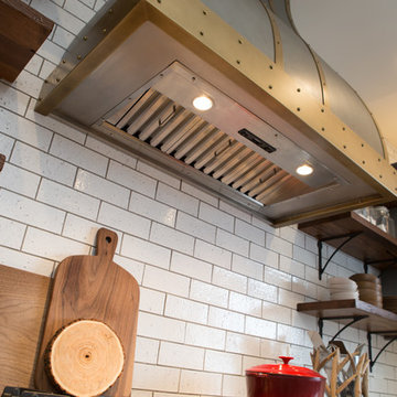
The main focal point of the kitchen is custom zinc and brass ventilation hood with a vintage sheen, which was hand made to order by a small company in Indiana named Vogler Metalworking. “It’s like sculpture, a true work of art”, says Jennifer. Your eye is immediately drawn towards this elegant yet practical hood that eliminated the home’s downdraft problem and added a striking conversation piece at the same time. The carpenters had to use special gloves when transporting and installing it, so they didn’t smudge it with fingerprints. The beautiful hood centers proudly over the stunning black enamel and brass LaCornue Range. “I had a friend who had a LaCornue range and after learning how easy it was to cook perfect meals, I was convinced I wanted to have one”, says Jennifer. This unique, breathtaking combination anchors the entire kitchen and is apparent immediately as you walk into the great room the surrounds the space.
DuraSupreme Crestwood cabinets with a Kendall Panel add function and sophistication. A custom gray paint color paired with a storm blue was developed so that the new kitchen looked like it belonged to the existing space. Unlacquered brass faucets and hardware were important to Jennifer because she wanted the living finishes to age over time. Remarkable brass diamond mesh cabinet door inserts imported from the UK continue to add this one-of-a-kind kitchen renovation; giving it a “you won’t see this everywhere” quality. The use of old railcar flooring for the coffee bar countertop and reclaimed oak for the open shelving gives an authenticity to the space uncommon in kitchens today.
Jennifer and Michelle fell in love with the Limestone Grey Stone while they were investigating unique island countertop ideas. They liked the fact that the limestone as a living finish will age and change over time. Calcutta Miel Quartz countertops made for an excellent pairing around the perimeter, as it’s durable and perfect for cooking preparations. A textured white subway tile backsplash that runs to the ceiling keeps your eye moving towards the open shelving, and to the main focal point of the stunning range hood combination.
“The kitchen functions beautifully, and it’s gorgeous,” beams Jennifer as she gestures with both hands while smiling ear to ear. “The most important thing was I wanted a kitchen that had a wonderful flow, cooked beautiful meals and was a great gathering place for family and friends, and this space does that perfectly! Beauty wise, it turned out exactly how I had envisioned. I felt the function part was the hardest part, and that was nailed”!
Relocating the garage entry to the new mudroom was a huge priority and has finally separated the family’s arriving home functions from their kitchen. Now coats and shoes and bags have their own area for dropping once members arrive home. Matching gray DuraSupreme cabinetry helped create gorgeous, purposeful lockers for the family. A reclaimed vintage sink and custom wall paper were added to the tiny powder room to beautify the once previously only functional space. Advance Design was even able to create a custom space for their dog to sleep while the family is away.
“It was unbelievable that a project of this size was completed in such a short time, and I think that’s because of the large amount of planning and preparation that went into it,” Jennifer marveled, “When we started, we were ready, and everything was prepared”.
When it came to execution, Project Manager Justin Davis and his crew were quick, accessible, and organized. Projects like this kitchen are typically completed in as little as 8-10 weeks. Jennifer’s kitchen however despite the relocation of some challenging HVAC in a soffit and moving of an exterior door was completed remarkably fast in part because the team was working with an existing tile floor that ran throughout the first floor that the client really loved.
“You get to know these people really well because they’re living in your house while you’re living in your house. They were so fast and really good, it didn’t take as long as even planned” reported Jennifer. “I would text Justin and he always responded almost immediately. I got to know all the guys who were working in our house and they were all wonderful people”.
Details in a customized kitchen like this one require skill and care from the people who install it. “All the guys on the job were skilled at what the did. I wanted small details like little feet to look like furniture, that is where their carpentry skill came in to make these all perfect”, said Jennifer. “The tile guys were wonderful. They even let me determine how I wanted the texture with the grout to appear for a salt and pepper look; now that is a very skilled trade person making it custom”.
In Jennifer’s interview, she continued to reference Advance Design’s “Common Sense Remodeling”, so I took a minute to ask her exactly what that phrase meant to her and how it played out in her experience with her project and the Advance Design team. Here is what she said: “I was intrigued about Common Sense Remodeling and in my head that there would be clear costs and prices, great communication between the design team, the execution team and me”, said Jennifer. They did deliver on that, it was so clear about the cost breakdown, what I could expect from everyone who came to my house, and everything that we had ordered. That to me is the Common Sense”!
It’s great to see a client take literally our assertion that a well-planned remodeling project is simply “Common Sense”! She anticipated each step of the way would be clear, concise, and predictable, all the while protecting the outcome due to the careful upfront planning. “Advance Design delivered on their ‘Common Sense Remodeling’ promise,” Jennifer said. “From the design team, to the execution team - everything was straight forward like I imagined. The project turned out exactly how I envisioned, I enjoyed this process and absolutely would recommend Advance Design Studio to anyone.”
 TVL Creative Ltd.
These wonderful clients returned to us for their newest home remodel adventure. Their newly purchased custom built 1970s modern ranch sits in one of the loveliest neighborhoods south of the city but the current conditions of the home were out-dated and not so lovely. Upon entering the front door through the court you were greeted abruptly by a very boring staircase and an excessive number of doors. Just to the left of the double door entry was a large slider and on your right once inside the home was a soldier line up of doors. This made for an uneasy and uninviting entry that guests would quickly forget and our clients would often avoid. We also had our hands full in the kitchen. The existing space included many elements that felt out of place in a modern ranch including a rustic mountain scene backsplash, cherry cabinets with raised panel and detailed profile, and an island so massive you couldn’t pass a drink across the stone. Our design sought to address the functional pain points of the home and transform the overall aesthetic into something that felt like home for our clients.
For the entry, we re-worked the front door configuration by switching from the double door to a large single door with side lights. The sliding door next to the main entry door was replaced with a large window to eliminate entry door confusion. In our re-work of the entry staircase, guesta are now greeted into the foyer which features the Coral Pendant by David Trubridge. Guests are drawn into the home by stunning views of the front range via the large floor-to-ceiling glass wall in the living room. To the left, the staircases leading down to the basement and up to the master bedroom received a massive aesthetic upgrade. The rebuilt 2nd-floor staircase has a center spine with wood rise and run appearing to float upwards towards the master suite. A slatted wall of wood separates the two staircases which brings more light into the basement stairwell. Black metal railings add a stunning contrast to the light wood.
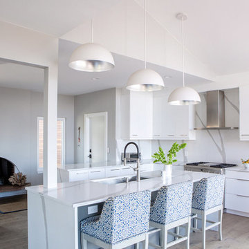
Other fabulous upgrades to this home included new wide plank flooring throughout the home, which offers both modernity and warmth. The once too-large kitchen island was downsized to create a functional focal point that is still accessible and intimate. The old dark and heavy kitchen cabinetry was replaced with sleek white cabinets, brightening up the space and elevating the aesthetic of the entire room. The kitchen countertops are marble look quartz with dramatic veining that offers an artistic feature behind the range and across all horizontal surfaces in the kitchen. As a final touch, cascading island pendants were installed which emphasize the gorgeous ceiling vault and provide warm feature lighting over the central point of the kitchen.
This transformation reintroduces light and simplicity to this gorgeous home, and we are so happy that our clients can reap the benefits of this elegant and functional design for years to come.
 Roeser Home Remodeling
This young couple in Glendale loved their home and their neighborhood, but with three growing children they felt they were running out of space. They began a list of needs which quickly grew after a couple of years. This list helped them to see how they used their current space, but also helped them identify what was lacking.
Their needs list quickly revealed that a two-story addition would be needed to fit all the family’s requirements. With much thought and discussion, a design was created by the Roeser Team in collaboration with Ann Begemann, architect. It was important to the homeowner that the design fit the look of the house. This is always a top priority for Roeser Home Remodeling. We pride ourselves in our finish product appearing as if it had always been there and especially in this remodel, we think we succeeded.
On the list of this family’s needs were to have ample storage space for the three children’s school and sporting equipment. A wider entrance hallway from the garage and the backyard provided a unique place to build custom locker spaces, along with a communication station that will close nice and neat when company is expected. Drawer units also give extra storage and allow for a filing system to keep track of all the paper work that comes home. Extra cabinets above the lockers provide much needed additional storage for out of season belongings. A 12 X 24 S140 tile floor laid in a broken joint pattern provides for easy cleaning of this space and keeps dirty shoes or boots from finding its way into the main living quarters.
The kitchen was at the top of the priority list for this family as well. The existing kitchen was just too small and narrow and did not allow for an eat-in kitchen, or an adequate workspace for the family. Since the homeowner loves to cook, our Roeser Home Remodeling designer came up with a beautiful design plan that allowed for both. The kitchen was moved to the addition, and the existing kitchen was remodeled with a breakfast nook, housing both a custom bench and a table with chairs, along with a pantry and dry bar. This was the perfect plan and now allows the homeowner to have seating and storage for the family and entertaining.
The custom bench was built to match a picture the homeowner had and was custom produced in our own little mill shop. A drawer on both sides of the bench is handy for any extra storage items that the family may need seasonally.
The kitchen quickly became a favorite with the Roeser Home Remodeling Team. With the mix of metals and the many extra features in this space, this kitchen is full of interest as well as function.
The perimeter cabinets are Wellborn Cabinet’s Premier Line, Charleston maple door style with glacier pewter finish. A Kohler Apron Front smart divide sink adds to the design and function of this beautiful kitchen.
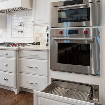
A wall mount pot filler hovers above a Wolfe five-burner stove top. The Wellborn hood unit passes the cabinet depth of the upper cabinets and compliments the Wellborn drawer unit underneath. Deeper drawers housed the 36” Wolf, five-burner professional gas stove top and added more storage. The addition of feet to the bottom of the drawer unit along with pushing back the toe kick gives an added detail and look of a furniture piece.
Flanking each end of the perimeter of cabinets are high end appliances. The 42” built-in French Door Sub-Zero Refrigerator/Freezer is left of the sink and concealed by Wellborn appliance panels. The Bosch 800 Series Dishwasher next in line is also concealed by a Wellborn appliance panel. However, the 30” Professional Wolf Oven and the 30” M Series Wolf Professional Convection Steam Oven sparkle with their stainless-steel finishes complimenting the Kohler Artifacts pull-down kitchen faucet, the Kohler Artifacts Pot Filler and the Top Knobs Hardware (Normandy Appliance Pulls in Polished Nickel, Button Faced Knob in Polish Nickel and the Tuscany Small D- Pull in Pewter Antique). A 30” Kitchen-Aid electric warming drawer is concealed by a Wellborn Drawer front and Top Knob hardware.
The Quartzite counter top in Taj Mahal is always an eye-catching feature for this beautiful kitchen. The large space of the island shows off its remarkable beauty. The island stands on its own with a custom design using Wellborn Cabinets Premier Line, Charleston maple door style in a Pebble Java finish, a darker finish cabinet not only serves as a focal point, but also warms the room against its starker contrast. The island houses a Sharp microwave drawer and its hardware is the same Tuscany small D-Pull as the rest of the kitchen, but in a German Bronze finish to compliment the island’s Hudson Valley Orchard Park light in an Aged Brass Finish.
The original half bath was the only bathroom on this floor of the house and the expense to move it was not an option. The location of the bathroom in the middle of the house was problematic. Roeser Home Remodeling solved the problem by creating an opening between the living room and new family room, along with giving the illusion of a small hallway behind the dry bar in the breakfast room. This created a nice space going into the living room and gave the feeling of an open floor plan, providing and a nice private entry to the existing half bath.
Updating the bath with wallpaper, a new Barclay- Stanford Pedestal Sink, a new Portsmouth wide-spread faucet in polished nickel, a new Devonshire comfort height toilet, new towel ring, paper holder, lighting and mirror made this cute little powder room a jewel in its own right!
The family room was also housed in the addition as a family hang-out place for homework, games and movie watching. Two sets of Sierra Pacific 6’0” X 6’8” aluminum clad wood French Sliding Patio Doors were installed to invite the outdoors in. This allowed for natural lighting and an open spacious feel to the room.
A Custom Entertainment Unit built by Roeser Home Remodeling in our mill shop, is the perfect space to house all the family’s television and gaming needs, keeping them neatly stored, but also close at hand.
Opposite of the French Doors is the original opening to the backyard. By keeping the opening and installing beautiful glass doors, it opened the flow of the house to the formal living room. By adding the glass doors, it provided a cozy area for quiet adult conversation while keeping an eye on the children as they play or watch TV.
 TVL Creative Ltd.
These wonderful clients returned to us for their newest home remodel adventure. Their newly purchased custom built 1970s modern ranch sits in one of the loveliest neighborhoods south of the city but the current conditions of the home were out-dated and not so lovely. Upon entering the front door through the court you were greeted abruptly by a very boring staircase and an excessive number of doors. Just to the left of the double door entry was a large slider and on your right once inside the home was a soldier line up of doors. This made for an uneasy and uninviting entry that guests would quickly forget and our clients would often avoid. We also had our hands full in the kitchen. The existing space included many elements that felt out of place in a modern ranch including a rustic mountain scene backsplash, cherry cabinets with raised panel and detailed profile, and an island so massive you couldn’t pass a drink across the stone. Our design sought to address the functional pain points of the home and transform the overall aesthetic into something that felt like home for our clients.
For the entry, we re-worked the front door configuration by switching from the double door to a large single door with side lights. The sliding door next to the main entry door was replaced with a large window to eliminate entry door confusion. In our re-work of the entry staircase, guesta are now greeted into the foyer which features the Coral Pendant by David Trubridge. Guests are drawn into the home by stunning views of the front range via the large floor-to-ceiling glass wall in the living room. To the left, the staircases leading down to the basement and up to the master bedroom received a massive aesthetic upgrade. The rebuilt 2nd-floor staircase has a center spine with wood rise and run appearing to float upwards towards the master suite. A slatted wall of wood separates the two staircases which brings more light into the basement stairwell. Black metal railings add a stunning contrast to the light wood.
Other fabulous upgrades to this home included new wide plank flooring throughout the home, which offers both modernity and warmth. The once too-large kitchen island was downsized to create a functional focal point that is still accessible and intimate. The old dark and heavy kitchen cabinetry was replaced with sleek white cabinets, brightening up the space and elevating the aesthetic of the entire room. The kitchen countertops are marble look quartz with dramatic veining that offers an artistic feature behind the range and across all horizontal surfaces in the kitchen. As a final touch, cascading island pendants were installed which emphasize the gorgeous ceiling vault and provide warm feature lighting over the central point of the kitchen.
This transformation reintroduces light and simplicity to this gorgeous home, and we are so happy that our clients can reap the benefits of this elegant and functional design for years to come.
 TVL Creative Ltd.
These wonderful clients returned to us for their newest home remodel adventure. Their newly purchased custom built 1970s modern ranch sits in one of the loveliest neighborhoods south of the city but the current conditions of the home were out-dated and not so lovely. Upon entering the front door through the court you were greeted abruptly by a very boring staircase and an excessive number of doors. Just to the left of the double door entry was a large slider and on your right once inside the home was a soldier line up of doors. This made for an uneasy and uninviting entry that guests would quickly forget and our clients would often avoid. We also had our hands full in the kitchen. The existing space included many elements that felt out of place in a modern ranch including a rustic mountain scene backsplash, cherry cabinets with raised panel and detailed profile, and an island so massive you couldn’t pass a drink across the stone. Our design sought to address the functional pain points of the home and transform the overall aesthetic into something that felt like home for our clients.
For the entry, we re-worked the front door configuration by switching from the double door to a large single door with side lights. The sliding door next to the main entry door was replaced with a large window to eliminate entry door confusion. In our re-work of the entry staircase, guesta are now greeted into the foyer which features the Coral Pendant by David Trubridge. Guests are drawn into the home by stunning views of the front range via the large floor-to-ceiling glass wall in the living room. To the left, the staircases leading down to the basement and up to the master bedroom received a massive aesthetic upgrade. The rebuilt 2nd-floor staircase has a center spine with wood rise and run appearing to float upwards towards the master suite. A slatted wall of wood separates the two staircases which brings more light into the basement stairwell. Black metal railings add a stunning contrast to the light wood.
Other fabulous upgrades to this home included new wide plank flooring throughout the home, which offers both modernity and warmth. The once too-large kitchen island was downsized to create a functional focal point that is still accessible and intimate. The old dark and heavy kitchen cabinetry was replaced with sleek white cabinets, brightening up the space and elevating the aesthetic of the entire room. The kitchen countertops are marble look quartz with dramatic veining that offers an artistic feature behind the range and across all horizontal surfaces in the kitchen. As a final touch, cascading island pendants were installed which emphasize the gorgeous ceiling vault and provide warm feature lighting over the central point of the kitchen.
This transformation reintroduces light and simplicity to this gorgeous home, and we are so happy that our clients can reap the benefits of this elegant and functional design for years to come.
 TVL Creative Ltd.
These wonderful clients returned to us for their newest home remodel adventure. Their newly purchased custom built 1970s modern ranch sits in one of the loveliest neighborhoods south of the city but the current conditions of the home were out-dated and not so lovely. Upon entering the front door through the court you were greeted abruptly by a very boring staircase and an excessive number of doors. Just to the left of the double door entry was a large slider and on your right once inside the home was a soldier line up of doors. This made for an uneasy and uninviting entry that guests would quickly forget and our clients would often avoid. We also had our hands full in the kitchen. The existing space included many elements that felt out of place in a modern ranch including a rustic mountain scene backsplash, cherry cabinets with raised panel and detailed profile, and an island so massive you couldn’t pass a drink across the stone. Our design sought to address the functional pain points of the home and transform the overall aesthetic into something that felt like home for our clients.
For the entry, we re-worked the front door configuration by switching from the double door to a large single door with side lights. The sliding door next to the main entry door was replaced with a large window to eliminate entry door confusion. In our re-work of the entry staircase, guesta are now greeted into the foyer which features the Coral Pendant by David Trubridge. Guests are drawn into the home by stunning views of the front range via the large floor-to-ceiling glass wall in the living room. To the left, the staircases leading down to the basement and up to the master bedroom received a massive aesthetic upgrade. The rebuilt 2nd-floor staircase has a center spine with wood rise and run appearing to float upwards towards the master suite. A slatted wall of wood separates the two staircases which brings more light into the basement stairwell. Black metal railings add a stunning contrast to the light wood.
Other fabulous upgrades to this home included new wide plank flooring throughout the home, which offers both modernity and warmth. The once too-large kitchen island was downsized to create a functional focal point that is still accessible and intimate. The old dark and heavy kitchen cabinetry was replaced with sleek white cabinets, brightening up the space and elevating the aesthetic of the entire room. The kitchen countertops are marble look quartz with dramatic veining that offers an artistic feature behind the range and across all horizontal surfaces in the kitchen. As a final touch, cascading island pendants were installed which emphasize the gorgeous ceiling vault and provide warm feature lighting over the central point of the kitchen.
This transformation reintroduces light and simplicity to this gorgeous home, and we are so happy that our clients can reap the benefits of this elegant and functional design for years to come.
 TVL Creative Ltd.
These wonderful clients returned to us for their newest home remodel adventure. Their newly purchased custom built 1970s modern ranch sits in one of the loveliest neighborhoods south of the city but the current conditions of the home were out-dated and not so lovely. Upon entering the front door through the court you were greeted abruptly by a very boring staircase and an excessive number of doors. Just to the left of the double door entry was a large slider and on your right once inside the home was a soldier line up of doors. This made for an uneasy and uninviting entry that guests would quickly forget and our clients would often avoid. We also had our hands full in the kitchen. The existing space included many elements that felt out of place in a modern ranch including a rustic mountain scene backsplash, cherry cabinets with raised panel and detailed profile, and an island so massive you couldn’t pass a drink across the stone. Our design sought to address the functional pain points of the home and transform the overall aesthetic into something that felt like home for our clients.
For the entry, we re-worked the front door configuration by switching from the double door to a large single door with side lights. The sliding door next to the main entry door was replaced with a large window to eliminate entry door confusion. In our re-work of the entry staircase, guesta are now greeted into the foyer which features the Coral Pendant by David Trubridge. Guests are drawn into the home by stunning views of the front range via the large floor-to-ceiling glass wall in the living room. To the left, the staircases leading down to the basement and up to the master bedroom received a massive aesthetic upgrade. The rebuilt 2nd-floor staircase has a center spine with wood rise and run appearing to float upwards towards the master suite. A slatted wall of wood separates the two staircases which brings more light into the basement stairwell. Black metal railings add a stunning contrast to the light wood.
Other fabulous upgrades to this home included new wide plank flooring throughout the home, which offers both modernity and warmth. The once too-large kitchen island was downsized to create a functional focal point that is still accessible and intimate. The old dark and heavy kitchen cabinetry was replaced with sleek white cabinets, brightening up the space and elevating the aesthetic of the entire room. The kitchen countertops are marble look quartz with dramatic veining that offers an artistic feature behind the range and across all horizontal surfaces in the kitchen. As a final touch, cascading island pendants were installed which emphasize the gorgeous ceiling vault and provide warm feature lighting over the central point of the kitchen.
This transformation reintroduces light and simplicity to this gorgeous home, and we are so happy that our clients can reap the benefits of this elegant and functional design for years to come.
28