
Search results for "Quick running" in Home Design Ideas
 Electronic Design & Consulting, Inc.
This article is posted here with the consent of the author. The views and opinions expressed in this article are those of the author and do not necessarily reflect the official policy, position, view, or opinion of Crestron Electronics, Inc., or of any of its employees. Crestron Electronics is not responsible for, and does not verify the accuracy of, any of the information contained in this article.
By Jeff Singer
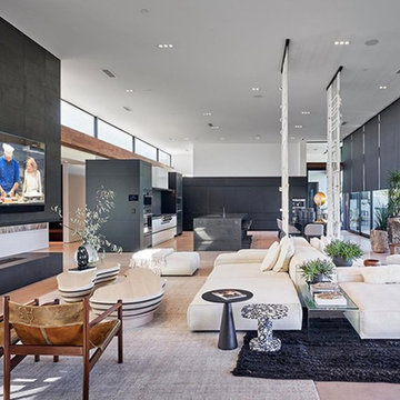
The “smart” revolution began several years ago with smartphones (a.k.a phones) and has extended in recent years to thermostats, doorbells, alarm systems, and kitchen appliances. Smart devices are so ubiquitous that the term “smart” is overused to the point that it is almost meaningless. Companies are eager to jump on the bandwagon and claim their products are “smart,” and consumers proudly claim they have a smart home because they have lighting control. Misconceptions about smart homes are prevalent and create confusion in the marketplace. This can have deleterious effects on businesses and underserve consumers. Here are seven of the most popular misconceptions about smart homes:
1. Apps are smart
Apps are convenient and easy to use. Yes, it seems there’s an app for everything. People expect to be able to download an app and do just about anything. App developers and many companies do not disavow consumers of this myth. On the contrary, they promote this idea with carefully worded descriptions. The promise of having the world at your fingertips for $1.99 is very enticing. Although it sounds too good to be true, it is also too good to pass up for many people. This leads to undervaluing home control and disappointment when the apps don’t work, which undermines confidence in our industry. The fact is that apps are not smart. They do not control anything. They must connect to and communicate with a control system or cloud service that processes, prioritizes, and executes commands. That’s the real magic and what most people do not understand.
2. Smart devices work together
With so many smart appliances and devices on the market today, it’s understandable that the average consumer might think that they actually communicate and work together. This is simply not the case. Smart devices are not that smart. They are designed and manufactured by different, often competing, companies. There are no national or industry standards governing these products. Even if they all operate using Wi-Fi® communications, that doesn’t mean they work together. Some companies promote a home control platform, which unites different devices from different companies – in theory. The platform is yet another third-party software totally dependent on other companies developing APIs and writing control modules for their hardware to run on that piece of software. The devices are not independently compatible. Also, when updates are made to either the hardware or the software, functionality may be affected for some period. That’s a nice way of saying the device or system won’t work and there’s no way of knowing for how long.
3. It’s a DIY project
Which brings us to the next myth, which is that the average person can do it themselves. Unless you are a skilled professional, I would not advise taking on a smart home project. You want to make a light turn on and off with your Alexa® or Google Assistant™ virtual assistant software, go for it. A smart home takes much more planning and expertise. I have no problem changing a light bulb or hanging a light fixture in my dining room; however, I am not going to rewire my house. I may change the flush valve in my toilet, but I’m not going to replace the pipes in my house. You get it. Integrating devices and systems, establishing different zones, creating scenes, designing the UI with a balance between control, feedback, and simplicity – all takes experience and skill.
4. Need a programmer to make changes
Early adopters may have experienced the pain of trying to make a simple change or update to their home control system. Years ago, if the cable provider changed the channel line-up, the homeowner would have to call the dealer or programmer to make an appointment for them to come out to the house to reprogram the system. The system wouldn’t work as expected until it was updated, which often took several days and beaucoup bucks. Not anymore. Technology has evolved so now it’s easy for system owners to change favorite channels, create scenes, rename buttons, update images, and more. While a professional is needed for the initial installation and setup, the system is easy to manage once it’s up and running. This makes life so much easier for both dealer and customer.
5. Tech becomes obsolete quickly
Similar to updating the UI, updating firmware or hardware used to be a stressful process. A smart home should be intelligent enough to update itself. Apps don’t become obsolete. Updates are constantly pushed out from the cloud, making them better all the time. The same is true for a good smart home system. New features, functions, and device support gets added in the background consistently, so the system you installed (or purchased) yesterday gets better over time. Swapping out decorative elements, such as keypads, dimmers, and touch screens is also seamless. When a new device is added, all the settings are pulled down from the cloud and it just works. No system interruptions. No sunk costs. No imposing house calls. No surprise bills.
6. Lighting control saves energy and money
Lighting control is one of the most popular smart systems, but it takes more than just one system to make a home smart. On the surface, it makes sense that if you dim the lights ten percent, then you save ten percent of energy costs. If the shades are raised during the day to take advantage of sunlight so the lights don’t need to be on (or at least not 100%), but that causes the room temperature to rise a few degrees, which triggers the air conditioner to run longer and more often, was energy usage (or cost) reduced? A smart home integrates all the various systems and technology to optimize comfort, convenience, safety, and sometimes energy.
7. Home technology is easy to hack
Security is at the forefront of people’s minds these days. Personal identities are stolen; email accounts hacked; private photos publicized; and more. A smart home must outsmart those who don’t respect privacy. Crestron control systems adhere to the strictest security standards. The same Crestron control system that goes into a home is also installed in secure government and military facilities, global banking institutions, hospitals, and other mission critical applications. When installed correctly by a trained professional, a Crestron smart home is the gold standard for security, comfort, and convenience.

 Advance Design Studio, Ltd.
Jennifer and Dan have lived in their Deer Park Illinois home for 15 years, slowly making minor fixes like painting and decorating; but they had a new plan for their kitchen the entire time. An awkwardly placed garage door, and an island cooktop with a terrible downdraft made a full-scale kitchen remodel an absolute must. Jennifer had many ideas in mind and wanted to work with a company that could provide high-end work, while partnering with a designer that would tailor the kitchen to her ideas.
She was intrigued by the phrase “Common Sense Remodeling” in Advance Design’s feature she discovered while perusing an issue of the community’s Quintessential Barrington Magazine. Doing further research on the company’s website, as she looked through project profiles and read about Advance Design’s “Common Sense Remodeling” philosophy, she promptly scheduled an appointment to see if the people and ideas she read about were truly who they said they were. The more she read, the more she knew that the “Common Sense” approach to remodeling they described was exactly the type of company she was looking for.
The partnership was sealed after an initial consultation with Owner Todd Jurs and Project Designer Michelle Lecinski. They displayed a combination of friendliness, professionalism and respect that was unmatched by any of the other companies Jennifer talked to. She knew that with Advance Design, she would be able to retain the vision that she had in mind with high-quality craftsmanship.
“I reached out to Advance Design because of the ‘Common Sense Remodeling’ tagline,” Jennifer said. “That’s what lingered for me”. “Advance Design was the most respectful- of the house and of my design ideas, and the most professional of the handful of companies that looked at my project”.
Soon after the meeting Jennifer began working with Michelle on the project design. They quickly developed chemistry. Jennifer loved how Michelle researched and located every detail that Jennifer wanted for the kitchen. Between the two of them, every concept and idea was worked through and perfected. “Jennifer had definite ideas about what she wanted the new kitchen to look like, she just didn’t know how to bring it all together. We worked together really well to make her ideas into the practical reality necessary for a well-functioning kitchen, with the look and feel that she had envisioned”, says Michelle.
“Michelle was wonderful in using the CAD system she would show me new drawings every time we changed the layout while working through the design,” Jennifer said. “She was a really wonderful partner in execution, she made sure everything happened quickly and easily.”
The finished design drew out elements of Jennifer’s style and personality. The pair call the look “sophisticated farmhouse” to describe the kitchen renovation to family and friends. The result was a beautifully crafted, authentic-feeling space that satisfied Jennifer’s dreams 15 years in the making. The whole project consisted of a kitchen remodel, mudroom upgrade with powder room, and garage entry relocation. “The projects I personally like the best, are the ones that put the client’s dreams on display,” Project Designer Michelle said. “And this is one of those projects.”
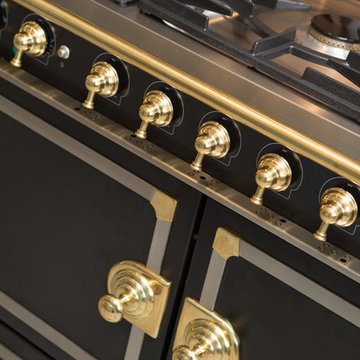
The main focal point of the kitchen is custom zinc and brass ventilation hood with a vintage sheen, which was hand made to order by a small company in Indiana named Vogler Metalworking. “It’s like sculpture, a true work of art”, says Jennifer. Your eye is immediately drawn towards this elegant yet practical hood that eliminated the home’s downdraft problem and added a striking conversation piece at the same time. The carpenters had to use special gloves when transporting and installing it, so they didn’t smudge it with fingerprints. The beautiful hood centers proudly over the stunning black enamel and brass LaCornue Range. “I had a friend who had a LaCornue range and after learning how easy it was to cook perfect meals, I was convinced I wanted to have one”, says Jennifer. This unique, breathtaking combination anchors the entire kitchen and is apparent immediately as you walk into the great room the surrounds the space.
DuraSupreme Crestwood cabinets with a Kendall Panel add function and sophistication. A custom gray paint color paired with a storm blue was developed so that the new kitchen looked like it belonged to the existing space. Unlacquered brass faucets and hardware were important to Jennifer because she wanted the living finishes to age over time. Remarkable brass diamond mesh cabinet door inserts imported from the UK continue to add this one-of-a-kind kitchen renovation; giving it a “you won’t see this everywhere” quality. The use of old railcar flooring for the coffee bar countertop and reclaimed oak for the open shelving gives an authenticity to the space uncommon in kitchens today.
Jennifer and Michelle fell in love with the Limestone Grey Stone while they were investigating unique island countertop ideas. They liked the fact that the limestone as a living finish will age and change over time. Calcutta Miel Quartz countertops made for an excellent pairing around the perimeter, as it’s durable and perfect for cooking preparations. A textured white subway tile backsplash that runs to the ceiling keeps your eye moving towards the open shelving, and to the main focal point of the stunning range hood combination.
“The kitchen functions beautifully, and it’s gorgeous,” beams Jennifer as she gestures with both hands while smiling ear to ear. “The most important thing was I wanted a kitchen that had a wonderful flow, cooked beautiful meals and was a great gathering place for family and friends, and this space does that perfectly! Beauty wise, it turned out exactly how I had envisioned. I felt the function part was the hardest part, and that was nailed”!
Relocating the garage entry to the new mudroom was a huge priority and has finally separated the family’s arriving home functions from their kitchen. Now coats and shoes and bags have their own area for dropping once members arrive home. Matching gray DuraSupreme cabinetry helped create gorgeous, purposeful lockers for the family. A reclaimed vintage sink and custom wall paper were added to the tiny powder room to beautify the once previously only functional space. Advance Design was even able to create a custom space for their dog to sleep while the family is away.
“It was unbelievable that a project of this size was completed in such a short time, and I think that’s because of the large amount of planning and preparation that went into it,” Jennifer marveled, “When we started, we were ready, and everything was prepared”.
When it came to execution, Project Manager Justin Davis and his crew were quick, accessible, and organized. Projects like this kitchen are typically completed in as little as 8-10 weeks. Jennifer’s kitchen however despite the relocation of some challenging HVAC in a soffit and moving of an exterior door was completed remarkably fast in part because the team was working with an existing tile floor that ran throughout the first floor that the client really loved.
“You get to know these people really well because they’re living in your house while you’re living in your house. They were so fast and really good, it didn’t take as long as even planned” reported Jennifer. “I would text Justin and he always responded almost immediately. I got to know all the guys who were working in our house and they were all wonderful people”.
Details in a customized kitchen like this one require skill and care from the people who install it. “All the guys on the job were skilled at what the did. I wanted small details like little feet to look like furniture, that is where their carpentry skill came in to make these all perfect”, said Jennifer. “The tile guys were wonderful. They even let me determine how I wanted the texture with the grout to appear for a salt and pepper look; now that is a very skilled trade person making it custom”.
In Jennifer’s interview, she continued to reference Advance Design’s “Common Sense Remodeling”, so I took a minute to ask her exactly what that phrase meant to her and how it played out in her experience with her project and the Advance Design team. Here is what she said: “I was intrigued about Common Sense Remodeling and in my head that there would be clear costs and prices, great communication between the design team, the execution team and me”, said Jennifer. They did deliver on that, it was so clear about the cost breakdown, what I could expect from everyone who came to my house, and everything that we had ordered. That to me is the Common Sense”!
It’s great to see a client take literally our assertion that a well-planned remodeling project is simply “Common Sense”! She anticipated each step of the way would be clear, concise, and predictable, all the while protecting the outcome due to the careful upfront planning. “Advance Design delivered on their ‘Common Sense Remodeling’ promise,” Jennifer said. “From the design team, to the execution team - everything was straight forward like I imagined. The project turned out exactly how I envisioned, I enjoyed this process and absolutely would recommend Advance Design Studio to anyone.”
 Roeser Home Remodeling
This young couple in Glendale loved their home and their neighborhood, but with three growing children they felt they were running out of space. They began a list of needs which quickly grew after a couple of years. This list helped them to see how they used their current space, but also helped them identify what was lacking.
Their needs list quickly revealed that a two-story addition would be needed to fit all the family’s requirements. With much thought and discussion, a design was created by the Roeser Team in collaboration with Ann Begemann, architect. It was important to the homeowner that the design fit the look of the house. This is always a top priority for Roeser Home Remodeling. We pride ourselves in our finish product appearing as if it had always been there and especially in this remodel, we think we succeeded.
On the list of this family’s needs were to have ample storage space for the three children’s school and sporting equipment. A wider entrance hallway from the garage and the backyard provided a unique place to build custom locker spaces, along with a communication station that will close nice and neat when company is expected. Drawer units also give extra storage and allow for a filing system to keep track of all the paper work that comes home. Extra cabinets above the lockers provide much needed additional storage for out of season belongings. A 12 X 24 S140 tile floor laid in a broken joint pattern provides for easy cleaning of this space and keeps dirty shoes or boots from finding its way into the main living quarters.
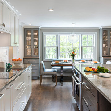
The kitchen was at the top of the priority list for this family as well. The existing kitchen was just too small and narrow and did not allow for an eat-in kitchen, or an adequate workspace for the family. Since the homeowner loves to cook, our Roeser Home Remodeling designer came up with a beautiful design plan that allowed for both. The kitchen was moved to the addition, and the existing kitchen was remodeled with a breakfast nook, housing both a custom bench and a table with chairs, along with a pantry and dry bar. This was the perfect plan and now allows the homeowner to have seating and storage for the family and entertaining.
The custom bench was built to match a picture the homeowner had and was custom produced in our own little mill shop. A drawer on both sides of the bench is handy for any extra storage items that the family may need seasonally.
The kitchen quickly became a favorite with the Roeser Home Remodeling Team. With the mix of metals and the many extra features in this space, this kitchen is full of interest as well as function.
The perimeter cabinets are Wellborn Cabinet’s Premier Line, Charleston maple door style with glacier pewter finish. A Kohler Apron Front smart divide sink adds to the design and function of this beautiful kitchen.
A wall mount pot filler hovers above a Wolfe five-burner stove top. The Wellborn hood unit passes the cabinet depth of the upper cabinets and compliments the Wellborn drawer unit underneath. Deeper drawers housed the 36” Wolf, five-burner professional gas stove top and added more storage. The addition of feet to the bottom of the drawer unit along with pushing back the toe kick gives an added detail and look of a furniture piece.
Flanking each end of the perimeter of cabinets are high end appliances. The 42” built-in French Door Sub-Zero Refrigerator/Freezer is left of the sink and concealed by Wellborn appliance panels. The Bosch 800 Series Dishwasher next in line is also concealed by a Wellborn appliance panel. However, the 30” Professional Wolf Oven and the 30” M Series Wolf Professional Convection Steam Oven sparkle with their stainless-steel finishes complimenting the Kohler Artifacts pull-down kitchen faucet, the Kohler Artifacts Pot Filler and the Top Knobs Hardware (Normandy Appliance Pulls in Polished Nickel, Button Faced Knob in Polish Nickel and the Tuscany Small D- Pull in Pewter Antique). A 30” Kitchen-Aid electric warming drawer is concealed by a Wellborn Drawer front and Top Knob hardware.
The Quartzite counter top in Taj Mahal is always an eye-catching feature for this beautiful kitchen. The large space of the island shows off its remarkable beauty. The island stands on its own with a custom design using Wellborn Cabinets Premier Line, Charleston maple door style in a Pebble Java finish, a darker finish cabinet not only serves as a focal point, but also warms the room against its starker contrast. The island houses a Sharp microwave drawer and its hardware is the same Tuscany small D-Pull as the rest of the kitchen, but in a German Bronze finish to compliment the island’s Hudson Valley Orchard Park light in an Aged Brass Finish.
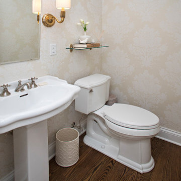
The original half bath was the only bathroom on this floor of the house and the expense to move it was not an option. The location of the bathroom in the middle of the house was problematic. Roeser Home Remodeling solved the problem by creating an opening between the living room and new family room, along with giving the illusion of a small hallway behind the dry bar in the breakfast room. This created a nice space going into the living room and gave the feeling of an open floor plan, providing and a nice private entry to the existing half bath.
Updating the bath with wallpaper, a new Barclay- Stanford Pedestal Sink, a new Portsmouth wide-spread faucet in polished nickel, a new Devonshire comfort height toilet, new towel ring, paper holder, lighting and mirror made this cute little powder room a jewel in its own right!
The family room was also housed in the addition as a family hang-out place for homework, games and movie watching. Two sets of Sierra Pacific 6’0” X 6’8” aluminum clad wood French Sliding Patio Doors were installed to invite the outdoors in. This allowed for natural lighting and an open spacious feel to the room.
A Custom Entertainment Unit built by Roeser Home Remodeling in our mill shop, is the perfect space to house all the family’s television and gaming needs, keeping them neatly stored, but also close at hand.
Opposite of the French Doors is the original opening to the backyard. By keeping the opening and installing beautiful glass doors, it opened the flow of the house to the formal living room. By adding the glass doors, it provided a cozy area for quiet adult conversation while keeping an eye on the children as they play or watch TV.
Find the right local pro for your project
 Advance Design Studio, Ltd.
Jennifer and Dan have lived in their Deer Park Illinois home for 15 years, slowly making minor fixes like painting and decorating; but they had a new plan for their kitchen the entire time. An awkwardly placed garage door, and an island cooktop with a terrible downdraft made a full-scale kitchen remodel an absolute must. Jennifer had many ideas in mind and wanted to work with a company that could provide high-end work, while partnering with a designer that would tailor the kitchen to her ideas.
She was intrigued by the phrase “Common Sense Remodeling” in Advance Design’s feature she discovered while perusing an issue of the community’s Quintessential Barrington Magazine. Doing further research on the company’s website, as she looked through project profiles and read about Advance Design’s “Common Sense Remodeling” philosophy, she promptly scheduled an appointment to see if the people and ideas she read about were truly who they said they were. The more she read, the more she knew that the “Common Sense” approach to remodeling they described was exactly the type of company she was looking for.
The partnership was sealed after an initial consultation with Owner Todd Jurs and Project Designer Michelle Lecinski. They displayed a combination of friendliness, professionalism and respect that was unmatched by any of the other companies Jennifer talked to. She knew that with Advance Design, she would be able to retain the vision that she had in mind with high-quality craftsmanship.
“I reached out to Advance Design because of the ‘Common Sense Remodeling’ tagline,” Jennifer said. “That’s what lingered for me”. “Advance Design was the most respectful- of the house and of my design ideas, and the most professional of the handful of companies that looked at my project”.
Soon after the meeting Jennifer began working with Michelle on the project design. They quickly developed chemistry. Jennifer loved how Michelle researched and located every detail that Jennifer wanted for the kitchen. Between the two of them, every concept and idea was worked through and perfected. “Jennifer had definite ideas about what she wanted the new kitchen to look like, she just didn’t know how to bring it all together. We worked together really well to make her ideas into the practical reality necessary for a well-functioning kitchen, with the look and feel that she had envisioned”, says Michelle.
“Michelle was wonderful in using the CAD system she would show me new drawings every time we changed the layout while working through the design,” Jennifer said. “She was a really wonderful partner in execution, she made sure everything happened quickly and easily.”
The finished design drew out elements of Jennifer’s style and personality. The pair call the look “sophisticated farmhouse” to describe the kitchen renovation to family and friends. The result was a beautifully crafted, authentic-feeling space that satisfied Jennifer’s dreams 15 years in the making. The whole project consisted of a kitchen remodel, mudroom upgrade with powder room, and garage entry relocation. “The projects I personally like the best, are the ones that put the client’s dreams on display,” Project Designer Michelle said. “And this is one of those projects.”
The main focal point of the kitchen is custom zinc and brass ventilation hood with a vintage sheen, which was hand made to order by a small company in Indiana named Vogler Metalworking. “It’s like sculpture, a true work of art”, says Jennifer. Your eye is immediately drawn towards this elegant yet practical hood that eliminated the home’s downdraft problem and added a striking conversation piece at the same time. The carpenters had to use special gloves when transporting and installing it, so they didn’t smudge it with fingerprints. The beautiful hood centers proudly over the stunning black enamel and brass LaCornue Range. “I had a friend who had a LaCornue range and after learning how easy it was to cook perfect meals, I was convinced I wanted to have one”, says Jennifer. This unique, breathtaking combination anchors the entire kitchen and is apparent immediately as you walk into the great room the surrounds the space.
DuraSupreme Crestwood cabinets with a Kendall Panel add function and sophistication. A custom gray paint color paired with a storm blue was developed so that the new kitchen looked like it belonged to the existing space. Unlacquered brass faucets and hardware were important to Jennifer because she wanted the living finishes to age over time. Remarkable brass diamond mesh cabinet door inserts imported from the UK continue to add this one-of-a-kind kitchen renovation; giving it a “you won’t see this everywhere” quality. The use of old railcar flooring for the coffee bar countertop and reclaimed oak for the open shelving gives an authenticity to the space uncommon in kitchens today.
Jennifer and Michelle fell in love with the Limestone Grey Stone while they were investigating unique island countertop ideas. They liked the fact that the limestone as a living finish will age and change over time. Calcutta Miel Quartz countertops made for an excellent pairing around the perimeter, as it’s durable and perfect for cooking preparations. A textured white subway tile backsplash that runs to the ceiling keeps your eye moving towards the open shelving, and to the main focal point of the stunning range hood combination.
“The kitchen functions beautifully, and it’s gorgeous,” beams Jennifer as she gestures with both hands while smiling ear to ear. “The most important thing was I wanted a kitchen that had a wonderful flow, cooked beautiful meals and was a great gathering place for family and friends, and this space does that perfectly! Beauty wise, it turned out exactly how I had envisioned. I felt the function part was the hardest part, and that was nailed”!
Relocating the garage entry to the new mudroom was a huge priority and has finally separated the family’s arriving home functions from their kitchen. Now coats and shoes and bags have their own area for dropping once members arrive home. Matching gray DuraSupreme cabinetry helped create gorgeous, purposeful lockers for the family. A reclaimed vintage sink and custom wall paper were added to the tiny powder room to beautify the once previously only functional space. Advance Design was even able to create a custom space for their dog to sleep while the family is away.
“It was unbelievable that a project of this size was completed in such a short time, and I think that’s because of the large amount of planning and preparation that went into it,” Jennifer marveled, “When we started, we were ready, and everything was prepared”.
When it came to execution, Project Manager Justin Davis and his crew were quick, accessible, and organized. Projects like this kitchen are typically completed in as little as 8-10 weeks. Jennifer’s kitchen however despite the relocation of some challenging HVAC in a soffit and moving of an exterior door was completed remarkably fast in part because the team was working with an existing tile floor that ran throughout the first floor that the client really loved.
“You get to know these people really well because they’re living in your house while you’re living in your house. They were so fast and really good, it didn’t take as long as even planned” reported Jennifer. “I would text Justin and he always responded almost immediately. I got to know all the guys who were working in our house and they were all wonderful people”.
Details in a customized kitchen like this one require skill and care from the people who install it. “All the guys on the job were skilled at what the did. I wanted small details like little feet to look like furniture, that is where their carpentry skill came in to make these all perfect”, said Jennifer. “The tile guys were wonderful. They even let me determine how I wanted the texture with the grout to appear for a salt and pepper look; now that is a very skilled trade person making it custom”.
In Jennifer’s interview, she continued to reference Advance Design’s “Common Sense Remodeling”, so I took a minute to ask her exactly what that phrase meant to her and how it played out in her experience with her project and the Advance Design team. Here is what she said: “I was intrigued about Common Sense Remodeling and in my head that there would be clear costs and prices, great communication between the design team, the execution team and me”, said Jennifer. They did deliver on that, it was so clear about the cost breakdown, what I could expect from everyone who came to my house, and everything that we had ordered. That to me is the Common Sense”!
It’s great to see a client take literally our assertion that a well-planned remodeling project is simply “Common Sense”! She anticipated each step of the way would be clear, concise, and predictable, all the while protecting the outcome due to the careful upfront planning. “Advance Design delivered on their ‘Common Sense Remodeling’ promise,” Jennifer said. “From the design team, to the execution team - everything was straight forward like I imagined. The project turned out exactly how I envisioned, I enjoyed this process and absolutely would recommend Advance Design Studio to anyone.”

 Tile Doctor Ltd
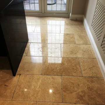
This Tumbled Travertine tiled floor at a beautiful house in Horley had been poorly maintained through the years using the wrong type of sealer which quickly wore down allowing dirt to become ingrained in the stone. The owner had become concerned about the state of the tiles and decided it was time to call in an expert that could restore the tiles to a condition that complimented the environment in which it was situated.
Travertine is known for being very distinctive in character and very durable, making it a very popular choice for tiled flooring in properties worldwide. However, the stone does require regular professional maintenance and polishing to keep it looking it top shape and home owners rarely realise this when they decide to have it installed. Fortunately, in the UK at least you can rely on your local tile doctor to maintain it for you.
The first part of the job involved giving the floor a thorough clean to remove what was left of old sealers and any polishing compounds that remained on the floor. Before beginning that however I brought in all my equipment and products into the house and then prepped the area by taping up the woodwork to protect it during the renovation process.
To remove what was left of the old sealers and other coatings still present on the floor a strong solution of Tile Doctor Remove and Go was applied to the floor and left to soak in for about ten minutes before being actively worked in with a rotary machine fitted with a black scrubbing pad. The solution turned black with the soil as it was lifted out of the pores of the stone and it was then rinsed off with water and extracted with a wet vacuum.
Following this, we moved on to a process we know as burnishing that hones the stone and brings up the polished appearance. Working in sections due to the size of the floor It involves the application of a series of diamond encrusted burnishing pads from coarse through to very fine.
The coarse 400-grit pad fitted to the rotary floor buffer and run over the floor using only water for lubrication. The water turns into a slurry as the pad does its job removing dirt and this has to be rinsed off the floor and extracted with the wet vacuum before applying the next pad. The process was then repeated with medium 800 grit pad for an initial polish followed by the Fine 1500 grit pad for the second polish using water for lubrication and rinsing and extracting in between each pad.
The last pad is a very fine 3000 grit pad for the final polish and is applied with only a little water sprayed onto the floor using a technique we call a Spray Burnish. This last pad really brings up the polished appearance of the stone.
To bring up the appearance of the stone even further and add a really durable polish Tile Doctor Shine Powder was applied. This is a crystallising powder sealer that ensures a very high shine and a tough, durable finish. This powder is applied directly to the tiles in combination with approximately ½ a litre of water and a soft white buffing pad.
Last step was to add to the protection provided by the Shine Powder with two coats of Tile Doctor Ultra-Seal which is a natural look sealer that doesn’t change the look of the stone and is applied to the stone and grout. This sealer works by seeping into the stone, occupying the pores and preventing dirt from becoming ingrained.
The customer was ecstatic with the results, being particularly pleased that she got the floor looking the way she originally wanted without significant expense, not to mention stress.
Michael Conlon
East Surrey Tile Doctor
 Homestead Doors, Inc.
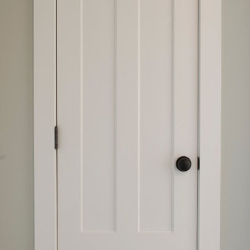
Door #10
FP3190
Flat 3 Panel Interior Door with Farmhouse Sticking
Solid Poplar stiles and rails
MDF panels
Painted White
1 x 4 door casing
1 x 6 baseboard
Bravura 336B door knob
Call us for a quote on your door project
419-684-9582
Visit https://www.door.cc


 Tile Doctor Ltd
A family living in Guildford were in touch recently about restoring the appearance of their Ceramic tiled shower and bathroom. They were about to put the property up for sale and were concerned the grubby grout might put off potential buyers. First impressions do count so renovating a bathroom or kitchen before selling is a really good idea and will help you achieve a better price.
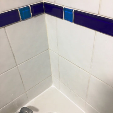
In this case the Ceramic tiles were dirty and black with mould in places which looked unhygienic and uninviting. Additionally, the mastic sealant between the tile and bath was tired and worn to the extent that water could end up leaking behind the seal. After visiting the property, they were pleased to hear I could help and happily accepted our quote which was based around a days work and some materials.
Firstly, I cleaned the grout using a Tile Doctor product called Duo Clean which is designed to tackle dirty grout and mould. I sprayed the product along all the grout lines and left it to soak in for about fifteen minutes. Once ready I brushed them with a firm wire brush then rinsed off with water. Next, I cleaned the tiles using a strong dilution of Tile Doctor Pro-Clean which was decanted into a spray bottle and sprayed onto the wall tiles. After ten minutes I then used a handheld buffing machine fitted with a small white buffing pad to shift the dirt and buff up the white tiles. After rinsing the slurry off with water you could see a marked improvement.
I hand dried the tile and grout with a cloth and then set about stripping out the old white mastic sealer with a sharp knife. This took some time, as you have to be careful not to scratch the bath or the tile.
By this time the grout had dried off fully and I was able to see if more work was required. To achieve a uniform colour throughout. Mould and some cleaning products can discolour grout permanently and, in this case, there was some grout staining I was unable to remove. We had discussed this possibility earlier and how it would be best resolved using a white grout colourant. So, I carefully applied Tile Doctor Grout Colour which is painted on with a small brush with any excess wiped off the tile before it can set. This resulted in a uniform white grout throughout and really gave the whole bathroom a lift.
With the cleaning process completed I applied a new white mastic between the bath and tile and along the verticals. This is done with the bath filled with water and then left for 24 hours to allow the silicone to fully cure.
After the grout colour had dried, I applied an aerosol Tile and Grout sealer over the whole surface and then lightly polished off any excess with a clean cloth. This does two things; one it adds a further layer of protection to the new grout colour and to the surface of the tiles. Secondly Ceramic tiles are non-porous, but bacterial dirt can still get a grip on the surface, with the sealer in place you will find water quickly runs off without getting a chance to get a hold.
Sealers do wear off, so I recommended re-applying it every year. I had plenty left over and gave it to the customer when I finished using it. For regular cleaning of tiled shower areas, I recommend they use Tile Doctor Aqua-Pro this will neutralise any acid build-up caused by acidic shampoos etc.
West Surrey Tile Doctor
Rupert Mcleod
 Advance Design Studio, Ltd.
Jennifer and Dan have lived in their Deer Park Illinois home for 15 years, slowly making minor fixes like painting and decorating; but they had a new plan for their kitchen the entire time. An awkwardly placed garage door, and an island cooktop with a terrible downdraft made a full-scale kitchen remodel an absolute must. Jennifer had many ideas in mind and wanted to work with a company that could provide high-end work, while partnering with a designer that would tailor the kitchen to her ideas.
She was intrigued by the phrase “Common Sense Remodeling” in Advance Design’s feature she discovered while perusing an issue of the community’s Quintessential Barrington Magazine. Doing further research on the company’s website, as she looked through project profiles and read about Advance Design’s “Common Sense Remodeling” philosophy, she promptly scheduled an appointment to see if the people and ideas she read about were truly who they said they were. The more she read, the more she knew that the “Common Sense” approach to remodeling they described was exactly the type of company she was looking for.
The partnership was sealed after an initial consultation with Owner Todd Jurs and Project Designer Michelle Lecinski. They displayed a combination of friendliness, professionalism and respect that was unmatched by any of the other companies Jennifer talked to. She knew that with Advance Design, she would be able to retain the vision that she had in mind with high-quality craftsmanship.
“I reached out to Advance Design because of the ‘Common Sense Remodeling’ tagline,” Jennifer said. “That’s what lingered for me”. “Advance Design was the most respectful- of the house and of my design ideas, and the most professional of the handful of companies that looked at my project”.
Soon after the meeting Jennifer began working with Michelle on the project design. They quickly developed chemistry. Jennifer loved how Michelle researched and located every detail that Jennifer wanted for the kitchen. Between the two of them, every concept and idea was worked through and perfected. “Jennifer had definite ideas about what she wanted the new kitchen to look like, she just didn’t know how to bring it all together. We worked together really well to make her ideas into the practical reality necessary for a well-functioning kitchen, with the look and feel that she had envisioned”, says Michelle.
“Michelle was wonderful in using the CAD system she would show me new drawings every time we changed the layout while working through the design,” Jennifer said. “She was a really wonderful partner in execution, she made sure everything happened quickly and easily.”
The finished design drew out elements of Jennifer’s style and personality. The pair call the look “sophisticated farmhouse” to describe the kitchen renovation to family and friends. The result was a beautifully crafted, authentic-feeling space that satisfied Jennifer’s dreams 15 years in the making. The whole project consisted of a kitchen remodel, mudroom upgrade with powder room, and garage entry relocation. “The projects I personally like the best, are the ones that put the client’s dreams on display,” Project Designer Michelle said. “And this is one of those projects.”
The main focal point of the kitchen is custom zinc and brass ventilation hood with a vintage sheen, which was hand made to order by a small company in Indiana named Vogler Metalworking. “It’s like sculpture, a true work of art”, says Jennifer. Your eye is immediately drawn towards this elegant yet practical hood that eliminated the home’s downdraft problem and added a striking conversation piece at the same time. The carpenters had to use special gloves when transporting and installing it, so they didn’t smudge it with fingerprints. The beautiful hood centers proudly over the stunning black enamel and brass LaCornue Range. “I had a friend who had a LaCornue range and after learning how easy it was to cook perfect meals, I was convinced I wanted to have one”, says Jennifer. This unique, breathtaking combination anchors the entire kitchen and is apparent immediately as you walk into the great room the surrounds the space.
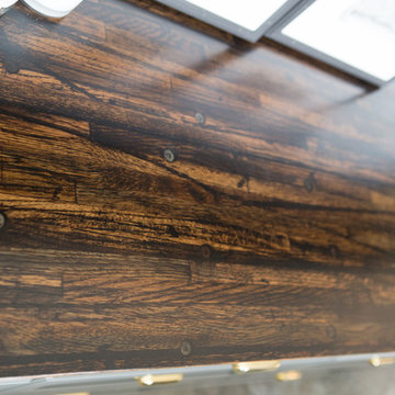
DuraSupreme Crestwood cabinets with a Kendall Panel add function and sophistication. A custom gray paint color paired with a storm blue was developed so that the new kitchen looked like it belonged to the existing space. Unlacquered brass faucets and hardware were important to Jennifer because she wanted the living finishes to age over time. Remarkable brass diamond mesh cabinet door inserts imported from the UK continue to add this one-of-a-kind kitchen renovation; giving it a “you won’t see this everywhere” quality. The use of old railcar flooring for the coffee bar countertop and reclaimed oak for the open shelving gives an authenticity to the space uncommon in kitchens today.
Jennifer and Michelle fell in love with the Limestone Grey Stone while they were investigating unique island countertop ideas. They liked the fact that the limestone as a living finish will age and change over time. Calcutta Miel Quartz countertops made for an excellent pairing around the perimeter, as it’s durable and perfect for cooking preparations. A textured white subway tile backsplash that runs to the ceiling keeps your eye moving towards the open shelving, and to the main focal point of the stunning range hood combination.
“The kitchen functions beautifully, and it’s gorgeous,” beams Jennifer as she gestures with both hands while smiling ear to ear. “The most important thing was I wanted a kitchen that had a wonderful flow, cooked beautiful meals and was a great gathering place for family and friends, and this space does that perfectly! Beauty wise, it turned out exactly how I had envisioned. I felt the function part was the hardest part, and that was nailed”!
Relocating the garage entry to the new mudroom was a huge priority and has finally separated the family’s arriving home functions from their kitchen. Now coats and shoes and bags have their own area for dropping once members arrive home. Matching gray DuraSupreme cabinetry helped create gorgeous, purposeful lockers for the family. A reclaimed vintage sink and custom wall paper were added to the tiny powder room to beautify the once previously only functional space. Advance Design was even able to create a custom space for their dog to sleep while the family is away.
“It was unbelievable that a project of this size was completed in such a short time, and I think that’s because of the large amount of planning and preparation that went into it,” Jennifer marveled, “When we started, we were ready, and everything was prepared”.
When it came to execution, Project Manager Justin Davis and his crew were quick, accessible, and organized. Projects like this kitchen are typically completed in as little as 8-10 weeks. Jennifer’s kitchen however despite the relocation of some challenging HVAC in a soffit and moving of an exterior door was completed remarkably fast in part because the team was working with an existing tile floor that ran throughout the first floor that the client really loved.
“You get to know these people really well because they’re living in your house while you’re living in your house. They were so fast and really good, it didn’t take as long as even planned” reported Jennifer. “I would text Justin and he always responded almost immediately. I got to know all the guys who were working in our house and they were all wonderful people”.
Details in a customized kitchen like this one require skill and care from the people who install it. “All the guys on the job were skilled at what the did. I wanted small details like little feet to look like furniture, that is where their carpentry skill came in to make these all perfect”, said Jennifer. “The tile guys were wonderful. They even let me determine how I wanted the texture with the grout to appear for a salt and pepper look; now that is a very skilled trade person making it custom”.
In Jennifer’s interview, she continued to reference Advance Design’s “Common Sense Remodeling”, so I took a minute to ask her exactly what that phrase meant to her and how it played out in her experience with her project and the Advance Design team. Here is what she said: “I was intrigued about Common Sense Remodeling and in my head that there would be clear costs and prices, great communication between the design team, the execution team and me”, said Jennifer. They did deliver on that, it was so clear about the cost breakdown, what I could expect from everyone who came to my house, and everything that we had ordered. That to me is the Common Sense”!
It’s great to see a client take literally our assertion that a well-planned remodeling project is simply “Common Sense”! She anticipated each step of the way would be clear, concise, and predictable, all the while protecting the outcome due to the careful upfront planning. “Advance Design delivered on their ‘Common Sense Remodeling’ promise,” Jennifer said. “From the design team, to the execution team - everything was straight forward like I imagined. The project turned out exactly how I envisioned, I enjoyed this process and absolutely would recommend Advance Design Studio to anyone.”

 OKLAHOMA SHUTTERS
Benefits of Plantation Shutters
Plantation shutters offer advantages and benefits to homeowners over other window coverings including:
• A permanent addition to a house: While they don't add much to the sale price and don't guarantee a return on investment, the curb appeal helps the house sell faster. The permanency of plantation shutters allows them to be included in appraisals.
• Versatility: Many have the ability to open only halfway if desired. If you want to let in all the light, plantation shutters swing away from the window to grant an unobstructed view.
• Insulation: When all louvers are closed, a good insulating barrier is created, trapping unwanted temperatures and saving you money on your energy bill.
• Easy maintenance: With wide louvers, a simple wipe-down is often all that's needed. Vinyl shutters can be taken off their hinges and sprayed off for a major cleaning.
• Elegance: The classic, yet modern look conveys a permanency like no other window dressing can. Whether painted or natural wood, they all have a look that says; welcome home.
Wood vs. Faux Wood
It's not hard to argue that natural wood is more appealing than vinyl or PVC. However, "faux wood," as it's sometimes called, has some advantages:
• Price -- Faux wood shutters are often lower in price than real wood.
• Weight -- Because some shutters are made "hollow core" (as opposed to vinyl-wrapped medium density fiberboard, MDF), they can be significantly lighter.
• Moisture Resistance -- If you live in an area with high humidity, hollow faux wood or aluminum core will resist expanding and sagging. (MDF core louvers will tend to expand and crack as the material swells with moisture.)
Natural wood is the choice for those who have a very healthy budget or for whom a specific appearance is a must. Among the advantages are:
• Size -- Because wood plantation shutters are made of hardwood, they can be quite a bit larger than plastic or vinyl. Vinyl shutters larger than 29 inches may be prone to sag, so they need divider rails or other supports which can destroy the traditional look of a plantation shutter.
• Natural -- While vinyl or plastic shutters can be painted to match any color scheme, the natural shades and finishes of the various species of wood have something for every look.
• Classic -- While many plastic shutters can be made to look like real wood, the faux wood finishes can vary significantly depending on manufacturer and model. Up close, it can be easy to tell they're plastic. The warmth of natural wood is a classic feel that's impossible to beat.
Popular Plantation Shutter Brands
When you go to purchase your plantation shutters, brands names may offer a good representation of high-, mid-, and low-cost range of what's available. Which one you choose depends on your budget and your tastes. Hunter-Douglas and Norman Shutters produce three lines of plantation shutters in both real wood and faux wood styles. A higher-end product, Hunter-Douglas may be worth the cost for beauty and quality of workmanship. The Window Outfitters and Sunland produce a mid-cost line of shutters. The mid-range pricing may be for those who are balancing aesthetics with a budget. National franchise and or box stores may not offer an in-house expert or designer. Look to local companies that specialize in plantation shutters looking online may offer a low-cost brand for budget-minded DIYers. Available in both faux and real wood, the affordability combines with the visual appeal to make this a very popular choice for plantation shutters. Regardless of which line you go with, be sure to ask about frames. Generally all manufactures offer frame choices and may add to the cost, but they add an unsurpassed beauty and warmth to a room with plantation shutters.
Plantation shutters look like similar to wooden blinds, but there are significant differences. Blinds are often narrow, made of aluminum or vinyl, and the slats tilt based on a gear and pulley mechanism and they hang in the window with cords. By contrast, plantation shutters have wide compound louvers that fit into a frame and are controlled by way of a wooden rod running up the middle. When not needed, they can be manufactured to swing back onto the wall. Options to are available to build a more contemporary look with a larger view with a “hidden tilt” feature.
Cost of Plantation Shutters
Nationally, the cost of plantation shutters, depending on their size and the material, whether or not they are custom arches and colors or stains, may vary. Most manufacturers want their shutters to be professionally installed to keep the warranty intact which is a benefit to the customer in the long run. They will usually have a limited lifetime warranty.
Cost of Installation
Costs for having plantation shutters installed by a contractor are a bit more predictable. Contractors who have installed plantation shutters before can quickly get accurate measurements and suggest which materials would work best in different rooms. For example, while natural wood may look beautiful in your living room, it might not be so practical in a bathroom where moisture will cause the wood to warp. The size, material, and quality of the shutter will have a significant effect on the cost. Contractors usually go through a shutter supplier and can get various sizes that are not normally available at home improvement stores. Hiring a professional team of knowledgeable suppliers and installers is a good choice.
Here are some sample prices of the shutters most contractors use for standard-sized windows: In general, plantation shutters should cost approximately $20 to $26 per square foot. Labor costs depend on factors such as the contractor's workload, remoteness of the location, environment, and the contractor's overhead. Labor generally runs about $100 per hour and will be added to the shutter cost.
• 16x20 -- Faux wood $120. Real wood $156
• 24x50 -- Faux wood $160. Real wood $208
• 36x54 -- Faux wood $270. Real wood $351
• 36x60 -- Faux wood $300 Real wood $390
• 42x72 -- Faux wood $420. Real wood $546
• 48x82 -- Faux wood $550. Real wood $715
DIY
Plantation shutters can be purchased and installed by the homeowners. How much they cost will depend on size and material. Faux wood shutter’s cost depends on size and wooden shutter’s cost will depend on size and whether or not they are painted or stained.
• Natural wood is $90-$600 depending on size. Many companies offer standard stained selection but custom color matching may be available from $175 -$250.
• Faux wood will be from $120-$500.
• Additional tools include: Hang Strips $4-$15 and about $4 for mounting hardware. Locks or closures can cost up to $15 for each shutter.
Finally, if you order them online, you can expect to pay $30-$70 shipping per shutter or per set of shutters per window depending on the supplier. Keep in mind that even if you're handy with tools, installing shutters can be time-consuming if you've never done it before there is defiantly a learning curve.
 TKS Design Group
Download our free ebook, Creating the Ideal Kitchen. DOWNLOAD NOW
Lakefront property in the northwest suburbs of Chicago is hard to come by, so when we were hired by this young family with exactly that, we were immediately inspired by not just the unusually large footprint of this 1950’s colonial revival but also the lovely views of the manmade lake it was sited on. The large 5-bedroom home was solidly stuck in the 1980’s, but we saw tons of potential. We started out by updating the existing staircase with a fresh coat of paint and adding new herringbone slate to the entry hall.
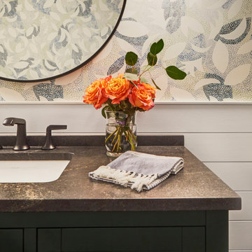
The powder room off the entryway also got a refresh - new flooring, new cabinets and fixtures. We ran the new slate right through into this space for some consistency. A fun wallpaper and shiplap trim add a welcoming feel and set the tone for the home.
Next, we tackled the kitchen. Located away from the rest of the first floor, the kitchen felt a little isolated, so we immediately began planning for how to better connect it to the rest of the first floor. We landed on removing the wall between the kitchen and dining room and designed a modified galley style space with separate cooking and clean up zones. The cooking zone consists of the refrigerator, prep sink and cooktop, along with a nice long run of prep space at the island. The cleanup side of the kitchen consists of the main sink and dishwasher. Both areas are situated so that the user can view the lake during prep work and cleanup!
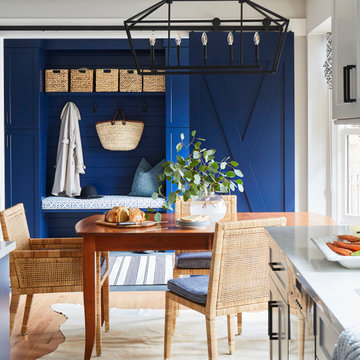
One of the home’s main puzzles was how to incorporate the mudroom and area in front of the patio doors at the back of the house. We already had a breakfast table area, so the space by the patio doors was a bit of a no man’s land. We decided to separate the kitchen proper from what became the new mudroom with a large set of barn doors. That way you can quickly hide any mudroom messes but have easy access to the light coming in through the patio doors as well as the outdoor grilling station. We also love the impact the barn doors add to the overall space.
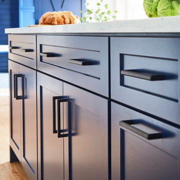
The homeowners’ first words to us were “it’s time to ditch the brown,” so we did! We chose a lovely blue pallet that reflects the home’s location on the lake which is also vibrant yet easy on the eye. Countertops are white quartz, and the natural oak floor works well with the other honey accents. The breakfast table was given a refresh with new chairs, chandelier and window treatments that frame the gorgeous views of the lake out the back.
We coordinated the slate mudroom flooring with that used in the home’s main entrance for a consistent feel. The storage area consists of open and closed storage to allow for some clutter control as needed.
Next on our “to do” list was revamping the dated brown bar area in the neighboring dining room. We eliminated the clutter by adding some closed cabinets and did some easy updates to help the space feel more current. One snag we ran into here was the discovery of a beam above the existing open shelving that had to be modified with a smaller structural beam to allow for our new design to work. This was an unexpected surprise, but in the end we think it was well worth it!
We kept the colors here a bit more muted to blend with the homeowner’s existing furnishings. Open shelving and polished nickel hardware add some simple detail to the new entertainment zone which also looks out onto the lake!
Next we tackled the upstairs starting with the homeowner’s son’s bath. The bath originally had both a tub shower and a separate shower, so we decided to swap out the shower for a new laundry area. This freed up some space downstairs in what used to be the mudroom/laundry room and is much more convenient for daily laundry needs.
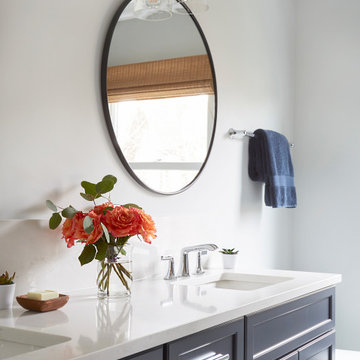
We continued the blue palette here with navy cabinetry and the navy tile in the shower. Porcelain floor tile and chrome fixtures keep maintenance to a minimum while matte black mirrors and lighting add some depth the design. A low maintenance runner adds some warmth underfoot and ties the whole space together.
We added a pocket door to the bathroom to minimize interference with the door swings. The left door of the laundry closet is on a 180 degree hinge to allow for easy full access to the machines. Next we tackled the master bath which is an en suite arrangement. The original was typical of the 1980’s with the vanity outside of the bathroom, situated near the master closet. And the brown theme continued here with multiple shades of brown.
Our first move was to segment off the bath and the closet from the master bedroom. We created a short hall from the bedroom to the bathroom with his and hers walk-in closets on the left and right as well as a separate toilet closet outside of the main bathroom for privacy and flexibility.
The original bathroom had a giant soaking tub with steps (dangerous!) as well as a small shower that did not work well for our homeowner who is 6’3”. With other bathtubs in the home, they decided to eliminate the tub and create an oversized shower which takes up the space where the old tub was located. The double vanity is on the opposite wall and a bench is located under the window for morning conversations and a place to set a couple of towels.
The pallet in here is light and airy with a mix of blond wood, creamy porcelain and marble tile, and brass accents. A simple roman shade adds some texture and it’s top-down mechanism allows for light and privacy.
This large whole house remodel gave our homeowners not only the ability to maximize the potential of their home but also created a lovely new frame from which to view their fabulous lake views.
Designed by: Susan Klimala, CKD, CBD
Photography by: Michael Kaskel
For more information on kitchen and bath design ideas go to: www.kitchenstudio-ge.com
 TKS Design Group
Download our free ebook, Creating the Ideal Kitchen. DOWNLOAD NOW
Lakefront property in the northwest suburbs of Chicago is hard to come by, so when we were hired by this young family with exactly that, we were immediately inspired by not just the unusually large footprint of this 1950’s colonial revival but also the lovely views of the manmade lake it was sited on. The large 5-bedroom home was solidly stuck in the 1980’s, but we saw tons of potential. We started out by updating the existing staircase with a fresh coat of paint and adding new herringbone slate to the entry hall.
The powder room off the entryway also got a refresh - new flooring, new cabinets and fixtures. We ran the new slate right through into this space for some consistency. A fun wallpaper and shiplap trim add a welcoming feel and set the tone for the home.
Next, we tackled the kitchen. Located away from the rest of the first floor, the kitchen felt a little isolated, so we immediately began planning for how to better connect it to the rest of the first floor. We landed on removing the wall between the kitchen and dining room and designed a modified galley style space with separate cooking and clean up zones. The cooking zone consists of the refrigerator, prep sink and cooktop, along with a nice long run of prep space at the island. The cleanup side of the kitchen consists of the main sink and dishwasher. Both areas are situated so that the user can view the lake during prep work and cleanup!
One of the home’s main puzzles was how to incorporate the mudroom and area in front of the patio doors at the back of the house. We already had a breakfast table area, so the space by the patio doors was a bit of a no man’s land. We decided to separate the kitchen proper from what became the new mudroom with a large set of barn doors. That way you can quickly hide any mudroom messes but have easy access to the light coming in through the patio doors as well as the outdoor grilling station. We also love the impact the barn doors add to the overall space.
The homeowners’ first words to us were “it’s time to ditch the brown,” so we did! We chose a lovely blue pallet that reflects the home’s location on the lake which is also vibrant yet easy on the eye. Countertops are white quartz, and the natural oak floor works well with the other honey accents. The breakfast table was given a refresh with new chairs, chandelier and window treatments that frame the gorgeous views of the lake out the back.
We coordinated the slate mudroom flooring with that used in the home’s main entrance for a consistent feel. The storage area consists of open and closed storage to allow for some clutter control as needed.
Next on our “to do” list was revamping the dated brown bar area in the neighboring dining room. We eliminated the clutter by adding some closed cabinets and did some easy updates to help the space feel more current. One snag we ran into here was the discovery of a beam above the existing open shelving that had to be modified with a smaller structural beam to allow for our new design to work. This was an unexpected surprise, but in the end we think it was well worth it!
We kept the colors here a bit more muted to blend with the homeowner’s existing furnishings. Open shelving and polished nickel hardware add some simple detail to the new entertainment zone which also looks out onto the lake!
Next we tackled the upstairs starting with the homeowner’s son’s bath. The bath originally had both a tub shower and a separate shower, so we decided to swap out the shower for a new laundry area. This freed up some space downstairs in what used to be the mudroom/laundry room and is much more convenient for daily laundry needs.
We continued the blue palette here with navy cabinetry and the navy tile in the shower. Porcelain floor tile and chrome fixtures keep maintenance to a minimum while matte black mirrors and lighting add some depth the design. A low maintenance runner adds some warmth underfoot and ties the whole space together.
We added a pocket door to the bathroom to minimize interference with the door swings. The left door of the laundry closet is on a 180 degree hinge to allow for easy full access to the machines. Next we tackled the master bath which is an en suite arrangement. The original was typical of the 1980’s with the vanity outside of the bathroom, situated near the master closet. And the brown theme continued here with multiple shades of brown.
Our first move was to segment off the bath and the closet from the master bedroom. We created a short hall from the bedroom to the bathroom with his and hers walk-in closets on the left and right as well as a separate toilet closet outside of the main bathroom for privacy and flexibility.
The original bathroom had a giant soaking tub with steps (dangerous!) as well as a small shower that did not work well for our homeowner who is 6’3”. With other bathtubs in the home, they decided to eliminate the tub and create an oversized shower which takes up the space where the old tub was located. The double vanity is on the opposite wall and a bench is located under the window for morning conversations and a place to set a couple of towels.
The pallet in here is light and airy with a mix of blond wood, creamy porcelain and marble tile, and brass accents. A simple roman shade adds some texture and it’s top-down mechanism allows for light and privacy.
This large whole house remodel gave our homeowners not only the ability to maximize the potential of their home but also created a lovely new frame from which to view their fabulous lake views.
Designed by: Susan Klimala, CKD, CBD
Photography by: Michael Kaskel
For more information on kitchen and bath design ideas go to: www.kitchenstudio-ge.com
 TKS Design Group
Download our free ebook, Creating the Ideal Kitchen. DOWNLOAD NOW
Lakefront property in the northwest suburbs of Chicago is hard to come by, so when we were hired by this young family with exactly that, we were immediately inspired by not just the unusually large footprint of this 1950’s colonial revival but also the lovely views of the manmade lake it was sited on. The large 5-bedroom home was solidly stuck in the 1980’s, but we saw tons of potential. We started out by updating the existing staircase with a fresh coat of paint and adding new herringbone slate to the entry hall.
The powder room off the entryway also got a refresh - new flooring, new cabinets and fixtures. We ran the new slate right through into this space for some consistency. A fun wallpaper and shiplap trim add a welcoming feel and set the tone for the home.
Next, we tackled the kitchen. Located away from the rest of the first floor, the kitchen felt a little isolated, so we immediately began planning for how to better connect it to the rest of the first floor. We landed on removing the wall between the kitchen and dining room and designed a modified galley style space with separate cooking and clean up zones. The cooking zone consists of the refrigerator, prep sink and cooktop, along with a nice long run of prep space at the island. The cleanup side of the kitchen consists of the main sink and dishwasher. Both areas are situated so that the user can view the lake during prep work and cleanup!
One of the home’s main puzzles was how to incorporate the mudroom and area in front of the patio doors at the back of the house. We already had a breakfast table area, so the space by the patio doors was a bit of a no man’s land. We decided to separate the kitchen proper from what became the new mudroom with a large set of barn doors. That way you can quickly hide any mudroom messes but have easy access to the light coming in through the patio doors as well as the outdoor grilling station. We also love the impact the barn doors add to the overall space.
The homeowners’ first words to us were “it’s time to ditch the brown,” so we did! We chose a lovely blue pallet that reflects the home’s location on the lake which is also vibrant yet easy on the eye. Countertops are white quartz, and the natural oak floor works well with the other honey accents. The breakfast table was given a refresh with new chairs, chandelier and window treatments that frame the gorgeous views of the lake out the back.
We coordinated the slate mudroom flooring with that used in the home’s main entrance for a consistent feel. The storage area consists of open and closed storage to allow for some clutter control as needed.
Next on our “to do” list was revamping the dated brown bar area in the neighboring dining room. We eliminated the clutter by adding some closed cabinets and did some easy updates to help the space feel more current. One snag we ran into here was the discovery of a beam above the existing open shelving that had to be modified with a smaller structural beam to allow for our new design to work. This was an unexpected surprise, but in the end we think it was well worth it!
We kept the colors here a bit more muted to blend with the homeowner’s existing furnishings. Open shelving and polished nickel hardware add some simple detail to the new entertainment zone which also looks out onto the lake!
Next we tackled the upstairs starting with the homeowner’s son’s bath. The bath originally had both a tub shower and a separate shower, so we decided to swap out the shower for a new laundry area. This freed up some space downstairs in what used to be the mudroom/laundry room and is much more convenient for daily laundry needs.
We continued the blue palette here with navy cabinetry and the navy tile in the shower. Porcelain floor tile and chrome fixtures keep maintenance to a minimum while matte black mirrors and lighting add some depth the design. A low maintenance runner adds some warmth underfoot and ties the whole space together.
We added a pocket door to the bathroom to minimize interference with the door swings. The left door of the laundry closet is on a 180 degree hinge to allow for easy full access to the machines. Next we tackled the master bath which is an en suite arrangement. The original was typical of the 1980’s with the vanity outside of the bathroom, situated near the master closet. And the brown theme continued here with multiple shades of brown.
Our first move was to segment off the bath and the closet from the master bedroom. We created a short hall from the bedroom to the bathroom with his and hers walk-in closets on the left and right as well as a separate toilet closet outside of the main bathroom for privacy and flexibility.
The original bathroom had a giant soaking tub with steps (dangerous!) as well as a small shower that did not work well for our homeowner who is 6’3”. With other bathtubs in the home, they decided to eliminate the tub and create an oversized shower which takes up the space where the old tub was located. The double vanity is on the opposite wall and a bench is located under the window for morning conversations and a place to set a couple of towels.
The pallet in here is light and airy with a mix of blond wood, creamy porcelain and marble tile, and brass accents. A simple roman shade adds some texture and it’s top-down mechanism allows for light and privacy.
This large whole house remodel gave our homeowners not only the ability to maximize the potential of their home but also created a lovely new frame from which to view their fabulous lake views.
Designed by: Susan Klimala, CKD, CBD
Photography by: Michael Kaskel
For more information on kitchen and bath design ideas go to: www.kitchenstudio-ge.com
Sponsored
Columbus, OH

Trish Takacs Design
Award Winning & Highly Skilled Kitchen & Bath Designer in Columbus
 TKS Design Group
Download our free ebook, Creating the Ideal Kitchen. DOWNLOAD NOW
Lakefront property in the northwest suburbs of Chicago is hard to come by, so when we were hired by this young family with exactly that, we were immediately inspired by not just the unusually large footprint of this 1950’s colonial revival but also the lovely views of the manmade lake it was sited on. The large 5-bedroom home was solidly stuck in the 1980’s, but we saw tons of potential. We started out by updating the existing staircase with a fresh coat of paint and adding new herringbone slate to the entry hall.
The powder room off the entryway also got a refresh - new flooring, new cabinets and fixtures. We ran the new slate right through into this space for some consistency. A fun wallpaper and shiplap trim add a welcoming feel and set the tone for the home.
Next, we tackled the kitchen. Located away from the rest of the first floor, the kitchen felt a little isolated, so we immediately began planning for how to better connect it to the rest of the first floor. We landed on removing the wall between the kitchen and dining room and designed a modified galley style space with separate cooking and clean up zones. The cooking zone consists of the refrigerator, prep sink and cooktop, along with a nice long run of prep space at the island. The cleanup side of the kitchen consists of the main sink and dishwasher. Both areas are situated so that the user can view the lake during prep work and cleanup!
One of the home’s main puzzles was how to incorporate the mudroom and area in front of the patio doors at the back of the house. We already had a breakfast table area, so the space by the patio doors was a bit of a no man’s land. We decided to separate the kitchen proper from what became the new mudroom with a large set of barn doors. That way you can quickly hide any mudroom messes but have easy access to the light coming in through the patio doors as well as the outdoor grilling station. We also love the impact the barn doors add to the overall space.
The homeowners’ first words to us were “it’s time to ditch the brown,” so we did! We chose a lovely blue pallet that reflects the home’s location on the lake which is also vibrant yet easy on the eye. Countertops are white quartz, and the natural oak floor works well with the other honey accents. The breakfast table was given a refresh with new chairs, chandelier and window treatments that frame the gorgeous views of the lake out the back.
We coordinated the slate mudroom flooring with that used in the home’s main entrance for a consistent feel. The storage area consists of open and closed storage to allow for some clutter control as needed.
Next on our “to do” list was revamping the dated brown bar area in the neighboring dining room. We eliminated the clutter by adding some closed cabinets and did some easy updates to help the space feel more current. One snag we ran into here was the discovery of a beam above the existing open shelving that had to be modified with a smaller structural beam to allow for our new design to work. This was an unexpected surprise, but in the end we think it was well worth it!
We kept the colors here a bit more muted to blend with the homeowner’s existing furnishings. Open shelving and polished nickel hardware add some simple detail to the new entertainment zone which also looks out onto the lake!
Next we tackled the upstairs starting with the homeowner’s son’s bath. The bath originally had both a tub shower and a separate shower, so we decided to swap out the shower for a new laundry area. This freed up some space downstairs in what used to be the mudroom/laundry room and is much more convenient for daily laundry needs.
We continued the blue palette here with navy cabinetry and the navy tile in the shower. Porcelain floor tile and chrome fixtures keep maintenance to a minimum while matte black mirrors and lighting add some depth the design. A low maintenance runner adds some warmth underfoot and ties the whole space together.
We added a pocket door to the bathroom to minimize interference with the door swings. The left door of the laundry closet is on a 180 degree hinge to allow for easy full access to the machines. Next we tackled the master bath which is an en suite arrangement. The original was typical of the 1980’s with the vanity outside of the bathroom, situated near the master closet. And the brown theme continued here with multiple shades of brown.
Our first move was to segment off the bath and the closet from the master bedroom. We created a short hall from the bedroom to the bathroom with his and hers walk-in closets on the left and right as well as a separate toilet closet outside of the main bathroom for privacy and flexibility.
The original bathroom had a giant soaking tub with steps (dangerous!) as well as a small shower that did not work well for our homeowner who is 6’3”. With other bathtubs in the home, they decided to eliminate the tub and create an oversized shower which takes up the space where the old tub was located. The double vanity is on the opposite wall and a bench is located under the window for morning conversations and a place to set a couple of towels.
The pallet in here is light and airy with a mix of blond wood, creamy porcelain and marble tile, and brass accents. A simple roman shade adds some texture and it’s top-down mechanism allows for light and privacy.
This large whole house remodel gave our homeowners not only the ability to maximize the potential of their home but also created a lovely new frame from which to view their fabulous lake views.
Designed by: Susan Klimala, CKD, CBD
Photography by: Michael Kaskel
For more information on kitchen and bath design ideas go to: www.kitchenstudio-ge.com
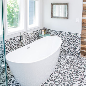
 TVL Creative Ltd.
This project is an incredible transformation and the perfect example of successful style mixing! This client, and now a good friend of TVL (as they all become), is a wonderfully eclectic and adventurous one with immense interest in texture play, pops of color, and unique applications. Our scope in this home included a full kitchen renovation, main level powder room renovation, and a master bathroom overhaul. Taking just over a year to complete from the first design phases to final photos, this project was so insanely fun and packs an amazing amount of fun details and lively surprises. The original kitchen was large and fairly functional. However, the cabinetry was dated, the lighting was inefficient and frankly ugly, and the space was lacking personality in general. Our client desired maximized storage and a more personalized aesthetic. The existing cabinets were short and left the nice height of the space under-utilized. We integrated new gray shaker cabinets from Waypoint Living Spaces and ran them to the ceiling to really exaggerate the height of the space and to maximize usable storage as much as possible. The upper cabinets are glass and lit from within, offering display space or functional storage as the client needs. The central feature of this space is the large cobalt blue range from Viking as well as the custom made reclaimed wood range hood floating above. The backsplash along this entire wall is vertical slab of marble look quartz from Pental Surfaces. This matches the expanse of the same countertop that wraps the room. Flanking the range, we installed cobalt blue lantern penny tile from Merola Tile for a playful texture that adds visual interest and class to the entire room. We upgraded the lighting in the ceiling, under the cabinets, and within cabinets--we also installed accent sconces over each window on the sink wall to create cozy and functional illumination. The deep, textured front Whitehaven apron sink is a dramatic nod to the farmhouse aesthetic from KOHLER, and it's paired with the bold and industrial inspired Tournant faucet, also from Kohler. We finalized this space with other gorgeous appliances, a super sexy dining table and chair set from Room & Board, the Paxton dining light from Pottery Barn and a small bar area and pantry on the far end of the space. In the small powder room on the main level, we converted a drab builder-grade space into a super cute, rustic-inspired washroom. We utilized the Bonner vanity from Signature Hardware and paired this with the cute Ashfield faucet from Pfister. The most unique statements in this room include the water-drop light over the vanity from Shades Of Light, the copper-look porcelain floor tile from Pental Surfaces and the gorgeous Cashmere colored Tresham toilet from Kohler. Up in the master bathroom, elegance abounds. Using the same footprint, we upgraded everything in this space to reflect the client's desire for a more bright, patterned and pretty space. Starting at the entry, we installed a custom reclaimed plank barn door with bold large format hardware from Rustica Hardware. In the bathroom, the custom slate blue vanity from Tharp Cabinet Company is an eye catching statement piece. This is paired with gorgeous hardware from Amerock, vessel sinks from Kohler, and Purist faucets also from Kohler. We replaced the old built-in bathtub with a new freestanding soaker from Signature Hardware. The floor tile is a bold, graphic porcelain tile with a classic color scheme. The shower was upgraded with new tile and fixtures throughout: new clear glass, gorgeous distressed subway tile from the Castle line from TileBar, and a sophisticated shower panel from Vigo. We finalized the space with a small crystal chandelier and soft gray paint. This project is a stunning conversion and we are so thrilled that our client can enjoy these personalized spaces for years to come. Special thanks to the amazing Ian Burks of Burks Wurks Construction for bringing this to life!
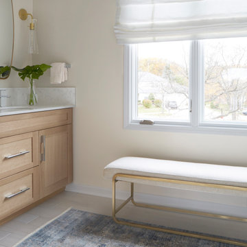 TKS Design Group
Download our free ebook, Creating the Ideal Kitchen. DOWNLOAD NOW
Lakefront property in the northwest suburbs of Chicago is hard to come by, so when we were hired by this young family with exactly that, we were immediately inspired by not just the unusually large footprint of this 1950’s colonial revival but also the lovely views of the manmade lake it was sited on. The large 5-bedroom home was solidly stuck in the 1980’s, but we saw tons of potential. We started out by updating the existing staircase with a fresh coat of paint and adding new herringbone slate to the entry hall.
The powder room off the entryway also got a refresh - new flooring, new cabinets and fixtures. We ran the new slate right through into this space for some consistency. A fun wallpaper and shiplap trim add a welcoming feel and set the tone for the home.
Next, we tackled the kitchen. Located away from the rest of the first floor, the kitchen felt a little isolated, so we immediately began planning for how to better connect it to the rest of the first floor. We landed on removing the wall between the kitchen and dining room and designed a modified galley style space with separate cooking and clean up zones. The cooking zone consists of the refrigerator, prep sink and cooktop, along with a nice long run of prep space at the island. The cleanup side of the kitchen consists of the main sink and dishwasher. Both areas are situated so that the user can view the lake during prep work and cleanup!
One of the home’s main puzzles was how to incorporate the mudroom and area in front of the patio doors at the back of the house. We already had a breakfast table area, so the space by the patio doors was a bit of a no man’s land. We decided to separate the kitchen proper from what became the new mudroom with a large set of barn doors. That way you can quickly hide any mudroom messes but have easy access to the light coming in through the patio doors as well as the outdoor grilling station. We also love the impact the barn doors add to the overall space.
The homeowners’ first words to us were “it’s time to ditch the brown,” so we did! We chose a lovely blue pallet that reflects the home’s location on the lake which is also vibrant yet easy on the eye. Countertops are white quartz, and the natural oak floor works well with the other honey accents. The breakfast table was given a refresh with new chairs, chandelier and window treatments that frame the gorgeous views of the lake out the back.
We coordinated the slate mudroom flooring with that used in the home’s main entrance for a consistent feel. The storage area consists of open and closed storage to allow for some clutter control as needed.
Next on our “to do” list was revamping the dated brown bar area in the neighboring dining room. We eliminated the clutter by adding some closed cabinets and did some easy updates to help the space feel more current. One snag we ran into here was the discovery of a beam above the existing open shelving that had to be modified with a smaller structural beam to allow for our new design to work. This was an unexpected surprise, but in the end we think it was well worth it!
We kept the colors here a bit more muted to blend with the homeowner’s existing furnishings. Open shelving and polished nickel hardware add some simple detail to the new entertainment zone which also looks out onto the lake!
Next we tackled the upstairs starting with the homeowner’s son’s bath. The bath originally had both a tub shower and a separate shower, so we decided to swap out the shower for a new laundry area. This freed up some space downstairs in what used to be the mudroom/laundry room and is much more convenient for daily laundry needs.
We continued the blue palette here with navy cabinetry and the navy tile in the shower. Porcelain floor tile and chrome fixtures keep maintenance to a minimum while matte black mirrors and lighting add some depth the design. A low maintenance runner adds some warmth underfoot and ties the whole space together.
We added a pocket door to the bathroom to minimize interference with the door swings. The left door of the laundry closet is on a 180 degree hinge to allow for easy full access to the machines. Next we tackled the master bath which is an en suite arrangement. The original was typical of the 1980’s with the vanity outside of the bathroom, situated near the master closet. And the brown theme continued here with multiple shades of brown.
Our first move was to segment off the bath and the closet from the master bedroom. We created a short hall from the bedroom to the bathroom with his and hers walk-in closets on the left and right as well as a separate toilet closet outside of the main bathroom for privacy and flexibility.
The original bathroom had a giant soaking tub with steps (dangerous!) as well as a small shower that did not work well for our homeowner who is 6’3”. With other bathtubs in the home, they decided to eliminate the tub and create an oversized shower which takes up the space where the old tub was located. The double vanity is on the opposite wall and a bench is located under the window for morning conversations and a place to set a couple of towels.
The pallet in here is light and airy with a mix of blond wood, creamy porcelain and marble tile, and brass accents. A simple roman shade adds some texture and it’s top-down mechanism allows for light and privacy.
This large whole house remodel gave our homeowners not only the ability to maximize the potential of their home but also created a lovely new frame from which to view their fabulous lake views.
Designed by: Susan Klimala, CKD, CBD
Photography by: Michael Kaskel
For more information on kitchen and bath design ideas go to: www.kitchenstudio-ge.com
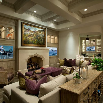
 Goodall Custom Cabinetry
Living room - traditional formal dark wood floor living room idea in Phoenix with beige walls, a standard fireplace and a media wall
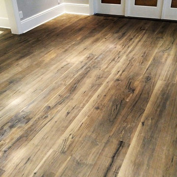
 Cypress Hardwood Flooring Ltd.
Jeanette
Living room - mid-sized rustic dark wood floor and brown floor living room idea in Vancouver with gray walls
Living room - mid-sized rustic dark wood floor and brown floor living room idea in Vancouver with gray walls
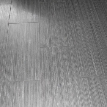
 McCullough's Flooring
Gorgeous master bath finished with Dal-Tile's Fabrique porcelain tile in the color Noir Linen polished. Tile size is 12"x24" installed in a brick joint pattern. The floor boasts underfloor heating on a timed thermostat.

 Five Star Tree Care
Winter has arrived and this means many months of snow and ice are ahead. When trees shed their leaves and go dormant for the winter, this is like how bears hibernate; they are both sleeping through the cold and waiting until the warm spring weather comes back. But unlike hibernating bears, who are safe and snuggled up in a warm cave somewhere, trees are left to withstand the harsh, cold elements throughout the entire winter. This means that they are more impacted than you might believe.
It is easier for mature trees to be able to handle the long winter months due to their extensive root system and thick bark. But saplings and other newly planted trees are not yet fully equipped with these natural defenses to handle the cold. No matter if you have new or older trees, following our tips will help them prosper during the cold Canadian winter ahead. Our team at Five Star Tree Services has come up with some winter maintenance essentials for your trees that will give them an extra hand over the winter.
One Last Water
Getting one last good watering in before the ground freezes is helpful to newly planted and young trees. Always make sure to water your tree slowly and gently. This allows the water to seep down into the root system as opposed to it running off the top and freezing.
Apply Mulch
When you use mulch, it acts like a barrier between the tree roots and the cold snow, it helps to insulate it. When you are applying mulch, make sure you spread it around the base of the tree so that it is no more than 3 inches deep. You also need to make sure to spread the mulch all the way to the drip line surrounding the tree. Make sure to not exceed 3 inches around your entire tree and keep the mulch away from the trunk of the tree.
Wrap Tree Trunks
There is a condition called sunscalding that can occur during the winter months. This happens when there is a temperature change that happens quickly. You might notice it when the sun warms the trees, which thaws the bark but during the night, when it gets cold again, it causes the melted water in the bark to rupture, causing cracks in the tree’s trunk. Young trees are especially susceptible to this happening. To help stop this from happening, it is best to wrap your trees with tree wraps or a plastic guard. It is advisable to wrap the trunk from the ground up and stop just below the first branch.
Shelter Your Trees
Young or newly planted trees are fairly defenseless for the first handful of years. Older and more mature trees have had time to develop a strong root system and hardy bark that help to protect them against things like animals and the freezing cold. If you want to help your little sapling along this winter, you can build a shelter that can handle having snow piled on it. You can also periodically use a broom to brush off the snow that accumulates on a tree’s branches. But try to avoid breaking off any ice that has formed on the branches, as this can actually end up hurting the tree if you accidentally break one of its branches instead.
Keep Road Salt Away
It’s no big secret that the use of road salt is detrimental to trees. When it gets on them, the end result come springtime is a dead tree, or at least, a severely damaged one. As much as you can, protect your trees and limit their exposure to salt over the winter.
Protect Your Trees
Winter is not only limiting for trees, but for a lot of other animals as well. This includes rabbits, mice, moles, squirrels, and other furry little creatures, who like to use trees as a food source during the summer months. During the winter, this food is now cut off when the trees go dormant. This only leaves the tree’s bark as an alternative food source for these critters. They seem to especially like young tree bark to chew on over the winter. In order to stop this from happening, you need to protect the bark with things like a fence surrounding your tree, wrapping the trunk with a plastic guard or hardware cloth.
Winter Pruning
The best time to prune any tree is during the winter months when the tree is dormant. Pruning allows you to rid the tree of any excess branches and control disease. Winter pruning is highly beneficial and lets your tree improve branch development in the spring.
Don’t Use
Always make sure to avoid products that are known to hurt trees, especially ones containing sodium chloride. Products like that cause negative reactions in trees or any plants, as it hinders their water intake. Instead, look for products that have potassium, calcium, and magnesium chloride.
How Five Star Tree Services Can Help
For newly planted and young trees, it is especially important to help them through the winter as best you can. We here at Five Star Tree Services are here to help you get your trees through the winter. If you require Toronto Tree Care, make sure to give us a call at (416) 990-3355.
30