
Search results for "Redtube same origin" in Home Design Ideas
 ODS Architecture
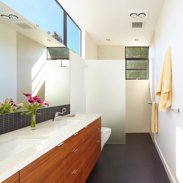
Originally a nearly three-story tall 1920’s European-styled home was turned into a modern villa for work and home. A series of low concrete retaining wall planters and steps gradually takes you up to the second level entry, grounding or anchoring the house into the site, as does a new wrap around veranda and trellis. Large eave overhangs on the upper roof were designed to give the home presence and were accented with a Mid-century orange color. The new master bedroom addition white box creates a better sense of entry and opens to the wrap around veranda at the opposite side. Inside the owners live on the lower floor and work on the upper floor with the garage basement for storage, archives and a ceramics studio. New windows and open spaces were created for the graphic designer owners; displaying their mid-century modern furnishings collection.
A lot of effort went into attempting to lower the house visually by bringing the ground plane higher with the concrete retaining wall planters, steps, wrap around veranda and trellis, and the prominent roof with exaggerated overhangs. That the eaves were painted orange is a cool reflection of the owner’s Dutch heritage. Budget was a driver for the project and it was determined that the footprint of the home should have minimal extensions and that the new windows remain in the same relative locations as the old ones. Wall removal was utilized versus moving and building new walls where possible.
Photo Credit: John Sutton Photography.
 Ziegler Doors Inc.
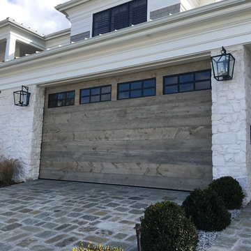
Just like in the french louvered door we have added a semi-gloss black iron window frame over tempered clear glass. One of the benefits of a reclaimed wood garage door is that the aged wood comes from old trees that provide longer wider boards. As shown in this project the long wide planks make this modern garage door fit nicely with this Newport Modern house.
There are several benefits of using reclaimed timber. Because we live in a world where supply is ever shrinking as we diminish our natural resources, in addition to, over-forestation and the ever growing environmental concerns of global warming or pollutants and wood Beatles killing 15 million trees in our forests of the past decade. Using reclaimed wood helps to preserve our forests and reduces the need for cutting young trees to keep up with the growing demand for timber. The other benefit of using the old timber from barns and old structures has to do with the maturation of the tree originally. Back in the day the only cut mature trees that had reached full potential growth. This wood tends to be stringer and less likely to split or fracture. What they call virgin timber is young trees that are softer and have a greater potential to split. Using reclaimed timber give you yet one more added benefit too, the wood has been aged in an environment that allows the wood to naturally preserve and tarnish with unique characteristics. The wood in old buildings has expanded and contracted constantly over the years and has fully dried out, making it more durable and less prone to warping and splitting. Old wood also tends to have a dense grain making it more stable. Those are natural design elements that make each reclaimed door different! Not one door will be exactly the same. Since the wood has naturally preserved and tarnished then all you have to do is apply a clear coat to the door and you’re done! Thus, leaving your garage, a beautiful naturally finished garage door, that is full of rustic beauty and charm. The wood has done what the wood is going to do and colors and scars tell the 100 year plus, history. What could be more original and charming than a reclaimed wood garage door from Ziegler!
You should always remember that reclaimed timber is itself, a finite resource. There are only so many old structures out there to source the wood from and eventually these too will become unavailable. In the meantime, reclaimed wood provides a valuable source of characterful material for farmhouse, traditional and rustic garage doors, and gates and shutters too! Ziegler is one of the oldest wood door manufactures in California and now body does it better than the originator of style and design. Contact one of our top designers in the industry today to start your own history with Ziegler 714-437-0870
 Tracy A. Stone Architect
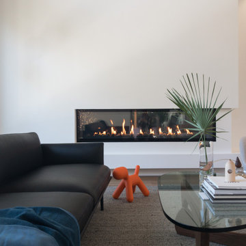
The original house had a wood burning masonry fireplace in the same location, but the client wanted a sleeker look and a more energy efficient (and less polluting) option.
Find the right local pro for your project
 ODS Architecture
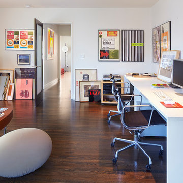
Originally a nearly three-story tall 1920’s European-styled home was turned into a modern villa for work and home. A series of low concrete retaining wall planters and steps gradually takes you up to the second level entry, grounding or anchoring the house into the site, as does a new wrap around veranda and trellis. Large eave overhangs on the upper roof were designed to give the home presence and were accented with a Mid-century orange color. The new master bedroom addition white box creates a better sense of entry and opens to the wrap around veranda at the opposite side. Inside the owners live on the lower floor and work on the upper floor with the garage basement for storage, archives and a ceramics studio. New windows and open spaces were created for the graphic designer owners; displaying their mid-century modern furnishings collection.
A lot of effort went into attempting to lower the house visually by bringing the ground plane higher with the concrete retaining wall planters, steps, wrap around veranda and trellis, and the prominent roof with exaggerated overhangs. That the eaves were painted orange is a cool reflection of the owner’s Dutch heritage. Budget was a driver for the project and it was determined that the footprint of the home should have minimal extensions and that the new windows remain in the same relative locations as the old ones. Wall removal was utilized versus moving and building new walls where possible.
Photo Credit: John Sutton Photography.
 Carl Mattison Design
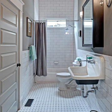
A hall bath was carved out between two of the downstairs bedrooms. This deep bath is anchored by the tub with window allowing ample light. The sink was reclaimed from an original summer/prep kitchen in the home and refinished. The school house style bath is easy to clean, simple and ready for guests with it's abundant storage.
Photography by Josh Vick
 ODS Architecture
Originally a nearly three-story tall 1920’s European-styled home was turned into a modern villa for work and home. A series of low concrete retaining wall planters and steps gradually takes you up to the second level entry, grounding or anchoring the house into the site, as does a new wrap around veranda and trellis. Large eave overhangs on the upper roof were designed to give the home presence and were accented with a Mid-century orange color. The new master bedroom addition white box creates a better sense of entry and opens to the wrap around veranda at the opposite side. Inside the owners live on the lower floor and work on the upper floor with the garage basement for storage, archives and a ceramics studio. New windows and open spaces were created for the graphic designer owners; displaying their mid-century modern furnishings collection.
A lot of effort went into attempting to lower the house visually by bringing the ground plane higher with the concrete retaining wall planters, steps, wrap around veranda and trellis, and the prominent roof with exaggerated overhangs. That the eaves were painted orange is a cool reflection of the owner’s Dutch heritage. Budget was a driver for the project and it was determined that the footprint of the home should have minimal extensions and that the new windows remain in the same relative locations as the old ones. Wall removal was utilized versus moving and building new walls where possible.
Photo Credit: John Sutton Photography.
 Alexandra Rae Design
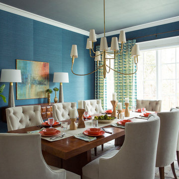
This dining room was built around an artisan table that was a prized possesion of the clients. It was made entirely without nails by a Seattle artist. To compliment the table, Alexandra Rae created a room in the vein of master Mid Century furniture makers. The brass chandelier, carved floating buffet and tufted velvet saber leg chairs subtly nod to Mad Men chic. Details like the sculptural vases, hand carved candle sticks and poured concrete lamps ground the space with the same post modern artisanal personality of the dining table

Sponsored
Sunbury, OH

J.Holderby - Renovations
Franklin County's Leading General Contractors - 2X Best of Houzz!
 Gregory Thomas, Residential Architect
Living Room
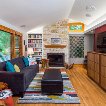
Turning left in the Entry Hall, one sees the Living room, set up for listening to music with the hi-fi stereo hidden in the cabinetry. The television can be dropped into the same cabinet, using an automated scissor lift.
The vaulted ceiling replaced the formerly flat ceiling. Solar tube skylights and a clerestory window brighten the room with daylight, while a built-in cove light brightens the space at night.
A new picture window facing the street replaces the original. A small high window facing north brings in additional natural light, and a view to the trees beyond.
stained oak trim; original oak floors • Waynesboro Taupe by Benjamin paint on walls & ceiling • Seattle Mist by Benjamin Moore paint in music nook • sun tunnel • custom designed & built buffet
Construction by CG&S Design-Build.
Photography by Tre Dunham, Fine focus Photography
 Soucie Horner, Ltd.
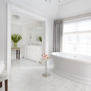
A fresh take on traditional style, this sprawling suburban home draws its occupants together in beautifully, comfortably designed spaces that gather family members for companionship, conversation, and conviviality. At the same time, it adroitly accommodates a crowd, and facilitates large-scale entertaining with ease. This balance of private intimacy and public welcome is the result of Soucie Horner’s deft remodeling of the original floor plan and creation of an all-new wing comprising functional spaces including a mudroom, powder room, laundry room, and home office, along with an exciting, three-room teen suite above. A quietly orchestrated symphony of grayed blues unites this home, from Soucie Horner Collections custom furniture and rugs, to objects, accessories, and decorative exclamationpoints that punctuate the carefully synthesized interiors. A discerning demonstration of family-friendly living at its finest.
 StudioLAB
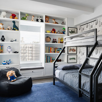
Across from Hudson River Park, the Classic 7 pre-war apartment had not renovated in over 50 years. The new owners, a young family with two kids, desired to open up the existing closed in spaces while keeping some of the original, classic pre-war details. Dark, dimly-lit corridors and clustered rooms that were a detriment to the brilliant natural light and expansive views the existing apartment inherently possessed, were demolished to create a new open plan for a more functional style of living. Custom charcoal stained white oak herringbone floors were laid throughout the space. The dark blue lacquered kitchen cabinets provide a sharp contrast to the otherwise neutral colored space. A wall unit in the same blue lacquer floats on the wall in the Den.
 Arciform
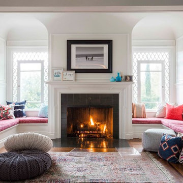
The layout of the original living room remained the same, with its lovely built in benches at the windows surrounding the fireplace. Decoration by Jenna Sheingold. - Dibble Photography
 User
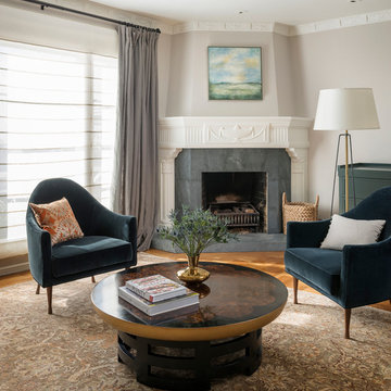
UserInspiration for a transitional formal and enclosed medium tone wood floor living room remodel in San Francisco with gray walls and a corner fireplace

 Allen Construction
The original house was demolished to make way for a two-story house on the sloping lot, with an accessory dwelling unit below. The upper level of the house, at street level, has three bedrooms, a kitchen and living room. The “great room” opens onto an ocean-view deck through two large pocket doors. The master bedroom can look through the living room to the same view. The owners, acting as their own interior designers, incorporated lots of color with wallpaper accent walls in each bedroom, and brilliant tiles in the bathrooms, kitchen, and at the fireplace tiles in the bathrooms, kitchen, and at the fireplace.
Architect: Thompson Naylor Architects
Photographs: Jim Bartsch Photographer
Sponsored
Sunbury, OH
J.Holderby - Renovations
Franklin County's Leading General Contractors - 2X Best of Houzz!
 Architect Heather Johnston
CASA 1O
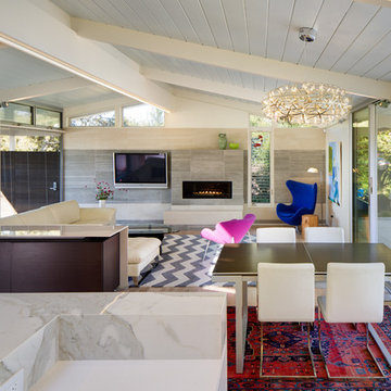
Contemporary on a Mid-century Scaffold.
Largely unmodified since its design by Russell Forester and construction in 1957, the structure housed the original family until 2013. An intimate 1,910 square foot space, the house acquired a separate 600 square foot cottage in the 70’s designed by another architect. New owners purchased the house with the idea of keeping the original architect’s intent intact – the simple accommodation of everyday life with a focus on outdoor living only possible in Southern California. At the same time the house needed insulation, new electrical, plumbing, siding – everything but new studs and foundations.
A single roof beam travels south from the north fireplace wall all the way to the bedrooms in the back. Functions occur to either side, with private access to exterior courtyards. How do we accentuate the uncomplicated while enhancing the qualities of the chosen materials? Contemporary applied to a mid-century scaffold.
We focused on reduction, a few things performing many tasks. Each component, material or color performs more than one duty.
Lighting is paramount, enhancing the design’s procession from front to back, north to south, public to private. Strip LED’s reinforce the beam’s linear presence and spot LED’s make punctuation points of the roof purlins. Hidden up and down-lights in the cabinets and elsewhere provide the rooms with a quiet glow.
Exterior grass plantings give the only vertical dimension to the design, waving as the breeze moves them. All else is horizontal: caramelized bamboo siding, porcelain tile, roof line and ocean horizon.
Architect: Heather Johnston Architect
Landscaping: HJA
Photography: Brady Architectural Photography
 Landis Architects | Builders
Photo: Michael K. Wilkinson
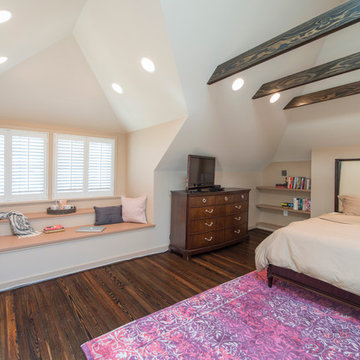
The owners of this 1923 home in Washington DC wanted a master suite, and originally considered combining two rooms on the second floor to serve this purpose. However, they showed our team the home’s attic and expressed an interest in seeing a design option for a master suite in that space.
Our designer was immediately inspired. The appeal of moving the master suite to the attic was that it offered an opportunity to create a unique space that was larger and had more design options than combining two bedrooms.
The original attic had wood paneling on the walls and ceiling and was mostly used for storage and as a retreat for the cats. The 7-foot walls did not capture the volume of the roof line, nor did it take advantage of the square footage.
We removed the existing paneling and pushed the existing walls back so they had a lower height around the perimeter. This provides a dramatic contrast to the new high ceiling and dramatic angles of the roofline. We maintained an open floor plan and used glass panels and doors for privacy and separation of different functions. The finished square footage is 650 sq.ft. There is about 350 sq.ft. of unfinished the storage area.
We also installed larger windows in the front dormer. The new windows are casement windows for egress purposes, which are required by code in a bedroom. The front dormer was also reframed in a shape that follows the original frame, which adds more volume. We installed two long steps inside the dormer to hide the ducts underneath and provide seating and storage.
The space needed some detailing to balance the large volume. The open plan also required a visual delineation of the different areas. Our designer added three beams across the ceiling over the bed to define the master bedroom. The beams were finished with the same dark stain used to refinish the attic’s original pine flooring. Dimmable recessed lights in the ceiling are placed in accordance with the beams location.
 Remodeling by Classic Homes
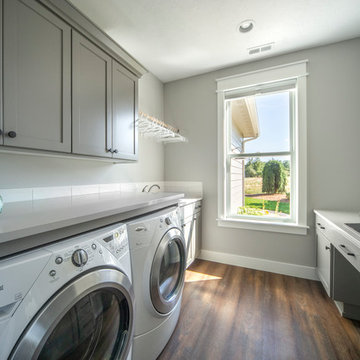
The original ranch style home was built in 1962 by the homeowner’s father. She grew up in this home; now her and her husband are only the second owners of the home. The existing foundation and a few exterior walls were retained with approximately 800 square feet added to the footprint along with a single garage to the existing two-car garage. The footprint of the home is almost the same with every room expanded. All the rooms are in their original locations; the kitchen window is in the same spot just bigger as well. The homeowners wanted a more open, updated craftsman feel to this ranch style childhood home. The once 8-foot ceilings were made into 9-foot ceilings with a vaulted common area. The kitchen was opened up and there is now a gorgeous 5 foot by 9 and a half foot Cambria Brittanicca slab quartz island.
 Balboa Design Group
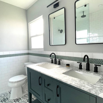
Our clients wanted a REAL master bathroom with enough space for both of them to be in there at the same time. Their house, built in the 1940’s, still had plenty of the original charm, but also had plenty of its original tiny spaces that just aren’t very functional for modern life.
The original bathroom had a tiny stall shower, and just a single vanity with very limited storage and counter space. Not to mention kitschy pink subway tile on every wall. With some creative reconfiguring, we were able to reclaim about 25 square feet of space from the bedroom. Which gave us the space we needed to introduce a double vanity with plenty of storage, and a HUGE walk-in shower that spans the entire length of the new bathroom!
While we knew we needed to stay true to the original character of the house, we also wanted to bring in some modern flair! Pairing strong graphic floor tile with some subtle (and not so subtle) green tones gave us the perfect blend of classic sophistication with a modern glow up.
Our clients were thrilled with the look of their new space, and were even happier about how large and open it now feels!

Sponsored
Columbus, OH

Wannemacher Interiors
Customized Award-Winning Interior Design Solutions in Franklin Cnty OH
 CG&S Design-Build
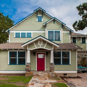
One of the most important things for the homeowners was to maintain the look and feel of the home. The architect felt that the addition should be about continuity, riffing on the idea of symmetry rather than asymmetry. This approach shows off exceptional craftsmanship in the framing of the hip and gable roofs. And while most of the home was going to be touched or manipulated in some way, the front porch, walls and part of the roof remained the same. The homeowners continued with the craftsman style inside, but added their own east coast flare and stylish furnishings. The mix of materials, pops of color and retro touches bring youth to the spaces.
Photography by Tre Dunham
 Cape Associates, Inc.
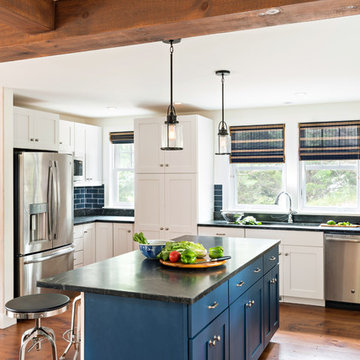
The little cottage on Turnip Field Road in Eastham had been owned by the same couple since 1940, until they built a new, adjacent house on the property. The cottage was then handed down to the next generation, who began spending more and more time at the cottage. It was then that they contacted Cape Associates to construct a more livable home in place of that little cottage. It was crucial to the owners however, that the home keep with the understated charm and Cape Cod-feel of the neighborhood.
The primary challenge was to keep it humble, while building the owners their well-deserved vacation retreat. The original cottage had no air conditioning, and renovating was quickly dismissed because of the inadequacies and the cost of modernizing. Building new allowed the team to relocate the house further back from the street, and it meant meeting the owners’ needs without compromise.
Cape Associates’ project manager Lance LaLone said the owners expressed their desire to incorporate lots of wood and the types of materials that were in the old cottage. Most of the interior is pine, which was used on the flooring, the walls, and wrapped around the ceiling’s beams, giving the owners what they desired on a grander scale – a beautiful, modern dwelling that still held the personality of that little cottage that held such cherished memories.
The front of the home has a two-car garage and breezeway entrance, while the rear reveals an entertainer’s paradise, with an enormous mahogany deck with an outdoor shower, a stunning Connecticut-fieldstone fireplace with a chimney that reaches around 30 feet in height, and multiple sliders to access the home. The finished basement opens to the ground level, and above the entrance breezeway is another small deck with a great view. It’s the best of indoor/outdoor living.
Movement patterns from beach to house to bedroom were an important consideration. The site also provided an excellent opportunity to visually connect the basement level patio visually to the main level deck and finally the master bedroom deck. The finished home provides year-round living, with a summer-getaway atmosphere.
 Brad Cox, Architect, Inc.
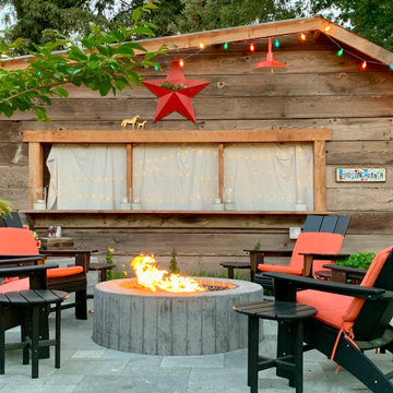
This barn used to be the carriage house for an adjacent property, and was initially in pretty bad shape: no roof, sagging beams, and so much Redwood duff and ivy that the owner didn't realize there was a concrete floor underneath. A framer helped the owner reframe the barn from the inside, using dimensional lumber to keep the integrity of the original studs. (Back in the day, a 2 x 4 actually measured 2" x 4".) The siding seen here was originally on the inside of this same wall. Originally the barn had three "rooms", and when the third room collapsed the wall was replaced with plywood.
4