
Search results for "Reduce access" in Home Design Ideas
 Spin Design Limited
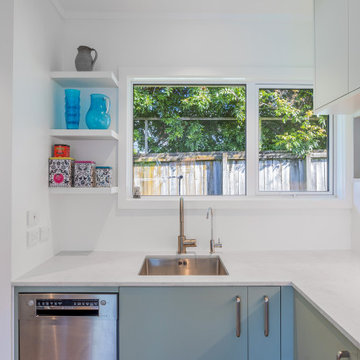
Removing a wall in a small two-bedroom unit has resulted in a significant transformation. By opening up the space, a seamless connection has been established between the kitchen, dining area, and living room, creating a multi-functional and versatile area. The removal of the wall has eliminated the physical barriers that previously separated these spaces, fostering a sense of openness and facilitating better communication and interaction among family members.
The kitchen extension resulting from the removal of the wall has provided several practical benefits. Firstly, it has allowed for the expansion of the bench space, providing more room for meal preparation, cooking, and other kitchen activities. Additionally, the kitchen extension has led to an improvement in storage capacity. This means that kitchen utensils, appliances, and ingredients can be neatly organized and easily accessible, reducing clutter and enhancing efficiency in the kitchen.
 Simply Home Decorating
The kitchen may be the heart of a home, but the dining room is where the family gathers to enjoy special occasions, create and pass on traditions, and savour each other’s company free from distractions. The family behind this particular dining room enjoys doing just that.
When they are not traveling the world, Matthew and Anna (names changed) love to cook meals at home with their teenage daughter, entertain family and friends, and live amongst their cherished travel souvenirs and heirlooms. Their dining room, however, was far from the perfect backdrop for these experiences.
Before: Dining Room:
When Matthew and Anna contacted us, they imagined a space that would comfortably seat 8 to 10 people and incorporate their beautiful inherited dining table and sideboard in a fresh, modern way. Above all, they wanted a dining room that they would feel proud to share.
They worked with us to design, lightly renovate, and furnish their dining room and adjacent living space. Now, the room is nothing short of inviting and elevated.
Classic Yet Contemporary Dining Room:
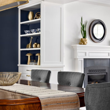
Viewed from the living area, the dining room is a hidden gem waiting to be discovered. Matthew and Anna wanted dark blue for the walls, and we couldn’t have been happier to find the perfect shade for them. By leaning darker, this rich blue creates the perception of depth, making the room feel enticing, comfortable and secluded.
The previous built-ins were underwhelming and lacked function, so we designed wider, taller, double sided cabinets that integrated the existing bulk-head, and then accessorized the shelves with the family’s travel finds, books, and decor. Topping these units with brass art lights not only blends contemporary and traditional styles, it also draws attention to the dining table’s modern show-stopping chandelier. You can’t miss it.
Inside the dining room, the effect is equally impressive: enveloping yet spacious, warm yet cool, classic yet contemporary. We incorporated their heirloom pieces seamlessly into the design thanks to the 1:2 ratio. For every traditional piece, we introduced two more modern or contemporary pieces — clean lines, subtle curves, and lustrous brass hardware. The result is a collected yet updated look.
In any room with dark walls, lighting is of the utmost importance. We placed a mirror adjacent to the window to reflect natural light throughout the room, and we kept the trim and ceiling white for brightness. To provide maximum versatility, we provided multiple light sources that can be adjusted to create different levels of light to suit any mood or occasion. These include: pot lights and a chandelier on dimmers, a sculptural trilight lamp on the sideboard, and art lights on the bookcases and above important art pieces.
The built-ins have another surprise waiting inside this special dining room:
Double-sided built-ins: dining room shelving and living room shelving.
Rather than keep them white like we did in the living room, we painted the back wall of the book cases the same dark blue as the walls in the rest of the room. This reduces the contrast with the surrounding walls and emphasizes the white outline of the cabinets. We also love the dark blue walls’ role as a beautiful backdrop for this family’s treasures. The brass accessories and hand-painted vases and bowls feel like part of the experience.
Of course, what is beauty without function? It may not look like it, but the base storage is only accessible from the dining room side. The units include deep cabinets for storing serving ware, as well as another delightful surprise: silverware drawers lined in luxurious navy velvet!
Lastly, we designed this beautiful nook for their heirloom sideboard. From afar, the wall looks as if it has texture and perhaps a touch of shine. Up close, you will notice that it is actually navy blue wallpaper with tiny golden dots. This unique touch accentuates the brass in the room touches throughout the space.. The room feels curated, contemporary, and full of character.
Words of Praise:
Anna and Matthew were thrilled with their new dining room and with the design process itself, which is always the highest compliment. They said:
“Working with Lori and her team at Simply Home Decorating was a great experience. The design they came up with was both beautiful and practical for our family. Renovations can be stressful but working with Simply Home made the process much more pleasant.
“Simply Home's project management and their longstanding relationships with reliable trades meant we could relax, knowing that everything was taken care of. If an issue arose, the entire Simply Home team was quick to address it. They were excellent at communicating with us—we never felt like we didn't know what was going on. We would highly recommend working with Simply Home Decorating.”
Thank you, Matthew and Anna! We are honoured to have been part of your journey and wish your family many happy memories in these new spaces.
Now, is it your turn? Are you ready to uncover the hidden potential in your home? If so, contact us here to start the conversation or download my guide Uncovering the Hidden Potential in Your Home below to learn more about what we can do for you.
 ZeroEnergy Design
This LEED Platinum certified house reflects the homeowner's desire for an exceptionally healthy and comfortable living environment, within a traditional neighborhood.
INFILL SITE. The family, who moved from another area of Wellesley, sought out this property to be within walking distance of the high school and downtown area. An existing structure on the tight lot was removed to make way for the new home. 84% of the construction waste, from both the previous structure and the new home, was diverted from a landfill. ZED designed to preserve the existing mature trees on the perimeter of the property to minimize site impacts, and to maintain the character of the neighborhood as well as privacy on the site.
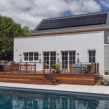
EXTERIOR EXPRESSION. The street facade of the home relates to the local New England vernacular. The rear uses contemporary language, a nod to the family’s Californian roots, to incorporate a roof deck, solar panels, outdoor living space, and the backyard swimming pool. ZED’s careful planning avoided to the need to face the garage doors towards the street, a common syndrome of a narrow lot.
THOUGHTFUL SPACE. Homes with dual entries can often result in duplicate and unused spaces. In this home, the everyday and formal entry areas are one and the same; the front and garage doors share the entry program of coat closets, mudroom storage with bench for removing your shoes, and a laundry room with generous closets for the children's sporting equipment. The entry area leads directly to the living space, encompassing the kitchen, dining and sitting area areas in an L-shaped open plan arrangement. The kitchen is placed at the south-west corner of the space to allow for a strong connection to the dining, sitting and outdoor living spaces. A fire pit on the deck satisfies the family’s desire for an open flame while a sealed gas fireplace is used indoors - ZED’s preference after omitting gas burning appliances completely from an airtight home. A small study, with a window seat, is conveniently located just off of the living space. A first floor guest bedroom includes an accessible bathroom for aging visitors and can be used as a master suite to accommodate aging in place.
HEALTHY LIVING. The client requested a home that was easy to clean and would provide a respite from seasonal allergies and common contaminants that are found in many indoor spaces. ZED selected easy to clean solid surface flooring throughout, provided ample space for cleaning supplies on each floor, and designed a mechanical system with ventilation that provides a constant supply of fresh outdoor air. ZED selected durable materials, finishes, cabinetry, and casework with low or no volatile organic compounds (VOCs) and no added urea formaldehyde.
YEAR-ROUND COMFORT. The home is super insulated and air-tight, paired with high performance triple-paned windows, to ensure it is draft-free throughout the winter (even when in front of the large windows and doors). ZED designed a right-sized heating and cooling system to pair with the thermally improved building enclosure to ensure year-round comfort. The glazing on the home maximizes passive solar gains, and facilitates cross ventilation and daylighting.
ENERGY EFFICIENT. As one of the most energy efficient houses built to date in Wellesley, the home highlights a practical solution for Massachusetts. First, the building enclosure reduces the largest energy requirement for typical houses (heating). Super-insulation, exceptional air sealing, a thermally broken wall assembly, triple pane windows, and passive solar gain combine for a sizable heating load reduction. Second, within the house only efficient systems consume energy. These include an air source heat pump for heating & cooling, a heat pump hot water heater, LED lighting, energy recovery ventilation, and high efficiency appliances. Lastly, photovoltaics provide renewable energy help offset energy consumption. The result is an 89% reduction in energy use compared to a similar brand new home built to code requirements.
RESILIENT. The home will fare well in extreme weather events. During a winter power outage, heat loss will be very slow due to the super-insulated and airtight envelope– taking multiple days to drop to 60 degrees even with no heat source. An engineered drainage system, paired with careful the detailing of the foundation, will help to keep the finished basement dry. A generator will provide full operation of the all-electric house during a power outage.
OVERALL. The home is a reflection of the family goals and an expression of their values, beautifully enabling health, comfort, safety, resilience, and utility, all while respecting the planet.
ZED - Architect & Mechanical Designer
Bevilacqua Builders Inc - Contractor
Creative Land & Water Engineering - Civil Engineering
Barbara Peterson Landscape - Landscape Design
Nest & Company - Interior Furnishings
Eric Roth Photography - Photography
Find the right local pro for your project
 Taylor Made Custom Contracting Inc.
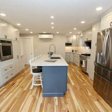
This custom kitchen remodel in Jarrettsville was thoughtfully designed to combine timeless style with highly functional storage solutions that make everyday living easier. The kitchen features custom cabinetry, quartz countertops, decorative tilework, and warm hickory flooring that flows seamlessly throughout the space, adding natural warmth and character. A contrasting blue island creates a beautiful focal point while adding additional workspace, storage, and seating to the heart of the kitchen.
A hidden walk-in pantry cabinet is seamlessly integrated into the cabinetry wall, providing generous storage while maintaining a clean, built-in appearance. Adjacent to the range, a pull-out utensil holder keeps cooking tools organized and within easy reach. A hidden roll-out cabinet neatly stores a folding step stool for convenient access to upper cabinets. The kitchen also includes a lift-up appliance drawer designed to raise heavy countertop appliances, such as a KitchenAid mixer, to working height with ease, helping reduce lifting and countertop clutter. Around the corner, floating shelves framed by full-height decorative tile create an elegant display area that adds both storage and visual interest to the space. Thoughtful details like crown molding, layered finishes, and custom storage features make this kitchen both beautiful and exceptionally practical for daily life.
 Dura Supreme Cabinetry
Explore this thoughtfully designed mudroom and laundry room sanctuary that is filled with both functionality and personality.
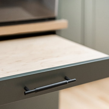
On the mudroom side, there is personalized organization for every member of the household. Thoughtfully integrated divided shoe shelves beneath a cozy boot bench, along with open storage perfectly sized for decorative baskets, and decorative coat hooks ensure every essential from seasonal accessories to everyday items (i.e. gloves, hats, scarves, shoes, jackets, etc.) has its designated place. Overhead, elegant closed storage conceals and organizes, maintaining a pristine aesthetic that endures.
On the laundry room side, experience the ultimate in ergonomic design with raised washer and dryers, seamlessly integrated for effortless access and reduced strain and bending. Below the machines, a locking roll-out shelf glides out smoothly creating a perfectly positioned platform to set a laundry basket at an easy-to-reach height for loading and unloading. All designed to transforming loading and unloading the washer and dryer into a seamless, comfortable task.
Design by Cedar Design Build, Minnesota. Architectural Design by Becky Watson of Niche Design.
Cabinetry and mudroom lockers featuring Dura Supreme Cabinetry’s Reese Inset skinny shaker door style in an Evergreen Fog painted finish with accents of Natural Cherry wood.
Request a FREE Dura Supreme Brochure Packet:
https://www.durasupreme.com/request-brochures/
Find a Dura Supreme Showroom near you today:
https://www.durasupreme.com/find-a-showroom/
Want to become a Dura Supreme Dealer? Go to:
https://www.durasupreme.com/become-a-dealer/
 Katie Hutchison Studio
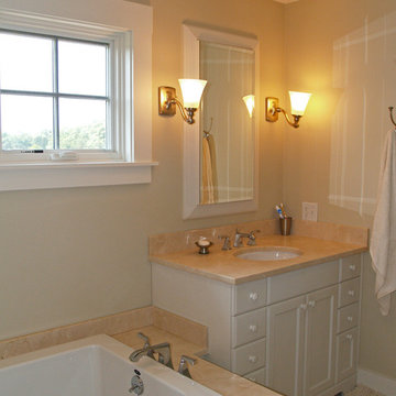
This larger home, constructed on Martha’s Vineyard, is a collection of informal, dormered gable components and grounding one-story, shed-roof elements that reduce its overall scale.
Designed to take advantage of a gently sloping up-Island property, this 5500 sq. ft. (not including finished basement) six-bedroom home includes staggered floor levels that climb from the front of the site to the rear. Generous, open living space on the entry level -- anchored on the west end by a fireplace and on the east end by the kitchen -- borders a dining area that’s nestled under a roof which also shelters the adjacent wrap-around porch. A deck off the rear of the dining space extends around the kitchen and is easily accessible from the nearby family room, too. Bedrooms occupy the other above-grade levels, including, at the upper-most level, the master suite comprised of a study, roof deck, master bath, walk-in closets and the master bedroom.
A clean-lined interior of warm neutrals sets a soothing tone in which the Island landscape is welcomed through expansive windows, porches and decks. Clad in white cedar shingles with a red cedar roof, the West Tisbury House will softly weather in-tune with its meadow site.
Katie Hutchison Studio collaborated with Geoffrey Koper Architect of Yarmouth Port, Mass. on the West Tisbury House. Kitchen fit-out and interior finishes, fixtures, and furnishings by others.
photo by Katie Hutchison
 Blossom US
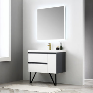
❤ Furniture grade polyvinyl chloride board plus 5 layers paint provides extra waterproof and resistance to moisture and humidity.
❤ Ergonomic Design Handles provide comfortable access to drawers.
❤ Anti-fog, Color Temp Change, Brightness Adjustable Smart LED Mirror.
❤ High quality easy clean up and maintenance free ACRYLIC SINK.
❤ EASY CLEAN & Maintenance free glossy finish surfaces.
❤ FULL EXTENSION DRAWERS offers you spacious storage space and keeping all daily items well organized.
❤ SOFT CLOSE prevents cracks and reduces friction on the hardware.
❤ U SHAPE & OPEN BACK for easy plumbing installation.
❤ COMPATIBLE METAL LEGS provides extra base support.
❤ ONE YEAR WARRANTY with top level customer service.

Sponsored
Columbus, OH
Free consultation for landscape design!

Peabody Landscape Group
Franklin County's Reliable Landscape Design & Contracting
 katherine
Office Workstations and Cubicles: The Unsung Heroes of Efficient Team Environments
In today's fast-paced business world, the hum of productivity is the sweetest sound an office can produce. But what fuels this symphony of efficiency?
While leadership and strategy are crucial, the physical environment in which a team operates plays a role that is just as vital. The debate between open-plan offices and traditional cubicles has raged for years, yet the truth is that a well-designed space incorporating both office workstations cubicles can be the key to unlocking a team's full potential. This isn't just about furniture; it's about creating a habitat for success.
The Evolution of the Workspace: Beyond the Beige Box
Gone are the days of monotonous rows of identical, soul-crushing cubicles. Modern office design has embraced a more nuanced understanding of worker needs. The contemporary workstation is a far cry from its predecessors, offering flexibility, ergonomic support, and a nod to aesthetic appeal. This evolution recognizes that a one-size-fits-all approach stifles creativity and productivity.
Fostering Focus in a Sea of Collaboration
While collaboration is a cornerstone of modern business, the need for individual, focused work remains paramount. This is where the modern cubicle shines. It provides a sanctuary from the constant distractions of a completely open office, allowing employees to delve deep into tasks that require concentration. This dedicated space minimizes interruptions, leading to higher quality work and reduced stress levels.
The Power of Personalization and Ownership
Giving employees a degree of control over their immediate environment can have a profound impact on morale and engagement. Modern workstations and cubicles that allow for personalization be it through adjustable shelving, pinboards for personal items, or even the choice of chair foster a sense of ownership. This small act of empowerment can translate into a greater sense of belonging and commitment to the organization.
Ergonomics: The Foundation of Employee Well-being and Productivity
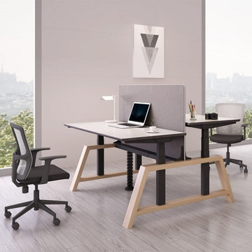
A comfortable employee is a productive employee. Ergonomics is not a luxury; it's a fundamental necessity in any office environment. Poorly designed workstations can lead to a host of musculoskeletal issues, from back pain to carpal tunnel syndrome, resulting in increased absenteeism and decreased efficiency. Investing in ergonomic chairs, adjustable-height desks, and properly positioned monitors is an investment in the long-term health and performance of your team.
Designing for Synergy: The Strategic office layout design
The arrangement of workstations and cubicles is as important as the furniture itself. A strategic office layout design can facilitate seamless communication and collaboration while still providing pockets of privacy for focused work. This involves creating "neighborhoods" for different teams, placing collaborative zones in central, easily accessible areas, and ensuring that high-traffic pathways don't cut through quiet work zones.
Breaking Down Barriers with Hybrid Designs
The most effective office environments often feature a hybrid approach. This might involve clusters of cubicles for focused work, interspersed with open, collaborative "huddle spaces" equipped with whiteboards and comfortable seating. This variety allows employees to choose the environment that best suits the task at hand, offering the best of both worlds.
The Role of Acoustics in a Thriving Workplace
Noise is one of the biggest complaints in open-plan offices. Well-designed cubicles with sound-dampening panels can significantly mitigate this issue. Furthermore, incorporating acoustic solutions throughout the office, such as sound-absorbing materials on walls and ceilings, can create a more pleasant and productive auditory environment for everyone.
Integrating Technology for a Seamless Workflow
In the digital age, technology is the lifeblood of any business. Modern office workstations are designed with this in mind, featuring integrated power and data ports, cable management systems, and ample space for multiple monitors. This seamless integration of technology ensures that employees have the tools they need to work efficiently and without frustration.
Choosing the Right Partner for Your Office Environment
The task of outfitting an office can be daunting. Partnering with a knowledgeable and reputable Meet&Co commercial furniture supplier is crucial to creating an environment that is both functional and inspiring. A good supplier will not only offer a wide range of high-quality products but will also provide expert advice on space planning and ergonomic best practices, ensuring that your investment yields the best possible return.
The Future of the Office: Flexibility and Adaptability
The world of work is constantly evolving, and office design must evolve with it. The future lies in creating flexible and adaptable spaces that can be easily reconfigured to meet the changing needs of a business. Modular furniture and movable partitions are key components of this future-proof approach, allowing organizations to scale and adapt without the need for costly and disruptive renovations.
Conclusion: A Strategic Investment in Your Greatest Asset
Ultimately, the design of your office is a direct reflection of your company's culture and values. By investing in high-quality, ergonomic, and well-designed office workstations and cubicles, you are sending a clear message to your employees: their well-being and productivity matter. This strategic investment in your physical workspace is, in fact, an investment in your most valuable asset your people. The result is a more engaged, efficient, and innovative team, ready to tackle the challenges of tomorrow.
 Ke Design Collective Inc.
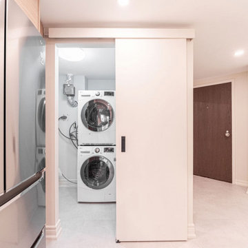
A complete two bath & kitchen renovation in a condo. Client wanted a larger kitchen area and better layout for bathrooms. We removed a wall near the entrance and extended the kitchen with additional cabinetry and storage area. Laundry room was reduced to accommodate the larger kitchen.
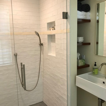
The shared and primary bathrooms were gutted and fully remodeled as well. Enlarged shower enclosure in shared bath for more space. Layout of primary bathroom was changed for better accessibility and flow in the area. Vanity and shower was relocated to create a more spacious and inviting environment.
Client didn’t like the current floors, we replaced it with luxury vinyl planks for durability.
 Edger Landscape Design
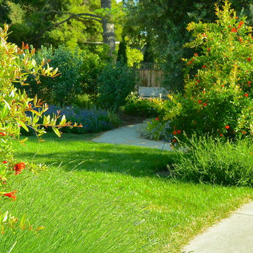
The reduced lawn is flanked by Lavender and Pomegranate trees on either side of the patio access.
Inspiration for a large mediterranean partial sun backyard gravel garden path in San Francisco for spring.
Inspiration for a large mediterranean partial sun backyard gravel garden path in San Francisco for spring.
 Camellia Cabinetry & More
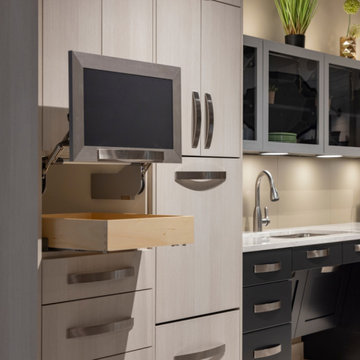
Thoughtful cabinetry should do more than look beautiful—it should make daily kitchen tasks easier. A built-in appliance lift keeps small appliances tucked away but easy to access, while integrated storage helps reduce counter clutter and keep essentials organized.
Visit our Danville showroom to explore cabinetry solutions in person.
Call or text: 925-236-0558
Book a visit: https://calendly.com/wendi-camelliacabinetry/60min
 Katie Hutchison Studio
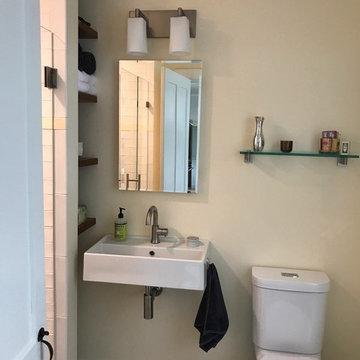
The new owners of this house in Harvard, Massachusetts loved its location and authentic Shaker characteristics, but weren’t fans of its curious layout. A dated first-floor full bathroom could only be accessed by going up a few steps to a landing, opening the bathroom door and then going down the same number of steps to enter the room. The dark kitchen faced the driveway to the north, rather than the bucolic backyard fields to the south. The dining space felt more like an enlarged hall and could only comfortably seat four. Upstairs, a den/office had a woefully low ceiling; the master bedroom had limited storage, and a sad full bathroom featured a cramped shower.
KHS proposed a number of changes to create an updated home where the owners could enjoy cooking, entertaining, and being connected to the outdoors from the first-floor living spaces, while also experiencing more inviting and more functional private spaces upstairs.
On the first floor, the primary change was to capture space that had been part of an upper-level screen porch and convert it to interior space. To make the interior expansion seamless, we raised the floor of the area that had been the upper-level porch, so it aligns with the main living level, and made sure there would be no soffits in the planes of the walls we removed. We also raised the floor of the remaining lower-level porch to reduce the number of steps required to circulate from it to the newly expanded interior. New patio door systems now fill the arched openings that used to be infilled with screen. The exterior interventions (which also included some new casement windows in the dining area) were designed to be subtle, while affording significant improvements on the interior. Additionally, the first-floor bathroom was reconfigured, shifting one of its walls to widen the dining space, and moving the entrance to the bathroom from the stair landing to the kitchen instead.
These changes (which involved significant structural interventions) resulted in a much more open space to accommodate a new kitchen with a view of the lush backyard and a new dining space defined by a new built-in banquette that comfortably seats six, and -- with the addition of a table extension -- up to eight people.
Upstairs in the den/office, replacing the low, board ceiling with a raised, plaster, tray ceiling that springs from above the original board-finish walls – newly painted a light color -- created a much more inviting, bright, and expansive space. Re-configuring the master bath to accommodate a larger shower and adding built-in storage cabinets in the master bedroom improved comfort and function. A new whole-house color palette rounds out the improvements.
Photos by Katie Hutchison
 Katie Hutchison Studio
The new owners of this house in Harvard, Massachusetts loved its location and authentic Shaker characteristics, but weren’t fans of its curious layout. A dated first-floor full bathroom could only be accessed by going up a few steps to a landing, opening the bathroom door and then going down the same number of steps to enter the room. The dark kitchen faced the driveway to the north, rather than the bucolic backyard fields to the south. The dining space felt more like an enlarged hall and could only comfortably seat four. Upstairs, a den/office had a woefully low ceiling; the master bedroom had limited storage, and a sad full bathroom featured a cramped shower.
KHS proposed a number of changes to create an updated home where the owners could enjoy cooking, entertaining, and being connected to the outdoors from the first-floor living spaces, while also experiencing more inviting and more functional private spaces upstairs.
On the first floor, the primary change was to capture space that had been part of an upper-level screen porch and convert it to interior space. To make the interior expansion seamless, we raised the floor of the area that had been the upper-level porch, so it aligns with the main living level, and made sure there would be no soffits in the planes of the walls we removed. We also raised the floor of the remaining lower-level porch to reduce the number of steps required to circulate from it to the newly expanded interior. New patio door systems now fill the arched openings that used to be infilled with screen. The exterior interventions (which also included some new casement windows in the dining area) were designed to be subtle, while affording significant improvements on the interior. Additionally, the first-floor bathroom was reconfigured, shifting one of its walls to widen the dining space, and moving the entrance to the bathroom from the stair landing to the kitchen instead.
These changes (which involved significant structural interventions) resulted in a much more open space to accommodate a new kitchen with a view of the lush backyard and a new dining space defined by a new built-in banquette that comfortably seats six, and -- with the addition of a table extension -- up to eight people.
Upstairs in the den/office, replacing the low, board ceiling with a raised, plaster, tray ceiling that springs from above the original board-finish walls – newly painted a light color -- created a much more inviting, bright, and expansive space. Re-configuring the master bath to accommodate a larger shower and adding built-in storage cabinets in the master bedroom improved comfort and function. A new whole-house color palette rounds out the improvements.
Photos by Katie Hutchison
Sponsored
Sunbury, OH

J.Holderby - Renovations
Franklin County's Leading General Contractors - 2X Best of Houzz!
 Drury Design
THE SETUP
This remodeling project transformed a catchall room into a cinema-style theater designed for family entertainment and relaxation. The original space, which housed a small TV, older furniture, and various children’s toys, was reimagined to create a sophisticated, adult-friendly home theater with ample seating and modern amenities.
Design Objectives:
Create a Dark Theater Space: Ensure the room mimics a traditional movie theater environment.
Provide Comfortable Theater Seating: Include enough seating for the family and guests.
Integrate a Dry Bar Area: Include a space for snacks and drinks.
Optimize Space Utilization: Maintain an open area for additional activities.
Design Challenges:
Natural light: The room was too bright for a theater setting.
Seating: Accommodating six theater seats without obstructing views.
Lighting: Ensuring the lighting does not interfere with the viewing experience.
AV: Finding a clutter-free solution for AV equipment.
Dry Bar: Incorporating a dry bar area without overcrowding the space.
Viewing: Ensuring the TV placement allows for comfortable, optimized viewing.
THE RENEWED SPACE
Design Solutions:
Natural Light Control: Installed blackout remote shades on the back window and painted the walls dark charcoal to reduce natural light infiltration.
Seating Arrangement: Built a second level for the back row of seating to ensure unobstructed views for all movie watchers.
Lighting Design: Installed sconces on either side of the window that shine from the sides (to avoid interfering with the viewing experience).
AV Equipment Storage: Utilized existing recess areas with custom shelves matching the cabinetry and concealed cables using a PVC pipe system.
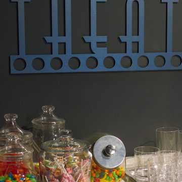
Dry Bar Integration: Created a dry bar area on the back wall with a refrigerator, candy storage, and a small counter space for a popcorn machine and ice maker, with locked drawers to prevent unsupervised access.
Optimal Viewing Distance: Evaluated multiple floor plans and placed the TV on the most suitable wall to ensure optimal viewing and comfortable reclined seating.
Final Thoughts:
The completed home theater has been a resounding success, providing a versatile space for the entire family. The thoughtful design and meticulous attention to detail have created a functional and enjoyable home theater that meets diverse needs, from watching movies and playing video games to relaxing and reading. The areas to the sides of the theater seats can accommodate spillover seating or activity zones. The area housing the AV equipment also includes extra shelves for storing snuggle-grade movie viewing blankets. This theater space has become a favorite hangout spot, offering comfort and entertainment for everyone.
This view shows the dual level theater seating, bean bags, open AV shelving on the right to tuck the cables which our installers ran behind the TV with PVC piping.
 Sherman Associates
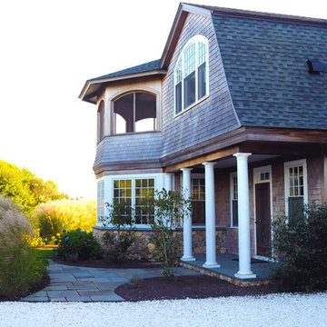
Views of the Atlantic and Katama Bay from the second floor were a driving force behind the Design of this home built several years ago in Edgartown. The Gambrel roof provides great headroom on the second floor with dormers in critical areas for windows and doors. Subtle curves soften the edges and a mix of materials help to reduce the scale and add interest to the exterior. The Porte Cochere provides access to the pool area as well as an entire wall of storage closets for the trappings of summer. Attention to detail and more than ample natural light make this house a very pleasant experience.
 F9 Productions Inc.
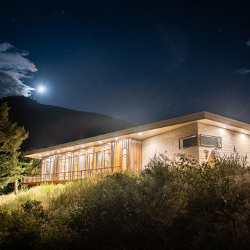
Imagine a home nestled in Colorado’s mountains that feels as enduring as the landscape itself. East Watch is that place – efficient, tough, and thoughtfully designed to make mountain living effortless and enjoyable. It’s where modern ideas meet nature’s demands, creating a space that’s both beautiful and practical.
Our clients wanted a mountain retreat that saved energy, stood strong against the elements, and stayed functional as life changes. High up at 8,200 feet, efficiency was key to cut heating costs, while durability meant handling winds up to 100mph and heavy snow. They also planned for the future with easy access – no stairs, wide doors, and spots for handrails if needed.
Mountain homes can rack up bills and wear down fast from weather and fires. We solved that with smart solar heating that covers most warmth needs naturally, using big windows and heavy walls to store heat. For strength, steel framing and fire-safe materials keep everything secure. And for everyday ease, the layout follows “form follows function,” making spaces like the kitchen intuitive and the whole home barrier-free.
The core idea? Work with the sun and the site. Windows face southeast for passive heat gain, with overhangs to block summer sun and shed snow. Inside, sloped ceilings let hot air escape, and thermal masses like the concrete floor hold warmth overnight. It’s a design that flows naturally, promoting comfort without extra effort.
Built on steel posts and beams for unshakeable support, the exterior uses corten steel, stone, and glass – all local, low-maintenance, and fire-resistant. The roof is top-rated for fires, and the deck withstands the elements year after year. Efficient floor heating kicks in only when necessary, keeping things cozy and costs low.
Simple and serene, with soft colors and clean shapes that let the views shine. Wide hallways and no steps make navigation easy, with thoughtful prep for any future needs. It’s a home that feels open, peaceful, and perfectly in tune with the outdoors.
Since 2019, East Watch has been a haven of sustainability and strength. It reduces energy use, withstands the mountains’ challenges, and adapts to life’s stages – all while offering stunning views and daily comfort. A true example of design that enhances how you live, built for lasting joy and resilience.
 Dependable Rooter and Plumbing
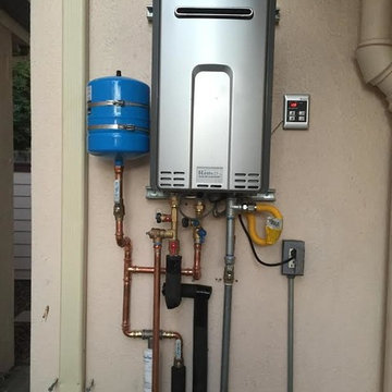
We installed a new Rinnai Tankless water heater. We installed isolation valves for access to do proper maintenance, we also added an expansion tank to help prevent build up of high pressure in the system. We installed a new a descaler to help reduce lime and all waters scale. New shut off valves were installed on water and gas supply lines going to the tankless water heater. We installed a new sediment trap on the water heater to prevent sediments in the gas pipe from getting into the tankless water heater.
Sponsored
Sunbury, OH
J.Holderby - Renovations
Franklin County's Leading General Contractors - 2X Best of Houzz!
 Native Edge Landscape
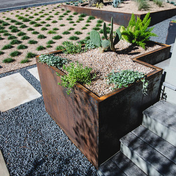
We had a several challenges to face with this project. Not only did we need to update a dated landscape to accommodate two seemingly different design tastes (modern & minimalistic vs natural english garden), we were tasked with improving the property’s drainage, improving the driveway access, reducing water usage and plant maintenance, and fixing a crumbling wall.
To marry the two design tastes, we started with the more modern elements of metal planters and softened the landscape with mass plantings of ornamental grasses and native sedge. These grasses act as a turf replacement that do not need to be mowed and require less regular watering. On each side of the yard we constructed new cedar fences to provide updated and additional privacy. In addition, we poured a new concrete wall to replace the existing retaining wall and play off the new modern vibe.
 Better Living Design (BLD)
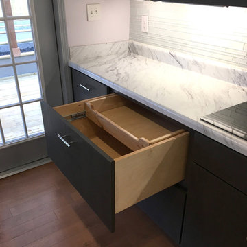
Pull out shelves and multi-level drawers in the kitchen base cabinets bring storage to the user. This ease of access reduces bending and reaching to get stored items. Items can also be more easily seen.
 Cure Design Group
KITCHEN RENOVATION CURRENT CRAFTSMAN
This client started off just being curious about our services - what we could do, and if we could even help her update her kitchen. She and her husband with their two teenage kids have lived in their home for several years without updating anything since the house was originally built. They didn’t quite have a budget in mind yet. They didn’t know their style, or even if they had one. Their timeline was simple, “as fast as you can so we’re not without a kitchen for very long” (usually what we hear for kitchen updates).
After a very productive consultation: determining the scope of work and zeroing in on a budget, I was very excited to update this underwhelming space to something that is modern but timeless, something that is theirs. And, it was easy to see what type of design style they gravitated toward looking at the pieces they already own: Craftsman/Prairie Style. I left the meeting so excited to weave in yet another genre of design to my CDG portfolio! We circled in our contractor to discuss the changes they were looking to make and the scope of work that would be theirs. Then I was off to get designing:
// Because the kitchen’s footprint and the defined breakfast space delineated by the bay, we kept the perimeter cabinetry as it was originally laid out. We updated these cabinets to a beautiful soft Alabaster White with a Barn Wood Glaze to highlight the simplicity of the shaker style doors. We added transom cabinets above the uppers, with only the back wall having seeded glass inserts to highlight some of their collectables.
// The original shaped island was counter-productive (See what I did there?) in functionality and design. We squared this off to reduce some of the angles and gain more storage. We highlighted the new island with a contrasting oak cabinet in a dark finish, to pay our respects to the craftsman style, and topped with a concrete-like countertop as a nod to the Prairie Style, allowing the homeowners to gain two extra seats and a massive -uninterrupted- work surface.
// The small section of cabinetry between the garage entry and fridge now is the perfect dump-station for mail, electronics, whatever is in their hands when they come into the house; and completely hidden by the refrigerator.
// The disconnected cabinetry in the breakfast area makes for a great place to have a working office. Accessible from the kitchen or the adjacent great room, this is the perfect place for the kids to do their homework while mom and dad are putting together dinner. The base cabinets are built out for office-type storage: paper and pencil drawers, filing systems, and cord management. Additionally, the long counter provides a ton of worksurface to spread out.
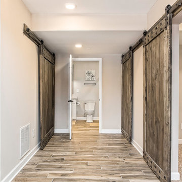
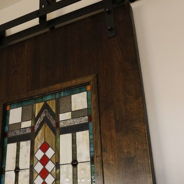
// The largest transformation was the pantry. We raised the height of the doorway and added huge custom designed bypass sliding barndoors. Finished with a dark stain to compliment the island and cut to inset 4 stained glass windows, typical of this style of design, and driving home the concept for the whole space.
// They were desperate to replace their flooring with something extremely durable to flow throughout the kitchen and the whole main level. This beautiful new flooring is actually a textured LVT(!) Which allowed them to save on overall cost and extend the life of their new flooring purchase.
// They loved their copper table, so we kept it and added new simple, mid-century modern chairs around it and a shiny new craftsman-style chandelier above. We added bright barstools in a burnt orange-red accent, and a bright woven rug to tie it all together.
// Because the kitchen renovation was shaping up to be pretty spectacular, they decided they needed to now replace their ‘now-these-look-a-little-too-old’ upholstered seating in the neighboring great room with 2 new sofas. We found the perfect sage-y-grey fabric which we covered on sofa frames that have and exposed oak-wood base, which we finished in a warm weathered grey.
// As every designer knows, a room isn’t finished until there’s something on the windows. Now that the new flooring was installed and every other room on the main level ‘seemed’ to be updated, we needed to update the window treatments in the dining, and great rooms to reflect their new design concept.
I hope you find the ‘after’ photos refreshing (as refreshing as it was for me to work on something that’s not a “Farm House” style that’s saturating the industry right now!) This was such a fun project and a great collaboration with our contractor.
36