
Search results for "Removable" in Home Design Ideas
 JMorris Design LLC
Jacob Snavely
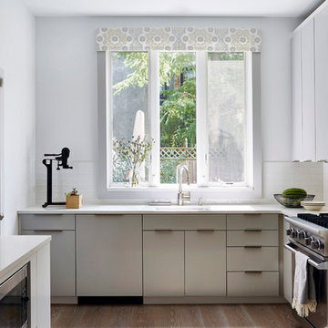
Inspiration for a small transitional u-shaped light wood floor enclosed kitchen remodel in New York with an undermount sink, flat-panel cabinets, gray cabinets, quartz countertops, white backsplash, ceramic backsplash, paneled appliances and no island
Inspiration for a small transitional u-shaped light wood floor enclosed kitchen remodel in New York with an undermount sink, flat-panel cabinets, gray cabinets, quartz countertops, white backsplash, ceramic backsplash, paneled appliances and no island


Find the right local pro for your project

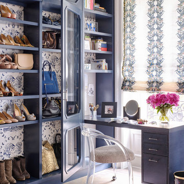
 DHD Architecture and Interior Design
Montgomery Place Townhouse
The unique and exclusive property on Montgomery Place, located between Eighth Avenue and Prospect Park West, was designed in 1898 by the architecture firm Babb, Cook & Willard. It contains an expansive seven bedrooms, five bathrooms, and two powder rooms. The firm was simultaneously working on the East 91st Street Andrew Carnegie Mansion during the period, and ensured the 30.5’ wide limestone at Montgomery Place would boast landmark historic details, including six fireplaces, an original Otis elevator, and a grand spiral staircase running across the four floors. After a two and half year renovation, which had modernized the home – adding five skylights, a wood burning fireplace, an outfitted butler’s kitchen and Waterworks fixtures throughout – the landmark mansion was sold in 2014. DHD Architecture and Interior Design were hired by the buyers, a young family who had moved from their Tribeca Loft, to further renovate and create a fresh, modern home, without compromising the structure’s historic features. The interiors were designed with a chic, bold, yet warm aesthetic in mind, mixing vibrant palettes into livable spaces.
Photography: Annie Schlechter
www.annieschlechter.com
© DHD / ALL RIGHTS RESERVED.
 Jamie Bush & Co.
Matthew Millman
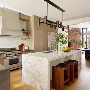
Kitchen - contemporary l-shaped medium tone wood floor and brown floor kitchen idea in San Francisco with an undermount sink, flat-panel cabinets, light wood cabinets, white backsplash, stainless steel appliances, an island and white countertops
Kitchen - contemporary l-shaped medium tone wood floor and brown floor kitchen idea in San Francisco with an undermount sink, flat-panel cabinets, light wood cabinets, white backsplash, stainless steel appliances, an island and white countertops

 TKS Design Group
Download our free ebook, Creating the Ideal Kitchen. DOWNLOAD NOW
For many, extra time at home during COVID left them wanting more from their homes. Whether you realized the shortcomings of your space or simply wanted to combat boredom, a well-designed and functional home was no longer a want, it became a need. Tina found herself wanting more from her Old Irving Park home and reached out to The Kitchen Studio about adding function to her kitchen to make the most of the available real estate.
At the end of the day, there is nothing better than returning home to a bright and happy space you love. And this kitchen wasn’t that for Tina. Dark and dated, with a palette from the past and features that didn’t make the most of the available square footage, this remodel required vision and a fresh approach to the space. Lead designer, Stephanie Cole’s main design goal was better flow, while adding greater functionality with organized storage, accessible open shelving, and an overall sense of cohesion with the adjoining family room.
The original kitchen featured a large pizza oven, which was rarely used, yet its footprint limited storage space. The nearby pantry had become a catch-all, lacking the organization needed in the home. The initial plan was to keep the pizza oven, but eventually Tina realized she preferred the design possibilities that came from removing this cumbersome feature, with the goal of adding function throughout the upgraded and elevated space. Eliminating the pantry added square footage and length to the kitchen for greater function and more storage. This redesigned space reflects how she lives and uses her home, as well as her love for entertaining.
The kitchen features a classic, clean, and timeless palette. White cabinetry, with brass and bronze finishes, contrasts with rich wood flooring, and lets the large, deep blue island in Woodland’s custom color Harbor – a neutral, yet statement color – draw your eye.
The kitchen was the main priority. In addition to updating and elevating this space, Tina wanted to maximize what her home had to offer. From moving the location of the patio door and eliminating a window to removing an existing closet in the mudroom and the cluttered pantry, the kitchen footprint grew. Once the floorplan was set, it was time to bring cohesion to her home, creating connection between the kitchen and surrounding spaces.
The color palette carries into the mudroom, where we added beautiful new cabinetry, practical bench seating, and accessible hooks, perfect for guests and everyday living. The nearby bar continues the aesthetic, with stunning Carrara marble subway tile, hints of brass and bronze, and a design that further captures the vibe of the kitchen.
Every home has its unique design challenges. But with a fresh perspective and a bit of creativity, there is always a way to give the client exactly what they want [and need]. In this particular kitchen, the existing soffits and high slanted ceilings added a layer of complexity to the lighting layout and upper perimeter cabinets.
While a space needs to look good, it also needs to function well. This meant making the most of the height of the room and accounting for the varied ceiling features, while also giving Tina everything she wanted and more. Pendants and task lighting paired with an abundance of natural light amplify the bright aesthetic. The cabinetry layout and design compliments the soffits with subtle profile details that bring everything together. The tile selections add visual interest, drawing the eye to the focal area above the range. Glass-doored cabinets further customize the space and give the illusion of even more height within the room.
While her family may be grown and out of the house, Tina was focused on adding function without sacrificing a stunning aesthetic and dreamy finishes that make the kitchen the gathering place of any home. It was time to love her kitchen again, and if you’re wondering what she loves most, it’s the niche with glass door cabinetry and open shelving for display paired with the marble mosaic backsplash over the range and complimenting hood. Each of these features is a stunning point of interest within the kitchen – both brag-worthy additions to a perimeter layout that previously felt limited and lacking.
Whether your remodel is the result of special needs in your home or simply the excitement of focusing your energy on creating a fun new aesthetic, we are here for it. We love a good challenge because there is always a way to make a space better – adding function and beauty simultaneously.


 Blythe Interiors
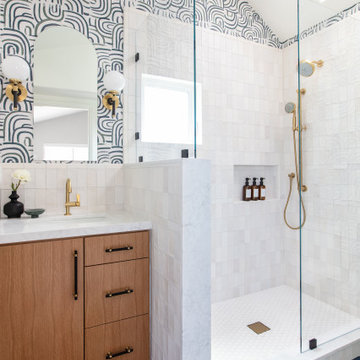
Bathroom - contemporary white tile and porcelain tile porcelain tile, blue floor, single-sink, vaulted ceiling and wallpaper bathroom idea in San Diego with light wood cabinets, a one-piece toilet, white walls, an undermount sink, quartz countertops, a niche and a built-in vanity
 TKS Design Group
Download our free ebook, Creating the Ideal Kitchen. DOWNLOAD NOW
For many, extra time at home during COVID left them wanting more from their homes. Whether you realized the shortcomings of your space or simply wanted to combat boredom, a well-designed and functional home was no longer a want, it became a need. Tina found herself wanting more from her Old Irving Park home and reached out to The Kitchen Studio about adding function to her kitchen to make the most of the available real estate.
At the end of the day, there is nothing better than returning home to a bright and happy space you love. And this kitchen wasn’t that for Tina. Dark and dated, with a palette from the past and features that didn’t make the most of the available square footage, this remodel required vision and a fresh approach to the space. Lead designer, Stephanie Cole’s main design goal was better flow, while adding greater functionality with organized storage, accessible open shelving, and an overall sense of cohesion with the adjoining family room.
The original kitchen featured a large pizza oven, which was rarely used, yet its footprint limited storage space. The nearby pantry had become a catch-all, lacking the organization needed in the home. The initial plan was to keep the pizza oven, but eventually Tina realized she preferred the design possibilities that came from removing this cumbersome feature, with the goal of adding function throughout the upgraded and elevated space. Eliminating the pantry added square footage and length to the kitchen for greater function and more storage. This redesigned space reflects how she lives and uses her home, as well as her love for entertaining.
The kitchen features a classic, clean, and timeless palette. White cabinetry, with brass and bronze finishes, contrasts with rich wood flooring, and lets the large, deep blue island in Woodland’s custom color Harbor – a neutral, yet statement color – draw your eye.
The kitchen was the main priority. In addition to updating and elevating this space, Tina wanted to maximize what her home had to offer. From moving the location of the patio door and eliminating a window to removing an existing closet in the mudroom and the cluttered pantry, the kitchen footprint grew. Once the floorplan was set, it was time to bring cohesion to her home, creating connection between the kitchen and surrounding spaces.
The color palette carries into the mudroom, where we added beautiful new cabinetry, practical bench seating, and accessible hooks, perfect for guests and everyday living. The nearby bar continues the aesthetic, with stunning Carrara marble subway tile, hints of brass and bronze, and a design that further captures the vibe of the kitchen.
Every home has its unique design challenges. But with a fresh perspective and a bit of creativity, there is always a way to give the client exactly what they want [and need]. In this particular kitchen, the existing soffits and high slanted ceilings added a layer of complexity to the lighting layout and upper perimeter cabinets.
While a space needs to look good, it also needs to function well. This meant making the most of the height of the room and accounting for the varied ceiling features, while also giving Tina everything she wanted and more. Pendants and task lighting paired with an abundance of natural light amplify the bright aesthetic. The cabinetry layout and design compliments the soffits with subtle profile details that bring everything together. The tile selections add visual interest, drawing the eye to the focal area above the range. Glass-doored cabinets further customize the space and give the illusion of even more height within the room.
While her family may be grown and out of the house, Tina was focused on adding function without sacrificing a stunning aesthetic and dreamy finishes that make the kitchen the gathering place of any home. It was time to love her kitchen again, and if you’re wondering what she loves most, it’s the niche with glass door cabinetry and open shelving for display paired with the marble mosaic backsplash over the range and complimenting hood. Each of these features is a stunning point of interest within the kitchen – both brag-worthy additions to a perimeter layout that previously felt limited and lacking.
Whether your remodel is the result of special needs in your home or simply the excitement of focusing your energy on creating a fun new aesthetic, we are here for it. We love a good challenge because there is always a way to make a space better – adding function and beauty simultaneously.
 Milgard Windows & Doors
The Kiguchi family moved into their Austin, Texas home in 1994. Built in the 1980’s as part of a neighborhood development, they happily raised their family here but longed for something more contemporary. Once they became empty nesters, they decided it was time for a major remodel. After spending many years visiting Austin AIA Home Tours that highlight contemporary residential architecture, they had a lot of ideas and in 2013 were ready to interview architects and get their renovation underway.
The project turned into a major remodel due to an unstable foundation. Architects Ben Arbib and Ed Hughey, of Arbib Hughey Design were hired to solve the structural issue and look for inspiration in the bones of the house, which sat on top of a hillside and was surrounded by great views.
Unfortunately, with the old floor plan, the beautiful views were hidden by small windows that were poorly placed. In order to bring more natural light into the house the window sizes and configurations had to be addressed, all while keeping in mind the homeowners desire for a modern look and feel.
To achieve a more contemporary and sophisticated front of house, a new entry was designed that included removing a two-story bay window and porch. The entrance of the home also became more integrated with the landscape creating a template for new foliage to be planted. Older exterior materials were updated to incorporate a more muted palette of colors with a metal roof, dark grey siding in the back and white stucco in the front. Deep eaves were added over many of the new large windows for clean lines and sun protection.
“Inside it was about opening up the floor plan, expanding the views throughout the house, and updating the material palette to get a modern look that was also warm and inviting,” said Ben from Arbib Hughey Design. “Prior to the remodel, the house had the typical separation of rooms. We removed the walls between them and changed all of the windows to Milgard Thermally Improved Aluminum to connect the inside with the outside. No matter where you are you get nice views and natural light.”
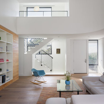
The architects wanted to create some drama, which they accomplished with the window placement and opening up the interior floor plan to an open concept approach. Cabinetry was used to help delineate intimate spaces. To add warmth to an all-white living room, white-washed oak wood floors were installed and pine planks were used around the fireplace. The large windows served as artwork bringing the color of nature into the space.
An octagon shaped, elevated dining room, (named “the turret”), had a big impact on the design of the house. They architects rounded the corners and added larger window openings overlooking a new sunken garden. The great room was also softened by rounding out the corners and that circular theme continued throughout the house, being picked up in skylight wells and kitchen cabinetry. A staircase leading to a catwalk was added and the result was a two-story window wall that flooded the home with natural light.
When asked why Milgard® Thermally Improved Aluminum windows were selected, the architectural team listed many reasons:
1) Aesthetics: “We liked the slim profiles and narrow sightlines. The window frames never get in the way of the view and that was important to us. They also have a very contemporary look that went well with our design.”
2) Options: “We liked that we could get large sliding doors that matched the windows, giving us a very cohesive look and feel throughout the project.”
3) Cost Effective: “Milgard windows are affordable. You get a good product at a good price.”
4) Custom Sizes: “Milgard windows are customizable, which allowed us to get the right window for each location.”
Ready to take on your own traditional to modern home remodeling project? Arbib Hughey Design advises, “Work with a good architect. That means picking a team that is creative, communicative, listens well and is responsive. We think it’s important for an architect to listen to their clients and give them something they want, not something the architect thinks they should have. At the same time you want an architect who is willing and able to think outside the box and offer up design options that you may not have considered. Design is about a lot of back and forth, trying out ideas, getting feedback and trying again.”
The home was completely transformed into a unique, contemporary house perfectly integrated with its site. Internally the home has a natural flow for the occupants and externally it is integrated with the surroundings taking advantage of great natural light. As a side note, it was highly praised as part of the Austin AIA homes tour.
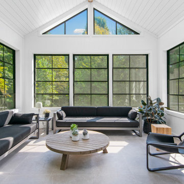
 Linc Thelen Design
This couple purchased a second home as a respite from city living. Living primarily in downtown Chicago the couple desired a place to connect with nature. The home is located on 80 acres and is situated far back on a wooded lot with a pond, pool and a detached rec room. The home includes four bedrooms and one bunkroom along with five full baths.
The home was stripped down to the studs, a total gut. Linc modified the exterior and created a modern look by removing the balconies on the exterior, removing the roof overhang, adding vertical siding and painting the structure black. The garage was converted into a detached rec room and a new pool was added complete with outdoor shower, concrete pavers, ipe wood wall and a limestone surround.
Porch Details:
Features Eze Breezy Fold down windows and door, radiant flooring, wood paneling and shiplap ceiling.
-Sconces, Wayfair
-New deck off the porch for dining
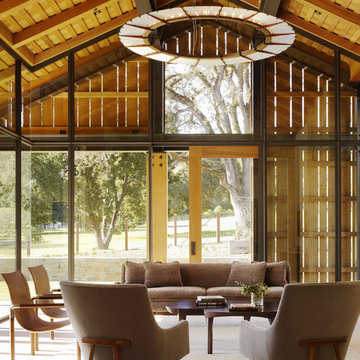
 Walker Warner Architects
Matthew Millman
Example of a cottage sunroom design in San Francisco with a standard ceiling
Example of a cottage sunroom design in San Francisco with a standard ceiling
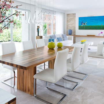
 Interiors by Maite Granda
Project Feature in: Luxe Magazine & Luxury Living Brickell
From skiing in the Swiss Alps to water sports in Key Biscayne, a relocation for a Chilean couple with three small children was a sea change. “They’re probably the most opposite places in the world,” says the husband about moving
from Switzerland to Miami. The couple fell in love with a tropical modern house in Key Biscayne with architecture by Marta Zubillaga and Juan Jose Zubillaga of Zubillaga Design. The white-stucco home with horizontal planks of red cedar had them at hello due to the open interiors kept bright and airy with limestone and marble plus an abundance of windows. “The light,” the husband says, “is something we loved.”
While in Miami on an overseas trip, the wife met with designer Maite Granda, whose style she had seen and liked online. For their interview, the homeowner brought along a photo book she created that essentially offered a roadmap to their family with profiles, likes, sports, and hobbies to navigate through the design. They immediately clicked, and Granda’s passion for designing children’s rooms was a value-added perk that the mother of three appreciated. “She painted a picture for me of each of the kids,” recalls Granda. “She said, ‘My boy is very creative—always building; he loves Legos. My oldest girl is very artistic— always dressing up in costumes, and she likes to sing. And the little one—we’re still discovering her personality.’”
To read more visit:
https://maitegranda.com/wp-content/uploads/2017/01/LX_MIA11_HOM_Maite_12.compressed.pdf
Rolando Diaz Photographer

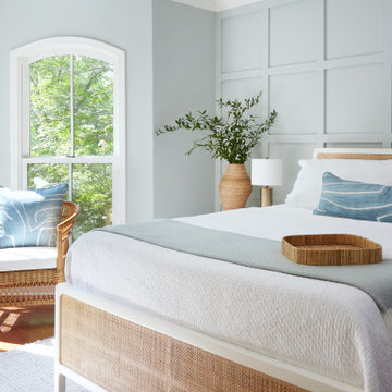
 Amber Scott Design
Example of a mid-sized transitional master dark wood floor bedroom design in Milwaukee with blue walls

 Kitchen & Bath Concepts
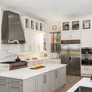
This dark and dated feeling kitchen and bar were completely renovated for this multi-generational global family. By re-configuring the space and incorporating the bar, removing several heavy columns and a wall, it made the kitchen open and accessible to the adjacent rooms and visible from the front door. Everything was lightened and brightened with new cabinetry, counter tops, appliances, flooring, paint, better windows, electrical and lighting. The old range top and down draft were enclosed in a massive brick structure, with no prep space, by removing it and centering the new range on the wall with a custom hood and full height stone back splash, a stunning focal point was created. The position of other key appliances and plumbing were moved or added to create several work stations throughout the large space, such as the refrigeration, full prep sink, coffee bar, baking station, cocktail bar and clean up island. Another special feature of this kitchen was roll out table from the end of the serving island.
Specialty features include:
A roll out table for eating, prep or serving; coffee bar and drink service area with beverage center; full size prep sink adjacent to refrigeration and cooking areas; steam oven and baking station; microwave/warming drawer; dual fuel range with double ovens, 6 burners and a griddle top; two separate islands, one for serving large family meals, one for clean up; specialty spice storage inserts and pull outs; corner turn outs for large items; two double pull outs for trash and recycling; stacked cabinetry with glass display at the top to take advantage of the 14' ceilings.
 Champion Floor Company
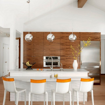
The homeowners of this Mid Century Modern home in Creve Coeur are a young Architect and his wife and their two young sons. Being avid collectors of Mid Century Modern furniture and furnishings, they purchased their Atomic Ranch home, built in the 1970s, and saw in it a perfect future vessel for their lifestyle. Nothing had been done to the home in 40 years but they saw it as a fresh palette. The walls separating the kitchen from the dining, living, and entry areas were removed. Support beams and columns were created to hold the loads. The kitchen and laundry facilities were gutted and the living areas refurbished. They saw open space with great light, just waiting to be used. As they waited for the perfect time, they continued collecting. The Architect purchased their Claritone, of which less than 50 are in circulation: two are in the Playboy Mansion, and Frank Sinatra had four. They found their Bertoia wire chairs, and Eames and Baby Eames rockers. The chandelier over the dining room was found in a Los Angeles prop studio. The dining table and benches were made from the reclaimed wood of a beam that was removed, custom designed and made by Mwanzi and Co. The flooring is white oak with a white stain. Chairs are by Kartell. The lighting pendants over the island are by Tom Dixon and were found at Centro in St. Louis. Appliances were collected as they found them on sale and were stored in the garage along with the collections, until the time was right.. Even the dog was curated...from a South Central Los Angeles Animal Shelter!
 Bethesda Contracting
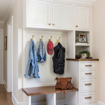
Inspiration for a transitional medium tone wood floor and brown floor mudroom remodel in DC Metro with beige walls
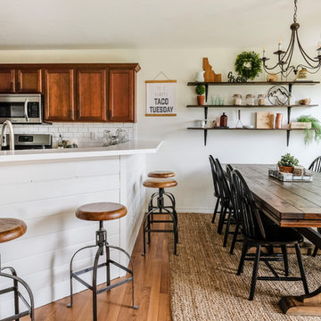
 Joyfully Growing Blog, LLC
White and Wood 'Budget Kitchen Makeover'
Example of a mid-sized cottage laminate floor and brown floor kitchen/dining room combo design in Other with white walls
Example of a mid-sized cottage laminate floor and brown floor kitchen/dining room combo design in Other with white walls
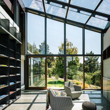
 Fougeron Architecture FAIA
Photo by Joe Fletcher
Inspiration for a contemporary family room remodel in San Francisco
Inspiration for a contemporary family room remodel in San Francisco
31