
Search results for "Restriction" in Home Design Ideas
 Daniel Krienbuehl Contractors Inc.
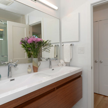
This project began with a sketch from our client that they'd received from a friend. It gave us a general idea of what they wanted but adjustments needed to be made for us to keep the renovation within budget. There were plenty of challenges in the designing and building stages. Early on, we learned the main structure of this 1940s house was encroaching the building restriction line. To remain within zoning limits, we needed to have two corners of the new addition slightly out of square. The new structure, cantilevered on both sides, required a heavy 45-degree angle beam to carry the load of the second floor and the roof. We equipped the house with central AC and expanded the existing hydronic heating system into the new space. The completed addition resulted in a shared music room and in-law suite with a bathroom on the first floor, and a master bedroom, bath, and hall bath on the second floor.
 Metke Remodeling & Luxury Homes
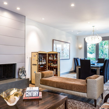
A traditional 1926 cottage was transformed into a stunning, contemporary home. The focal point from both inside and out is a 3-story floating wood and stainless staircase, showcased by oversized windows and dramatic lighting. Walnut cabinetry with a distinct stain and natural slab surfaces offset the metals used throughout – Including at the interior and exterior of the fireplace. Reclaimed wood floors pay homage to the industrial area the home is situated in.
In designing this home restrictions set forth by the building department were key. For instance, in order for the project to be considered a remodel the existing 8’ tall perimeter walls had to remain in place. The homeowners desperately wanted 9’ tall ceilings, so with crafty engineering and framing we were able to embellish the existing wall framing to achieve the added height.
Clearstory windows allow much needed light into the spaces and creates the illusion of spaciousness, while maintaining wall areas for key furnishings and artwork. Every inch of space maximizes storage throughout the 2,600 square foot home.
A cabinet for shoe storage immediately inside the front door also serves as a key component at the staircase and provides a platform to highlight sculptural artwork. Unique products and details, such as a metal link shower curtain and custom built-in guest beds with strategically placed outlets and horizontal surfaces to allow for electronics to be close at hand, elevate this home to the next level.
 Sovereign
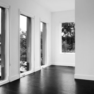
THE SHADOW HOUSE IS A PRODUCT OF THE CONTEXT IT SITS WITHIN, YET IT SUBVERTS IT AT THE SAME TIME. IT’S IMPOSSIBLE TO IGNORE IT UP CLOSE, YET FROM AFAR IT DISAPPEARS INTO THE ETHER. A TINY LOT, A LARGE PROGRAM, RESTRICTIVE ZONING REGULATIONS AND AN INVOLVED NEIGHBORHOOD INTEREST GROUP WERE THE CONSTANT AND UNRELENTING PRESSURES THAT CREATED THIS HOUSE — AND THE RESULT IS BETTER OFF FOR IT.
THE SCALLOPED SHINGLES ARE A COMMON ELEMENT ACROSS THE NEIGHBORHOOD, BUT ARE OFTEN RESERVED FOR DETAIL AREAS UNDER EAVES, AS THE MATERIAL WAS VERY EXPENSIVE ONE HUNDRED YEARS AGO. WE TOOK THAT HIGHLY-SPECIALIZED, VERY EXCLUSIVE MATERIAL AND APPLIED IT AS A BROAD, MASS-PRODUCED TEXTURE ACROSS THE ENTIRE RESIDENCE — TAKING SOMETHING FROM HIGHLIGHT TO BACKGROUND TEXTURE. THE SILHOUETTE DIRECTLY ECHOES THE ITALIANATE HOMES IN THE LARGER NEIGHBORHOOD — BUT WE STRIPPED THE TYPICAL ORNATE, DECORATED FAÇADE BACK TO UTTER MINIMALISM. WE ENLARGED THE TYPICAL WINDOW SIZE TO EXAGGERATE THE RIGID SYMMETRY OF THE STYLE, AND BROUGHT THEM TO THE FLOOR AND THE CEILING TO PROVIDE AS MUCH LIGHT AS POSSIBLE — AND THEN RECESSED THEM DEEP INTO THE FAÇADE TO MIMIC THE HEAVY BRICK AND STONE LINTELS OF THE PAST.
THE HOUSE IS BLACK — THE ONLY COLOR IT COULD BE. IF WE’D PAINTED IT UP LIKE ITS VICTORIAN SISTERS, IT WOULD’VE COMPETED FOR ATTENTION. BLACK CAUSES THE HOUSE TO SIMULTANEOUSLY DISAPPEAR AND STAND OUT — IT IS IMPOSSIBLE TO IGNORE WHILE YOU’RE WALKING PAST, BUT A FEW BLOCKS AWAY IT BECOMES IMPOSSIBLE TO DISCERN AGAINST THE BACKGROUND.
TWO BEDROOMS WITH EN-SUITE BATHS, FLOOR-TO-CEILING WINDOWS, AN AIRY AND OPEN STAIRCASE AND A MASSIVE GLASS ROOF DOOR MAKE THE SHADOW HOUSE IMPOSSIBLY LIGHT AND OPEN — YET IT’S ONLY 1,400 SQUARE FEET ON A 30’ X 50’ LOT.
Find the right local pro for your project
 Ventures Design
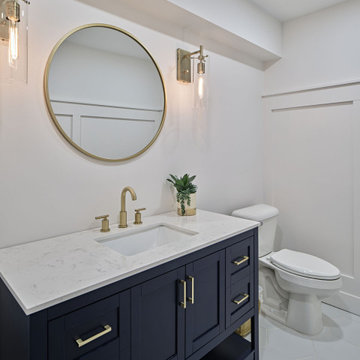
Below Buchanan is a basement renovation that feels as light and welcoming as one of our outdoor living spaces. The project is full of unique details, custom woodworking, built-in storage, and gorgeous fixtures. Custom carpentry is everywhere, from the built-in storage cabinets and molding to the private booth, the bar cabinetry, and the fireplace lounge.
Creating this bright, airy atmosphere was no small challenge, considering the lack of natural light and spatial restrictions. A color pallet of white opened up the space with wood, leather, and brass accents bringing warmth and balance. The finished basement features three primary spaces: the bar and lounge, a home gym, and a bathroom, as well as additional storage space. As seen in the before image, a double row of support pillars runs through the center of the space dictating the long, narrow design of the bar and lounge. Building a custom dining area with booth seating was a clever way to save space. The booth is built into the dividing wall, nestled between the support beams. The same is true for the built-in storage cabinet. It utilizes a space between the support pillars that would otherwise have been wasted.
The small details are as significant as the larger ones in this design. The built-in storage and bar cabinetry are all finished with brass handle pulls, to match the light fixtures, faucets, and bar shelving. White marble counters for the bar, bathroom, and dining table bring a hint of Hollywood glamour. White brick appears in the fireplace and back bar. To keep the space feeling as lofty as possible, the exposed ceilings are painted black with segments of drop ceilings accented by a wide wood molding, a nod to the appearance of exposed beams. Every detail is thoughtfully chosen right down from the cable railing on the staircase to the wood paneling behind the booth, and wrapping the bar.
 Walczak Design And Build
What once felt dark, segmented, and inefficient is now a bright, connected, and highly functional first floor designed for real family living.
Our clients, Terry and Lou, came to us with a home that simply wasn’t keeping up with their growing family. The kitchen was cramped, with tight working lanes and limited light. The laundry room doubled as a powder room—yet functioned poorly as both. Sightlines between spaces were cut off, making it difficult to stay connected to their young children throughout the day. Across the board, the home felt dated and disconnected.
Through thoughtful planning and strategic structural changes, we reimagined the entire first floor to better support how this family truly lives.
We began by redefining the entry experience—creating a true foyer complete with a dedicated drop zone and custom cubby storage. This space now acts as a natural landing point, bringing order and intention to everyday comings and goings.
Adjacent to the new entry, we relocated and redesigned the laundry room. Now positioned exactly where it needs to be, it functions as a hardworking utility space with countertops for folding, a utility sink for immediate stain treatment, and the ability to be closed off—keeping daily life contained when needed.
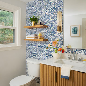
Separating the previous shared function allowed us to carve out a distinct, personality-filled powder room. Wrapped in a bold wave-patterned wallpaper and grounded by a custom reeded oak vanity with warm brass accents, this space delivers a moment of delight and individuality within the home.
The kitchen transformation is where the impact is felt most deeply.
What was once a dark, restrictive layout has been opened into a spacious, highly efficient U-shaped kitchen with generous clearances and an oversized island for gathering. A thoughtful mix of painted cabinetry and rift white oak introduces warmth and balance, while the custom reeded hood becomes a sculptural focal point. Open shelving, integrated pantry storage, and layered lighting ensure the space is as functional as it is beautiful.
Beyond aesthetics, the redesign prioritizes flow—both in movement and in connection. Sightlines between the kitchen, dining, and living areas were intentionally opened, allowing for ease of interaction and visibility throughout the main living spaces.
To unify the home, existing hardwood floors were refinished and extended, creating continuity and a seamless visual experience from one space to the next.
The result is a home that feels lighter, more open, and deeply aligned with how this family lives day to day—designed not just to look beautiful, but to support everything from busy mornings to slow, shared evenings.
 Axis Mundi | Chicago
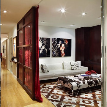
Good design must reflect the personality of the client. So when siblings purchased studios in Downtown by Philippe Starck, one of the first buildings to herald the revitalization of Manhattan’s Financial District, the aim was to create environments that were truly bespoke. The brother’s tastes jibed synchronously with the insouciant idea of France’s most popular prankster converting a building that once housed the buttoned-up offices of JP Morgan Chase. His collection of Takashi Murakami works, the gallery-like centerpiece of the main area, announces his boldness and flair up front, as do furnishings by Droog, Moooi and, of course Starck, as well as hide rugs and upholstery, and a predominantly red palette. His sister was after something soothing and discreet. So Axis Mundi responded with a neutrals and used glass to carve out a bedroom surrounded by drapes that transform it into a golden cocoon. Hide (albeit less flamboyantly applied) evokes a familial commonality, and built-in furniture and cabinetry optimize space restrictions inherent in studio apartments.
Design Team: John Beckmann, with Richard Rosenbloom
Photography: Mikiko Kikuyama
© Axis Mundi Design LLC
 Walczak Design And Build
What once felt dark, segmented, and inefficient is now a bright, connected, and highly functional first floor designed for real family living.
Our clients, Terry and Lou, came to us with a home that simply wasn’t keeping up with their growing family. The kitchen was cramped, with tight working lanes and limited light. The laundry room doubled as a powder room—yet functioned poorly as both. Sightlines between spaces were cut off, making it difficult to stay connected to their young children throughout the day. Across the board, the home felt dated and disconnected.
Through thoughtful planning and strategic structural changes, we reimagined the entire first floor to better support how this family truly lives.
We began by redefining the entry experience—creating a true foyer complete with a dedicated drop zone and custom cubby storage. This space now acts as a natural landing point, bringing order and intention to everyday comings and goings.
Adjacent to the new entry, we relocated and redesigned the laundry room. Now positioned exactly where it needs to be, it functions as a hardworking utility space with countertops for folding, a utility sink for immediate stain treatment, and the ability to be closed off—keeping daily life contained when needed.
Separating the previous shared function allowed us to carve out a distinct, personality-filled powder room. Wrapped in a bold wave-patterned wallpaper and grounded by a custom reeded oak vanity with warm brass accents, this space delivers a moment of delight and individuality within the home.
The kitchen transformation is where the impact is felt most deeply.
What was once a dark, restrictive layout has been opened into a spacious, highly efficient U-shaped kitchen with generous clearances and an oversized island for gathering. A thoughtful mix of painted cabinetry and rift white oak introduces warmth and balance, while the custom reeded hood becomes a sculptural focal point. Open shelving, integrated pantry storage, and layered lighting ensure the space is as functional as it is beautiful.
Beyond aesthetics, the redesign prioritizes flow—both in movement and in connection. Sightlines between the kitchen, dining, and living areas were intentionally opened, allowing for ease of interaction and visibility throughout the main living spaces.
To unify the home, existing hardwood floors were refinished and extended, creating continuity and a seamless visual experience from one space to the next.
The result is a home that feels lighter, more open, and deeply aligned with how this family lives day to day—designed not just to look beautiful, but to support everything from busy mornings to slow, shared evenings.
 CRG Homes
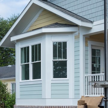
 Located in the well-established community of Northwood, close to Grande Dunes, this superior quality craftsman styled 3 bedroom, 2.5 bathroom energy efficient home designed by CRG Companies will feature a Hardie board exterior, Trex decking, vinyl railings and wood beadboard ceilings on porches, a screened-in porch with outdoor fireplace and carport. The interior features include 9’ ceilings, thick crown molding and wood trim, wood-look tile floors in main living areas, ceramic tile in baths, carpeting in bedrooms, recessed lights, upgraded 42” kitchen cabinets, granite countertops, stainless steel appliances, a huge tile shower and free standing soaker tub in the master bathroom. The home will also be pre-wired for home audio and security systems. Detached garage can be an added option. No HOA fee or restrictions, 98' X 155' lot is huge for this area, room for a pool.
 Nip Tuck Remodeling
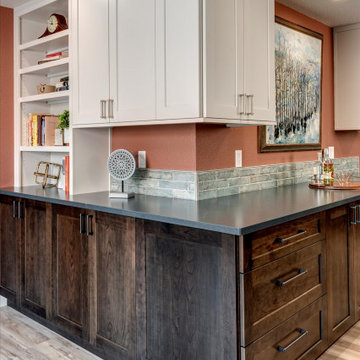
It's not everyday that we get to radically transform the heart of a home. There are often restrictions that keep the kitchen in the kitchen. These clients wanted a vaulted kitchen ceiling, which would have required major roof reconstruction. That is until it was decided to use an adjacent part of the home that already had a vaulted ceiling. The kitchen is now more connected to the living and dining areas, they have a walk-in pantry that better uses the low-ceilings, and with added storage space. Like the clients said we "blew their minds!"
 Juan Felipe Goldstein Design Co Inc.
Location: Sunset Strip, West Hollywood, CA, USA
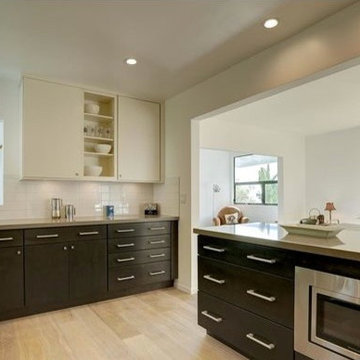
Remodel of existing house to update and refresh for turn around. Great location and a fun house to work with. Even with a lot of budgetary restrictions we were able to get a great result!
Juan Felipe Goldstein Design Co.
 Walczak Design And Build
What once felt dark, segmented, and inefficient is now a bright, connected, and highly functional first floor designed for real family living.
Our clients, Terry and Lou, came to us with a home that simply wasn’t keeping up with their growing family. The kitchen was cramped, with tight working lanes and limited light. The laundry room doubled as a powder room—yet functioned poorly as both. Sightlines between spaces were cut off, making it difficult to stay connected to their young children throughout the day. Across the board, the home felt dated and disconnected.
Through thoughtful planning and strategic structural changes, we reimagined the entire first floor to better support how this family truly lives.
We began by redefining the entry experience—creating a true foyer complete with a dedicated drop zone and custom cubby storage. This space now acts as a natural landing point, bringing order and intention to everyday comings and goings.
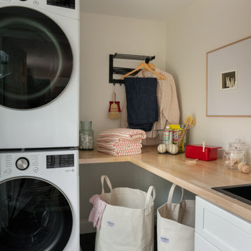
Adjacent to the new entry, we relocated and redesigned the laundry room. Now positioned exactly where it needs to be, it functions as a hardworking utility space with countertops for folding, a utility sink for immediate stain treatment, and the ability to be closed off—keeping daily life contained when needed.
Separating the previous shared function allowed us to carve out a distinct, personality-filled powder room. Wrapped in a bold wave-patterned wallpaper and grounded by a custom reeded oak vanity with warm brass accents, this space delivers a moment of delight and individuality within the home.
The kitchen transformation is where the impact is felt most deeply.
What was once a dark, restrictive layout has been opened into a spacious, highly efficient U-shaped kitchen with generous clearances and an oversized island for gathering. A thoughtful mix of painted cabinetry and rift white oak introduces warmth and balance, while the custom reeded hood becomes a sculptural focal point. Open shelving, integrated pantry storage, and layered lighting ensure the space is as functional as it is beautiful.
Beyond aesthetics, the redesign prioritizes flow—both in movement and in connection. Sightlines between the kitchen, dining, and living areas were intentionally opened, allowing for ease of interaction and visibility throughout the main living spaces.
To unify the home, existing hardwood floors were refinished and extended, creating continuity and a seamless visual experience from one space to the next.
The result is a home that feels lighter, more open, and deeply aligned with how this family lives day to day—designed not just to look beautiful, but to support everything from busy mornings to slow, shared evenings.
 River Valley Landscapes
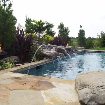
 This project was the result of the owner’s desire to install a swimming pool and outdoor living space inspired by tropical resorts they had visited on family vacations. The one element asked for specifically was a large waterfall spilling into the pool. The challenge for the designers was how to achieve the look the owner’s wished without the use of clichéd items such as thatched huts and tiki torches. The designers decided lush full plantings using plants found in the northeast region that met certain design criteria would be the primary way of giving the tropical feel. Boulder outcroppings, irregular stone paving and fire bowls along the back of the pool would complete the look.
The property is located in a newer subdivision with homes on both sides and a school to the rear. A walkway connects the neighborhood and the school along one side. The desired privacy would be addressed by the placement of plants and trees around the perimeter in mounded beds. Placing the waterfall to the rear of the pool helped block the view of the school beyond. The township had restrictions on the amount of impervious material allowable on site. The patio was designed to the maximum allowable size with square footage going to where it would be most usable. Planting beds were cut into the patio to decrease unnecessary square footage, divide spaces, and allow for more places to add plants and trees.
A rectangular swimming pool was chosen to make it easier to install an automatic pool cover. The pool was designed, with input from the landscape designers, and contracted separately by the owner. The landscape designers chose the location of pool and waterfall so that it was prominently placed to be the focal point of the backyard. The pool includes a curving sunbathing shelf running from end to end, finished in a lighter color to make it more visible, with removable umbrellas for shade and to add to the resort feel. To tie into the boulders used throughout the design, a large boulder was used as a substitute for a diving board. The yard sloped down towards the back of the property which required a large amount of soil to be added and large boulder retaining wall along the back.
For the planting design, the designers choose to focus on plants with larger leaves, various leaf colors and textures, and plants with large flowers in bold colors. These plants were then arranged into a loose lush planting scheme mixed with more traditional northeast plants such as pines, grasses, and roses. Unique plants such as hardy bananas were added for their tropical and exotic look. The full planting beds help to nestle in and enclose the living space.
Broken flagstone was chosen for the patio and intentionally left irregular at the edges. PA flagstone was avoided and a stone with gold and brown tones was chosen. Boulder outcroppings added to the natural and tropical theme. The fire pit was designed with a large built-in bench to increase the amount of seating. The designers chose a rounded smooth shape and incorporated the same stone as the pool coping for the caps and bench. For entertaining guests the outdoor kitchen was outfitted with a large gas grill, beverage taps, refrigerator, sink and a dedicated lobster cooker. The kitchen was finished with granite countertops and stainless steel cabinets. Two strategically placed fire bowls, along with the low voltage lighting, add additional interest to the space at night.
While the designers were faced with many challenges the resulting design incorporated enough elements to achieve the desired look and feel. Using plants appropriate to the northeast that fit the design criteria and carefully choosing hardscaping materials was essential. The owner’s feel they now have their own tropical theme resort right in their Pennsylvania backyard.
 Swatch Design Group
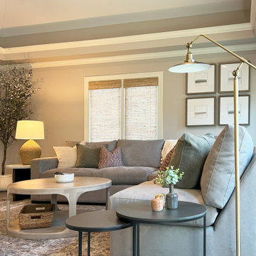
This comprehensive main floor remodel transformed a dated early-2000s home into a warm, distinctive space tailored for modern family life and effortless entertaining. Located in Northwest Indiana, the home’s renovation included the kitchen, living room, dining-to-sitting room conversion, office, mudroom, and laundry—each space reimagined with layered detail and a cohesive design language.
The project’s primary goal was to move away from builder-grade finishes and create a home full of character and comfort. In the kitchen, we reworked the layout to improve flow—removing a restrictive peninsula, extending the island for added seating, and designing a custom hood and cabinetry plan that worked around existing structural beams. A warmer palette of earth tones and neutrals reflected the clients’ personal style, while upgraded lighting, a statement range, and a larger pantry elevated functionality.
A double-sided fireplace connecting the kitchen and living room was redesigned to feel more intentional, with cohesive materials used on both faces. In the living area, a previously underwhelming wet bar became a standout moment with deep green cabinetry, a wine fridge, and built-in storage—adding both function and sophistication.
Throughout the project, structural limitations and narrow footprints presented design challenges that were met with custom solutions—from a uniquely shaped island to intentional lighting plans that worked around ceiling beams. The final result is a highly personal, connected series of spaces that support both everyday routines and meaningful moments of gathering—infused with warmth, purpose, and a relaxed sense of luxury.
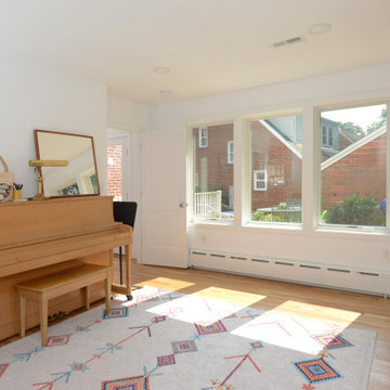 Daniel Krienbuehl Contractors Inc.
This project began with a sketch from our client that they'd received from a friend. It gave us a general idea of what they wanted but adjustments needed to be made for us to keep the renovation within budget. There were plenty of challenges in the designing and building stages. Early on, we learned the main structure of this 1940s house was encroaching the building restriction line. To remain within zoning limits, we needed to have two corners of the new addition slightly out of square. The new structure, cantilevered on both sides, required a heavy 45-degree angle beam to carry the load of the second floor and the roof. We equipped the house with central AC and expanded the existing hydronic heating system into the new space. The completed addition resulted in a shared music room and in-law suite with a bathroom on the first floor, and a master bedroom, bath, and hall bath on the second floor.
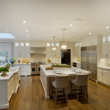
 Bilotta Kitchen & Home
This kitchen, designed by David Arnoff, features Bilotta Collection cabinetry in a classic Frosty White paint on the perimeter and Rift Cut White Oak with a “Driftwood” stain for the island. The kitchen prior to renovation had a small island and a peninsula that blocked the flow into the other rooms. It also had a massive wood hood that flanked both sides of the range all the way down to the countertop which was very cumbersome and restrictive. The client wanted to reuse their appliances which were fairly new. So the cabinetry had to be designed around those models but laid out with a much more functional flow. David chose to eliminate the existing peninsula to allow access to the sun room and living area. He opted instead for a larger island to give back the space lost by removing the peninsula. This gave the same amount of cabinet and counter space and was far more functional and easier to move around. Since the one wall of cabinets (where the main sink is) had no wall cabinets, David designed the opposite wall with double stacked cabinets for additional storage – with glass fronts for aesthetics. They also raised the custom hood, by Amore, allowing for more countertop space around the range. The countertops are polished quartz, Aurea Stone by Eastern Stone. The Backsplash is a basket weave marble from Greenwich Tile Marble. Sink and faucets by Kohler. Appliances are a mix of Subzero and Wolf.
Designer: David Arnoff
Photo Credit: Peter Krupenye
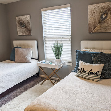
 A2Z Interiors, LLC
Client was using 4th bedroom as a catchall but with restrictions needed a place to work and accommodate guests, cleaned out the space, added a second bed and a desk to give a quiet work from home space when needed.
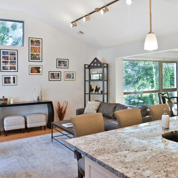
 Michael Nash Design, Build & Homes
For this couple, planning to move back to their rambler home in Arlington after living overseas for few years, they were ready to get rid of clutter, clean up their grown-up kids’ boxes, and transform their home into their dream home for their golden years.
The old home included a box-like 8 feet x 10 feet kitchen, no family room, three small bedrooms and two back to back small bathrooms. The laundry room was located in a small dark space of the unfinished basement.
This home is located in a cul-de-sac, on an uphill lot, of a very secluded neighborhood with lots of new homes just being built around them.
The couple consulted an architectural firm in past but never were satisfied with the final plans. They approached Michael Nash Custom Kitchens hoping for fresh ideas.
The backyard and side yard are wooded and the existing structure was too close to building restriction lines. We developed design plans and applied for special permits to achieve our client’s goals.
The remodel includes a family room, sunroom, breakfast area, home office, large master bedroom suite, large walk-in closet, main level laundry room, lots of windows, front porch, back deck, and most important than all an elevator from lower to upper level given them and their close relative a necessary easier access.
The new plan added extra dimensions to this rambler on all four sides. Starting from the front, we excavated to allow a first level entrance, storage, and elevator room. Building just above it, is a 12 feet x 30 feet covered porch with a leading brick staircase. A contemporary cedar rail with horizontal stainless steel cable rail system on both the front porch and the back deck sets off this project from any others in area. A new foyer with double frosted stainless-steel door was added which contains the elevator.
The garage door was widened and a solid cedar door was installed to compliment the cedar siding.
The left side of this rambler was excavated to allow a storage off the garage and extension of one of the old bedrooms to be converted to a large master bedroom suite, master bathroom suite and walk-in closet.
We installed matching brick for a seam-less exterior look.
The entire house was furnished with new Italian imported highly custom stainless-steel windows and doors. We removed several brick and block structure walls to put doors and floor to ceiling windows.
A full walk in shower with barn style frameless glass doors, double vanities covered with selective stone, floor to ceiling porcelain tile make the master bathroom highly accessible.
The other two bedrooms were reconfigured with new closets, wider doorways, new wood floors and wider windows. Just outside of the bedroom, a new laundry room closet was a major upgrade.
A second HVAC system was added in the attic for all new areas.
The back side of the master bedroom was covered with floor to ceiling windows and a door to step into a new deck covered in trex and cable railing. This addition provides a view to wooded area of the home.
By excavating and leveling the backyard, we constructed a two story 15’x 40’ addition that provided the tall ceiling for the family room just adjacent to new deck, a breakfast area a few steps away from the remodeled kitchen. Upscale stainless-steel appliances, floor to ceiling white custom cabinetry and quartz counter top, and fun lighting improved this back section of the house with its increased lighting and available work space. Just below this addition, there is extra space for exercise and storage room. This room has a pair of sliding doors allowing more light inside.
The right elevation has a trapezoid shape addition with floor to ceiling windows and space used as a sunroom/in-home office. Wide plank wood floors were installed throughout the main level for continuity.
The hall bathroom was gutted and expanded to allow a new soaking tub and large vanity. The basement half bathroom was converted to a full bathroom, new flooring and lighting in the entire basement changed the purpose of the basement for entertainment and spending time with grandkids.
Off white and soft tone were used inside and out as the color schemes to make this rambler spacious and illuminated.
Final grade and landscaping, by adding a few trees, trimming the old cherry and walnut trees in backyard, saddling the yard, and a new concrete driveway and walkway made this home a unique and charming gem in the neighborhood.
 Lundin Architects LLC
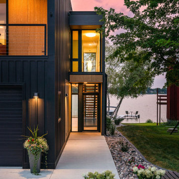
Set on a narrow lakefront parcel defined by tight setbacks and limited hardscape allowance, this modern cabin demonstrates how thoughtful design can transform restriction into possibility. Carefully composed to preserve privacy while opening fully toward the water, the home feels both expansive and intimate—an elevated retreat grounded in its landscape.
Though modest in footprint, the residence lives generously. Four bedrooms are tucked efficiently within the plan, including a light-filled quilting studio that reflects the homeowners’ creative life. Each bedroom opens onto its own private balcony, offering moments of pause and perspective with views stretching across lake and countryside.
The upper level also includes a family room, providing a quiet gathering space removed from the activity below. From here, the home’s vertical volume becomes apparent, as daylight pours down through a dramatic two-story space framed by glass facing the lake.
At the center of the home, a custom steel-and-wood plank stair acts as both circulation and sculpture. Rising through the double-height volume, it leads the eye upward to a tall Nelson cigar lamp suspended above—an intentional moment of drama and delight.
The main floor is designed around connection and flow. Kitchen, dining, and living areas exist as one continuous space, unified by light, views, and material warmth. A 12-foot-long island anchors the kitchen, serving as the natural gathering place for morning coffee, family meals, and summertime buffet-style entertaining. When fully opened, large folding accordion glass doors dissolve the boundary between inside and out, allowing the screened porch to become a true extension of the living space.
Function is carefully layered throughout the plan. A mudroom entry from the tucked-under two-car garage includes a powder room and utility closet, while a generous entry closet provides essential storage and has been dimensioned to accommodate a future elevator.
Designed intentionally for aging in place, the home incorporates zero-threshold access from the garage, wide halls and doorways, reinforced wall blocking for future grab bars, and infrastructure for a future elevator—ensuring long-term comfort without compromising design.
Clad in dark painted board-and-batten siding, the exterior minimizes visual scale and allows the home to recede quietly into the landscape. Recessed balconies and façade elements are wrapped in warm wood-look siding, adding depth and contrast while bringing warmth into the interior. At night, light spills softly from within, and the cabin glows along the shoreline—welcoming, calm, and enduring.
 TERRAFIRMA Landscape
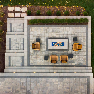
This lakefront second home in the Irish Hills offered expansive lake views, yet the yard provided little usable space beyond the existing deck. The slope toward the water restricted gathering areas and made site access during construction especially complex.
The goal was to extend the living environment beyond the deck. To create a series of spaces that felt connected to the water, social with corn hole tournaments and a cozy place to unwind in the evening after docking the boat, cast in warm, soft lighting.

 SV Design
This historic 1840’s Gothic Revival home perched on the harbor, presented an array of challenges: they included a narrow-restricted lot cozy to the neighboring properties, a sensitive coastal location, and a structure desperately in need of major renovations.
The renovation concept respected the historic notion of individual rooms and connecting hallways, yet wanted to take better advantage of water views. The solution was an expansion of windows on the water siding of the house, and a small addition that incorporates an open kitchen/family room concept, the street face of the home was historically preserved.
The interior of the home has been completely refreshed, bringing in a combined reflection of art and family history with modern fanciful choices.
Adds testament to the successful renovation, the master bathroom has been described as “full of rainbows” in the morning.
69