
Search results for "Reworking" in Home Design Ideas
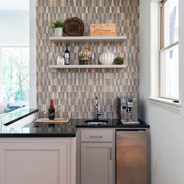
 Nicole Arnold Interiors
Purchased as a fixer-upper, this 1998 home underwent significant aesthetic updates to modernize its amazing bones. The interior had to live up to the coveted 1/2 acre wooded lot that sprawls with landscaping and amenities. In addition to the typical paint, tile, and lighting updates, the kitchen was completely reworked to lighten and brighten an otherwise dark room. The staircase was reinvented to boast an iron railing and updated designer carpeting. Traditionally planned rooms were reimagined to suit the needs of the family, i.e. the dining room is actually located in the intended living room space and the piano room Is in the intended dining room area. The live edge table is the couple’s main brag as they entertain and feature their vast wine collection while admiring the beautiful outdoors. Now, each room feels like “home” to this family.
 TKS Design Group
Download our free ebook, Creating the Ideal Kitchen. DOWNLOAD NOW
The homeowners built their traditional Colonial style home 17 years’ ago. It was in great shape but needed some updating. Over the years, their taste had drifted into a more contemporary realm, and they wanted our help to bridge the gap between traditional and modern.
We decided the layout of the kitchen worked well in the space and the cabinets were in good shape, so we opted to do a refresh with the kitchen. The original kitchen had blond maple cabinets and granite countertops. This was also a great opportunity to make some updates to the functionality that they were hoping to accomplish.
After re-finishing all the first floor wood floors with a gray stain, which helped to remove some of the red tones from the red oak, we painted the cabinetry Benjamin Moore “Repose Gray” a very soft light gray. The new countertops are hardworking quartz, and the waterfall countertop to the left of the sink gives a bit of the contemporary flavor.
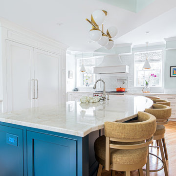
We reworked the refrigerator wall to create more pantry storage and eliminated the double oven in favor of a single oven and a steam oven. The existing cooktop was replaced with a new range paired with a Venetian plaster hood above. The glossy finish from the hood is echoed in the pendant lights. A touch of gold in the lighting and hardware adds some contrast to the gray and white. A theme we repeated down to the smallest detail illustrated by the Jason Wu faucet by Brizo with its similar touches of white and gold (the arrival of which we eagerly awaited for months due to ripples in the supply chain – but worth it!).
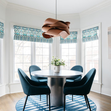
The original breakfast room was pleasant enough with its windows looking into the backyard. Now with its colorful window treatments, new blue chairs and sculptural light fixture, this space flows seamlessly into the kitchen and gives more of a punch to the space.
The original butler’s pantry was functional but was also starting to show its age. The new space was inspired by a wallpaper selection that our client had set aside as a possibility for a future project. It worked perfectly with our pallet and gave a fun eclectic vibe to this functional space. We eliminated some upper cabinets in favor of open shelving and painted the cabinetry in a high gloss finish, added a beautiful quartzite countertop and some statement lighting. The new room is anything but cookie cutter.
Next the mudroom. You can see a peek of the mudroom across the way from the butler’s pantry which got a facelift with new paint, tile floor, lighting and hardware. Simple updates but a dramatic change! The first floor powder room got the glam treatment with its own update of wainscoting, wallpaper, console sink, fixtures and artwork. A great little introduction to what’s to come in the rest of the home.
The whole first floor now flows together in a cohesive pallet of green and blue, reflects the homeowner’s desire for a more modern aesthetic, and feels like a thoughtful and intentional evolution. Our clients were wonderful to work with! Their style meshed perfectly with our brand aesthetic which created the opportunity for wonderful things to happen. We know they will enjoy their remodel for many years to come!
Photography by Margaret Rajic Photography

Find the right local pro for your project
 Gardner/Fox Associates, Inc
After removing a structural support beam in the center of this colonial home's kitchen Gardner/Fox designed and built an open, updated space with plenty of room for friends and family. The room's unique ceiling comes from the removal and reworking of the home's previous structural support. The new design includes ample storage and counter space, as well as a coffee station and work desk. The renovation also included the installation of a new bar and updated powder room.
 Home Suite Design & Realty
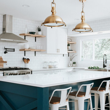
The full-home remodel involved moving the kitchen completely, in order to make it larger and take advantage of great views out back, building a large deck off the back of the house, redoing all flooring, building a custom fireplace surround, converting the old kitchen into a half bath, re-working the master bedroom and bath layout, building a room for a music studio in the basement, and updating the remaining 2 bathrooms, wet bar, rec room, 4 bedrooms, and exterior entryway and finish.
 New Frameworks Natural Design Build
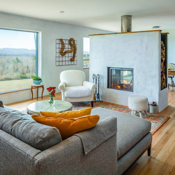
We re-worked the floor plan to open up the space in this 1950s ranch, added new high performance windows, an energy efficient fireplace, reclaimed timbers, and lime plaster to completely transform the feel of the space. Photo credit to Mark Bayer Photography.
 Simply Home Decorating
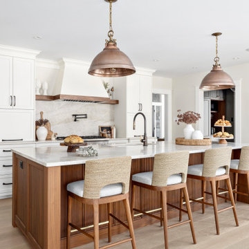
When our clients approached us to renovate their 1950s Newfoundland home, their goal was to modernize while reflecting both their West Coast roots and current East Coast lifestyle. What began as a simple ensuite repair expanded into a full home transformation, completed in two thoughtfully phased renovations. Drawing from our cross-coastal experience—and a personal connection to the home’s past—we blended classic East Coast charm with West Coast simplicity. From reworking the layout and finishes to integrating their art collection and layering in warm, tactile materials, every detail was designed to feel cohesive, inviting, and deeply personal.
 Mosaik Design & Remodeling
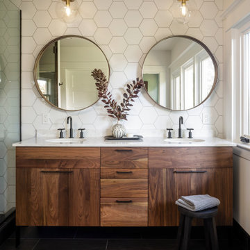
This existing sleeping porch was reworked into a stunning Mid Century bathroom complete with geometric shapes that add interest and texture. Rich woods add warmth to the black and white tiles. Wood tile was installed on the shower walls and pick up on the wood vanity and Asian-inspired custom built armoire.
 2e Architects
Alain jaramillo
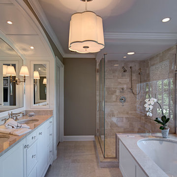
Example of a classic bathroom design in Baltimore with an undermount tub
Example of a classic bathroom design in Baltimore with an undermount tub
 Ferguson Bath, Kitchen & Lighting Gallery
Four Brothers LLC
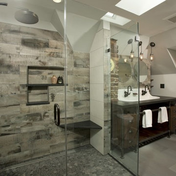
Doorless shower - large industrial master gray tile and porcelain tile porcelain tile and gray floor doorless shower idea in DC Metro with a trough sink, dark wood cabinets, solid surface countertops, gray walls, open cabinets, a two-piece toilet and a hinged shower door
Doorless shower - large industrial master gray tile and porcelain tile porcelain tile and gray floor doorless shower idea in DC Metro with a trough sink, dark wood cabinets, solid surface countertops, gray walls, open cabinets, a two-piece toilet and a hinged shower door
 Fireclay Tile
Photos by Courtney Apple
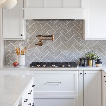
Example of a mid-sized classic ceramic tile and black floor eat-in kitchen design in Newark with an undermount sink, shaker cabinets, white cabinets, marble countertops, gray backsplash, ceramic backsplash, stainless steel appliances, an island and gray countertops
Example of a mid-sized classic ceramic tile and black floor eat-in kitchen design in Newark with an undermount sink, shaker cabinets, white cabinets, marble countertops, gray backsplash, ceramic backsplash, stainless steel appliances, an island and gray countertops


 Cameron Getter Design
This primary bathroom got a much needed upgrade! We infused color, texture, and warmth throughout this design. This full renovation included new green shower wall tile and terrazzo wall + floor tile, fresh paint, a custom-built vanity, new vanity countertop, all new brass plumbing fixtures, vanity mirrors and sconce lighting, custom shower glass wall + door, floating shelf, artwork, vintage Turkish rug, and bath accessories.

 Amy Storm & Company
The picture perfect home
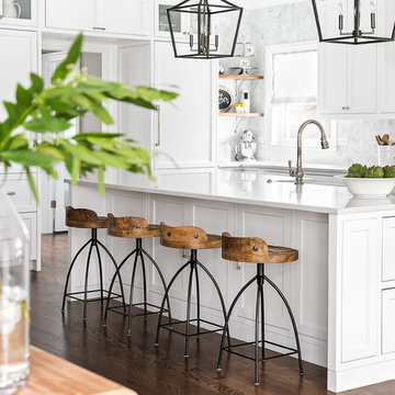
Example of a large transitional medium tone wood floor and brown floor eat-in kitchen design in Chicago with a farmhouse sink, beaded inset cabinets, white cabinets, quartz countertops, gray backsplash, marble backsplash, stainless steel appliances and an island
Example of a large transitional medium tone wood floor and brown floor eat-in kitchen design in Chicago with a farmhouse sink, beaded inset cabinets, white cabinets, quartz countertops, gray backsplash, marble backsplash, stainless steel appliances and an island

 ZeroEnergy Design
This renovated brick rowhome in Boston’s South End offers a modern aesthetic within a historic structure, creative use of space, exceptional thermal comfort, a reduced carbon footprint, and a passive stream of income.
DESIGN PRIORITIES. The goals for the project were clear - design the primary unit to accommodate the family’s modern lifestyle, rework the layout to create a desirable rental unit, improve thermal comfort and introduce a modern aesthetic. We designed the street-level entry as a shared entrance for both the primary and rental unit. The family uses it as their everyday entrance - we planned for bike storage and an open mudroom with bench and shoe storage to facilitate the change from shoes to slippers or bare feet as they enter their home. On the main level, we expanded the kitchen into the dining room to create an eat-in space with generous counter space and storage, as well as a comfortable connection to the living space. The second floor serves as master suite for the couple - a bedroom with a walk-in-closet and ensuite bathroom, and an adjacent study, with refinished original pumpkin pine floors. The upper floor, aside from a guest bedroom, is the child's domain with interconnected spaces for sleeping, work and play. In the play space, which can be separated from the work space with new translucent sliding doors, we incorporated recreational features inspired by adventurous and competitive television shows, at their son’s request.
MODERN MEETS TRADITIONAL. We left the historic front facade of the building largely unchanged - the security bars were removed from the windows and the single pane windows were replaced with higher performing historic replicas. We designed the interior and rear facade with a vision of warm modernism, weaving in the notable period features. Each element was either restored or reinterpreted to blend with the modern aesthetic. The detailed ceiling in the living space, for example, has a new matte monochromatic finish, and the wood stairs are covered in a dark grey floor paint, whereas the mahogany doors were simply refinished. New wide plank wood flooring with a neutral finish, floor-to-ceiling casework, and bold splashes of color in wall paint and tile, and oversized high-performance windows (on the rear facade) round out the modern aesthetic.
RENTAL INCOME. The existing rowhome was zoned for a 2-family dwelling but included an undesirable, single-floor studio apartment at the garden level with low ceiling heights and questionable emergency egress. In order to increase the quality and quantity of space in the rental unit, we reimagined it as a two-floor, 1 or 2 bedroom, 2 bathroom apartment with a modern aesthetic, increased ceiling height on the lowest level and provided an in-unit washer/dryer. The apartment was listed with Jackie O'Connor Real Estate and rented immediately, providing the owners with a source of passive income.
ENCLOSURE WITH BENEFITS. The homeowners sought a minimal carbon footprint, enabled by their urban location and lifestyle decisions, paired with the benefits of a high-performance home. The extent of the renovation allowed us to implement a deep energy retrofit (DER) to address air tightness, insulation, and high-performance windows. The historic front facade is insulated from the interior, while the rear facade is insulated on the exterior. Together with these building enclosure improvements, we designed an HVAC system comprised of continuous fresh air ventilation, and an efficient, all-electric heating and cooling system to decouple the house from natural gas. This strategy provides optimal thermal comfort and indoor air quality, improved acoustic isolation from street noise and neighbors, as well as a further reduced carbon footprint. We also took measures to prepare the roof for future solar panels, for when the South End neighborhood’s aging electrical infrastructure is upgraded to allow them.
URBAN LIVING. The desirable neighborhood location allows the both the homeowners and tenant to walk, bike, and use public transportation to access the city, while each charging their respective plug-in electric cars behind the building to travel greater distances.
OVERALL. The understated rowhouse is now ready for another century of urban living, offering the owners comfort and convenience as they live life as an expression of their values.
Photography Eric Roth Photo
 Rudloff Custom Builders
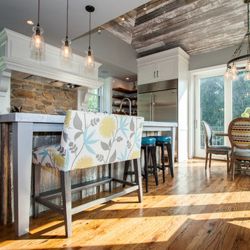
A stone wall was removed and the layout reworked to create more room for two people to cook at the same time in this new kitchen. The raised ceiling and creamy cabinets make things more open and a custom hood over the stone backsplash creates a strong focal point. The gorgeous island has a surround of reclaimed wood and also compliments the same wood also used on the raised ceiling.
We are proud to say that this kitchen was featured in a
Houzz Kitchen of the Week article!
Alicia's Art, LLC
RUDLOFF Custom Builders, is a residential construction company that connects with clients early in the design phase to ensure every detail of your project is captured just as you imagined. RUDLOFF Custom Builders will create the project of your dreams that is executed by on-site project managers and skilled craftsman, while creating lifetime client relationships that are build on trust and integrity.
We are a full service, certified remodeling company that covers all of the Philadelphia suburban area including West Chester, Gladwynne, Malvern, Wayne, Haverford and more.
As a 6 time Best of Houzz winner, we look forward to working with you on your next project.
 Laurel Wreath Homes
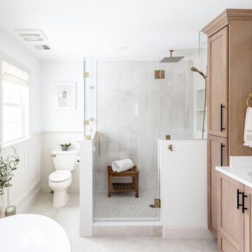
Full renovation for this Primary Bathroom. Re-worked the floor plan to create a larger walk-in shower space with custom glass enclosure. Designed a custom wooden vanity with plenty of storage, with a subtly veined quartz countertop. Free standing bathtub is surrounded by a half wall of paneling, painted in a light and bright color scheme. Neutral tile installed on bathroom floor and shower walls, with a coordinating penny tile on the shower floor and niches. Textured bamboo roman shades and floating shelves were installed for contrast and mixed and matched black and gold hardware for detail.
 Refresh Your Space
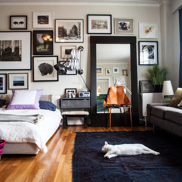
I wanted to make a big impact in a small space so creating a gallery wall not only helped to add color to the space, but also in moving the eye along the whole length of the room.
44