
Search results for "Separating graphics" in Home Design Ideas
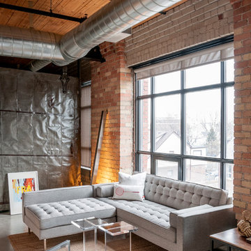
 Direct Furniture
Spencer Loft Bi-Sectional by Gus Modern From $2,999
The Mid Century inspired compact Spencer series features blind tufted seat and back cushions with a stainless steel base. Hardwood frames are constructed with FSC Certified wood in support of responsible forest management
Features:
-Bi-Sectional ottoman can be used as stand-alone seating when separated from Sofa
-Comes with two square bolsters
-Cushions are blind tufted on the front side and secured with a hidden button on the back
-Seat and back cushions are one sided and are made from a Medium density polyurethane foam covered in a Dacron wrap
-9 gauge No-Sag, sinuous spring system (LOFT Bi-Sectional uses Elastic Webbing)
-Springs are held in place with injection molded spring clip system
-All fabric is Cal 117 certified and double rub tested
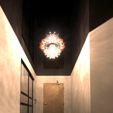
 Laqfoil Ltd.
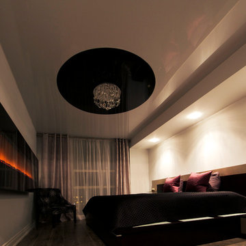
The issues that annoyed the family in this condo are common to new condo units: Low ceilings covered with a popcorn finish, small rooms, low light in the bedrooms and living room, and no ceiling light fixtures. Concrete ceilings are not only difficult to drill into to install fixtures, installing wiring behind them for such fixtures is impossible. There are often conduits for building services embedded in the concrete along with structural steel reinforcements, so drilling without x-raying first is dangerous.
Laqfoil stretch ceiling provided a solution to all of these issues for this condo unit. A high gloss finish was chosen, as the reflections visually double the height of the space. Installing a stretch ceiling also naturally conceals the popcorn ceiling behind it, but in this case, was also used to conceal the wiring necessary to add ceiling lights in every room. The wiring was simply attached to the existing popcorn ceiling. Laqfoil stretch ceiling is supported around the perimeter only, by tracks, or profiles which are only about 0.75" thick. The ceiling membrane itself is less than one millimetre thick.
We also added a small vector graphic, printed in each corner of the living room ceiling, for a unique aesthetic effect.
We constructed a suspended bulkhead above the island and covered it with red high gloss membrane, to visually separate the kitchen and living room while keeping the design's open concept. This also provided a supporting structure for 3 mini chandelier pendant lights.
A red rose depicted on a black and white textured ground was chosen for the kitchen ceiling and applied using digital wide format printing technology, to tie the red, black and white colour scheme with the kitchen cabinets' texture.
 Visbeen Architects
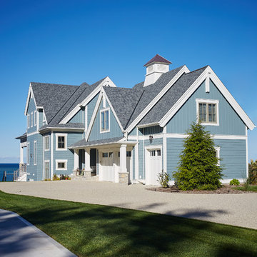
Designed with an open floor plan and layered outdoor spaces, the Onaway is a perfect cottage for narrow lakefront lots. The exterior features elements from both the Shingle and Craftsman architectural movements, creating a warm cottage feel. An open main level skillfully disguises this narrow home by using furniture arrangements and low built-ins to define each spaces’ perimeter. Every room has a view to each other as well as a view of the lake. The cottage feel of this home’s exterior is carried inside with a neutral, crisp white, and blue nautical themed palette. The kitchen features natural wood cabinetry and a long island capped by a pub height table with chairs. Above the garage, and separate from the main house, is a series of spaces for plenty of guests to spend the night. The symmetrical bunk room features custom staircases to the top bunks with drawers built in. The best views of the lakefront are found on the master bedrooms private deck, to the rear of the main house. The open floor plan continues downstairs with two large gathering spaces opening up to an outdoor covered patio complete with custom grill pit.
Find the right local pro for your project
 Sitka Log Homes
don cochran photography
http://www.doncphoto.com
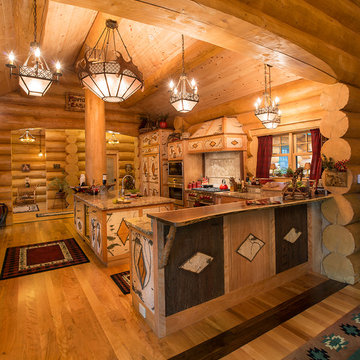
Example of a mountain style single-wall medium tone wood floor kitchen design in New York with beige backsplash and an island
Example of a mountain style single-wall medium tone wood floor kitchen design in New York with beige backsplash and an island
 Advance Design Studio, Ltd.
Jennifer and Dan have lived in their Deer Park Illinois home for 15 years, slowly making minor fixes like painting and decorating; but they had a new plan for their kitchen the entire time. An awkwardly placed garage door, and an island cooktop with a terrible downdraft made a full-scale kitchen remodel an absolute must. Jennifer had many ideas in mind and wanted to work with a company that could provide high-end work, while partnering with a designer that would tailor the kitchen to her ideas.
She was intrigued by the phrase “Common Sense Remodeling” in Advance Design’s feature she discovered while perusing an issue of the community’s Quintessential Barrington Magazine. Doing further research on the company’s website, as she looked through project profiles and read about Advance Design’s “Common Sense Remodeling” philosophy, she promptly scheduled an appointment to see if the people and ideas she read about were truly who they said they were. The more she read, the more she knew that the “Common Sense” approach to remodeling they described was exactly the type of company she was looking for.
The partnership was sealed after an initial consultation with Owner Todd Jurs and Project Designer Michelle Lecinski. They displayed a combination of friendliness, professionalism and respect that was unmatched by any of the other companies Jennifer talked to. She knew that with Advance Design, she would be able to retain the vision that she had in mind with high-quality craftsmanship.
“I reached out to Advance Design because of the ‘Common Sense Remodeling’ tagline,” Jennifer said. “That’s what lingered for me”. “Advance Design was the most respectful- of the house and of my design ideas, and the most professional of the handful of companies that looked at my project”.
Soon after the meeting Jennifer began working with Michelle on the project design. They quickly developed chemistry. Jennifer loved how Michelle researched and located every detail that Jennifer wanted for the kitchen. Between the two of them, every concept and idea was worked through and perfected. “Jennifer had definite ideas about what she wanted the new kitchen to look like, she just didn’t know how to bring it all together. We worked together really well to make her ideas into the practical reality necessary for a well-functioning kitchen, with the look and feel that she had envisioned”, says Michelle.
“Michelle was wonderful in using the CAD system she would show me new drawings every time we changed the layout while working through the design,” Jennifer said. “She was a really wonderful partner in execution, she made sure everything happened quickly and easily.”
The finished design drew out elements of Jennifer’s style and personality. The pair call the look “sophisticated farmhouse” to describe the kitchen renovation to family and friends. The result was a beautifully crafted, authentic-feeling space that satisfied Jennifer’s dreams 15 years in the making. The whole project consisted of a kitchen remodel, mudroom upgrade with powder room, and garage entry relocation. “The projects I personally like the best, are the ones that put the client’s dreams on display,” Project Designer Michelle said. “And this is one of those projects.”
The main focal point of the kitchen is custom zinc and brass ventilation hood with a vintage sheen, which was hand made to order by a small company in Indiana named Vogler Metalworking. “It’s like sculpture, a true work of art”, says Jennifer. Your eye is immediately drawn towards this elegant yet practical hood that eliminated the home’s downdraft problem and added a striking conversation piece at the same time. The carpenters had to use special gloves when transporting and installing it, so they didn’t smudge it with fingerprints. The beautiful hood centers proudly over the stunning black enamel and brass LaCornue Range. “I had a friend who had a LaCornue range and after learning how easy it was to cook perfect meals, I was convinced I wanted to have one”, says Jennifer. This unique, breathtaking combination anchors the entire kitchen and is apparent immediately as you walk into the great room the surrounds the space.
DuraSupreme Crestwood cabinets with a Kendall Panel add function and sophistication. A custom gray paint color paired with a storm blue was developed so that the new kitchen looked like it belonged to the existing space. Unlacquered brass faucets and hardware were important to Jennifer because she wanted the living finishes to age over time. Remarkable brass diamond mesh cabinet door inserts imported from the UK continue to add this one-of-a-kind kitchen renovation; giving it a “you won’t see this everywhere” quality. The use of old railcar flooring for the coffee bar countertop and reclaimed oak for the open shelving gives an authenticity to the space uncommon in kitchens today.
Jennifer and Michelle fell in love with the Limestone Grey Stone while they were investigating unique island countertop ideas. They liked the fact that the limestone as a living finish will age and change over time. Calcutta Miel Quartz countertops made for an excellent pairing around the perimeter, as it’s durable and perfect for cooking preparations. A textured white subway tile backsplash that runs to the ceiling keeps your eye moving towards the open shelving, and to the main focal point of the stunning range hood combination.
“The kitchen functions beautifully, and it’s gorgeous,” beams Jennifer as she gestures with both hands while smiling ear to ear. “The most important thing was I wanted a kitchen that had a wonderful flow, cooked beautiful meals and was a great gathering place for family and friends, and this space does that perfectly! Beauty wise, it turned out exactly how I had envisioned. I felt the function part was the hardest part, and that was nailed”!
Relocating the garage entry to the new mudroom was a huge priority and has finally separated the family’s arriving home functions from their kitchen. Now coats and shoes and bags have their own area for dropping once members arrive home. Matching gray DuraSupreme cabinetry helped create gorgeous, purposeful lockers for the family. A reclaimed vintage sink and custom wall paper were added to the tiny powder room to beautify the once previously only functional space. Advance Design was even able to create a custom space for their dog to sleep while the family is away.
“It was unbelievable that a project of this size was completed in such a short time, and I think that’s because of the large amount of planning and preparation that went into it,” Jennifer marveled, “When we started, we were ready, and everything was prepared”.
When it came to execution, Project Manager Justin Davis and his crew were quick, accessible, and organized. Projects like this kitchen are typically completed in as little as 8-10 weeks. Jennifer’s kitchen however despite the relocation of some challenging HVAC in a soffit and moving of an exterior door was completed remarkably fast in part because the team was working with an existing tile floor that ran throughout the first floor that the client really loved.
“You get to know these people really well because they’re living in your house while you’re living in your house. They were so fast and really good, it didn’t take as long as even planned” reported Jennifer. “I would text Justin and he always responded almost immediately. I got to know all the guys who were working in our house and they were all wonderful people”.
Details in a customized kitchen like this one require skill and care from the people who install it. “All the guys on the job were skilled at what the did. I wanted small details like little feet to look like furniture, that is where their carpentry skill came in to make these all perfect”, said Jennifer. “The tile guys were wonderful. They even let me determine how I wanted the texture with the grout to appear for a salt and pepper look; now that is a very skilled trade person making it custom”.
In Jennifer’s interview, she continued to reference Advance Design’s “Common Sense Remodeling”, so I took a minute to ask her exactly what that phrase meant to her and how it played out in her experience with her project and the Advance Design team. Here is what she said: “I was intrigued about Common Sense Remodeling and in my head that there would be clear costs and prices, great communication between the design team, the execution team and me”, said Jennifer. They did deliver on that, it was so clear about the cost breakdown, what I could expect from everyone who came to my house, and everything that we had ordered. That to me is the Common Sense”!
It’s great to see a client take literally our assertion that a well-planned remodeling project is simply “Common Sense”! She anticipated each step of the way would be clear, concise, and predictable, all the while protecting the outcome due to the careful upfront planning. “Advance Design delivered on their ‘Common Sense Remodeling’ promise,” Jennifer said. “From the design team, to the execution team - everything was straight forward like I imagined. The project turned out exactly how I envisioned, I enjoyed this process and absolutely would recommend Advance Design Studio to anyone.”
 Laqfoil Ltd.
The issues that annoyed the family in this condo are common to new condo units: Low ceilings covered with a popcorn finish, small rooms, low light in the bedrooms and living room, and no ceiling light fixtures. Concrete ceilings are not only difficult to drill into to install fixtures, installing wiring behind them for such fixtures is impossible. There are often conduits for building services embedded in the concrete along with structural steel reinforcements, so drilling without x-raying first is dangerous.
Laqfoil stretch ceiling provided a solution to all of these issues for this condo unit. A high gloss finish was chosen, as the reflections visually double the height of the space. Installing a stretch ceiling also naturally conceals the popcorn ceiling behind it, but in this case, was also used to conceal the wiring necessary to add ceiling lights in every room. The wiring was simply attached to the existing popcorn ceiling. Laqfoil stretch ceiling is supported around the perimeter only, by tracks, or profiles which are only about 0.75" thick. The ceiling membrane itself is less than one millimetre thick.
We also added a small vector graphic, printed in each corner of the living room ceiling, for a unique aesthetic effect.
We constructed a suspended bulkhead above the island and covered it with red high gloss membrane, to visually separate the kitchen and living room while keeping the design's open concept. This also provided a supporting structure for 3 mini chandelier pendant lights.
A red rose depicted on a black and white textured ground was chosen for the kitchen ceiling and applied using digital wide format printing technology, to tie the red, black and white colour scheme with the kitchen cabinets' texture.
 GS Construction
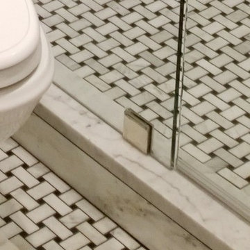
Example of a small classic 3/4 white tile and stone tile mosaic tile floor alcove shower design in Chicago with an undermount sink, recessed-panel cabinets, black cabinets, quartzite countertops, a two-piece toilet and gray walls

Sponsored
Columbus, OH

Structural Remodeling
Franklin County's Heavy Timber Specialists | Best of Houzz 2020!
 Bilotta Kitchen & Home
Transitional design bridges the gap between this Tudor home and the contemporary esthetic these homeowners love. White frameless full-overlay cabinetry is uncluttered, and the wide-framed doors with subtle beveled inner profiles are a fresh take on classic Shaker. White quartz countertops with understated veining and waterfall ends are the perfect low-maintenance choice for this busy young family. As a counterpoint to all the white, a warm wood-look backsplash tile was chosen. Bucking the common practice of using the same door style everywhere, the cabinets flanking the vent hood have triple panels. This gives the narrow doors much more pleasing proportions. Matte black hardware, faucet and funnel-shaped gold lined island pendants echo the black mullions.
The breakfast area epitomizes the juxtaposition of Tudor and modern. Against a backdrop of diamond leaded windows and transoms in the adjacent room is a mid-century tulip table and perforated bucket chairs. A bubble starburst chandelier and colorful abstract artwork complete the look.
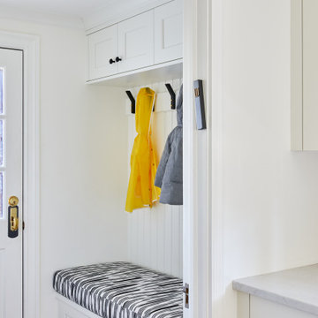
Separated from the kitchen by a pocket door is a handy mud room. A drawer seat with a graphic cushion and a wall cabinet above supply much-needed sports gear and outerwear storage. The beadboard back panel for coat hooks is a charming addition.
This project was designed in collaboration with Emily Shron Interiors.
 CO Interiors
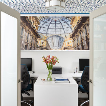
Framed by frosted-glass doors, this shared home office was designed for a couple who both work from home. A custom T-shaped desk gives each person a dedicated workstation while the central surface provides space to collaborate when needed. Graphic blue-and-white ceiling wallpaper and an oversized architectural photograph draw the eye upward, bringing personality and dimension to the streamlined white workspace.
 Bilotta Kitchen & Home
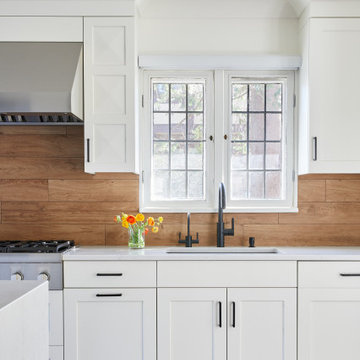
Transitional design bridges the gap between this Tudor home and the contemporary esthetic these homeowners love. White frameless full-overlay cabinetry is uncluttered, and the wide-framed doors with subtle beveled inner profiles are a fresh take on classic Shaker. White quartz countertops with understated veining and waterfall ends are the perfect low-maintenance choice for this busy young family. As a counterpoint to all the white, a warm wood-look backsplash tile was chosen. Bucking the common practice of using the same door style everywhere, the cabinets flanking the vent hood have triple panels. This gives the narrow doors much more pleasing proportions. Matte black hardware, faucet and funnel-shaped gold lined island pendants echo the black mullions.
The breakfast area epitomizes the juxtaposition of Tudor and modern. Against a backdrop of diamond leaded windows and transoms in the adjacent room is a mid-century tulip table and perforated bucket chairs. A bubble starburst chandelier and colorful abstract artwork complete the look.
Separated from the kitchen by a pocket door is a handy mud room. A drawer seat with a graphic cushion and a wall cabinet above supply much-needed sports gear and outerwear storage. The beadboard back panel for coat hooks is a charming addition.
This project was designed in collaboration with Emily Shron Interiors.
 Bilotta Kitchen & Home
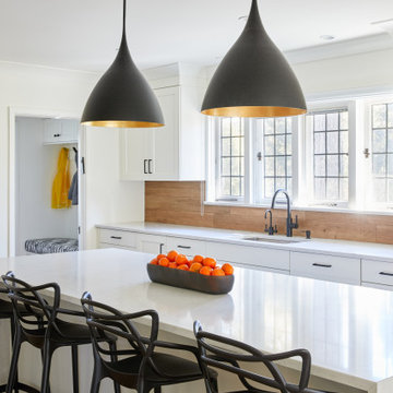
Transitional design bridges the gap between this Tudor home and the contemporary esthetic these homeowners love. White frameless full-overlay cabinetry is uncluttered, and the wide-framed doors with subtle beveled inner profiles are a fresh take on classic Shaker. White quartz countertops with understated veining and waterfall ends are the perfect low-maintenance choice for this busy young family. As a counterpoint to all the white, a warm wood-look backsplash tile was chosen. Bucking the common practice of using the same door style everywhere, the cabinets flanking the vent hood have triple panels. This gives the narrow doors much more pleasing proportions. Matte black hardware, faucet and funnel-shaped gold lined island pendants echo the black mullions.
The breakfast area epitomizes the juxtaposition of Tudor and modern. Against a backdrop of diamond leaded windows and transoms in the adjacent room is a mid-century tulip table and perforated bucket chairs. A bubble starburst chandelier and colorful abstract artwork complete the look.
Separated from the kitchen by a pocket door is a handy mud room. A drawer seat with a graphic cushion and a wall cabinet above supply much-needed sports gear and outerwear storage. The beadboard back panel for coat hooks is a charming addition.
This project was designed in collaboration with Emily Shron Interiors.
 Twilly and Fig
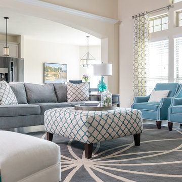
Our client asked us to design a transitional space that would be light and airy. They loved blue green and grays. We selected a modern fabric for the accent chairs. All of the furniture and accessories brought in the color while keeping the walls and window treatment fabric in neutral colors.
Michael Hunter Photography
 Bamboo Remodeling
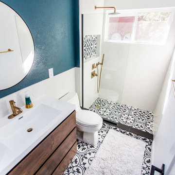
A beautiful bathroom remodel completed by our on-shore team in Austin, TX working with our interior deisgner Nemanja. We loved the end result, check out more on bambooapp.com

Sponsored
Sunbury, OH

J.Holderby - Renovations
Franklin County's Leading General Contractors - 2X Best of Houzz!
 Ross Industries PDX, Portland OR
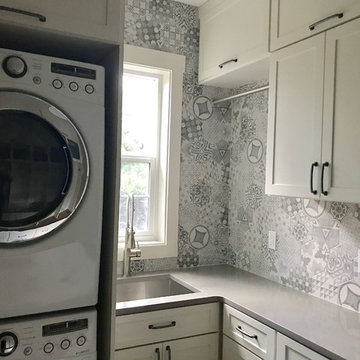
For this project, we expanded what was a very small laundry room out on to the existing porch to make it 2.5x in size. The resulting laundry/ mudroom has an industrial/farmhouse feel. We used white cabinets, concrete color grey quartz, a rustic italian tile in heringbone pattern on the floor and hexagon graphic backsplash tile for a little more personality. We added a wall of cubbies for the family and added a live edge wood bench to warm things up. We love both the function and beauty of this room for the family.
 TOC design & construction inc.
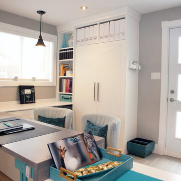
The importance of a properly designed home office ( especially when the space is also used as a meeting-place/showroom ) entails the comfort & positive experience of your customer in the following manner:
1. Exclusive office space with its own entrance separate from rest of home.
2. Ergonomic customer seating and ample presentation surfaces.
3. Dedicated customer computer screen(s) detailing CAD drawings & presentation in a show and tell manner.
4. Proper lighting ( LED lighting has come a long way )
5. Practical design touches ( hooks for purses, coats, umbrella stand, refreshments area, guest WIFI, etc...)
One of the greatest benefits of a home office is the freedom to design it with a distinct identity. In other words, we shouldn’t blend the workplace with the rest of our personal space, aka home.
 TOC design & construction inc.
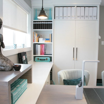
The importance of a properly designed home office ( especially when the space is also used as a meeting-place/showroom ) entails the comfort & positive experience of your customer in the following manner:
1. Exclusive office space with its own entrance separate from rest of home.
2. Ergonomic customer seating and ample presentation surfaces.
3. Dedicated customer computer screen(s) detailing CAD drawings & presentation in a show and tell manner.
4. Proper lighting ( LED lighting has come a long way )
5. Practical design touches ( hooks for purses, coats, umbrella stand, refreshments area, guest WIFI, etc...)
One of the greatest benefits of a home office is the freedom to design it with a distinct identity. In other words, we shouldn’t blend the workplace with the rest of our personal space, aka home.
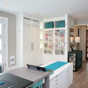 TOC design & construction inc.
The importance of a properly designed home office ( especially when the space is also used as a meeting-place/showroom ) entails the comfort & positive experience of your customer in the following manner:
1. Exclusive office space with its own entrance separate from rest of home.
2. Ergonomic customer seating and ample presentation surfaces.
3. Dedicated customer computer screen(s) detailing CAD drawings & presentation in a show and tell manner.
4. Proper lighting ( LED lighting has come a long way )
5. Practical design touches ( hooks for purses, coats, umbrella stand, refreshments area, guest WIFI, etc...)
One of the greatest benefits of a home office is the freedom to design it with a distinct identity. In other words, we shouldn’t blend the workplace with the rest of our personal space, aka home.
Sponsored
Sunbury, OH
J.Holderby - Renovations
Franklin County's Leading General Contractors - 2X Best of Houzz!
 TVL Creative Ltd.
This kitchen took a tired, 80’s builder kitchen and revamped it into a personalized gathering space for our wonderful client. The existing space was split up by the dated configuration of eat-in kitchen table area to one side and cramped workspace on the other. It didn’t just under-serve our client’s needs; it flat out discouraged them from using the space. Our client desired an open kitchen with a central gathering space where family and friends could connect. To open things up, we removed the half wall separating the kitchen from the dining room and the wall that blocked sight lines to the family room and created a narrow hallway to the kitchen. The old oak cabinets weren't maximizing storage and were dated and dark. We used Waypoint Living Spaces cabinets in linen white to brighten up the room. On the east wall, we created a hutch-like stack that features an appliance garage that keeps often used countertop appliance on hand but out of sight. The hutch also acts as a transition from the cooking zone to the coffee and wine area. We eliminated the north window that looked onto the entry walkway and activated this wall as storage with refrigerator enclosure and pantry. We opted to leave the east window as-is and incorporated it into the new kitchen layout by creating a window well for growing plants and herbs. The countertops are Pental Quartz in Carrara. The sleek cabinet hardware is from our friends at Amerock in a gorgeous satin champagne bronze. One of the most striking features in the space is the pattern encaustic tile from Tile Shop. The pop of blue in the backsplash adds personality and contrast to the champagne accents. The reclaimed wood cladding surrounding the large east-facing window introduces a quintessential Colorado vibe, and the natural texture balances the crisp white cabinetry and geometric patterned tile. Minimalist modern lighting fixtures from Mitzi by Hudson Valley Lighting provide task lighting over the sink and at the wine/ coffee station. The visual lightness of the sink pendants maintains the openness and visual connection between the kitchen and dining room. Together the elements make for a sophisticated yet casual vibe-- a comfortable chic kitchen. We love the way this space turned out and are so happy that our clients now have such a bright and welcoming gathering space as the heart of their home!
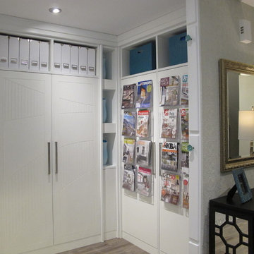 TOC design & construction inc.
The importance of a properly designed home office ( especially when the space is also used as a meeting-place/showroom ) entails the comfort & positive experience of your customer in the following manner:
1. Exclusive office space with its own entrance separate from rest of home.
2. Ergonomic customer seating and ample presentation surfaces.
3. Dedicated customer computer screen(s) detailing CAD drawings & presentation in a show and tell manner.
4. Proper lighting ( LED lighting has come a long way )
5. Practical design touches ( hooks for purses, coats, umbrella stand, refreshments area, guest WIFI, etc...)
One of the greatest benefits of a home office is the freedom to design it with a distinct identity. In other words, we shouldn’t blend the workplace with the rest of our personal space, aka home.
 Jack Calderone
This bedroom and full bathroom are part of an adventuresome project my wife and I embarked upon to create a complete apartment in the basement of our townhouse. We designed a floor plan that creatively and efficiently used all of the 385-square-foot-space, without sacrificing beauty, comfort or function – and all without breaking the bank! To maximize our budget, we did the work ourselves and added everything from thrift store finds to DIY wall art to bring it all together.
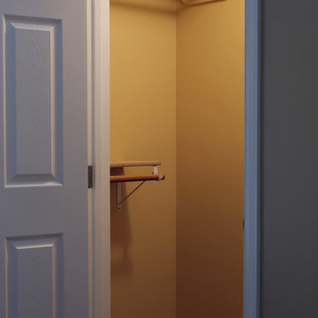
A partial double closet bar adds a little extra space while still leaving room for longer hanging clothes.
15