
Search results for "Simply remove" in Home Design Ideas
 Scheer & Co. Interior Design
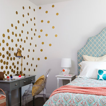
Kids' bedroom (girl)
Small transitional dark wood floor bedroom photo in Austin with white walls
Small transitional dark wood floor bedroom photo in Austin with white walls
 KrimsonHAUS
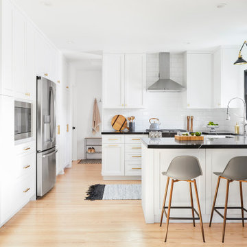
Kitchen - mid-sized transitional u-shaped medium tone wood floor and brown floor kitchen idea in Los Angeles with a farmhouse sink, shaker cabinets, white cabinets, marble countertops, white backsplash, subway tile backsplash, stainless steel appliances, a peninsula and black countertops
 Fox Interiors
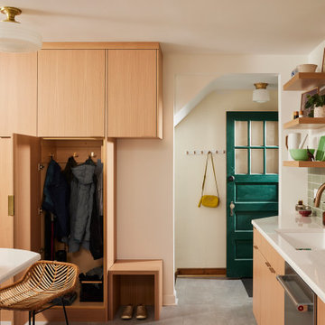
Inspired by their years in Japan and California and their Scandinavian heritage, we updated this 1938 home with a earthy palette and clean lines.
Rift-cut white oak cabinetry, white quartz counters and a soft green tile backsplash are balanced with details that reference the home's history.
Classic light fixtures soften the modern elements.
We created a new arched opening to the living room and removed the trim around other doorways to enlarge them and mimic original arched openings.
Removing an entry closet and breakfast nook opened up the overall footprint and allowed for a functional work zone that includes great counter space on either side of the range, when they had none before.
The new pantry wall incorporates storage for the microwave, coat storage, and a bench for shoe removal.
Find the right local pro for your project

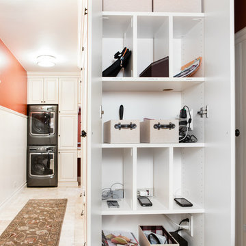
 Closet Organizing Systems
A perpendicular Charging Station with mail/paperwork slots, plenty of room for cell phones, I-Pods, I-Pads plus the children’s electronic gadgets, bins for paraphernalia and related attachments is a sure sign of this Century. Ivory glazed melamine. Donna Siben/Designer for Closet Organizing Systems

 TKS Design Group
Download our free ebook, Creating the Ideal Kitchen. DOWNLOAD NOW
For many, extra time at home during COVID left them wanting more from their homes. Whether you realized the shortcomings of your space or simply wanted to combat boredom, a well-designed and functional home was no longer a want, it became a need. Tina found herself wanting more from her Old Irving Park home and reached out to The Kitchen Studio about adding function to her kitchen to make the most of the available real estate.
At the end of the day, there is nothing better than returning home to a bright and happy space you love. And this kitchen wasn’t that for Tina. Dark and dated, with a palette from the past and features that didn’t make the most of the available square footage, this remodel required vision and a fresh approach to the space. Lead designer, Stephanie Cole’s main design goal was better flow, while adding greater functionality with organized storage, accessible open shelving, and an overall sense of cohesion with the adjoining family room.
The original kitchen featured a large pizza oven, which was rarely used, yet its footprint limited storage space. The nearby pantry had become a catch-all, lacking the organization needed in the home. The initial plan was to keep the pizza oven, but eventually Tina realized she preferred the design possibilities that came from removing this cumbersome feature, with the goal of adding function throughout the upgraded and elevated space. Eliminating the pantry added square footage and length to the kitchen for greater function and more storage. This redesigned space reflects how she lives and uses her home, as well as her love for entertaining.
The kitchen features a classic, clean, and timeless palette. White cabinetry, with brass and bronze finishes, contrasts with rich wood flooring, and lets the large, deep blue island in Woodland’s custom color Harbor – a neutral, yet statement color – draw your eye.
The kitchen was the main priority. In addition to updating and elevating this space, Tina wanted to maximize what her home had to offer. From moving the location of the patio door and eliminating a window to removing an existing closet in the mudroom and the cluttered pantry, the kitchen footprint grew. Once the floorplan was set, it was time to bring cohesion to her home, creating connection between the kitchen and surrounding spaces.
The color palette carries into the mudroom, where we added beautiful new cabinetry, practical bench seating, and accessible hooks, perfect for guests and everyday living. The nearby bar continues the aesthetic, with stunning Carrara marble subway tile, hints of brass and bronze, and a design that further captures the vibe of the kitchen.
Every home has its unique design challenges. But with a fresh perspective and a bit of creativity, there is always a way to give the client exactly what they want [and need]. In this particular kitchen, the existing soffits and high slanted ceilings added a layer of complexity to the lighting layout and upper perimeter cabinets.
While a space needs to look good, it also needs to function well. This meant making the most of the height of the room and accounting for the varied ceiling features, while also giving Tina everything she wanted and more. Pendants and task lighting paired with an abundance of natural light amplify the bright aesthetic. The cabinetry layout and design compliments the soffits with subtle profile details that bring everything together. The tile selections add visual interest, drawing the eye to the focal area above the range. Glass-doored cabinets further customize the space and give the illusion of even more height within the room.
While her family may be grown and out of the house, Tina was focused on adding function without sacrificing a stunning aesthetic and dreamy finishes that make the kitchen the gathering place of any home. It was time to love her kitchen again, and if you’re wondering what she loves most, it’s the niche with glass door cabinetry and open shelving for display paired with the marble mosaic backsplash over the range and complimenting hood. Each of these features is a stunning point of interest within the kitchen – both brag-worthy additions to a perimeter layout that previously felt limited and lacking.
Whether your remodel is the result of special needs in your home or simply the excitement of focusing your energy on creating a fun new aesthetic, we are here for it. We love a good challenge because there is always a way to make a space better – adding function and beauty simultaneously.
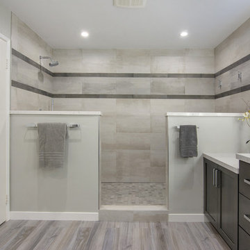
 Tracy Berman Interiors
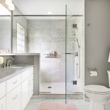
Simplicity, Calming, Contemporary and easy to clean were all adjectives the home owners wanted to see in their new Master Bathroom remodel. A oversized Jacuzzi tub was removed to create a very large walk in shower with a wet and dry zone. Corner benches were added for seating along with a niche for toiletries. The new vanity has plenty of storage capacity. The chrome fixtures coordinate with the mirrors and vanity lights to create a contemporary and relaxing Master Bathroom.


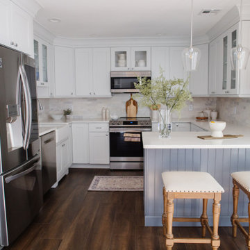


 Delphinium Design
GC: Ekren Construction
Photography: Tiffany Ringwald
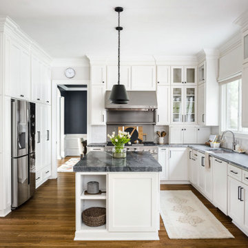
Example of a mid-sized transitional l-shaped medium tone wood floor and brown floor eat-in kitchen design in Charlotte with an undermount sink, shaker cabinets, white cabinets, quartzite countertops, gray backsplash, porcelain backsplash, stainless steel appliances, an island and black countertops
Example of a mid-sized transitional l-shaped medium tone wood floor and brown floor eat-in kitchen design in Charlotte with an undermount sink, shaker cabinets, white cabinets, quartzite countertops, gray backsplash, porcelain backsplash, stainless steel appliances, an island and black countertops
 Ki Arts
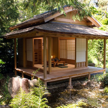
This ridge roof (kirizuma) style tea house, which has posts partly submerged in a koi pond, is constructed with Port Orford cedar. The tearoom is 4-1/2 tatami mats or approx. 9' square. The interior includes a closet kitchen (mizuya) and an alcove for displaying art (tokonoma). The tea house is enclosed by sliding shoji doors and surrounded by a veranda (engawa).
 TKS Design Group
Download our free ebook, Creating the Ideal Kitchen. DOWNLOAD NOW
For many, extra time at home during COVID left them wanting more from their homes. Whether you realized the shortcomings of your space or simply wanted to combat boredom, a well-designed and functional home was no longer a want, it became a need. Tina found herself wanting more from her Old Irving Park home and reached out to The Kitchen Studio about adding function to her kitchen to make the most of the available real estate.
At the end of the day, there is nothing better than returning home to a bright and happy space you love. And this kitchen wasn’t that for Tina. Dark and dated, with a palette from the past and features that didn’t make the most of the available square footage, this remodel required vision and a fresh approach to the space. Lead designer, Stephanie Cole’s main design goal was better flow, while adding greater functionality with organized storage, accessible open shelving, and an overall sense of cohesion with the adjoining family room.
The original kitchen featured a large pizza oven, which was rarely used, yet its footprint limited storage space. The nearby pantry had become a catch-all, lacking the organization needed in the home. The initial plan was to keep the pizza oven, but eventually Tina realized she preferred the design possibilities that came from removing this cumbersome feature, with the goal of adding function throughout the upgraded and elevated space. Eliminating the pantry added square footage and length to the kitchen for greater function and more storage. This redesigned space reflects how she lives and uses her home, as well as her love for entertaining.
The kitchen features a classic, clean, and timeless palette. White cabinetry, with brass and bronze finishes, contrasts with rich wood flooring, and lets the large, deep blue island in Woodland’s custom color Harbor – a neutral, yet statement color – draw your eye.
The kitchen was the main priority. In addition to updating and elevating this space, Tina wanted to maximize what her home had to offer. From moving the location of the patio door and eliminating a window to removing an existing closet in the mudroom and the cluttered pantry, the kitchen footprint grew. Once the floorplan was set, it was time to bring cohesion to her home, creating connection between the kitchen and surrounding spaces.
The color palette carries into the mudroom, where we added beautiful new cabinetry, practical bench seating, and accessible hooks, perfect for guests and everyday living. The nearby bar continues the aesthetic, with stunning Carrara marble subway tile, hints of brass and bronze, and a design that further captures the vibe of the kitchen.
Every home has its unique design challenges. But with a fresh perspective and a bit of creativity, there is always a way to give the client exactly what they want [and need]. In this particular kitchen, the existing soffits and high slanted ceilings added a layer of complexity to the lighting layout and upper perimeter cabinets.
While a space needs to look good, it also needs to function well. This meant making the most of the height of the room and accounting for the varied ceiling features, while also giving Tina everything she wanted and more. Pendants and task lighting paired with an abundance of natural light amplify the bright aesthetic. The cabinetry layout and design compliments the soffits with subtle profile details that bring everything together. The tile selections add visual interest, drawing the eye to the focal area above the range. Glass-doored cabinets further customize the space and give the illusion of even more height within the room.
While her family may be grown and out of the house, Tina was focused on adding function without sacrificing a stunning aesthetic and dreamy finishes that make the kitchen the gathering place of any home. It was time to love her kitchen again, and if you’re wondering what she loves most, it’s the niche with glass door cabinetry and open shelving for display paired with the marble mosaic backsplash over the range and complimenting hood. Each of these features is a stunning point of interest within the kitchen – both brag-worthy additions to a perimeter layout that previously felt limited and lacking.
Whether your remodel is the result of special needs in your home or simply the excitement of focusing your energy on creating a fun new aesthetic, we are here for it. We love a good challenge because there is always a way to make a space better – adding function and beauty simultaneously.
 Revision LLC
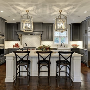
Large transitional u-shaped dark wood floor and brown floor kitchen photo in Minneapolis with gray cabinets, white backsplash, stainless steel appliances, an island, raised-panel cabinets, a farmhouse sink, solid surface countertops, white countertops and ceramic backsplash

 Regan Baker Design Inc.
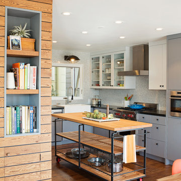
Stylish brewery owners with airline miles that match George Clooney’s decided to hire Regan Baker Design to transform their beloved Duboce Park second home into an organic modern oasis reflecting their modern aesthetic and sustainable, green conscience lifestyle. From hops to floors, we worked extensively with our design savvy clients to provide a new footprint for their kitchen, dining and living room area, redesigned three bathrooms, reconfigured and designed the master suite, and replaced an existing spiral staircase with a new modern, steel staircase. We collaborated with an architect to expedite the permit process, as well as hired a structural engineer to help with the new loads from removing the stairs and load bearing walls in the kitchen and Master bedroom. We also used LED light fixtures, FSC certified cabinetry and low VOC paint finishes.
Regan Baker Design was responsible for the overall schematics, design development, construction documentation, construction administration, as well as the selection and procurement of all fixtures, cabinets, equipment, furniture,and accessories.
Key Contributors: Green Home Construction; Photography: Sarah Hebenstreit / Modern Kids Co.

 Bonaventura Architect
Please see this Award Winning project in the October 2014 issue of New York Cottages & Gardens Magazine: NYC&G
http://www.cottages-gardens.com/New-York-Cottages-Gardens/October-2014/NYCG-Innovation-in-Design-Winners-Kitchen-Design/
It was also featured in a Houzz Tour:
Houzz Tour: Loving the Old and New in an 1880s Brooklyn Row House
http://www.houzz.com/ideabooks/29691278/list/houzz-tour-loving-the-old-and-new-in-an-1880s-brooklyn-row-house
Photo Credit: Hulya Kolabas
 Cabinet Innovations
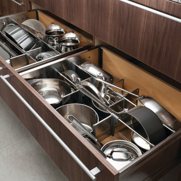
Large wide and deep drawers for storage of large pots and pans with dividers for easy organization. Cabinets are Wood-Mode 84 featuring the Vanguard Plus door style on Plain Sawn Walnut. Flooring by Porcelanosa, Rapid Gris.
All pictures are copyright Wood-Mode. For promotional use only.


1