
Search results for "Simply remove" in Home Design Ideas
 THE Remodel Group
A luxurious en suite bath was created within this classic 1925 Portland bungalow by reconfiguring the second story’s original small bedrooms and tiny half bath. In this welcoming new urban boho space, eclectic finishes mingle harmoniously, integrated through subtle repetition of shapes and materials.
A furniture-style vanity sets the tone for this luxurious space, introducing materials, colors, shapes, and textures that repeat throughout. Individual walnut hexagons join to create distinctive vanity doors, offset beautifully by horizontal-grain drawers. Topping the cabinetry is a simple concrete countertop with integral sinks. An expansive framed mirror above enlarges and brightens the room. Within the mirror, sconces float, their globes a nod to the hexagons below. Champagne bronze fixtures reflect the warm walnut glow. Nestled into the back corner, a stunning shower features waterjet tiles in a double herringbone pattern, each precisely cut and laid to maintain design integrity at every surface transition. Teak floor tiles and a pebbled niche hint at the classic spa experience. Across from the shower, a large hexagonal window provides a treetop view from the free-standing tub below. The gentle oval of the tub and the beaded chandelier above provide a pleasing contrast to the strong lines surrounding it, as do the softly-shaded pebbles in the full-length niche. Shiplap wainscotting wraps the room, creating an illusion of height in the compact space. Subtle flooring and soft green walls create an understated backdrop for the bold mix of materials, unifying them into a serene oasis.
Asking a century-old home to accommodate a modern luxury bath is a tall order. Asbestos-laden plaster and flooring had to be abated. The subfloor had to be leveled and reinforced to increase strength and prevent deflection. Water lines and multiple electrical circuits had to be brought across and up without disturbing a beautifully-paneled ceiling, something we accomplished by firring out stair walls to hide the chases. Our client had visions of a leafy view from her tub, but the new layout eliminated existing windows. Placing a new window was complicated by deep eaves and flat soffits. By pushing the header into the roofline, however, we were able to accommodate a picture window. The flat soffit was replaced by an inverse hip lined with stained tongue and groove cedar, tying it to the bathroom finishes. Bringing materials up a narrow staircase became truly challenging when it was time to install the big items. However, strategic removal of drywall around the landing got the job done. Our attention to detail is showcased in the shower tile, where precise cuts were required at surface transitions to maintain the integrity of a complex double herringbone lay. The project was delivered on time.
Savvy layout choices minimized spending on structural changes. Because we were dealing with dormer space, head height was an issue. Raising the ceiling would have been complex and expensive so our design accommodated the constraints – tub on the low outside wall, shower on the full-height interior wall. The vanity spanned the spread, accommodating our petite client on the exterior side and her taller husband on the interior side. An under-eave closet was closed off to create room for both a freestanding tub and a separate shower. Rather than building replacement storage elsewhere, we simply added a new door into the closet from the primary bedroom. This was made possible by absorbing the short hallway separating the existing bed and bathroom into the primary bedroom. This new layout also created an en suite relationship between the primary bedroom and the new bath. We saved additional dollars by selecting a furniture-style vanity rather than using custom cabinetry, and the countertop with integral sinks provided a cost savings over a more traditional quartz countertop with undermount sinks. Affordable shower tiles allowed us to put more money into a dynamic tile layout. The project was delivered within budget.
 RAJ Kitchen and Bath, LLC
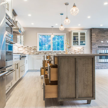
There were a few difficulties in making this kitchen any better than how it was. There was a separate staircase that had access to the second floor which was located in the kitchen. This left just enough room to push the dining room to one side. Then, there was the porch. A really nice panoramic view of the back, but was somehow under-used by the family during the summer months. Then, it was the size of the kitchen. It simply was way too small for a growing family, and while it had a peninsular in place, the flow just didn’t work. I remember watching them one day demonstrating how awkward it was using the kitchen. We got it! We had our marching orders to go and figure out how to make this kitchen work for this family.
Everything in the room was fair play. The design was done to make the kitchen very open. For a few ideas, we incorporated the porch in the kitchen by using the nana wall idea but it ended up being too cost prohibitive to do so. We then decided to do a permanent fix by using a commercial glass wall application. Once we figured that out, we moved back inside and removed the staircase. This gave us two added benefits. One allowed us to really reconfigure the kitchen and the other opened up the second floor for a huge built in closet system.
We relocated the windows, added a fire place with a built In TV above. From there, it was onto the kitchen itself which contained a huge Island with seating, large kitchen sink and built in appliances which was set up in a way to take advantage of the new layout. We re-positioned the kitchen facing the beautiful views outside rather than looking towards a wall. Now, when you enter the house up the entry stairs, the kitchen now draws you into the magnificent new open space. This is now setup for entertaining, relaxation, hanging out and most of all, preparing meals in a room where you only have to leave if you want to.
This one was all about the design. Design was what made this space. Setting this space up for success was crucial, and this kitchen is a great example of how design can cover a multitude of sins in Kitchen designs.
… Just close your eyes for a second and imagine waking up one winter morning and having a cup of coffee and watching the snow fall through those huge windows, leaning up against those 3D feature walls while watching the kids sitting around the table enjoying those warm radiant heated floors in this spacious kitchen…..
 Fabco Sanctuary
The architect and designer Guy Derwent was approached by his client with a clear and compelling brief: to completely transform a grand Victorian terrace house they were planning to renovate. The client envisioned something far beyond a standard renovation – this was to be a bold and dramatic reimagining of a family home that could grow with them over time.
With the property having remained largely untouched for more than fifty years, the architects saw an opportunity to unlock its potential and deliver a contemporary design that would contrast beautifully with its Victorian heritage.
The existing layout consisted of a series of small, disconnected rooms to the rear of the house. To respond to the client’s need for openness and flexibility, the architect proposed a radical restructuring of the ground floor:
The rear rooms were completely removed
Suspended timber floors were lowered by up to two metres to align with the garden
Two bold extensions were added
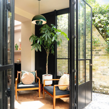
The first extension filled in the side return with a London stock brick facade and a glazed roof, while the second – a striking black steel and glass pavilion was glazed on three sides and placed along the garden elevation.
This new pavilion redefined the building’s relationship with the garden. Its steel-framed glazing created a seamless dialogue between interior and exterior, offering a sense of immersion in the surrounding landscape.
At the heart of the plan sits a dramatic, five-metre-tall dining space that acts as a transition from the original entrance hall into the new addition. A large, circular cast-glass window, framed in steel, provides a visual and spatial link between old and new, allowing light and movement to travel through the depth of the home.
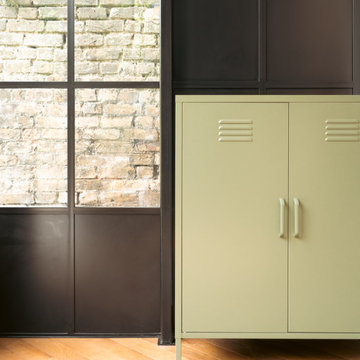
Throughout the project, a series of black metal elements were introduced as sculptural interventions – each marking moments of transformation within the house. These included the bespoke steel framed circular window, a custom metal staircase, a cylindrical support column, and the striking steel and glass garden pavilion. Together, they formed a coherent architectural language that underscored the project’s bold intent.
Our steel windows and doors played a vital role in delivering the project’s vision. The architects chose steel for its refined sight lines and distinctive material character, which helped bridge the gap between the historical context of the building and the bold new additions.
The black steel frames provided a crisp contrast to the pale London stock brick and added definition to the glazed pavilion, reinforcing the sense of architectural precision. In particular, the fine steel profiles of the garden room allowed the extension to feel both lightweight and immersive, blurring the boundary between the house and its garden.
The architect drew inspiration from the Bauhaus Movement, particularly the work of Walter Gropius, whose approach to functional beauty and industrial materials informed the design of the garden pavilion.
Here, our glazing system was used not just for transparency, but as an expressive architectural element. The carefully proportioned panels help to conceal the roof thickness and reinforce the pavilion’s industrial yet abstract character – a deliberate nod to product design and modernist detailing.
Sustainability was an important factor in the selection of materials. Our steel systems, made from 99% recycled content and 100% recyclable, aligned with the project’s broader environmental goals.
The architects noted that this commitment to material longevity and circularity was central to their decision to use steel. The durability and recyclability of the windows and doors ensured the project met both aesthetic and ethical criteria.
This London terrace house now stands as a celebration of contrast – between heritage and innovation, solidity and transparency, tradition and transformation. Our steel windows and doors were not simply components; they were essential tools in crafting a home that is as bold and expressive as it is functional.
The result is a home designed for modern family life, where light, space, and materiality come together in perfect harmony.
Find the right local pro for your project
 Total Home
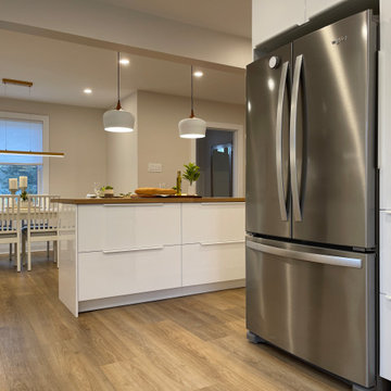
We are very proud of this kitchen renovation, for an older home in Kemptville. The house as you can see from the before photos, was quite dated, to the original kitchen, so it was time for an upgrade.
We removed a wall, separating the dining area to the kitchen, and had to install a beam above the island. We simply clad it in drywall for a clean aesthetic.
You would not know that these two spaces were one and the same.
The quality and care Gilbert executed in this renovation is top notch!
Another quality project by Total Home.
 Sierra Living Concepts Inc
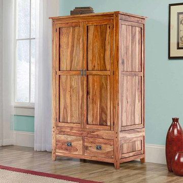
Dimension: 42" L X 24" D X 72" H
Wardrobes and armoires are simply a more compact and pragmatic form of walk-in closets, and allow you to complement your room interiors with their unique styles. Now you can keep things handy while adding an extra oomph to your space with our Delaware Solid Hardwood 2 Drawer Rustic Wardrobe Armoire.
This solid Rosewood wardrobe features a distinctly rustic style design. The double-doors sit snugly atop the 2 adjacent deep-storage drawers. The door leafs have been crafted in the rustic ‘barn door’ style with a smart wooden trim and are complemented by stylized hand-wrought metal handles – a sure win when you’re working with an interior design theme.
The inside is just as impressive. Upon opening the wardrobe, you’ll be immediately greeted by an ample amount of hanging space outfitted by a hanging rod where you can hang your clothes. Right below it are 2 open shelves where you can assemble all your accessories including jewelry, cosmetics, purses and more.
Handcrafted from solid Rosewood, this wardrobe warrants a strong, sturdy and resilient heirloom quality. Coupled with its beautiful striations, organic finish, even the stain of this piece is applied by hand. The versatile aesthetic of this solid hardwood armoire wardrobe also ensures that it can be paired with a number of interior design styles. Want something to complement your rustic or country-chic interiors? This is your piece! Want something shabby chic to complete your bedroom aesthetic? This armoire is the best there is!
Special Features:
• 100% Handcrafted
• Solid Rosewood craftsmanship
• Rustic style design
• Barn-door inspired door leafs
• Stylish door & drawer handles
• Metal rod to hang clothes
• 2 drawers at the bottom
• 2 open shelves inside
• Can be custom-made to have adjustable/removable shelves upon request
• Heirloom quality
• Easy to clean and maintain
Note: Real wood is a product of nature, and as such, no two pieces are alike. Variations in solid wood grain patterns are to be expected and make each furniture uniquely beautiful, just like us humans.
 The Amendola Group, Inc.
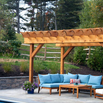
At THE AMENDOLA GROUP, INC., we design + build landscapes and outdoor living spaces with attention to detail, style, and high-quality craftsmanship that is unmatched in the industry.
There are many aspects to consider when hiring a landscaping company for your home or business. Whether you are looking for more privacy, an outdoor living area fit for entertaining, or you simply want to enhance the aesthetics of your property, the team at Amendola Landscapes, Inc. can design the perfect landscape for you.
Your vision is our top priority. We are not satisfied with our work until we have exceeded our client's expectations. We take pride in the quality of our work and it shows—much of our new business is based on client referrals.
No matter the size of the job, Amendola Landscapes, Inc. can take care of all your needs. From the design phase right through the final product, we are always professional and we always over-deliver.
THE AMENDOLA GROUP, INC. — a partner with Amendola Landscapes, Inc. — is a full-service landscape design, build, and maintenance firm located in Dutchess County, NY.
OUR SERVICES INCLUDE: Landscape design | 3d renderings | Custom stonework including both natural stone and UNILOCK pavers and wall stone | Excavation | Custom decking | Landscape lighting | Waterscapes | Commercial snow removal | Professional lawn and garden maintenance
 Get It Together Inc.
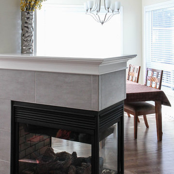
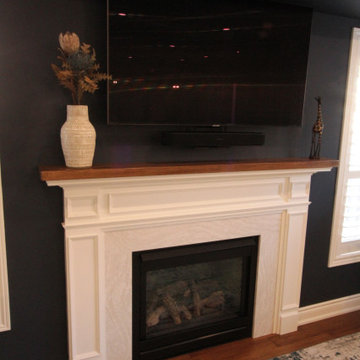
We had the 3 tiers removed from the fireplace mantle to open up this space.
Photos by: Ruth Skiffington Photography
Inspiration for a mid-sized transitional open concept medium tone wood floor living room remodel in Calgary with white walls, a two-sided fireplace, a tile fireplace and a tv stand
Inspiration for a mid-sized transitional open concept medium tone wood floor living room remodel in Calgary with white walls, a two-sided fireplace, a tile fireplace and a tv stand


 Keystone Fabrics
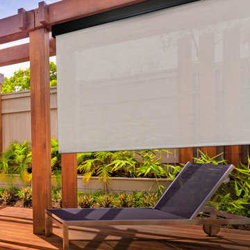
Are you hot and uncomfortable in your outdoor spaces? If so, Keystone Fabrics cordless outdoor sun shades are the perfect solution. Our shades are made from a high quality, durable PVC fabric. With up to 90% UV block, these shades keep your space cool, while lowering your energy costs, reducing blinding glare and fading of furniture. Simply roll your shades down, using the pole and hand crank system, before heat starts building up on your window, porch or patio and start enjoying your outdoor space again. An installation template and removable pole are included. These shades are available in a variety of colors and sizes.
 Kitchen Tune-Up Franchise System
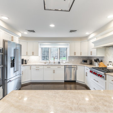
Your kitchen is the heart of your home, but if it's outdated and in desperate need of a makeover, it can be difficult to enjoy spending time in it. Fortunately, a kitchen reface update can completely transform your space and give it a fresh, modern look without the need for a full remodel. And if you're looking for a timeless and elegant design, a white shaker reface may be just what you need.
Why Choose a White Shaker Reface?
The white shaker style is a classic design that has been popular for decades. It features clean, simple lines and a versatile color that can be easily paired with a wide range of decor styles. White shaker cabinets are also a great choice for those who want a bright and airy kitchen, as the light color reflects natural light and makes the space feel larger.
When it comes to a reface update, choosing a white shaker design can help to modernize your kitchen and make it feel more up-to-date. Whether your existing cabinets are dark and dated, or simply in need of a refresh, a white shaker reface can give them a fresh new look that will stand the test of time.
The Refacing Process
One of the benefits of a reface update is that it is a much quicker and less invasive process than a full remodel. Instead of tearing out your existing cabinets and starting from scratch, a reface involves removing the doors and drawers and replacing them with new ones that are custom-made to fit your existing cabinets.
In the case of a white shaker reface, your new doors and drawers will feature the classic shaker style, with clean lines and a fresh white finish. You may also choose to update other elements of your kitchen, such as the hardware or countertops, to complete the look.
 Keystone Fabrics
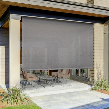
Are you hot and uncomfortable in your outdoor spaces? If so, Keystone Fabrics cordless outdoor sun shades are the perfect solution. Our shades are made from a high quality, durable PVC fabric. With up to 92% UV block, these shades keep your space cool, while lowering your energy costs, reducing blinding glare and fading of furniture. Simply roll your shades down, using the pole and hand crank system, before heat starts building up on your window, porch or patio and start enjoying your outdoor space again. An installation template and removable pole are included. These shades are available in a variety of colors and sizes.
 Forward Design Build Remodel
Goals
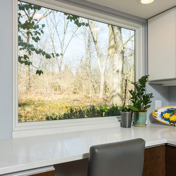
Our clients loved the functionality of their kitchen, however, not the outdated look. They desired to keep the kitchen’s original layout while simply bringing in a modern aesthetic.
Our Design Solution
We began by removing the rounded cabinets and countertops and replacing them with a modern flat paneled cabinet and a large white counter. We brought the counter down the side of the cabinet for a unique modern element. Enlarging the window behind the sink allowed for more natural light to flood the space and warm up the new light gray walls. Making the counters one level instead of two opened up the space as well. All the appliances were updated and the fridge was hidden behind cabinet doors for a modern finish.

 Specialty Air Inc
Always make sure that the air ducts for your air conditioner are checked periodically to clean out the dirt that builds up as the dirty vents can strain the HVAC system and affect the indoor air quality. Read the blog for detailed information.
 Accurate Painters
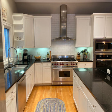
The stained wooden cabinets were original to the house and the homeowner was looking for a refinnish to brighten up the kitchen and revitalize the space. Cabinet boxes were finished with low-VOC enamel and cabinet doors were sprayed with cabinet lacquer, all in Ben-Moore Simply White. Dated backsplash was removed and replaced with subway tile to update overall appearance.

 Total Home
We are very proud of this kitchen renovation, for an older home in Kemptville. The house as you can see from the before photos, was quite dated, to the original kitchen, so it was time for an upgrade.
We removed a wall, separating the dining area to the kitchen, and had to install a beam above the island. We simply clad it in drywall for a clean aesthetic.
You would not know that these two spaces were one and the same.
The quality and care Gilbert executed in this renovation is top notch!
Another quality project by Total Home.
 Fabco Sanctuary
The architect and designer Guy Derwent was approached by his client with a clear and compelling brief: to completely transform a grand Victorian terrace house they were planning to renovate. The client envisioned something far beyond a standard renovation – this was to be a bold and dramatic reimagining of a family home that could grow with them over time.
With the property having remained largely untouched for more than fifty years, the architects saw an opportunity to unlock its potential and deliver a contemporary design that would contrast beautifully with its Victorian heritage.
The existing layout consisted of a series of small, disconnected rooms to the rear of the house. To respond to the client’s need for openness and flexibility, the architect proposed a radical restructuring of the ground floor:
The rear rooms were completely removed
Suspended timber floors were lowered by up to two metres to align with the garden
Two bold extensions were added
The first extension filled in the side return with a London stock brick facade and a glazed roof, while the second – a striking black steel and glass pavilion was glazed on three sides and placed along the garden elevation.
This new pavilion redefined the building’s relationship with the garden. Its steel-framed glazing created a seamless dialogue between interior and exterior, offering a sense of immersion in the surrounding landscape.
At the heart of the plan sits a dramatic, five-metre-tall dining space that acts as a transition from the original entrance hall into the new addition. A large, circular cast-glass window, framed in steel, provides a visual and spatial link between old and new, allowing light and movement to travel through the depth of the home.
Throughout the project, a series of black metal elements were introduced as sculptural interventions – each marking moments of transformation within the house. These included the bespoke steel framed circular window, a custom metal staircase, a cylindrical support column, and the striking steel and glass garden pavilion. Together, they formed a coherent architectural language that underscored the project’s bold intent.
Our steel windows and doors played a vital role in delivering the project’s vision. The architects chose steel for its refined sight lines and distinctive material character, which helped bridge the gap between the historical context of the building and the bold new additions.
The black steel frames provided a crisp contrast to the pale London stock brick and added definition to the glazed pavilion, reinforcing the sense of architectural precision. In particular, the fine steel profiles of the garden room allowed the extension to feel both lightweight and immersive, blurring the boundary between the house and its garden.
The architect drew inspiration from the Bauhaus Movement, particularly the work of Walter Gropius, whose approach to functional beauty and industrial materials informed the design of the garden pavilion.
Here, our glazing system was used not just for transparency, but as an expressive architectural element. The carefully proportioned panels help to conceal the roof thickness and reinforce the pavilion’s industrial yet abstract character – a deliberate nod to product design and modernist detailing.
Sustainability was an important factor in the selection of materials. Our steel systems, made from 99% recycled content and 100% recyclable, aligned with the project’s broader environmental goals.
The architects noted that this commitment to material longevity and circularity was central to their decision to use steel. The durability and recyclability of the windows and doors ensured the project met both aesthetic and ethical criteria.
This London terrace house now stands as a celebration of contrast – between heritage and innovation, solidity and transparency, tradition and transformation. Our steel windows and doors were not simply components; they were essential tools in crafting a home that is as bold and expressive as it is functional.
The result is a home designed for modern family life, where light, space, and materiality come together in perfect harmony.
 Classic Kitchens Designs & Renovations Ltd.
This project started with an older kitchen that really needed some pizzazz and an update to a more open concept look. We started by removing the old support wall between the kitchen and living room and installing a new support beam to handle the weight. once that had been accomplished, the new hardwood floor was put down followed by new cabinetry painted in Benjamin Moores "Simply White" with the complimentary Island colour "Hale Navy". Cambria 3cm thick quartz countertops were then installed with a beautiful white undermount sink and stunning Brushed gold faucet to match the door hardware. We then installed the finishing touch, the subway backsplash and specially selected detailed mosaic tile behind the stove and exhaust hood for a stunning final result. Matching light fixtures also carried the brushed gold theme to a new level....outstanding!!!
 User
UserAll Weather teamed up with the Property Brothers and Queen of Broadway Idina Menzel on this week’s episode of HGTV’s hit show CELEBRTIY IOU. In the Idina Menzel’s Slam Dunk Reno episode, Idina pivots from her award-winning stage, film and music success to give back and surprise her good friend and son’s basketball coach James, by transforming his detached garage into a dedicated office and athletic retreat.
James Hunt founded Culture Run, a youth basketball program that gives kids the skills to succeed in both basketball and life. With IDINA MENZEL’S surprise renovation, James is one step closer to running a centralized training facility and headquarters where kids can drop by for counseling, basketball tips, and more.
When the PROPERTY BROTHERS meet up with Idina to demo the garage, they involve her in every step. Menzel gets her hands dirty by swinging a sledgehammer, operating an electric hand saw and removing storage bins. “I didn’t know they get as down and dirty as they do,” Menzel commented. “I also didn’t know they were gonna have me do so much!” Menzel also helped choose the tile, cabinets, hardware, flooring and the overall color palette.
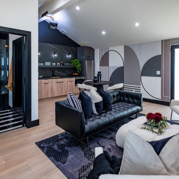
All the effort was worthwhile because Menzel was able to surprise James with the basketball hangout and showstopping of his dreams. The newly dedicated office and athletic retreat features All Weather SERIES 7000 French Swing Doors and SERIES 5000 casement and fixed windows to allow natural light and fresh air in; a sleek kitchenette with an induction cooktop; a modern bathroom with a 7 1/2′ tall shower head for basketball players; a comfortable seating area for James to review film, meet with his players or simply relax; and a unique basketball themed wall mural.
Check out more PROJECT PHOTS here.
Now in its third season, Celebrity IOU gives celebrities a chance to show their deepest gratitude to friends, family and mentors by giving them a surprise renovation courtesy of Drew and Jonathan Scott.
 Kitchen Culture Cambridgeshire
Nestled in a home in Thrapston, this stunning kitchen was the result of a chance connection over golf, and it turned into something simply perfect for a lovely family.
There’s a great story behind this kitchen. It might never have happened if not for a few golf lessons with a brilliant local pro, who, as it turned out, needed a kitchen. The result is a beautiful room that we’re proud to have delivered from start to finish.
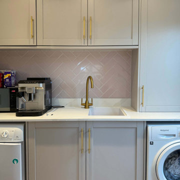
We used Crown Imperial’s Midsomer range for this project, painted in Sage and Blush. The Royal Calacatta Gold Quartz worktops bring a soft, luxurious feel to the space, and the Karndean herringbone floor adds warmth and texture underfoot. Bosch appliances and a standout gold Quooker tap bring both function and flair. That Quooker, especially, was a decision that took a bit of bravery, but it paid off.
There are a few design details that really make this kitchen special to us. The tall units in Blush add a soft accent, with matching tiles at the opposite end of the room to tie the whole space together. A curved pilaster helps soften the corner, making the tall units feel less imposing. And the centralised hob with integrated canopy hood gives the room a far cleaner, more balanced finish, even if it did require a bit of head scratching during the design stage.
We handled the entire project, from removing the old kitchen to the final finishing touches. That included plumbing, electrics, plastering, and the new flooring—every step was taken care of by our team.
This kitchen is more than just a pretty space – it’s full of considered design choices and lovely touches that really suit the family who lives here. We adore how it turned out. A truly lovely room for a lovely family.
 Forward Design Build Remodel
Goals
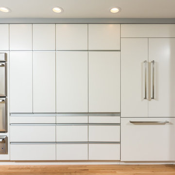
Our clients loved the functionality of their kitchen, however, not the outdated look. They desired to keep the kitchen’s original layout while simply bringing in a modern aesthetic.
Our Design Solution
We began by removing the rounded cabinets and countertops and replacing them with a modern flat paneled cabinet and a large white counter. We brought the counter down the side of the cabinet for a unique modern element. Enlarging the window behind the sink allowed for more natural light to flood the space and warm up the new light gray walls. Making the counters one level instead of two opened up the space as well. All the appliances were updated and the fridge was hidden behind cabinet doors for a modern finish.
 J.P. Hoffman Design Build
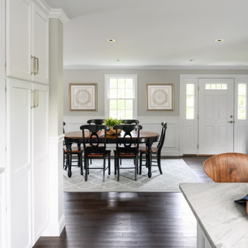
These homeowners came to J.P. Hoffman Design Build, looking for a creative solution to a problem they were told couldn’t be fixed. We defied the odds with our Design Build process and redesigned most of this Colonial’s first floor. Space for an island was number one on the want list. In order to achieve that goal, we did what we always do, We listened. We listened to what our client needed, how they used their space and how they envisioned their space. Then we designed a creative solution that made that seemingly unachievable vision, a reality. We removed the wall between the dining room and kitchen and expanded the kitchen cabinets into the hallway, once used to access the bathroom and garage. We simply re-routed the flow to the garage, through the now opened-up dining room, and in the process, created a new hallway with a coat closet, mudroom bench and access to the powder room which we also refreshed. In the kitchen, we relocated the slider leading out to the deck. This allowed for more cabinets and the floor space for that dream island. Our carpentry team installed a new kitchen window and slider, while modifying the existing deck to allow for the change. We installed new flooring, cabinets, countertops, plumbing fixtures and more. We receive lots of inquires about increasing function within the first floor. This project is a fantastic example of how it can be achieved, without an addition.
51