
Search results for "Simply remove" in Home Design Ideas
 Keystone Fabrics
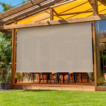
Are you hot and uncomfortable in your outdoor spaces? If so, Keystone Fabrics cordless outdoor sun shades are the perfect solution. Our shades are made from a high quality, durable PVC fabric. With up to 92% UV block, these shades keep your space cool, while lowering your energy costs, reducing blinding glare and fading of furniture. Simply roll your shades down, using the pole and hand crank system, before heat starts building up on your window, porch or patio and start enjoying your outdoor space again. An installation template and removable pole are included. These shades are available in a variety of colors and sizes.
 The Amendola Group, Inc.
At THE AMENDOLA GROUP, INC., we design + build landscapes and outdoor living spaces with attention to detail, style, and high-quality craftsmanship that is unmatched in the industry.
There are many aspects to consider when hiring a landscaping company for your home or business. Whether you are looking for more privacy, an outdoor living area fit for entertaining, or you simply want to enhance the aesthetics of your property, the team at Amendola Landscapes, Inc. can design the perfect landscape for you.
Your vision is our top priority. We are not satisfied with our work until we have exceeded our client's expectations. We take pride in the quality of our work and it shows—much of our new business is based on client referrals.
No matter the size of the job, Amendola Landscapes, Inc. can take care of all your needs. From the design phase right through the final product, we are always professional and we always over-deliver.
THE AMENDOLA GROUP, INC. — a partner with Amendola Landscapes, Inc. — is a full-service landscape design, build, and maintenance firm located in Dutchess County, NY.
OUR SERVICES INCLUDE: Landscape design | 3d renderings | Custom stonework including both natural stone and UNILOCK pavers and wall stone | Excavation | Custom decking | Landscape lighting | Waterscapes | Commercial snow removal | Professional lawn and garden maintenance
 FRONTGATE
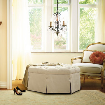
You're sure to fall head-over-heels for our Serena Shoe Ottoman. Exquisitely tailored and masterfully crafted, Serena elegantly keeps your shoes organized and easy to find. Simply open the hinged top to reveal 15 removable pockets along the perimeter and ample room in the middle for boots, belts or handbags. With its button-tufted upholstered seating, dressmaker's skirting and fleur-de-lis medallions, Serena is a beautiful way to declutter.
Find the right local pro for your project
 LBK Design Build
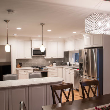
This was a fun project because the original kitchen was so small even though the house is approximately 2000 square ft. By simply opening the space by removing a non load bearing wall sperating the dining room, we made a dramatic change in the way the home owners can use the space. Aside from having the use and conveniences of a modern day kitchen, they are now able to effectively entertain their guests, which they now do more often.
 Accurate Painters
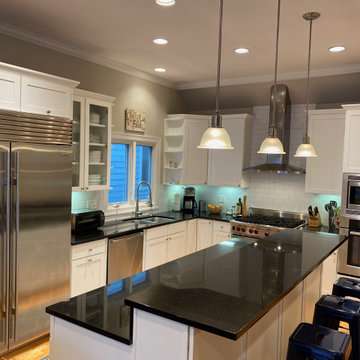
The stained wooden cabinets were original to the house and the homeowner was looking for a refinnish to brighten up the kitchen and revitalize the space. Cabinet boxes were finished with low-VOC enamel and cabinet doors were sprayed with cabinet lacquer, all in Ben-Moore Simply White. Dated backsplash was removed and replaced with subway tile to update overall appearance.
 Jennifer Gilmer Kitchen & Bath
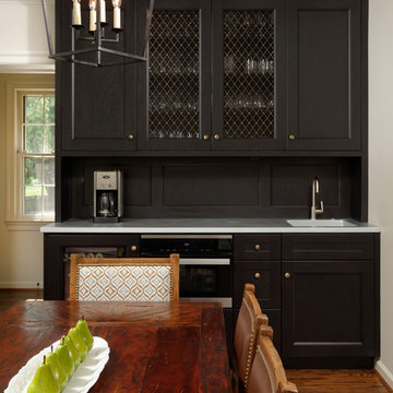
Alexandria, Virginia Transitional Kitchen Design with Intriguing Zinc Accents by #MeghanBrowne4JenniferGilmer. Taking a holistic approach to the space, we moved the doorway to the garage first and created a new entrance with a mini-mud room with shelving and catch-all space that helps contain clutter as people enter the home. With the doorway removed from the center of the kitchen, we were also able to create an expansive countertop run with the zinc hood and blue range centered in the space for an ideal work zone. On the adjacent wall, we simply replaced the windows with shorter windows to allow for the sink to sit underneath and overlook the backyard.
Photography by Bob Narod. http://www.gilmerkitchens.com/
 Quadra-Fire Wood & Pellet Stoves
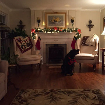
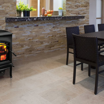
The Explorer II delivers beautiful, powerful performance you can see. Get maximum heat and a clean burn with the Quadra-Fire four point burn system delivering up to 65,800 BTU's. Save time with Quadra-Fire's exclusive Automatic Combustion Control (ACC). Simply load the wood, light the fire and walk away. Quadra-Fire's ash removal system (ARS) makes cleaning quick and easy. Enjoy the looks and performance of cast iron with a solid steel welded firebox - proving it's built to last.


 Fiorito Interior Design
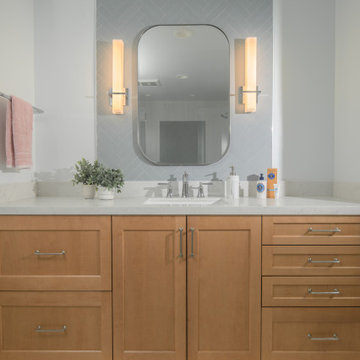
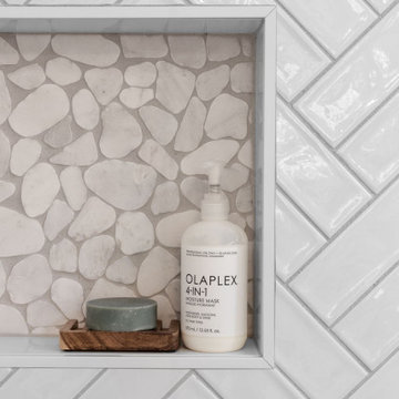
When purchasing a new home, clients often inherit outdated spaces that are either dysfunctional or simply unappealing. Such was the case for a couple who came to me with a cramped primary bathroom. Defined by an unmistakable 1980s aesthetic and a truly perplexing layout, the space was divided into a maze of enclosed areas, including a walled-in shower and an awkward corner vanity.
By fully gutting the room, we were able to reimagine it from the ground up, creating a space that feels open, expansive, and inviting. With the partition walls removed, natural light now flows freely throughout. The design direction, guided by the clients, centers on calm and serenity. A restrained palette of pale marble and sky-blue accent tiles—laid in a herringbone pattern at the vanity and echoed in the generous shower—creates a quiet sense of rhythm and ease.
There is nothing to distract, nothing to disrupt—just a soothing space to begin the day or unwind in the evening.
Photos: Bernardo Grijalva
 THE Remodel Group
A luxurious en suite bath was created within this classic 1925 Portland bungalow by reconfiguring the second story’s original small bedrooms and tiny half bath. In this welcoming new urban boho space, eclectic finishes mingle harmoniously, integrated through subtle repetition of shapes and materials.
A furniture-style vanity sets the tone for this luxurious space, introducing materials, colors, shapes, and textures that repeat throughout. Individual walnut hexagons join to create distinctive vanity doors, offset beautifully by horizontal-grain drawers. Topping the cabinetry is a simple concrete countertop with integral sinks. An expansive framed mirror above enlarges and brightens the room. Within the mirror, sconces float, their globes a nod to the hexagons below. Champagne bronze fixtures reflect the warm walnut glow. Nestled into the back corner, a stunning shower features waterjet tiles in a double herringbone pattern, each precisely cut and laid to maintain design integrity at every surface transition. Teak floor tiles and a pebbled niche hint at the classic spa experience. Across from the shower, a large hexagonal window provides a treetop view from the free-standing tub below. The gentle oval of the tub and the beaded chandelier above provide a pleasing contrast to the strong lines surrounding it, as do the softly-shaded pebbles in the full-length niche. Shiplap wainscotting wraps the room, creating an illusion of height in the compact space. Subtle flooring and soft green walls create an understated backdrop for the bold mix of materials, unifying them into a serene oasis.
Asking a century-old home to accommodate a modern luxury bath is a tall order. Asbestos-laden plaster and flooring had to be abated. The subfloor had to be leveled and reinforced to increase strength and prevent deflection. Water lines and multiple electrical circuits had to be brought across and up without disturbing a beautifully-paneled ceiling, something we accomplished by firring out stair walls to hide the chases. Our client had visions of a leafy view from her tub, but the new layout eliminated existing windows. Placing a new window was complicated by deep eaves and flat soffits. By pushing the header into the roofline, however, we were able to accommodate a picture window. The flat soffit was replaced by an inverse hip lined with stained tongue and groove cedar, tying it to the bathroom finishes. Bringing materials up a narrow staircase became truly challenging when it was time to install the big items. However, strategic removal of drywall around the landing got the job done. Our attention to detail is showcased in the shower tile, where precise cuts were required at surface transitions to maintain the integrity of a complex double herringbone lay. The project was delivered on time.
Savvy layout choices minimized spending on structural changes. Because we were dealing with dormer space, head height was an issue. Raising the ceiling would have been complex and expensive so our design accommodated the constraints – tub on the low outside wall, shower on the full-height interior wall. The vanity spanned the spread, accommodating our petite client on the exterior side and her taller husband on the interior side. An under-eave closet was closed off to create room for both a freestanding tub and a separate shower. Rather than building replacement storage elsewhere, we simply added a new door into the closet from the primary bedroom. This was made possible by absorbing the short hallway separating the existing bed and bathroom into the primary bedroom. This new layout also created an en suite relationship between the primary bedroom and the new bath. We saved additional dollars by selecting a furniture-style vanity rather than using custom cabinetry, and the countertop with integral sinks provided a cost savings over a more traditional quartz countertop with undermount sinks. Affordable shower tiles allowed us to put more money into a dynamic tile layout. The project was delivered within budget.
 Classic Kitchens Designs & Renovations Ltd.
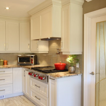
We started with an older home that had a very dated kitchen with an older closed room design that needed to change to open concept to work with how today's families live in their home. To walls were removed to open the floorplan and new porcilain tile and 3/4 oak hardwood were installed to visually separate the family room from the kitchen area. New, custom coloured Benjamin Moore painted Cabinetry was then installed with a custom Island In Alderwood "Espresso" colour. Granite countertops were selected and a Glass Subway tile was installed, complete with a Pot filler over the stove and high volume exhaust fan. The result is simply stunning!! We have also included before pictures to show where we started, and this new kitchen has really come a long way. What a Game Changer!!!!
 Cynthia J. Hoffman Interior Design, Inc.
1953 CAPE COD KITCHEN/POWDER ROOM UPDATE
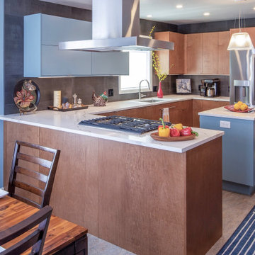
A young couple contacted us to update their 1953 Cape Cod after having seen another of our projects. They were inspired by the open kitchen and wanted a more open, spacious kitchen for their home. This was accomplished by removing the wall between the dining room and kitchen.
The house posed a bit of a problem as the floors were not level. After the structural engineer we recommended made the house as level as possible we were able to work around the slight tilt by designing cabinetry with custom toe kicks to bring the countertops to level.
The wish list included light wood tone cabinets with ample counter space and a sustainable, renewable floor. We selected Marmoleum linoleum floor with a marbleized pattern and we incorporated a contrasting pale blue upper cabinet and island to break up the look.
A pantry as well as a place for the clients’ CO2 tank for homemade carbonated drinks and a mud room area were requested . The entrance from the screened-in porch was a perfect place for beadboard paneling with coat hooks and a bench for the client’s Mother to sit down to put on her shoes.
After exploring, at the client’s request, a new location for the Powder Room, we were able instead to simply reconfigure the fixture locations. A spa-like look was created with the large format blue marbleized porcelain tile, a custom wood floating countertop with vessel sink and good lighting.
 Drury Design
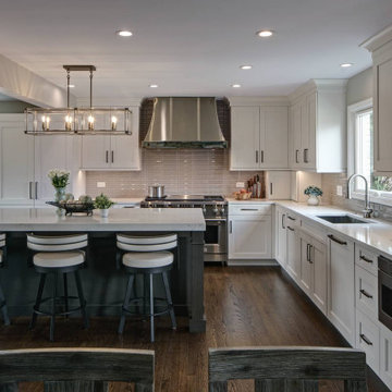
Design objectives for the remodel were aimed at giving the kitchen a larger feel, more room for cooking and extra seating for entertaining:
-Island with seating
-Space for a larger range/cooking area
-More storage with cabinets to the ceiling
-Making the original dining room blend with the kitchen so it all feels like one space
Design challenges to be solved:
-Making the header between the kitchen and the old dining room make sense as we combined the two spaces
-Avoid feeling crammed – a large island with seating still needed space for people walking around the space
-Refrigerator location – the header and window placements needed to stay, so finding a new and functional place for the fridge was a priority
-Add a large hood for wow-factor appeal
Design solutions fell into place as the overall layout came together:
-A large island to seat their four-person family comfortably. -Seating on two sides of the island improves conversation and has a great look.
-Knocking out a dining room wall gave us more room for the island. The leftover part of the dining was perfect for a dry bar/beverage area.
-The refrigerator needed to blend in and also be easily accessible. We removed the built-in pantry and used this space to house the refrigerator/freezer. Then we added tall pantry cabinets throughout the kitchen to make up for the loss of space.
-A large metal hood broke up the space and made for a fun statement piece
The new space is perfect for family time when the kids are back. It’s more conducive for being together, hanging out together, and entertaining with different friend groups together… the family simply spends more time together when they’re together in their new space.
“It’s the design and the openness,” the mom says. “Everybody loves it and gathers around the island all the time. It’s the lighting, too – it’s brighter in here. It’s just more open. We love it!”
 Crystal Kitchen + Bath
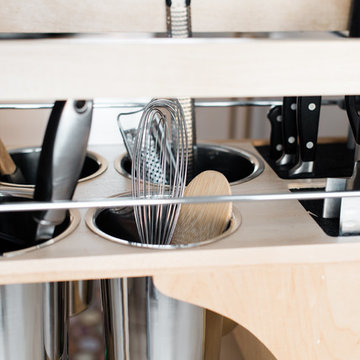
Infusing this once, drab 80’s kitchen with light and color was one goal in this extensive remodel. By removing the wall separating the dining room from the kitchen, the space doubled in size and allowed natural light to flood it.
Creating a design that filled the space yet remained very functional to the homeowner was extremely important. By implementing the two working triangles, one homeowner can be using the sink, cooktop and refrigerator while the other uses the secondary island for food prep as it has an additional sink.
A large soffit housing HVAC runs through the middle of the townhome and seemed intrusive to the space at first. After embracing it in the design, it’s as if it were meant to be. Three aluminum framed cabinets hang below, one directly underneath the soffit to create an asymmetrical design.
On a budget but still wanting a beautiful design, Crystal’s semi-custom line of cabinetry came into play. Simply White and Light Grey provide the perfect backdrop for natural maple, brushed gold hardware and accessories that infuse the space with color. Inside the cabinetry, the best storage solutions make for an extremely functional kitchen!
What a dream it is to have a kitchen that boasts quality, functionality and makes a person feel inspired within it.
Photography: Paige Kilgore

 Accurate Painters
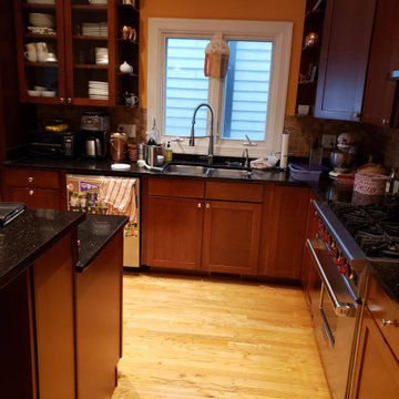
The stained wooden cabinets were original to the house and the homeowner was looking for a refinnish to brighten up the kitchen and revitalize the space. Cabinet boxes were finished with low-VOC enamel and cabinet doors were sprayed with cabinet lacquer, all in Ben-Moore Simply White. Dated backsplash was removed and replaced with subway tile to update overall appearance.
 Fiorito Interior Design
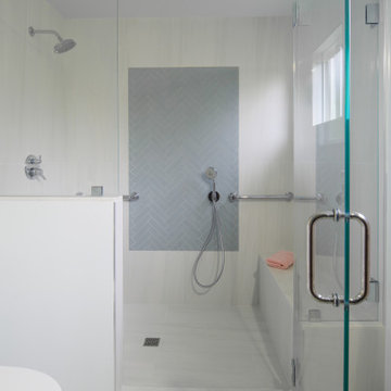
When purchasing a new home, clients often inherit outdated spaces that are either dysfunctional or simply unappealing. Such was the case for a couple who came to me with a cramped primary bathroom. Defined by an unmistakable 1980s aesthetic and a truly perplexing layout, the space was divided into a maze of enclosed areas, including a walled-in shower and an awkward corner vanity.
By fully gutting the room, we were able to reimagine it from the ground up, creating a space that feels open, expansive, and inviting. With the partition walls removed, natural light now flows freely throughout. The design direction, guided by the clients, centers on calm and serenity. A restrained palette of pale marble and sky-blue accent tiles—laid in a herringbone pattern at the vanity and echoed in the generous shower—creates a quiet sense of rhythm and ease.
There is nothing to distract, nothing to disrupt—just a soothing space to begin the day or unwind in the evening.
Photos: Bernardo Grijalva
 Ranney Blair Home Renovations
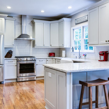
Eat-in kitchen - mid-sized country u-shaped medium tone wood floor and brown floor eat-in kitchen idea in Atlanta with a farmhouse sink, shaker cabinets, gray cabinets, quartz countertops, white backsplash, ceramic backsplash, stainless steel appliances and a peninsula
 Drury Design
THE SETUP
Senior Designer Diana Burton’s client loved her sixties-era home – it just needed some work. The cozy galley kitchen was narrow and mostly closed off from the family room. A pass-through window served as a limited pipeline for treats and chatter. The appliances were failing, too. It was simply time for an overhaul.
Design Objectives:
Remove load bearing wall and open kitchen to the family room
Omit large unused fireplace in family room
Increase work surfaces and overall storage solutions
Dedicated small countertop appliance storage
Seating for 3 or 4 at island
Add pantry storage
Offer solution for lack of mudroom
Upgrade all appliances
THE REMODEL
Design Challenges:
Finding a location to hide structural support for new beam
Reworking awkward configuration of existing walls
Adding a walk-in pantry
Creating mudroom storage
Allowing room for large sectional in family room
Design Solutions:
Add a discreet column by the fridge to hide essential support
Flush out wall by bath to be even with the range wall, where the new walk in pantry exists
Use void space behind new wall for large appliance garage
Create combination walk in pantry/mudroom by adding bench with shoe storage and hooks
Maintain island depth for comfortable seating without infringing on space for the sectional
THE RENEWED SPACE
This cramped, dated kitchen has a new lease on life! Opening it to the family room dramatically transformed the space. Diana’s client now has plenty of storage, a big island for food prep, and an open-concept space that’s perfect for entertaining and hanging out with friends and family.
 Classic Kitchens Designs & Renovations Ltd.
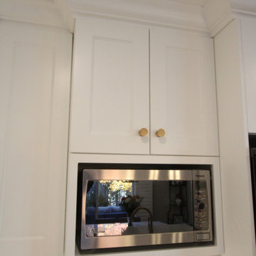
This project started with an older kitchen that really needed some pizzazz and an update to a more open concept look. We started by removing the old support wall between the kitchen and living room and installing a new support beam to handle the weight. once that had been accomplished, the new hardwood floor was put down followed by new cabinetry painted in Benjamin Moores "Simply White" with the complimentary Island colour "Hale Navy". Cambria 3cm thick quartz countertops were then installed with a beautiful white undermount sink and stunning Brushed gold faucet to match the door hardware. We then installed the finishing touch, the subway backsplash and specially selected detailed mosaic tile behind the stove and exhaust hood for a stunning final result. Matching light fixtures also carried the brushed gold theme to a new level....outstanding!!!
 J.P. Hoffman Design Build
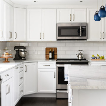
These homeowners came to J.P. Hoffman Design Build, looking for a creative solution to a problem they were told couldn’t be fixed. We defied the odds with our Design Build process and redesigned most of this Colonial’s first floor. Space for an island was number one on the want list. In order to achieve that goal, we did what we always do, We listened. We listened to what our client needed, how they used their space and how they envisioned their space. Then we designed a creative solution that made that seemingly unachievable vision, a reality. We removed the wall between the dining room and kitchen and expanded the kitchen cabinets into the hallway, once used to access the bathroom and garage. We simply re-routed the flow to the garage, through the now opened-up dining room, and in the process, created a new hallway with a coat closet, mudroom bench and access to the powder room which we also refreshed. In the kitchen, we relocated the slider leading out to the deck. This allowed for more cabinets and the floor space for that dream island. Our carpentry team installed a new kitchen window and slider, while modifying the existing deck to allow for the change. We installed new flooring, cabinets, countertops, plumbing fixtures and more. We receive lots of inquires about increasing function within the first floor. This project is a fantastic example of how it can be achieved, without an addition.
 Kitchen Culture Cambridgeshire
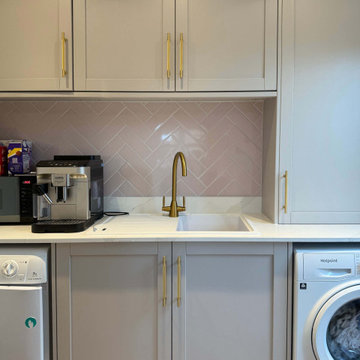
Nestled in a home in Thrapston, this stunning kitchen was the result of a chance connection over golf, and it turned into something simply perfect for a lovely family.
There’s a great story behind this kitchen. It might never have happened if not for a few golf lessons with a brilliant local pro, who, as it turned out, needed a kitchen. The result is a beautiful room that we’re proud to have delivered from start to finish.
We used Crown Imperial’s Midsomer range for this project, painted in Sage and Blush. The Royal Calacatta Gold Quartz worktops bring a soft, luxurious feel to the space, and the Karndean herringbone floor adds warmth and texture underfoot. Bosch appliances and a standout gold Quooker tap bring both function and flair. That Quooker, especially, was a decision that took a bit of bravery, but it paid off.
There are a few design details that really make this kitchen special to us. The tall units in Blush add a soft accent, with matching tiles at the opposite end of the room to tie the whole space together. A curved pilaster helps soften the corner, making the tall units feel less imposing. And the centralised hob with integrated canopy hood gives the room a far cleaner, more balanced finish, even if it did require a bit of head scratching during the design stage.
We handled the entire project, from removing the old kitchen to the final finishing touches. That included plumbing, electrics, plastering, and the new flooring—every step was taken care of by our team.
This kitchen is more than just a pretty space – it’s full of considered design choices and lovely touches that really suit the family who lives here. We adore how it turned out. A truly lovely room for a lovely family.
50