
Search results for "Simply remove" in Home Design Ideas
 Chicology
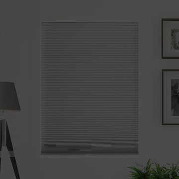
Chicology Cordless Honeycomb Cellular Shades are efficient. Efficient in function. Efficient in performance. Efficient in style. Efficient in design. Efficient in energy. By combining function with stylish design, Chicology Honeycomb Cellular modern blackout shades highlight any room in need while helping against penetrating summer heat or winter air.
The cordless honeycomb cellular shade hexagon unique structure cells design has been mastered to become a premium draft and heat barrier. Chicology Cordless honeycomb cellular blackout shade's marvelous design does an excelent job at being the most energy efficient shades in the market. The honeycomb design does a marvelous job at blocking light out of any room, while also trapping air keeping your home cool in the summer heat and a great insulator in the winter; saving you money on summer/heating energy bills year round. 9/18-inch single cells are lined with blackout fabric that creates the best functional eco-friendly shades while maintaining the Chic look you want. The unique honeycomb cellular fabric is rich, timeless but yet durable. The honeycomb cells open and close in an accordion fashion, with a simple child and pet safe cordless, hassle free lift or pull of a hand. Our cordless lift system provides a fresh look by removing the need for operating cords. Simply cordless, the easy to use cellular shade stays exactly where you want, with no cords attached. Styled in blackout UV protection, energy saver fabrics that block any incoming light beautifully – our blackout window coverings create total sun-cover and complete privacy protection during the day and at night.
The rich crisp fabric is available in a range of stunning beautiful array of colors, from Morning Mist (White), Morning Croissant (Beige), Morning Pebble (Grey), Morning Fog (Dark Grey), Morning Ocean (Blue), Evening Mist (White with Blackout). All colors come with fabric matching head rail and bottom rail color coordinated to match your shade – for a complete and finished look. Installation is quick and easy. Just install the brackets to the wall or ceiling and clip the head rail on. Capable of both inside and outside mount, the width you purchase is exactly the width you get – there is no deduction. It is available in 3 different lengths: 48, 64, and 84.
 Buffy Goodwin Design
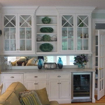
Sun filled, open floor plan kitchen, sunroom and family room. Removed wall to create connected space drenched with light. Glass Slipper walls, Simply White cabinetry.
 Classic Kitchens Designs & Renovations Ltd.
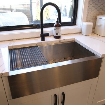
This charming century home is steeped in Oshawa's history, but it needed a facelift that would bring it up to speed for todays living. We removed the tired cabinets and corrected the sagging legacy beam, in order pave the way for a new and fresh look in the kitchen, which was more in keeping with the homeowners lifestyle. New porcilain floors were laid and new shaker style cabinetry was installed, finished with custom Benjamin Moore "Oxford white" paint. Cambria "Brittanica" quartz countertops were used complete with a matching waterfall quartz end to make the look much more contemporary. Mosaic tile was used for the backsplash and open shelving in walnut added to tie in some of the history of the home with the great new look of the kitchen. The end result is simply stunning!
Find the right local pro for your project
 User
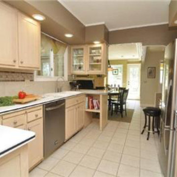
UserWe updated this kitchen by simply replacing dated white appliances with fresh stainless steel and removed all pet paraphernalia. Notice how the kitchen counter was staged with a cutting board and fresh vegetables.
 USI Design & Remodeling
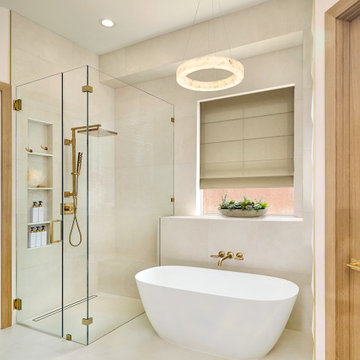
This master bathroom renovation in Frisco was completed for a repeat USI Design & Remodeling client as part of a larger first-floor transformation of the home. The original bathroom reflected a very typical North Texas layout of its era — dark stained cabinetry, granite countertops, compartmentalized vanities, a built-in tub adjoining a framed shower, and separated spaces that no longer aligned with how the homeowners wanted to live. As their aesthetic evolved toward a more transitional and contemporary direction, the goal became less about replacing finishes and more about redefining the experience of the room itself. The project needed to feel calmer, more architectural, and far more intentional in how the space functioned visually and emotionally.
One of the most important changes was removing the original shower curb and pony wall in favor of a fully open curbless shower with ultra-clear ½-inch heavy glass. Achieving that look required recessing the slab, re-floating the shower floor toward a linear drain, and engineering the space so the room would read as visually uninterrupted from end to end. Throughout the project, many of the design decisions were rooted in restraint rather than excess. The oversized 24x48 Porcelanosa flooring carries very little shade variation, creating a quieter visual field, while the cabinetry was executed in rift-sawn white oak specifically because it produces a far more controlled and consistent finish outcome than more common cuts of wood. In luxury projects, consistency itself becomes part of the refinement.
The floating vanity was designed more like custom furniture than traditional cabinetry, utilizing waterfall mitered edges and fully reworked plumbing locations so both homeowners could share in having generous functional countertop space. The original makeup station was repurposed into integrated storage with powered drawers and concealed organization for everyday items such as blow dryers and flat irons. Along the vanity wall, wall-mounted plumbing fixtures were paired with ribbed natural marble surfaces — a detail that required intentional planning long before construction began. Rather than allowing the ribbed material to terminate awkwardly behind the fixtures, the backsplash and stone transitions were specifically designed to resolve those conditions cleanly. Those are the types of details that distinguish highly coordinated design-build work from projects that simply assemble materials together.
While the room contains a significant amount of luxury detailing — from the freestanding tub and geoprism marble focal wall to the custom rift-sawn white oak closet doors and elongated mirrors that leverage the 11-foot ceiling heights — the project was always guided by quiet luxury rather than visual competition. Even the water closet enclosure was handled with restraint through the use of a satin-etched glass door rather than another heavy solid opening. The intent throughout was to create a bathroom that feels restorative and serene rather than overdesigned. In our view, the best luxury spaces are the ones that feel composed long after the initial impression wears off.
 Houseplay Renovations LLC
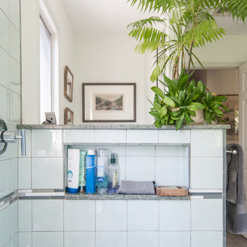
What if your bathroom could be not just lackluster, but a place of real luxury … spacious, fresh, and beautiful? In this project, we gave new life to a bathroom that wasn’t meeting its full potential.
This spacious, sunny bathroom’s layout and design were pre-existing, so the space simply needed freshening up. Our team did just that, through the use of careful planning, new materials, and skilled labor.
With serenity in mind, we created an oasis, painting and tiling to bring the homeowner’s vision to life. While installing new tile required the removal and re-installation of all plumbing fixtures, the transformation was well worth it.
This project is a great example of how choosing materials gives life to a space. Here, the wood-look floor tile, ceramic crackle wall tile, and glass mosaic detail strips join together to create the lush, luxurious look.
Once we’d established a new look for the space, we turned our attention to the finishing touches, such as the deep soaker tub, square drain in the standing shower, and stone tops on the vanity and half-walls. These details complete the room, facilitating a sense of ease and tranquility.
Sometimes, all it takes is a few changes to yield a fantastic result … in this case, a place of peace in the midst of a wild world.
Want to brighten up your home? Contact us; we’re here to help.
Photo Credit: Tamara Templeman
 Total Home
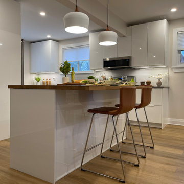
We are very proud of this kitchen renovation, for an older home in Kemptville. The house as you can see from the before photos, was quite dated, to the original kitchen, so it was time for an upgrade.
We removed a wall, separating the dining area to the kitchen, and had to install a beam above the island. We simply clad it in drywall for a clean aesthetic.
You would not know that these two spaces were one and the same.
The quality and care Gilbert executed in this renovation is top notch!
Another quality project by Total Home.


 Level Custom Build
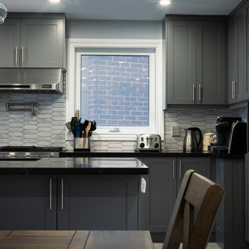
Our team completed this simple and beautiful kitchen in 2023. We removed the kitchen partition wall and installed a 3-ply LVL beam which we then cladded in an unfinished oak veneer. The cabinets were built custom and painted Benjamin Moore Gunmetal - 1902. We also tiled the kitchen, dining and sitting area floor, and backsplash. The idea was to simply maximize the kitchen space but to open up area and allow more natural light in. The clients have a rear addition with a separate living area which made this layout more feasible.
 Kitchen Culture Cambridgeshire
Nestled in a home in Thrapston, this stunning kitchen was the result of a chance connection over golf, and it turned into something simply perfect for a lovely family.
There’s a great story behind this kitchen. It might never have happened if not for a few golf lessons with a brilliant local pro, who, as it turned out, needed a kitchen. The result is a beautiful room that we’re proud to have delivered from start to finish.
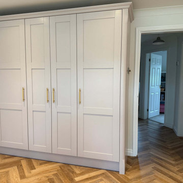
We used Crown Imperial’s Midsomer range for this project, painted in Sage and Blush. The Royal Calacatta Gold Quartz worktops bring a soft, luxurious feel to the space, and the Karndean herringbone floor adds warmth and texture underfoot. Bosch appliances and a standout gold Quooker tap bring both function and flair. That Quooker, especially, was a decision that took a bit of bravery, but it paid off.
There are a few design details that really make this kitchen special to us. The tall units in Blush add a soft accent, with matching tiles at the opposite end of the room to tie the whole space together. A curved pilaster helps soften the corner, making the tall units feel less imposing. And the centralised hob with integrated canopy hood gives the room a far cleaner, more balanced finish, even if it did require a bit of head scratching during the design stage.
We handled the entire project, from removing the old kitchen to the final finishing touches. That included plumbing, electrics, plastering, and the new flooring—every step was taken care of by our team.
This kitchen is more than just a pretty space – it’s full of considered design choices and lovely touches that really suit the family who lives here. We adore how it turned out. A truly lovely room for a lovely family.
 C.E. Pontz Sons
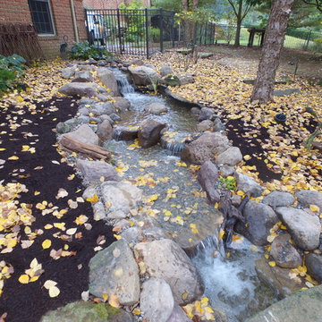
This Pond project consisted of removal and rebuilding of existing stream and pond. All new pond components were installed. The installation included pond liner, pump, rock, skimmer and filtration. This is a complete Aquascape ecosystem pond. The pond is roughly 15’x 20′ at its largest and has a 20′ meandering stream. We also installed a custom fire bowl spillway fountain. The self-contained fire fountain is a water feature with a fire feature in the center making it an ideal focal point or centerpiece to any outdoor setting. We customized this fountain to include a spillway as well. it is no longer self-contained. We incorporated it to work with the pond system. Simply add paraffin or “tiki torch fuel” and you’re ready to go. We also installed an automatic dosing system for ease of maintenance. This Pond was installed in Lancaster, PA. We also did some renovation work on the flagstone walkway along the pond.
 The Amendola Group, Inc.
At THE AMENDOLA GROUP, INC., we design + build landscapes and outdoor living spaces with attention to detail, style, and high-quality craftsmanship that is unmatched in the industry.
There are many aspects to consider when hiring a landscaping company for your home or business. Whether you are looking for more privacy, an outdoor living area fit for entertaining, or you simply want to enhance the aesthetics of your property, the team at Amendola Landscapes, Inc. can design the perfect landscape for you.
Your vision is our top priority. We are not satisfied with our work until we have exceeded our client's expectations. We take pride in the quality of our work and it shows—much of our new business is based on client referrals.
No matter the size of the job, Amendola Landscapes, Inc. can take care of all your needs. From the design phase right through the final product, we are always professional and we always over-deliver.
THE AMENDOLA GROUP, INC. — a partner with Amendola Landscapes, Inc. — is a full-service landscape design, build, and maintenance firm located in Dutchess County, NY.
OUR SERVICES INCLUDE: Landscape design | 3d renderings | Custom stonework including both natural stone and UNILOCK pavers and wall stone | Excavation | Custom decking | Landscape lighting | Waterscapes | Commercial snow removal | Professional lawn and garden maintenance
 THE Remodel Group
A luxurious en suite bath was created within this classic 1925 Portland bungalow by reconfiguring the second story’s original small bedrooms and tiny half bath. In this welcoming new urban boho space, eclectic finishes mingle harmoniously, integrated through subtle repetition of shapes and materials.
A furniture-style vanity sets the tone for this luxurious space, introducing materials, colors, shapes, and textures that repeat throughout. Individual walnut hexagons join to create distinctive vanity doors, offset beautifully by horizontal-grain drawers. Topping the cabinetry is a simple concrete countertop with integral sinks. An expansive framed mirror above enlarges and brightens the room. Within the mirror, sconces float, their globes a nod to the hexagons below. Champagne bronze fixtures reflect the warm walnut glow. Nestled into the back corner, a stunning shower features waterjet tiles in a double herringbone pattern, each precisely cut and laid to maintain design integrity at every surface transition. Teak floor tiles and a pebbled niche hint at the classic spa experience. Across from the shower, a large hexagonal window provides a treetop view from the free-standing tub below. The gentle oval of the tub and the beaded chandelier above provide a pleasing contrast to the strong lines surrounding it, as do the softly-shaded pebbles in the full-length niche. Shiplap wainscotting wraps the room, creating an illusion of height in the compact space. Subtle flooring and soft green walls create an understated backdrop for the bold mix of materials, unifying them into a serene oasis.
Asking a century-old home to accommodate a modern luxury bath is a tall order. Asbestos-laden plaster and flooring had to be abated. The subfloor had to be leveled and reinforced to increase strength and prevent deflection. Water lines and multiple electrical circuits had to be brought across and up without disturbing a beautifully-paneled ceiling, something we accomplished by firring out stair walls to hide the chases. Our client had visions of a leafy view from her tub, but the new layout eliminated existing windows. Placing a new window was complicated by deep eaves and flat soffits. By pushing the header into the roofline, however, we were able to accommodate a picture window. The flat soffit was replaced by an inverse hip lined with stained tongue and groove cedar, tying it to the bathroom finishes. Bringing materials up a narrow staircase became truly challenging when it was time to install the big items. However, strategic removal of drywall around the landing got the job done. Our attention to detail is showcased in the shower tile, where precise cuts were required at surface transitions to maintain the integrity of a complex double herringbone lay. The project was delivered on time.
Savvy layout choices minimized spending on structural changes. Because we were dealing with dormer space, head height was an issue. Raising the ceiling would have been complex and expensive so our design accommodated the constraints – tub on the low outside wall, shower on the full-height interior wall. The vanity spanned the spread, accommodating our petite client on the exterior side and her taller husband on the interior side. An under-eave closet was closed off to create room for both a freestanding tub and a separate shower. Rather than building replacement storage elsewhere, we simply added a new door into the closet from the primary bedroom. This was made possible by absorbing the short hallway separating the existing bed and bathroom into the primary bedroom. This new layout also created an en suite relationship between the primary bedroom and the new bath. We saved additional dollars by selecting a furniture-style vanity rather than using custom cabinetry, and the countertop with integral sinks provided a cost savings over a more traditional quartz countertop with undermount sinks. Affordable shower tiles allowed us to put more money into a dynamic tile layout. The project was delivered within budget.
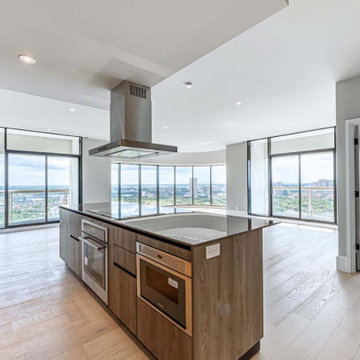
 The Parklane
Summer in Houston has a way of changing the rhythm of everyday life. Mornings start a little earlier, evenings stretch a little longer, and weekends seem to invite you outside. It is a season for enjoying the city, slowing down when you can, and making the most of the time you have.
For those considering Houston high rise condos, summer can also offer a fresh perspective on what it means to choose a home.
At The Parklane, life is not simply about living above the city. It is about having Houston's green spaces, cultural destinations, dining, recreation, and everyday conveniences woven into the experience of home. Located alongside Hermann Park in the Museum District, The Parklane offers a setting where summer can feel both connected and wonderfully removed from the pace of the city.

 Skill Construction & Design, LLC
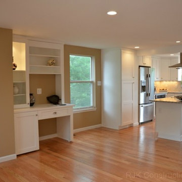
There are so many design elements to this kitchen, I almost don’t know where to start. Bright and airy with crisp clean white cabinets, the kitchen is open and welcoming. Still crisp but gently contrasting, the stainless steel appliance add depth amid the white. To keep this kitchen warm, natural oak covers the floors and a toasted wheat color washes the walls. And then there is the architectural elements. You know. That post and beam in the middle of the room. It’s the center of attention.
When you walk into a room your eyes roam around, establishing the size and shape of the room as your feet take you forward. From the front door of this home straight ahead you encountered this wall. The dining area to the right gives you a glimpse of things to come. Where there is a dining room you will usually find a kitchen.
The architecture of years gone by consistently hides the kitchen, the heart of the home, behind walls. I sympathize with my Mom, and all the other Moms, who have had to spend so much time tucked into a tight kitchen, away from the family. This wall had to go, but it was structural. We needed its support but not its bulk.
So we got rid of the bulk and only the bulk. Instead of a wall we have a post and beam, offering all of the structure we need. We could have installed a huge steel beam and reconfigure the joists to upset the beam, but why? The small beam and post add an incredible architectural element. It’s turning lemons into lemon, we simply made the most of what we had. It may be functional but it’s so fantastic. It looks like we created the effect just for the drama.
The original kitchen may have had a working triangle and some counter space, but it was fairly small, with each area only a step or two away. The dark cabinets made the space feel even smaller and the butcher block patterned laminate counter tops were very dated. The appliances were feeling their age as well, from a coil burner electric stove to a top freezer refrigerator. To keep this kitchen within its space, a half wall separated it from the dining area.
With the wall gone we borrowed some space from the living room and extended what was a U shaped kitchen into an L. At the living room window we start our new kitchen. We kept a small part of the wall to support the other end of our decorative beam. Sandwiched between a large pantry and our new French door refrigerator, the wall disappears. With our new open floor plan a sizable island was in order.
We split our cooking areas and installed a continuous grill gas cooktop into the island. A sleek island hood takes care of exhaust and adds an extra element to our architectural feature. Under the cooktop we added over-sized drawers for pots and pan storage. The frameless cabinets from New River Cabinetry are maple, painted white, with the Herndon door style. With the cooktop safely nestled into our island, we still had to add an oven.
We used the space where the old range sat for a large single oven of stainless steel and glass. If it worked for one, why not two? We created a home for a microwave in the wall cabinets. It’s perfect for heating leftovers so close to the refrigerator.
An important consideration for hot spots in your kitchen is landing zones. Each of our cooking areas have generous landing zones, one on each side of the cooktop and an entire counter area above or below the ovens, depending on which one you’re using.
We wanted to give the sink area more room so the half wall had to come out. We moved the trash and recycle cans into a cabinet, removed the heavy soffits and kept the sink under the window.
With that little bit of extra space we were able to add a larger cabinet above the dishwasher and slide it all down. This used to be where the carpeting met the vinyl floor, but all of it is gone. Long oak planks eliminate that final divide between the kitchen and the dining area, while adding visual length to the area. White wall cabinets on each side of the window reflect the sunlight for a brighter view.
With all of the darker cabinetry the backsplash walls had been painted white. Even still, there was a darkness in the corners and it wasn’t very exciting. We wanted to add visual interest and reflect the new under-cabinet lighting, eliminating the shadows in this corner.
With 1″x 2″ Arabescato Honed marble mosaics and those under-cabinet lights, we achieved the perfect balance. The marble has subtle swirls in gray and beige on a clean white background, but with the honed finish the light is softly reflected instead of glaring. For granite, we chose the soft gray tones of Luna Pearl. The speckles of gray and beige are a gentle contrast to the white cabinets and emulate the color of the stainless steel.
Between the carpet, red half wall, dark railing and dated light fixture, the dining area felt tired. Since the kitchen lacked sufficient storage, a large utility cabinet crowded the table space without adding any decorate elements.
Although it didn’t get any bigger, our dining area feels fresher and more open too. With the oak flooring joining the area to the rest of our space and the toasted wheat on the walls, the white table and chairs compliment the cabinetry while contrasting the warmer colors. We replaced the chandelier with recessed lighting and changed that railing too.
With our new open floor plan, we ended up with a fairly open area in between our foyer closet and the living room window. Not one to miss an opportunity, we filled the space with a multi-functional work space.
With the sunlight streaming in this bright corner works for anything this family needs.
There’s plenty of space for a chair under this large desk drawer. A closed cabinet below, glass doors above and lots of open shelving let you store and or showcase your belongings. We added a lite area at the top to keep away the darker corners.
The transformation is complete. This kitchen and all of its features are truly the center of attention in this home.
http://www.designsbyskill.com/
http://www.rjkconstructioninc.com/
 Fiorito Interior Design
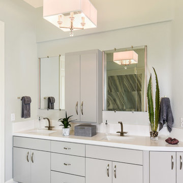
For this project, my client’s goal was to remove a rarely-used existing bath tub next to a medium-sized shower and replace it all with a roomy, open, walk-in shower. With soaring, ten-foot high ceilings, this space became a luxurious statement in minimalism!
I chose a neutral, linen-striated ceramic tile for the floor which, since we were creating a barrier-free shower, meant I could run this tile into the shower and add a hidden, tiled drain for a continuous, seamless look. This makes the bathroom appear even larger. For interest, I added opulent, large-format, ceramic tiles with a blue- and grey-veined marble pattern trimmed out with metal strips. A grand glass wall separates the wet area from the rest of the bathroom. Controls for the shower were wisely placed at the entrance which also features towel hooks and a towel bar on a coordinating panel of blue marble ceramic tile.
The rest of the bathroom received a modern makeover as well with a crisp, custom-built vanity and quartz counter top replacing the old tile counter. Undermount sinks and sculptural hardware sit under modern mirrors with integrated LED lights for maximum light on the face. To top this design off, I chose a glamorous but tailored chandelier with discreet crystal embellishments to infuse sophistication into this sleek, minimalist space.
The new room is light, bright, and uncluttered. For this client, the ultimate luxury is not having a space full of things, but having a space that is simply full of space!
Photo by Bernardo Grijalva
 Classic Kitchens Designs & Renovations Ltd.
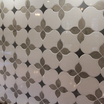
This project started with an older kitchen that really needed some pizzazz and an update to a more open concept look. We started by removing the old support wall between the kitchen and living room and installing a new support beam to handle the weight. once that had been accomplished, the new hardwood floor was put down followed by new cabinetry painted in Benjamin Moores "Simply White" with the complimentary Island colour "Hale Navy". Cambria 3cm thick quartz countertops were then installed with a beautiful white undermount sink and stunning Brushed gold faucet to match the door hardware. We then installed the finishing touch, the subway backsplash and specially selected detailed mosaic tile behind the stove and exhaust hood for a stunning final result. Matching light fixtures also carried the brushed gold theme to a new level....outstanding!!!
 Houseplay Renovations LLC
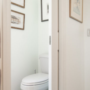
What if your bathroom could be not just lackluster, but a place of real luxury … spacious, fresh, and beautiful? In this project, we gave new life to a bathroom that wasn’t meeting its full potential.
This spacious, sunny bathroom’s layout and design were pre-existing, so the space simply needed freshening up. Our team did just that, through the use of careful planning, new materials, and skilled labor.
With serenity in mind, we created an oasis, painting and tiling to bring the homeowner’s vision to life. While installing new tile required the removal and re-installation of all plumbing fixtures, the transformation was well worth it.
This project is a great example of how choosing materials gives life to a space. Here, the wood-look floor tile, ceramic crackle wall tile, and glass mosaic detail strips join together to create the lush, luxurious look.
Once we’d established a new look for the space, we turned our attention to the finishing touches, such as the deep soaker tub, square drain in the standing shower, and stone tops on the vanity and half-walls. These details complete the room, facilitating a sense of ease and tranquility.
Sometimes, all it takes is a few changes to yield a fantastic result … in this case, a place of peace in the midst of a wild world.
Want to brighten up your home? Contact us; we’re here to help.
Photo Credit: Tamara Templeman
 Keystone Fabrics
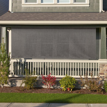
Are you hot and uncomfortable in your outdoor spaces? If so, Keystone Fabrics cordless outdoor sun shades are the perfect solution. Our shades are made from a high quality, durable PVC fabric. With up to 92% UV block, these shades keep your space cool, while lowering your energy costs, reducing blinding glare and fading of furniture. Simply roll your shades down, using the pole and hand crank system, before heat starts building up on your window, porch or patio and start enjoying your outdoor space again. An installation template and removable pole are included. These shades are available in a variety of colors and sizes.
 Classic Kitchens Designs & Renovations Ltd.
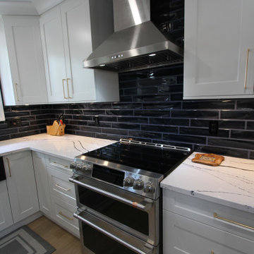
Our homeowner came to us with an older backsplit bungalow with 3 traditionally divided rooms which they wanted to unify into one large kitchen and family room space. After removing all the walls and bulkheads we were able to put new plank flooring throughout the new open space. We then installed new, Benjamin Moore painted custom cabinetry in the kitchen area followed by stunning Cambria quartz countertops in the "Portrush" colour. Glazed backsplash was then installed to complete the look. The colour combinations and the final look and feel is simply stunning! Have a look at the before pics to see where we started.

49