
Search results for "Space related challenges" in Home Design Ideas
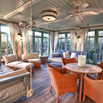
 E. F. San Juan
Wooden Classicism
Nesbitt House – Seaside, Florida
Architect: Robert A. M. Stern
Builder: O.B. Laurent Construction
E. F. San Juan produced all of the interior and exterior millwork for this elegantly designed residence in the influential New Urban town of Seaside, Florida.
Challenges:
The beachfront residence required adherence to the area’s strict building code requirements, creating a unique profile for the compact layout of each room. Each room was also designed with all-wood walls and ceilings, which meant there was a lot of custom millwork!
Solution:
Unlike many homes where the same molding and paneling profiles are repeated throughout each room, this home featured a unique profile for each space. The effort was laborious—our team at E. F. San Juan created tools for each of these specific jobs. “The project required over four hundred man-hours of knife-grinding just to produce the tools,” says Edward San Juan. “Organization and scheduling were critical in this project because so many parts were required to complete each room.”
The long hours and hard work allowed us to take the compacted plan and create the feel of an open, airy American beach house with the influence of 1930s Swedish classicism. The ceiling and walls in each room are paneled, giving them an elongated look to open up the space. The enticing, simplified wooden classicism style seamlessly complements the sweeping vistas and surrounding natural beauty along the Gulf of Mexico.
---
Photography by Steven Mangum – STM Photography
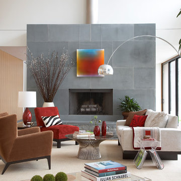
 Amanda Martocchio Architecture
Photo credit Michael Partenio
This new home takes advantage of a beautiful hilltop site. The outdoor spaces function as an extension of the house and support the family’s casual, sports-oriented lifestyle. The design, for a family of seven, provides spaces for individual privacy and family gatherings.
The design challenge was to incorporate a number of sustainable features into the design. The south-facing roof is integrated with a 5-kilowatt photovoltaic system, generating electricity for the home and furnishing emergency backup power. The heating is exclusively radiant with high efficiency boilers partially burning biofuel. Measures taken to produce an efficient building envelope include a drainage plane behind the siding, spray foam insulation, and high performance, insulated window glass.
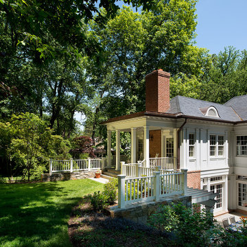
 Wiedemann Architects LLC
Our client was drawn to the property in Wesley Heights as it was in an established neighborhood of stately homes, on a quiet street with views of park. They wanted a traditional home for their young family with great entertaining spaces that took full advantage of the site.
The site was the challenge. The natural grade of the site was far from traditional. The natural grade at the rear of the property was about thirty feet above the street level. Large mature trees provided shade and needed to be preserved.
The solution was sectional. The first floor level was elevated from the street by 12 feet, with French doors facing the park. We created a courtyard at the first floor level that provide an outdoor entertaining space, with French doors that open the home to the courtyard.. By elevating the first floor level, we were able to allow on-grade parking and a private direct entrance to the lower level pub "Mulligans". An arched passage affords access to the courtyard from a shared driveway with the neighboring homes, while the stone fountain provides a focus.
A sweeping stone stair anchors one of the existing mature trees that was preserved and leads to the elevated rear garden. The second floor master suite opens to a sitting porch at the level of the upper garden, providing the third level of outdoor space that can be used for the children to play.
The home's traditional language is in context with its neighbors, while the design allows each of the three primary levels of the home to relate directly to the outside.
Builder: Peterson & Collins, Inc
Photos © Anice Hoachlander
Find the right local pro for your project
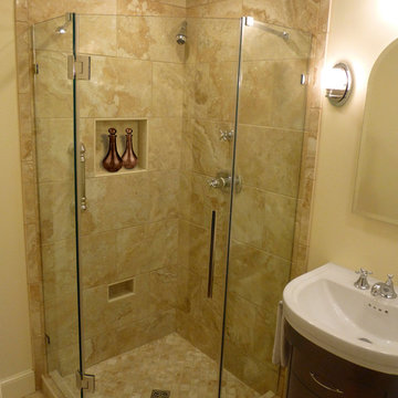
 Renovisions
When it was time to update their small and poorly functional master bath, these homeowners approached Renovisions for help. The small 5’x8’ size constraints was a challenge but ‘Team Renovisions’ was up for the task and came up with a beautiful creative use of space which incorporates a spacious walk-in shower, a curved furniture-styled vanity with porcelain lavatory top, a sleek and energy efficient luxury performance toilet, with faucet and shower fixtures in chrome finish. Safety is a must for our projects and this decorative grab bar that matches the towel holder accessories is evidence of that as it provides both functional and aesthetic attributes.
18”x18” porcelain tiles in a brown marble pattern was a great choice as these over-sized tiles increased the feeling of the room while the rich cherry finish of the vanity complimented the brown veining of the tile nicely.
This newly remodeled master bath is clearly an example of making the most out of a small space. Beauty, functionality and style – it has it all!
 Crystal Kitchen + Bath
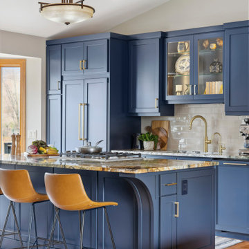
At the core of this transformation was the client’s aspiration for an open, interconnected space.
The removal of barriers between the kitchen, dining, and living areas created an expansive, fluid layout, elevating the home’s ambiance and facilitating seamless interaction among spaces.
The new open layout is the perfect space to cook and entertain merging sophistication with functionality.
The journey began with the client’s exploration of colors, eventually embracing Benjamin Moore’s Hale Navy blue as the cornerstone for the cabinetry. This choice set the stage for a harmonious palette that tied in with the living and dining room furniture and rugs.
Integrating a natural stone countertop became a focal point, incorporating these varied hues while gold fixtures added a touch of luxury and sophistication.
Throughout the design process, challenges were met with innovative solutions. Space optimization was key, requiring strategic placement of appliances like a smaller-width refrigerator alongside a pull-out pantry cabinet. The island, a central feature, not only provided additional seating but replaced the need for a separate table and chairs, optimizing the space for gatherings and enhancing the flow between the kitchen and the adjoining areas.
The revitalized kitchen now stands as a vibrant hub for social interaction. The homeowner seamlessly integrates into gatherings, no longer confined by kitchen walls, while guests engage effortlessly in the cooking process at the island. This transformation embodies the convergence of beauty and functionality, where every design element tells a story of thoughtful innovation and meticulous attention to detail.
 TKS Design Group
Download our free ebook, Creating the Ideal Kitchen. DOWNLOAD NOW
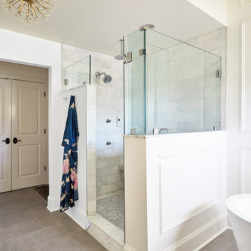
A tired primary bathroom, with varying ceiling heights and a beige-on-beige color scheme, was screaming for love. Squaring the room and adding natural materials erased the memory of the lack luster space and converted it to a bright and welcoming spa oasis. The home was a new build in 2005 and it looked like all the builder’s material choices remained. The client was clear on their design direction but were challenged by the differing ceiling heights and were looking to hire a design-build firm that could resolve that issue.
This local Glen Ellyn couple found us on Instagram (@kitchenstudioge, follow us ?). They loved our designs and felt like we fit their style. They requested a full primary bath renovation to include a large shower, soaking tub, double vanity with storage options, and heated floors. The wife also really wanted a separate make-up vanity. The biggest challenge presented to us was to architecturally marry the various ceiling heights and deliver a streamlined design.
The existing layout worked well for the couple, so we kept everything in place, except we enlarged the shower and replaced the built-in tub with a lovely free-standing model. We also added a sitting make-up vanity. We were able to eliminate the awkward ceiling lines by extending all the walls to the highest level. Then, to accommodate the sprinklers and HVAC, lowered the ceiling height over the entrance and shower area which then opens to the 2-story vanity and tub area. Very dramatic!
This high-end home deserved high-end fixtures. The homeowners also quickly realized they loved the look of natural marble and wanted to use as much of it as possible in their new bath. They chose a marble slab from the stone yard for the countertops and back splash, and we found complimentary marble tile for the shower. The homeowners also liked the idea of mixing metals in their new posh bathroom and loved the look of black, gold, and chrome.
Although our clients were very clear on their style, they were having a difficult time pulling it all together and envisioning the final product. As interior designers it is our job to translate and elevate our clients’ ideas into a deliverable design. We presented the homeowners with mood boards and 3D renderings of our modern, clean, white marble design. Since the color scheme was relatively neutral, at the homeowner’s request, we decided to add of interest with the patterns and shapes in the room.
We were first inspired by the shower floor tile with its circular/linear motif. We designed the cabinetry, floor and wall tiles, mirrors, cabinet pulls, and wainscoting to have a square or rectangular shape, and then to create interest we added perfectly placed circles to contrast with the rectangular shapes. The globe shaped chandelier against the square wall trim is a delightful yet subtle juxtaposition.
The clients were overjoyed with our interpretation of their vision and impressed with the level of detail we brought to the project. It’s one thing to know how you want a space to look, but it takes a special set of skills to create the design and see it thorough to implementation. Could hiring The Kitchen Studio be the first step to making your home dreams come to life?
 Interiors by Natasha
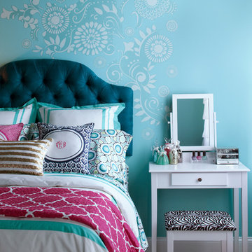
I was hired by the parents of a soon-to-be teenage girl turning 13 years-old. They wanted to remodel her bedroom from a young girls room to a teenage room. This project was a joy and a dream to work on! I got the opportunity to channel my inner child. I wanted to design a space that she would love to sleep in, entertain, hangout, do homework, and lounge in.
The first step was to interview her so that she would feel like she was a part of the process and the decision making. I asked her what was her favorite color, what was her favorite print, her favorite hobbies, if there was anything in her room she wanted to keep, and her style.
The second step was to go shopping with her and once that process started she was thrilled. One of the challenges for me was making sure I was able to give her everything she wanted. The other challenge was incorporating her favorite pattern-- zebra print. I decided to bring it into the room in small accent pieces where it was previously the dominant pattern throughout her room. The color palette went from light pink to her favorite color teal with pops of fuchsia. I wanted to make the ceiling a part of the design so I painted it a deep teal and added a beautiful teal glass and crystal chandelier to highlight it. Her room became a private oasis away from her parents where she could escape to. In the end we gave her everything she wanted.
Photography by Haigwood Studios

 SGDI - Sarah Gallop Design Inc.
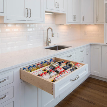
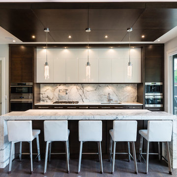
The objective was to create a warm neutral space to later customize to a specific colour palate/preference of the end user for this new construction home being built to sell. A high-end contemporary feel was requested to attract buyers in the area. An impressive kitchen that exuded high class and made an impact on guests as they entered the home, without being overbearing. The space offers an appealing open floorplan conducive to entertaining with indoor-outdoor flow.
Due to the spec nature of this house, the home had to remain appealing to the builder, while keeping a broad audience of potential buyers in mind. The challenge lay in creating a unique look, with visually interesting materials and finishes, while not being so unique that potential owners couldn’t envision making it their own. The focus on key elements elevates the look, while other features blend and offer support to these striking components. As the home was built for sale, profitability was important; materials were sourced at best value, while retaining high-end appeal. Adaptations to the home’s original design plan improve flow and usability within the kitchen-greatroom. The client desired a rich dark finish. The chosen colours tie the kitchen to the rest of the home (creating unity as combination, colours and materials, is repeated throughout).
Photos- Paul Grdina
 Unique Landscapes and Custom Pools
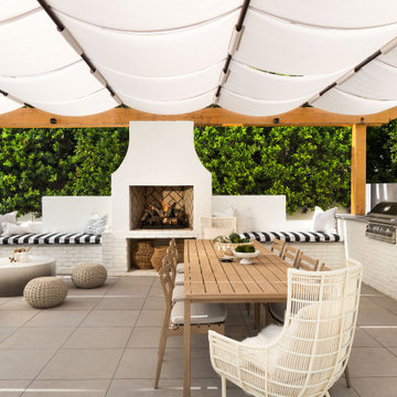
This masterfully designed outdoor living space feels open, airy, and filled with light thanks to the lighter finishes and the fabric pergola shade. Clean, modern lines and a muted color palette add to the spa-like feel of this outdoor living space.
 Tomecek Studio Architecture
Photography by Patrick Ray
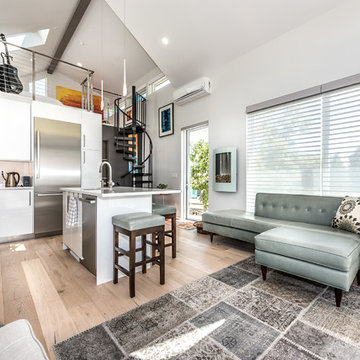
With a footprint of just 450 square feet, this micro residence embodies minimalism and elegance through efficiency. Particular attention was paid to creating spaces that support multiple functions as well as innovative storage solutions. A mezzanine-level sleeping space looks down over the multi-use kitchen/living/dining space as well out to multiple view corridors on the site. To create a expansive feel, the lower living space utilizes a bifold door to maximize indoor-outdoor connectivity, opening to the patio, endless lap pool, and Boulder open space beyond. The home sits on a ¾ acre lot within the city limits and has over 100 trees, shrubs and grasses, providing privacy and meditation space. This compact home contains a fully-equipped kitchen, ¾ bath, office, sleeping loft and a subgrade storage area as well as detached carport.
 Montgomery Robbins, Inc.
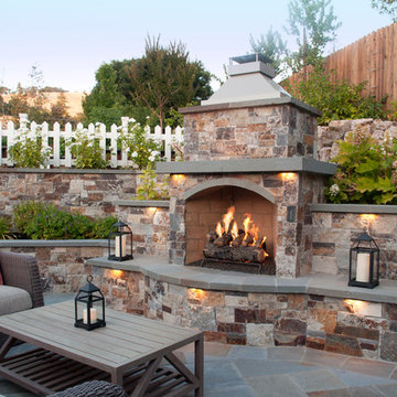
We were asked to create something really special for one of our most admired clients. This home has been a labor of love for both of us as we finally made it exactly what she wanted it to be. After many concept ideas we landed on a design that is stunning! All of the elements on her wish list are incorporated in this challenging, multi-level landscape: A front yard to match the modern traditional-style home while creating privacy from the street; a side yard that proudly connects the front and back; and a lower level with plantings in lush greens, whites, purples and pinks and plentiful lawn space for kids and dogs. Her outdoor living space includes an outdoor kitchen with bar, outdoor living room with fireplace, dining patio, a bedroom-adjacent lounging patio with modern fountain, enclosed vegetable garden, rose garden walk with European-style fountain and meditation bench, and a fire pit with sitting area on the upper level to take in the panoramic views of the sunset over the wooded ridge. Outdoor lighting brings it alive at night, and for parties you can’t beat the killer sound system!
 Designs by Cheryl
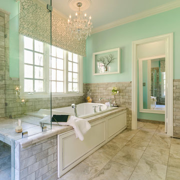
What a gorgeous after transformation this room under went. The client's wanted a relaxing and tranquil feel to this space, and we accomplished this. The tall shower doors after taken down 2 walls makes this space larger looking. The shower has a built in seat bench the client's love and wanted. The large tiles 12 x 24 makes the floor more open and makes the space appear larger. The accessories really added that special touch to the space, giving it a welcome and inviting feeling. John Magor Photography took this beautiful photo.This was a fun project, making it easy to love what I do.
 Schwartz and Architecture
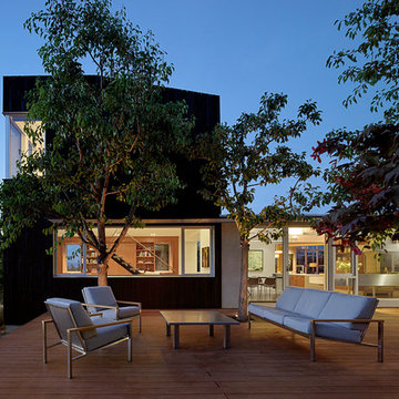
This project, an extensive remodel and addition to an existing modern residence high above Silicon Valley, was inspired by dominant images and textures from the site: boulders, bark, and leaves. We created a two-story addition clad in traditional Japanese Shou Sugi Ban burnt wood siding that anchors home and site. Natural textures also prevail in the cosmetic remodeling of all the living spaces. The new volume adjacent to an expanded kitchen contains a family room and staircase to an upper guest suite.
The original home was a joint venture between Min | Day as Design Architect and Burks Toma Architects as Architect of Record and was substantially completed in 1999. In 2005, Min | Day added the swimming pool and related outdoor spaces. Schwartz and Architecture (SaA) began work on the addition and substantial remodel of the interior in 2009, completed in 2015.
Photo by Matthew Millman

 Valerie Grant Interiors
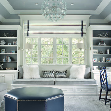
A multi purpose room for the kids. This rooms serves as a hang out space, sleep over room with built in trundle bed, homework space with a custom desk and just a space for kids to get away from it all. Photography by Peter Rymwid.
 Drewett Works
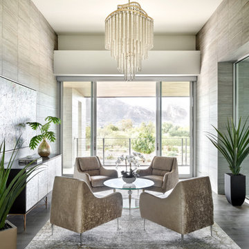
With nearly 14,000 square feet of transparent planar architecture, In Plane Sight, encapsulates — by a horizontal bridge-like architectural form — 180 degree views of Paradise Valley, iconic Camelback Mountain, the city of Phoenix, and its surrounding mountain ranges.
Large format wall cladding, wood ceilings, and an enviable glazing package produce an elegant, modernist hillside composition.
The challenges of this 1.25 acre site were few: a site elevation change exceeding 45 feet and an existing older home which was demolished. The client program was straightforward: modern and view-capturing with equal parts indoor and outdoor living spaces.
Though largely open, the architecture has a remarkable sense of spatial arrival and autonomy. A glass entry door provides a glimpse of a private bridge connecting master suite to outdoor living, highlights the vista beyond, and creates a sense of hovering above a descending landscape. Indoor living spaces enveloped by pocketing glass doors open to outdoor paradise.
The raised peninsula pool, which seemingly levitates above the ground floor plane, becomes a centerpiece for the inspiring outdoor living environment and the connection point between lower level entertainment spaces (home theater and bar) and upper outdoor spaces.
Project Details: In Plane Sight
Architecture: Drewett Works
Developer/Builder: Bedbrock Developers
Interior Design: Est Est and client
Photography: Werner Segarra
Awards
Room of the Year, Best in American Living Awards 2019
Platinum Award – Outdoor Room, Best in American Living Awards 2019
Silver Award – One-of-a-Kind Custom Home or Spec 6,001 – 8,000 sq ft, Best in American Living Awards 2019
 TKS Design Group
Download our free ebook, Creating the Ideal Kitchen. DOWNLOAD NOW
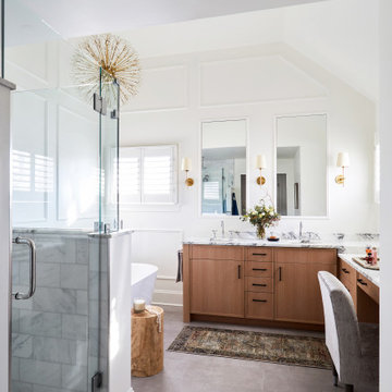
A tired primary bathroom, with varying ceiling heights and a beige-on-beige color scheme, was screaming for love. Squaring the room and adding natural materials erased the memory of the lack luster space and converted it to a bright and welcoming spa oasis. The home was a new build in 2005 and it looked like all the builder’s material choices remained. The client was clear on their design direction but were challenged by the differing ceiling heights and were looking to hire a design-build firm that could resolve that issue.
This local Glen Ellyn couple found us on Instagram (@kitchenstudioge, follow us ?). They loved our designs and felt like we fit their style. They requested a full primary bath renovation to include a large shower, soaking tub, double vanity with storage options, and heated floors. The wife also really wanted a separate make-up vanity. The biggest challenge presented to us was to architecturally marry the various ceiling heights and deliver a streamlined design.
The existing layout worked well for the couple, so we kept everything in place, except we enlarged the shower and replaced the built-in tub with a lovely free-standing model. We also added a sitting make-up vanity. We were able to eliminate the awkward ceiling lines by extending all the walls to the highest level. Then, to accommodate the sprinklers and HVAC, lowered the ceiling height over the entrance and shower area which then opens to the 2-story vanity and tub area. Very dramatic!
This high-end home deserved high-end fixtures. The homeowners also quickly realized they loved the look of natural marble and wanted to use as much of it as possible in their new bath. They chose a marble slab from the stone yard for the countertops and back splash, and we found complimentary marble tile for the shower. The homeowners also liked the idea of mixing metals in their new posh bathroom and loved the look of black, gold, and chrome.
Although our clients were very clear on their style, they were having a difficult time pulling it all together and envisioning the final product. As interior designers it is our job to translate and elevate our clients’ ideas into a deliverable design. We presented the homeowners with mood boards and 3D renderings of our modern, clean, white marble design. Since the color scheme was relatively neutral, at the homeowner’s request, we decided to add of interest with the patterns and shapes in the room.
We were first inspired by the shower floor tile with its circular/linear motif. We designed the cabinetry, floor and wall tiles, mirrors, cabinet pulls, and wainscoting to have a square or rectangular shape, and then to create interest we added perfectly placed circles to contrast with the rectangular shapes. The globe shaped chandelier against the square wall trim is a delightful yet subtle juxtaposition.
The clients were overjoyed with our interpretation of their vision and impressed with the level of detail we brought to the project. It’s one thing to know how you want a space to look, but it takes a special set of skills to create the design and see it thorough to implementation. Could hiring The Kitchen Studio be the first step to making your home dreams come to life?
 Progressive Design Build
Challenge
This 2001 riverfront home was purchased by the owners in 2015 and immediately renovated. Progressive Design Build was hired at that time to remodel the interior, with tentative plans to remodel their outdoor living space as a second phase design/build remodel. True to their word, after completing the interior remodel, this young family turned to Progressive Design Build in 2017 to address known zoning regulations and restrictions in their backyard and build an outdoor living space that was fit for entertaining and everyday use.
The homeowners wanted a pool and spa, outdoor living room, kitchen, fireplace and covered patio. They also wanted to stay true to their home’s Old Florida style architecture while also adding a Jamaican influence to the ceiling detail, which held sentimental value to the homeowners who honeymooned in Jamaica.
Solution
To tackle the known zoning regulations and restrictions in the backyard, the homeowners researched and applied for a variance. With the variance in hand, Progressive Design Build sat down with the homeowners to review several design options. These options included:
Option 1) Modifications to the original pool design, changing it to be longer and narrower and comply with an existing drainage easement
Option 2) Two different layouts of the outdoor living area
Option 3) Two different height elevations and options for the fire pit area
Option 4) A proposed breezeway connecting the new area with the existing home
After reviewing the options, the homeowners chose the design that placed the pool on the backside of the house and the outdoor living area on the west side of the home (Option 1).
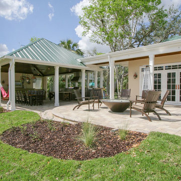
It was important to build a patio structure that could sustain a hurricane (a Southwest Florida necessity), and provide substantial sun protection. The new covered area was supported by structural columns and designed as an open-air porch (with no screens) to allow for an unimpeded view of the Caloosahatchee River. The open porch design also made the area feel larger, and the roof extension was built with substantial strength to survive severe weather conditions.
The pool and spa were connected to the adjoining patio area, designed to flow seamlessly into the next. The pool deck was designed intentionally in a 3-color blend of concrete brick with freeform edge detail to mimic the natural river setting. Bringing the outdoors inside, the pool and fire pit were slightly elevated to create a small separation of space.
Result
All of the desirable amenities of a screened porch were built into an open porch, including electrical outlets, a ceiling fan/light kit, TV, audio speakers, and a fireplace. The outdoor living area was finished off with additional storage for cushions, ample lighting, an outdoor dining area, a smoker, a grill, a double-side burner, an under cabinet refrigerator, a major ventilation system, and water supply plumbing that delivers hot and cold water to the sinks.
Because the porch is under a roof, we had the option to use classy woods that would give the structure a natural look and feel. We chose a dark cypress ceiling with a gloss finish, replicating the same detail that the homeowners experienced in Jamaica. This created a deep visceral and emotional reaction from the homeowners to their new backyard.
The family now spends more time outdoors enjoying the sights, sounds and smells of nature. Their professional lives allow them to take a trip to paradise right in their backyard—stealing moments that reflect on the past, but are also enjoyed in the present.

 StudioLAB
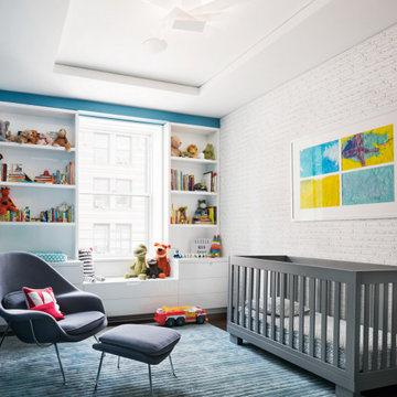
Boasting views of the Museum of Natural History and Central Park, the Beaux Arts and French Renaissance style building built in 1900 was once home to a luxury hotel. Over the years multiple hotel rooms were combined into the larger apartment residences that exist today. The resulting units, while large in size, lacked the continuity of a single formed space. StudioLAB was presented with the challenge of re-designing the space to fit a modern family’s lifestyle today with the flexibility to adjust as they evolve into their tomorrow. Thus, the existing configuration was completely abandoned with new programmatic elements being relocated in each and every corner of the space. For clients that are big wine connoisseurs, the focal point of entry and circulation lies in a 400 bottle, custom built, blackened steel and glass, temperature controlled wine cabinet. The once enclosed living room was demolished to create one main entertaining space that includes a new dining area and open kitchen. Hafele bi-folding pocket door slides were used in the Living room wall unit to conceal the television, bar and display shelves when not in use. Posing as kitchen cabinetry, a hidden integrated door opens to reveal a guest bedroom with an en suite bathroom. Down the hallway of wide plank ebony stained walnut flooring, a compact powder room was built to house an original Paul Villinski installation of small butterflies cut from recycled aluminum cans, entitled Mistral. Continuing down the hall, and through one of the walnut veneered doors, is the shared kids bedroom where a custom-built bunk bed with integrated storage steps and desk was designed to allow for play space and a reading corner. The kids bathroom across the hall is decorated with custom Lego inspired hand cast concrete tiles and integrated pull-out footstools residing underneath the floating vanity. The master suite features a bio-ethanol fireplace wrapped in blackened steel and integrated into the Tabu veneered built-in. The spacious walk-in closet serves several purposes, which include housing the apartment’s new central HVAC system as well as a sleeping spot for the family’s dog. An integrated URC control system paired with Lutron Radio RA lighting keypads were installed to control the AV, HVAC, lighting and solar shades all by the use of smartphones.
 ODS Architecture
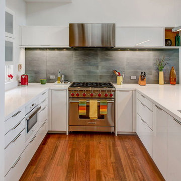
A relatively new existing home on a steep downsloping lot where you park and enter at the upper floor needed to have a dramatic stairway entry. By refining and reducing structure and scale, introducing new glass railing and a combination of wood and white cabinetry, the space now expresses a clean, crisp aesthetic reflecting how the owners want to live.
Working with German cabinets by Leicht the kitchen area was sculpted to create more usable cabinet pantry and counter area in a combination of white oak and gloss white lacquer paint. Final touches include a new porcelain tiled fireplace surround and hearth with gas insert and powder room with figured wall and floating walnut vanity. Previously partially blocked by cabinetry, now the new kitchen, dining and living rooms now all share equal access to dramatic views of the bay.
Photo Credits: Treve Johnson.
 DesignARC
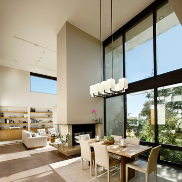
The Tice Residences replace a run-down and aging duplex with two separate, modern, Santa Barbara homes. Although the unique creek-side site (which the client’s original home looked toward across a small ravine) proposed significant challenges, the clients were certain they wanted to live on the lush “Riviera” hillside.
The challenges presented were ultimately overcome through a thorough and careful study of site conditions. With an extremely efficient use of space and strategic placement of windows and decks, privacy is maintained while affording expansive views from each home to the creek, downtown Santa Barbara and Pacific Ocean beyond. Both homes appear to have far more openness than their compact lots afford.
The solution strikes a balance between enclosure and openness. Walls and landscape elements divide and protect two private domains, and are in turn, carefully penetrated to reveal views.
Both homes are variations on one consistent theme: elegant composition of contemporary, “warm” materials; strong roof planes punctuated by vertical masses; and floating decks. The project forms an intimate connection with its setting by using site-excavated stone, terracing landscape planters with native plantings, and utilizing the shade provided by its ancient Riviera Oak trees.
2012 AIA Santa Barbara Chapter Merit Award
Jim Bartsch Photography
13