
Search results for "Spending" in Home Design Ideas
 Advance Design Studio, Ltd.
Karen and Chad of Tower Lakes, IL were tired of their unfinished basement functioning as nothing more than a storage area and depressing gym. They wanted to increase the livable square footage of their home with a cohesive finished basement design, while incorporating space for the kids and adults to hang out.
“We wanted to make sure that upon renovating the basement, that we can have a place where we can spend time and watch movies, but also entertain and showcase the wine collection that we have,” Karen said.
After a long search comparing many different remodeling companies, Karen and Chad found Advance Design Studio. They were drawn towards the unique “Common Sense Remodeling” process that simplifies the renovation experience into predictable steps focused on customer satisfaction.
“There are so many other design/build companies, who may not have transparency, or a focused process in mind and I think that is what separated Advance Design Studio from the rest,” Karen said.
Karen loved how designer Claudia Pop was able to take very high-level concepts, “non-negotiable items” and implement them in the initial 3D drawings. Claudia and Project Manager DJ Yurik kept the couple in constant communication through the project. “Claudia was very receptive to the ideas we had, but she was also very good at infusing her own points and thoughts, she was very responsive, and we had an open line of communication,” Karen said.
A very important part of the basement renovation for the couple was the home gym and sauna. The “high-end hotel” look and feel of the openly blended work out area is both highly functional and beautiful to look at. The home sauna gives them a place to relax after a long day of work or a tough workout. “The gym was a very important feature for us,” Karen said. “And I think (Advance Design) did a very great job in not only making the gym a functional area, but also an aesthetic point in our basement”.
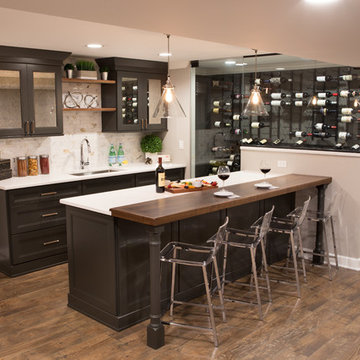
An extremely unique wow-factor in this basement is the walk in glass wine cellar that elegantly displays Karen and Chad’s extensive wine collection. Immediate access to the stunning wet bar accompanies the wine cellar to make this basement a popular spot for friends and family.
The custom-built wine bar brings together two natural elements; Calacatta Vicenza Quartz and thick distressed Black Walnut. Sophisticated yet warm Graphite Dura Supreme cabinetry provides contrast to the soft beige walls and the Calacatta Gold backsplash. An undermount sink across from the bar in a matching Calacatta Vicenza Quartz countertop adds functionality and convenience to the bar, while identical distressed walnut floating shelves add an interesting design element and increased storage. Rich true brown Rustic Oak hardwood floors soften and warm the space drawing all the areas together.
Across from the bar is a comfortable living area perfect for the family to sit down at a watch a movie. A full bath completes this finished basement with a spacious walk-in shower, Cocoa Brown Dura Supreme vanity with Calacatta Vicenza Quartz countertop, a crisp white sink and a stainless-steel Voss faucet.
Advance Design’s Common Sense process gives clients the opportunity to walk through the basement renovation process one step at a time, in a completely predictable and controlled environment. “Everything was designed and built exactly how we envisioned it, and we are really enjoying it to it’s full potential,” Karen said.
Constantly striving for customer satisfaction, Advance Design’s success is heavily reliant upon happy clients referring their friends and family. “We definitely will and have recommended Advance Design Studio to friends who are looking to embark on a remodeling project small or large,” Karen exclaimed at the completion of her project.
 Michael Nash Design, Build & Homes
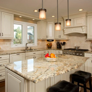
• A busy family wanted to rejuvenate their entire first floor. As their family was growing, their spaces were getting more cramped and finding comfortable, usable space was no easy task. The goal of their remodel was to create a warm and inviting kitchen and family room, great room-like space that worked with the rest of the home’s floor plan.
The focal point of the new kitchen is a large center island around which the family can gather to prepare meals. Exotic granite countertops and furniture quality light-colored cabinets provide a warm, inviting feel. Commercial-grade stainless steel appliances make this gourmet kitchen a great place to prepare large meals.
A wide plank hardwood floor continues from the kitchen to the family room and beyond, tying the spaces together. The focal point of the family room is a beautiful stone fireplace hearth surrounded by built-in bookcases. Stunning craftsmanship created this beautiful wall of cabinetry which houses the home’s entertainment system. French doors lead out to the home’s deck and also let a lot of natural light into the space.
From its beautiful, functional kitchen to its elegant, comfortable family room, this renovation achieved the homeowners’ goals. Now the entire family has a great space to gather and spend quality time.
 Palmerston Design Consultants
Lisa Petrole
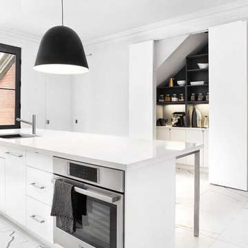
Inspiration for a large contemporary porcelain tile kitchen remodel in Toronto with an undermount sink, flat-panel cabinets, white cabinets, quartz countertops, white backsplash, stone slab backsplash, stainless steel appliances and an island
Inspiration for a large contemporary porcelain tile kitchen remodel in Toronto with an undermount sink, flat-panel cabinets, white cabinets, quartz countertops, white backsplash, stone slab backsplash, stainless steel appliances and an island
Find the right local pro for your project
 Boswell Construction
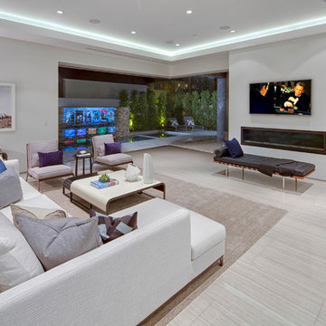
flooring: Porcelain tile with woodgrain
lighting: recessed ceiling with led strip lighting
doors: fleetwood pocket doors
#buildboswell
Example of a large trendy open concept porcelain tile family room design in Los Angeles with a ribbon fireplace, white walls, a plaster fireplace and a wall-mounted tv
Example of a large trendy open concept porcelain tile family room design in Los Angeles with a ribbon fireplace, white walls, a plaster fireplace and a wall-mounted tv

 SPACE Architects + Planners
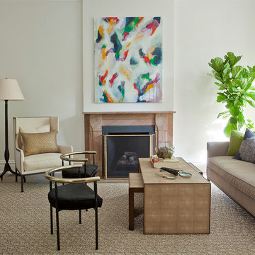
Living room - transitional formal living room idea in Chicago with white walls and a standard fireplace


 Christy Webber Landscapes
With amazing city views, its hard not to want to spend all your time living outside. With this design, you can. In one corner you have planters packed with seasonal vegetables that can be picked, rinsed and served, all within about 10 footsteps. Want some protein with that? No problem. The outdoor kitchen is set to feed a crowd, all while engaging friends over the bar, and into the dining area. Here, with built-in retractable pergola canopies, you can control your environment to whatever shade, sun, or night sky setting you desire. And then, when you can eat no more, kick-back and relax in the comfy, heated lounge seating area.
 ÁBATON
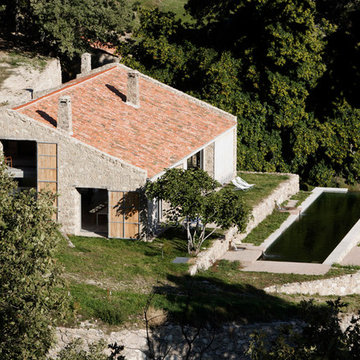
Architecture by ÁBATON www.abaton.es
Interior Design Project and furnishing by BATAVIA www.batavia.es
Photographs: Belen Imaz
Photo of a farmhouse landscaping in Madrid.
Photo of a farmhouse landscaping in Madrid.

 Closet Factory
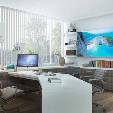
A delightfully vivid and modern design, this commercial park executive office features a combination of medium dark Oak and white wood grain textured melamine, 2 1/4” thick workstation countertop, built-in cabinetry, upper cabinet flipper doors, moveable drawer unit on casters, and thick floated shelves.
 Swanson Homes
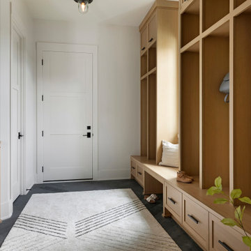
This warm and inviting mudroom with entry from the garage is the inspiration you need for your next custom home build. The walk-in closet to the left holds enough space for shoes, coats and other storage items for the entire year-round, while the white oak custom storage benches and compartments in the entry make for an organized and clutter free space for your daily out-the-door items. The built-in-mirror and table-top area is perfect for one last look as you head out the door, or the perfect place to set your keys as you look to spend the rest of your night in.
 America's Best House Plans
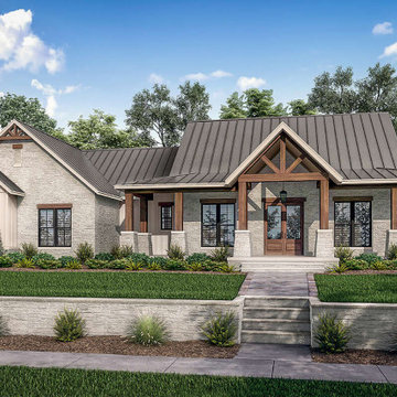
This rustic Modern Farmhouse is for those who desire handsome curb appeal, a private master suite, and an open layout. As you gaze at the home’s exterior, take note of the lightly hued brickwork, natural timber beams holding up the front porch, and decorating the gable roofing. You won’t be able to help imagine spending countless hours on this wrap-around porch as you greet friends and family in its vaulted center.
 Wilson Kelsey Design
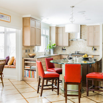
Our client said of her new kitchen, "It transforms the way our family lives." Her children used to spend their time in the basement rec room where she rarely saw them, but now, with the island in the expanded kitchen, she has more together time with them and is thrilled.
Custom built light oak cabinets, Jerusalem gold limestone subway tile backsplash, a honeycomb of honey onyx marble tiles behind the range hood, and jupiter crystal granite countertops create a warm visual language that evokes the homeowners' favorite travels. Counter-height red leather and mahogany bar stools surround a glass top pedestal table which integrates with the kitchen's custom center island.
For this project, WKD was asked to design a new kitchen in a Boston suburb with custom kitchen cabinets along with new cabinets in the adjacent family room, creating more of a kitchen lounge. They were also asked to find space for a much needed walk-in pantry, reconfigure a home office and create a mudroom. By moving walls and reorienting doors, spaces were reconfigured to provide more storage and a more welcoming atmosphere. The custom painted floor creates a happy balance with all the wood tones in the room.
Photos by Michael Lee
 Ginkgo Leaf Studio
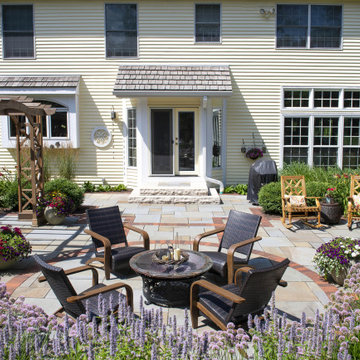
View of the home from the patio. New lannon stone steps connect the patio to the home.
Renn Kuhnen Photography
Patio - large traditional backyard stone patio idea in Chicago
Patio - large traditional backyard stone patio idea in Chicago
 Johnston Architects
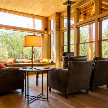
Living room library - large rustic open concept medium tone wood floor living room library idea in Seattle with a wood stove and a metal fireplace
 MILLER + MILLER Architectural Photography
Miller + Miller Real Estate
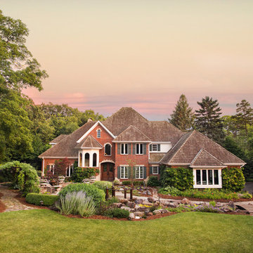
A must see luxury house less than 3 miles from Downtown Naperville. Private and secluded home on a spectacular wooded lot that borders a 14-acre forest preserve. The front patio features perennials, a mahogany stream bridge, 2 mahogany pond decks overlooking koi ponds, waterfalls and 40′ English Arbor. 40′ English Arbor with Wisteria, Clematis, & Akebia. More than 75 trees on the property, along driveway & several ornamentals. Woodland garden with abundant daffodils, scylla, redbuds, columbine, bleeding hearts & lily of the valley. Kitchen garden.
 Rachel Loewen Photography
Photo: Rachel Loewen Photography © 2017 Houzz
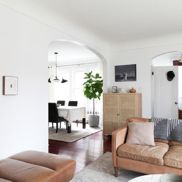
Example of a danish living room design in Chicago
Example of a danish living room design in Chicago
 Standard Kitchen & Bath
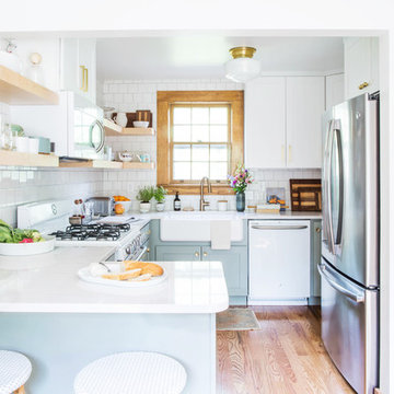
Example of a small transitional u-shaped medium tone wood floor and brown floor eat-in kitchen design with a farmhouse sink, shaker cabinets, blue cabinets, quartz countertops, white backsplash, porcelain backsplash, white appliances and a peninsula
 Jones & Boer Architects, Inc.
Anice Hoachlander photographer
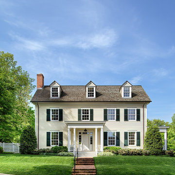
Example of a classic two-story wood exterior home design in DC Metro
Example of a classic two-story wood exterior home design in DC Metro
36