
Search results for "Start reading" in Home Design Ideas

 Twelve Chairs Interiors
Photo: Sarah M. Young | smyphoto
Mid-sized transitional formal and open concept light wood floor and beige floor living room photo in Boston with gray walls
Mid-sized transitional formal and open concept light wood floor and beige floor living room photo in Boston with gray walls


 Adrienne DeRosa
Photo: Adrienne DeRosa © 2015 Houzz
An eclectic array of artwork and layered Bokhara rugs create a comfortable living space. Weiss put together the gallery wall starting with one piece and worked outward. "It's like putting together a puzzle," she says.
One of the most significant changes made to the building is the addition of windows and doors along the back wall. Constructed from steel and double-pained glass, the windows are at once referential and thoroughly modern.
Windows: A&S Window Associates, Inc.
Find the right local pro for your project

 Dancer Concrete Design
This client came to us looking for a space that would allow their children a place to hang out while still feeling at home. The versatility of finished concrete flooring works well to adapt to a variety of home styles, and works seamlessly with this Craftsman-style home. We worked with the client to decide that a darker reactive stain would really make the space feel warm, inviting, and comfortable. The look and feel of the floor with this stain selection would be similar to the pictures they provided of the look they were targeting when we started the selection process. The clients really embraced the existing cracks in the concrete, and thought they exhibited the character of the house – and we agree.
When our team works on residential projects, it is imperative that we keep everything as clean and mess-free as possible for the client. For this reason, our first step was to apply RAM Board throughout the house where our equipment would be traveling. Tape and 24″ plastic were also applied to the walls of the basement to protect them. The original floor was rather new concrete with some cracks. Our team started by filling the cracks with a patching product. The grinding process then began, concrete reactive stain was applied in the color Wenge Wood, and then the floor was sealed with our two step concrete densification and stain-guard process. The 5 step polishing process was finished by bringing the floor to a 800-grit level. We were excited to see how the space came together after the rest of construction, which was overseen by the contractor Arbor Homes, was complete. View the gallery below to take a look!
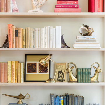
 User
UserHuge eclectic terra-cotta tile home design photo in Los Angeles with white walls, a standard fireplace and a plaster fireplace

 Melissa Hill Home Design
This client was so much fun to design for. Their project was all about color, texture and creating a master bedroom and guest bedroom that compliments their passion for traveling and eclectic style. We created a seating area in the master bedroom where the family can gather at night to read and spend time quality time. Their desire for deep color and bold pattern allowed us to create a casual space that is both warm and inviting at the end of a long day. Guests often visit and stay for a bit. They wanted to give their family and friends the same cozy feel in their guest bedroom. We were able to use a combination of patterns, textures and colors with our custom-made bedding and pillows. We also love to repurpose where we can and painted furniture is a great place to start. The depth of color used here is a true reflection of our clients' warm and friendly personality that says "welcome to our home."
Custom designed by Hartley and Hill Design
All materials and furnishings in this space are available through Hartley and Hill Design. www.hartleyandhilldesign.com
888-639-0639
Neil Landino Photography

 TOTAL CONCEPTS
Living room - traditional living room idea in San Francisco with white walls, a standard fireplace and a stone fireplace



 Regan Baker Design Inc.
Intentional. Elevated. Artisanal.
With three children under the age of 5, our clients were starting to feel the confines of their Pacific Heights home when the expansive 1902 Italianate across the street went on the market. After learning the home had been recently remodeled, they jumped at the chance to purchase a move-in ready property. We worked with them to infuse the already refined, elegant living areas with subtle edginess and handcrafted details, and also helped them reimagine unused space to delight their little ones.
Elevated furnishings on the main floor complement the home’s existing high ceilings, modern brass bannisters and extensive walnut cabinetry. In the living room, sumptuous emerald upholstery on a velvet side chair balances the deep wood tones of the existing baby grand. Minimally and intentionally accessorized, the room feels formal but still retains a sharp edge—on the walls moody portraiture gets irreverent with a bold paint stroke, and on the the etagere, jagged crystals and metallic sculpture feel rugged and unapologetic. Throughout the main floor handcrafted, textured notes are everywhere—a nubby jute rug underlies inviting sofas in the family room and a half-moon mirror in the living room mixes geometric lines with flax-colored fringe.
On the home’s lower level, we repurposed an unused wine cellar into a well-stocked craft room, with a custom chalkboard, art-display area and thoughtful storage. In the adjoining space, we installed a custom climbing wall and filled the balance of the room with low sofas, plush area rugs, poufs and storage baskets, creating the perfect space for active play or a quiet reading session. The bold colors and playful attitudes apparent in these spaces are echoed upstairs in each of the children’s imaginative bedrooms.
Architect + Developer: McMahon Architects + Studio, Photographer: Suzanna Scott Photography




 Бюро Александры Федоровой
конструкция камина выполнена из металла на заказ. Это была тяжелая сварная конструкция , которая приваривалась к несущей стене , она покрашена в цвет каминной топки. Топка открытая,трехсторонняя. Сверху у нее выезжает защитная сетка.. Над камином за панелями интегрированы шкафы.

 Steven Cabinets
Published in Midwest Home October 2012
Architects: TEA2
Photographer: Susan Gilmore
Eat-in kitchen - huge traditional eat-in kitchen idea in Minneapolis with an undermount sink, beaded inset cabinets, white cabinets, marble countertops, white backsplash, subway tile backsplash, stainless steel appliances and an island
Eat-in kitchen - huge traditional eat-in kitchen idea in Minneapolis with an undermount sink, beaded inset cabinets, white cabinets, marble countertops, white backsplash, subway tile backsplash, stainless steel appliances and an island

Sponsored
Sunbury, OH

J.Holderby - Renovations
Franklin County's Leading General Contractors - 2X Best of Houzz!

 Shannon White Design
Aaron Kraft / Krafty Photos
Mountain style l-shaped medium tone wood floor kitchen photo with a single-bowl sink, recessed-panel cabinets, brown cabinets, gray backsplash, subway tile backsplash, stainless steel appliances, two islands and white countertops
Mountain style l-shaped medium tone wood floor kitchen photo with a single-bowl sink, recessed-panel cabinets, brown cabinets, gray backsplash, subway tile backsplash, stainless steel appliances, two islands and white countertops

 LMOH Home
Transitional bedroom featuring a Rustic Glam style by blending weathered and worn with sparkle and glimmer. What started as a blank canvas and dark moody cave is now a light-filled serene and cozy space. Project includes: New French wood floors, clerestory window, French patio doors, recessed lighting, decorative lighting, fireplace feature wall and all custom bedding, furniture, dog bed, accessories and finishing touches designed by LMOH Home. Existing bedside tables and artwork. | Photography Joshua Caldwell.

 Sarah Herman Landscape Design
You can read more about the project through this Houzz Feature link: https://www.houzz.com/magazine/hillside-yard-offers-scenic-views-and-space-for-contemplation-stsetivw-vs~131483772

 Tiffany Brooks, HGTV Host & Interior Designer
Inquire About Our Design Services
When we first started talking in the spring of 2015, I was impressed. She was witty, realistic, and understood that as much as she loves my shows on HGTV, design does not does not happen in 43 minutes! She told me about her space, and how she felt that her bedroom seemed “blah” to her. She had no retreat. Molly desperately longed for a place that she could spend time in, read in, play in and above all, relax in.
What we did:
Many people are terrified of hiring a designer. Rightfully so, they are investing a pretty penny in their homes. They want to make sure that everything, down to the last floral arrangement, is to their liking, because they will have to live it (and pay for it). Unfortunately, a client can unintentionally stifle a designer’s creativity through micro-management. This can produce lackluster results and ultimately cause more time (and money) to be spent on a project than is really necessary.
With Molly, that was never an issue. Before she even showed me the room in question, she said that I could have full creative license to do what I needed to do to her bedroom. SAY WHAAH!?
With Molly giving me complete creative freedom, I planned everything out and got down to business. The result: Bite-your-bottom-lip sexy. I don’t get jealous of too many of my clients’ spaces, but this one still takes my breath away every time I look at the pics!
The craziest part was that by adding more furniture, it actually made the space feel larger.
Molly and her husband Patrick loved the finished space, and promised me I will be back to finish the rest of the house!
Here’s the highlights of the rest of the project:
I came up with a space plan with three options.
Next, we reviewed mood boards and fabric schemes that would work for both Molly and her hubby Patrick.
We started with the bed. My goal was to add edge to its otherwise traditional style.
We decided to spice things up by painting the trim work in the room black.
We built in layers of lighting with dimmers. In a bedroom everything should be on dimmers, right? Right.
We designed and customized bedding, chairs and window treatments.
Together with Molly, we selected the most perfect wallpaper. This geometric “grasscloth” adds so much depth and dimension that was just missing before.
What I love:
That light fixture. I mean it is really, really amazing in person.
The porcupine mirror. This thing came packaged like it was the hope diamond, and everyone was terrified to handle it. But it really became a highlight of the room.
Sponsored
Sunbury, OH
J.Holderby - Renovations
Franklin County's Leading General Contractors - 2X Best of Houzz!

 TKS Design Group
Download our free ebook, Creating the Ideal Kitchen. DOWNLOAD NOW
This client was referred to us from a past client. They are a busy 2-career household with young children and enjoy entertaining friends and family in their home. They have a beautiful open concept home but unfortunately the kitchen was not fitting for the rest of the home. They were not quite sure what to do with the space. We talked about trying to refresh it or do more of a minor remodel, but in the end they decided a full gut would get them to where they wanted to be.
One problem was there was no place for guests to hang out other than the large and awkward banquette area. The brick wall and tiled hood area were feeling a bit dated and tired. The space was just not functional for their lifestyle. There was no prep space near the cooktop and no landing area for items coming out of the ovens or refrigerator, plus a big dead zone in the center of the room.
Banquettes, like the one they previously had in the space, are great for small spaces, but when they get really large like this one, it makes getting in and out of the seating area awkward and uncomfortable. Plus, there was room for a large table, so we eliminated the awkward built in.
We started by removing the faux brick wall between the kitchen and back entry. We relocated the entry to the garage over a couple feet in order to get every last inch out of the new kitchen. We also made the decision to close up the primary window that faced the pretty ho hum brick wall of the neighbor’s house. There was plenty of light coming in from the seating area, so we just didn’t feel the window was adding much to the room.
Construction went smoothy. There was a bit of rework with electrical, flooring and HVAC, but in the end, we think it was well worth it.
The clients really wanted a sleek contemporary look, and we originally had planned for a full height slab backsplash, but due to it’s size, it was a budget buster. Instead, we got creative and settled on large format porcelain tiles that have a similar feel but were a fraction of the cost. We made sure the wall was plumb and level so that the fit and finish would mimic that of slab material.
The final space was quite a change. A large prep sink sits directly across from the new pro-style range with plenty additional prep space on the large island. The refrigerator and ovens now have miles of landing space, and a nice tight work triangle makes cooking a breeze.
Since we wanted a more contemporary feel, not many wall cabinets were included. Instead, we outfitted some of the drawers for dish storage with a peg system. Two large pantries flanking the refrigerator hold baking supplies and small appliances. Large drawers by the cooktop hold pots and pans, and an appliance garage tucked away to the left of the range hides away miscellaneous items. The large island also houses a microwave drawer and tons of storage, most of which is drawers offering maximum convenience.
The island now seats 5-6 people comfortably along with the new table in the seating area which can seat up to 8. Entertaining will be a breeze in this space. With such a clean backdrop, we knew we would need some drama with the lighting, so we chose two sets of staggered pendants, which we adjusted for the right visual balance above the island.
We also included a small coffee station to the right of the main kitchen, which helps keep the coffee clutter out of the kitchen proper. Two tones of complimentary gray are featured in this kitchen. The perimeter is a light gray that reads almost white. The island is a gray stain that adds some depth and interest with the visible wood texture. The countertops are clean white quartz, and the hardware, barstools and light fixtures add warm brass tones. I see lots of cooking and entertaining with family and friends in the near future in this bright and airy new space.
Designed by: Susan Klimala, CKD, CBD
Photography by: Michael Kaskel
For more information on kitchen and bath design ideas go to: www.kitchenstudio-ge.com

 David Mitchell Interior Design
Eric Piasecki
Inspiration for a mid-sized coastal master dark wood floor bedroom remodel in New York with beige walls and no fireplace
Inspiration for a mid-sized coastal master dark wood floor bedroom remodel in New York with beige walls and no fireplace
 Bartelt. The Remodeling Resource
Photo Credit - David Bader
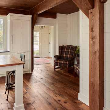
Home design - farmhouse home design idea in Milwaukee
Home design - farmhouse home design idea in Milwaukee
5