
Search results for "State's formation" in Home Design Ideas

 Custom Kitchens by John Wilkins, Inc.
Staff
Inspiration for a small coastal 3/4 gray tile and porcelain tile porcelain tile bathroom remodel in San Francisco with an undermount sink, flat-panel cabinets, dark wood cabinets, solid surface countertops, a wall-mount toilet and gray walls
Inspiration for a small coastal 3/4 gray tile and porcelain tile porcelain tile bathroom remodel in San Francisco with an undermount sink, flat-panel cabinets, dark wood cabinets, solid surface countertops, a wall-mount toilet and gray walls

 Carlton Edwards
This modern lake house is located in the foothills of the Blue Ridge Mountains. The residence overlooks a mountain lake with expansive mountain views beyond. The design ties the home to its surroundings and enhances the ability to experience both home and nature together. The entry level serves as the primary living space and is situated into three groupings; the Great Room, the Guest Suite and the Master Suite. A glass connector links the Master Suite, providing privacy and the opportunity for terrace and garden areas.
Won a 2013 AIANC Design Award. Featured in the Austrian magazine, More Than Design. Featured in Carolina Home and Garden, Summer 2015.

 Structure Home
Set upon an oversized and highly sought-after creekside lot in Brentwood, this two story home and full guest home exude a casual, contemporary farmhouse style and vibe. The main residence boasts 5 bedrooms and 5.5 bathrooms, each ensuite with thoughtful touches that accentuate the home’s overall classic finishes. The master retreat opens to a large balcony overlooking the yard accented by mature bamboo and palms. Other features of the main house include European white oak floors, recessed lighting, built in speaker system, attached 2-car garage and a laundry room with 2 sets of state-of-the-art Samsung washers and dryers. The bedroom suite on the first floor enjoys its own entrance, making it ideal for guests. The open concept kitchen features Calacatta marble countertops, Wolf appliances, wine storage, dual sinks and dishwashers and a walk-in butler’s pantry. The loggia is accessed via La Cantina bi-fold doors that fully open for year-round alfresco dining on the terrace, complete with an outdoor fireplace. The wonderfully imagined yard contains a sparkling pool and spa and a crisp green lawn and lovely deck and patio areas. Step down further to find the detached guest home, which was recognized with a Decade Honor Award by the Los Angeles Chapter of the AIA in 2006, and, in fact, was a frequent haunt of Frank Gehry who inspired its cubist design. The guest house has a bedroom and bathroom, living area, a newly updated kitchen and is surrounded by lush landscaping that maximizes its creekside setting, creating a truly serene oasis.
Find the right local pro for your project

Inspiration for a 1950s formal medium tone wood floor living room remodel in Portland with blue walls, a ribbon fireplace and no tv
 Twelve Stones Designs, LLC
The owners of this kitchen had spent the money to upgrade the finishes in their kitchen upon building the home 12 years ago, but after living in the space for several years they realized how nonfunctional the layout really was. The (then) two preschool aged children had grown into busy, hungry teenagers with many friends who also liked to hang out at the house. So the family needed a more functional kitchen with better traffic flow, space for daily activities revolving around the kitchen at different times of day, and a kitchen that could accommodate cooking for and serving large groups. Furthermore, the dark, traditional finishes no longer reflected the homeowners’ style. They requested a brighter, more relaxed, coastal style that reflected their love of the seaside cities they like to visit.
Originally, the kitchen was U-shaped with a narrow island in the middle. The island created narrow aisles that bottle-necked at the dishwasher, refrigerator, and cooktop areas. There was a pass-through from the foyer into the kitchen, but the owners never liked that the pass-through was also located so close to the powder room. The awkward proximity was unappealing and made guests feel uncomfortable.
The kitchen’s storage was made up of lots of narrow cabinets, apothecary drawers, clipped corner units, and very few drawers. It lacked useful storage for the larger items the family used on a daily basis. And the kitchen’s only pantry was small closet that had only builder-grade, narrow shelving with no illumination to be able to see the contents inside.
Overall, the kitchen’s lighting plan was poorly executed. Only six recessed cans illuminated the entire kitchen and nook areas. The under cabinet lighting was not evenly distributed either. In fact, the builder had mis-placed the under cabinet lighting around the decorative pilasters which made for choppy, dark cubbies. Further, the builder didn’t include any lighting over the sink or the bar area, which meant whoever was doing the dishes was always in their own shadow. That, coupled with the steep overhang of the game room above made the bar area feel like a dim, cavernous space that wasn’t inviting or task oriented. The kitchen looked out into the main living space, but the raised bar and a narrow wall (which held the only large cabinet in the kitchen) created more of a barrier than a relationship to the living room or breakfast nook. In fact, one couldn’t even see the breakfast nook from the cooktop or sink areas due to its orientation. The raised bar top was too narrow to comfortably sit to either dine at or chat from due to the lack of knee space. The the homeowners confided that the kitchen felt more like a dark, dirty prison than place where the family, or their guests, wanted to gather and commune.
The clients' needs and desires were:
➢ to create a kitchen that would be a space the family loved to be in; to relate to the adjacent spaces all around, and to have better flow for entertaining large groups
➢ to remove the walls between the breakfast nook and living area and to be able to utilize the natural light from the windows in both those areas
➢ to incorporate a functional chopping block for prepping fresh food for home cooked meals, an island with a large sink and drain board, 2 pull out trash cans, and seating for at least the 2 teens to eat or do homework
➢ to design a kitchen and breakfast nook with an airy, coastal, relaxed vibe that blended with the rest of the house's coastal theme
➢ to integrate a layered lighting plan which would include ample general illumination, specific task lighting, decorative lighting, and lots of illuminated storage
➢ to design a kitchen with not only more storage for all the husband’s kitchen gadgets and collection of oils and spices, but smart storage, including a coffee/breakfast bar and a place to store and conceal the toaster oven and microwave
➢ to find a way to utilize the large open space between the kitchen, pantry area, and breakfast nook
Twelve Stones Designs achieved the owner's goals by:
➢ removing the walls between the kitchen and living room to allow the natural light to filter in from the adjacent rooms and to create a connection between the kitchen, nook, and living spaces for a sense of unity and communion
➢ removing the existing pantry and designing 3 large pantry style cabinets with LED tape lights and rollout drawers to house lots of kitchen appliances, gadgets, and tons of groceries. We also took the cabinets all the way up to the 9’ ceiling for additional storage for seasonal items and bulk storage.
➢ designing 2 islands - 1 with a gorgeous black walnut chopping block that houses a drawer for chopping and carving knives and a custom double pull out trash unit for point of use utilization - and 1 that houses the dishwasher, a large Blanco Gourmet sink with integrated drain board, woven baskets for fresh root vegetables and kitchen towels, plenty of drawer storage for kitchen items, and bar seating for up to 4 diners.
➢ closing off the space between the kitchen and the powder room to create a beautiful new private alcove for the powder room as well as adding some decorative storage. This also gave us space to include more tall storage near the new range for precision placement of the husband’s extensive oil and spice collection as well as a location for a combo-steam oven the wife wanted for baking and cooking healthy meals.
The project is enhanced functionally by:
➢ incorporated USB and standard receptacles for the kids’ laptops and phone charging in the large island
➢ designing the small island to include additional open shelving for items used on a daily basis such as a variety of bowls, plates, and colanders. This set up also works well for the husband who prefers to “plate” his dinners in restaurant-style fashion before presenting them to the table.
➢ the integration of specific storage units, such as double stacked cutlery drawers, a custom spice pull-out, a Kuerig coffee and tea pod drawer, and custom double stacked utensil drawers
➢ moving the refrigerator to the old oven location - this eliminated the bottle neck as well as created a better relationship to the eating table. It also utilizes the floor space between the pantry, nook, and kitchen
➢ creating a banquet style breakfast nook - this banquette seating not only doubles the amount of seating for large gatherings but it better utilizes the odd space between the kitchen and the previous nook area. It also helps to create a distinct pathway from the mudroom room through the pantry area, kitchen, nook, and living room.
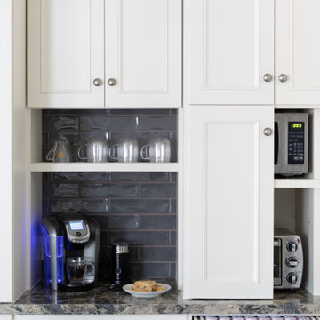
➢ the coffee/breakfast bar area which includes the perfect location for the concealed microwave and toaster oven, convenient storage for the coffee pods and tea accoutrements. Roll-out drawers below also house the smoothie maker, hot water kettle, and a plethora of smoothie-making ingredients such as protein powders, smoothie additives, etc. Furthermore, the drawers below the Keurig house measuring utensil, cutlery, baking supplies and tupperware storage.
➢ incorporating lots of wide drawers and pullouts to accommodate large cookware.
➢ utilizing as much vertical space as possible by building storage to the ceiling which accommodates the family’s abundant amount of serving platters, baking sheets, bakeware, casserole dishes, and additional cutting boards.
The project is enhanced aesthetically by:
➢ new 5-piece Versailles pattern porcelain tile that now seamlessly joins the entire down stairs area together creating a bright, cohesiveness feeling instead of choppy separated spaces - it also adds a coastal feeling
➢ designing a cabinet to conceal the microwave and toaster oven
➢ the coastal influenced light fixtures over the nook table and island
➢ the sandy colors of the Langdon Cambria countertops. The swirling pattern and sparkling quartz pieces remind the homeowner of black-and-tan sandy beaches
➢ the striped banquet seating whose creamy white background and blue-green stripes were the inspiration for the cabinet and wall colors.
➢ All the interior doors were painted black to coordinate with the blacks and grays in the backsplash tile and countertop. This also adds a hint of tailored formality to an otherwise casual space.
➢ the use of WAC's Oculux small aperture LED units for the overhead lighting complimented with Diode LED strips for task lighting under the cabinets and inside the pantry and glass wall cabinets. All of the lighting applications are on separate dimmer switches.
Innovative uses of materials or construction methods by Realty Restoration LLC:
➢ Each 1-1/2” x 3” block of reclaimed end-grain black walnut that makes up the center island chopping block was hand milled and built in the shop. It was designed to look substantial and proportional to the surrounding elements, executed by creating the 4 inch tall top with a solid wood chamfered edge band.
➢ The metal doors on either side of the vent hood were also custom designed for this project and built in the Realty Restoration LLC shop. They are made 1x2, 11-gauge mild steel with ribbed glass. Weighing 60 lbs a piece, heavy duty cabinet hinges were added to support the weight of the door and keep them from sagging.
➢ Under-cabinet receptacles were added along the range wall in order to have a clean, uninterrupted backsplash.
Design obstacles to overcome:
➢ Because we were removing the demising walls between the kitchen and living room, we had to find a way to plumb and vent the new island. We did this by tunneling through the slab (the slab had post tension cables which prevented us from just trenching) to run a new wet vent through a nearby structural wall. We pulled the existing hot and cold lines between upper floor joists and ran them down the structural wall as well and up through a conduit in the tunnel.
➢ Since we were converting from wall overs to a gas range it allowed us to utilize the 220 feed for the wall ovens to provide a new sub panel for all the new kitchen circuits
➢ Due to framing deficiencies inherited from the original build there was a 1-1/2” differential in the floor-to-ceiling height over a 20 foot span; by utilizing the process of cutting and furring coupled with the crown moulding details on the cabinet elevations we were able to mask the problem and provide seamless transitions between the cabinet components.
Evidence of superior craftsmanship:
➢ uniquely designed, one-of-a-kind metal “X” end panels on the large island. The end panels were custom made in the Realty Restoration LLC shop and fitted to the exact dimensions of the island. The welding seams are completely indistinguishable - the posts look like they are cut from a single sheet of metal
➢ square metal posts on the small island were also custom made and designed to compliment and carry through the metal element s throughout the kitchen
➢ the beautiful, oversized end panels on the pantry cabinets which give the breakfast nook a tailored look
➢ integrating a large format 5 piece Versailles tile pattern to seamlessly flow from the existing spaces into the new kitchen space
➢ By constructing a custom cabinet that jogged around a corner we could not remodel (housing the entry way coat closet) we were able to camouflage the adjacent wall offset within the upper and lower cabinets. By designing around the existing jog in the structural walls we accomplished a few things: we were able to find the space to house, and hide, the microwave and toaster oven yet still have a clean cohesive appearance from the kitchen side. Additionally, the owners were able to keep their much needed coat closet and we didn’t have to increase the budget with unnecessary structural work.

 Angela Todd Studios | Portland, OR
Although our empty nester clients were still enjoying their custom home they had lived in for nearly 30 years, they had outgrown their once state-of-the-art 1980s master bathroom.
Our master bathroom facelift transformed a bathroom with carpet, wallpaper, glass block tiles, and a 30 year old Jacuzzi. It transformed into a clean lined, yet warm and inviting space that still worked with the home’s contemporary architecture. Our selections started with a natural stone for the vanity, and selecting Sapele wood cabinetry for both it’s textured lines and color qualities. Our next step was our hardware and fittings – knowing we wanted both function and visual appeal.
We relocated the double vanities at the center of the room, and installed the shower on the other side of the wall creating a circular passage for flow. The integrated sinks make a statement at the vanity – as well as the large apron of stone surrounding the face of the cabinetry. Wall mount faucets, and matte textured tile running vertically complete the look.
The free-standing vessel tub leaves a lasting impression against the windows. Corner cabinetry and shelves add both storage and visual appeal. Tucked in the corner an upholstered bench, yet more storage and built in jewelry organization.
Large format porcelain floor tiles were installed with a smooth skimstone application on the shower floor. Amenities and special touches in the bathroom include radiant heating, LED lighting under the cabinets and behind the vanity mirrors, a large format thermostat controlled towel bar, a linear drain in the shower, and a wall mounted energy efficient toilet.
For more about Angela Todd Studios, click here: https://www.angelatoddstudios.com/
To learn more about this project, click here: https://www.angelatoddstudios.com/portfolio/cedar-hills-master-suite/



 TKS Design Group
Download our free ebook, Creating the Ideal Kitchen. DOWNLOAD NOW
This client was referred to us from a past client. They are a busy 2-career household with young children and enjoy entertaining friends and family in their home. They have a beautiful open concept home but unfortunately the kitchen was not fitting for the rest of the home. They were not quite sure what to do with the space. We talked about trying to refresh it or do more of a minor remodel, but in the end they decided a full gut would get them to where they wanted to be.
One problem was there was no place for guests to hang out other than the large and awkward banquette area. The brick wall and tiled hood area were feeling a bit dated and tired. The space was just not functional for their lifestyle. There was no prep space near the cooktop and no landing area for items coming out of the ovens or refrigerator, plus a big dead zone in the center of the room.
Banquettes, like the one they previously had in the space, are great for small spaces, but when they get really large like this one, it makes getting in and out of the seating area awkward and uncomfortable. Plus, there was room for a large table, so we eliminated the awkward built in.
We started by removing the faux brick wall between the kitchen and back entry. We relocated the entry to the garage over a couple feet in order to get every last inch out of the new kitchen. We also made the decision to close up the primary window that faced the pretty ho hum brick wall of the neighbor’s house. There was plenty of light coming in from the seating area, so we just didn’t feel the window was adding much to the room.
Construction went smoothy. There was a bit of rework with electrical, flooring and HVAC, but in the end, we think it was well worth it.
The clients really wanted a sleek contemporary look, and we originally had planned for a full height slab backsplash, but due to it’s size, it was a budget buster. Instead, we got creative and settled on large format porcelain tiles that have a similar feel but were a fraction of the cost. We made sure the wall was plumb and level so that the fit and finish would mimic that of slab material.
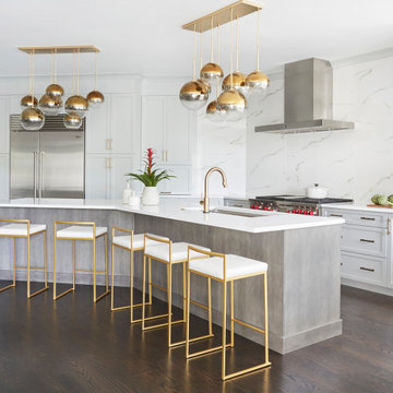
The final space was quite a change. A large prep sink sits directly across from the new pro-style range with plenty additional prep space on the large island. The refrigerator and ovens now have miles of landing space, and a nice tight work triangle makes cooking a breeze.
Since we wanted a more contemporary feel, not many wall cabinets were included. Instead, we outfitted some of the drawers for dish storage with a peg system. Two large pantries flanking the refrigerator hold baking supplies and small appliances. Large drawers by the cooktop hold pots and pans, and an appliance garage tucked away to the left of the range hides away miscellaneous items. The large island also houses a microwave drawer and tons of storage, most of which is drawers offering maximum convenience.
The island now seats 5-6 people comfortably along with the new table in the seating area which can seat up to 8. Entertaining will be a breeze in this space. With such a clean backdrop, we knew we would need some drama with the lighting, so we chose two sets of staggered pendants, which we adjusted for the right visual balance above the island.
We also included a small coffee station to the right of the main kitchen, which helps keep the coffee clutter out of the kitchen proper. Two tones of complimentary gray are featured in this kitchen. The perimeter is a light gray that reads almost white. The island is a gray stain that adds some depth and interest with the visible wood texture. The countertops are clean white quartz, and the hardware, barstools and light fixtures add warm brass tones. I see lots of cooking and entertaining with family and friends in the near future in this bright and airy new space.
Designed by: Susan Klimala, CKD, CBD
Photography by: Michael Kaskel
For more information on kitchen and bath design ideas go to: www.kitchenstudio-ge.com
 Angela Todd Studios | Portland, OR
Although our empty nester clients were still enjoying their custom home they had lived in for nearly 30 years, they had outgrown their once state-of-the-art 1980s master bathroom.
Our master bathroom facelift transformed a bathroom with carpet, wallpaper, glass block tiles, and a 30 year old Jacuzzi. It transformed into a clean lined, yet warm and inviting space that still worked with the home’s contemporary architecture. Our selections started with a natural stone for the vanity, and selecting Sapele wood cabinetry for both it’s textured lines and color qualities. Our next step was our hardware and fittings – knowing we wanted both function and visual appeal.
We relocated the double vanities at the center of the room, and installed the shower on the other side of the wall creating a circular passage for flow. The integrated sinks make a statement at the vanity – as well as the large apron of stone surrounding the face of the cabinetry. Wall mount faucets, and matte textured tile running vertically complete the look.
The free-standing vessel tub leaves a lasting impression against the windows. Corner cabinetry and shelves add both storage and visual appeal. Tucked in the corner an upholstered bench, yet more storage and built in jewelry organization.
Large format porcelain floor tiles were installed with a smooth skimstone application on the shower floor. Amenities and special touches in the bathroom include radiant heating, LED lighting under the cabinets and behind the vanity mirrors, a large format thermostat controlled towel bar, a linear drain in the shower, and a wall mounted energy efficient toilet.
For more about Angela Todd Studios, click here: https://www.angelatoddstudios.com/
To learn more about this project, click here: https://www.angelatoddstudios.com/portfolio/cedar-hills-master-suite/
 Angela Todd Studios | Portland, OR
Although our empty nester clients were still enjoying their custom home they had lived in for nearly 30 years, they had outgrown their once state-of-the-art 1980s master bathroom.
Our master bathroom facelift transformed a bathroom with carpet, wallpaper, glass block tiles, and a 30 year old Jacuzzi. It transformed into a clean lined, yet warm and inviting space that still worked with the home’s contemporary architecture. Our selections started with a natural stone for the vanity, and selecting Sapele wood cabinetry for both it’s textured lines and color qualities. Our next step was our hardware and fittings – knowing we wanted both function and visual appeal.
We relocated the double vanities at the center of the room, and installed the shower on the other side of the wall creating a circular passage for flow. The integrated sinks make a statement at the vanity – as well as the large apron of stone surrounding the face of the cabinetry. Wall mount faucets, and matte textured tile running vertically complete the look.
The free-standing vessel tub leaves a lasting impression against the windows. Corner cabinetry and shelves add both storage and visual appeal. Tucked in the corner an upholstered bench, yet more storage and built in jewelry organization.
Large format porcelain floor tiles were installed with a smooth skimstone application on the shower floor. Amenities and special touches in the bathroom include radiant heating, LED lighting under the cabinets and behind the vanity mirrors, a large format thermostat controlled towel bar, a linear drain in the shower, and a wall mounted energy efficient toilet.
For more about Angela Todd Studios, click here: https://www.angelatoddstudios.com/
To learn more about this project, click here: https://www.angelatoddstudios.com/portfolio/cedar-hills-master-suite/

 Middlefork Luxury Home Builders
Rising amidst the grand homes of North Howe Street, this stately house has more than 6,600 SF. In total, the home has seven bedrooms, six full bathrooms and three powder rooms. Designed with an extra-wide floor plan (21'-2"), achieved through side-yard relief, and an attached garage achieved through rear-yard relief, it is a truly unique home in a truly stunning environment.
The centerpiece of the home is its dramatic, 11-foot-diameter circular stair that ascends four floors from the lower level to the roof decks where panoramic windows (and views) infuse the staircase and lower levels with natural light. Public areas include classically-proportioned living and dining rooms, designed in an open-plan concept with architectural distinction enabling them to function individually. A gourmet, eat-in kitchen opens to the home's great room and rear gardens and is connected via its own staircase to the lower level family room, mud room and attached 2-1/2 car, heated garage.
The second floor is a dedicated master floor, accessed by the main stair or the home's elevator. Features include a groin-vaulted ceiling; attached sun-room; private balcony; lavishly appointed master bath; tremendous closet space, including a 120 SF walk-in closet, and; an en-suite office. Four family bedrooms and three bathrooms are located on the third floor.
This home was sold early in its construction process.
Nathan Kirkman

 A. Bollman & Sons.
Custom 2 sided single bed with built in storage and trundle bed.
Recessed and surface mounted Kreon lighting fixtures throughout.
Photo by Lauren Coleman
Furniture by Holly Hunt

Transitional beige tile medium tone wood floor, brown floor and double-sink bathroom photo in Houston with shaker cabinets, white cabinets, white walls, a vessel sink, white countertops and a built-in vanity

 7th House Interiors
Small danish master white tile and subway tile ceramic tile, black floor and double-sink alcove shower photo in Tampa with flat-panel cabinets, brown cabinets, a one-piece toilet, white walls, a vessel sink, quartz countertops, a hinged shower door, white countertops, a niche and a freestanding vanity

 Avenue B Development
Inspiration for a contemporary white tile tub/shower combo remodel in Austin with flat-panel cabinets, medium tone wood cabinets and white walls

 June Scott Design
Blending a modern sensibility with traditional architecture, this garden features a front yard meadow with native grasses (Carex praecracilis) and wildflowers. Poured-in-place concrete pavers in a meandering pattern slow the approach from the sidewalk to the entry. The modest backyard has been maximized for entertaining with outdoor dining and seating areas. Native plants, herbs, and edibles share the back garden beds, and a raised pond brings the garden to life.

 Corine Maggio Design
This adorable beach cottage is in the heart of the village of La Jolla in San Diego. The goals were to brighten up the space and be the perfect beach get-away for the client whose permanent residence is in Arizona. Some of the ways we achieved the goals was to place an extra high custom board and batten in the great room and by refinishing the kitchen cabinets (which were in excellent shape) white. We created interest through extreme proportions and contrast. Though there are a lot of white elements, they are all offset by a smaller portion of very dark elements. We also played with texture and pattern through wallpaper, natural reclaimed wood elements and rugs. This was all kept in balance by using a simplified color palate minimal layering.
I am so grateful for this client as they were extremely trusting and open to ideas. To see what the space looked like before the remodel you can go to the gallery page of the website www.cmnaturaldesigns.com
Photography by: Chipper Hatter
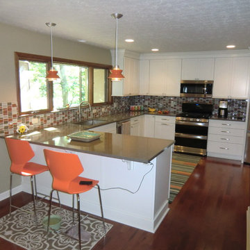
Sponsored
Westerville, OH

Custom Home Works
Franklin County's Award-Winning Design, Build and Remodeling Expert

 McLain Homes, LLC
Photos by Scott Richard
Inspiration for a mid-sized transitional master medium tone wood floor bedroom remodel in New Orleans with multicolored walls and no fireplace
Inspiration for a mid-sized transitional master medium tone wood floor bedroom remodel in New Orleans with multicolored walls and no fireplace
 Structure Home
Set upon an oversized and highly sought-after creekside lot in Brentwood, this two story home and full guest home exude a casual, contemporary farmhouse style and vibe. The main residence boasts 5 bedrooms and 5.5 bathrooms, each ensuite with thoughtful touches that accentuate the home’s overall classic finishes. The master retreat opens to a large balcony overlooking the yard accented by mature bamboo and palms. Other features of the main house include European white oak floors, recessed lighting, built in speaker system, attached 2-car garage and a laundry room with 2 sets of state-of-the-art Samsung washers and dryers. The bedroom suite on the first floor enjoys its own entrance, making it ideal for guests. The open concept kitchen features Calacatta marble countertops, Wolf appliances, wine storage, dual sinks and dishwashers and a walk-in butler’s pantry. The loggia is accessed via La Cantina bi-fold doors that fully open for year-round alfresco dining on the terrace, complete with an outdoor fireplace. The wonderfully imagined yard contains a sparkling pool and spa and a crisp green lawn and lovely deck and patio areas. Step down further to find the detached guest home, which was recognized with a Decade Honor Award by the Los Angeles Chapter of the AIA in 2006, and, in fact, was a frequent haunt of Frank Gehry who inspired its cubist design. The guest house has a bedroom and bathroom, living area, a newly updated kitchen and is surrounded by lush landscaping that maximizes its creekside setting, creating a truly serene oasis.

 Design Loft Company
Trendy 3/4 gray floor alcove shower photo in San Francisco with flat-panel cabinets, dark wood cabinets, white walls, an integrated sink, a hinged shower door and beige countertops
32